Posts filed under Ink Reviews

Cult Pens Diamine Christine Iridescink Review

I guess I’m a sheen ink guy now. At least somewhat.

For any ink that is created to exhibit properties on the more extreme end of the spectrum - sheen and shimmer, for example - I am cautious. That means, I stick with the big brands who have a track record of good inky behavior. Not only do I expect them to work well, they need to flow well, clean well, dry well, and not act odd on the nib or on the page.

Diamine is one of those brands I have had great luck with, so when Cult Pens asked if I wanted to review round two of their Iridescink collection, it was an easy yes.

The relationship between these two great British brands extends back for several years, beginning with the Deep Dark series. Those colors were a hit, and the Iridescink has turned this entire collaboration up to eleven.

Previously, I reviewed Maureen and Robert, the first two inks in the series. I love both, but I cannot tell a lie: I love Maureen the most. Sorry Robert! Maureen is a bright blue with a red sheen, so when I saw Christine’s formulation - blue black with red sheen - you could say I was excited. I’m happy to report Cult Pens and Diamine delivered another winner.

I used my TWSBI ECO 1.1 mm stub to test Christine with. The ink goes down dark on the page, and dries with a red sheen covering what seems to be around 90% of the line. Where the letters start, and the ink is thinner, a bright blue peeks out from underneath, making for a great result on the page. I’m biased, of course, because blue black ink with red sheen may be my single favorite every day ink option. (Note: Similar to my Maureen and Robert review, it is practically impossible for me to get a good picture of this ink.)

It’s this level of sheen that I am not used to. It shows up the best on sheen-favorable (aka long dry time) paper like Tomoe River and in my Yoseka notebook. On Rhodia, it’s not as pronounced and more of the blue comes out on the page, with some sheen around the edges. On Leuchtturm, it was darker with less sheen, but dried the fastest.

Rhodia DotPad

Cult Pens lays all of this out on the product page, stating:

“Sheen can be fickle. Everything has to be just right for sheen to show up, so we can't guarantee you'll see sheen when you write with these inks, but they give you a good chance in the right conditions. You need the right combination of ink, pen and paper.”

This matters if you want the full effect of Iridescink, or any sheening ink. Heck, this matters for any pen, ink, and paper combination. That said, Christine is a color I enjoy on any paper type so far. The next test will be if I like it in a fine nib, as opposed to a stub. My guess is I will.

Yoseka Notebook

As much as I have fawned over these inks, I have yet to discuss possibly the best part of all: The price. At £9.50 (just under $12) for an 80 ml bottle, they are practically giving it away. That makes biting the bullet on international shipping a whole lot easier.

I’m a fan of sheen when it is well-behaved. The Iridescink inks from Cult Pens and Diamine are exactly that, and I can’t wait to see what they come up with next.

(Cult Pens provided this product at no charge to The Pen Addict for review purposes.)

Posted on September 16, 2019 and filed under Diamine, Cult Pens, Sheen, Ink Reviews.

Diamine Gibson Les Paul Guitar Ink in Pelham Blue Burst: A Review

(Susan M. Pigott is a fountain pen collector, pen and paperholic, photographer, and professor. You can find more from Susan on her blog Scribalishess.)

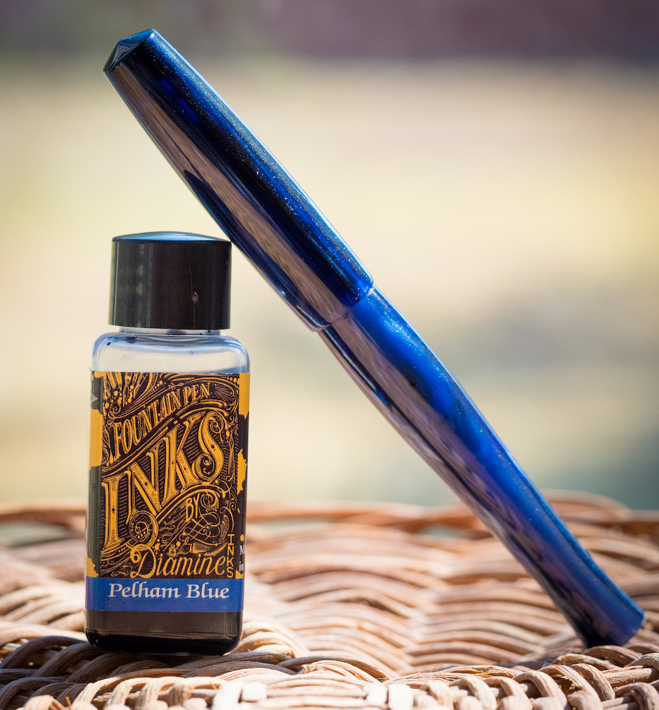
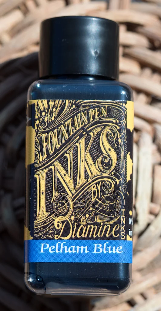
Diamine produces inks in such a wide array of colors that it’s hard to keep up. But sometimes they offer collections of inks that follow a theme, such as the Gibson Les Paul collection. Each ink in the collection evokes one of the finishes of the Gibson Les Paul guitars. I received the version called Pelham Blue Burst. It is named after the color on this gorgeous guitar:

This is a Gibson Les Paul Studio 2016 T Pelham Blue Guitar. (image via Reverb.com)

As soon as I received my bottle of ink, I put it in a beautiful blue PenBBS Model 323 and have been writing with it for a couple of months. It’s a gorgeous deep blue that leans toward dark turquoise.

In my tests, the ink is simply stunning on Rhodia dot paper. Even in fine nibs there’s a bit of shading, and it only gets better in wider nibs. The ink is medium-wet, not too dry and not so wet that it smears when you write with it. The swab shows how dark the color can get--it actually spans a wide range of blues depending on the width of the nib. It is not waterproof.

On my Col-o-dex card, the deepness of the blue shows in the swab. I used a Brause Blue Pumpkin dip nib to write the name of the ink, and, again, you can see how dark the ink can get. What’s really intriguing is the sheen. The ink splats glow magenta and green.

Chromatography confirms the sheen found in the ink. There’s a good amount of pink/magenta, a bit of green, and, of course, blue.

I always like to test my inks with my Handwritmic ruling pen to see how they perform in a giant nib. Pelham blue definitely shines, with lots of shading variation and sheen where the ink pools.

I am quite taken with Pelham Blue. It’s an unusual blue with a wide range of hues depending on the paper, the nib width, and the wetness of the nib. The sheen is quite striking, but even in normal writing circumstances when the ink doesn’t pool, this blue exudes sophistication.

You can purchase Diamine Gibson Les Paul Guitar Ink in Pelham Blue from Goldspot Pens in a 30ml bottle for $7.50 or a huge 80ml bottle for $15.00.

(Goldspot provided this product at no charge to The Pen Addict for review purposes.)


Enjoy reading The Pen Addict? Then consider becoming a member to receive additional weekly content, giveaways, and discounts in The Pen Addict shop. Plus, you support me and the site directly, for which I am very grateful.

Membership starts at just $5/month, with a discounted annual option available. To find out more about membership click here and join us!

Posted on September 6, 2019 and filed under Diamine, Ink Reviews.

Taccia Daidai Orange Ink Review

(Jeff Abbott is a regular contributor at The Pen Addict. You can find more from Jeff online at Draft Evolution and Twitter.)

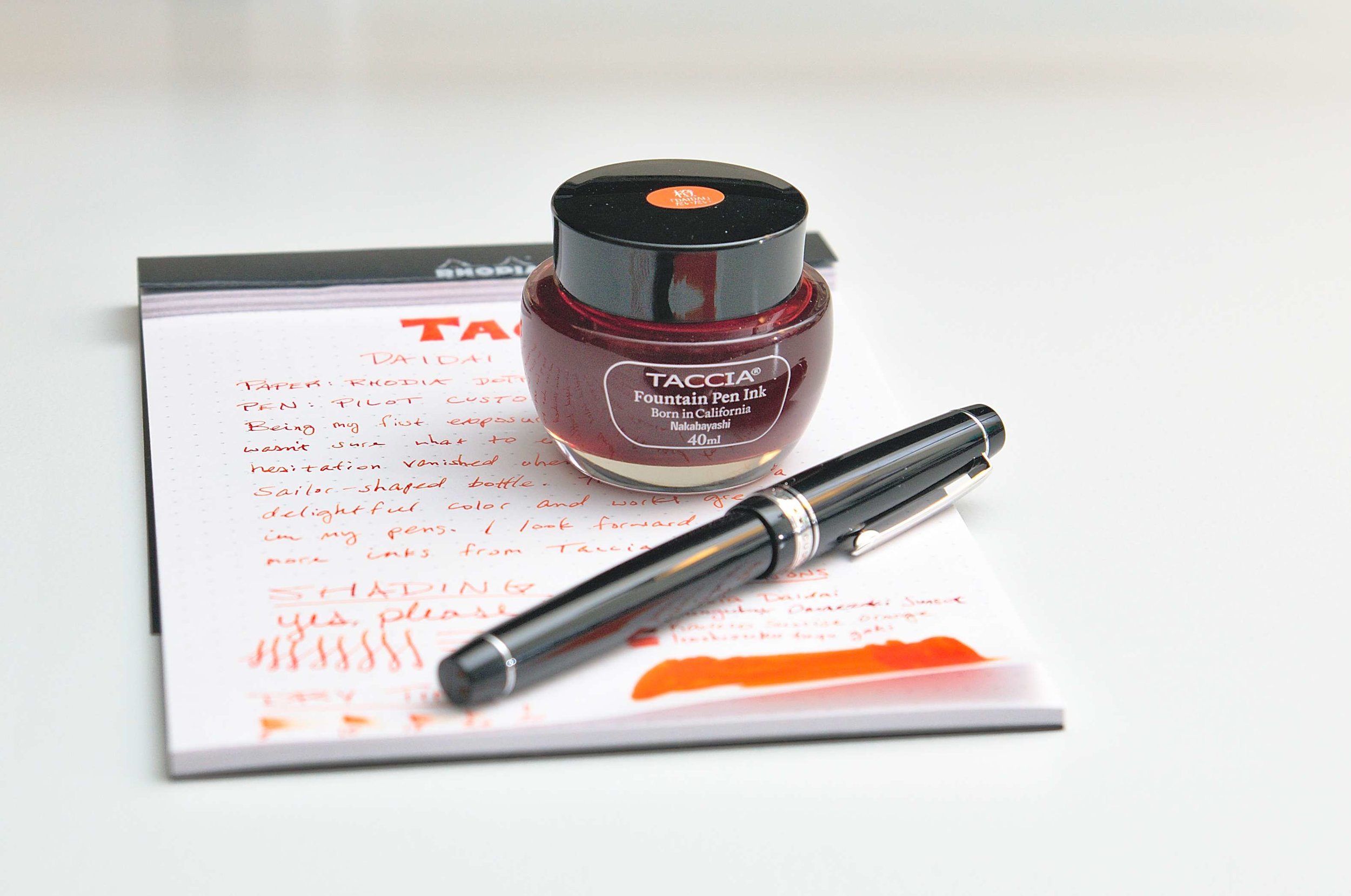
Taccia may have entered the ink game a bit late, but they already have a good sense of what they're doing. Taccia inks are made in Japan and feature a bottle design that is very reminiscent of Sailor bottles. The ink names are all Japanese and center around the primary colors that generate joy and spark imagination. The color I'm reviewing today is Daidai orange, and it is lovely.

Daidai orange is a fairly standard bright orange. There aren't many hints of red, yellow, or brown in this variant, and it just screams on the page. I can't help but smile when writing with this ink, and I find myself scribbling and filling in more areas with ink just to see more of the color.

Another thing I love about this ink is the level of shading it exhibits. While the main color is a tangerine orange color, it can also lighten up a bit in the shallow strokes. It's definitely still orange, but noticeably lighter. Either way, the level of variance is what makes this ink just a touch more special than a typical bright orange ink. The shading really adds the spark and makes it a great choice for any orange lover.

One thing that I haven't enjoyed so much about this ink is the dry times. It is a slow dryer. Even when writing fairly lightly and using as little ink as possible, it takes upwards of twenty seconds for the ink to fully dry. While this isn't unheard of and certainly well within accepted metrics, it's also a bit of a bummer. In a perfect world, inks would always dry in a couple of seconds, but that's not the physical world we live in.

Writing with this ink has been fantastic in a number of pens. It flows smoothly and makes dry nibs feel a tad wetter and smoother when writing. The lubrication quality is good but not overdone, and I haven't had any issues with this ink clogging up or drying out my nibs. According to Taccia, the ink is pH neutral, which means it should play nice with any pen you put it in. Inks and pen materials can sometimes react poorly, but that's rarely the case with a neutral ink like this one. And, almost as important as not ruining your pen, this ink also washes out of your nib, feed, and converters with ease.

I've used this ink with several different nibs, ranging from EF to a soft gold medium, and I haven't seen any issues with feathering or bleeding. The ink stays within the nib tracks very well. Being an orange, it also doesn't show through on the back side of the page very well. It's such a well-behaved ink!

Taccia Daidai orange is available in a 40ml bottle for just $12. Based on my experience with the ink, this is a steal. It's a well-behaved ink with plenty of character and depth, and 40ml is a good size for a bottle of good ink. But, if you don't want to commit to the whole bottle, you can also pick up a 4ml sample. I plan to try out several other Taccia inks, and I'm hopeful that they all share the same level of quality and craftsmanship as Daidai. If that's the case, this is a fantastic value with plenty of great color options to keep everyone happy.

(Vanness Pens provided this product at no charge to The Pen Addict for review purposes.)


Enjoy reading The Pen Addict? Then consider becoming a member to receive additional weekly content, giveaways, and discounts in The Pen Addict shop. Plus, you support me and the site directly, for which I am very grateful.

Membership starts at just $5/month, with a discounted annual option available. To find out more about membership click here and join us!

Posted on September 4, 2019 and filed under Taccia, Ink Reviews.