Posts filed under Ink Reviews

Diamine Havasu Turquoise Ink Review

Diamine Havasu Turquoise Ink Review

There is something to be said for a brand that has been around for over 150 years like Diamine. They do one things, and do that one thing very well: Make ink. It’s not all fountain pen ink - they are an industrial manufacturer as well - but fountain pen ink is what we know and love them for.

And love is a term that many people will use when describing Diamine Havasu Turquoise. This bright blue has been a favorite of fountain pen users for years, and for good reason.

Diamine Havasu Turquoise Ink

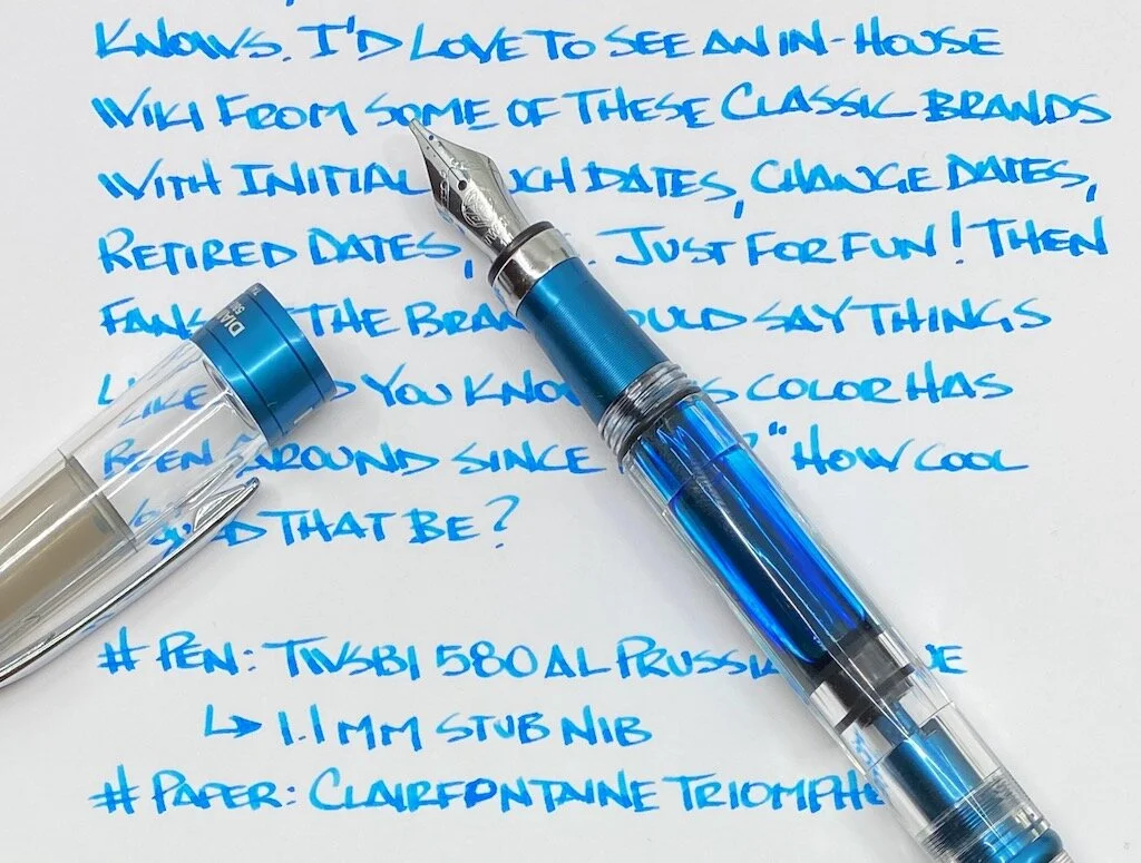
As I was writing this review up I got to thinking just how long Havasu Turquoise has been in existence? At least a decade, maybe two? How great would it be if historical companies like Diamine had something like a production Wiki to where we could see the launch year, the date of any formula changes, and the date of retirement for any inks that were shelved. I think that would be pretty cool, not only for research, but for story-telling. I know that’s asking a lot, but one can dream!

Diamine Havasu Turquoise

Regardless of when Havasau Turquoise was launched, it has been at the core of Diamine’s offerings for years, right up there with other classic colors such as Ancient Copper and Oxblood. Named after Havasu Falls in the Grand Canyon region of Arizona, it is a bright blue with moderate shading, and a tiny hint of red sheen around the edge of the lines. In other words, exactly what I want in an ink.

Diamine Havasu Turquoise Writing

As great as I think this ink is, what makes it even better is the price. You can grab a 30ml bottle for $7.50, or jump up to an 80ml bottle for $16.50. In a world where I’ve happily paid over $20 for a 30ml bottle, Diamine inks are a steal at this price for this quality. They are great every day inks, easy to use and clean, and perfect for beginners and experts alike.

It’s no wonder they have been in business since 1864.

(JetPens provided this product at no charge to The Pen Addict for review purposes.)


Enjoy reading The Pen Addict? Then consider becoming a member to receive additional weekly content, giveaways, and discounts in The Pen Addict shop. Plus, you support me and the site directly, for which I am very grateful.

Membership starts at just $5/month, with a discounted annual option available. To find out more about membership click here and join us!

Diamine Havasu Turquoise Line Art
Posted on September 14, 2020 and filed under Diamine, Ink Reviews.

Colorverse Office Series Blue Black Ink Review

Colorverse Office Series Blue Black Ink Review

(Jeff Abbott is a regular contributor at The Pen Addict. You can find more from Jeff online at Draft Evolution and Twitter.)

I've been on quite a blue black ink kick lately, and the latest contender in this list is from Colorverse. Part of their Office Series, their take on Blue Black is what I consider to be a traditional, middle-of-the-road interpretation of this classic color. In short, I love it and think it's something you should try out if you're in the market for a blue black ink for your favorite pens.

Colorverse Office Series Blue Black Ink

When it comes to blue black inks, there can actually be quite a bit of variation and differences of interpretation in terms of color. Some blue black inks may be so dark that you can barely make out any blue, while others take on a dusty blue or denim hue. Those are two opposite ends of the spectrum, but you can also see hints of purple or gray in some inks, as well as some red sheen in some cases. This is great in terms of variety, but it can also be frustrating if your idea of a blue black ink doesn't match up with the ink manufacturer's vision.

Colorverse's blue black is what I consider to be a definitive example of a true blue black. People will surely disagree with this statement, but that just goes to show that colors are incredibly objective perceptions that vary across all human beings. This blue black ink has a dark and luxurious tone while also being obviously blue. You don't have to look too closely to detect the deep blue, and it also doesn't have any stray colors that creep out in the light strokes and bright light. It's true to itself and the name given to it. It's not the most exciting color, but it's a beautiful example of a classic ink color.

Colorverse Office Series Blue Black

So, getting into the specifics of this particular ink, the first thing I noticed when using this ink (besides the color!) was how smooth it feels on the page. I've been really impressed by all of the Colorverse inks I've tried before, and this one is no exception. Ink flow is smooth out of the nib, and it lays down evenly on the page without letting too much out at a time. And, even the ink flows easily, it doesn't go crazy on more absorbent papers and feather out across the uncoated paper fibers. It's well-behaved, and I feel comfortable using it on any kind of paper — fancy or ordinary.

There isn't any visible sheen with this ink, and there also isn't a lot of variation in color or shading. It's a no-nonsense ink that works well and doesn't offer any frills. There's a reason that Colorverse included this in the "Office Series," and that's totally okay. There's a place for vibrant, loud inks in the same way there's a place for more subdued and "boring" colors. This ink will fit in great at the workplace (remember when we were around other people and could talk about pens and inks?) but also looks great in a Field Notes or bullet journal. There's enough visual interest in the color and ink properties to make it better than other similar inks.

Colorverse Office Series Blue Black Swab

One area where this ink really surprised me is the dry time. In most cases, and even when using it with a wet medium cursive italic nib, the ink was dry by around 12 or 15 seconds. Larger glops took a little longer (in the 20-second range), but on average there wasn't much time involved before the ink was smudge resistant.

I've really enjoyed using this ink, and it's quickly raced to the top of my list of favorite blue blacks. If you're curious in trying out a blue black ink, this is an excellent place to start. At $13.50 for a 30ml bottle, it won't break the bank, and you can even order a 4ml sample vial to try out if you're not sure you want to commit to the full bottle. Give it a shot in your next order with Vanness!

(Vanness Pens provided this product at no charge to The Pen Addict for review purposes.)


Enjoy reading The Pen Addict? Then consider becoming a member to receive additional weekly content, giveaways, and discounts in The Pen Addict shop. Plus, you support me and the site directly, for which I am very grateful.

Membership starts at just $5/month, with a discounted annual option available. To find out more about membership click here and join us!

Colorverse Office Series Blue Black Review
Posted on September 9, 2020 and filed under Colorverse, Ink Reviews.

Kyo No Oto Sakuranezumi Ink: A Review

Kyo No Oto Sakuranezumi Ink: A Review

(Susan M. Pigott is a fountain pen collector, pen and paperholic, photographer, and professor. You can find more from Susan on her blog Scribalishess.)

Kyo No Oto inks are made in Kyoto, Japan. Also known as Takeda Jimuki or TAG, the inks in this collection are meant to evoke colors from the beautiful city of Kyoto.

Sakuranezumi is a purple-grey color inspired by cherry blossoms beneath grey, cloudy skies. Literally, the words "sakura" and "nezumi" mean "cherry blossom mouse," which just makes me so happy. I mean, these days, it's the little things, am I right?

The ink comes in a 40ml glass bottle curved on the sides and flat in the front and back. The bottle is tall enough to ink large nibs (unlike the flat, round Sailor bottles that drive me crazy).

This dusky-grey purple is, in a word, glorious. On the Col-o-dex card, you can see the various shades of the ink in the swab and the green sheen in the splats.

Kyo No Oto Sakuranezumi Ink

Sakuranezumi is especially pretty on white Rhodia paper. I used my Leonardo Furore with a 14k 1.3 stub nib to test the ink. It displays excellent shading and is saturated enough to work well in all nib sizes. The ink is fairly wet, drying completely after about 35 seconds. It is not waterproof.

Kyo No Oto Sakuranezumi Ink Test

Chromatography displays the complexity of this ink. It contains multiple colors which make for the rich purple-grey when combined.

Kyo No Oto Sakuranezumi Ink Chromatography

The ink is lovely in extra-wide nibs (such as my Handwritmic ruling nib), demonstrating shading, sheen, and deep pools of color.

Kyo No Oto Sakuranezumi Ink Writing
Kyo No Oto Sakuranezumi Ink Close

I used my MD Notebook Journal to practice calligraphy and to write a long passage out with the Leonardo stub. This ink looks extra nice on cream-colored paper.

Kyo No Oto Sakuranezumi Ink Alphabet
Kyo No Oto Sakuranezumi Ink Alphabet Close
Kyo No Oto Sakuranezumi Ink Passage

I looked through all my purple ink swatches, and none of them was similar to Sakuranezumi. I'm sure there are probably similar inks, but to my great delight, I don't own them. I love it when I find an ink that is unlike any in my collection.

You can purchase Kyo-no-oto Sakuranezumi from Jet Pens for $22.00 (for a 40ml bottle). Yes, this is a higher priced ink, but if you love moody colors with lots of character, it's totally worth it.

(JetPens provided this product at no charge to The Pen Addict for review purposes.)


Enjoy reading The Pen Addict? Then consider becoming a member to receive additional weekly content, giveaways, and discounts in The Pen Addict shop. Plus, you support me and the site directly, for which I am very grateful.

Membership starts at just $5/month, with a discounted annual option available. To find out more about membership click here and join us!

Kyo No Oto Sakuranezumi
Posted on September 4, 2020 and filed under Kyo-no-oto, Ink Reviews.