Posts filed under Ink Reviews

Robert Oster Carbon Fire Ink Review

Robert Oster Carbon Fire Ink Review

(Jeff Abbott is a regular contributor at The Pen Addict. You can find more from Jeff online at Draft Evolution and Twitter.)

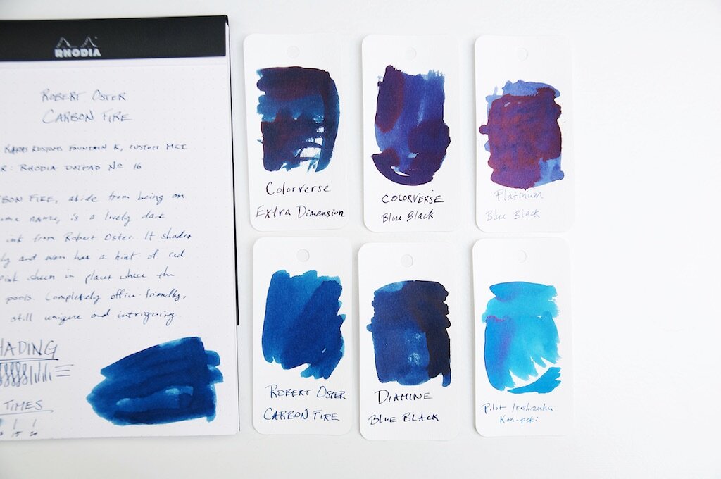
Over the past few months, I've definitely had a thing for trying new blue black inks. While I'm not tired of blue blacks, I decided it was time for something a little different. But don't get too excited — this next ink is just a shade or two brighter than the typical blue black. Despite being a close cousin of blue black, Robert Oster Carbon Fire is a spectacular dark blue that has just enough brightness to really lift my spirits.

While going through my ink and swatch collection to find comparable inks to Carbon Fire, I realized that I really don't have much at all in the blue spectrum that falls between bright, happy blue and blue black. Carbon Fire is the perfect dark blue that has an obviously blue hue while also being dark enough to seem "professional." To me, this is the color that most defacto "blue" that comes in gel, ballpoint, or rollerball refills. But, Carbon Fire has some extra qualities that set it apart from regular old navy blue.

Robert Oster Carbon Fire Ink Shading

For one, I'm a big fan of the amount of shading in this ink. It's not an intense level of shade between different blues, but it's enough that you can see it with small nibs. Of course, the larger the nib, the more pronounced and beautiful the shading becomes. I love an ink that has a good amount of shading, and Carbon Fire really does the trick for me.

Another hidden quality that I've only been able to coax out when using this ink with a medium cursive italic (or anything larger) is a very subtle sheen. It's so subtle and hard to detect that I can't decide if it's more of a red or pink sheen. Despite being subtle, it's somehow quite deliberate when you're looking at the ink color as a whole. It's difficult to describe. The subtle sheen adds a level of intrigue to the ink because you can't quite put your finger on what makes the ink something a bit more than a standard blue ink. It's not shimmery, it's not glossy...what is it?! These were my internal questions while I was testing this ink. Only by holding the paper at the right angle against the light does the sheen show itself for what it is. It hides beneath the navy surface and adds a pleasant je ne sais quoi to an otherwise ordinary ink color.

Robert Oster Carbon Fire Ink Comparison

If you like ink colors that exhibit mysterious qualities, this ink is right up your alley.

Aside from the color, shading, and sheen, this ink is standard fare for Robert Oster. It's not dry, but not too wet. It's smooth when writing and behaves well in the pens I've tried. It dries in a fairly standard 15-20 seconds depending on how large and wet the nib is. I couldn't detect any feathering or bleeding, which is also something I've come to admire with any Robert Oster ink.

I picked up Carbon Fire as a sample because I was intrigued by the name and thought the online swatch example was unique for a dark blue ink. I'm glad I followed the intrigue, because I might have found a new favorite ink.

You can pick up your own bottle of Robert Oster Carbon Fire from your favorite ink retailers for around $17 (Vanness, Pen Chalet, Goldspotand JetPens to name a few).


Enjoy reading The Pen Addict? Then consider becoming a member to receive additional weekly content, giveaways, and discounts in The Pen Addict shop. Plus, you support me and the site directly, for which I am very grateful.

Membership starts at just $5/month, with a discounted annual option available. To find out more about membership click here and join us!

Robert Oster Carbon Fire Ink Swab
Posted on January 27, 2021 and filed under Robert Oster, Ink Reviews.

Van Dieman's Ink Sample Review, Part 3

Van Dieman's Ink Sample Review, Part 3

(Sarah Read is an author, editor, yarn artist, and pen/paper/ink addict. You can find more about her at her website and on Twitter. And check out her latest book, Out of Water, now available where books are sold!)

Here is the final installment of my trove of Van Dieman's ink samples. I saved these three for last, because they looked like my kind of colors and they had cool names, which is very important to me in ink. While an ink color name might have nothing to do with its performance, it gets me every time.

Van Dieman's Eclipse
Van Dieman's Eclipse Chromatography

First up is Eclipse. Looking at the sample, one might ask, "Is it grey? Brown? Purple?" And really, the answer is yes. I love mysterious colors that can't quite be pinned down, and this one has some great complexity to it. It's like a warm, smokey color that doesn't come across well in pictures. The chromatography shows a bit of its character, especially in that gold hue that gives it its warmth. This ink behaved very well, though it had a longer dry time. It doesn't show much shading, but it does have a little bit of water resistance. By far its best characteristic is its way of looking like completely different colors in different lighting.

Van Dieman's Hanging Lake
Van Dieman's Hanging Lake Chromatography

Next is Hanging Lake, a gorgeous, slightly ominous navy. This is a very saturated color, rich and deep, with some great complexity. Grey, rose, and cobalt blue show up in the chromatography. It also has a long dry time, but it does show some shading on longer pen strokes. It was quite water resistant in the drip test, with all lines still visible, regardless of whether the water was dabbed or wiped away. This is a very professional looking blue. With its ability to withstand spills, it would be great for office or school use.

Van Dieman's Hastings Lake
Van Dieman's Hastings Lake Chromatography

Last but not least is Hastings Caves Shimmer. Like the shimmers I tested in part one, the particles in this ink require regular, vigorous agitation to remain suspended. They settle quickly and need some encouragement to disperse themselves back into the liquid. But once that is achieved, it's a really gorgeous color. The ink itself is a gold tone, with brass-colored shimmer that gives it an antique gold look. Chromatography shows a surprising progression, from pale pink to saffron yellow, to a touch of almost teal that I can't really explain. The shimmer is very pronounced in the lines, so long as you make sure to agitate the ink before writing. Like the other shimmers, I'd recommend using this in a pen that can be easily and thoroughly cleaned, because those particles settle like river sediment and I'd be a little worried about what they might do to a feed. This color did not have any water resistance, and had a long dry time.

Van Dieman's Hastings Lake Swirl

My biggest takeaway from this line of inks is that the creators are dedicated to complex color recipes. Chromatography isn't usually this exciting, but every sample was like a fireworks display, with surprising colors creeping out of each of them. While I think some of the samples are better suited to fountain pens than others, there are some fantastic, unique colors in this lineup. With all the ink colors out there in the world, I'm always amazed when a new one arises, with no look-alikes. This is a great line for experimenting with some fun, new tones.

(Vanness Pens provided this product at no charge to The Pen Addict for review purposes.)


Enjoy reading The Pen Addict? Then consider becoming a member to receive additional weekly content, giveaways, and discounts in The Pen Addict shop. Plus, you support me and the site directly, for which I am very grateful.

Membership starts at just $5/month, with a discounted annual option available. To find out more about membership click here and join us!

Van Dieman's Ink Samples
Posted on January 21, 2021 and filed under Van Dieman's, Ink Reviews.

Platinum Blue Black Ink Review

Platinum Blue Black Ink Review

(Jeff Abbott is a regular contributor at The Pen Addict. You can find more from Jeff online at Draft Evolution and Twitter.)

Over the past several months, I've tried close to a dozen different blue black inks. While they are all incredibly similar in color, it's been interesting to see the more subtle differences appear on the page when using these inks. Just because they share the same name doesn't mean they are the same ink. For as many different versions of this inks that are available, there are an equal number of interpretations for what blue black really means.

The latest in this journey is Platinum Blue Black. Belonging to one of the big Japanese pen manufacturing brands, I'm surprised I didn't try this one sooner. Unexpectedly, the quality of this ink matches up with the quality of Platinum's fountain pens. It's a fantastic ink with plenty of character, and I'm actually surprised by a couple of the characteristics that I missed before trying this ink myself.

Platinum Blue Black Ink

The first thing I noticed after testing this ink with a normal nib and letting the ink dry was that there's a slight amount of sheen even with normal use. I got out the swatches and layered the ink on thick to see exactly how much sheen would show up in a pool of dried ink. For an ink that doesn't tout any sheening properties in its marketing, this ink has a spectacular amount of red sheen that sits on top of any puddle. It's beautiful, and I wish I'd discovered this ink earlier. The sheen is even noticeable when writing with smaller nibs if the light hits the page just right.

Platinum Blue Black Swab

Another thing I didn't realize about this ink until after I tried it is that it's an iron gall ink. Iron gall permanent inks aren't something I normally search out, but it's pretty cool that this seemingly standard "base level" ink boasts such a unique attribute. Iron gall inks aren't super common, and they're usually much more obvious about the fact that they're iron gall. In the case of Platinum blue black, they don't make it overly apparent, but I appreciate the extra robustness and permanence that this ink has after it dries on the page. This means it shouldn't fade over time and will even withstand water damage. In my experience with iron gall inks, the ink stays on the paper for as long as the paper is structurally sound. Definitely something to consider if you lean toward permanent inks. As with any iron gall inks, it's important to understand that these inks are more acidic than water-based fountain pen inks. This means your nib could develop some corrosion after a few weeks of this ink being in your pen. Not a big deal, but something to be mindful of. Be sure to clean out your pens if you don't plan on using them.

Platinum Blue Black

Along with the surprise iron gall and sheening aspects, I was also excited by how quickly it dries. With the 1.1mm stub nib I used in the writing sample, it takes about 10-15 seconds to fully dry, but it's usually between 5 and 10 seconds in a Platinum medium nib I've also been using. Overall, pretty quick times, especially on the Rhodia's coated paper.

I've really enjoyed using this blue black ink over the past few weeks. It has a classic navy blue hue, a decent amount of shading, and quick dry times. On top of that, it's a permanent ink. Really solid competitor in the blue black market, and definitely worth your attention.

If you're interested in Platinum's blue black offering, you can pick it up in their proprietary cartridge form (which only works in Platinum pens) or a 60ml bottle. The cartridges come in a ten pack and cost $7 a box, while the large bottle costs a flat $20. Both are a pretty good deal, but I lean toward the bottle since the cartridges only work with Platinum pens. This ink is good enough to enjoy in all pens!

(JetPens provided this product at no charge to The Pen Addict for review purposes.)


Enjoy reading The Pen Addict? Then consider becoming a member to receive additional weekly content, giveaways, and discounts in The Pen Addict shop. Plus, you support me and the site directly, for which I am very grateful.

Membership starts at just $5/month, with a discounted annual option available. To find out more about membership click here and join us!

Platinum Blue Black Comparison
Posted on January 20, 2021 and filed under Platinum, Ink Reviews.