Posts filed under Ink Reviews

Endless Stationery Alchemy Inks Series — Poseidon's Reef Review

Endless Stationery Alchemy Inks Series — Poseidon's Reef Review

(Jeff Abbott is a regular contributor at The Pen Addict. You can find more from Jeff online at Draft Evolution and Twitter.)

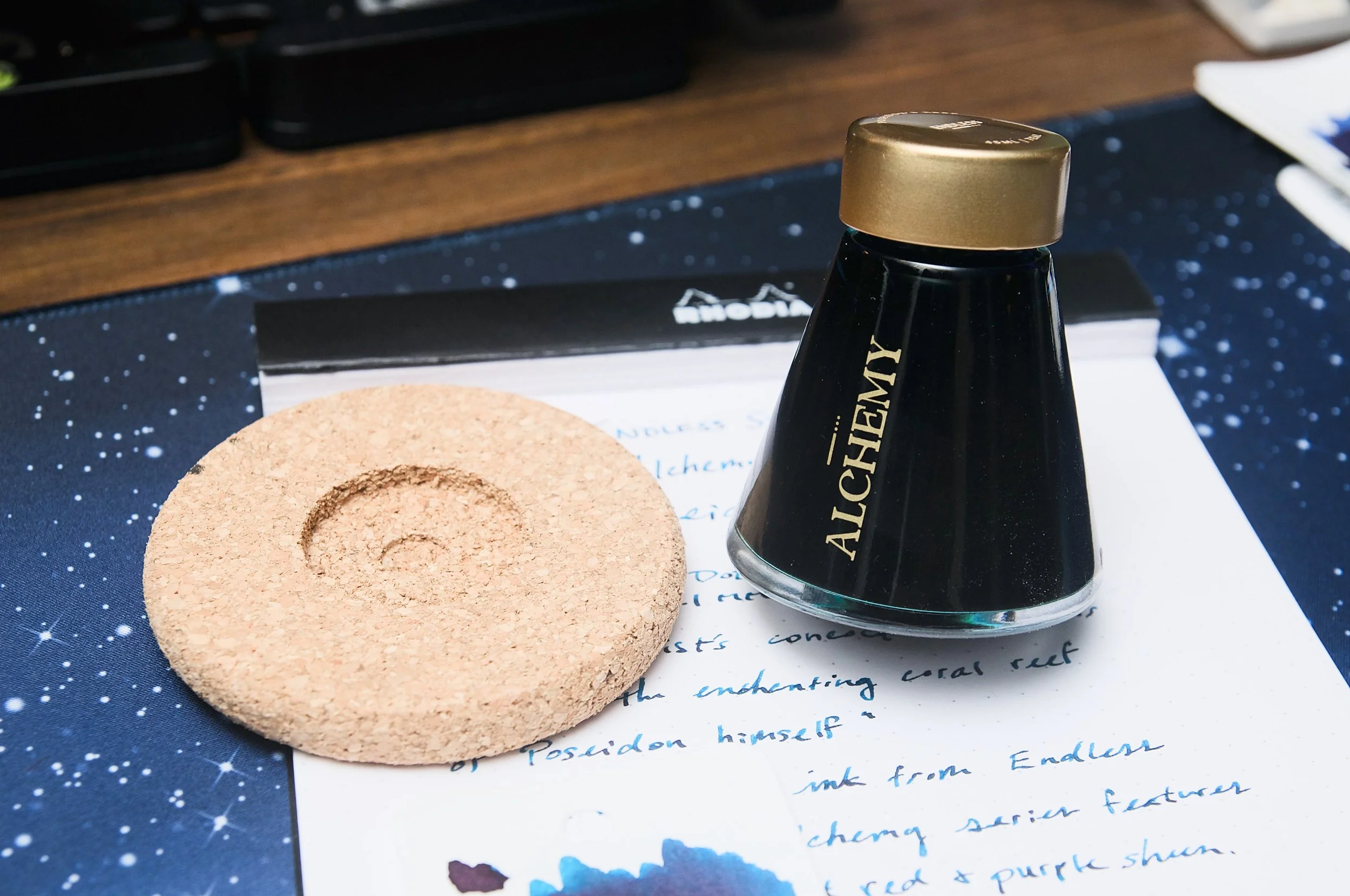
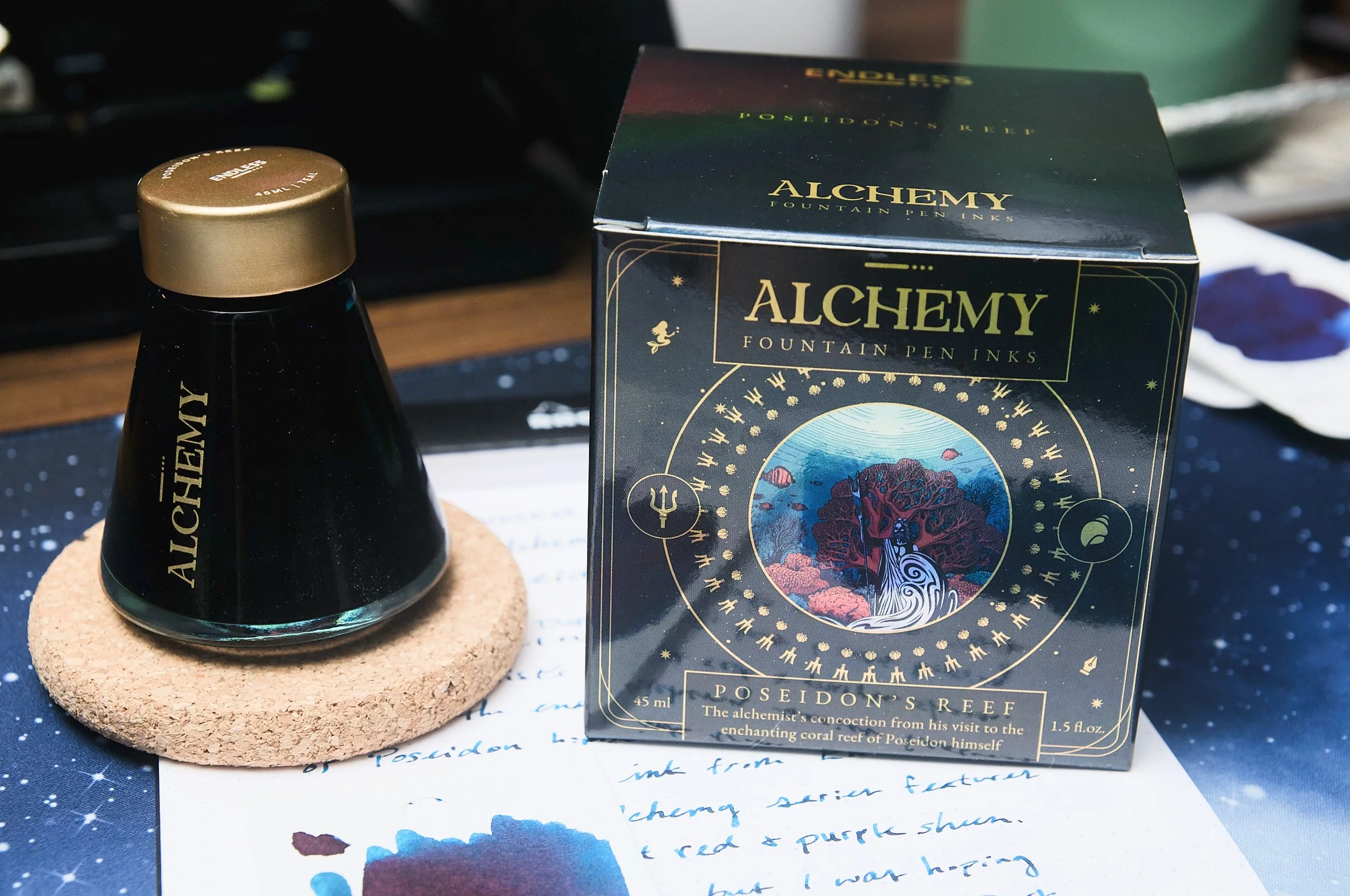
The Alchemy Inks Series from Endless Stationery is a fun collection of inks that all tell a story of how an alchemist was able to wield the power of each ink with the help of gods of legends. With Poseidon's Reef, we get a lovely teal ink with heaps of red/purple sheen and a bit of shading to mimic the look of shallow ocean water.

Endless Stationery Alchemy Inks Poseidon's Reef

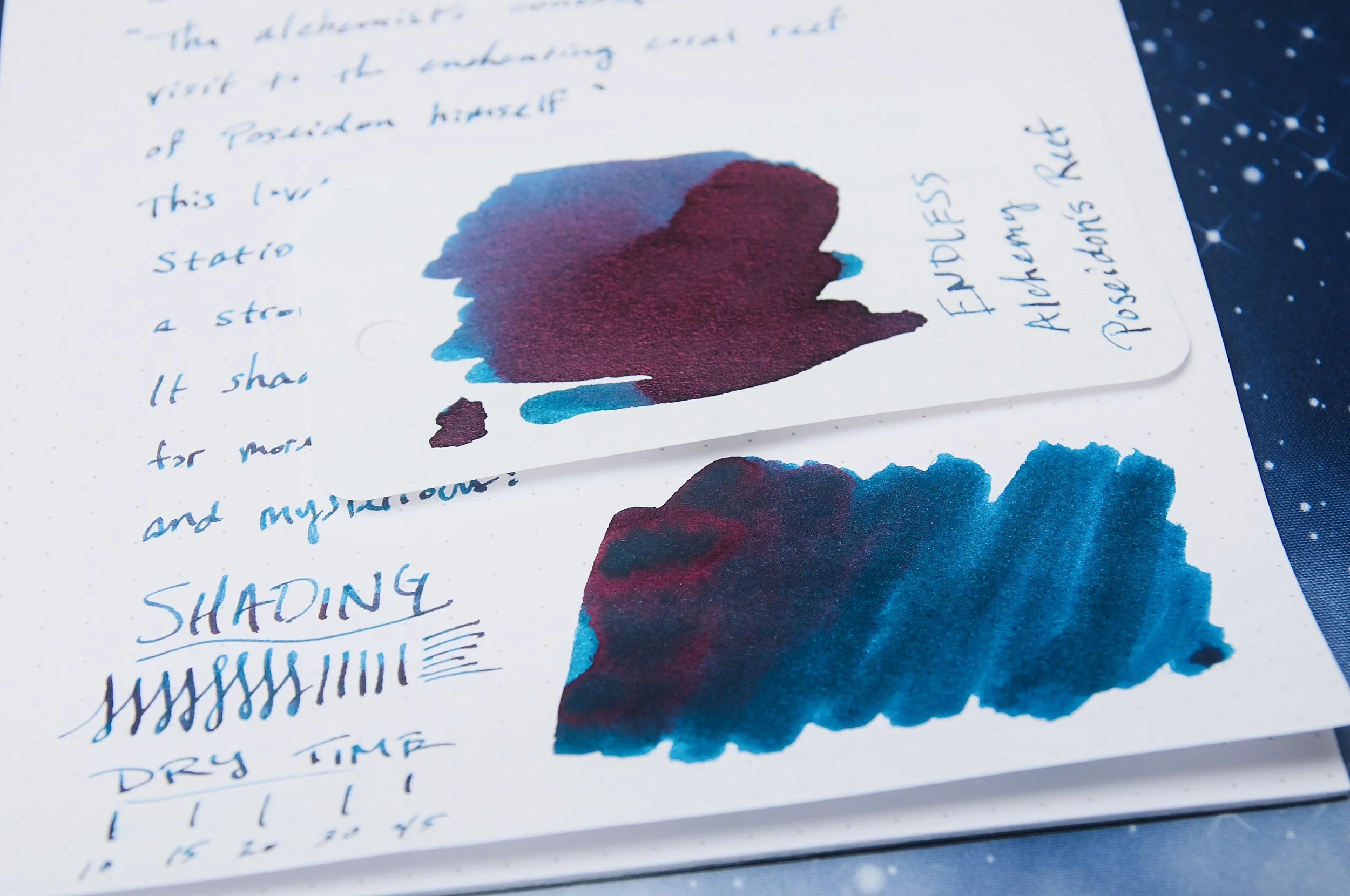
I'm personally powerless to resist adding a new blue, teal, or turquoise ink to my collection. At least with Poseidon's Reef, I get a nice dark teal ink that has a massive sheen flair that shows up on the page easily. The shade is a dark blue with a hint of green that turns it into a teal color. It's a pleasant color that somewhat reminds me of the ocean, but the slight bit of shading and hue variation adds more to that allusion. I'd like it if the ink had more shading variation, but the subtle effect is nice.

Endless Stationery Alchemy Inks Poseidon's Reef Sheen

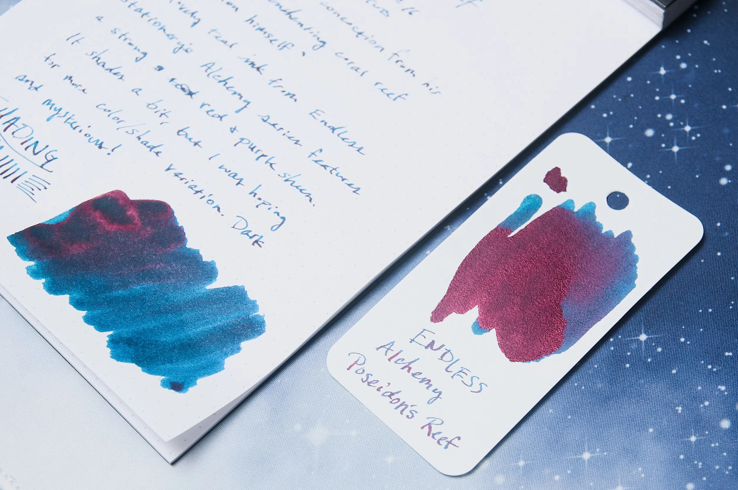
The characteristic that really surprised me with this ink is the sheen. There's an obvious and abundant red and purple sheen on this ink once it dries. Even in smaller nibs, the contrasting sheen shines through the dark teal background. It's a great effect, and one that really distinguishes this ink from other similar dark teal inks.

Something else that surprised me is the amount of time it takes this ink to dry. It's mostly dry by 15-20 seconds, where only some small areas still smudge with moderate pressure. In normal writing circumstances with a fine nib, I was able to write and immediate wipe my hand over the page without causing any smudges. The ink will still smear for left-handed writers, so we can't add it to the esteemed list of super-fast drying inks. Still, it dries fast enough to be worth mentioning.

Endless Stationery Alchemy Inks Poseidon's Reef Comparison

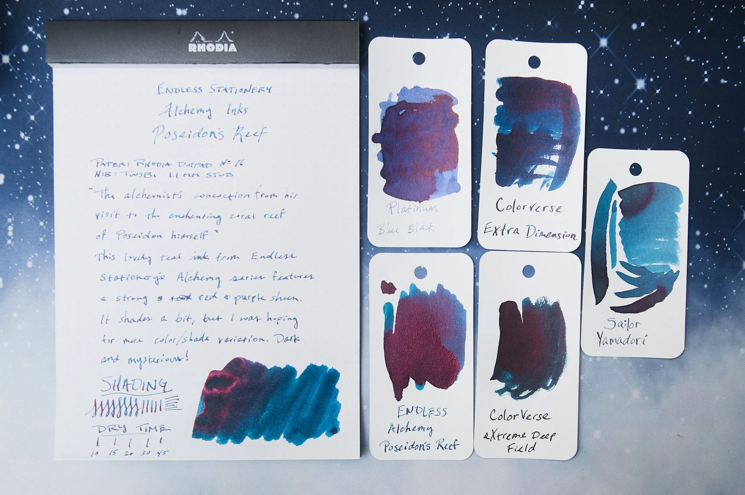
Once you get past the color and sheen effects, there's one characteristic that I've noticed that I don't like. In certain circumstances, the ink tends to feather and bleed. It doesn't happen all the time, which makes me think it has something to do with the paper. Still, it happens about once per sentence and is noticeable.

Feathering aside, this is still a wonderful ink. The flow is smooth and steady, the color is deep and mysterious, and the intense sheen is a lot of fun. The bottle that Endless Stationery use for the Alchemy series is a fun design as well. The base of the bottle is convex, which causes the bottle to twirl around gently. I definitely wouldn't let it twirl with the lid off, but you also get a nice cork stand that keeps the bottle steady when you're filling your pens. It's a fun bottle design, but definitely not something that should influence anyone's decision to buy. The artwork on the box is also fun, with a detailed illustration of Poseidon next to a coral reef with a holographic effect on the box that shifts the colors.

Endless Stationery Alchemy Inks Poseidon's Reef Bottle

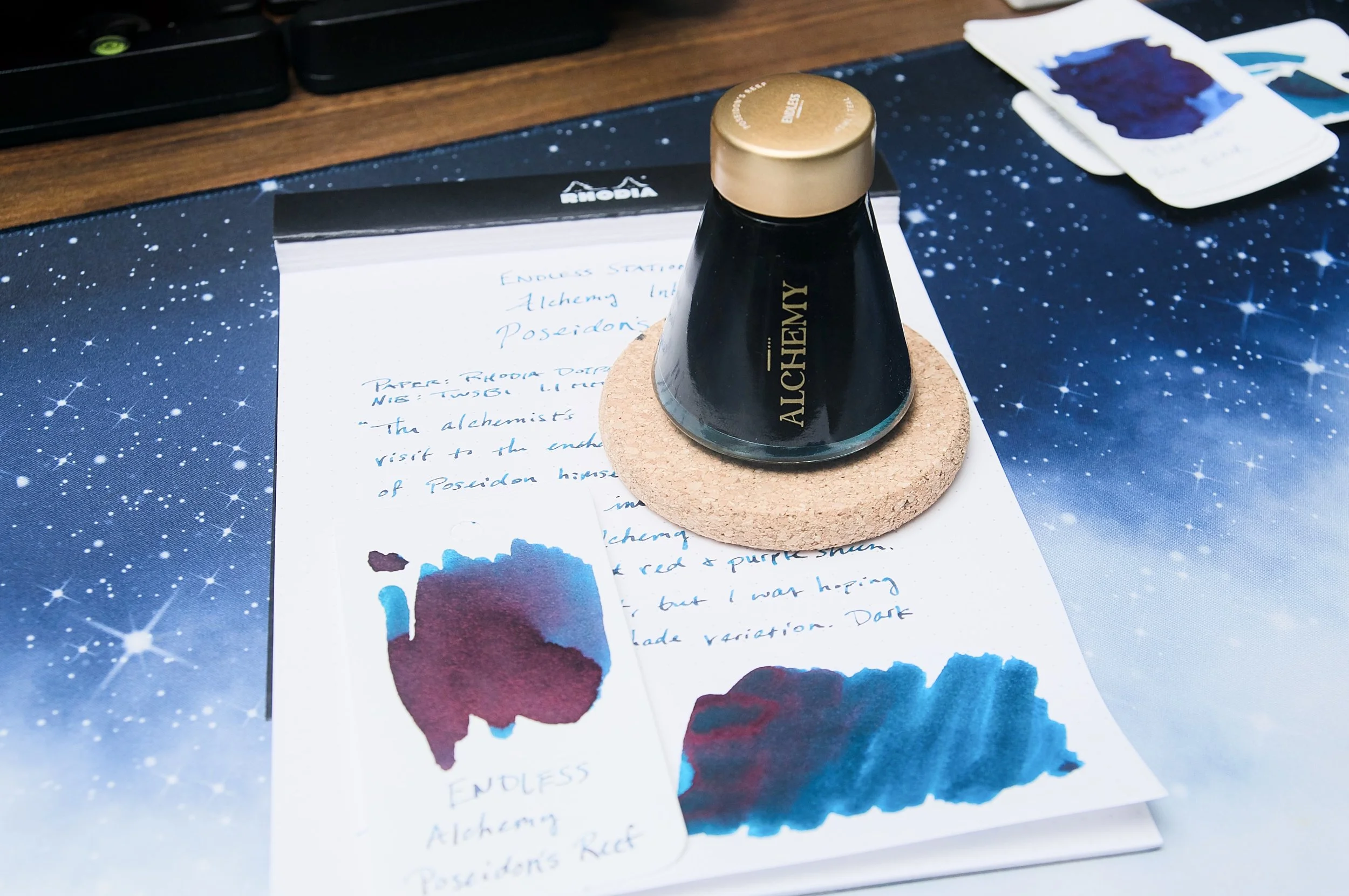
Poseidon's Reef is $20 for a 45 ml bottle, but you can also pick up a small 4 ml sample vial to try out if you're not sure you want the whole bottle. There are a few other color options in this series, and I look forward to trying some others!

(Vanness Pens provided this product at a discount to The Pen Addict for review purposes.)


Enjoy reading The Pen Addict? Then consider becoming a member to receive additional weekly content, giveaways, and discounts in The Pen Addict shop. Plus, you support me and the site directly, for which I am very grateful.

Membership starts at just $5/month, with a discounted annual option available. To find out more about membership click here and join us!

Endless Stationery Alchemy Inks
Posted on July 9, 2025 and filed under Endless, Ink Reviews.

Pilot Iroshizuku To-ro Fountain Pen Ink Review

Pilot Iroshizuku To-ro Fountain Pen Ink Review

Pilot has been actively updating the full Iroshizuku Fountain Pen Ink lineup over the past few years by removing underperforming colors, and adding new shades to fill in the gaps. Their choices have been questionable these past few rounds, but they nailed the newest three additions that launched in Fall 2024.

The newest shades are the Wintery-Blue Rikka, the deep Purple-Red-Black Syun-gyo, and the one I’m discussing today, the Warm Lantern Yellow-Orange of To-ro. Universally, these have been well-received, although did they really need another Blue? Rikka is fine, but I believe the least interesting of the bunch. Syun-go seems to lead the sales and usage charts - anecdotally, at least. To-ro, well, that’s a Brad ink, so let’s get into it.

Pilot Iroshizuku To-ro

Several years ago, as part of Pilot’s 100th Anniversary celebration, they launched an ink called Daikokuten, which quickly became one of my favorites. I classify it as a Yellow ink, and it is shockingly legible. I had been waiting to see if Pilot would bring it, or something similar, to the main Iroshizuku lineup, and instantly wondered if To-ro was it.

Not exactly, but To-ro may be better for more people with shades of Orange mixed with Yellow. A comparison swatche shows the differences:

Daikokuten vs To-ro

To-ro is clearly more Orange on the page, but not as Orange as Pilot’s other options in the lineup, Yu-yake and Fuyu-gaki. I think Yu-yake is closer to a standard shade of Orange, and Fuyu-gaki is the Red-Orange option. To-ro leans more yellow, and has an interesting vibrancy about it, making it perfectly legible on the page, even with my small handwriting.

Like all other Iroshizuku inks I’ve tried, the performance is right down the middle. They have great flow, good color, average dry time, moderate shading, and almost no sheen. In short, they are a Goldilocks performer. Price-wise, at $28.50 for 50 ml, they creep over into the expensive side of the ledger, but I think that’s fair for the quality. The bottle design is top-notch, as well.

Pilot Iroshizuku To-ro Lines

Given all that, how does To-ro rate among the new three inks? I still think Syun-gyo is the best - and most popular - of the new colors, for good reason. It is the most different shade, and most usable on the page. To-ro is a good addition to the lineup, but with it, we are now teetering on the edge of maximum Oranges for a 24 ink collection. Will Pilot continue to discontinue underperforming inks and create new ones? I wouldn’t be surprised, but I’m not sure this is an every year thing unless they grow the SKU count of the Iroshizuku lineup.

Pilot Iroshizuku To-ro Writing

To-ro is an ink that is right up my alley, and a good switch up from the hotter Oranges I frequently use. It clears the light shade barrier by a good margin, and is easily readable on the page. I see this being a frequent refill option for many of my pens, and I can’t wait to see where it lands next.

(JetPens provided this product at no charge to The Pen Addict for review purposes.)


Pilot Iroshizuku To-ro Line Art
Posted on June 9, 2025 and filed under Pilot, Iroshizuku, Ink Reviews.

Wearingeul Tick Tock Croc Ink Review

Wearingeul Tick Tock Croc Ink Review

(Jeff Abbott is a regular contributor at The Pen Addict. You can find more from Jeff online at Draft Evolution and Twitter.)

It's another week, so that means I'm on my continued green kick. I'm personally loving all the green I've been subjecting myself to, and I don't see any signs of this recent obsession dying anytime soon. This week, I'm looking at Wearingeul Tick Tock Croc.

Tick Tock Croc is a cool toned forest green with a little teal that shows through in the shading. Part of Wearingeul's Peter and Wendy collection, this ink takes inspiration from Peter Pan and the namesake crocodile villain.

Wearingeul Tick Tock Croc

I've had a great track record with Wearingeul inks in the past, but this ink marks my first slight issue. After inking a pen and cleaning up the nib and section, the pen wouldn't write despite having plenty of ink loaded in the feed. Touching a paper towel to an area around the feed would pull lots of ink, but the ink just wasn't making it down to the tip of the nib. I emptied the pen and refilled it, and the problem didn't persist. I've never had an issue like that before, so it could just be a fluke. At any rate, this ink is a touch on the dry side. The TWSBI 1.1mm stub that I used for the writing sample is typically a very wet and soft-feeling nib due to the large surface and good flow. With this ink, the nib feels a tiny bit scratchy. The flow is still great, and it can keep up with a fast pace, but it just feels a little dry. Not a problem, but something to consider if you plan on using this with a pen that you know to be on the dry flow side as well. Might not be a good combination!

Wearingeul Tick Tock Croc Dry

But, the dry flow translates to pretty fast dry times on the page. In most cases, the ink is basically smudge-proof after 15 seconds if you're using a medium nib or smaller. With this large 1.1mm TWSBI nib, the ink is dry at 20 seconds. Not bad!

Since this ink is taking inspiration from something that is dark green (at least in the Disney adaptation) and lives in the water, I love seeing both of these portrayed in the actual ink colors. The dominant color is a forest green, and there are teal shades that peek through in the lighter areas of the ink. The shading is subtle in variation, but still easy to see on the page with any size nib. In general, this is fantastic green shade with delightful teal and cold green accents that come out through the ink shading.

Wearingeul Tick Tock Croc Comparison

One thing that the marketing material mentions is that this ink also has a red sheening characteristic. Technically, this is true, but it's incredibly difficult to demonstrate. I tried many different swabs on different paper using different instruments, and I just wasn't able to bring out the sheen in a way that is easy to see. In the cases I could detect some slight sheen with my naked eyes, I couldn't capture with a camera. And, when I was able to pick out some sheening, it was more of a dark purple instead of red, which blended in with the dark green easily. For practical purposes, you can just ignore the red sheening aspect of this ink's marketing information. It's there, but not easy to reproduce. There are plenty of other green inks that create obvious red sheening with zero effort.

Wearingeul Tick Tock Croc Writing

Overall, Tick Tock Croc is a beautiful forest green ink with lovely teal undertones that add a lot of character to an otherwise plain color. The quick dry time is also big plus, but just be aware that it might make your pen feel a bit scratchy.

You can pick this ink up from Vanness for $22 for the 30ml bottle, or you can also grab a small 4ml sample for a few bucks instead. One cool thing to note about the bottle is that is features a holographic sticker on the front that changes between the standard logo and name to a graphic of a crocodile coming out of the water with its mouth wide open. Very cool! Not something that will influence anyone's decision to buy the ink, but it's definitely a fun surprise.

(Vanness Pens provided this product at a discount to The Pen Addict for review purposes.)


Enjoy reading The Pen Addict? Then consider becoming a member to receive additional weekly content, giveaways, and discounts in The Pen Addict shop. Plus, you support me and the site directly, for which I am very grateful.

Membership starts at just $5/month, with a discounted annual option available. To find out more about membership click here and join us!

Wearingeul Tick Tock Croc Writing Review
Posted on May 28, 2025 and filed under Wearingeul, Ink Reviews.