Posts filed under Ink Reviews

Dominant Industry Citrus Yellow Ink Review

Dominant Industry

(Jeff Abbott is a regular contributor at The Pen Addict. You can find more from Jeff online at Draft Evolution and Twitter.)

It's been quite a long time since I've used a yellow ink. Yellows aren't something you can use every day due to how light they appear on the page. But, when you find the right opportunity to use a nice yellow ink, it never fails to brighten your day.

I've recently been using Citrus Yellow from Dominant Industry, which is a bright yellow with little hints of green and orange if the light hits it just right. The bright color is accented by a mild sheen that makes the ink appear like it's still a bit wet. In all, it makes for a really special and fun ink to use.

Dominant Industry

While the main color in this ink is a bright yellow, you can also detect small hints of orange and green under the surface. This allows the ink to have a shading effect that gives it just enough character to differentiate it from a standard highlighting ink.

Dominant Industry

When writing with this ink, it appears extremely light — so light that it's pretty difficult to read. But as the ink dries, the color darkens a bit and exposes some of the other undertones of green and orange. Bear in mind, I don't really see any true green or orange in this ink — just yellow shades that lean toward green and orange. Either way, the dried ink is easy to read and has a happy, bright character that pops off the page. It's the opposite of gloomy.

Being my first ink from Dominant Industry, I was curious to see how it would behave in my pens. Delightfully, this ink works like a champ. There's plenty of lubrication to allow the nib to glide effortlessly across the page. The ink has no trouble starting after a break, and I can't detect any feathering or bleeding. It also washes out really easily — likely due to the light color.

Dominant Industry

One area that this ink really drags is when it comes to drying. It dries really slowly. In my testing (and in my super dry office where it's currently about 30% relative humidity), it took between 20 and 35 seconds for this ink to dry to the point where it wouldn't smudge when I ran my finger across it. That's definitely long enough to stop and consider before deciding to use this ink in certain circumstances.

Another minor downside to this ink is the bottle. While it's a beautiful and unique shape, the opening is quite small. You won't have any problem with most pens, but large nibs or large sections might have some trouble clearing the opening enough to draw up ink. If this is the case for you, Dominant Industry has included a small pipette in the box, or you can use your own syringe or bottle if needed.

Dominant Industry

Dry time aside, I've been really pleased with Citrus Yellow and look forward to trying other inks from Dominant Industry. A 25ml bottle of this boutique ink from South Korea will run $17. This is a fair price for the small shop and imported market — not to mention the high standard of quality. Can't wait to see what else they have to offer!

(I purchased this ink from Yoseka Stationery at full price for review purposes.)


Enjoy reading The Pen Addict? Then consider becoming a member to receive additional weekly content, giveaways, and discounts in The Pen Addict shop. Plus, you support me and the site directly, for which I am very grateful.

Membership starts at just $5/month, with a discounted annual option available. To find out more about membership click here and join us!

Dominant Industry
Posted on February 2, 2022 and filed under Dominant Industry, Ink Reviews.

Ink Institute's Cat at Midnight Ink Review

Ink Institute Cat at Midnight

(Jeff Abbott is a regular contributor at The Pen Addict. You can find more from Jeff online at Draft Evolution and Twitter.)

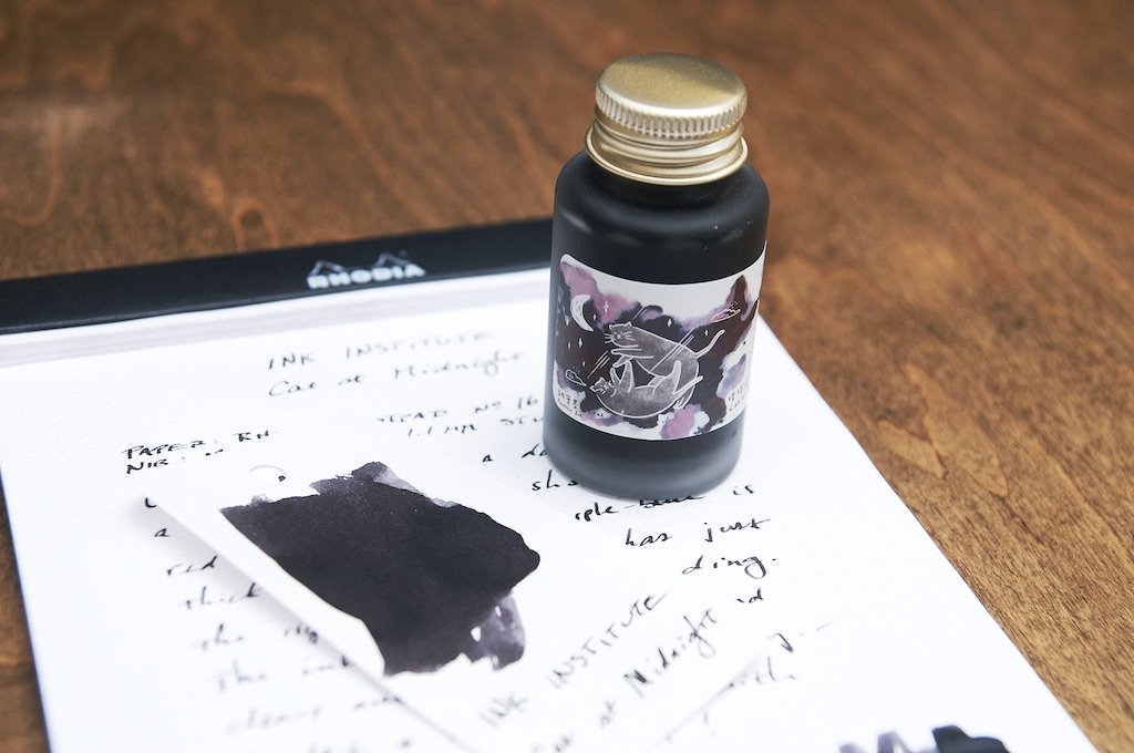
One of the newest inks to hit the scene (at least in my neck of the woods) is a Taiwanese company called Ink Institute. Ink Institute has an impressive selection of inks that feature bright colors and old classics alike. The first ink I've had the pleasure of trying is called Cat at Midnight. This is a dark ink that looks like a black-gray to my eyes, though the marketing says this is actually a dark purple-blue with red sheen. I can see some purple sometimes in certain light when the ink shading is light, and the red sheen shows up minimally in the right light as well. As a dark gray/purple ink, it does a great job.

Ink Institute Cat at Midnight

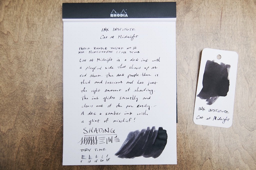
Being my first ink from Ink Institute, I was most curious about how the ink behaved in my pens. It's one thing to have interesting colors, but that doesn't matter if the ink doesn't play nice with nibs and paper. Fortunately, this ink is fantastic in terms of how it acts in the pen and on the paper. There's plenty of lubrication without the ink feeling too wet, and it does great on a variety of different paper types. Dry time isn't spectacular, but it's usually dry by 20 seconds when using a medium nib. This is a long time for left-handed writers, so it won't be a good pick if you need a fast drying ink.

On the paper, the ink looks crisp and richly saturated. There's no feathering or bleeding with this dye-based ink, even when the ink pools up. It acts the same regardless of what quality the paper is, and it seems fairly resistant to water.

Ink Institute Cat at Midnight

There's a fair amount of shading with this ink, which is what gives it most of its character. Without the plentiful shading, this ink is fairly boring and could be mistaken as a generic black ink. The shading is where the little hints of purple come through, even if they are slight.

At $16 for a 30ml bottle, this ink comes at a premium. I look forward to trying some other inks from Ink Institute because Cat at Midnight just doesn't offer enough to justify the price, and this is 100% due to the dark color. It's just hard to know what's going on in there! If it were a little lighter and the purple was more prominent, I'd probably love this ink. But with it being a black ink in my mind, there are many other inks I'd rather try before landing here.

Ink Institute Cat at Midnight

I recognize that I don't hold any fondness for super dark or black inks, but that doesn't mean that there are plenty of other people that would line up for a color like this one that performs so well. If you're looking for an almost-black ink with a little character, this is an interesting option. For me, I need a little more color in my inks.

You can find Cat At Midnight — along with a lot more from Ink Institute — at Yoseka Stationery.

(Yoseka Stationery provided this product at no charge to The Pen Addict for review purposes.)


Enjoy reading The Pen Addict? Then consider becoming a member to receive additional weekly content, giveaways, and discounts in The Pen Addict shop. Plus, you support me and the site directly, for which I am very grateful.

Membership starts at just $5/month, with a discounted annual option available. To find out more about membership click here and join us!

Ink Institute Cat at Midnight
Posted on January 26, 2022 and filed under Ink Institute, Ink Reviews.

Robert Oster Cities of America Miami Fountain Pen Ink Review

Robert Oster Cities of America Miami Fountain Pen Ink Review

What is it about interesting blue fountain pen inks that makes me keep buying similar shades over and over again? By all reasonable measures, I don’t need Robert Oster Cities of America Miami, but what about my stationery life is reasonable? Give me this ink!

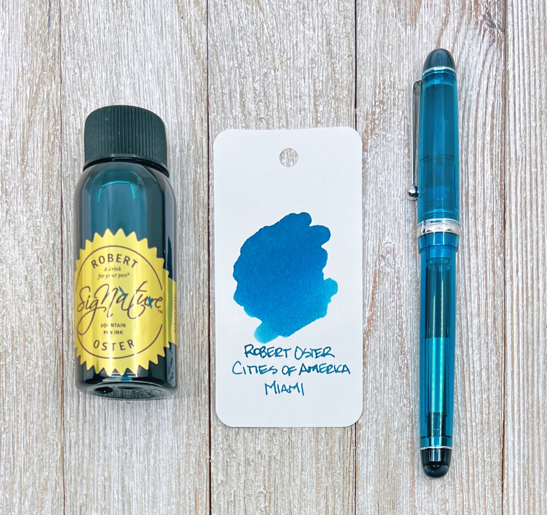
Right from the initial inking of Miami, I was wowed. This teal ink was created to mimic the Atlantic Ocean off the coast of Miami Beach, and while I can’t say I have in-person experience with the color of the water there, pictures tell me that it is stunning - like this ink.

Robert Oster Miami

Miami falls squarely into the teal category for me. It’s equal parts blue and green, and the right shades of each to make this ink stand out on the page. I’ve tested it on many papers, and it hasn’t failed to show off its shading, and has behaved perfectly.

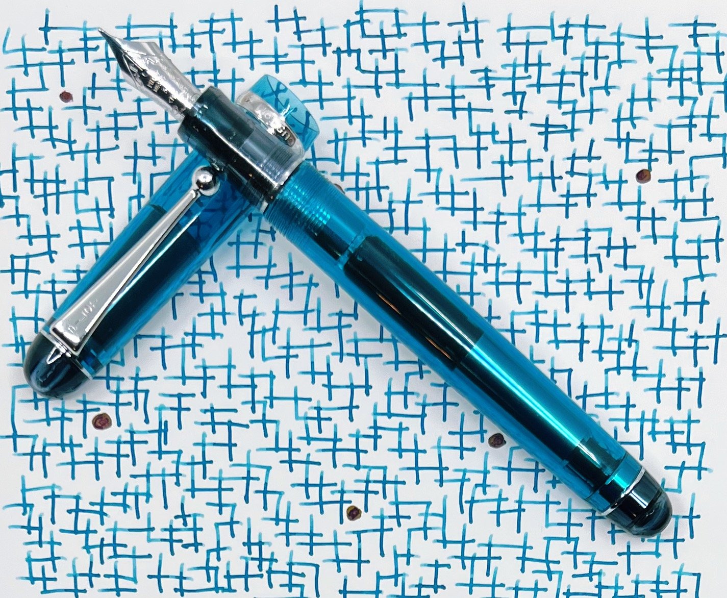
One of the reasons I might be enamored with this ink is how perfectly it matches the pen I chose to ink it up in. I ordered the Pilot Custom 74 in Teal for a future review at the same time I ordered this ink, with no intention that it would be used this way. Teal ink looks great in any pen, but once I did an initial swab of Miami and saw how close the Pilot acrylic was, well, that was an easy choice.

Robert Oster Miami Writing

And the right one, too. I’ll fully review the Custom 74 in the coming weeks, but the 14k Medium nib in this model shows off this ink exquisitely. Have I fawned enough yet?

All sub-categories of Robert Oster Miami land in the medium range: Medium flow, medium shading, medium dry time. It is not waterproof.

Robert Oster Miami

Price-wise, all Robert Oster inks provide some of the best bang-for-buck on the market. $18 for a 50 ml bottle is more than reasonable.

There are currently seven inks in the Cities of America series. I was trying to be good and only ordered two, one of which has already been given away, and the other of which is not going to be leaving my arsenal for quite some time. The only questions left to answer is how many more inks will be in this series, and how many more will I purchase?

(I purchased this product at a discount from Vanness Pens for review purposes.)


Enjoy reading The Pen Addict? Then consider becoming a member to receive additional weekly content, giveaways, and discounts in The Pen Addict shop. Plus, you support me and the site directly, for which I am very grateful.

Membership starts at just $5/month, with a discounted annual option available. To find out more about membership click here and join us!

Robert Oster Miami
Posted on January 24, 2022 and filed under Robert Oster, Ink Reviews.