Posts filed under Notebook Reviews

Tsubame Fools Cream Notebook Review

Yet another interesting paper product from Japan, Tsubame Fools Notebooks are an excellent quality mid-range notebook with a couple of interesting features to set them apart form the pack.

Tsubame has been making paper since 1947, most of it featuring their lattice-style watermark. This is not something seen or felt when writing, but is interesting nonetheless when holding the paper up to a light source. I was concerned it might be obtrusive at first - as a rule I don’t like watermarked paper - but it isn’t noticeable under normal use.

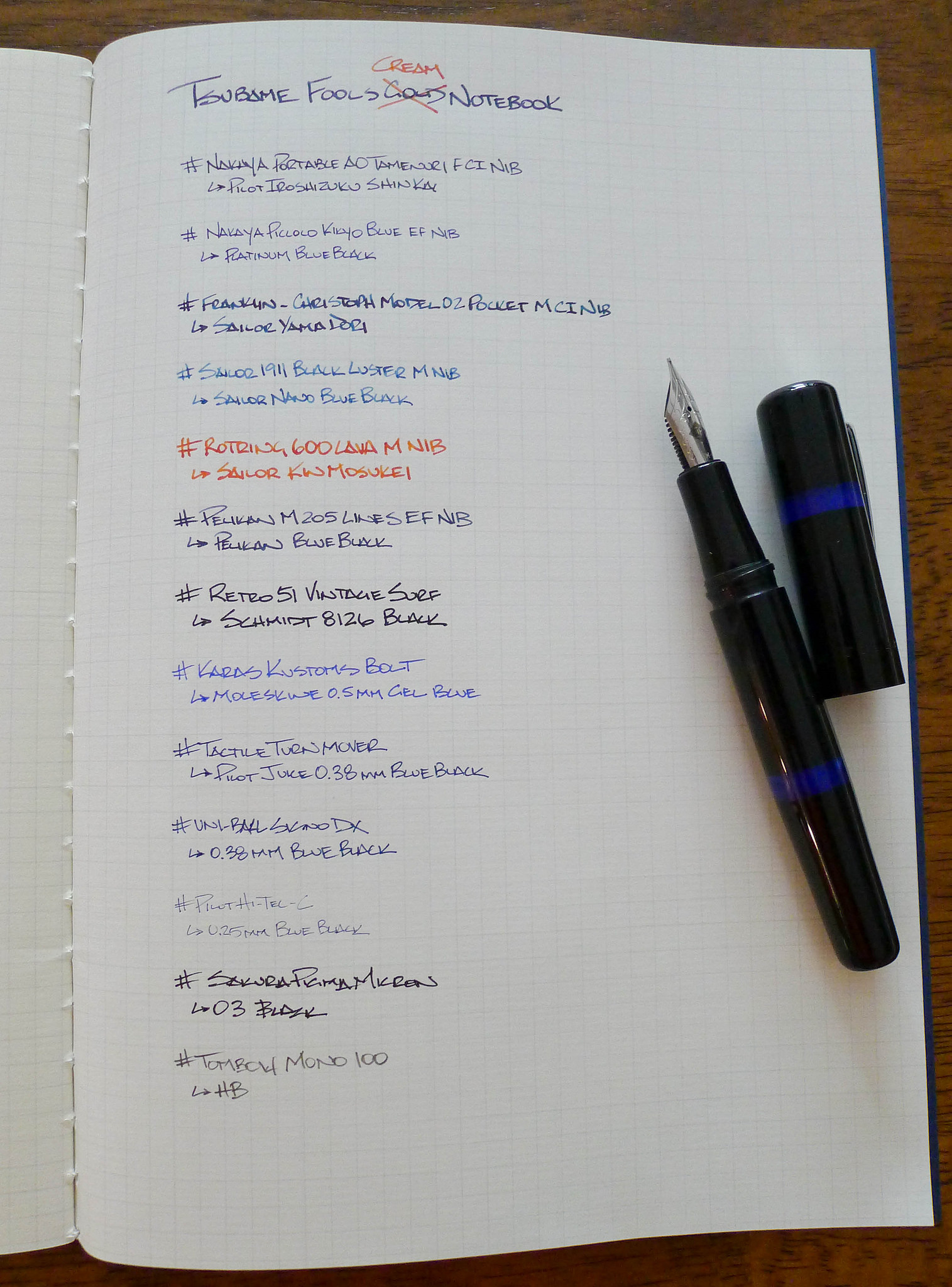
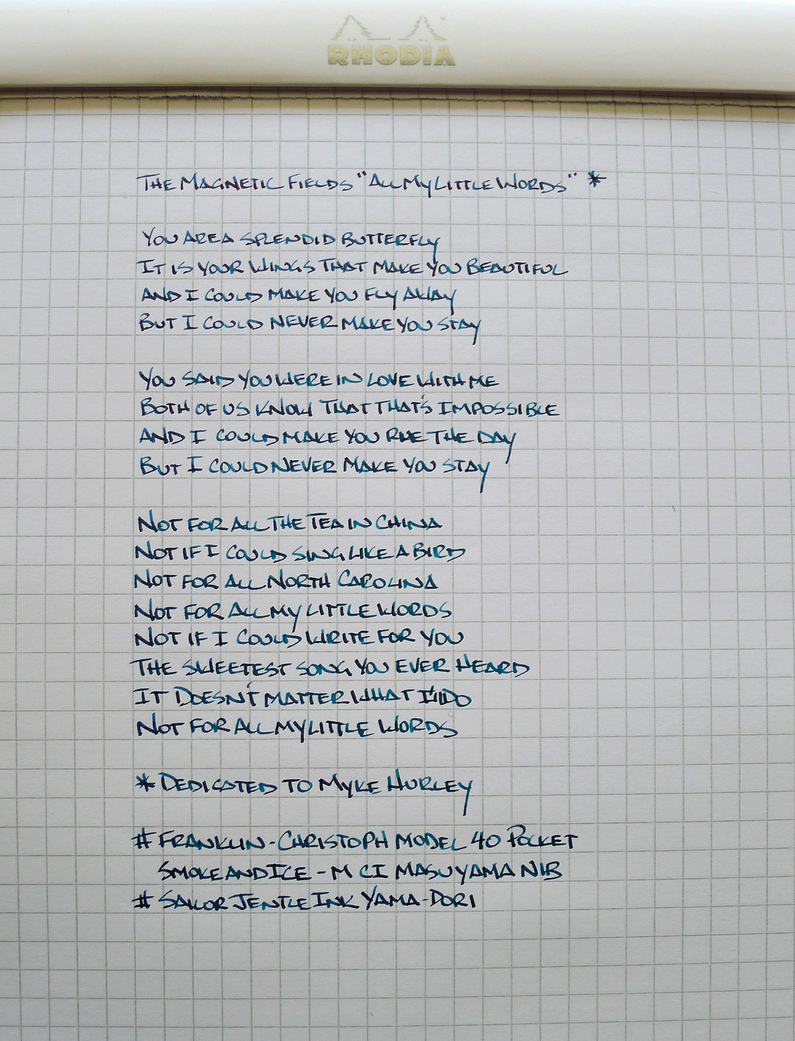
The first pens I tested on the Cream B5 5 mm Graph were fountain pens and I felt that the paper was smooth but didn’t have that glassy quality like Rhodia has. There is no tooth, per se, but there is a different feel to it. With my widest pens there was no feathering or bleed either. Zero. It barely showed through too, so those who write on both sides should have no issue.

All other pens performed well and pencil users may especially want to take note. Super smooth paper isn’t the best for graphite, so leadheads may enjoy these.

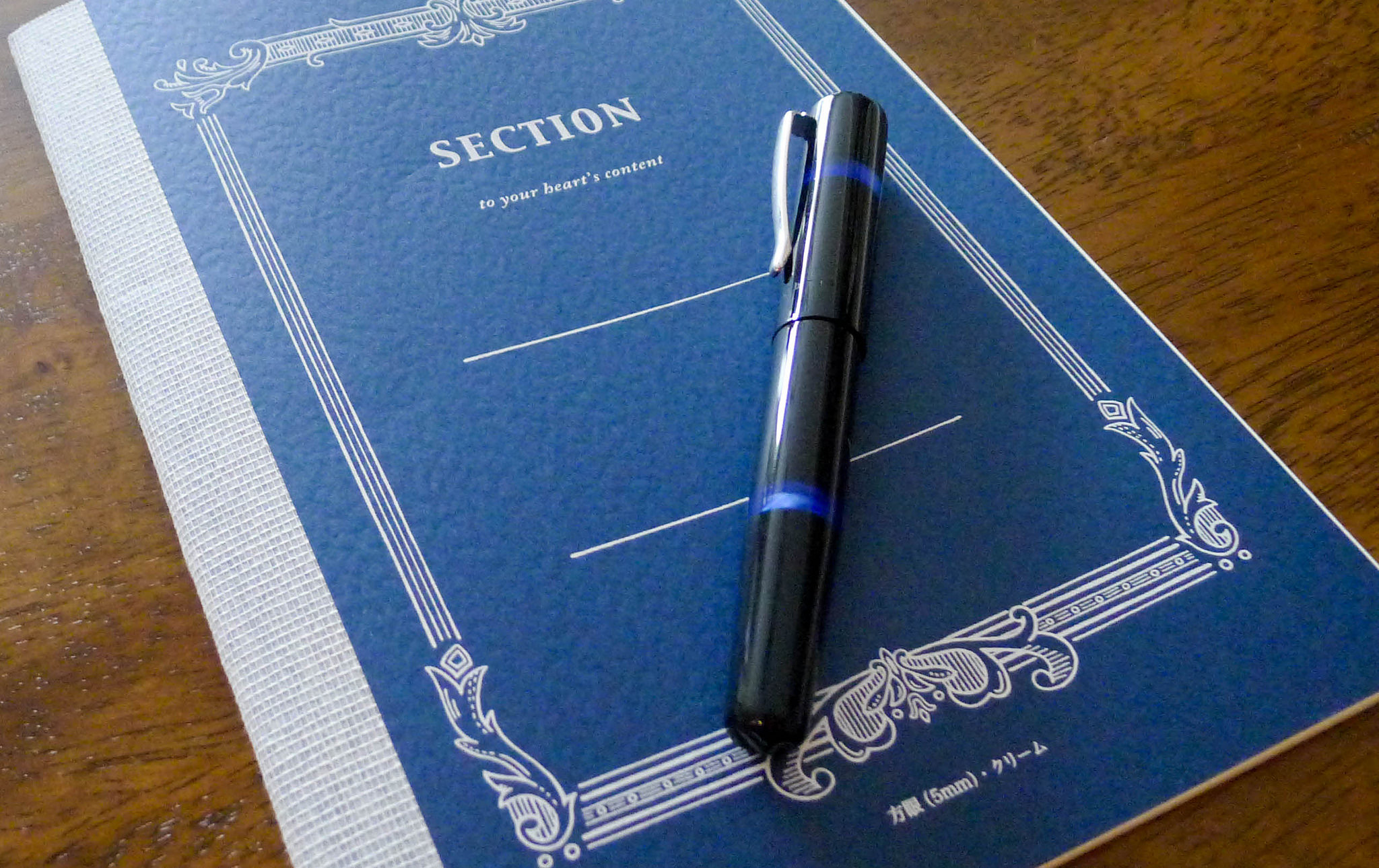
Everyone should enjoy the clean, classy design of the Tsubame Fools Cream Notebook. The navy/white combo looks great on the graph paper model, with gold/white and red/white featured on the plain and lined notebooks, respectively. I’m a big fan of the cheesecloth tape exterior binding and the thread stitched interior binding, both combining to allow the notebook to stay flat while retaining its flexibility.

At $6.50 for 32 sheets of B5 paper it’s moderatley priced. There are both less expensive and more expensive imported notebook options, but for one that can handle it all like Tsubame Fools I think the price is right.

Posted on August 18, 2014 and filed under Notebook Reviews, Tsubame Fools.

Rhodia Ice Pad Review

Upgrading your paper from the poor selection at the office supply store is a challenge. The good stuff isn't readily available to the masses, and when you hunt it down it is often more expensive than imagined. There is a difference though - a real tangible difference. This is why I tell people new to the pen and paper scene to buy some nice paper early on, and I always recommend Rhodia.

Why is Rhodia so good? It provides the best writing performance for the price. The paper is ridiculously smooth and will make even your worst pens feel and perform better. Yes, the right paper can actually make your pens write better. There is less bleed, no feathering, and their pads have the best perforations in the business. I mentioned it is smooth too, right?

That smoothness does come with one downside you should be aware of. Since the paper is higher quality than most it is not as porous, meaning the ink sits on top of the page for seconds longer than with inferior paper. Lefties especially should beware. This is one tradeoff I can live with.

The Rhodia Ice Pad has been around for a few months and I finally got my hands on my favorite No. 16 Graph size from my friends at JetPens. Rhodia Orange is so ubiquitous it should be its own Crayon color, but I like seeing these alternate covers. The white is wonderfully clean and the metallic silver accents are perfectly understated in typical Rhodia fashion. Plus, the lines are grey instead of the traditional violet, which I think I prefer.

Overall, this is exactly what I expect from Rhodia, if not more. The design is clean and beautiful, and the functionality is top notch. This is how you do paper. Do yourself a favor and add some to your arsenal.

(JetPens is an advertiser on The Pen Addict and I received this product at no charge.)

Posted on August 11, 2014 and filed under Notebook Reviews, Rhodia.

Etranger di Costarica Memo Book Review

I'm always on the lookout for good pocket memo books that play nicely with fountain pens and foutain pen inks, so it's no surprise that this post at The Well-Appointed Desk about the Etranger memo book caught my eye. Ana did a great job of showing the pros and cons of the book, so I ordered one right away from JetPens. I even chose the same color, because green is awesome.

Overall, this is a great little notebook, but this is one main reason why it hasn't become my number one memo book. For me, the lines are just too close together. By my measurement, the lines are 5 mm apart. I prefer something like 7 mm. That said, let's talk about the many things that make this notebook great.

The size

The size is comparable to the standard Field Notes size. It's just a bit smaller on both ends at 3.3" x 5.4". For reference, the Field Notes books are 3.5" x 5.5". The Etranger books pack in quite a few more pages than the Field Notes, however. 32 versus the Field Notes 24. Even though the books has more pages, it's still quite thin and I can barely feel it in my pocket.

The size is great and I can't really tell a difference between the size of this book and a Field Notes unless I have them side-by-side.

Paper quality

The paper quality is where the Etranger book beats out the generic Field Notes books for me. The paper doesn't handle foundtain pens like Rhodia or Clairefontaine, but it does a really good job. This is something that I've never been able to say about any Field Notes book I've used, and everyone knows that the Field Notes paper doesn't typically do well with fountain pens. That doesn't change the fact that I really would like to enjoy both the pocketable form factor and high-quality paper in a notebook.

I've used several different pens in this book so far, and it handles them all adequately. Obviously, it does better with finer nibs. Wetter nibs and inks tend to show through quite a bit, but dry inks and fine nibs do well. The paper is a nice white color, which is something I prefer.

Some inks also tend to feather a bit on this paper, but you have to look closely to notice it. If this was expensive paper, I'd complain, but for under $4, this is pretty impressive.

Now, for the reason that I can't use this book as my #1 pocket memo book: the lines. The lines! They're so close together. I normally prefer lined paper, but this is just too small. I have a Kokuyo notebook with 6 mm spacing, and it's manageable. I really like 7 mm spacing, honestly. But 5 mm is just too much for me. And my OCD won't allow me to use two lines for writing, so I'm stuck trying to fit my words into the tiny space allotted. If they had other options for lines, grids, plain, etc., I'd be extremely happy.

The outside

These books have a cover that is similar to other pocket memo books in that it's a medium-weight craft paper. What's different about the Etranger books is that they also come with a semi-transparent vinyl cover that slips onto each cover of the notebook. I wasn't sure if I'd like this when I ordered it, but after using it for a while, I've really grown to like it.

It feels good in hand, offers much more protection, and gives the plain white notebook a bit of personality. There are many colors to choose from, but I still think Apple Green is the right choice.

The book has no trouble mostly laying flat, and it closes nicely as well.

Overall

This is a fantastic notebook. For the price of a single Field Notes, you get a comparable notebook that has more pages, a vinyl cover, and is more friendly with fountain pens and inks. It's not for everyone due to the small spaced lines, but that doesn't stop me from using it every week. Even with the small line spacing, this notebook is far from a disappointment.

(You can find more from Jeff online at Draft Evolution, Twitter, and App.net.)

Posted on July 30, 2014 and filed under Notebook Reviews, Etranger di Costarica.