Posts filed under Notecard

Notsu To-Do List Cards and Case Review

Notsu To-Do List Cards and Case Review

“Where are all of the fountain pen friendly note cards?”

As an avid note card/index card user (I use those terms interchangeably,) I’ve always been on the lookout for a card that performs well with all pens, including fountain pens. And yes, at Nock Co., Jeff and I made some of the best there have been. Unfortunately, the paper we used was long ago discontinued, and the search for the next needle in the haystack has stopped - for now.

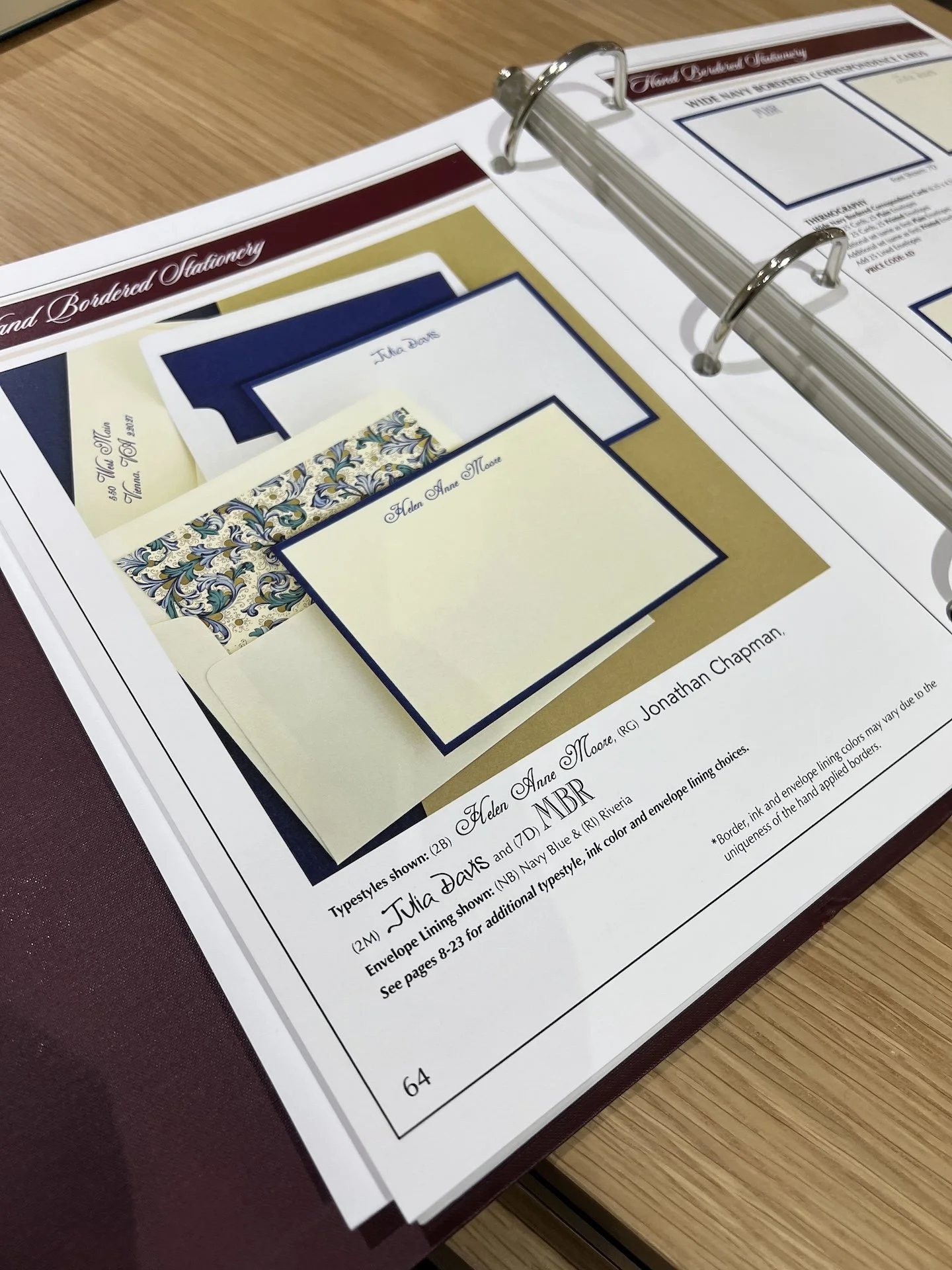
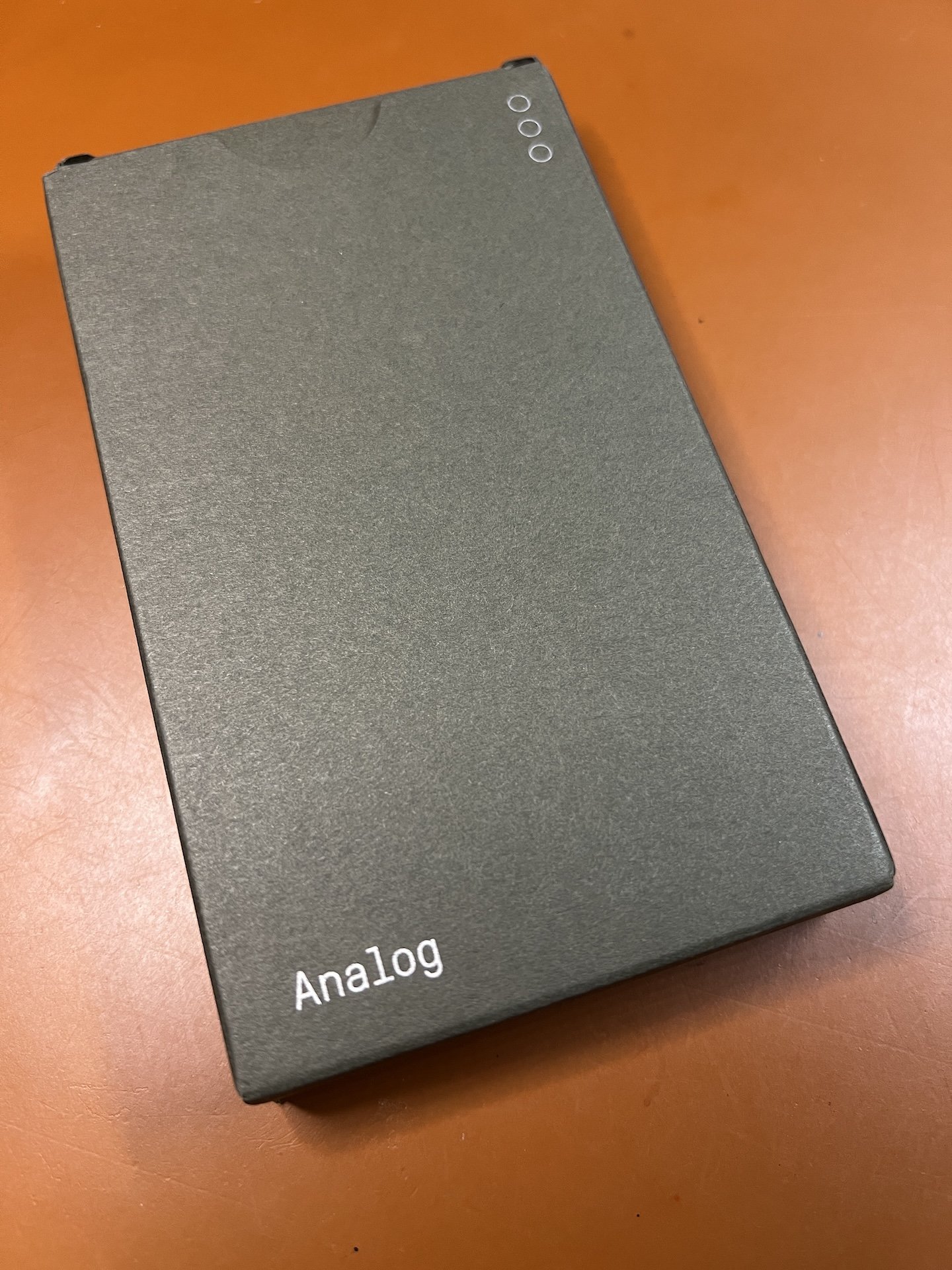
So where does that leave us? Are Exacompta cards the only choice? They have been a recommendation from me and others for years - and still are - but your choices are limited. I moved into the Foglietto system a couple of years ago, but they are now out of business (selling paper goods is brutal - as me how I know!) Analog cards, by Ugmonk, are beautiful, but only average for fountain pens. Shockingly, the Kraft card is the most ink friendly, which I love.

As you can tell, I have a thing for cards, as does Kimberly, who did all of the reviews linked above.

Notsu To-Do List Cards

New note cards are few and far between, but my eyes are always peeled to try something new. New is what I found at the recent Atlanta Pen Show in the form of Notsu, carried by my friend Joe at The Gentleman Stationer. What’s funny is that I didn’t notice them on my first pass at his table, when I was focused on picking up some ink and Traveler’s Notebook inserts. But on second glance I saw them, and saw Joe’s writing samples, and inquired as to their fountain pen friendliness. He assured me they were, and one test line later, I confirmed that was the case.

Notsu To-Do List Cards Sides

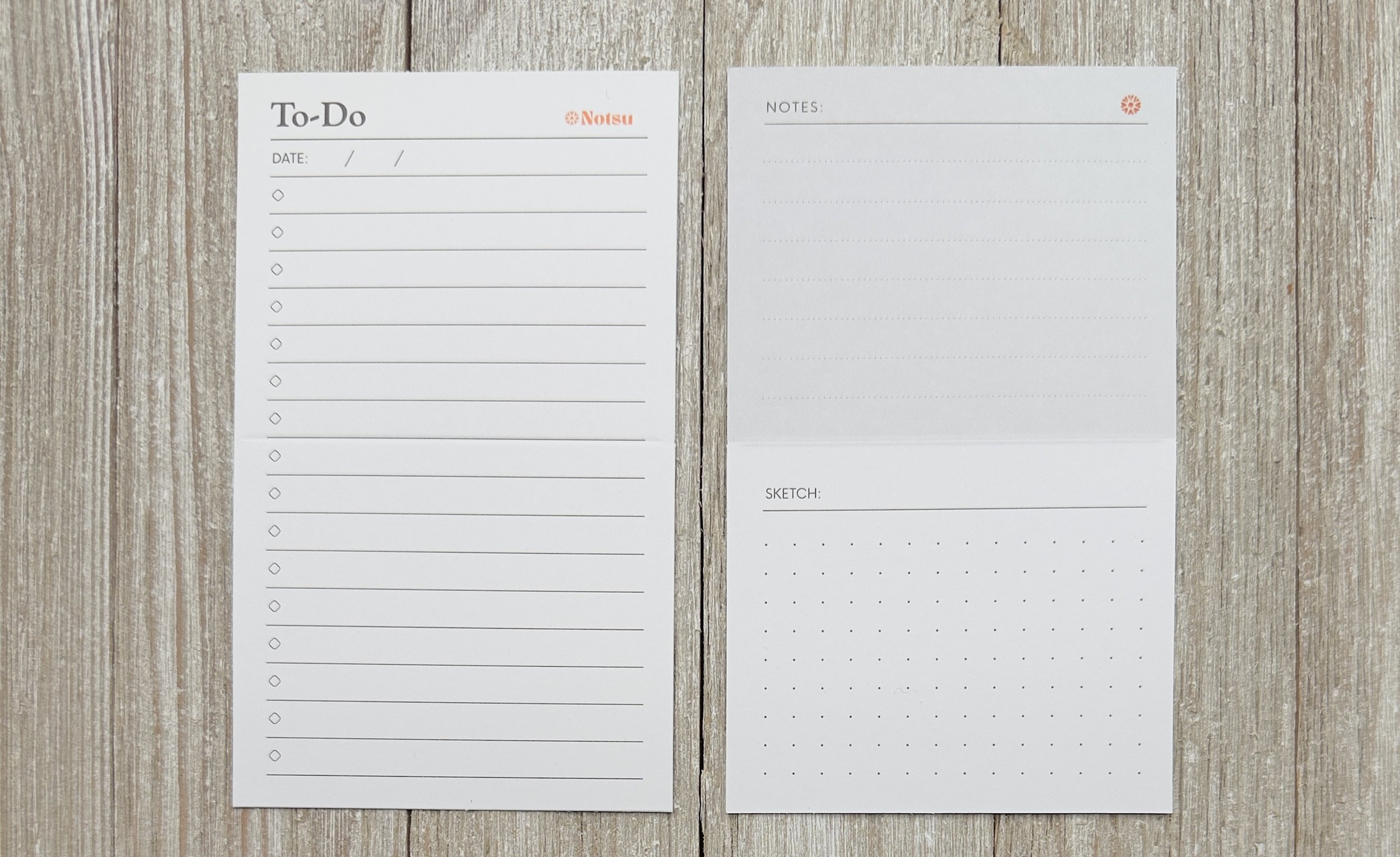
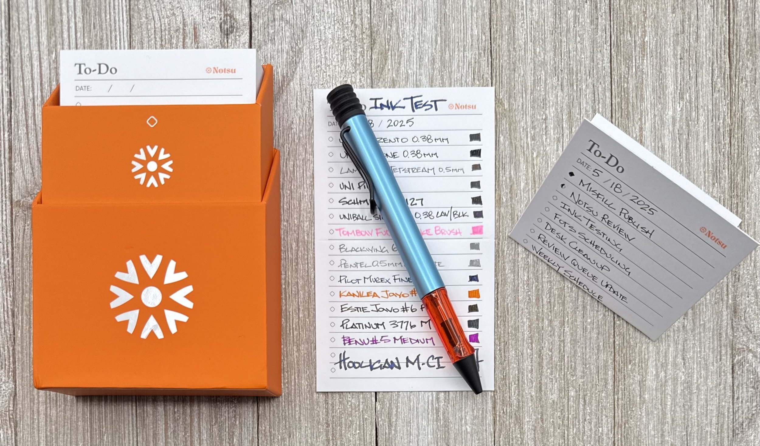
The design of the Notsu To-Do List Card is purposeful. The front of the 3”x5” card is where you list goes, with 16 lines and boxes for any tasks you need to handle. There is a date line at the top, and room for another header above that, next to the Orange Notsu logo. Flip the card over, and you are met with Notes section on the top, using faint dotted lines, and a Sketch section on the bottom, with a 5 mm dot grid. I often like to segment and separate my cards, so this is a nice framework to work with for someone like me who uses one card for multiple things.

On top of those design elements, Notsu has done something extra for this specific product. Cards made for the accompanying Card Case (and specified refills,) are scored in the middle, allowing you to easily fold the card, or display it as part of the magnetized card case setup. This is a great option for those of you who will use these cards at your desk, or need an extra visual of the tasks at hand.

Notsu To-Do List Cards Writing

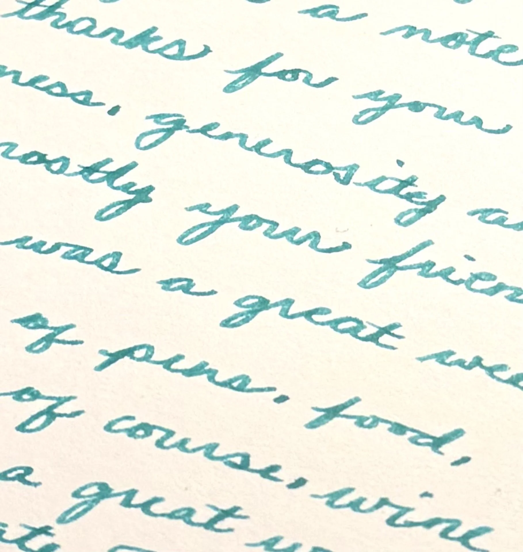
No feathering, bleed, or ghosting. These cards are thicc!

Notsu To-Do List Cards Ink

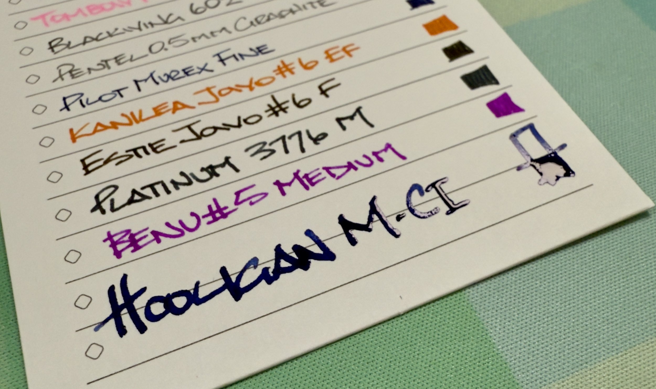
I took this pic when writing so you can see how much ink these cards handle without issue. You won’t see a lot of ink characteristics (shading, sheen,) but the page is smooth for all types of nibs.

“But Brad, I don’t need all of that nonsense. How about a simple card?” Notsu has you covered there, too, with their Dot Grid Index Cards. I haven’t tested those yet, but they use the same card stock as used in their other sets, so assumedly they are equally as nice. I’ll pick some up soon.

My final word on Notsu: Great quality, fun layout, absolutely usable with fountain pens. What’s not to like for a note card user? Even the price is nice. My review set, the Notsu To-Do List Card Case with 50 Cards, is $11.99. Refill packs of 50 To-Do cards run $8.99, as do the standard corner Dot Grid Card 50-pack (Rounded corners are $11.98 for the same quantity.) I think that is all fairly price for a nice card like this. and I look forward to using them frequently.

(I bought this pack from The Gentleman Stationer at the Atlanta Pen Show at regular price. Joe then gave me a second pack for free to give away tomorrow, so stay tuned!)


Enjoy reading The Pen Addict? Then consider becoming a member to receive additional weekly content, giveaways, and discounts in The Pen Addict shop. Plus, you support me and the site directly, for which I am very grateful.

Membership starts at just $5/month, with a discounted annual option available. To find out more about membership click here and join us!

Notsu To-Do List Cards Box
Posted on May 19, 2025 and filed under Notsu, Notecard, Index Card, Paper Reviews.

Personalized Stationery

(Kimberly (she/her) took the express train down the fountain pen/stationery rabbit hole and doesn't want to be rescued. She can be found on Instagram @allthehobbies because there really are many, many hobbies!.)

Growing up, I always looked through mail order catalogs and wished for the day I could get stationery with my name on it. I don’t know what I was going to do with it but it always seemed like a neat idea. When we first moved to our house, one of the first things I did was place an order for address labels since I was still paying a lot of the bills by mail (gasp!). And prior to that, the last time I had any stationery personalized was our wedding invitations. Fast forward to now and I get personalized items in the mail whether I want them or not - usually in the form of address labels or notepads, from organizations wanting donations. Pro tip: if you want address labels, just make a donation to a non-profit and eventually you’ll get more address labels than you could possibly ever use, lol.

Some time ago, a friend mailed me a note on their personalized stationery - a card complete with engraving and monogram, and in a lined & addressed envelope too. I absolutely loved getting something so fancy - it made me feel extra special. I was immediately struck with the need to have something like that for those special occasions when a generic-card-from-a-box isn’t enough. So I gave Jeremy Saumere of Flax Pen-to-Paper a heads-up that my next visit would entail picking out personalized stationery.

Consultation appointments are recommended (but not required) so the team can give you their full attention. Expect to spend at least a couple hours for your first visit. Three hours isn’t unheard of if you want to look through all the binders and don’t quite know what you’re looking for (like me). You can also spread it out over multiple appointments if you aren’t able to decide after the first session (all appointments/consultations are free). The initial visit needs to be in-person so you can not only see the colors but also feel the texture of the papers and print process. After the first meeting, the team can do virtual consultations, if needed. Jeremy did a follow-up virtual meeting with me because some of the options I chose had been discontinued.

Custom stationery is a personal thing and should reflect your personality, likes/dislikes, and use cases. Everyone will be different so looking for “popular” or “trendy” items kind of defeats the idea of personalized stationery. It was very helpful for me to have Jeremy to bounce ideas off of because it can be hard to pick between the various options, especially when they start looking more and more similar. He wasn’t helping me just because we’re friends - this is part of the free consultation service & experience that they provide.

Companies use large binders to show off their catalog of personalized items. There were more binders than this at the shop!

I knew that I wanted flat note cards, as opposed to folded ones, and I didn’t need paper for letter writing. I also wanted something a little more budget-friendly, so Jeremy pulled out a few binders for me to look through. After flipping through a few binders, I ended up liking more of the items from The Rytex Company.

I liked the simplicity and elegance of a color bordered card and I loved the liner of the envelope.

Could you tell I really liked this envelope liner?

Some of the pages include actual samples so you can see the colors and feel the textures of the paper, print process, envelopes, etc.

I also looked at some mini note cards (index card-sized.)

Each item has a price code (like AA, AB, AC, etc.) with prices that include the item (card, sheet, etc.), cost for plain envelopes, printed, or lined (envelope would have a decorative paper inside, not that there are lines in/on the envelope), and price per set of 25.

After picking the items that I liked (and checking the price sheet), I also had to figure out paper color, font, ink color, and print process, which is how the ink is applied to the paper. The print standard print processes are Engraving (raised using an engraving plate), Letterpress (pressed into the paper with a plate), Embossing (raised text, usually with no color), Thermography (mimics engraving using a heat process and resin powder), Lithography or Flat printing (single color process), and Foil Stamping.

Different print processes on various papers and ink colors. Each company has their own “swatch book” with their available papers, print processes and colors. I picked Thermography because of the texture.

You can see that different processes can lead to subtle variations in colors and shades (top/left row is Charcoal, the other is Grey Suede.)

After flipping through a couple of binders multiple times, I ended up picking some mini cards and larger correspondence cards and then it was font picking time.

Pages and pages of different fonts to choose from.

I had a hard time imagining how my name would look once it’s all put together, so I opted to get digital proofs. Prices for digital proofs depend on the company - some offer a free proof, and others charge $15 per round of proofs, etc. It takes a few days to turn around digital proofs. Proofs are entirely optional and not required to place the order.

I ended up picking the top one because I liked the spacing between the letters and I liked the L better. The print at the bottom felt a little too cold and formal for what I wanted. (Note: this image was made by cropping/combining the images I got from Rytex. The actual proof image included my home address on the envelope.)

I loved how fun and whimsical this looked and thought it would be perfect for the times when I wanted to send a more casual note.

Once I reviewed and signed off on the proofs for spelling, color, font, etc., my order was shipped a couple weeks later directly from The Rytex Company. Shipping is not included in the price and is typically in the $13-25 range - more if you need rush or international delivery.

So excited to open up these boxes of stationery!

These mini cards are the perfect size for short notes!

I picked the Thermography process which resulted in a darker font color on the mini cards, so it didn’t quite match the envelope liner as well as it would have had I chosen a different process. This was something I didn’t pay much attention to since I was getting a bit overwhelmed/overloaded by the time I got to picking the process. I think if I was local to the shop, I wouldn’t have tried to cram all the browsing and decision-making in one session. And I definitely would take a bit more time looking at, and understanding the differences between the various print processes and that the digital proofs don’t factor in color differences as a result of the selected print process.

OMG, these came out so awesome! I love how these cards are “so not me” but also “yeah, totally me” at the same time!

A writing sample on the mini card to thank Jeremy for all his help. Written with a Pelikan M800 with a Medium CI by Masuyama and inked with Laban Poseidon Green.

Personalized stationery isn’t for everyone and yes, it is more expensive than a box of cards (though if you want to go that route, I love the cards by Crane which are classic and also fountain pen friendly). But when you want to send something special with your personal touch, I highly recommend it. Jeremy has graciously offered a 10% discount (excluding shipping), but it’s only available from now through the end of March 2025, so reach out to them so you can get your own stationery too!

(Disclaimer: All products were purchased by me. Thank you to Jeremy for the consultation, your patience, and the discount 🙂!)

Posted on November 22, 2024 and filed under Stationery, Notecard.

Ugmonk Analog Cards Review

(Kimberly (she/her) took the express train down the fountain pen/stationery rabbit hole and doesn't want to be rescued. She can be found on Instagram @allthehobbies because there really are many, many hobbies!.)

Apparently it’s been well over a year and half since I last did a review of index cards, which I did on the Foglietto Memo Cards x Box, so I thought it was about time to do another one! As I’ve mentioned before, I’m not much of an index card user, and being a Bullet Journaler, my to-do lists live in my Bullet Journal and not on separate cards, but this still looked like a cool product to check out. Much thanks to Pen Addict Slacker, Tommy S., who sent these to me for funsies a couple years ago when he found out that I wanted to find fountain pen-friendly index cards. I still can’t believe our beloved Nock Co. index cards aren’t available anymore (sniff sniff). I wonder how many times I have to repeat this before The Bossman caves in and makes more just to get me to hush up, lol.

The Ugmonk Analog Productivity System is designed to be the “physical companion for your digital tools that helps you prioritize your most important tasks” and its main component is the Analog Card Pack. The pack contains 3 “decks” of 3”x5” (76mmx127mm) cards, and each “deck” contains 50 cards, along with an additional card that explains how to use them.

There are 35 white cards for Today, 10 cream cards for Next, and 5 brown cards for Someday. In addition to the color, the front of the cards also indicate which card it is (Today/Next/Someday) on the upper left. There is also room for the date or other info like project or name etc., as well as 3 small circles that you can use however you like. For example, if you filled in the top circle, these might be your high priority tasks, two filled circles average priority, three low priority. The rest of the card has space for 10 items. The back of all three cards is in small dot grid (approx. ⅛” or 3mm).

The concept behind the system is that you jot today’s tasks on the Today card and use the circle next to each task to indicate progress and/or completion. You can carry any remaining items to a new Today card or move some of them to the Next or Someday cards as appropriate. You can then use the items on the Next card to help you plan either the next day’s Today card or save it for later work. The Someday cards can be used for jotting down ideas, goals, inspiration, etc. You then periodically review the Next and Someday cards and move items to new cards as needed. You can read/watch more about their Analog system here.

Ugmonk Analog Cards Review
Ugmonk Analog Cards Instructions

Front of the cards, including the instruction card.

Ugmonk Analog Cards Dot Grid

Back of the cards in a small dot grid - I appreciate that the dots are visible but not super dark.

The cards are 100# weight, or approximately 270 gsm (the Foglietto Memo Cards I reviewed last time are 260 gsm) so they have a nice feel to them; thicker than the typical index card, thinner than a playing card. The paper is fairly smooth but not glassy. It didn’t feel bumpy or particularly fibrous either, so I was hopeful that they’d work well with fountain pens.

Pens

These are the pens/inks I picked to test the cards: Sailor Pro Gear (M)/Kobe Suidosuji Marchais Blue); Pilot Custom 823 (FA)/Robert Oster x Pen Addict Fire on Fire on Fire (for shimmer); Pelikan M800 (Italic Broad)/Diamine Ochre (for a wet pen and a wide nib); Pilot Custom Heritage 912 (FA)/ Van Dieman’s Woollewarre Bennelong (for flex and chromashading ink), OMAS Paragon (M)/Teranishi Innocent Mauve (another wet writer); Pelikan M405 (F); Pelikan Edelstein Moonstone (for a drier ink); Sailor Pro Gear Slim (MF)/Sailor Ink Studio 162 (for finer nib and chromashading ink); Schon Pocket 6 (Fine Monoc)/Kobe Shioya Blue (cuz Monoc, duh); Wancher PuChiCo (Fine)/Diamine Orange (cuz it’s cute and it’s the only other F nib I had inked up); Leonardo Momento Magico (Stylosuite X-Wing Harpoon)/Diamine Meadow (for a sharper flex nib).

They felt nice to write on with fountain pens, but more of my pens/inks feathered than didn’t, which was disappointing. The white Today card performed the worst, with the cream Next card faring a bit better. Wetter inks and pens made the feathering the worst but there was no ghosting or bleedthrough at all. I was surprised that the brown Someday card performed the best. That one was actually FP-friendly and showed no feathering except for the bit of flexing from the Leonardo, and even that was minimal.

Ugmonk Analog Cards Writing

The feathering on the Today card was pretty noticeable with almost all the pens. I expected more from the M800’s IB nib but it was less than other pens that had wetter inks (like Kobe or Teranishi). It was ok with a very light, unflexed writing from the Leonardo Momento Zero with an EF flex nib.

The Next card did better with more inks but still feathered with flex writing or wet inks.

The Someday card was surprisingly good. I was expecting the worst feathering and there really wasn’t any!

Aside from the feathering, you can get some regular shading (Van Dieman’s Woollawarre Bennelong and Pelikan Edelstein Moonstone) and the shimmer from FoFoF wasn’t a problem. I did not expect, nor did I see any chromashading (Van Dieman’s and Sailor 162). The ink colors were accurate, even on the brown Someday cards.

Thankfully, standard pens and pencils seemed to be just fine. Neither the Sharpie nor Tombow marker produced any feathering, ghosting, or bleedthrough.

Standard pens (and pencil) used: Parker Jotter BP, Zebra Sarasa Clip 05, Pilot G2 07, Lamy Tipo, Uniball One Gel 0.5, Pilot Frixion; Uniball refill in Spoke Pen; Caran d’Ache 849; HB 3.15 lead in Franklin-Christoph Model 90 pencil; Sharpie (Fine); Tombow ABT Brush Marker.

All standard pens and pencil wrote without any problems. I even did an erase test with the Frixion and it mostly erased cleanly (that’s more of a Frixion thing and not a paper issue.)

Pros:

  • The Someday card was FP-friendly. The other two cards need fine FP nibs and drier inks to minimize feathering.
  • Standard pens, pencils and markers behaved fine.
  • No ghosting or bleedthrough.
  • Lightly-colored dot grid on the back is a nice touch.

Cons:

  • Today and Next cards are not very FP-friendly.
  • Price is a bit steep at $13 for 50 cards, or $39 for 150 cards. A 3-month subscription (one 50 pack per month,) brings the cost down to $10 per pack, or $30 for the three months. For context, a pack of 80 larger Hamelin cards costs $7 and a 100 pack of 3” x 5” index cards from Exacompta costs around $4.

Neutral:

  • The Analog system of to-do/item tracking isn’t for me personally but I can see that it can be useful.
  • Cards can be sold separately - I like that you can buy additional packs that have all 3 cards or just Today, Next, or Someday cards.

Overall, these cards work well if you don’t plan to use fountain pens with them (or use very fine nibs and drier inks), and while they are pricey, they have fit that neat aesthetic (that my desk definitely doesn’t have), especially when paired with their Analog Wood Card Holder.

(Disclaimer: The Ugmonk Analog Cards were given to me by my friend and fellow Slacker, Tommy. All other products used are my own.)

Posted on November 1, 2024 and filed under Ugmonk, Notecard, Index Card.