Posts filed under Pen Reviews

Craft Design Technology Chrome Ball Point Pen Review

Craft Design Technology is a unique Japanese stationery brand whose mission statement is to marry "modern design with Japanese heritage of traditional craft and technology innovation." Their beautiful green packaging has been on my radar for a while and when Rikumo reached out to me offering a couple of products for review I was excited to take a look.

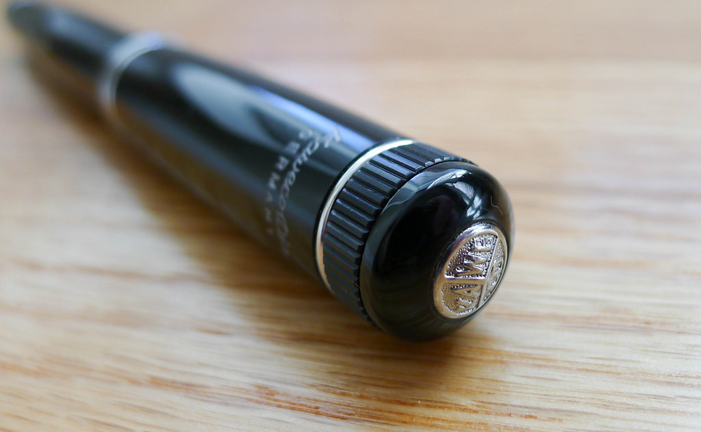
The first item I chose from Rikumo was the Craft Design Technology Chrome Ball Point Pen - Item 22, CDT's take on the classic business ballpoint. This is the type of pen I picture in my grandfather's shirt pocket, on my dad's office desk, or in a Mad Men client meeting. It exudes style and class.

Most pen companies in the 1950's through 1970's leaned heavy on this design and CDT has done their best to refine it. The chrome barrel is a stunner. It is so shiny it is hard to photograph for a hack like me, but in person it makes a statement. I could do without the CDT branding - just their logo would have been nicer - but I would be lying if I said I didn't like the whole "Item 22" thing. Something about that cracks me up. It is so Japanese, and I love it.

As with all writing products in this line, the chrome ball point is built in conjunction with Pentel and therefore uses Pentel refills. The 0.8 mm ballpoint is average at best. The darkness of the ink is excellent, but it is prone to being messy and there is even some spidering (a string of ink between letters/words when lifting the pen of the page.) In the abstract it looks fine, but on closer inspection I expect more.

Getting down to brass tacks, the Craft Design Technology Chrome Ball Point Pen is a value proposition. At $65, this is not a cheap pen, so are the benefits worth the price? I don't think so. The design is excellent and CDT's goals are admirable, but the value isn't there. There is a long list of pens that I would choose over Item 22.

There are Craft Design Technology items that look like they would suit my writing needs better and I hope to try out more soon. This is a company that is well worth keeping an eye on. Big thanks to Rikumo for sending me this pen for review. Be sure to check out their online shop for more wonderful Japanse imports or drop in to their brick and mortar store if you are in Philadelphia area.

Posted on June 9, 2014 and filed under Ballpoint, Pen Reviews, Craft Design Technology.

Kaweco Dia2 Fountain Pen Review

You do know Kaweco makes full-size fountain pens alongside thier already awesome pocket-size fountain pens, right? The Kaweco Dia2 is another of the big batch of products Kaweco sent me for review and it might be my favorite.

The Kaweco Allrounder is a decent enough looking pen, but not really my style. The Kaweco Elite is my style, but is a big, chunky pen that may be too much for others. The Kaweco Dia2 is just right in all the right places.

Simple. Classic. Understated. These are the words that describe the Dia2. Sounds boring, right? It is far from that in my mind. There are so many things that makes this a great pen. From a design standpoint, little touches like the knurling on the cap and end of the pen harken back to the original Dia2 which was released in the 1930's. The clip and Kaweco badge on the top of the cap are not unique to the Dia2 but the style of each fits this pen perfectly.

What I enjoy the most about the Dia2 is the grip section. Kaweco has done an excellent job unifying the barrel between the section and the body. The transition is smooth outside of the threading, which you hardly notice because there is no step to speak of. Sometimes a deep step in that area causes grip uncomfort but that isn't a problem here.

This nib, of course, is excellent. The Dia2 uses the same nibs found in the Kaweco AL Sport line and are easily swapable with a quick twist. I used an F nib with Kaweco Ruby Red bottled ink that Kaweco also provided. My lines were tight and clean and I liked the red ink better than I imagined.

While I find no downside to the Dia2, if I were King of Kaweco I would love to have this pen as a piston filler. It is cartridge/converter fill which doesn't bother me one bit, but this pen is screaming for a piston mechanism. At around $100 it is competing with the Pelikan M205 and the piston filler is the lone, and large, differentiator. Regardless, I'm happy with the Dia2 as-is and it works its way into my daily carry frequently.

Huge thanks to Kaweco for sending me this pen and ink to review. I think I have a few more goodies in the box to get to so stay tuned!

Posted on June 2, 2014 and filed under Fountain Pens, Kaweco, Pen Reviews.

Lamy Tipo Review

The Lamy Tipo is one of Lamy's more unique takes on the rollerball refill version of their products. There are rollerball models of the Safari, Vista, and even the 2000, but I think the Tipo looks the most unique of all of them. And, it's also the most affordable. At less than $11, you have to wonder how it compares to the Retro 51 and Schmidt refills.

Well, the Tipo doesn't beat the Retro 51 and Schmidt refills, but it's still a great, quirky pen with a decent refill.

Simple design

The Tipo doesn't have a knock like most retractable pens. Like the Retro 51, it uses an alternate system to extend and retract the refill. The Retro 51 uses a twist mechanism, which lots of other pens also use. They're smooth and sure.

I'm guessing that the typical rollerball refills don't work well with a clicky knock system, but I really don't know. In Lamy's case, they went with a unique catch system that uses the clip and barrel to keep the refill extended. There's a small hole in the body, and an inversely shaped knob on the end of the clip that fits perfectly into the hole when the clip is pressed down.

It's novel, but it needs work in my opinion. It feels cheap and it doesn't breed confidence in me when I use it. Many, many times I've wondered if it's going to stay when I start writing, and I've also missed the catch several times if I'm trying to click it quickly. When extending the refill with this pen, you have to be slow and deliberate to be sure it catches. I'm being a bit dramatic to make a point. In all honesty, it catches perfectly about 95% of the time. But it just doesn't make me feel sure most of the time.

The grip on the pen is fantastic for me. It's textured with shallow grooves and has a nice width. The pen is light, with more of the weight gathering toward the tip, which makes for a pleasant writing experience.

One of the most unique aspects of the Tipo is the variety of barrel colors available. White, black, pink, orange, and turquoise. They all look vibrant in the photos, and the white one I have is no let-down. On all colors, the grip, tip section, and clip are all black.

There's a small, tasteful Lamy logo on the top of the barrel parallel to the clip. It's a nice way to brand an otherwise mysterious looking pen.

Another gripe I have with the pen is the design of the top (butt?) of the pen. It looks unfinished. There are two small holes and nothing else. It looks like some decorative piece was once attached, but fell off at some point. It would be cool to see a plastic screw on the top, similar to the Safari and Vista caps. But, that's not really a big deal. The pen still has a really clean, pleasing design. Besides, at $11 I can't really complain too much about it missing decorative elements. Get a Safari already, right? I know.

An additional delightful little detail is the packaging of the pen. It's futuristic and difficult to explain, so check out the picture:

Lamy Tipo Packaging.jpg

Writing experience

Ah, the refill. Possibly the most important aspect of the pen. Short story: it does a good job of writing. It's smooth, dark, and mostly consistent. And that's the reason it doesn't get a perfect score. It tends to skip or go a little faint every now and then. Not enough to cause any frustration, but enough to knock it down a little.

Seriously, it's a good refill and I'd like to try some more just to make sure I didn't get a one off skippy refill. The refill is half the cost of the pen, so I'd expect the quality assurance to be fairly high, but that's probably a little too optimistic.

On the plus side, you have a choice of 4 colors: black, blue, red, and green.

The line is a tiny, tiny bit thicker than the default Schmidt refill that comes with the Retro 51. So, a 0.7mm refill that seems to contain a good amount of ink in the reservoir.

A point that really makes the Tipo an even greater value is the fact that it can take G2 size refills. That opens up another world of possibilities if you aren't happy with the refill that ships with the pen. Of course, you can also trim other refills that are similar to the G2. I personally use the Pilot Juice refills instead of the G2, and the Tipo body is a lot more interesting and attractive than the Juice body. Score.

Wrap up

The Lamy Tipo is a great little pen with a unique, quirky personality. It doesn't make waves with the refill, but it provides a compelling value and looks great while doing it. If you're like me and have an urge to try every rollerball out there, don't leave this one out.

(You can find more from Jeff online at Draft Evolution, Twitter, and App.net.)

Posted on May 28, 2014 and filed under Lamy, Tipo, Pen Reviews.