Posts filed under Pen Reviews

Edison Menlo Pump Filler Fountain Pen Review

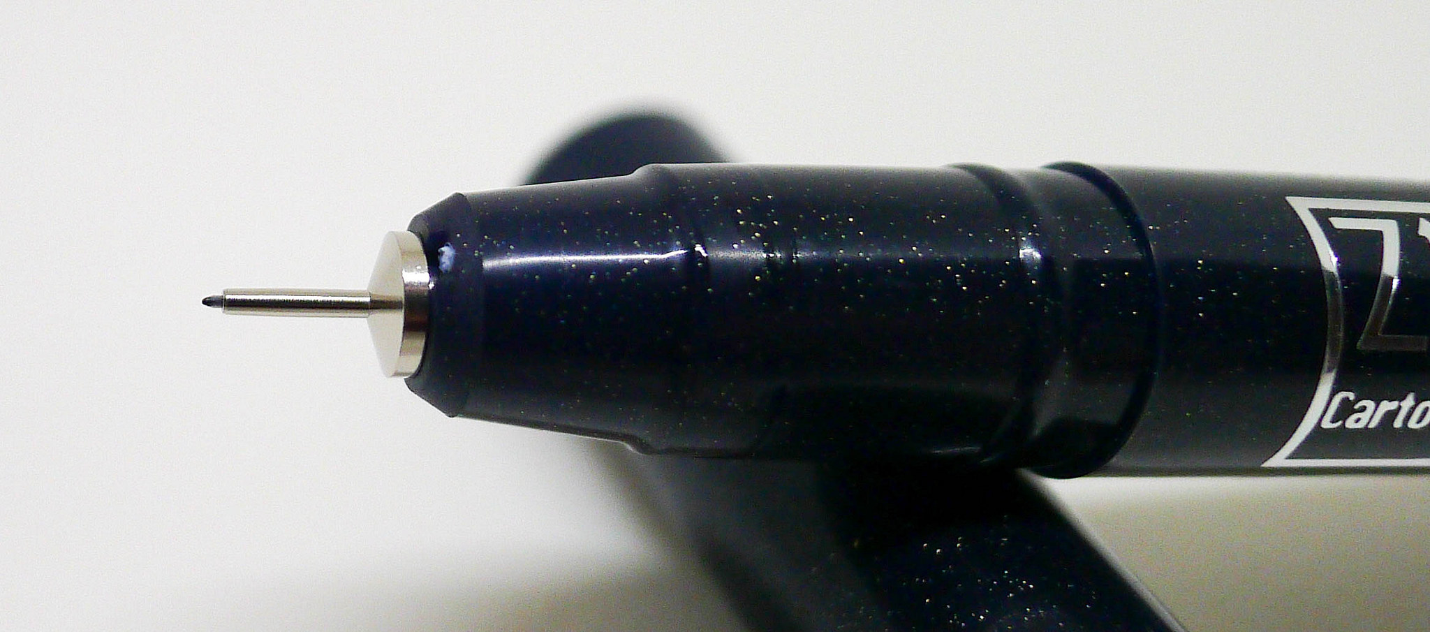
No sense in beating around the bush on this one. I love this pen.

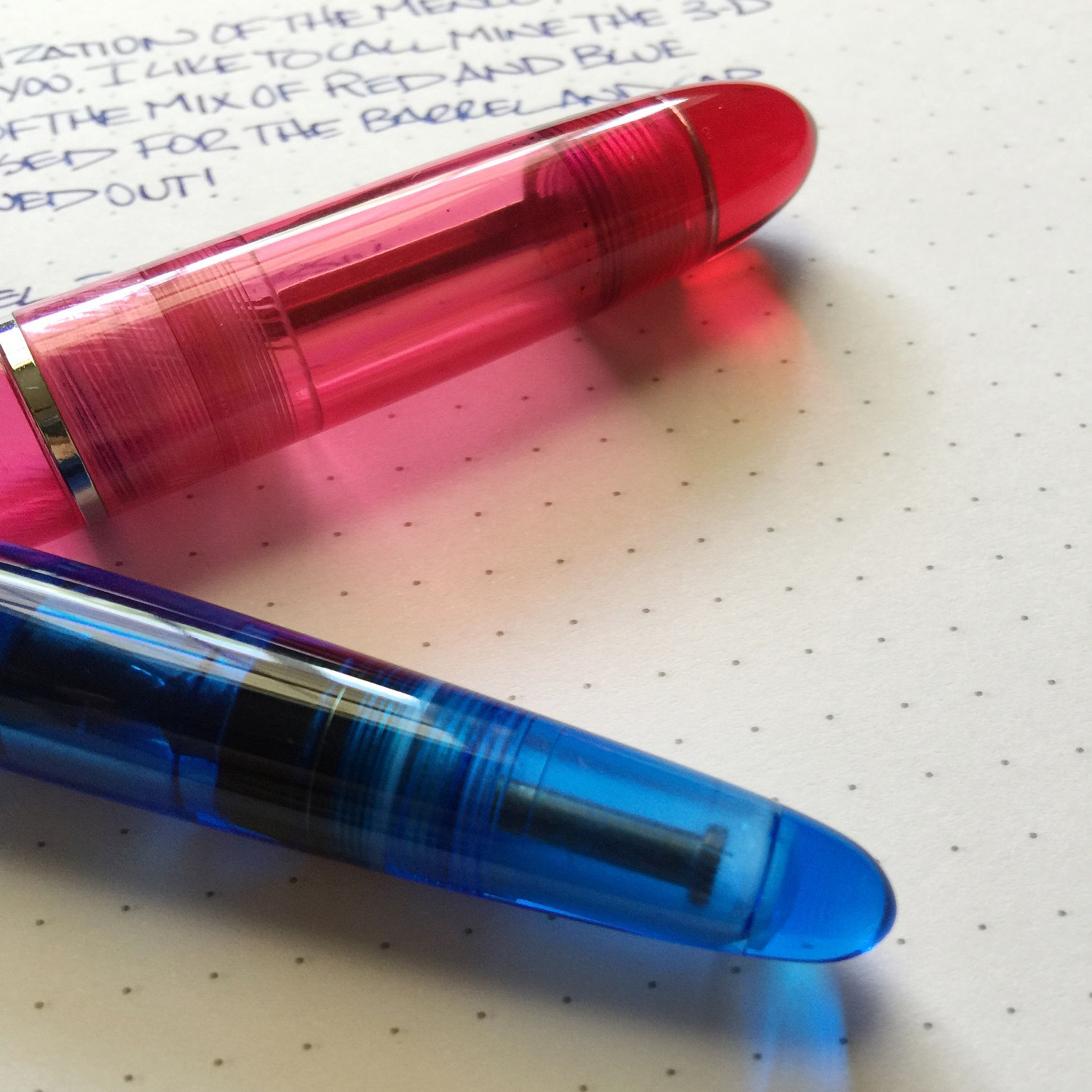
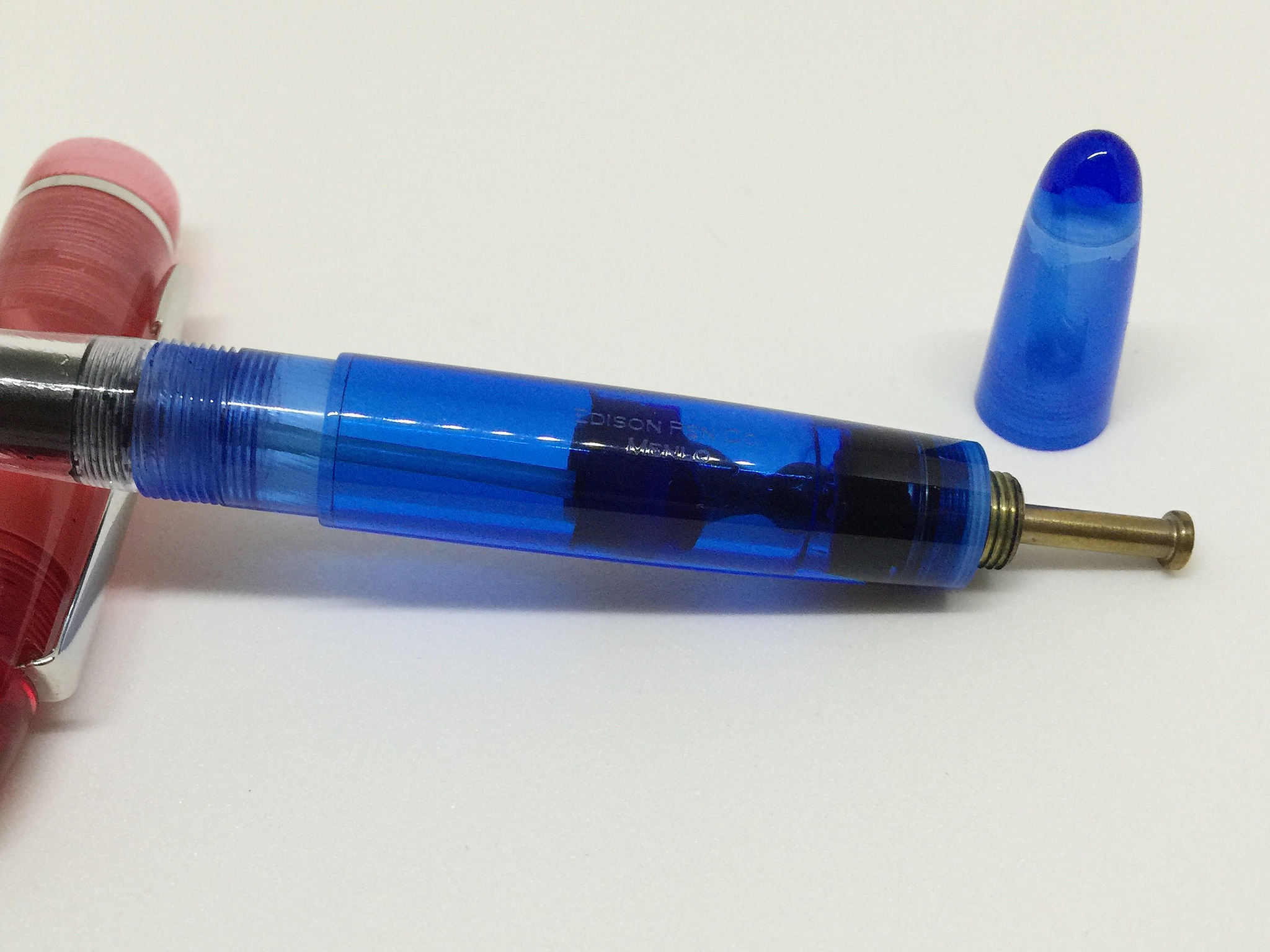
The Edison Menlo Pump Filler is one of the unique filling systems that Brian Gray of Edison Pen Co. has created or re-introduced over the years. Brian can explain it much better than me in his videos and diagrams (see the Menlo home page), but in a nutshell, you dip the nib into your ink bottle, depress the pump to expel air, then release the pump to bring in ink. It’s a fascinating process to see, especially in a demonstrator like mine. In about four pumps the entire 1.7 ml reservoir is full and ready to write.

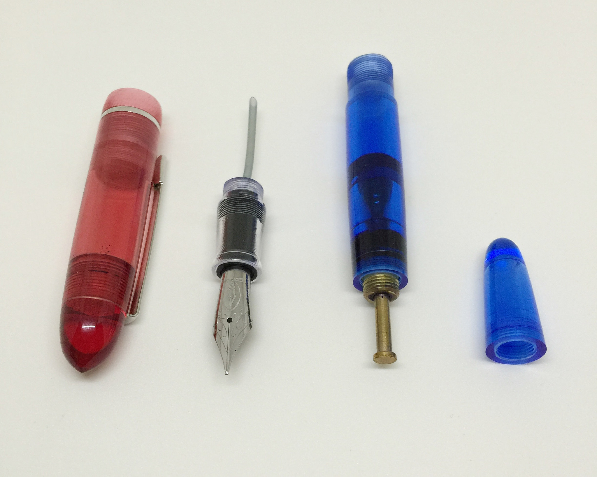
As great as this filling system is, there is more to this particular Menlo than that. First of all, this is a fully custom job done by Brian specifically for me. If you listen to the podcast or follow me on Instagram you have heard or seen me discuss how my Nock Co. partner Jeff got in touch with Brian to build this pen to give me as a gift. I had some general email conversations with Brian on a different pen that the two pulled from for the barrel colors, and then they conspired behind the scenes to nail down the final product. And nail it they did.

I love demonstrators, and I love red and blue, so why not combine the two? The result is what I refer to as my Menlo 3-D. It looks cool and is a joy to use. The aforementioned filling system works like a champ, and the steel fine cursive italic nib ground by Brian before leaving the shop is crisp and clean.

The barrel shape is almost an afterthought with everything else going on with this pen, but it may be the feature that suits me the most. It’s just the right length and just the right diameter to fit my hand and give me the best writing experience possible.

If there are any negatives to be mentioned about the Menlo, they would be the price and the difficulty in cleaning. The model I have cost $350 with the steel nib and will run you $450 with an 18k gold nib. With all of the additional design work and mechanics involved in making this pen you can be sure it will cost a pretty penny.

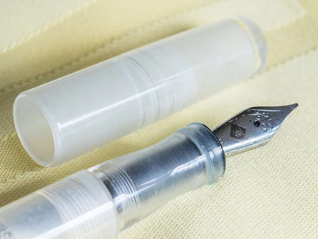
Cleaning the Menlo has proven to be a challenge, at least compared to cleaning a simple cartridge/converter fill pen. As easy as the pump is to fill the pen with, it takes several orders of magnitude more pumping to flush it clean. The pen can be unassembled for easier cleaning, which is the route I usually take. The nib unit is sealed on the back end to allow for the ink tube to function within the closed barrel so I generally soak it in water overnight since I cannot flush it with an aspirator like I would for more standard nibs. There is definitely some time and elbow grease involved to get it just right.

Sounds like a lot, doesn’t it? It is, but don’t let that sway you from considering a Menlo. It holds so much ink I actually end up cleaning it less than I do some of my other pens.

All in all, I am a big fan of the Menlo, and this one in particular. The style fits me perfectly both in form and function, and I love that there is a story to tell along with it. Yes, it was a gift, so I didn’t come out of my own pocket for it, but I can see another Menlo added to the collection in my future.

Posted on June 1, 2015 and filed under Edison, Fountain Pens, Pen Reviews.

Franklin-Christoph Model 65 Stabilis Review

(Susan M. Pigott is a fountain pen collector, pen and paperholic, photographer, and professor. You can find more from Susan on her blog Scribalishess.)

Well, I'm eating crow, that's for sure. In my review of the Franklin-Christoph Model 19, I claimed that I was not interested in the ice models that the company makes. I now own an ice model, and it is one of the coolest pens I own (pun intended).

I sent back the Model 19 after I decided it was too big for my hand. Following many emails back-and-forth with Lori in customer service (she gets new angel's wings every time I email her), I finally decided on the Model 65 Stabilis in ice. What made me change my tune? I saw a video review of a different ice model which the reviewer had eyedroppered. When the ice is filled to the brim with ink, the result is simply magical.

The pen transforms into whatever color the ink is, but, because the acrylic looks like ice, the ink sparkles inside. The effect is unlike any demonstrator pen I've owned.

The Model 65 Stabilis is the smaller version of Franklin-Christoph's desk pens with a #5 nib (the model 65 is longer and takes the larger #6 nib). The name Stabilis comes from the pen's unique design. The barrel is round except for one small portion that is flat. This allows the user to place the pen on a desk without worrying that it will roll off. It's genius, really.

The flat side is etched with the words "Franklin-Christoph Model 65." This branding is unobtrusive but classy, especially when you see it reflected in sunlight.

Another design element that makes this pen stand out is the cap threads. Instead of the threads being on the barrel, they are at the top of the grip section. Not only does that mean your fingers never feel the threads while writing, but the threads act as the barrier between your fingers and the nib. Why didn't someone think of this sooner?

Like most Franklin-Christoph pens, the Model 65 can be used with cartridges or a converter (both are included with the pen). The fact that you can also transform the pen into an eyedropper makes it even better.

The Model 65 is light, weighing only .06 oz/17grams without ink. It measures 5.35 inches in length capped, 5.6 inches uncapped, and 6.2 inches posted. The barrel diameter ranges from .51 inches to .39 inches near the grip. The Stabilis is a full-length pen with a comfortable barrel size. The acrylic makes it extremely light and easy to write with.

I don't normally post my pens, but I tried writing with the Stabilis posted just to see how it felt. I thought posting threw the balance off slightly, but it's a subjective thing. The cap is rather small, and it's completely round (no flat side), so it can roll off the desk pretty easily. I stand it up vertically so it won't roll.

For this pen, I decided to get the Mike Masuyama stainless-steel medium italic nib.

It is fantastic. In all honesty, I cannot tell the difference between this stainless steel nib and the 18k nib I had on the Model 19. In fact, I like this nib's design better–an understated "F" in an etched diamond and scroll work.

I thought the italic might be more finicky than the medium stub I had on the Model 19, but it is smooth and has a wide sweet spot. It produces a nice, crisp line and doesn't catch on the paper.

I emptied the pen after making it into an eyedropper to see how hard it is to get the ink out. I rinsed the barrel with water first, but I noticed ink residue near the bottom. I used some pen wash, shook it up pretty well, and rinsed again. Even using a Q-tip didn't get that little bit of residue out. If it makes me crazy, I'll try soaking it all night.

I disassembled the nib unit and all the ink accumulated there cleaned out nicely. Lori warned me that if ink gets in the threads it's more difficult to clean out. She suggested avoiding troublesome, highly saturated inks (which is fountain-pen-community-speak for avoiding a certain blue ink that causes major existential crises whenever it is mentioned in forums). The key is, use your common sense when deciding which inks to use if you transform the pen into an eyedropper.

The Model 65 Stabilis is a terrific pen. It suits me in every way that the Model 19 did not. The pen is currently available in classic black, solid ice, or a stunning blue-violet with numerous nib choices. Prices range from $149.50 to $244.50 depending on the nib.

I love, love, love this pen!

Pros

  • Beautiful pen at a reasonable price.
  • Versatile, since you can use cartridges, a converter, or transform the pen into an eyedropper
  • The Solid Ice model is magical when filled with ink in eyedropper mode.
  • The Masuyama stainless steel nib is fantastic.
  • This pen is absolutely comfortable in the hand.
  • Genius design elements, such as the flat side so the pen doesn't roll, and the placement of the cap threads, make this pen stand out.

Cons

  • People who prefer pens with some heft may find this pen too light.
  • Good luck trying to decide between the Solid Ice and the Violet-Blue. Even better, just get one of each!
  • Because this pen uses the #5 nib, you can't use it with the Franklin-Christoph 1.9 Music Nib which comes only in #6 size. You can get cursive italic calligraphy nibs in either 1.1 or 1.4mm sizes.
Posted on May 29, 2015 and filed under Fountain Pens, Franklin-Christoph, Pen Reviews.

Kuretake Zig Cartoonist Mangaka Outline Pen 003 Review

My love for the Kuretake Zig Cartoonist Mangaka Outline Pen is well known. My handwriting looks awesome, and the 02 size has become a regular part of my rotation.

Notice I said the 02 size. It's a wonderful writer, checking in around 0.35 mm line width, and even the 01 size sees a lot of use, leaving a line around 0.3 mm. But the 003 size Zig Cartoonist? Who do you think I am, Sam Larson?

I pick on Sam because I love his artwork. He does amazing work with some of the finest drawing pens on the planet, but I can't swing the 003 personally. I don't have the need for it. That said, compared to other tiny tipped drawing pens this Kuretake has a firmer tip than most. That's why I like the 01 and 02 sizes so much. Durability is important with this style of pen.

I'm curious how many readers out there have a use for such a specialized pen. It's clearly useful for many people, and honestly it's technically impressive that such a pen exists. How and why would you use a pen with a tip this small? Let me know in the comments section.

(JetPens provided this product at no charge to The Pen Addict for review purposes.)

Posted on May 27, 2015 and filed under Kuretake, Drawing Pen, Pen Reviews.