Posts filed under Pen Reviews

The Visconti Van Gogh Midi in Green Musk: A Review

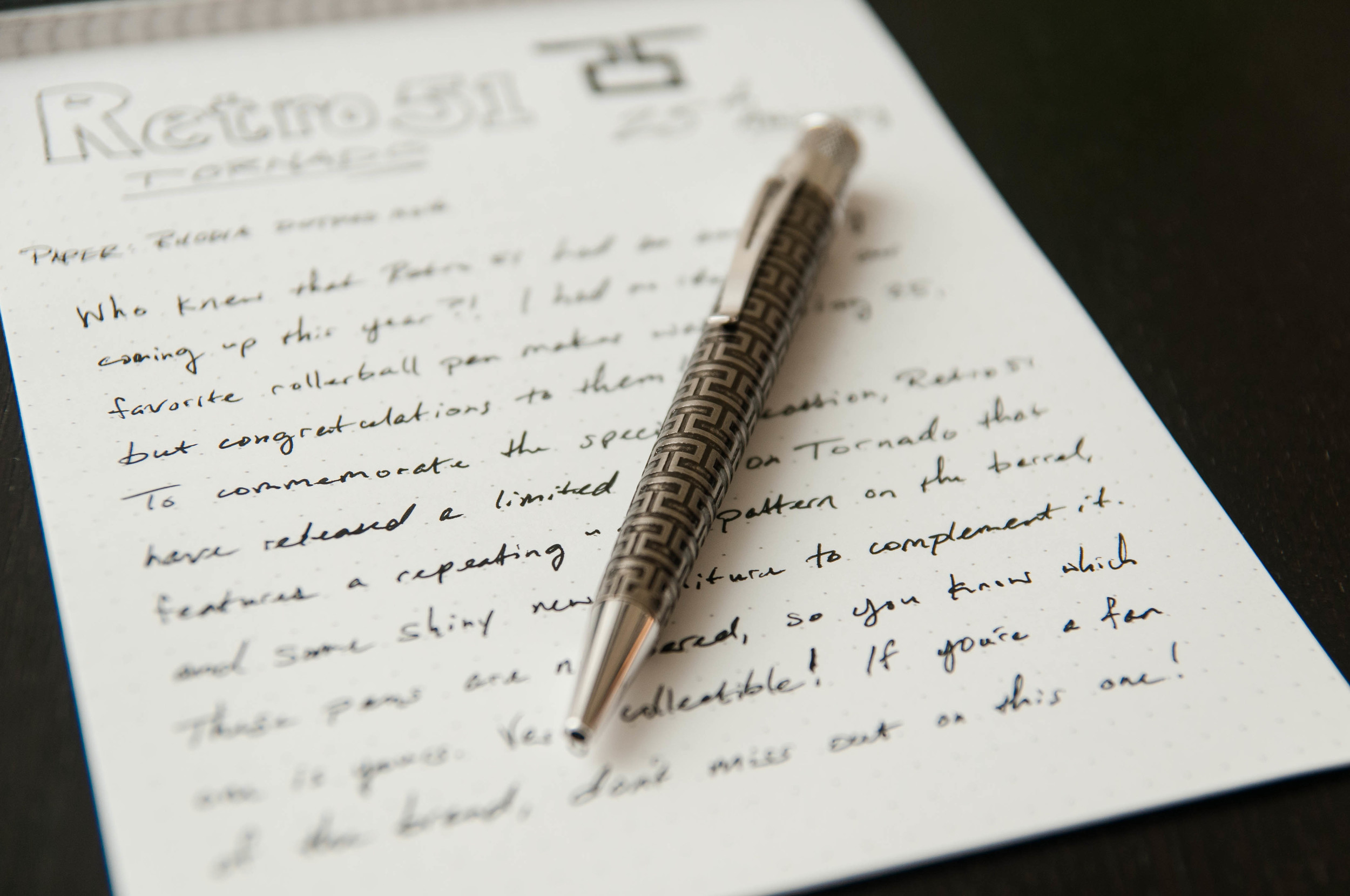
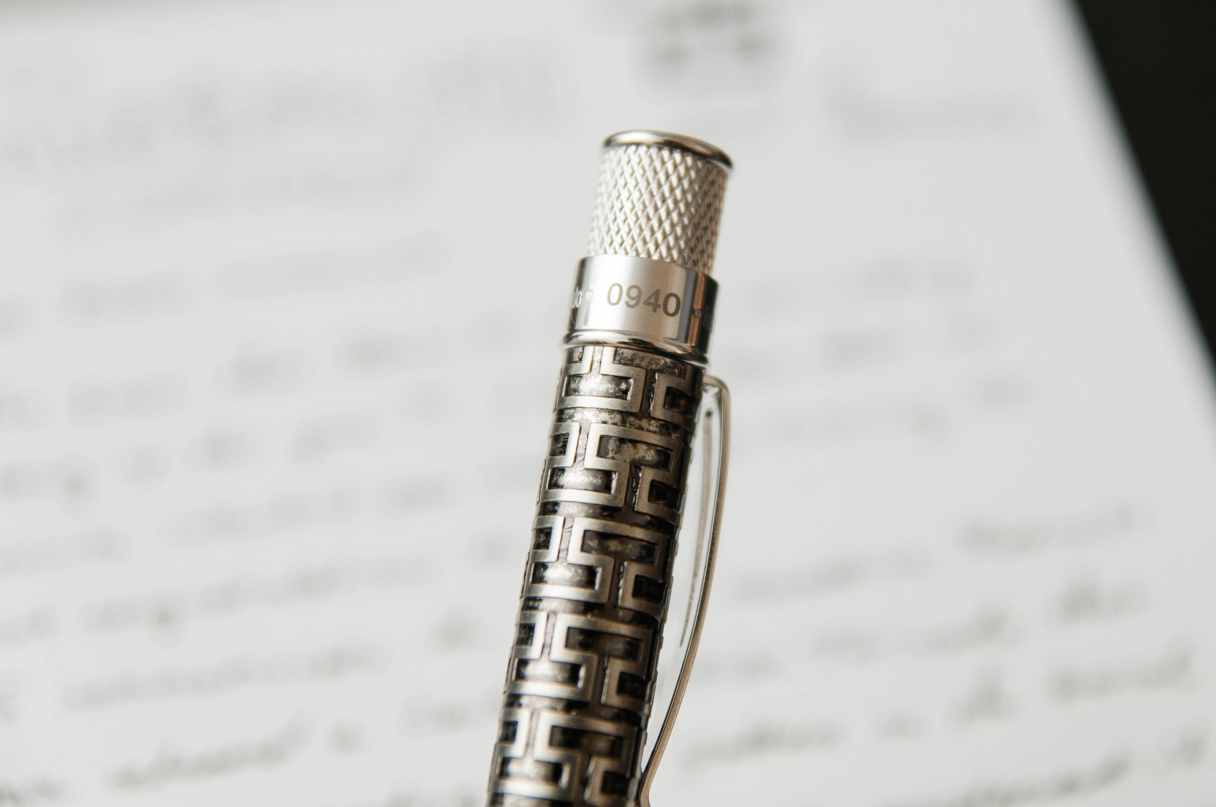
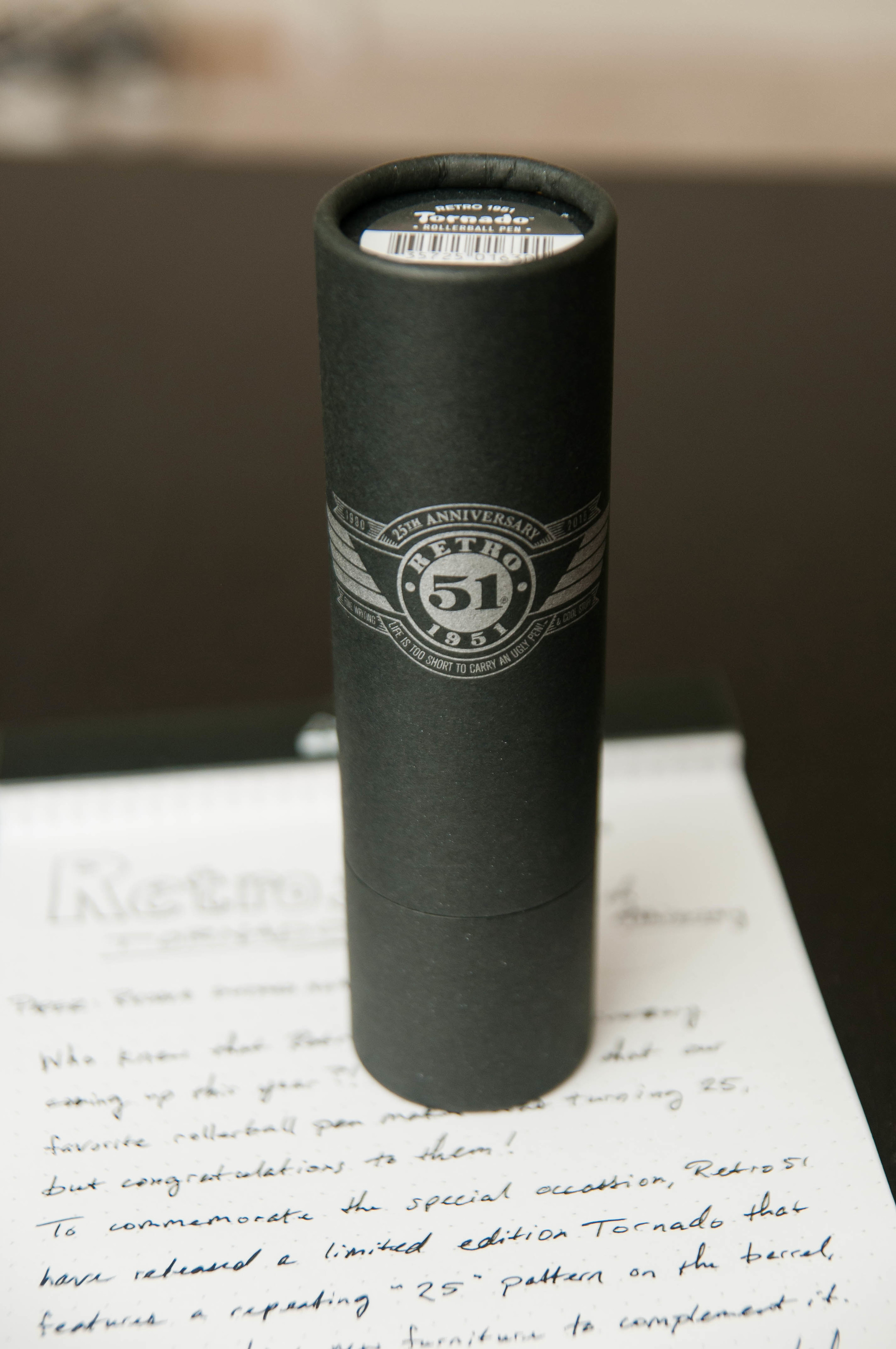
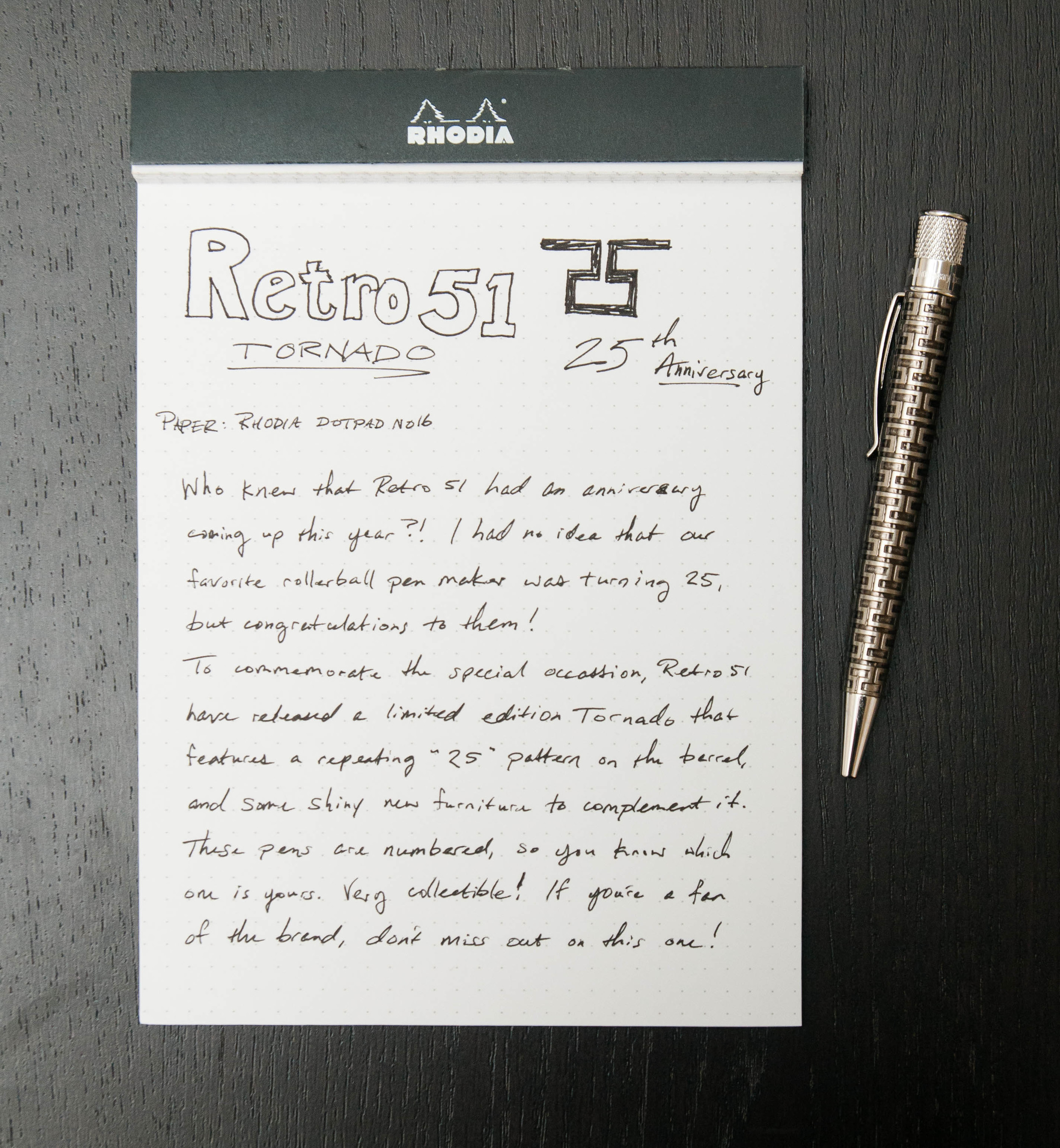
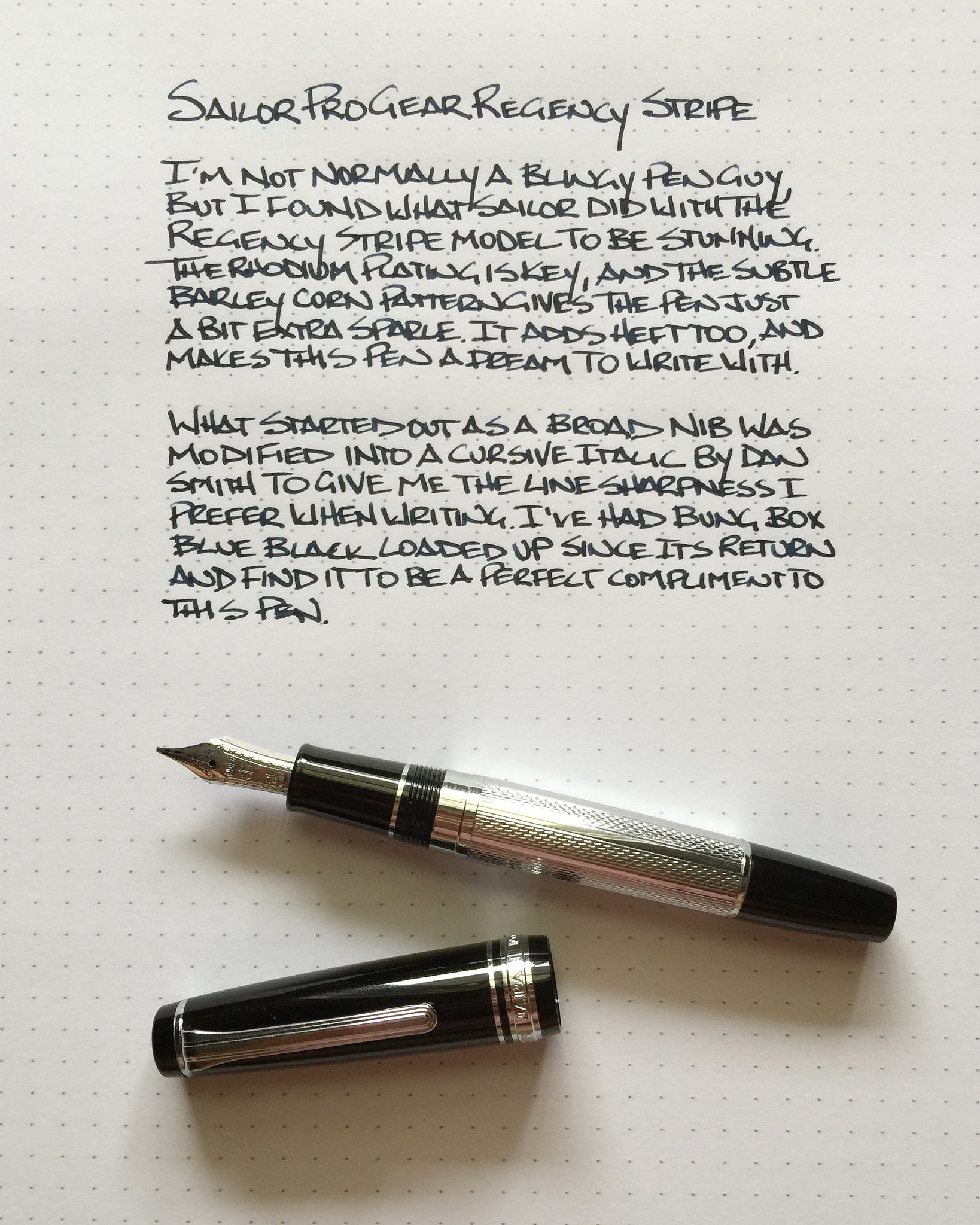
(Susan M. Pigott is a fountain pen collector, pen and paperholic, photographer, and professor. You can find more from Susan on her blog Scribalishess.)

Goldspot Pens kindly loaned The Pen Addict a Visconti Van Gogh Midi in Green Musk to review. This fountain pen comes nicely packaged in a faux leather clamshell box.

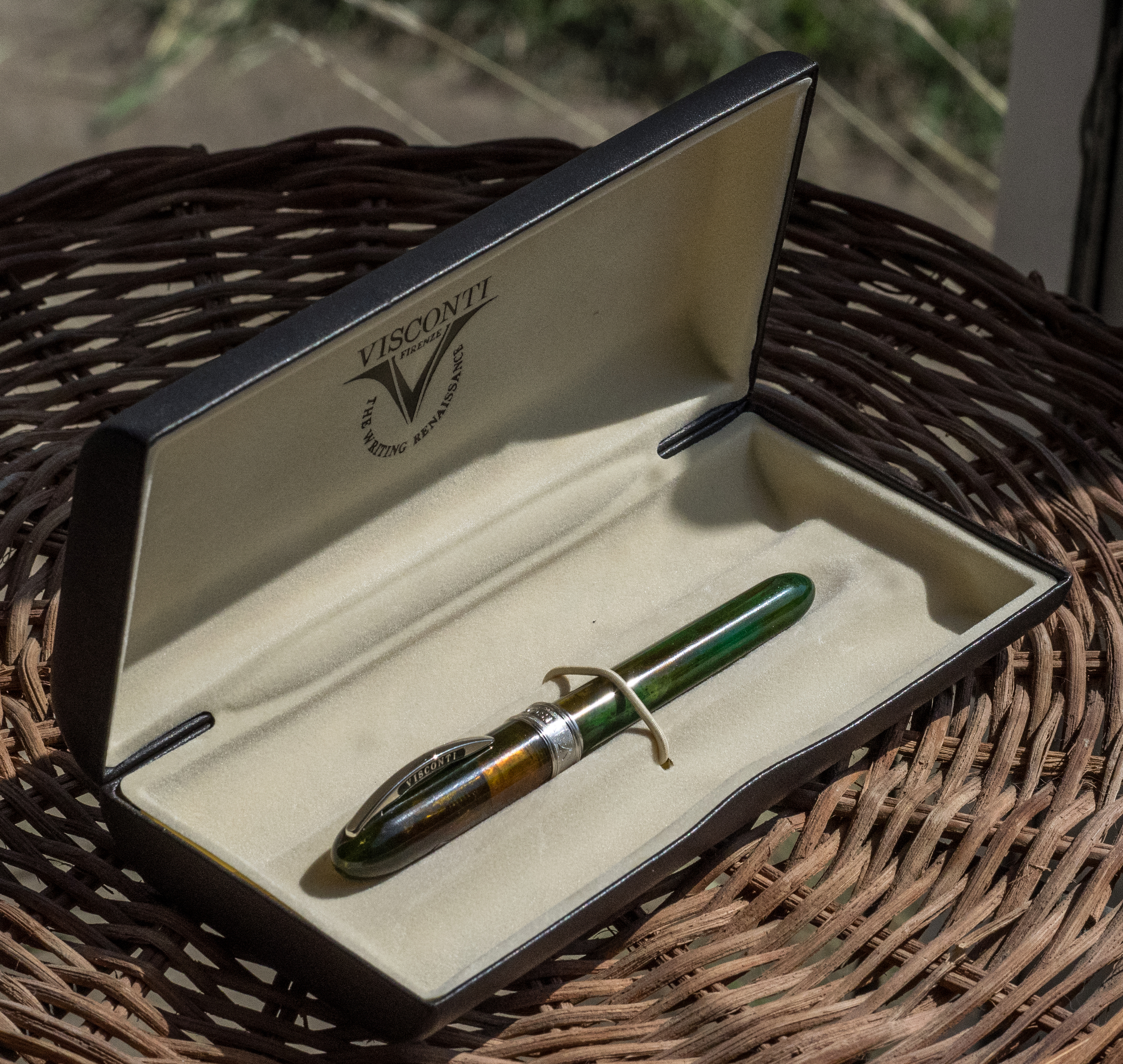
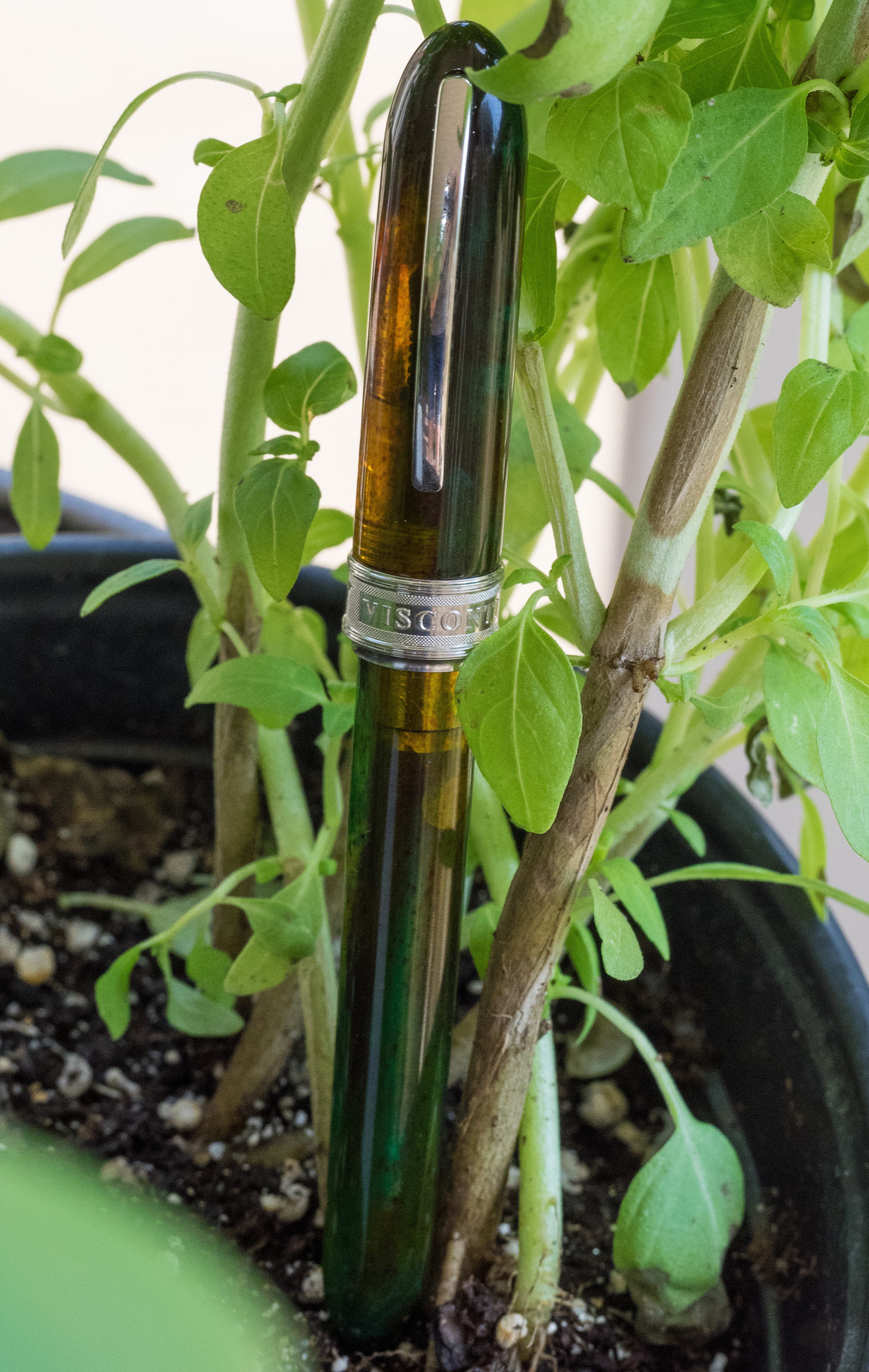
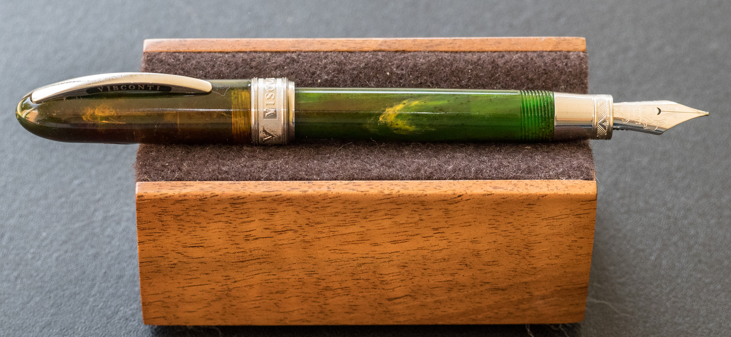
The pen is made of Italian resin that is semi-transparent. I really like the musk green color with its swirls of yellow, orange, and brown. The resin is stunning and changes with the light.

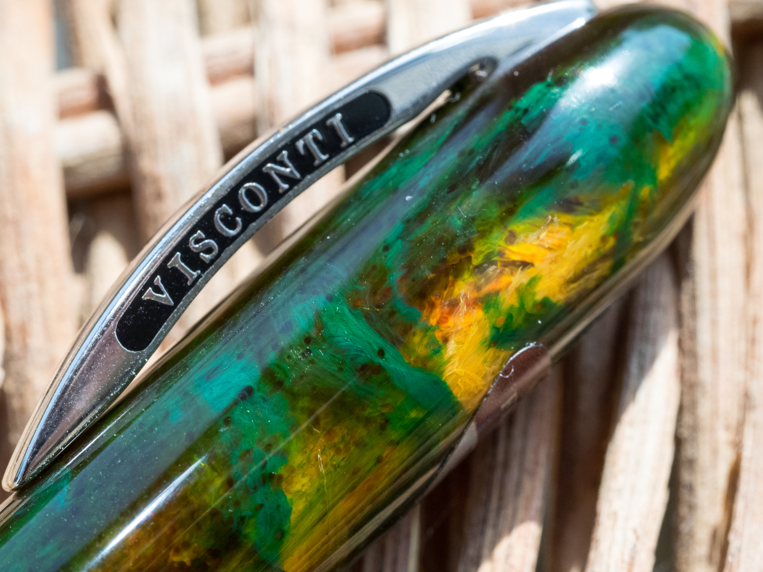
Rhodium-plated adornments accent the pen. The clip has the usual Visconti name on each side, and it is fully functional.

The cap is encircled at the bottom with a thick band that is engraved with "Visconti" and "Van Gogh" along with decorative texture.

They chose a strange font for "Van Gogh;" it almost looks like Comic Sans.

The portion of the grip nearest the nib is metal with similar engraved patterns.

One strange design element appears on the back side of the cap: a screw. Apparently, you can tighten or loosen the screw to increase or decrease the clip's tension (for a tighter or looser hold). On an otherwise beautiful pen, the screw, though practical, seems an inelegant aberration.

The pen is described as a "midi," but I find it to be a tiny pen, only 4.375 inches in length unposted and 5.5 posted. For comfortable writing, this is one pen you will probably need to post.

The pen is also small in diameter, and the metal is slippery, making it difficult for my fingers to find purchase. I have to hold the pen tightly which eventually results in hand cramps.

The Van Gogh comes with a medium steel nib that writes smoothly–when it writes.

Unfortunately, the nib on my pen performed quite poorly, exhibiting numerous hard starts, skipping, and simply running out of ink. I guess this is a feed problem that might be remedied by tweaking the tines. But, since this isn't my pen, I didn't feel the freedom to manipulate the nib or feed to see if I could get a better flow.

The barrel unscrews to allow you to insert an ink cartridge. This pen does not accept a converter. So, if you decide to order the Van Gogh, be sure to order ink cartridges as well.

For people with small hands or those who want an elegant pocket or purse pen, the Van Gogh Midi is an excellent choice, if you can get it to write consistently. Had the nib not been disappointing, I would have bought this pen for myself. It's absolutely beautiful.

The Visconti Van Gogh retails at Goldspot Pens for $174.95, and you'll need to add the cost of cartridges since only one is provided with the pen ($6.90 for 7 cartridges).

Pros

  • The Van Gogh is an elegant, small pen with gorgeous resin colors.

  • The rhodium-plated accents complement the pen nicely.

  • The pen is light and can be comfortable for those who prefer thinner barrels.
  • When the pen writes, it writes smoothly. The medium steel nib will be a good size for many people, but apparently no other sizes are available, nor are gold nibs offered.
  • For those who like the convenience of cartridges over converters, this pen works well.

Cons

  • The pen seems pretty expensive considering that it is so small, has a steel (rather than gold) nib, and only takes cartridges.
  • I find a cartridge-only pen to be extremely limiting. I much prefer having the converter option so I can use my own bottled ink. Of course, you can refill cartridges with your own ink using a syringe if you wish.
  • I found the pen uncomfortable to write with because of its narrow diameter and slippery grip. But that's just me. Others might find this pen extremely comfortable.
  • Unfortunately, the nib on the loaner pen, though smooth, was fussy. It would not start without me priming it each time, even if I only paused for a moment while writing. In addition it skipped and sometimes stopped writing entirely. I suspect a little widening of the tines might fix this issue, but a pen priced over $100 should come with a nib that just works.

Thank you to Goldspot Pens for loaning me this pen for review.

Posted on October 16, 2015 and filed under Fountain Pens, Pen Reviews, Visconti.

Retro 51 Tornado - 25th Anniversary Limited Edition Review

(Jeff Abbott is a regular contributor at The Pen Addict. You can find more from Jeff online at Draft Evolution and Twitter.)

Retro 51 — the darling of rollerballs — recently celebrated an important milestone of making great pens for 25 years. I had no idea that my favorite rollerball pen maker was having such a significant anniversary this year, but it's certainly exciting.

To mark the occasion, Retro 51 have released a special edition Tornado. This pen is a beauty to behold and has a couple of premium features that set it apart from other Tornado editions.

The most obvious feature of the pen is the body design. The pattern is a repeating "25" that stand out from the body like a relief sculpture. According to Goldspot, the barrel is acid-etched with the pattern, and then plated with a "stonewashed pewter" finish. Fancy words, but it all adds up to a positive experience when looking at the pen in person.

On top of the barrel finish, the furniture is made of rhodium, which is more shiny than the normal materials used in Tornados.

Along with the shiny material, the top band also includes some extra inscriptions that read "Retro 1951 25th Anniversary Tornado," followed by the unique number of the pen. My only complaint here is that the unique number isn't stamped with the same typeface and color as the rest of the text, but that's a really minor niggle.

The cardboard tube that holds the pen also receives some special branding attention, with a nice logo that indicates the 25th anniversary edition. Also, the same unique number is included on the bottom of the tube for reference. Apart from the branding, the packaging is the same you'd expect with any Tornado.

This really is a beautiful pen, and I'm glad I got to see one in person. If you're a fan of the Retro 51 brand, then this pen is definitely for you. It has a killer design, premium materials, and a limited appeal.

At around $50 for the pen, it's more costly than the standard or metal Tornado models, but it's a special edition and the price is fair for the premium materials and limited nature of the pen.

As far as writing with the pen, it uses the same cartridge we know and love. The raised etching on the body gives the pen a nice grip. I don't mind it at all, but I'm sure some people will prefer a smooth body for writing. Either way, it's still a beautiful limited edition, and I'm sure they'll be gone fast, so act quickly.

Goldspot graciously loaned this pen for the review, so you be sure to check it out and all of the other Retro 51’s they have in stock.

Posted on October 7, 2015 and filed under Retro 51, Pen Reviews.

Sailor Pro Gear Regency Stripe Review

I don’t normally buy blingy pens, but when I do, it’s the Sailor Pro Gear Regency Stripe.

I first saw this pen at the 2013 Atlanta Pen Show. Mike Masuyama, who rarely sells pens, had this one sitting on his table. I picked it up, becasue, well, it’s gorgeous, and loved the feel of it. It was my first pen show, and there weren’t many Sailor’s available to purchase, so I asked Mike the price.

“$400.”

I put the pen right back down. Not today, but not forgotten.

I didn’t even know what the name of this particular Sailor pen was, but the design was distinctive and stuck with me. It was shiny, yes, but in a sublte way. And it had a nice heft to it, unlike the Pro Gear Slim (aka Sapporo), which was the extent of my Sailor experience up to that point.

Fast forward to May of this year. I was scrolling through the Fountain Pen Network Classifieds (bad idea for your wallet!) and ran across a Sailor pen I had seen before. And it had a name: The Sailor Pro Gear Regency Stripe. It looked to be in great shape, the price was fair ($350), and I had it on the way nearly as quickly as I found it. I wasn’t passing it up for the second time.

The standout feature of the Regency Stripe is the rhodium stripe and barley corn pattern that adorns the barrel. It is as stunning to look at as it is to hold. There is some weight to it as I mentioned earlier, but it’s not too much. It gives it that “just right” feel when writing with it.

Mine came with a broad nib, which wouldn’t have been my first choice, but I never have an issue getting the pen I want and worrying about the nib later. The broad was ok as-is, but I shipped it off to my friend Dan Smith at The Nibsmith to give it a little cursive italic love to fit my writing style better. Dan delivered a sharp, juicy nib that is a pleasure to write with.

Would I have purchased this pen without the opportunity to have held it in Atlanta several years ago? I think the odds are very low that I would have. That’s a lot of money to shell out sight unseen. This is why pen shows are great. You learn more than you buy, and that is valuable when it comes to making purchasing decisions in the future. This was a decision I was very happy with, and I’m not the only one.

Posted on October 5, 2015 and filed under Pen Reviews, Fountain Pens, Sailor.