Posts filed under Pen Reviews

Danitrio Kama-nuri Kamakura-bori Blue Tame-nuri on Takumi Fountain Pen: A Review

(Susan M. Pigott is a fountain pen collector, pen and paperholic, photographer, and professor. You can find more from Susan on her blog Scribalishess.)

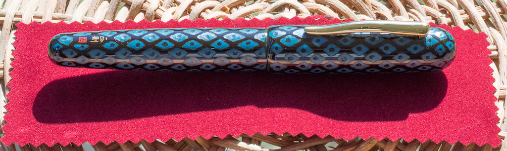
Every once in a while, you run across a pen that is so unique and so absurdly beautiful that you’ll do whatever it takes to own it. For me, that pen is the Danitrio Kama-nuri Kamakura-bori Blue Tame-nuri on Takumi (what a mouthful!) I honestly did not intend to buy another Danitrio. I owned a Sho-Hakkaku (reviewed here) that I eventually sold because I didn’t use it that often, and I found the soft stub to be too wide for my writing style (though I loved the feel of the nib). I told myself that if I found a Kama-nuri in blue, I would buy it.

Sure enough, Bryant, at Chatterley Luxuries let me know he got some Kama-nuris in, so I went to the site and looked. My finger was poised to click on the blue Kama-nuri when I saw a pen that dazzled me. I’d never seen anything like it before. Not only was it Kama-nuri style, it was more than that--blue diamonds were carved all over the body of the pen with carved black dots in the middle of each diamond. It was more expensive than any pen I’ve ever bought (I’ll just say it was close to $2000), and I told myself, “Absolutely not.” But then I thought, “What’s the chance that you’ll ever see a pen like this again?” So I bought it, and subsequently I sold a bunch of beloved pens to cover the cost. Was it worth it? You’ll have to read the rest of the review to find out.

Considering how expensive Danitrios are, the packaging is a bit of a disappointment. My pen came in a softwood box lined in fake red velvet. Unlike Nakaya, you don’t get a kimono for your pen, and although I never use my kimonos anyway, they are a nice touch. I found no paperwork or information about the artist included in the box.

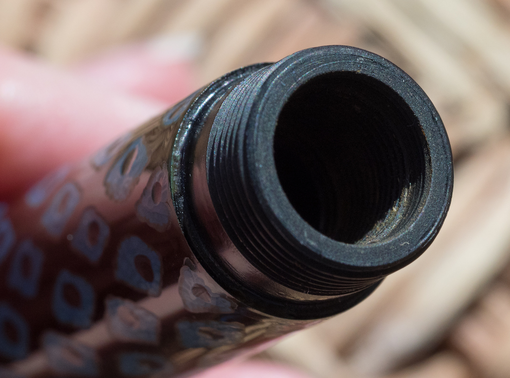
My Kamakura-bori began life as a black Urushi Takumi model. Then, the artist (Mr. Kazushi Kanego) applied layers of blue Urushi over the black. This was followed by more layers of black Urushi. Next, the artist hand-chiseled the diamond (or rhombus) pattern into the blue layer. Last he chiseled dots down into the original black layer. You can see the individual chisel marks in the macro photo below. Plus, you can see how thick the Urushi is in the second photo.

The result is a pen that is both beautiful to the eye but also tactile: you can feel the patterns with your fingers. Plus, this is no machine-made pen. The patterns are imperfect because they are done by hand. This makes the pen all the more beautiful, and it is absolutely unique.

The Takumi model is a cartridge/converter style pen, which suits me just fine. I’ve tried Danitrio’s eye-droppers and found them messy and unreliable in terms of flow (I may have just had bad luck). Sure, an eye-dropper holds more ink, but the converter is easy to use.

My pen has a gold-plated clip that is easy to manipulate. I prefer Danitrio’s painted clips, but obviously that wasn’t a deal-breaker for me.

The Takumi is a large pen, measuring 145mm/5.71 inches capped and 130mm/5.11 inches uncapped (Danitrios aren’t meant to be posted). Because it is made of Urushi, the pen is by no means heavy. It is comfortable in the hand (even though it is 16mm in diameter), and I experience no fatigue writing with it.

The #6 size, two-tone, 18k gold fine nib is perfectly proportioned for the pen. It has Danitrio’s distinctive fire logo on it. Unlike Japanese nibs, Danitrio fines are really closer to a western fine or a Japanese medium.

Unfortunately, my nib has issues. I noticed from the beginning that the nib was a bit scratchy and that it didn’t seem to write a consistently wet line. It’s been so rainy in Abilene that I had to wait quite a while for a day with enough sunlight to take macro photos of the nib. I discovered that the tines are misaligned, so that explains the problems I’m having.

I filled my pen with Sailor Yama-Dori, which is a terrific color to match the blue on the pen. When the pen is freshly inked, the nib alignment is not as noticeable, and the writing looks pretty good. But after the first few sentences, the misalignment becomes noticeable and the ink no longer flows as smoothly onto the paper. Obviously, this is a major disappointment in a pen this expensive.

So, is it worth it? Well . . . yes and no. Obviously, a pen’s worth is completely subjective. Some readers might think this pen is rather ostentatious. Others might agree with me that it is amazingly beautiful and unique. But ultimately, what matters is what I think, since I’m the one who spent the big bucks to buy it. Considering the amount of time the artist spent crafting this pen, and considering how unique the pen is, I purchased more than just a writing instrument. I purchased a piece of art that no one else on earth possesses. True, Mr. Kanego may have created other pieces with the same design, but since he hand-carved them, each pen is unique.

That said, I am disappointed with the nib. While it writes adequately, the misaligned tines definitely detract from the quality of the writing experience. I will have to send it in to get the tines realigned and the nib adjusted for better flow.

Only a few pen dealers offer Danitrios, and Chatterley Luxuries currently has the largest inventory. If you’re interested in a Kama-nuri model (all of which are hand carved), I suggest you head over to Chatterley Luxuries soon.

(I purchased this Danitrio pen with my own funds (and sold a ton of pens to pay for it!))

Posted on October 26, 2018 and filed under Danitrio, Pen Reviews.

Retro 51 Rescue Tornado Buzz Review

(Sarah Read is an author, editor, yarn artist, and pen/paper/ink addict. You can find more about her at her website and on Twitter.)

Of all the pen breeds, ballpoint is my least favorite. I still think they're fun, because pens, but I don't love them with the same manic fervor as I do other kinds. Except for this one!

There's something about the Retro 51 Buzz design and these crazy smooth Retro 51 Easy Flow 9000 ink cartridges. The pen will take any Parker-style ballpoint refill, but I've never used one that's better than this. It writes butter-smooth and never skips, but the line is crisp and as dark as gel ink--without the smearing. It has all the utilitarian properties of ballpoint ink but eliminates all my pet peeves about it. It's nicely saturated and doesn't feel dry or require hand-cramping pressure.

When you take a refill that good and put it in a pen this beautiful, well. That's just pure fantastic-ness. The body of the pen is acid-etched in a honeycomb pattern, enameled with honey-gold colors and adorable wee bees. The accents are in brushed copper. It has the classic Retro 51 knurled twist mechanism and sturdy metal clip. The finial is decorated with a hungry looking bear who has just found his favorite snack.

On top of all that, the proceeds from each sale go to the NW Honey Bee Habitat Restoration. So if you needed one more reason to push you over the edge, there you go. These would make excellent gifts, too--especially for people who like pens but don't want anything fussy or who need that ballpoint ink for work. It's just a good pen and this edition does good for the world. It is sweet as honey in every aspect.

(Pen Chalet provided this product at no charge to The Pen Addict for review purposes.)


Enjoy reading The Pen Addict? Then consider becoming a member to receive additional weekly content, giveaways, and discounts in The Pen Addict shop. Plus, you support me and the site directly, for which I am very grateful.

Membership starts at just $5/month, with a discounted annual option available. To find out more about membership click here and join us!

Posted on October 25, 2018 and filed under Retro 51, Pen Reviews.

Pineider Avatar Fountain Pen Review

(Jeff Abbott is a regular contributor at The Pen Addict. You can find more from Jeff online at Draft Evolution and Twitter.)

It's easy to spend years in the pen community and be completely unaware of various pen companies that are also operating in the same space. That's what happened to me with the Pineider Avatar. Pineider is an Italian stationery company that dates back to 1774, and recently rebooted in 2017. In the case of the Avatar, I've been pleasantly surprised by this new (to me, anyway) brand.

The Avatar is made of resin and silver trim, but that's really selling it short. The mixture of red shades and translucent material gives this pen a little something extra when the light catches it. Moving under the light, the pen appears to have dimensions and space beneath the surface, an intoxicating chatoyance.

The silver trim matches the pen nicely without detracting any from the real star of the show. The ends of the pen and cap are both rounded, and the clip is a spring-loaded mechanism that integrated into the top of the cap. It's not the strongest clip out there, but it gets the job done.

One of my favorite things about this pen is the magnetic cap system. Instead of a traditional screw-on cap or friction fit system, the Avatar has a nifty magnet catch design. Uncapping the pen is easy, and recapping it results in a satisfying /chink/ to let you know it's secure. When capped and not in use, the cap feel secure and I don't think it would slip off in normal circumstances. I would keep a close eye on this pen if I put it in my pants or shirt pocket if the pen couldn't reach the bottom of the pocket.

Another fun feature of the cap is the band. There's a lot going on with the band, and I wasn't sure I liked it at first. After looking a bit closer and realizing that it was a skyline, it started to grow on me. Since I didn't recognize the city skyline at first, I looked at the small pamphlet that came with the packaging and discovered that it was a skyline of Florence, Italy. Along with the skyline is a classy "Pineider" logo. I wish the band had a little more thickness and dimension, but I also appreciate that it's flush with the body of the cap.

The section of this pen is longer than most, but it has a nice shape. It's a slick metal finish that can get a bit slippery, but I haven't had any issues with it so far. One issue I did have during the first few days of using this pen was inky fingers. I wasn't sure how my fingers kept getting ink on them, but I finally figured out what was happening. Since there's no lip or ridge at the bottom of the section, my finger would slip down onto the feed and pick up ink. After realizing this, I consciously changed my grip on the pen to stay a little higher up. After doing this, I had no more issues with inky fingers. This is more of a individual preference problem, but worth mentioning since I don't normally have this problem with the dozens of other pens I own and use regularly.

The steel nib on the Avatar is also something that surprised me. It's minimally decorated and the size matches the size of the body perfectly, but it's also buttery smooth on paper. The nib is firm without feeling like a nail, but you also can't get any flex out of it. Even though it's labeled as a medium, it feels more like a fine — possibly even an extra fine. I'm not sure if Pineider nibs run small usually or if this is just an issue on the unit I have. Either way, I enjoy using the nib and it's performed beautifully right out of the box.

Speaking of the box, Pineider really takes pride in their presentation. The box that this pen arrives in is a black pleather covered box with a couple of small flaps that are secured with magnets (someone at Pineider really likes magnets...). Upon opening the box, you're greeted with the pen on a stand at the top of the box. Under the pen is a small drawer that contains some information on Pineider and some stationery supplies — small envelopes and pages for letters. It's a nice touch and something that I've never seen before for a pen of this price.

I think it's fair to classify Pineider as a luxury brand, and I've had mixed experiences with luxury brand pens before. This certainly isn't the norm, but there are times where the presentation is on par with a luxury brand, but the writing experience is poor. Sometimes it's hard to justify the price of a luxury pen if it doesn't easily attain the number one practical goal of all pens.

In the case of the Pineider Avatar, I'm pleased to report that this luxury pen is a satisfying mixture of elegant materials and presentation as well as a beautiful writing experience.

The Pineider Avatar retails for $280, but Pen Chalet sells it for about $225 at the time of this review. At that price, there's a lot of excellent competition that usually blows weaker luxury pens out of the water. With the combination of a great writing experience and the gorgeous, tantalizing materials of the Avatar, I think it sits fairly in this price range along with the likes of the Pilot Custom 823 and others.

If you're interested in the Avatar, it comes in four beautiful colors. The color featured in this review is Lipstick Red, but you can also choose from Coal Gray, Pacific Blue, and Saffron Yellow. Each pen comes with a cartridge converter and accepts international short cartridges. Unfortunately, there are no nib options outside of medium steel nibs.

(Pen Chalet provided this product at no charge to The Pen Addict for review purposes.)


Enjoy reading The Pen Addict? Then consider becoming a member to receive additional weekly content, giveaways, and discounts in The Pen Addict shop. Plus, you support me and the site directly, for which I am very grateful.

Membership starts at just $5/month, with a discounted annual option available. To find out more about membership click here and join us!

Posted on October 24, 2018 and filed under Pineider, Fountain Pens, Pen Reviews.