Posts filed under Pen Reviews

Faber-Castell Grip Fountain Pen Review

(Sarah Read is an author, editor, yarn artist, and pen/paper/ink addict. You can find more about her at her website and on Twitter. And check out her first novel, The Bone Weaver’s Orchard, now available where books are sold!)

There can never be too many entry-level fountain pens. The more variety there is, the more likely new hobbyists will find a pen they love and join us at the Pen Addict table. Faber-Castell's Grip fountain pen has flown under my radar, but it's an excellent contender for a beginner fountain pen--and it's a decent pen even for us wizened collectors.

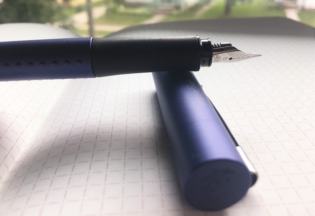
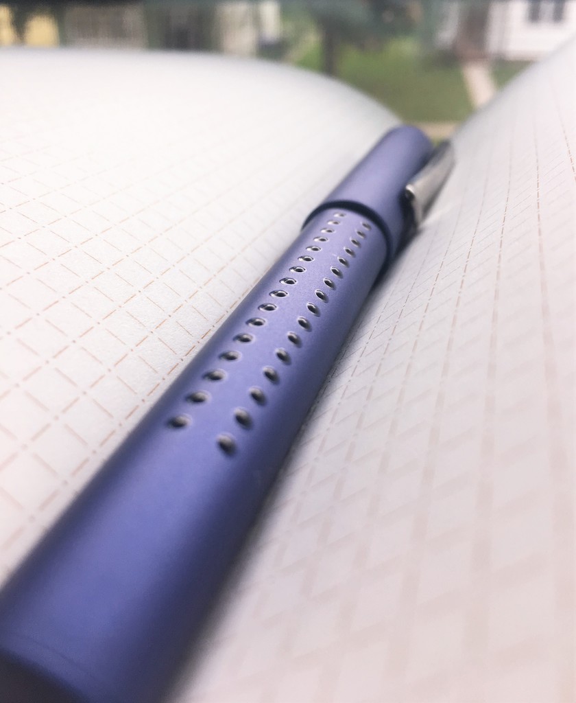
If this pen hadn't arrived in a fancy presentation box, I'd have assumed it was a generic rollerball from a big box store. I think the grip dots create this impression for me. They remind me of school pens. And this would actually make an excellent school pen! But it certainly isn't putting on any airs when it comes to appearance. The only ornament is the raised logo on the top of the cap and the lovely engraved nib. Otherwise, this is a very plain pen. Or maybe a better word would be 'inconspicuous.'

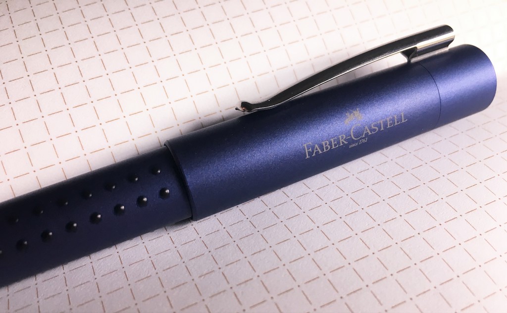
The body is molded plastic; this one is a pretty dark blue with black raised dots along the body. These are supposed to aid in gripping the pen, though they are conspicuously absent on the grip section itself. The grip section is textured soft plastic. The whole body is very subtly triangular shaped, so the pen doesn't roll too easily, and the grip is comfortable. The shaping guides your grip without forcing you into a specific pen hold.

The cap has the Faber-Castell name on it in white. It snaps to close and posts securely. It's very light even when posted, which makes it great for long writing sessions. The clip is folded stainless steel and works very well. It's springy but still secure, and the shaped tip doesn't damage paper or fabric.

The pen takes standard cartridges (long or short will work) or a standard converter. It comes with one cartridge.

The nib is steel and nicely decorated. This one is an extra fine and it is actually very fine. Other Faber-Castell nibs I've used have felt on the broader side to me, so I was surprised to get such hairline writing with this one. It does have a lot of feedback and feels a bit dry, but it isn't unpleasant at all. In fact, I think that makes it perfect for writing in pocket notebooks, or on office or school paper.

This is an excellent student pen, or work pen--or a pen that you want to carry around without worrying about it too much. It's reliable, writes well, and it's inexpensive. At $20, I think it's the perfect price for gifting to kids or office friends who might be fountain pen curious. It's been my work companion for a few weeks, now, and its plain appearance means I can leave it sitting on the desk while I wander away to work without worrying about it growing legs and walking away. No one looks twice at it, until I explain what makes it special.

(Vanness Pens provided this product at no charge to The Pen Addict for review purposes.)

Posted on July 18, 2019 and filed under Faber-Castell, Fountain Pens, Pen Reviews.

Platinum Procyon Fountain Pen Review

(Jeff Abbott is a regular contributor at The Pen Addict. You can find more from Jeff online at Draft Evolution and Twitter.)

As someone who loves pens, writing, and all things stationery, I'm a bit embarrassed that I haven't given the Platinum pens more attention. I've never disliked them; it's more of a combined time/attention/money problem. This year, I decided to start wading into the Platinum fountain pens and nib assortments. To start this journey, I chose a fairly affordable Platinum Procyon.

Prior to this pen, my only other Platinum pen experience are a handful of different Preppy models, and trying out different Platinums at the Atlanta Pen Show. As you can see, I only have experience with disparate ends of Platinum's fountain pen offerings. The Procyon hits a rare price point — $53 as of this writing — that always interests me. It's not crazy expensive when comparing against the complete market of fountain pens, but it's also not a highly-affordable plastic disposable pen, either. If manufacturers can nail this price point with a pen that performs well and is a joy to use, they've won.

The Procyon borrows its name from a star — the brightest star in the Canis Minor constellation — and is intended to "brighten" the writing experience. While this is cheesy marketing, it's still a pretty cool name. But does it brighten the writing experience? The simple answer is yes.

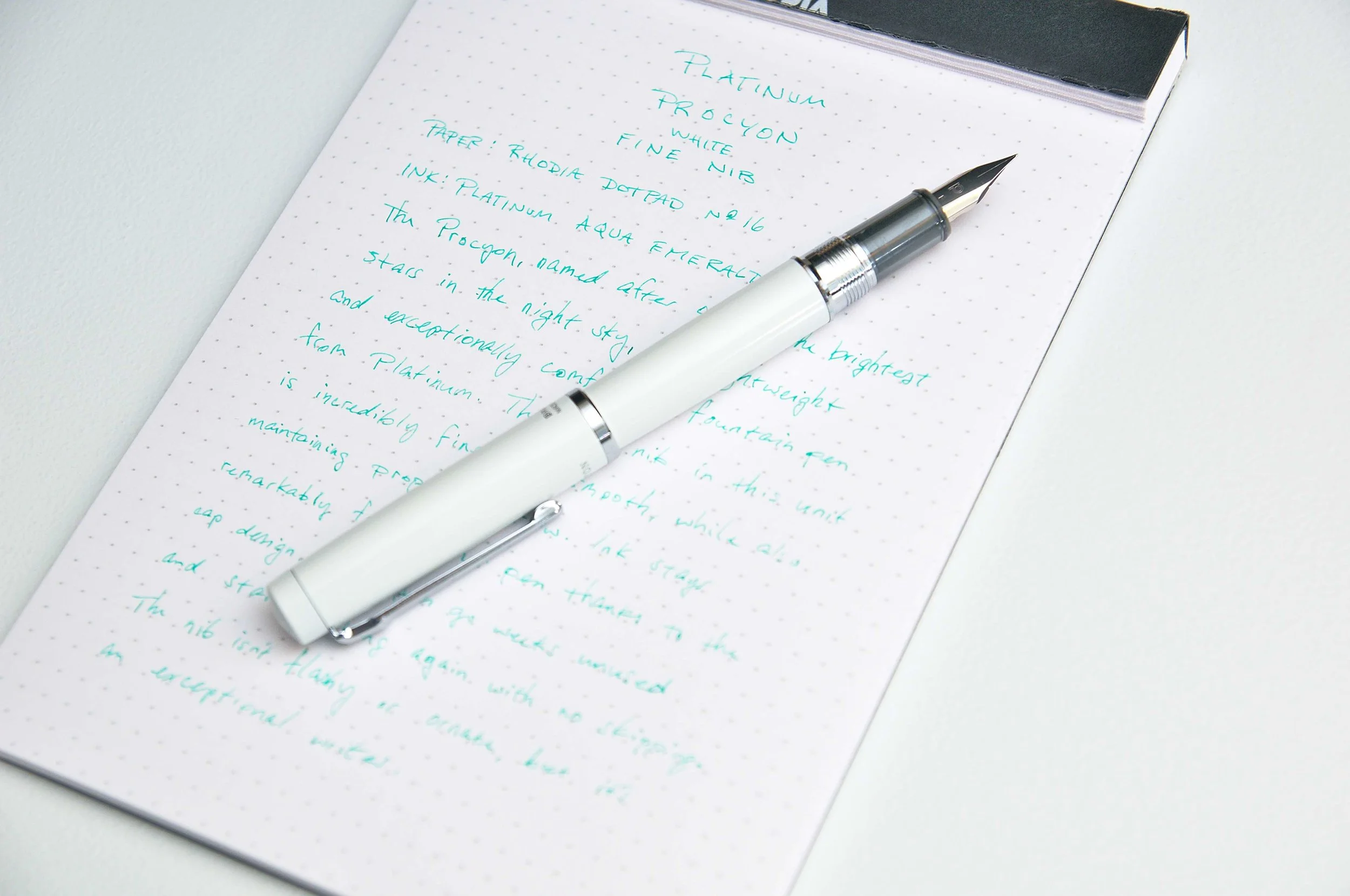
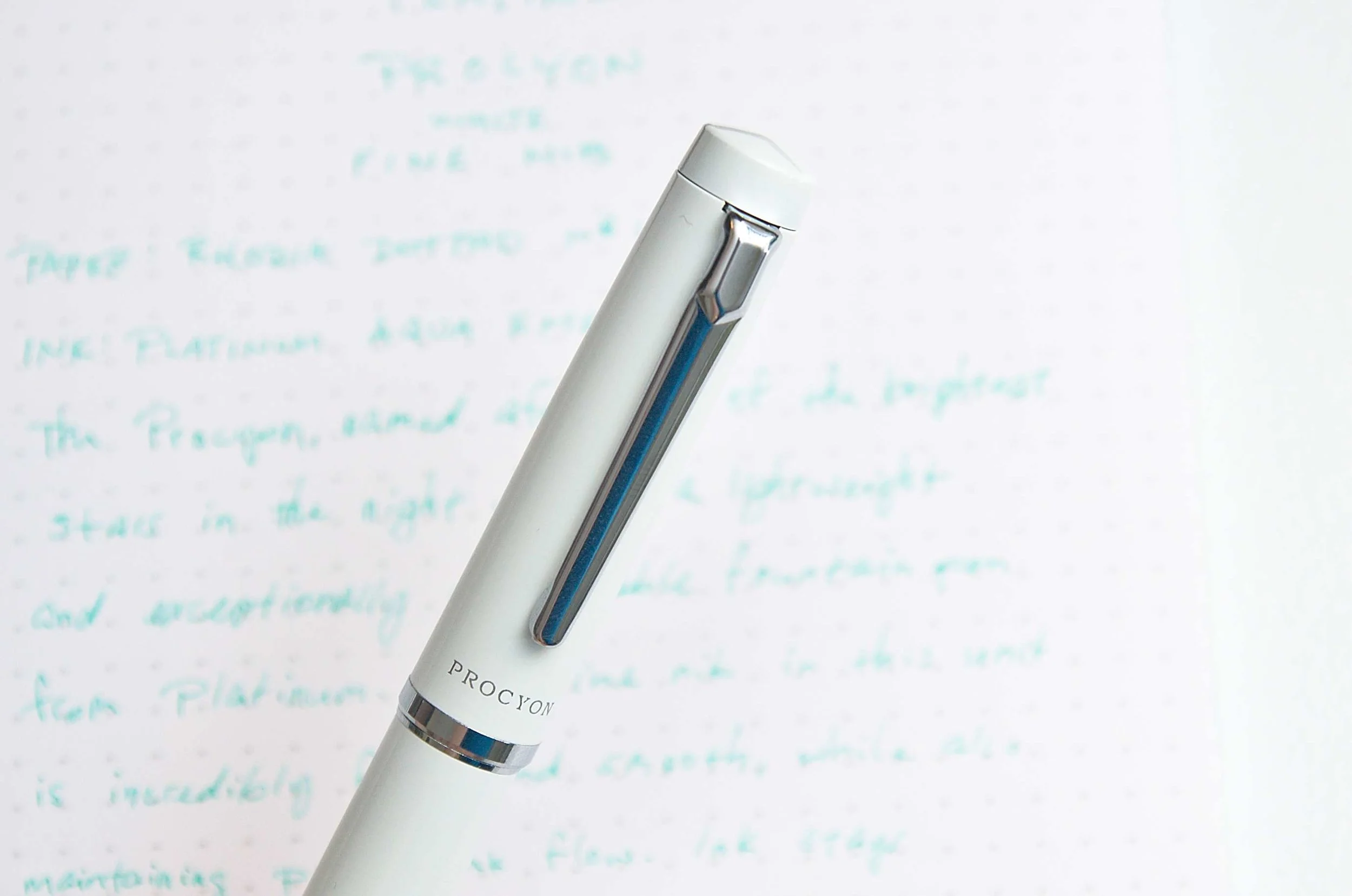
The exterior of the pen is a classy aluminum with either a high polish finish or a matte texture depending on the color option. In the case of my unit, the porcelain white finish is shiny without being flashy. It's a great finish, and I've really enjoyed the color, even though the orange one is really calling my name.

The clip is very sleek and also quite strong. The pen is very secure when attached to something, and I haven't any issues with it coming loose in my bag or pants pocket when on the move. The top of the cap and the bottom of the pen body both feature a convex shape that adds a bit of depth to the pen and borrows from other popular models in a higher price range. Throughout these pens, the accents are all chrome.

To open the pen, simply unscrew the cap. Unlike a lot of screw caps, this one only needs a half turn to open or close. It's a very smooth motion, and after getting used to it, I kind of wish all my pens only required half a turn to open and close. The threads are smooth and it feels like a much more expensive pen when handling the cap system.

Another incredibly nice feature of this cap is what Platinum call the "Slip and Seal" system. Basically, you can leave this pen capped and unused for weeks (maybe even months?) and it will write like a champ when you decide to pick it back up. No skipping, hard starts, stuttering — just smooth ink comes out after weeks of no use. I tried this myself, and I was impressed. If you're like me and tend to have too many pens inked up at a time, this is a great feature.

Once the pen is uncapped and it's time to write, you notice the translucent dark gray grip section. It's plastic and looks significantly cheaper than the rest of the pen. But, it feels great in the hand. The small ridge at the base of the grip is a perfect tactile bump for your fingers when writing, and the plastic is smooth but still grippy. And the translucency also cuts down on visible finger prints.

The one area that this pen obviously cut costs is the aesthetics of the nib. It's a great writer, but it looks like the same nib that comes on the Preppy, which are just a few bucks. The shape is very simple, there's no scroll work or decorative touch, leaving it plain and uninspiring. That being said, it does have a small Platinum "P" logo and a the nib size information, but these are just the basics when it comes to nibs. I understand that this price point is difficult to hit, but it would have been great to add something to this nib to differentiate it from the $5 Preppy nibs.

So maybe it doesn't look fancy, but how does it write? The good news is, it writes exceptionally well. The model I have features a fine nib, and it's not a disappointment. The nib is stiff and steadfast while remaining smooth and consistent. I've done zero modifications to the nib simply because it wrote perfectly out of the box. For a pen in this price range, I wish I could say this is the normal experience, but it just isn't. This is a great writer, and I couldn't be happier with it. There's almost no flex in this nib, but that's not to be expected in a Japanese fine unless otherwise mentioned in the product description. If you like a nib that's firm as a nail while also being smooth and consistent, you can't go wrong here.

I've really enjoyed writing with the Platinum Procyon over the last several months. I wasn't sure what I'd think of it based on the price and description, but it has surprised me and earned its place on my desk.

The Platinum Procyon is available in Porcelain White (featured here), Deep Sea, Persimmon Orange, Citron Yellow, and Turquoise Blue. The Deep Sea color-way also has an option of Fine or Medium nibs, but the rest of the colors are only available with a Fine nib.

(JetPens provided this product at no charge to The Pen Addict for review purposes.)

Enjoy reading The Pen Addict? Then consider becoming a member to receive additional weekly content, giveaways, and discounts in The Pen Addict shop. Plus, you support me and the site directly, for which I am very grateful.

Membership starts at just $5/month, with a discounted annual option available. To find out more about membership click here and join us!

Posted on July 17, 2019 and filed under Platinum, Fountain Pens, Pen Reviews.

Parker Jotter XL Ballpoint Pen Review

When I think of classic ballpoint pens, the first one that immediately comes to mind is the Parker Jotter. There are older ballpoint pens, and there are better ballpoint pens, but there is only one Parker Jotter.

It's place among the pantheon of all-time great pens is well-deserved. Parker has treated it as such, with regular updates over the decades.

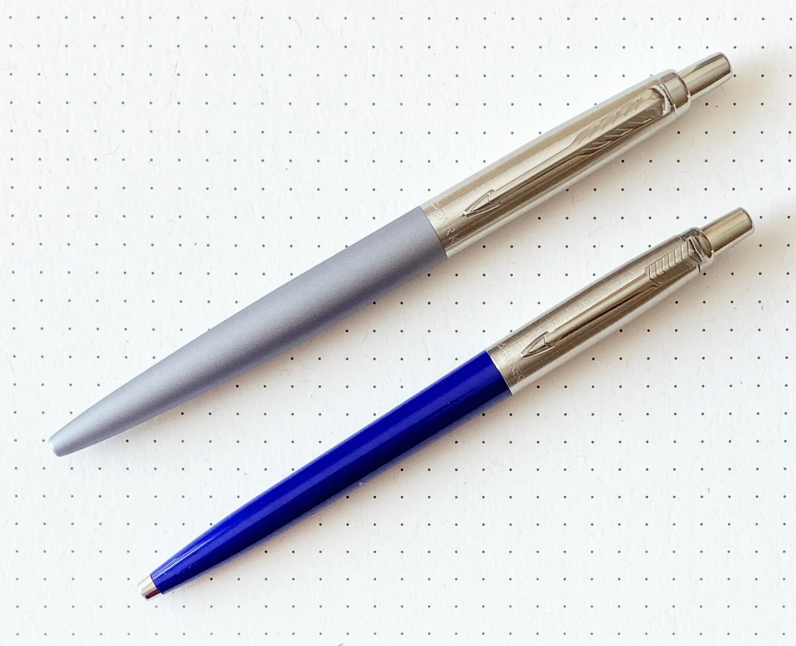
The most recent to hit the shelves is the Parker Jotter XL. As a Jotter fan myself, I was anxious to give this one a shot. And, while I like it fine, it's not compelling enough for me to recommend it over the classic-sized Jotter.

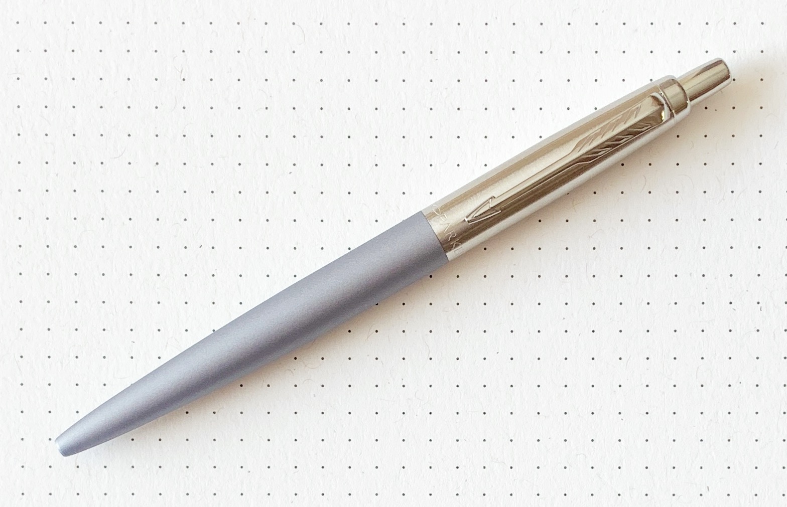
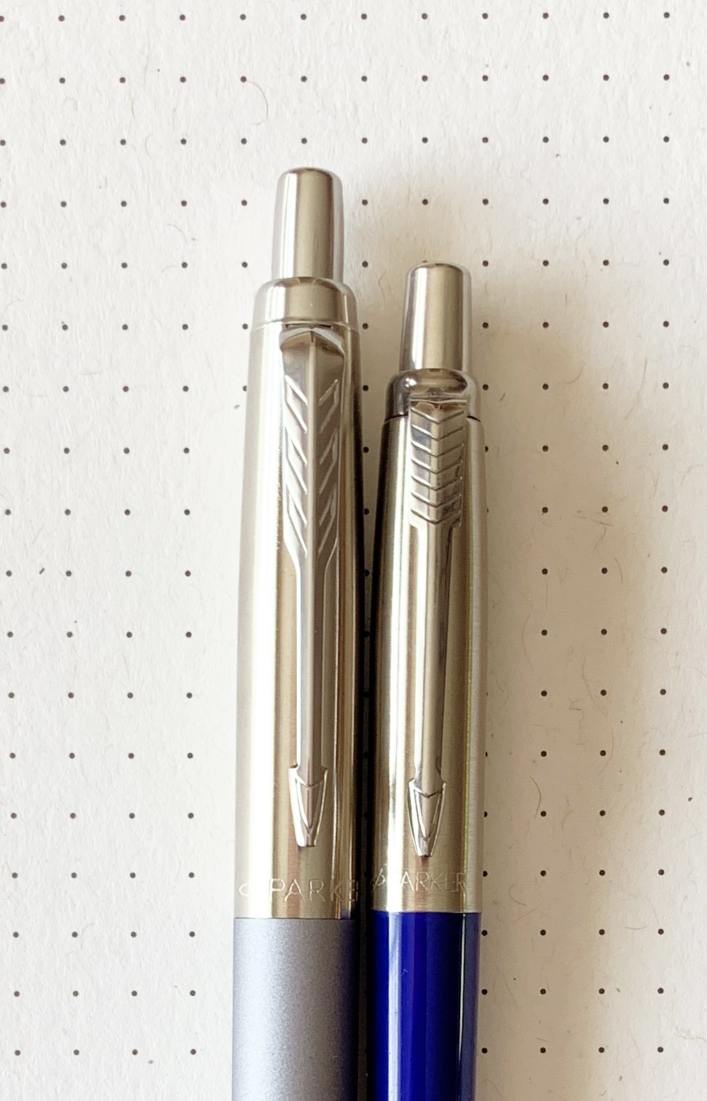
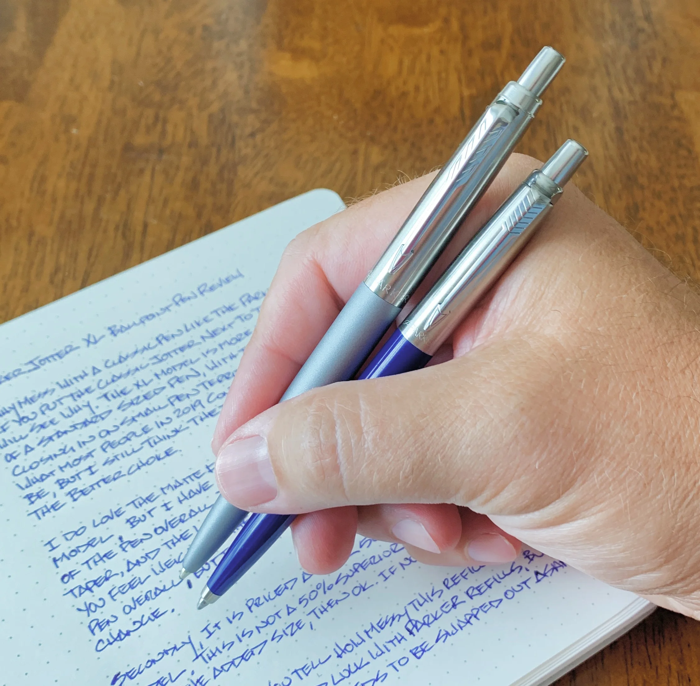
Let's talk about the XL moniker first. As it relates to the original, yes, it is longer, wider, and heavier. That puts it squarely into standard pen size for me, as the basic Jotter is actually a smaller-sized pen. That small size was certainly closer to expectations from this ubiquitous pen in its 1960’s and 70’s heyday. But like almost every other product that has been around this long, bigger is assumedly better.

I don't think the larger size serves the Jotter well.

The Jotter has always been a small, skinny, lightweight pen, with a plastic lower barrel and a thin metal upper barrel and clip. It tapers down towards the tip of the pen, and yes, with that thinness I see it being a non-starter for those with large hands. The XL does solve that issue, but I think that is where the benefits stop.

Due to the taper that is also present in the XL, the pen becomes more unbalanced the lower you grip it. It is a high-grippers pen, if you will. The top weight shift is not drastic - it's still a generally light pen - but I could feel it instantly.

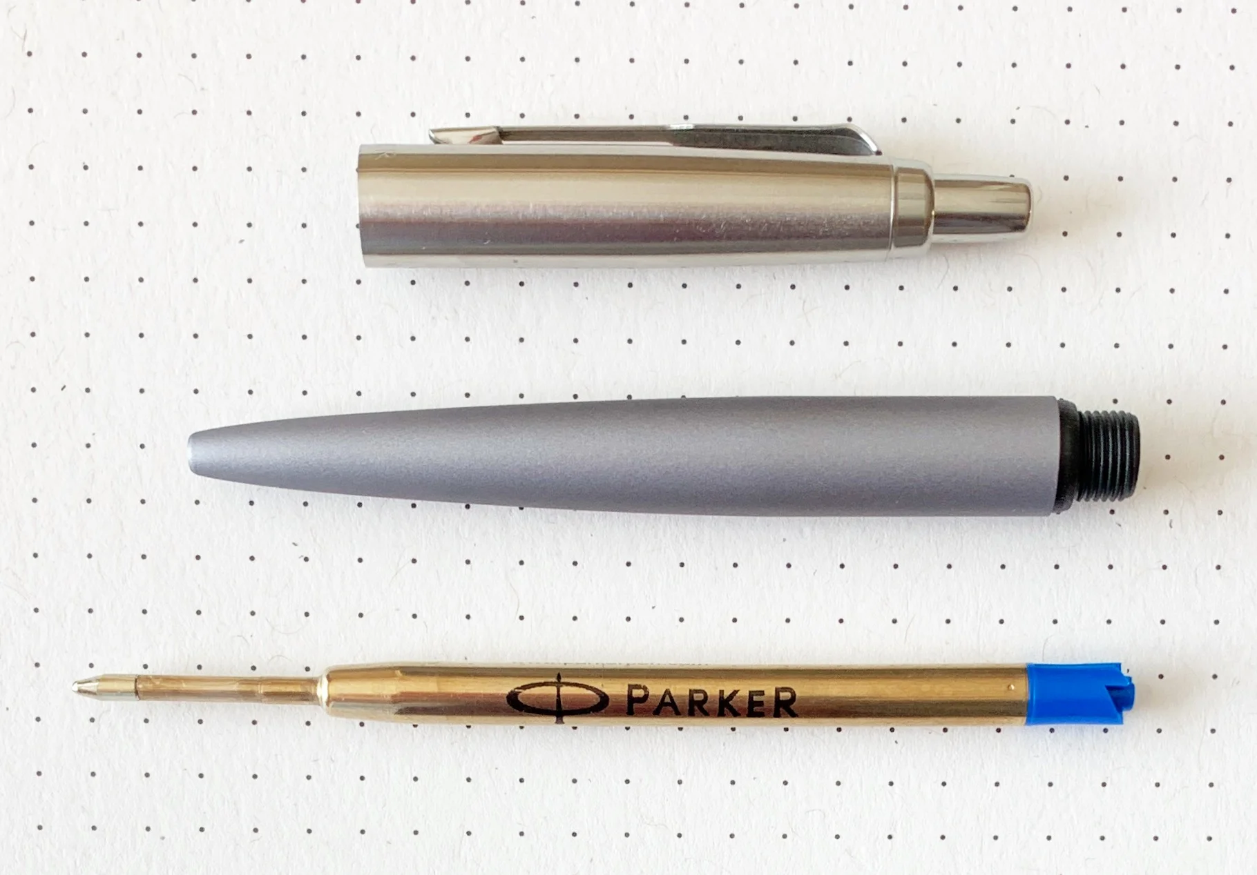
The refill also does this pen no justice. It shipped with a standard Parker 1.0 mm blue ballpoint refill, and while the smoothness and color were enjoyable, it was a blobby mess. Ballpoint refill technology has improved greatly over the years, so what passed for reasonable ink output a decade or so ago no longer cuts it. As I wrote, the ink collected on the tip, and subsequently transferred to the page when I rotated. I hate messy ballpoint pens, although it is correctable by swapping it out.

That brings up the biggest issue I have with this pen: The price. At over 60% more than the standard ($23.50 vs $14 at JetPens) it is only justifiable if a short, specific set of criteria are met. One, if you are a Jotter fan and the XL barrel fits your hands better, or two, if you are buying it as a gift. It's tailor made for engraving.

That's it in my book. It's not different enough for me to choose it over any of the few standard Parker Jotters I already own and love. Make it in bright orange or hot pink and I may change my tune (and the refill) but otherwise I'll stick with what has worked for decades.

(JetPens provided this product at no charge to The Pen Addict for review purposes.)

Enjoy reading The Pen Addict? Then consider becoming a member to receive additional weekly content, giveaways, and discounts in The Pen Addict shop. Plus, you support me and the site directly, for which I am very grateful.

Membership starts at just $5/month, with a discounted annual option available. To find out more about membership click here and join us!

Posted on July 15, 2019 and filed under Parker, Jotter, Ballpoint, Pen Reviews.