Posts filed under Pen Reviews

Wancher PuChiCo - A Pen for Ants?

(Kimberly (she/her) took the express train down the fountain pen/stationery rabbit hole and doesn't want to be rescued. She can be found on Instagram @allthehobbies because there really are many, many hobbies!.)

We all have our reasons for picking the pens we buy. Often, there is something about its look, design, shape, or color. Maybe it has a really cool nib - Monoc, stacked nibs, and flex nibs are some that come to mind. Maybe there is some personal history like a Pilot Myu that was manufactured and stamped with your birth month and year. Other times, something is so ridiculous, you can’t help but get it. That’s what happened to me at last year’s SF Pen Show.

I was at Kirk Speer’s table getting a nib grind when I saw one of the most adorably cute pens I had ever seen and I had to have it.

Wancher PuChiCo, Black Chocolate Orange, though it’s hard to tell how ridiculous it is on its own.

The PuChiCo is part of Wancher’s sub-brand 1xOnexWan, which focuses on more affordable offerings. The PuChiCo is one of three models in that lineup (the other being PoChaCo and Mofu) and costs around $25-30.

The PuChiCo is only available as an eyedropper, and it can hold ~0.5 ml of ink, which is a wee bit more than a Kaweco mini converter (a standard international cartridge can hold about 0.8 ml). I inked mine up with Diamine Orange and quickly realized that I had to leave room for the nib unit, so don’t fill it all the way!

Looking down into the barrel of the PuChiCo, you can see that there is a black o-ring - this is where the nib unit sits against once it’s screwed back in, aka this is your fill line.

I put some dark ink in it so you could see roughly how much ink it holds. The dark part near my fingers is from the black nib unit, and the bottom ⅓-½ is the ink.

You can get the PuChiCo in Extra Fine or Fine - I chose Fine. It wrote right away with no issues. I used it 26 times since I first inked it on Sept. 1 and finally wrote it dry a couple weeks ago, each time with zero issues despite how long it was since I last used it. There is also an o-ring on the nib unit to prevent leaks and having been on a dozen airplanes since I got it, there have been no burps either. I was pleasantly surprised at how nice and smooth the Fine nib felt. The nib and feed are similar in size and shape to a Kaweco Sport, but they aren’t exactly the same.

PuChiCo, Fine, with Diamine Orange.

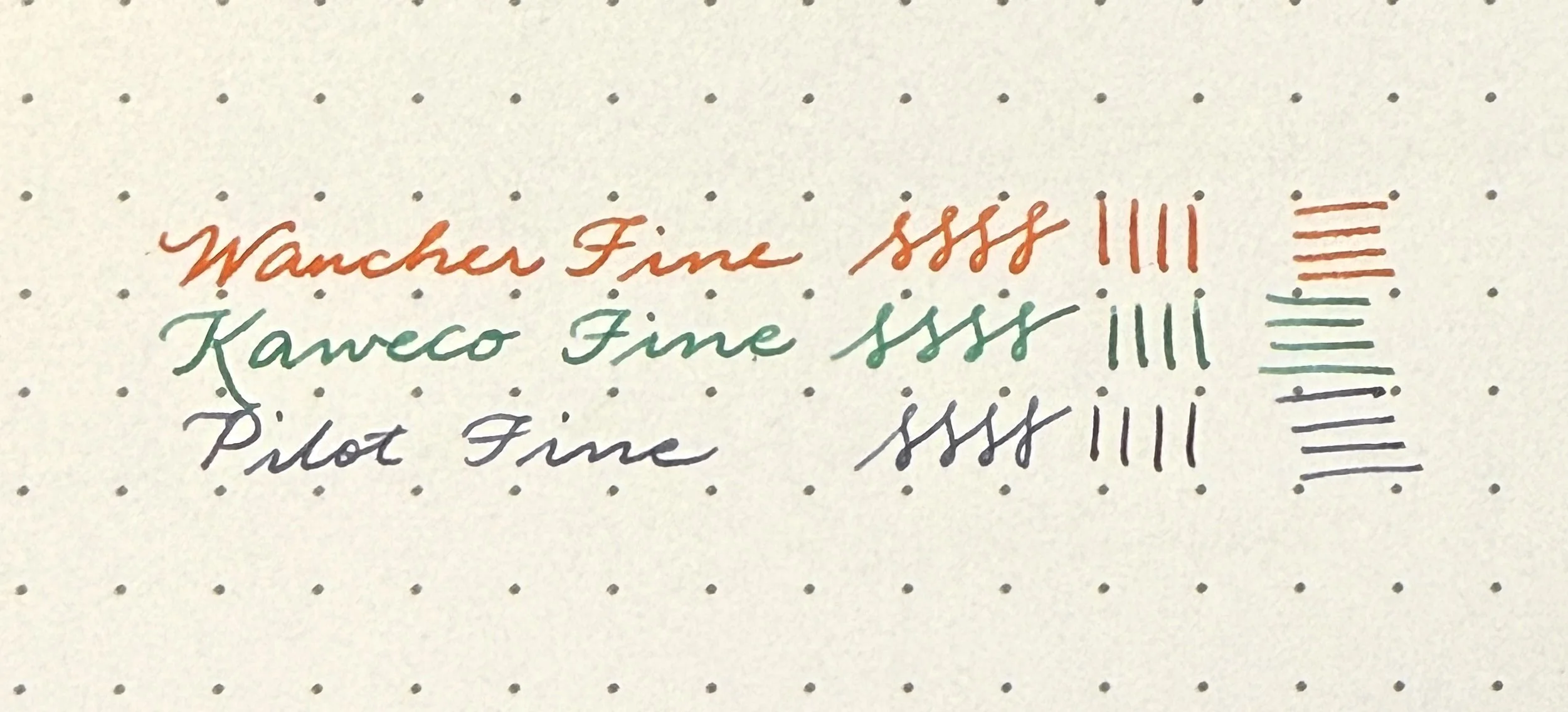
Writing samples of the PuChiCo Fine (top), Kaweco Sport Fine (middle) and Pilot VP Fine (bottom). It’s pretty close, but the Pilot Fine is finer than the other two.

Similar size/shape nib as the Kaweco Sport (ignore the not-yet-cleaned PuChiCo.)

PuChiCo’s feed (left) has more fins and a slightly different shape.

I usually don’t post my pocket pens, not even my Schon Pocket 6 or Kaweco Sport, but I have to post the PuChiCo. It is less than 2.5” long (60mm) un posted and only 3.5” (90mm) long when posted. Even though I love how cute this PuChiCo is, as well as how nicely it writes, I wish that it posted more securely. You really have to push the cap onto the barrel, otherwise the cap pops off easily. Despite my firm posting, I haven’t seen any marks or scratches on the barrel, so that’s a plus.

PuChiCo (left) next to a Kaweco Sport.

Uncapped - I did mention how small this thing is, right?

Posted PuChiCo next to an unposted Sport. It’s still not as long as the Sport, but it’s getting there and is usable for me. Probably still unusable for folks with larger hands or who like gripping their pens further back.

This is ridiculously small unposted. It’s like I have giant hands, lol.

So much better when posted.

Comparison with other pocket pens: Left to Right: PuChiCo, Schon Dsgn Pocket 6, Ensso XS, Kaweco Liliput, Kaweco Sport, Sailor Pro Gear Mini, TWSBI Mini.

Even posted, the PuChiCo is nowhere close to the other posted pocket pens in length.

This article wouldn’t be complete if I didn’t show the PuChiCo with my other stationery for ants, the Kokuyo Campus notebook keychain (approximately A9 in size,) and a normal-sized Aurora Optima and A5 sized Kokuyo Campus notebook, both of which look enormous by comparison, lol.

I love showing it off at meetups and shows because it always elicits plenty of “Omg, what is that little thing? Does it write?” reactions. I’m hoping to get its sibling, PoChaCo, which is the larger version, and also comes in eyedropper or cartridge. The Wancher PuChiCo is available from Kirk Speer of Pen Realm in other colors, including Hawaiian Blue, Peony Pink, and others. Now to re-ink it in time for the St. Louis Pen Show next weekend!

(Disclaimer: I paid full price for the PuChiCo from Kirk Speer at the 2024 SF Pen Show. All other pens/products shown are mine.)


Enjoy reading The Pen Addict? Then consider becoming a member to receive additional weekly content, giveaways, and discounts in The Pen Addict shop. Plus, you support me and the site directly, for which I am very grateful.

Membership starts at just $5/month, with a discounted annual option available. To find out more about membership click here and join us!

Posted on June 20, 2025 and filed under Wancher, Fountain Pens, Pen Reviews.

uniball Zento Basic Gel (or maybe Rollerball?) Pen Review

uniball Zento pen review

The biggest question I have about the uniball Zento is around the ink formulation used in the refill. Is it pigmented gel ink? Water-based rollerball ink? Oil-based ballpoint ink? A mixture of two, or even three of those formulations?

According to uniball Japan (via Google Translate): "uniball ZENTO uses newly developed water-based ink that has improved ooze and quick drying while maintaining the writing comfort of conventional water-based ink.”

According to uniball North America: “The uniball™ Zento features a liquid gel ink that dries quickly while providing a super smooth flow.”

According to JetPens: “Ink Composition: Pigment-Based, Water-Based”

Well, that’s as clear as the Black ink it lays down on the page!

uniball Zento Refill

Why does this matter so much to me? The type of ink sets expectations, and provides context. For myself, who likes to explain these things to someone looking for their perfect pen, this makes it challenging to narrow down.

For example, here are the currently available gel ink pen models from uniball:

  • Zento

  • One

  • 207

  • 207 PLUS+

  • 307

  • Signo DX

  • Signo RT

  • Impact

There are other models, and other barrel shapes and styles available, but I believe these 8 are the different refill types and formulations (the last three listed could use the same Signo ink formulation, but all write differently to me.) Even if there were only five pen and ink types, where does the Zento fit in?

uniball Zento comparison

L to R (all uniball): Zento, One F, DX, 307, Jetstream Lite Touch.

The ink is dark and smooth, and it performs like a gel ink on the page, hence my categorization alongside other gel ink pens. It’s closest to the Signo and 207/307 pens as far as darkness of ink, but behind the One, which is designed to have more saturated ink colors. It’s smooth, like the entire 0.38 mm lineup I tested, which is a credit to uniball’s manufacturing quality and consistency.

uniball Zento ink comparison

Not much you can tell here, other than the One is the darkest, and the 307 put down a wider line, despite the same tip size.

Still I ask: why? Why the uniball Zento? I don’t know. The ink is great, but not superior. The barrel is a combination of the One and the new Jetstream Lite Touch, which is fantastic, but seen in other models. The cost is average, at around $3 for the Basic model. It even had two premium options on launch - the $10 Flow model, and the $27 Signature model - which tells me uniball REALLY believes in this pen, but I can’t shake the question.

I don’t think I’ll have a satisfactory answer until uniball begins to pare down their pen offerings, or clarifies the marketing. They have the data, and know their markets much better than I do. And hey, I LOVE that there are new pens for me to talk about. I simply don’t know when I’ll ever choose, or recommend, the Zento over the One, the DX, the Lite Touch, or a litany of non-uniball competition.

uniball Zento Writing

No bleed, no feathering - as uniball intended.

Or maybe the Zento is the ONE TRUE ROLLERBALL ink replacement, and the uniball Vision series will be completely replaced? One can dream.

I would recommend the Zento over the 207/307 models, and the barrel is better than the RT. If they are able to add interesting ink colors into the mix, I might take another look. Until then, the best I can say is that if you try it, you won’t be disappointed, but I don’t think it is the best at anything, or unique in any special way.

(JetPens provided this product at no charge to The Pen Addict for review purposes.)


Enjoy reading The Pen Addict? Then consider becoming a member to receive additional weekly content, giveaways, and discounts in The Pen Addict shop. Plus, you support me and the site directly, for which I am very grateful.

Membership starts at just $5/month, with a discounted annual option available. To find out more about membership click here and join us!

uniball Zento Mnemosyne
Posted on June 16, 2025 and filed under uniball, Zento, Pen Reviews.

Pilot Vanishing Point with Special Alloy Nib Review

(Kimberly (she/her) took the express train down the fountain pen/stationery rabbit hole and doesn't want to be rescued. She can be found on Instagram @allthehobbies because there really are many, many hobbies!.)

As a self-professed Pilot Vanishing Point (or Capless) fan, I was a little surprised at myself for not owning one with the “Special Alloy” nib, which I will be referring to as “steel” even though I don’t know for certain what alloy they used. I think “old me” had fallen into the trap of gold must be better than steel, especially since all the VP/Decimo/Fermo/etc pens had gold nibs, so I never really gave it much thought. At one point, I wanted to have Hiroko Makino of Bokumondoh do some urushi & raden work on a VP for me, so I went and ordered this steel VP because it’s significantly cheaper than a gold one, and I didn’t have the time to wait for a deal on the secondary market. I figured I could always swap in one of the other gold VP nib units later. I opted to send her different pens, so I decided to ink up this VP anyway to see how it wrote.

Pilot Vanishing Point with Special Alloy Nib Review

Pilot Vanishing Point, Deep Yellow with steel Fine nib (left), Blue Carbonesque with 18kt gold Fine nib (right.)

I originally put Jacques Herbin Brun Eiffel in the Deep Yellow VP cuz you know me and matchy matchy inks. I inked up the Blue Carbonesque VP with De Atramentis Sherlock Holmes (aka “Night Blue”). Paper is Kokuyo Perpanep Tsuru Tsuru.

Pilot Vanishing Point Writing

Blue Carbonesque VP (top) and Deep Yellow VP (bottom.)

Despite both nibs being Fine, the gold nib felt just a wee bit softer and also gave a slightly wider line. The steel VP nib definitely felt more nail-like by comparison, not that the gold nib was bouncy or flexy by any stretch. But I could definitely feel the difference between the two.

So then I thought, well, maybe it’s the ink, so I put Brun Eiffel in the 18kt gold VP nib, and both nibs felt a bit more similar.

Both had similar line widths in print but it was more obvious with cursive, that the steel nib had a finer line.

Zooming in on some lines and squiggles, you can see that the top lines (18kt gold) are slightly wider than the bottom ones (steel.)

While I wouldn’t say the Jacques Herbin Brun Eiffel was a dry ink, it certainly isn’t as wet as De Atramentis, so I went and cleaned out the Deep Yellow VP and inked that up with DA Sherlock Holmes. I was surprised that the wetter ink didn’t produce a wider line, if anything, it almost looks like it is finer than it was with the Brun Eiffel, especially in print. I did a bit of writing after cleaning and inking to make sure it wasn’t due to a wet feed, etc., so it doesn’t make any sense.

Both pens inked up with De Atramentis Sherlock Holmes, the steel nib gave a thinner line, especially with print. The difference is less obvious with cursive.

Once again the 18kt gold nib (top) produced wider lines than the steel nib.

Before you jump to any conclusions about steel vs gold, I would also like to add that the steel writing experience was quite nice. I definitely prefer Medium nibs (in general) to Fine nibs, but the Deep Yellow VP with the steel nib wrote well and I didn’t have any problems with it in the 3 months that it’s been inked up. I’ve used it on 10 different occasions (thank you, FPC, for that handy data) and never had any hard starts, despite Brun Eiffel not being a super wet ink. I don’t love the EF VP nibs (or most EF nibs, for that matter), so this steel Fine is about as fine as I would want to write with on a regular basis. I was very pleasantly surprised at the experience and am glad I bought it.

The “special alloy” nib Pilot Vanishing Points are also available in Medium (I didn’t see any when I was originally shopping for it) as well as Fine, and seem to only be available in Black, Dark Blue, and Deep Yellow. I would assume that the Medium steel nib would feel similar, e.g. finer than the gold Medium, with a stiffer/firmer writing experience. To my knowledge, these steel nib Vanishing Points aren’t sold by US retailers besides Amazon, which was where I ordered mine. Prices range from $75-95 before sales tax. Considering a VP nib unit alone costs about $90-110, this is a pretty good way to try a real Pilot VP (not clone, homage, etc) to make sure you really like it.

(Disclaimer: I purchased mine on Amazon last year and it seems to be currently unavailable in Fine in the Deep Yellow. Here is a non-affiliate link to the Dark Blue VP, Fine, Special Alloy.)

Posted on June 13, 2025 and filed under Pilot, Vanishing Point, Pen Reviews.