Posts filed under Robert Oster

Robert Oster Cities of America Miami Fountain Pen Ink Review

Robert Oster Cities of America Miami Fountain Pen Ink Review

What is it about interesting blue fountain pen inks that makes me keep buying similar shades over and over again? By all reasonable measures, I don’t need Robert Oster Cities of America Miami, but what about my stationery life is reasonable? Give me this ink!

Right from the initial inking of Miami, I was wowed. This teal ink was created to mimic the Atlantic Ocean off the coast of Miami Beach, and while I can’t say I have in-person experience with the color of the water there, pictures tell me that it is stunning - like this ink.

Robert Oster Miami

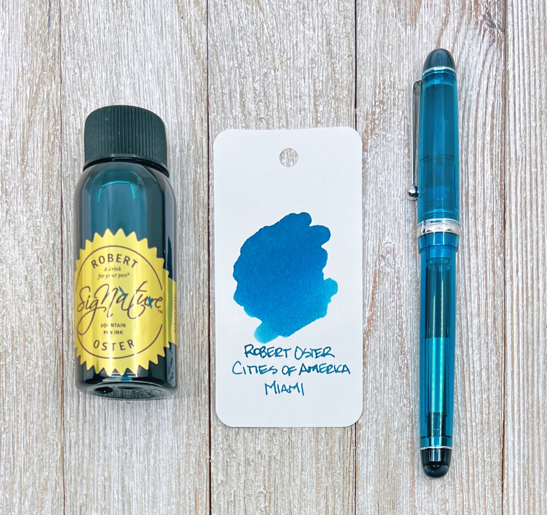
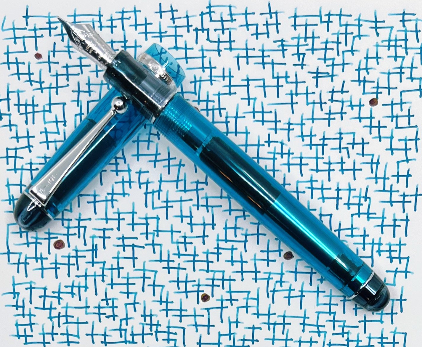
Miami falls squarely into the teal category for me. It’s equal parts blue and green, and the right shades of each to make this ink stand out on the page. I’ve tested it on many papers, and it hasn’t failed to show off its shading, and has behaved perfectly.

One of the reasons I might be enamored with this ink is how perfectly it matches the pen I chose to ink it up in. I ordered the Pilot Custom 74 in Teal for a future review at the same time I ordered this ink, with no intention that it would be used this way. Teal ink looks great in any pen, but once I did an initial swab of Miami and saw how close the Pilot acrylic was, well, that was an easy choice.

Robert Oster Miami Writing

And the right one, too. I’ll fully review the Custom 74 in the coming weeks, but the 14k Medium nib in this model shows off this ink exquisitely. Have I fawned enough yet?

All sub-categories of Robert Oster Miami land in the medium range: Medium flow, medium shading, medium dry time. It is not waterproof.

Robert Oster Miami

Price-wise, all Robert Oster inks provide some of the best bang-for-buck on the market. $18 for a 50 ml bottle is more than reasonable.

There are currently seven inks in the Cities of America series. I was trying to be good and only ordered two, one of which has already been given away, and the other of which is not going to be leaving my arsenal for quite some time. The only questions left to answer is how many more inks will be in this series, and how many more will I purchase?

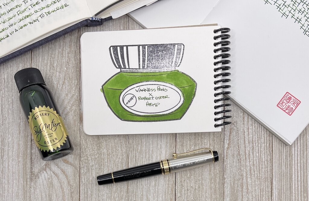
(I purchased this product at a discount from Vanness Pens for review purposes.)


Enjoy reading The Pen Addict? Then consider becoming a member to receive additional weekly content, giveaways, and discounts in The Pen Addict shop. Plus, you support me and the site directly, for which I am very grateful.

Membership starts at just $5/month, with a discounted annual option available. To find out more about membership click here and join us!

Robert Oster Miami
Posted on January 24, 2022 and filed under Robert Oster, Ink Reviews.

Vanness Pens x Robert Oster Hemp Fountain Pen Ink Review

Vanness Pens x Robert Oster Hemp Fountain Pen Ink Review

It takes a lot to get me to like a green ink.

Akkerman #28 Hofkwartier Groen is far and away my favorite, and is a top five personal ink, regardless of color. The green is bright, no doubt thanks to a hefty dose of yellow in the mix, and shades wonderfully. It’s flat-out fun to use.

Well down the line after that shade comes the classic Rohrer & Klinger Alt-Goldgrun, primarily because it is weird as heck, and shades like a beast. It’s one of those inks that once you see it in person you know you have to have it. Faber-Castell Viper Green is a more traditional shade of green, but has an electric/searing nature in its tone. This would fall into an everyday writing green, but with a bit of an edge.

Vanness Pens x Robert Oster Hemp Fountain Pen Ink

That’s mostly it for my green use, at least until I took a chance on Hemp, one of the three Vanness Pens collaborations with Robert Oster. This one is going into the rotation, most likely as my second green behind Akkerman #28.

Green inks are a short list for me, although I can’t explain why. Unlike blue, orange, or purple, green has to be a little weird for me to use. Traditional greens in the Kelly or Forest shades need not apply. Yellow undertones are good, which brings out the brightness, and having odd questions come to mind, like “What color of frog is this?” only serve to make it more fun.

Vanness Pens x Robert Oster Hemp Fountain Pen Ink Dry Time

I wasn’t sure what color Hemp would actually be. Was this to represent fresh growth, or in a processed for production phase? It’s definitely the former, with a good combination of established green in the middle, and the youth of yellow around the edges.

Vanness Pens x Robert Oster Hemp Fountain Pen Ink Writing

In my bank paper Musubi Notebook I saw more shading than I expected, using an Aurora Optima with a Medium gold nib. On Rhodia, the color was more flat, but bright (and had a loooong dry time.) On Tomoe River paper, the range of darkness showed up. The swab on the Col-o-ring Oversize is the best representation of the color that I see when writing with a nib.

The only remaining question I have at this point is how the ink will look on the page in one of my finer nibs. will the brightness and character still show up? I hope so, because I’ve answered the other important question - do I like this ink - already. And now I’m ready to use it more.

(I bought this ink from Vanness Pens at a discount.)


Enjoy reading The Pen Addict? Then consider becoming a member to receive additional weekly content, giveaways, and discounts in The Pen Addict shop. Plus, you support me and the site directly, for which I am very grateful.

Membership starts at just $5/month, with a discounted annual option available. To find out more about membership click here and join us!

Vanness Pens x Robert Oster Hemp Fountain Pen Ink Lines
Posted on March 1, 2021 and filed under Robert Oster, Ink Reviews.