Posts filed under Robert Oster

Robert Oster Whiskey Fountain Pen Ink Review

(Jeff Abbott is a regular contributor at The Pen Addict. You can find more from Jeff online at Draft Evolution and Twitter.)

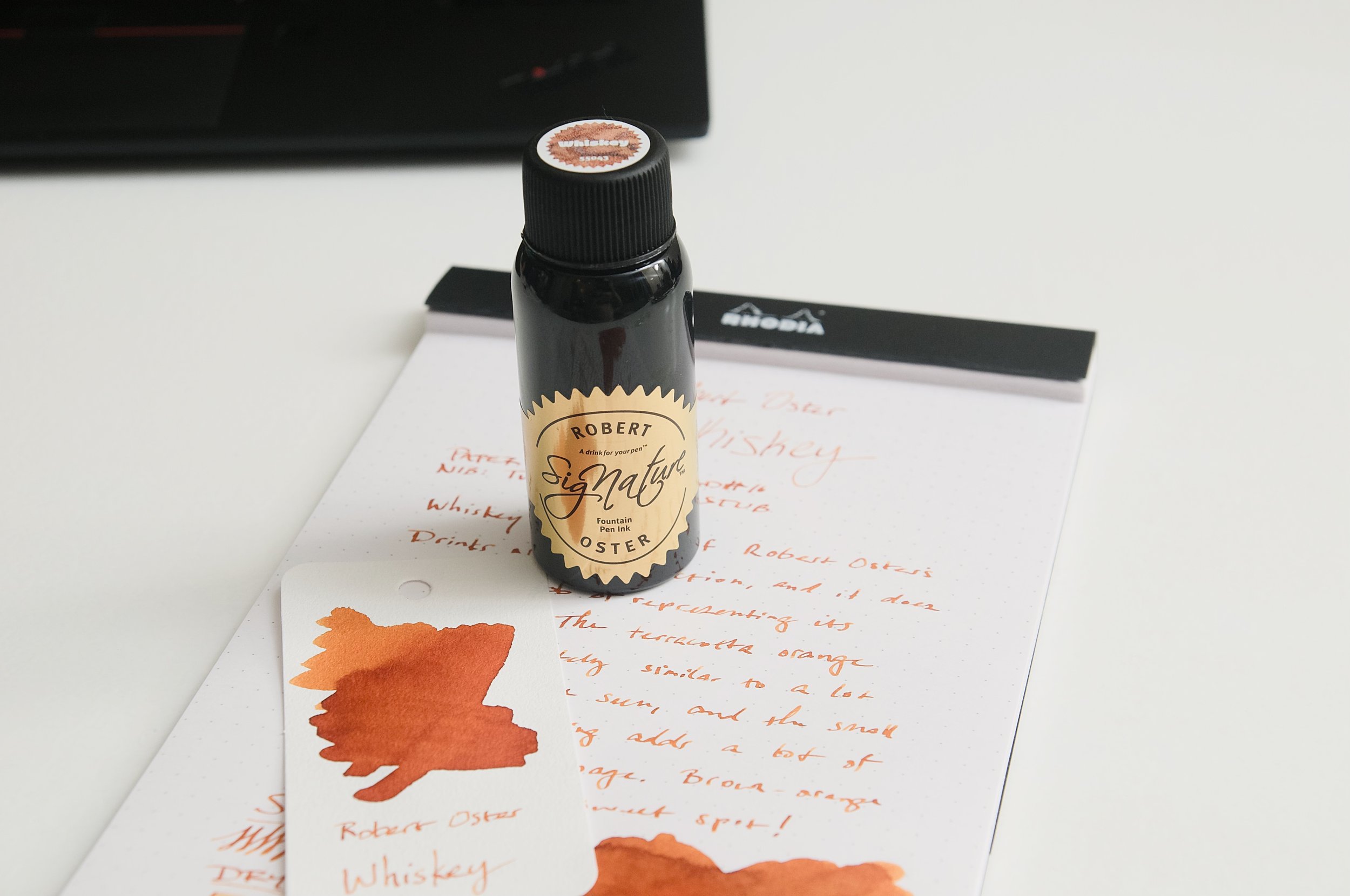
Ever since I saw Robert Oster's Whiskey fountain pen ink, I've wanted to try it out. For one reason or another, I either forgot to add it to an order or didn't have luck with it being in stock. But, I finally have it and have been using this brown-orange for the last couple weeks.

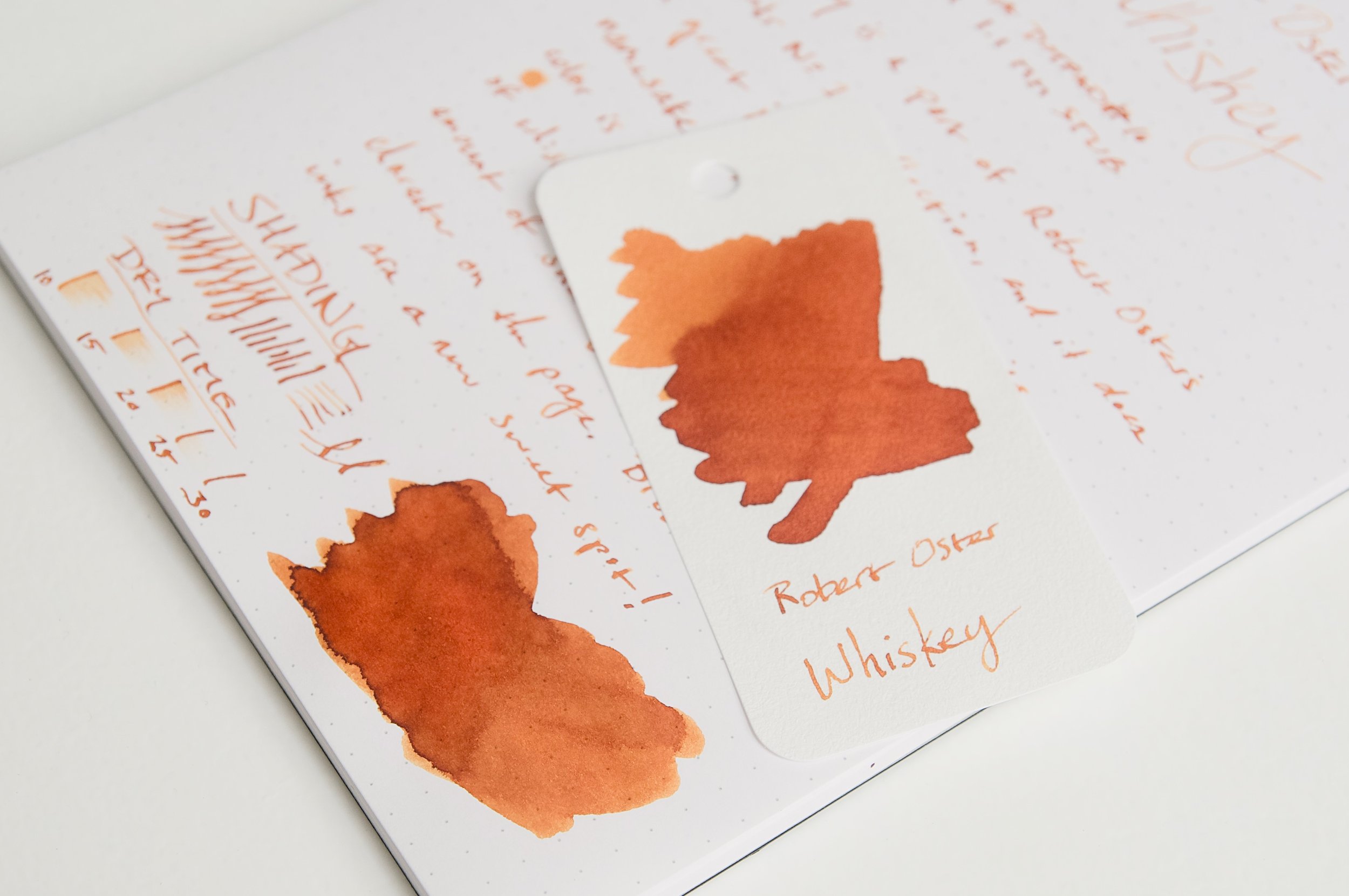
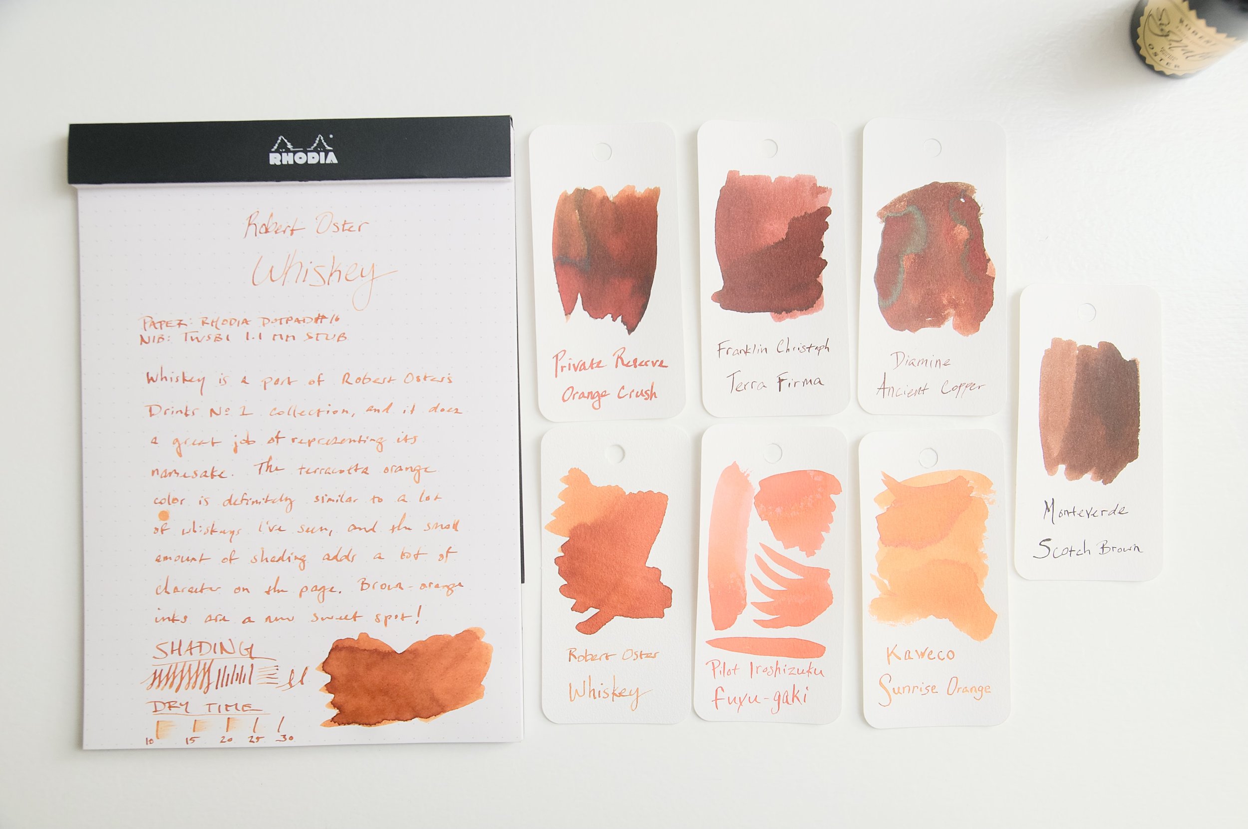
Whiskey is part of a collection of ink called Drinks that represents different drink colors. The caramel color of this particular ink does a fantastic job of emulating the smooth amber/brown liquid it's named after. Described as a "terracotta orange," this is an earthy ink with a little bit of shading to add some great character.

While whiskeys vary a lot in color, I think the hue that Robert Oster captured in this ink is a fantastic representation of the general spirit. As someone who has almost no other inks that fall into this brown-orange territory, I'm afraid I might have stumbled into a new favorite color category. It reminds me a little of Diamine's Ancient Copper, but with a lighter hue and more orange. In all, it's a fantastic color that suits everyday writing while adding a bit of flare that's easy to see on the page.

Aside from the warm, caramel color of this ink, it acts like every other Robert Oster ink I've ever tried. When it comes to the writing experience and my expectations, Robert Oster inks have gotten a little boring — meaning they always behave well in the pen and provide an excellent writing experience. With Robert Oster inks, you really only have to focus on the colors you like as well as other characteristics like shading and sheen. Regardless of what you pick, the baseline performance and behavior is stellar.

There's no feathering or bleeding to speak of (I'm not counting a little bit of feathering in one of my swatch samples because that's not what I consider a normal use). Show-through is minimal given the overall light/medium shade.

My favorite attribute of this ink apart from the color is the light level of shading you get with it. Like the spirit, there isn't any variation in the base color, but the fact that it's a liquid means it can look lighter or darker depending on how much of it is in a vessel, how much light is traveling through it, etc. This small bit of shading that the ink exhibits is a perfect nod to the fact that it's emulating a liquid. The little bits of darker brown/orange around the edges of letters where the ink pools up is so satisfying. If there wasn't any shading with this ink, the overall color might be a little drab. The shading gives it that little touch of character that elevates it to another level in terms of visual interest.

There is some bad news, though. This is not a fast-drying ink. It takes roughly 25 to 35 seconds to dry to a point where it doesn't smudge. For me, the sweet spot for ink dry times is around 20 seconds. Anything less than that is gravy. At 30 seconds or more, it means I have to take that into consideration when choosing whether to use that specific pen. This will be even more of a consideration for left-handed writers or for anyone that grips then pen in a way that means your hand or arm trails the pen's writing direction. There will be smudges!

Despite the slower dry time, this ink instantly shot to the top of my current list of favorite inks. Back when I first saw it and liked the color on screen, I should have just picked it up. Like I said, with Robert Oster inks, you know you'll get a great ink, so it's all a matter of listening to what colors speak to you.

Robert Oster Whiskey is available in a 50ml bottle for just $18. This is on par for other Oster inks, and a great value for what you get. If you dig this color, then you won't be let down by how it performs and looks on the page!

(Pen Chalet provided this product at a discount to The Pen Addict for review purposes.)


Enjoy reading The Pen Addict? Then consider becoming a member to receive additional weekly content, giveaways, and discounts in The Pen Addict shop. Plus, you support me and the site directly, for which I am very grateful.

Membership starts at just $5/month, with a discounted annual option available. To find out more about membership click here and join us!

Posted on June 5, 2024 and filed under Robert Oster, Ink Reviews.

Did Less, Swatched More, First Impressions

(Kimberly (she/her) took the express train down the fountain pen/stationery rabbit hole and doesn't want to be rescued. She can be found on Instagram @allthehobbies because there really are many, many hobbies!.)

In the vein of last week’s article where I drastically reduced the number of steps to swatch inks, I am happy to report that I have made progress! From the first of January until last week, I had swatched 7 inks (and yes, that included the ones I did for reviews). Since last week, drumroll please, I’ve swatched 20, yes TWENTY, more inks!!! Woohoo!

As you may already know, I like to be matchy matchy with my pens and inks (black, white, clear, silver, and gold pens are the exceptions). Which means I usually start with “what general color pen do I want to use”, then I go through my swatches to find the best match, which is either an exact match, if possible, or slightly lighter or darker depending on mood. Occasionally, I like to go the other route and start with an ink that I really want to use and then pick the pen after. Don’t worry, I’m neither reviewing nor inking up all 20 inks because that would take too long; instead I’ll share some first impressions. Who knows, maybe some of these will jump out and demand to be inked!

A few things to note: (1) Some of the pictures are at an angle because the shimmer showed up better than with head-on photos, (2) even with angled pictures, shimmer is hard to pick up in photos, (3) the picture below has a different colored mat than the other swatches, hence the vastly different background color, and (4) a lot of these are Wearingeul swatches because that’s what I bought samples of and happened to trade with a friend.

Look at all these swatches - I am SO happy to be over the swatching slump!

Here are the 20 inks that I swatched in the past week, sorted roughly by color:

-- Montblanc Le Petit Prince, Rose Burgundy - I knew that I would be inking up a LPP pen since I am nearing the completion of writing out the book, but I had to make sure it matched the pen first. It is a nice shade of burgundy with a hint of copper sheen on very wet swatches. I can’t wait to use it!

-- Wearingeul Anna Karenina - This is a rich red, but not quite burgundy, ink that also has red shimmer and a touch of green sheen on wet swatches. Pretty color but I don’t need to ink up any more red pens right now.

A bit hard to see the shimmer near the bottom.

-- Wearingeul Anne of Green Gables - Yes, this is a red ink, which I was not expecting. Yes, I know that the gables are green but still, it messes with my mind. The ink is actually named “Lucy Maud Montgomery”, and is a bright red ink with some greenish-gold sheen. Off the top of my head, it reminds me a bit of Iroshizuku Momiji.

Anne of Green Gables shows up as a bit more orange than in real life but you can still see the gold sheen in the swatch.

-- Wearingeul Wendy Darling - I am so glad I got a sample of this because I would be a little annoyed with myself if I bought a whole bottle. It is a really pretty, but extremely light, pale, borderline invisible, pastel blue ink with hints of pastel pink, and has silver and turquoise shimmer. I don’t know how readable it is, especially after seeing Kelli’s review from Mountain of Ink, but I’m kind of tempted to put it in a wet Pelikan, but not now, as there are too many other colors that are catching my eye.

Wendy Darling is way too light at any angle.

-- Robert Oster Romeo & Juliet - Ooh, now this one is different, especially from Robert Oster, who isn’t typically known for chromashading. This one is a dusty blue with grey shading that is visible in swatches and I suspect, fairly visible with a wetter pen on Tomoe River and similar papers. This is definitely a contender for “ink it up”!

I really want to see Robert Oster Romeo & Juliet on some Tomoe River!

-- Wearingeul Tinkerbell - Another ink from Wearingeul’s Wendy & Peter collection, this is a light muted, dusty green ink with pearlescent (silver? gold? both?) shimmer and is surprisingly readable. Not my usual jam but that might make it a contender as well?

Wearingeul Tinkerbell looked more readable than I expected.

-- Wearingeul Tick Tock Croc - Also from Wearingeul’s Wendy & Peter collection, Tick Tock Croc is a slightly teal leaning green ink. It looks alright, but it’s not jumping out at me. And yes, silly me forgot to get Peter Pan and Captain Hook.

-- Inkebara #236 Sand - A warm yellow-brown that has some green chromashading in wetter swabs. I’ve got a lot of brown inks in pens right now but this is definitely high on the list for the next light brown pen inking.

The “line” near the light part of the swatch is where there’s some green in Inkebara #236 Sand.

-- Sailor Moroccan Mint Tea - This ink is a touch darker than the Inkebara Sand and doesn’t seem to have the green hint to it either. I’m very curious to see how it compares to Sailor x Tinterias Homemade Tortilla.

-- Diamine Tobacco Sunburst - Part of the Gibson Les Paul series of inks from Diamine, Tobacco Sunburst is a medium golden brown. I wasn’t expecting much but was pleasantly surprised at the golden tone and how nicely it shades. Again, if I didn’t have so many browns inked up already …

-- KWZ x Newcastle Pen Show, Newky Brown - A kind friend surprised me with this ink and I am over the moon because I loved drinking Newcastle in my (much) younger days and I also love KWZ ink! This is a darker reddish/orangish brown ink that could potentially show some nice shading in a drier pen.

-- Franklin-Christoph Bronze Age - Was anyone surprised that I bought this one? Me neither. The color isn’t one that instantly grabs me but it is more interesting than the photo shows - it is a darker chocolate brown that has very slight green undertones, like patina’d bronze.

-- Wearingeul 20,000 Leagues Under the Sea - Ooh, this is a pretty royal blue ink with gold shimmer. I am VERY curious to see how this compares to Pelikan’s Ink of the Year, Golden Lapis, which looks quite similar (I can’t wait to get my bottle). This is a contender since I will be need to ink up a mid-toned blue soon.

The shimmer is much more pronounced in real life.

-- Wearingeul Iaros Orna Eperanto - This is a darker, richer blue with gold shimmer and a hint of red sheen in wetter patches. It reminds me of a shimmery Diamine Blue Velvet.

-- Lamy Pink Cliff - One of those instances where I can’t get past the name because it’s not remotely pink. Not a contender for near-term inking but I will be curious to see how it compares to Lamy Blue Black, which is a favorite.

-- Wearingeul Frankenstein - A slightly blue-leaning, royal purple ink with a hint of copper sheen? Yes, please, but is it unique? Not so much, but I still love the color!

-- Color Traveler Miyoshi Pione Purple - A little moodier and more red-leaning purple than Frankenstein, this is right up my alley, but I’m looking at 8 pens with purple ink right now, so this one has to wait a bit. I’m curious to see if it sheens or has shading properties on TR paper.

Oops, accidentally added an extra “L” in my Color Traveler Miyoshi Pione Purple swatch.

-- Wearingeul Persephone - Ok, Wearingeul, I love this one. Dusty purple with purple shimmer? Yeah, short list. I don’t care which purple pen I have to clear out to make room for this one.

Don’t see purple shimmer that often!

-- Wearingeul x EndlessPens, The Black Cat - My witch-crazed friend shared a sample of this one with me and I’m glad that it’s not a “plain black ink” but has a subtle purple and grey tint to it, as well as some pink (?) shimmer. Not in any rush to put black inks in any pens but this one could pass for almost purple-black.

-- Wearingeul Hades - I got a sample of this because I was hoping it would be more blue, but it’s really a dark black ink with blue shimmer, which is kinda cool.

One of the few ways to get me to use a black ink is to put shimmer in it!

So, out of these 20 swatches, which ones am I most eager to ink up?

Top 3 picks:

Montblanc Rose Burgundy - I already knew this was going into a pen, so maybe this is an unfair pick.

Montblanc Le Petit Prince, Rose Burgundy ink with the Le Petit Prince, Red Planet pen.

Robert Oster Romeo & Juliet - the chromashading looks promising

Robert Oster Romeo & Juliet pairs pretty well with S. T. Dupont D-Inital in Shark Blue.

Wearingeul Tinkerbell - This one is giving me all the feels and I don’t know why.

It’s like Wearingeul Tinkerbell and Sailor Pro Gear Slim, Solar Term, Fuki were made for each other!

Honorable mentions:

  • Inkebara #236 Sand - I wanna see how this ink shades on TR or Cosmo Air Light paper.
  • Wearingeul Persephone - I know, I said shortlist but there are too many purple pens inked up!

There you have it, some (relatively) quick thoughts on 20 different inks. Now to write some more pens dry so I can start using these inks, and get back to swatching!

(Disclaimer: All inks are my own, either purchased from various retailers at recent pen shows including Jimmy Dolive, Franklin-Christoph, and Vanness Pens, or samples swapped with a pen friend.)

Posted on May 24, 2024 and filed under Ink Reviews, Robert Oster, Lamy, Sailor, KWZ, Montblanc, Wearingeul.

Robert Oster Polar Vortex Fountain Pen Ink Review

(Jeff Abbott is a regular contributor at The Pen Addict. You can find more from Jeff online at Draft Evolution and Twitter.)

There are many Robert Oster inks that pay homage to a city or location, but Atlas Stationers have an exclusive ink that is named after a cold weather event in early 2019 that set a lot of temperature records in the area. The cold wave, which originated from the polar vortex further north, caused temperatures in the Chicago area to dip to −23 °F (−31 °C), with a windchill of −52 °F (−47 °C). There's nothing like crazy weather that bands together a community!

Dubbed Polar Vortex, this gray ink with blue and purple tones is offered exclusively by Atlas Stationers and made by Robert Oster. As Atlas describe on the product page, the ink color matches the winter sky. I'm just glad I'm enjoying it from the comfort of my heated home instead of the frigid conditions that it borrows its name from.

Polar Vortex is definitely a gray ink, but there's a delightful amount of purple and blue hues that come through in different light and depending on the amount of ink on the page. Heavy/thick strokes are undeniably dark gray, but there's plenty of medium-gray and gray-purple in the shaded areas. One of the things I enjoy most about Robert Oster inks is the amount of shading, and this one is no slouch. The cold gray tone is definitely a perfect fit for these short winter months.

Despite being a dark ink, there isn't any significant show-through on the back side of Rhodia paper with a wet medium cursive italic nib. On thinner paper, this might be a bit of an issue, but (for my tastes at least) still totally possible to use both sides of the page. The ink also lays down a crisp, sharp line. I haven't noticed any feathering or bleeding. In terms of performance, it behaves just as I expect a Robert Oster ink to behave (meaning, it behaves very well).

Dry time leaves a little to be desired, but it's not terrible. The ink dries in as little as 20 seconds and up to 45 seconds depending on the speed of the stroke and how wide or wet the nib is. I wouldn't recommend this ink for any left-handed writers.

At $18 for a 50ml bottle, the price is similar to what you'll find for any bottle of Robert Oster ink. It's great ink, and the price fits the quality. It's a beautiful gray ink with subtle purple and blue tones, and also a reminder of a rare weather event for the upper mid-west! If it looks interesting to you, you won't be disappointed in how this ink works in your pen or in how it looks on the page.

(Brad bought this ink at a discount from Atlas Stationers during the 2023 Fountain Pen Day event.)


Enjoy reading The Pen Addict? Then consider becoming a member to receive additional weekly content, giveaways, and discounts in The Pen Addict shop. Plus, you support me and the site directly, for which I am very grateful.

Membership starts at just $5/month, with a discounted annual option available. To find out more about membership click here and join us!

Posted on February 14, 2024 and filed under Robert Oster, Ink Reviews.