Posts filed under Sailor

Sailor Bung Box Hatsukoi "First Love" Sapphire Ink Review

(Susan M. Pigott is a fountain pen collector, pen and paperholic, photographer, and professor. You can find more from Susan on her blog Scribalishess.)

I can't remember where I first saw a photograph of Bung Box Sapphire–Twitter or Instagram or a Web site–but I immediately fell in love with it, apparently a common experience with this ink. The minute I got the email from Vanness Pens that a box had arrived I ordered some. It's a good thing, too, since their entire stock of Sapphire sold out the same day.

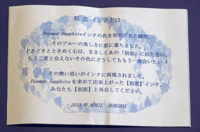
A little history about Bung Box Sapphire: apparently, the owner of the Bung Box store fell in love with Parker Penman Sapphire, so she tried to recreate the color. She called it Hatsukoi, which means "first love" (Bung Box Facebook Page), since that is the emotion the color evoked in her. I think most fountain pen lovers can relate to this experience, whether we fall in love with a particular ink color or a specific pen (or several).

An insert included with the ink tells the story of its name

An insert included with the ink tells the story of its name

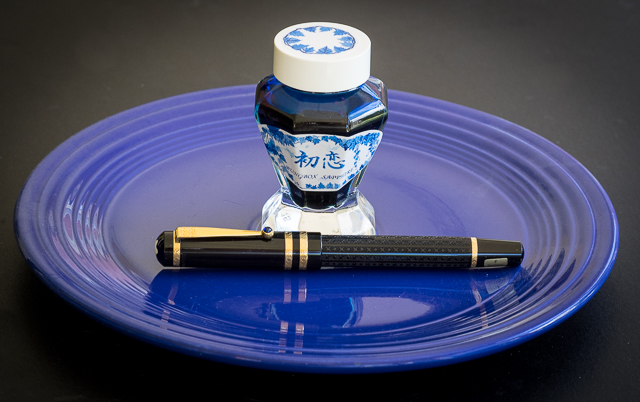
The Bung Box Sapphire ink bottle is a work of art. Compared to the usual Sailor Jentle ink bottles, these glass bottles are like miniature vases or containers for fancy perfume. I know I won't throw mine away when I've used up all the ink.

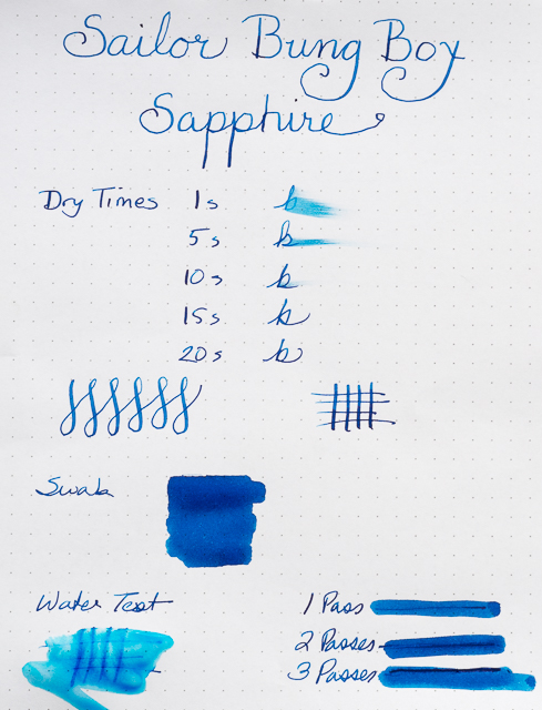
One of the best characteristics of Bung Box Sapphire is its excellent shading. As always with inks like this, the shading is most visible with wider nibs. I used my widest nibs (Pilot Parallel 2.4 and 1.5), my Nakaya music nib, an italic, a couple of flex nibs, and one fine nib to write samples.

The shading is fabulous, ranging from deep blue to a lighter, almost turquoise blue. If you look closely, you can even see shading with the fine nib.

Although the ink sparkles, I only detected sheen in my splash samples not in my writing samples. You can see a bit of magenta along the edges.

I compared Bung Box Sapphire with some of my other blue inks. All of them have distinctive characteristics. I would say Sapphire and Asa-Gao are the closest in terms of chromatography. Both have a little bit of magenta in them. But I think Bung Box Sapphire stands out (along with Akkerman Shocking Blue) as the most vivid color.

Bung Box Sapphire is an exquisite ink. It flows well and its dry times are in the normal range, at least with a fine nib on a Rhodia dot pad. With wider nibs, the dry time is longer. The ink is not waterproof.

One thing I've noticed about all my Sailor inks is that they have a distinctive odor. Apparently, they contain the chemical phenol to prevent mold or other contaminants from growing. In his glossary, Richard Binder says, "Phenol is an effective fungicide, acting as a protoplasmic poison, and was used for this purpose in ink until prohibited by law. (It is also toxic to forms of life other than fungi and is regulated as a Class B poison.) Phenol has a sweet, tar-like odor that is readily detected in inks containing it." I need to do more research on this ingredient as it can be rather caustic. I wonder if it can damage vintage pens, especially celluloid ones? Just in case, I'm not planning on using Sailor inks in any of my celluloid pens until I know more.

Sailor Bung Box Hatsukoi Sapphire is a unique, vibrant blue with excellent shading and some sheen. You can purchase this ink at Vanness Pens for $35.65 plus shipping, but only if you're really fast and lucky.

Posted on June 26, 2015 and filed under Bung Box, Ink Reviews, Sailor.

Sailor Fude Nagomi Brush Pen Extra Fine Review

I like the fact that I am seeing more and more Sailor pens of the non-fountain pen variety become available. It's possible these pens have been all over Japan for years, but I feel like it is a special treat when someone like JetPens imports them and makes them available to more people.

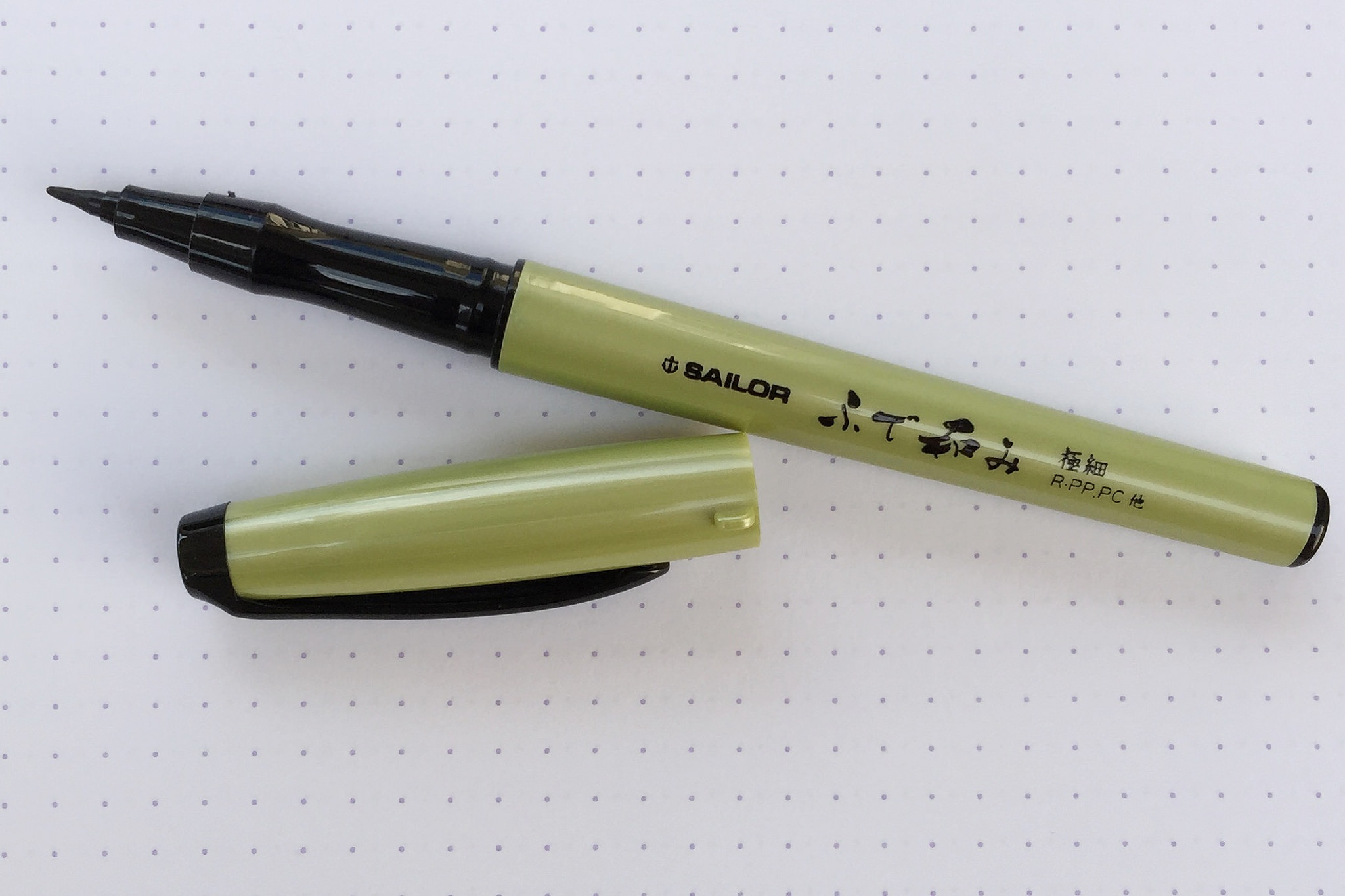
The Sailor Fude Nagomi Brush Pen was made in conjuction with a popular Japanese calligrapher named Ryofuka. She had a hand in the design of the pen, including the curved grip section, which I quite enjoy. In looking at the pamphlet of tips that came with the pen, it appears she prefers holding the pen at a very vertical angle. I find that interesting because I do that when writing, but for the broader strokes required with brush pens it seems odd.

It may work well with this extra fine model though, because there is very little line variation to be had. It reminds me a lot of the Kuretake Fudegokochi which I love for its general writing ability. This Sailor is very much the same, and will be primarily used for tasks that require smaller, more defined styles.

Many other, more standard, brush tips are available too, so be sure to take a look at all of the options that Sailor has brought to the table if you like the shape and style of this barrel.

(JetPens provided this product at no charge to The Pen Addict for review purposes.)

Posted on June 12, 2015 and filed under Sailor, Brush Pen, Pen Reviews.

Sailor 1911 Standard Music Nib Review

What is a music nib? That is a question I have wondered for years. I know generally what they are all about: A wider than normal nib suited well for writing musical scores. But how does it work, and most importantly, how will it work for me? Thanks to my friends at Goldspot Pens, I was able to get a Sailor 1911 Standard with Music Nib on loan to see what it is all about.

When you have a non-standard nib like a music nib, it becomes the singular reason you are buying the pen. The barrel feel and design are obviously important in the grand scheme, but they are secondary considerations to how the nib performs. As is the norm with all of Sailor's nibs, the music nib performed wonderfully.

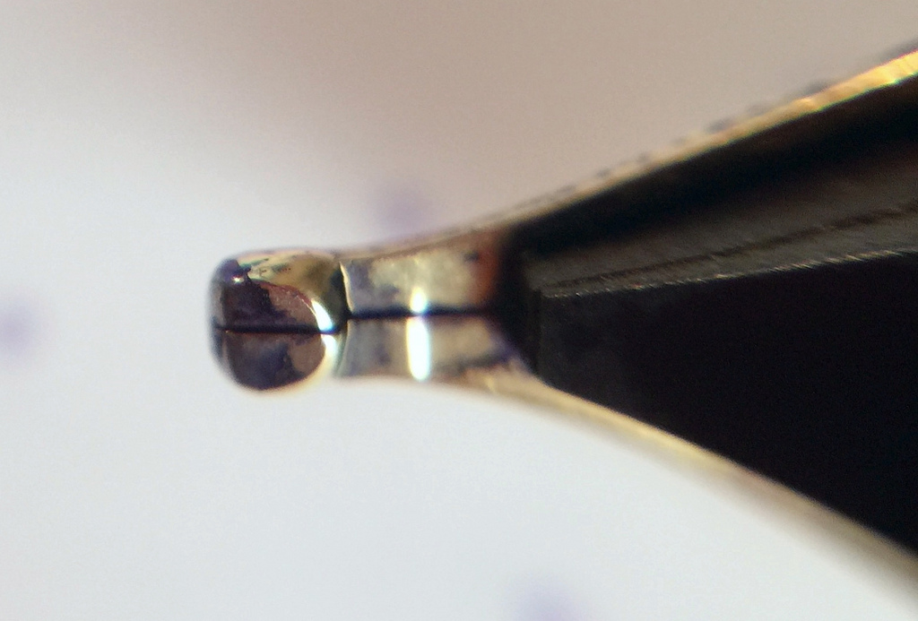
From a design perspective, the majority of music nibs are designed with two slits and three tines. This is to allow for big ink flow, which is a staple of music nibs. Sailors music nib is more traditional in that it has a single slit and two tines, but the tip of the nib is designed in such a way as to keep that same big ink flow. That was clear once I started writing with it using Sailor's Shigure ink. There were no issues putting this beautiful purple ink down on the page.

Top view

Top view

As I learned while researching this nib, music nibs are designed to hit the page more vertically than standard nibs, and at approximately a 90 degree angle. Picture your normal fountain pen writing grip where the nib hits the page at around a 45 degree angle. Rotate the pen in your hand counterclockwise (if you are a righty) until the nib hits the page at a 90 degree angle. Then move the barrel into a more vertical position instead of laid back as you would normally. Now become Mozart!

Side view

Side view

Once I realized this, well after my handwritten review mind you, all I could think of is isn't this what an architect grind is supposed to accomplish, without all of the angle adjustments? Wide horizontal strokes, thinner vertical strokes. Seems like it would do the trick. The thing is, no one uses a music nib for its named use these days anyway.

Bottom view

Bottom view

What the modern age of music nibs brings to the table is a thick, luscious line, perfect for large, sweeping writing. Big block lettering, cursive flourishes, and fancy styling. That's what this music nib is good at. Think of it as a chisel tip marker in a fountain pen nib. Go big or go home.

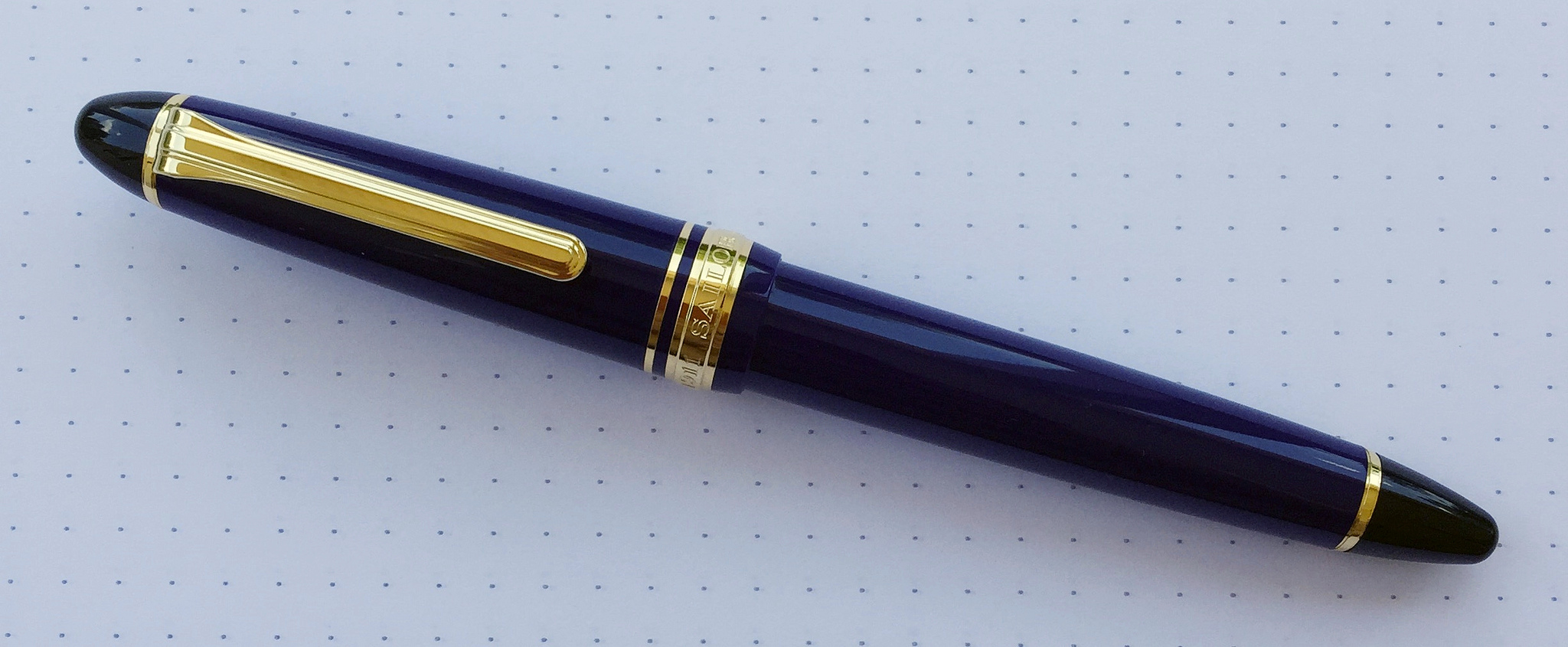
As I worked my way through this review my early prediction came true. It really is all about the nib. Sailor's 1911 barrel is excellent in its own right, with black, rounded ends set off by strongly colored resin barrels. I'm not a gold furniture guy but it's hard to argue how sharp these pens look.

Your writing style and planned use is the determining factor in purchasing a pen with a music nib. I've seen some amazing work with nibs like the one found in this Sailor. It's not a daily writer for me, but if I want to put some ink down on the page this is the way to go.

My thanks to Goldspot Pens for loaning me this pen for review. It will be heading back to its rightful home later this week, and I wish it safe travels!

Posted on May 18, 2015 and filed under Fountain Pens, Pen Reviews, Sailor, Music Nib.