Posts filed under Sailor

Sailor Professional Gear Transparent Orange Review

Sailor Pro Gear Transparent Orange.jpg

Being the fan of Japanese pens that I am it’s no surprise how much I enjoy the Sailor brand of pens. I’ve owned or tested most of their main line products, and there is no better fit for me personally than the barrel size, shape, and weight of the Pro Gear.

The Sailor Pro Gear Slim is smaller, lighter, and narrower, as is the 1911 Standard. The 1911 Large is similar in feel and weight, but the rounded end caps aren’t as aesthetically pleasing to me. The only one I haven’t compared side by side to the Pro Gear (King of Pens excluded) are any of the Realo models, which are similar in size to its Professional Gear and 1911 conterparts but use a piston filling system.

All of this is to say that everything about the Pro Gear fits what I am looking for in a pen to a tee.

The Transparent Orange model has been on my shopping list since I became interested in fountain pens several years ago. It’s loud and scary and breaks every traditional fountain pen mold. And I love it for that. The pink and green models are just as vibrant and I would be happy to own any or all of them and flaunt them whenever I could.

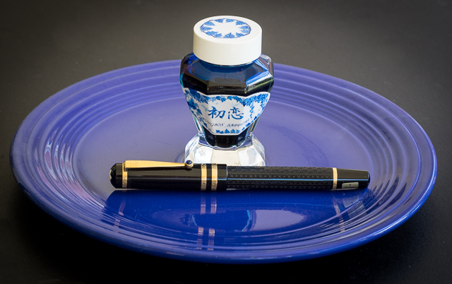
Goldspot Pens kindly loaned me this pen with a medium 21k gold nib for review. I inked it up with one of my favorite inks - Sailor Jentle Blue Black - and it wrote perfectly right out of the box. Japanese medium nibs are a sweet spot in my opinion. Fine enough to maintain nice line control, and wide enough to show off the ink on the page. And just look at that nib - it’s beautiful!

Being the fan of demonstrator pens that I am, I’m used to seeing converters and other internal mechanics inside pen barrels. With this Pro Gear, I have to say seeing the converter inside isn’t the greatest visual. Would I prefer a piston mechanism instead? Sure, but this is a small con in what is a pen full of pros. When I’m writing with it I don’t notice it at all.

All in all, borrowing this pen from Goldspot has only confirmed that I want to add one to my collection. It looks great, writes wonderfully, and is an excellent example of a Japanese brand having fun with a traditional writing instrument.

My thanks to Goldspot Pens for loaning me this pen for the purposes of this review.

Posted on July 27, 2015 and filed under Pen Reviews, Sailor.

Sailor Bung Box Hatsukoi "First Love" Sapphire Ink Review

(Susan M. Pigott is a fountain pen collector, pen and paperholic, photographer, and professor. You can find more from Susan on her blog Scribalishess.)

I can't remember where I first saw a photograph of Bung Box Sapphire–Twitter or Instagram or a Web site–but I immediately fell in love with it, apparently a common experience with this ink. The minute I got the email from Vanness Pens that a box had arrived I ordered some. It's a good thing, too, since their entire stock of Sapphire sold out the same day.

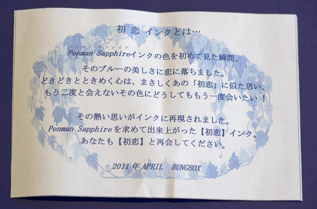
A little history about Bung Box Sapphire: apparently, the owner of the Bung Box store fell in love with Parker Penman Sapphire, so she tried to recreate the color. She called it Hatsukoi, which means "first love" (Bung Box Facebook Page), since that is the emotion the color evoked in her. I think most fountain pen lovers can relate to this experience, whether we fall in love with a particular ink color or a specific pen (or several).

An insert included with the ink tells the story of its name

An insert included with the ink tells the story of its name

The Bung Box Sapphire ink bottle is a work of art. Compared to the usual Sailor Jentle ink bottles, these glass bottles are like miniature vases or containers for fancy perfume. I know I won't throw mine away when I've used up all the ink.

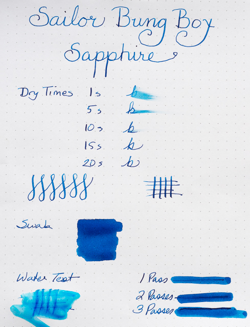
One of the best characteristics of Bung Box Sapphire is its excellent shading. As always with inks like this, the shading is most visible with wider nibs. I used my widest nibs (Pilot Parallel 2.4 and 1.5), my Nakaya music nib, an italic, a couple of flex nibs, and one fine nib to write samples.

The shading is fabulous, ranging from deep blue to a lighter, almost turquoise blue. If you look closely, you can even see shading with the fine nib.

Although the ink sparkles, I only detected sheen in my splash samples not in my writing samples. You can see a bit of magenta along the edges.

I compared Bung Box Sapphire with some of my other blue inks. All of them have distinctive characteristics. I would say Sapphire and Asa-Gao are the closest in terms of chromatography. Both have a little bit of magenta in them. But I think Bung Box Sapphire stands out (along with Akkerman Shocking Blue) as the most vivid color.

Bung Box Sapphire is an exquisite ink. It flows well and its dry times are in the normal range, at least with a fine nib on a Rhodia dot pad. With wider nibs, the dry time is longer. The ink is not waterproof.

One thing I've noticed about all my Sailor inks is that they have a distinctive odor. Apparently, they contain the chemical phenol to prevent mold or other contaminants from growing. In his glossary, Richard Binder says, "Phenol is an effective fungicide, acting as a protoplasmic poison, and was used for this purpose in ink until prohibited by law. (It is also toxic to forms of life other than fungi and is regulated as a Class B poison.) Phenol has a sweet, tar-like odor that is readily detected in inks containing it." I need to do more research on this ingredient as it can be rather caustic. I wonder if it can damage vintage pens, especially celluloid ones? Just in case, I'm not planning on using Sailor inks in any of my celluloid pens until I know more.

Sailor Bung Box Hatsukoi Sapphire is a unique, vibrant blue with excellent shading and some sheen. You can purchase this ink at Vanness Pens for $35.65 plus shipping, but only if you're really fast and lucky.

Posted on June 26, 2015 and filed under Bung Box, Ink Reviews, Sailor.

Sailor Fude Nagomi Brush Pen Extra Fine Review

I like the fact that I am seeing more and more Sailor pens of the non-fountain pen variety become available. It's possible these pens have been all over Japan for years, but I feel like it is a special treat when someone like JetPens imports them and makes them available to more people.

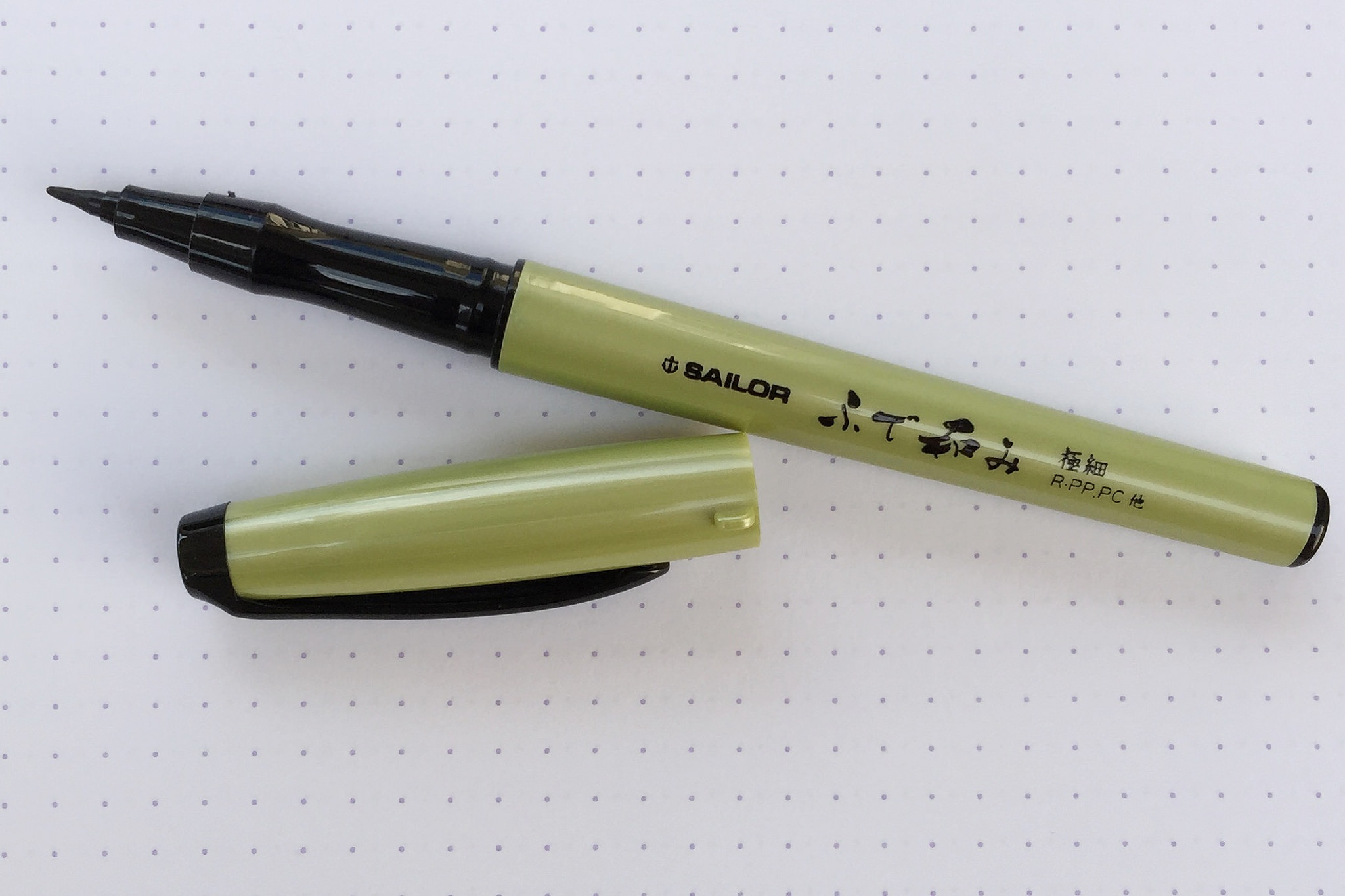
The Sailor Fude Nagomi Brush Pen was made in conjuction with a popular Japanese calligrapher named Ryofuka. She had a hand in the design of the pen, including the curved grip section, which I quite enjoy. In looking at the pamphlet of tips that came with the pen, it appears she prefers holding the pen at a very vertical angle. I find that interesting because I do that when writing, but for the broader strokes required with brush pens it seems odd.

It may work well with this extra fine model though, because there is very little line variation to be had. It reminds me a lot of the Kuretake Fudegokochi which I love for its general writing ability. This Sailor is very much the same, and will be primarily used for tasks that require smaller, more defined styles.

Many other, more standard, brush tips are available too, so be sure to take a look at all of the options that Sailor has brought to the table if you like the shape and style of this barrel.

(JetPens provided this product at no charge to The Pen Addict for review purposes.)

Posted on June 12, 2015 and filed under Sailor, Brush Pen, Pen Reviews.