Posts filed under Sailor

Bung Box Blue Black Ink Review

(Jeff Abbott is a regular contributor at The Pen Addict. You can find more from Jeff online at Draft Evolution and Twitter.)

As I experiment with more blue-black inks, it's becoming more clear that "blue-black" can mean a number of things. It doesn't always mean that the ink is just a really dark blue. Sometimes, the ink also has some green, gray, or purple hints as well. Some are darker than others, some shade well, and the list goes on. Blue-blacks are not created equal, which has made the process of trying new ones pretty exciting.

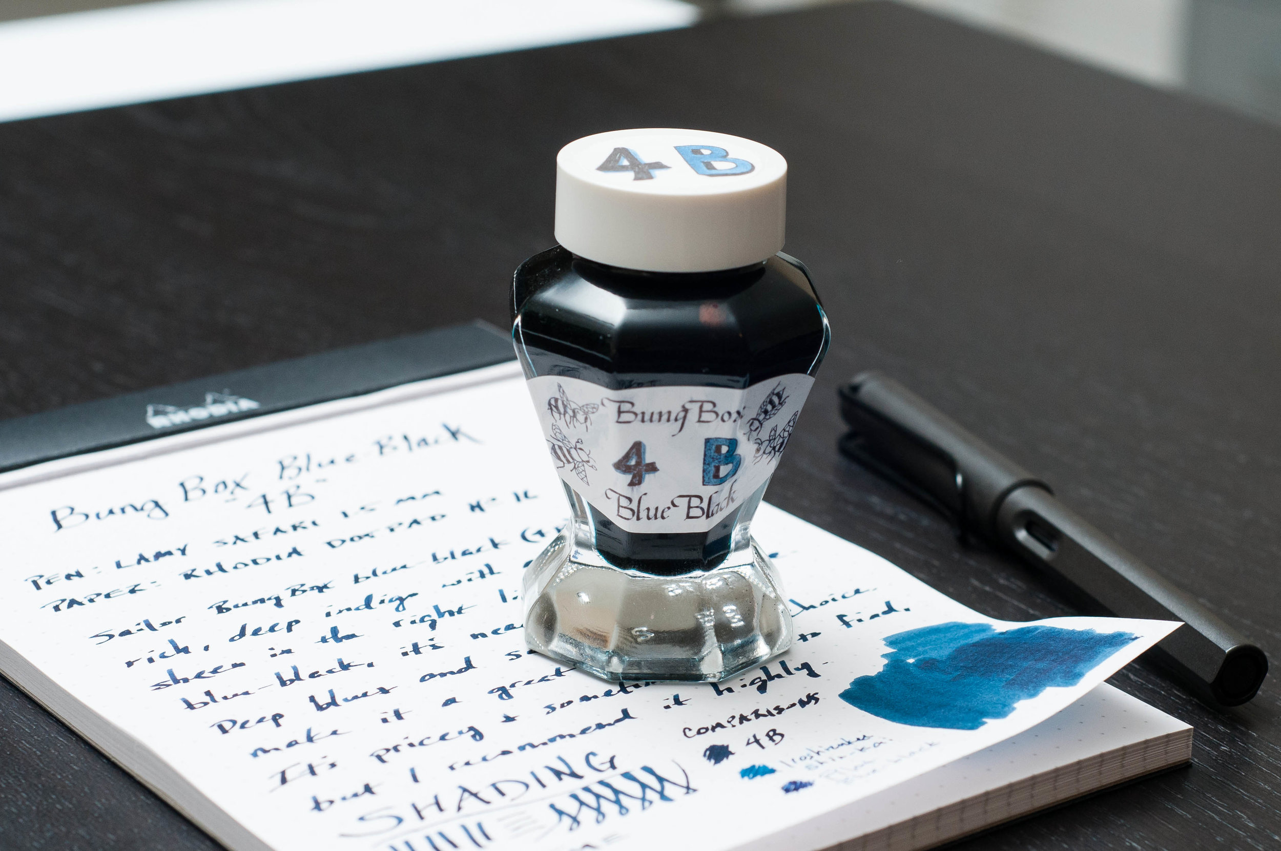
Quite a while back, I picked up a bottle of Bung Box Blue-Black, but in the bustle of moving, settling, and catching up on work, it got buried in the ink box for quite a while. Imagine my surprise when I was organizing my inks a few weeks back and discovered this little unopened gem! After that, I inked it up immediately to give a whirl in everyday writing tasks. While I wasn't very impressed at first, this ink won me over after a few days.

The color of this particular blue-black is undeniably indigo. There are no traces of purple or gray in this ink, but you can see some green in the swatch in my photos. In normal writing, I can't see any green. It's dark, rich, and blue all the way. Depending on the individual character of the pen you're using, it may be lighter or darker, but even in my "dry" pens, it's fairly dark.

There is some shading seen in this ink, but I wouldn't call it dramatic. It's subdued and classy, with just enough shading to be noticed if you're looking. Of course, the wider the nib, the more chances of tapping into the shading potential of this ink.

One surprising characteristic of this ink that I didn't notice for a while is a slight red sheen. It only comes out in certain lighting, but it's definitely there. Again, it's a subtle sheen and you have to look for it while holding the paper at a particular angle.

The writing experience is top-notch. This is a well-behaved ink that writes smoothly and is gentle on pens. The dry time is a little slow (coming in around 20 - 25 seconds in the 1.1mm stub), but does dry quicker than the test in my pictures if you're using a smaller, dryer nib. Still, it's something to consider if fast dry time is important to you (as in, this isn't a better option).

The only downsides I can see are the price and availability. It's pricey (over $40 usually) and not well-stocked, but that's generally true of all Bung Box inks. Vanness Pens is a good place to purchase this ink, and they typically have it in stock in a 50ml bottle or a 4ml sample vial.

Overall, I've been really happy with this blue-black! It's a rich, dark shade of blue, and it has subtle shading characteristics that make it stand apart from other blue-blacks. This is a high-quality choice for blue-black fans to try out at some point.


Enjoy reading The Pen Addict? Then consider becoming a member to receive additional weekly content, giveaways, and discounts in The Pen Addict shop. Plus, you support me and the site directly, which I am very grateful for.

Membership starts at just $5/month, with a discounted annual option available. To find out more about membership click here and join us!

Posted on September 14, 2016 and filed under Sailor, Bung Box, Ink Reviews.

Sailor Pro Gear Slim Four Seasons Haruzora Spring Sky Fountain Pen Review

Out of the top three Japanese pen brands, Sailor does the best job of mixing in limited and seasonal releases alongside their primary fountain pen offerings. My favorite manufacturer, Pilot, is the the worst in this area, with Platinum not doing much either, unless it relates to a Japanese lake.

Sailor, on the other hand, seems to enjoy putting out a few extra releases each year. And whether they revolve around neon colors, seasons, cities, or galaxies, they always seem to be interesting.

In late 2015, Sailor released the Pro Gear Slims Four Seasons lineup, featuring four colors: Haruzora Spring Sky Manyou, Summer Woods Meigetsu, Autumn Moon Yukitsubaki, and Winter Camelia. All feature unique resin colors to match the seasons, and 14k Medium Fine nibs.

It was hard to choose which one I wanted to review from Goldspot. An argument could be made for any of them actually. I thought Haruzora Spring Sky with its bright metallic light blue barrel was the standout, and, judging by the response on social media, I think I chose correctly.

The stark black end caps matched with the bright blue barrel and gold trim makes every bit of this pen pop. Although the blue isn’t a perfect match, I find the look to be Tiffany-esque. It’s classy, clean, and eye-catching.

Bottom to top: Pro Gear Slim, Pro Gear, 1911, King of Pens

The Sailor Pro Gear Slim, often called the Sapporo, is the smallest and lightest of Sailor’s gold nib pens. Despite that, it is a comfortable writer for all but the biggest of hands. Even when posted it remains light and well-balanced.

Sailor nibs are considered some of the best in the world, but I personally rank them behind both Pilot and Platinum. That is relative of course, like how I said above that Pilot is the worst among the three with seasonal releases. They are still wonderful, as are Sailor nibs. They have more tooth when compared to the smoothness of Pilot and precision of Platinum. Placing them third among that group is like saying someone is the third best supermodel in the world.

If you have never owned a Sailor fountain pen and were shopping for one of their gold nib models, my recommendation would be to go for the standard Pro Gear due to the larger barrel and nib. Yes, it is more expensive, but if it is your one and only Sailor it will make you the happiest in the long run I believe. If you have tried a Sailor and are familiar with the Sapporo size then you will certainly enjoy the unique colors of the Four Seasons series.

(Goldspot loaned this product at no charge to The Pen Addict for review purposes.)


Enjoy reading The Pen Addict? Then consider becoming a member to receive additional weekly content, giveaways, and discounts in The Pen Addict shop. Plus, you support me and the site directly, which I am very grateful for.

Membership starts at just $5/month, with a discounted annual option available. To find out more about membership click here and join us!

Posted on July 21, 2016 and filed under Sailor, Fountain Pens, Pen Reviews.

Sailor Jentle Uca Arcuata Fiddler Crab Green Ink: A Review

(Susan M. Pigott is a fountain pen collector, pen and paperholic, photographer, and professor. You can find more from Susan on her blog Scribalishess.)

I must admit, this has to be one of the most unusual ink colors I've reviewed. When I opened the bottle, my first thought was that the color looked like something from a festering pond.

I had no idea what it was supposed to be, and the name on the ink bottle, Uca Arcuata, didn't exactly reveal anything. So, I did some Googling and discovered that this ink is part of a bespoke collection made for the Kingdom Note Store based on various crustaceans. These inks include Zarigani blue, coconut crab brown, giant spider crab red, tiger prawn brown and Uca Arcuata (Fiddler Crab Green) which is currently sold out.

I've never seen an actual Fiddler Crab, but the ink color certainly looks like the color from the Fiddler Crab illustration on the box.

Still, I wouldn't call this color "green" at all. Maybe the color varies a bit from bottle to bottle since it's a specially formulated ink, but to me the color is yellow-brown, not green. Of course, Sailor can name their inks whatever they want, so if they want this to be green, who am I to argue?

Like all Sailor inks, this one has a distinctive odor to it due to the preservative phenol. It's not an unpleasant odor, just noticeable. And it keeps the ink from getting moldy, although I'm not sure mold would affect this color much.

The bottle comes with a built-in ink miser. Just turn the bottle upside down (cap on, of course) so the ink collects in the inner ink well, then turn it over and fill your pen. I usually remove the ink miser because I feel like it gets in the way of filling bigger pens. But, when ink runs low, it can be helpful.

The ink flows well and is even a bit wet. It exhibits nice shading qualities, but as far as I can tell, it has no sheen. It is also not waterproof.

The central question is, why would anyone use this color for writing? I can see it as a color for sketching, but for writing? I'm not sure. It's not a color that appeals to me, at least not yet. Maybe, in the fall when I want a color that matches the fallen leaves in Abilene (a drab yellow). . . .

Still, Uca Arcuata is quite similar to an ink I do love: Iroshizuku Ina-Ho. When placed next to one another, Ina-Ho actually seems to have more green than Uca Arcuata. But on its own, Ina-Ho comes across like a gold ink, whereas Uca Arcuata seems more brown.

I suspect both these colors are acquired tastes, sort of like Brussels Sprouts. I do enjoy breaking out of my blue ink rut, so I suspect that I will use Uca Arcuata from time to time. It might look especially nice on Tomoe River paper. I'm teaching a Harry Potter class this fall at my university, so Uca Arcuata might be just the thing to write acceptance letters to my aspiring wizards. Though, clearly, I need to work on my wax seals.


Enjoy reading The Pen Addict? Then consider becoming a member to receive additional weekly content, giveaways, and discounts in The Pen Addict shop. Plus, you support me and the site directly, which I am very grateful for.

Membership starts at just $5/month, with a discounted annual option available. To find out more about membership click here and join us!

Posted on July 8, 2016 and filed under Sailor, Kingdom Note, Ink Reviews.