Sakura Pigma Sensei Drawing Pen 0.4 mm Review

Sakura Pigma Sensei

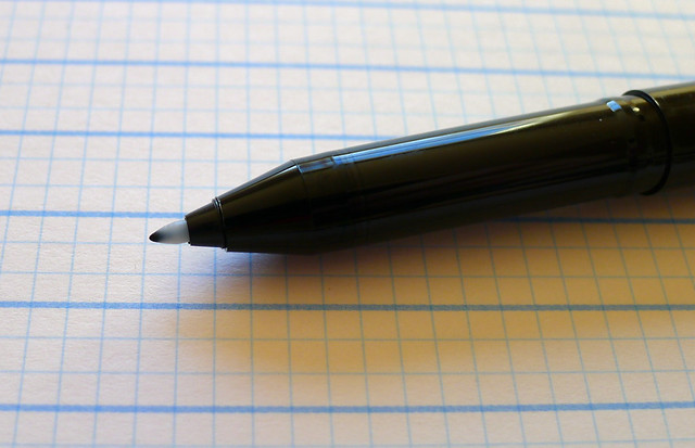
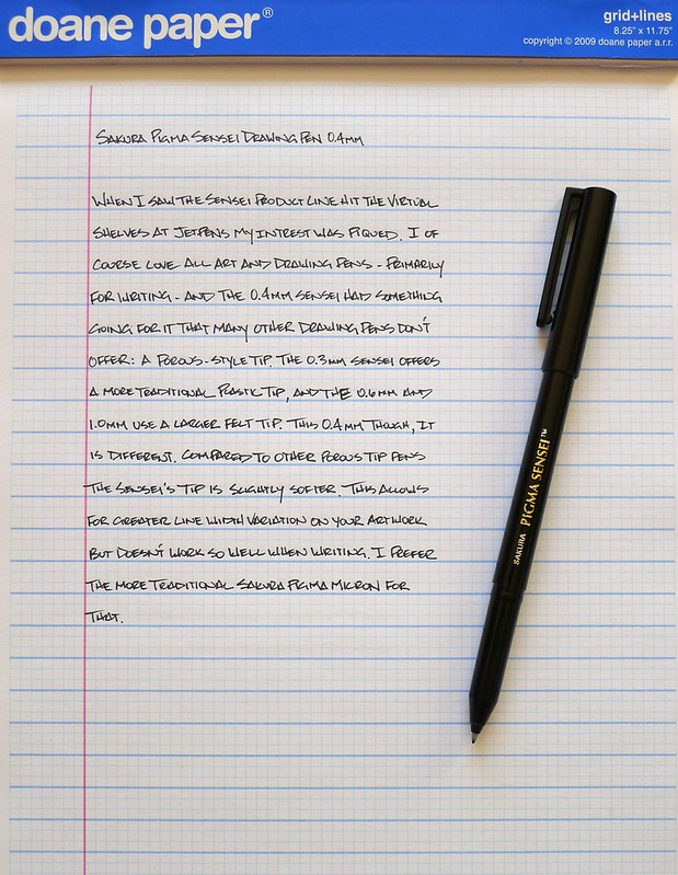
There are not many pens that I like more than the Sakura Pigma Micron. It has been a long time favorite of mine, and along with the Pilot Hi-Tec-C it is a pen I keep handy everywhere I am, or might be. The Sakura Pigma Sensei Drawing Pen shares some of the same properties as its cousin the Micron but has many unique qualities of its own.

What intrigued me the most about the Sensei line was the range of tip types offered, especially the porous tip found in the 0.4 mm. The product line is made to be sold as a set, with the 0.3 mm made to look like the traditional Micron for fine lines, and the wider 0.6 mm and 1.0 mm designed like markers for wide, bold lines. Fortunately for me, JetPens sells the pens individually as well because I really wanted to try the 0.4 mm the most.

Porous tip pens are one of my favorite types of pens because of the sharp, clean lines they produce. The ink is generally darker as well, compared to other similar types of pens. The Sensei is a winner in both of those areas, but the tip is a little more fibrous than I prefer. I believe it is designed like that for a reason, allowing artists some variation in line width. For me, I'd prefer a firmer, solid tip for every day writing.

I was hoping the Sensei would take a spot in my arsenal right next to the Micron, but it is one notch below for me. It is excellent for sure, but for my needs the Micron suits me better.

Sakura Pigma Sensei

Posted on February 10, 2013 and filed under Pen Reviews, Porous, Sakura.

Ink Links

-- Montblanc Meisterstuck Classique Platinum Fountain Pen Review (Palimpsest)

-- Ink Notes: Pilot Iroshizuku Fuyu-syogun (The Fountain Pen Quest)

-- Refreshed product lineup at Pencils.com (Woodclinched)

-- Review: BIGiDESIGN Solid Titanium Pen + Stylus - Black (Gourmet Pens)

-- Uni-ball Signo Bit (Art of the Letter)

-- Name Those Pens!! Reveal (Whatever)

-- Lamy Al-Star Pearl (KMPN)

-- Notebook Paper - Coming 3.5.13 (Doane Paper)

-- Sailot Fude Brush Stroke Fountain Pen (East...West...Everywhere)

-- Review and Giveaway: Elan Pocket-Size Field Book (Notebook Stories)

-- On Candies. Correction (Cronicas Estilograficas)

-- Inspired: Lamy Al-Star Ruby Red Limited Edition Fountain Pen (From the Pen Cup)

-- writing, stillman & birn, and what comes next (the captain)

-- Michael Rogers Dispatches Notebook Review (The Well-Appointed Desk)

-- Stationery Geek (espresso coco)

-- A quick look: the ZIG Cocoiro (Leigh Reyes)

-- Burgundy Parker 51 - Medium Nib (Informal Scribble)

-- Paper Users Waste Everyone's Time, Duh (512 Pixels)

-- On Gold and Steel (Cronicas Estilograficas)

-- Birthday Pen 2013 (And All Other Tasks)

Posted on February 9, 2013 and filed under Links.

Noodler's 54th Massachusetts Ink Review

Noodler's 54th Massachusetts

This is the point where I realized reviewing inks is going to be very difficult.

I am really happy with Noodler's 54th Massachusetts for many reasons. What I found challenging was showing the features of the ink that I enjoyed so much. The picture above is my second full pass at reviewing the ink, and there were several false starts in between. In fact, I nearly drained my 2ml sample from Goulet Pens before getting this done.

My first review was done with a Lamy Vista M nib. The ink worked great with the pen, but when it was time to photograph it I didn't think my picture showed off the ink well enough. I thought a wider nib might solve that problem, so I ordered a TWSBI Mini with a 1.5 mm Stub Nib. I had never used such a wide nib so I wasn't sure what to expect, but needless to say, I am very happy with my purchase.

What the 1.5 mm nib allowed for was more expressiveness in showing off the ink. Photography is hard for me to begin with, so on a dark ink like this it is nice to be able to show off the shading and color variations a bit. It still shows up dark though, so I do have some work to do on my lighting and editing.

On the ink itself, Noodler's 54th is classified as a blue black. It obviously leans more on the black side, and shows a lot of gray on the page. Sometimes I wonder where the blue actually is, but it shows up on the right paper and in the right light. This is an ink that I believe would grow on me the more I use it.

My ink reviews will be a work in progress. As my collection grows I will continue to add samples and work in more color comparisons. If there is anything specific you would like to see in the future please leave me a comment and I will do my best.

For more details on Noodler's 54th Massachusetts check out these great reviews:

Ink Nouveau - Noodler's 54th Massachusetts

Inkophile - Noodler's Has The Blues

Inkdependence! - Noodler's 54th Massachusetts

LostInBrittany Pens - Noodler's 54th Massachusetts Ink

Posted on February 7, 2013 and filed under Noodler's Ink, Ink Reviews.