My Fountain Pen Education: The Pilot Metal Falcon

Pilot Metal Falcon

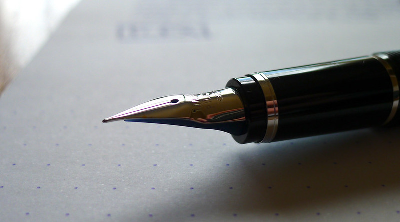
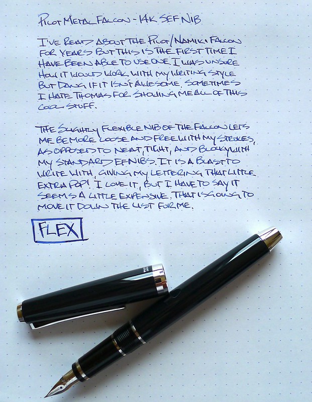
As was the case with many of my friend Thomas' pens that he sent me, I didn't know what to make of the Pilot Metal Falcon when I first inked it up. I had heard raves about its flexible nib but never having used one before, I was tentative. It didn't take long for me to get the hang of it and I discovered quickly why it is so well regarded.

It is hard to explain the feeling of a flex nib to someone who has never used one before. In a nutshell, the nib is reasonably firm and produces a fine line while using light writing pressure. When pressure is added, the tines spread and the lines become wider, giving the output on the page a little more flair.

My written review actually does a poor job of showing off the line width variation. Part of that is due to this being an SEF nib, or Soft Extra Fine. The other part is me not wanting to really lean into someone else's pen and spring the nib. If you need more variation, the Falcon nib is available up to Broad.

There were two things I did not like about this pen. One, the metal barrel felt awkward in the hand. I'm not sure if it was the added weight or that it was cool to the touch at start, but I never got used to it. Two, at nearly $250 from most US retailers it seemed expensive for what it is. I didn't find that much novelty or uniqueness to justify the price.

All was not lost though, as Thomas later pointed out to me that there is a Japanese model in black resin with rhodium trim for about $100 cheaper, which we both subsequently ordered. And you guys think I have a problem?

Look for more on my very own Falcon in the near future.

Pilot Metal Falcon

Posted on May 30, 2013 and filed under Fountain Pens, Pen Reviews, Pilot, Falcon.

The Pen Addict Podcast: Episode 56 - Them's Fightin' Words

In Episode 56 of The Pen Addict Podcast Myke and I discuss refills for his Render K and a better option for me in my Retro 51 Vintage Surf. We also cover some new products we each have on the way plus my recent post on Field Notes and Doane Paper fountain pen ink testing.

Show Notes & Download Links

Every time I use the Retro 51 Vintage Surf this song plays in my head...

Posted on May 29, 2013 and filed under Podcast.

Sailor Jentle Blue Black Ink Review

Sailor Jentle Blue Black

If it hasn't become clear by this point let me lay it out for you in no uncertain terms: I love blue black ink. I use it in every style of pen where it is available, especially fountain pens. Why? Anyone can use a basic blue or black ink. Using blue black shows that you put a little extra thought into your ink selection while still keeping it sane. I love wild, vivid colors as much as everyone else, but for daily use it is blue black all the way.

Sailor Jentle Blue Black is one of the recent additions to my ink collection and it has me perplexed. It is a well respected ink and is highly rated by many. For me, I think I am having a hard time coming to grips with where the color falls in respect to the other blue black inks I use regularly.

As I look at the pictures now I think the shade of blue black looks fantastic, but I distinctly recall more of a "meh" feeling when first inking the page. It is possible I didn't get the proper perspective by judging the ink immediately - there are often changes the longer ink sits. I want that initial satisfaction though, which I do get from other inks. Do you wait a certain amount of time before rating your inks?

I will be giving Sailor Jentle Blue Black a longer look in a wider variety of pens, especially finer nibs. That too makes a difference in how much I like a particular ink. I have been swayed by performance in an EF nib more than once and I look forward to seeing what else this ink can do.

Sailor Jentle Blue Black

(JetPens is an advertiser on The Pen Addict and I received this product at no charge.)

Posted on May 28, 2013 and filed under Ink Reviews, Sailor.