P.W. Akkerman #8 Diep-Duinwaterblauw Ink Review

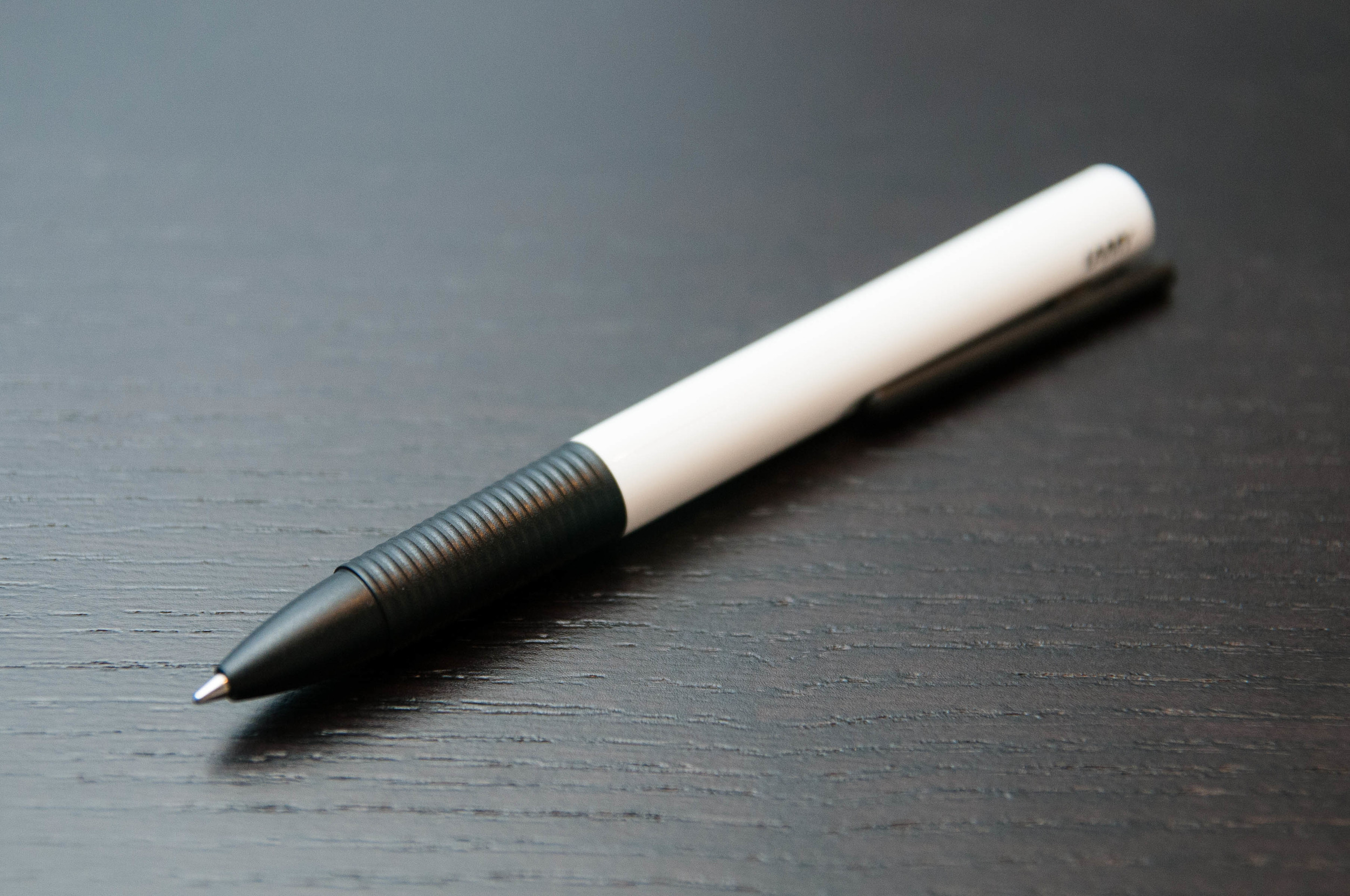
"What makes Akkerman inks so special?"

That is the question I get the most when talking about my P.W. Akkerman ink purchases. They are expensive, hard to come by, and some say, identical formulations to another very popular ink brand. Why spend the money and go through the trouble when you can get something similar for less and easier?

Located in The Hague, Netherlands, the P.W. Akkerman fountain pen shop has been in existence since 1910, carrying some of the finest brands on the market. To celebrate their 100th anniversary, they created their own fountain pen ink line which includes 31 vivid colors and possibly the coolest ink bottle on the planet.

Over the past several months I have been lucky enough to be sent several Akkerman ink samples, be part of a direct group buy, and grab a couple of bottles at the Atlanta Pen Show. So at the moment I have more Akkerman inks than any human being should ever own. Time to get reviewing.

Out of all the Akkerman inks in my possession, #8 Diep-Duinwaterblauw is my clear favorite. Knowing it is a blue black ink, that should come as no surprise. The funny thing is, as much as I loved it when I did the handwritten review below I don't think the color is an accurate representation of what I see looking at it in person. I actually think the color on my Pilot Letter Pad review is much more accurate. Looking at other reviews I'd say that is a fair statement.

Diep-Duinwaterblauw is a deep blue black with a hint of turquoise that I like more than I thought I would. The primary shade is dark, then pops of brightness come through, giving it a unique shading I have seen in very few other inks. It shows up in wide stub nibs as well as extra fine nibs and I find myself wanting to use it as much, if not more, than my favorite blue black inks.

One question that people have asked over the years about Akkerman is are these inks rebottled and rebranded? It is all speculation, but many people believe Diamine is the manufacturer of these inks. Not only that, there are Diamine equivalent inks that are exact matches to some Akkerman inks. I have no direct knowledge of this, and really have no comment on it either other than to inform you that there is a lot of conversation around this topic. Take from this what you will.

What I take away from my experience with #8 Diep-Duinwaterblauw is that this is a great color that perfoms wonderfully in any nib I pair it with. Is the price worth it? For me it is. I've spent as much on other inks that I haven't been nearly as happy with as my Akkerman inks. Look for more reviews of this brand in the very near future.

If you are interested in purchasing Akkerman inks and aren't visiting The Hague anytime soon, send an email to Vanness Pens and they may have what you are looking for.

Posted on May 30, 2014 and filed under Akkerman, Ink Reviews.

Lamy Tipo Review

The Lamy Tipo is one of Lamy's more unique takes on the rollerball refill version of their products. There are rollerball models of the Safari, Vista, and even the 2000, but I think the Tipo looks the most unique of all of them. And, it's also the most affordable. At less than $11, you have to wonder how it compares to the Retro 51 and Schmidt refills.

Well, the Tipo doesn't beat the Retro 51 and Schmidt refills, but it's still a great, quirky pen with a decent refill.

Simple design

The Tipo doesn't have a knock like most retractable pens. Like the Retro 51, it uses an alternate system to extend and retract the refill. The Retro 51 uses a twist mechanism, which lots of other pens also use. They're smooth and sure.

I'm guessing that the typical rollerball refills don't work well with a clicky knock system, but I really don't know. In Lamy's case, they went with a unique catch system that uses the clip and barrel to keep the refill extended. There's a small hole in the body, and an inversely shaped knob on the end of the clip that fits perfectly into the hole when the clip is pressed down.

It's novel, but it needs work in my opinion. It feels cheap and it doesn't breed confidence in me when I use it. Many, many times I've wondered if it's going to stay when I start writing, and I've also missed the catch several times if I'm trying to click it quickly. When extending the refill with this pen, you have to be slow and deliberate to be sure it catches. I'm being a bit dramatic to make a point. In all honesty, it catches perfectly about 95% of the time. But it just doesn't make me feel sure most of the time.

The grip on the pen is fantastic for me. It's textured with shallow grooves and has a nice width. The pen is light, with more of the weight gathering toward the tip, which makes for a pleasant writing experience.

One of the most unique aspects of the Tipo is the variety of barrel colors available. White, black, pink, orange, and turquoise. They all look vibrant in the photos, and the white one I have is no let-down. On all colors, the grip, tip section, and clip are all black.

There's a small, tasteful Lamy logo on the top of the barrel parallel to the clip. It's a nice way to brand an otherwise mysterious looking pen.

Another gripe I have with the pen is the design of the top (butt?) of the pen. It looks unfinished. There are two small holes and nothing else. It looks like some decorative piece was once attached, but fell off at some point. It would be cool to see a plastic screw on the top, similar to the Safari and Vista caps. But, that's not really a big deal. The pen still has a really clean, pleasing design. Besides, at $11 I can't really complain too much about it missing decorative elements. Get a Safari already, right? I know.

An additional delightful little detail is the packaging of the pen. It's futuristic and difficult to explain, so check out the picture:

Lamy Tipo Packaging.jpg

Writing experience

Ah, the refill. Possibly the most important aspect of the pen. Short story: it does a good job of writing. It's smooth, dark, and mostly consistent. And that's the reason it doesn't get a perfect score. It tends to skip or go a little faint every now and then. Not enough to cause any frustration, but enough to knock it down a little.

Seriously, it's a good refill and I'd like to try some more just to make sure I didn't get a one off skippy refill. The refill is half the cost of the pen, so I'd expect the quality assurance to be fairly high, but that's probably a little too optimistic.

On the plus side, you have a choice of 4 colors: black, blue, red, and green.

The line is a tiny, tiny bit thicker than the default Schmidt refill that comes with the Retro 51. So, a 0.7mm refill that seems to contain a good amount of ink in the reservoir.

A point that really makes the Tipo an even greater value is the fact that it can take G2 size refills. That opens up another world of possibilities if you aren't happy with the refill that ships with the pen. Of course, you can also trim other refills that are similar to the G2. I personally use the Pilot Juice refills instead of the G2, and the Tipo body is a lot more interesting and attractive than the Juice body. Score.

Wrap up

The Lamy Tipo is a great little pen with a unique, quirky personality. It doesn't make waves with the refill, but it provides a compelling value and looks great while doing it. If you're like me and have an urge to try every rollerball out there, don't leave this one out.

(You can find more from Jeff online at Draft Evolution, Twitter, and App.net.)

Posted on May 28, 2014 and filed under Lamy, Tipo, Pen Reviews.