Edison Beaumont Review

The Edison Beaumont was my final purchase at the 2014 Atlanta Pen Show, and it was completely unplanned. I thought I had finished my shopping for the day, but I kept coming back to the Anderson Pens booth and getting caught by the blue flakes that make up this pen. When I finally decided to pick it up, that's when my decision was made. Unscrewing and posting the cap and then holding the pen in the writing position was all it took. After a brief test, it was mine – my very first Edison pen.

Let's just say it won't be my last, either.

Aesthetics

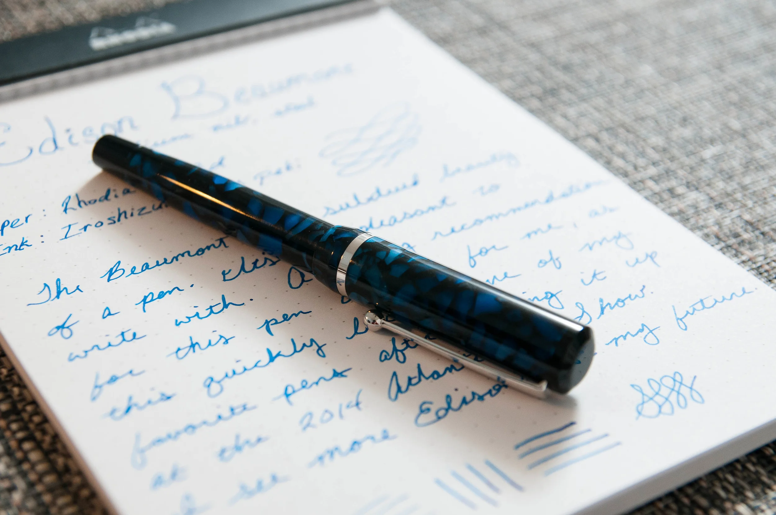
The Beaumont is a bit unassuming. It's not flashy or ornamental. It's pretty, but in a subdued sense. I think that's even more true for the model I bought – the Sapphire Flake. The dark blues tend to go unnoticed unless under bright light. When it has the appropriate light, it's gorgeous. That being said, I think the other three colors might get more attention due to their lighter palette.

The reason I bring that up is that this pen is a true workhorse. It's built to write, but I'll talk about that a bit later.

There's a combination of medium to dark blues on a background of black. The saturation of the blue is fantastic, and there's a sparkly quality to the resin that's hard to describe. Let's just say, it's nice to look at. Apart from the body and cap, the Beaumont has silver accents and a nice #6 nib with the Edison logo on it. The black grip has a great convex shape that makes writing very comfortable for me.

The pen is made of resin, so there's a slight smell sometimes, although it's somewhat faded since I first bought it. Now I only smell the resin when I unscrew the section to refill the converter with ink.

The build quality of the pen is outstanding. The tolerances are tight and it feels like a very high-quality instrument. On top of all that, it remains light, making it a great pen for long writing sessions.

It's pretty, it's comfortable, and it writes like a dream. I can't really think of any other way to put it.

Size-wise, I'd say it's a medium size. It's not full size, but it also isn't a pocket pen. The clip is just the way I like it – springy, but not so tight that it's difficult to clip onto things. That's been a real problem for a few of the recent pens I've acquired – they almost require two hands to clip them to a pen case pocket or a shirt pocket. The Beaumont is just right. Easy to clip, but also secure.

Writing

From day one, I haven't had a single complaint about how this pen writes. It's smooth, has great ink flow, and never has any starting, stopping, or skipping issues. Perfect. From what I understand, Brian Gray inspects and tunes each pen before it leaves his shop, so that's probably why it writes so beautifully.

If left sitting for a while, the feed tends to become overly saturated, which means there's more ink being put down on the page for a few sentences. It's a minor complaint, but if anyone knows how to adjust it, I'd like to know.

Being a steel nib, there isn't much flex to be had, but it's also very consistent in the line it does put down. I opted for a medium nib, which is great, but I think I'll go for an italic next time to get more character out of the ink. That's another great thing about this pen – the nib is swappable.

Like I said earlier, this pen is so enjoyable to write with. It's light, perfectly balanced for my hand, and the nib never causes any issues. The pen completely gets out of my way and I'm left to focus on the words and the page. Until using this pen, I never realized how much I crave that quality in a pen. In many cases, a pen has quirks that are forgivable but cause distractions while writing. I hope the pen has the same perfect balance for most hands, because it's absolutely fantastic.

It makes writing pleasant and effortless.

Conclusion

The Edison Beaumont is a great pen that I can't recommend enough. If you're like me, it might not look like much until you pick one up and try it out. It gets out of the way while writing, and looks great when not in use. That's pretty much exactly what I want in a pen.

I've always been fascinated by the process of creating the Edison pen barrels and caps, and I can't wait to add more Edisons to my collection. Part of the reason the process is so fascinating is that no two pens are the same. They are all unique.

If you're in the market for a great pen, you can find them at Anderson and Goulet with steel and 18k gold nibs. The steel versions run around $150, while the gold versions run around $275.

I can't recommend these pens enough. The Beaumont is definitely in my top 3!

(You can find more from Jeff online at Draft Evolution, Twitter, and App.net.)

Posted on June 11, 2014 and filed under Edison, Fountain Pens, Pen Reviews.

Architect's Wallet Giveaway from Huckberry

My good friends at Huckberry are back once again with another awesome giveaway for readers of The Pen Addict.

Huckberry just completed a full site redesign, which turned out beautifully I must add, and with Father's Day creeping up fast, they are loaded for bear with some of the coolest gear and accessories around. I'm excited to give one of these items away to my readers.

The Architect's Wallet by form.function.form is an exercise in design efficiency. Everything about it is just so, with no extraneous bits to cause friction. The notebook slot is designed to fit the extra small Moleskine Volant with a pen slot tailor-made for the Fisher Space Pen. There is space enough to store a few credit cards, cash, and receipts inside the notebook flap or in the rear thumb-slot pouch, and that's it. Minimalism at its finest.

One winner will receive the Architect's Wallet in English Derby (as seen in the pictures) as well as a matte black Fischer Space Pen and two Moleskine Volants to kit you out fully.

Here is how to enter the giveaway:

  1. Head over to Huckberry.com and sign up as a member (if you aren't already one.) All you need to do is enter your email address and a password, or connect with your Facebook account. It is that simple and there is zero commitment.

  2. Leave one comment on this post anytime between now and Thursday night, June 12th, at 11:59 PM Eastern Time. You are limited to one entry. International readers are welcome to enter!

  3. For this contest, I will pick one winner at random from the comments section of this post. The comments will be numbered in the order they are received, i.e. the first comment is #1, the second #2, and so on. The Random Integer Generator at random.org will be used to pick the number of the winner.

  4. The contest winner will be posted on Friday, June 13th. The winner will have one week to email me via the Contact link at the top of the page.

Thanks again to Huckberry for providing these goods for Pen Addict readers. It is greatly appreciated!

(Note: I am a Huckberry affiliate and links to Huckberry.com are affiliate links. If you patronize them through these links I get a small percentage back which helps support this site.)

Posted on June 10, 2014 and filed under Giveaways, Huckberry.

Craft Design Technology Chrome Ball Point Pen Review

Craft Design Technology is a unique Japanese stationery brand whose mission statement is to marry "modern design with Japanese heritage of traditional craft and technology innovation." Their beautiful green packaging has been on my radar for a while and when Rikumo reached out to me offering a couple of products for review I was excited to take a look.

The first item I chose from Rikumo was the Craft Design Technology Chrome Ball Point Pen - Item 22, CDT's take on the classic business ballpoint. This is the type of pen I picture in my grandfather's shirt pocket, on my dad's office desk, or in a Mad Men client meeting. It exudes style and class.

Most pen companies in the 1950's through 1970's leaned heavy on this design and CDT has done their best to refine it. The chrome barrel is a stunner. It is so shiny it is hard to photograph for a hack like me, but in person it makes a statement. I could do without the CDT branding - just their logo would have been nicer - but I would be lying if I said I didn't like the whole "Item 22" thing. Something about that cracks me up. It is so Japanese, and I love it.

As with all writing products in this line, the chrome ball point is built in conjunction with Pentel and therefore uses Pentel refills. The 0.8 mm ballpoint is average at best. The darkness of the ink is excellent, but it is prone to being messy and there is even some spidering (a string of ink between letters/words when lifting the pen of the page.) In the abstract it looks fine, but on closer inspection I expect more.

Getting down to brass tacks, the Craft Design Technology Chrome Ball Point Pen is a value proposition. At $65, this is not a cheap pen, so are the benefits worth the price? I don't think so. The design is excellent and CDT's goals are admirable, but the value isn't there. There is a long list of pens that I would choose over Item 22.

There are Craft Design Technology items that look like they would suit my writing needs better and I hope to try out more soon. This is a company that is well worth keeping an eye on. Big thanks to Rikumo for sending me this pen for review. Be sure to check out their online shop for more wonderful Japanse imports or drop in to their brick and mortar store if you are in Philadelphia area.

Posted on June 9, 2014 and filed under Ballpoint, Pen Reviews, Craft Design Technology.