The Pilot Lucina is a pen that I've often thought about getting, but couldn't really justify the almost-premium price tag. I'd look at pictures and read about it, but I couldn't understand why it was in the mid-$80 range. Basically, it's a unique design for Pilot, and it has some really fun colors. What else? Well, not much. But, if you like the looks of it, I guarantee it will charm you if you decide to pull the trigger on the purchase.
Aesthetics
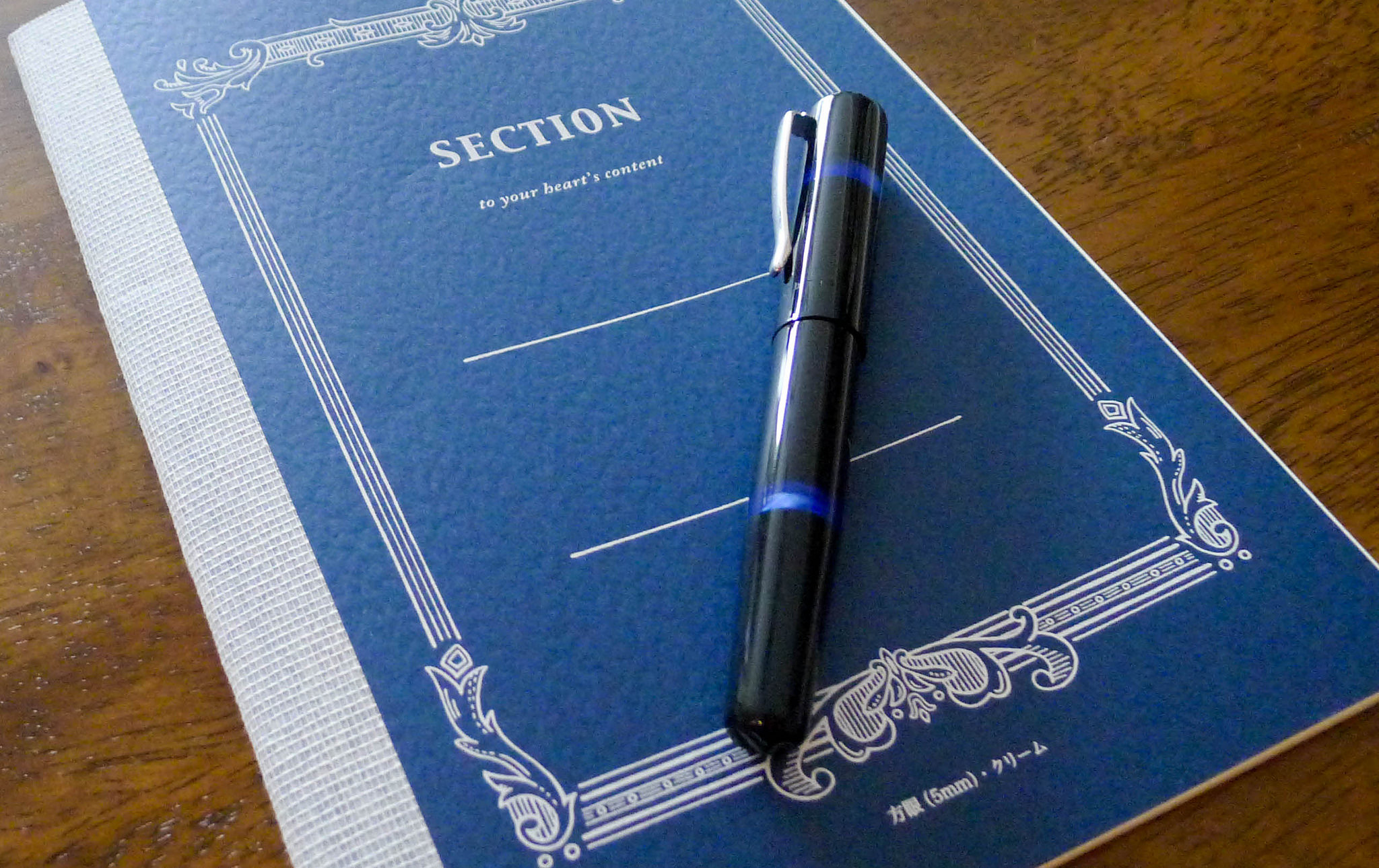
The Lucina comes in a standard Pilot flip box – nothing fancy, but classy and reserved. It's tucked into a plastic sleeve inside the case, which is something I wish the pen manufacturers wouldn't do. It takes away from the experience of opening a new toy.
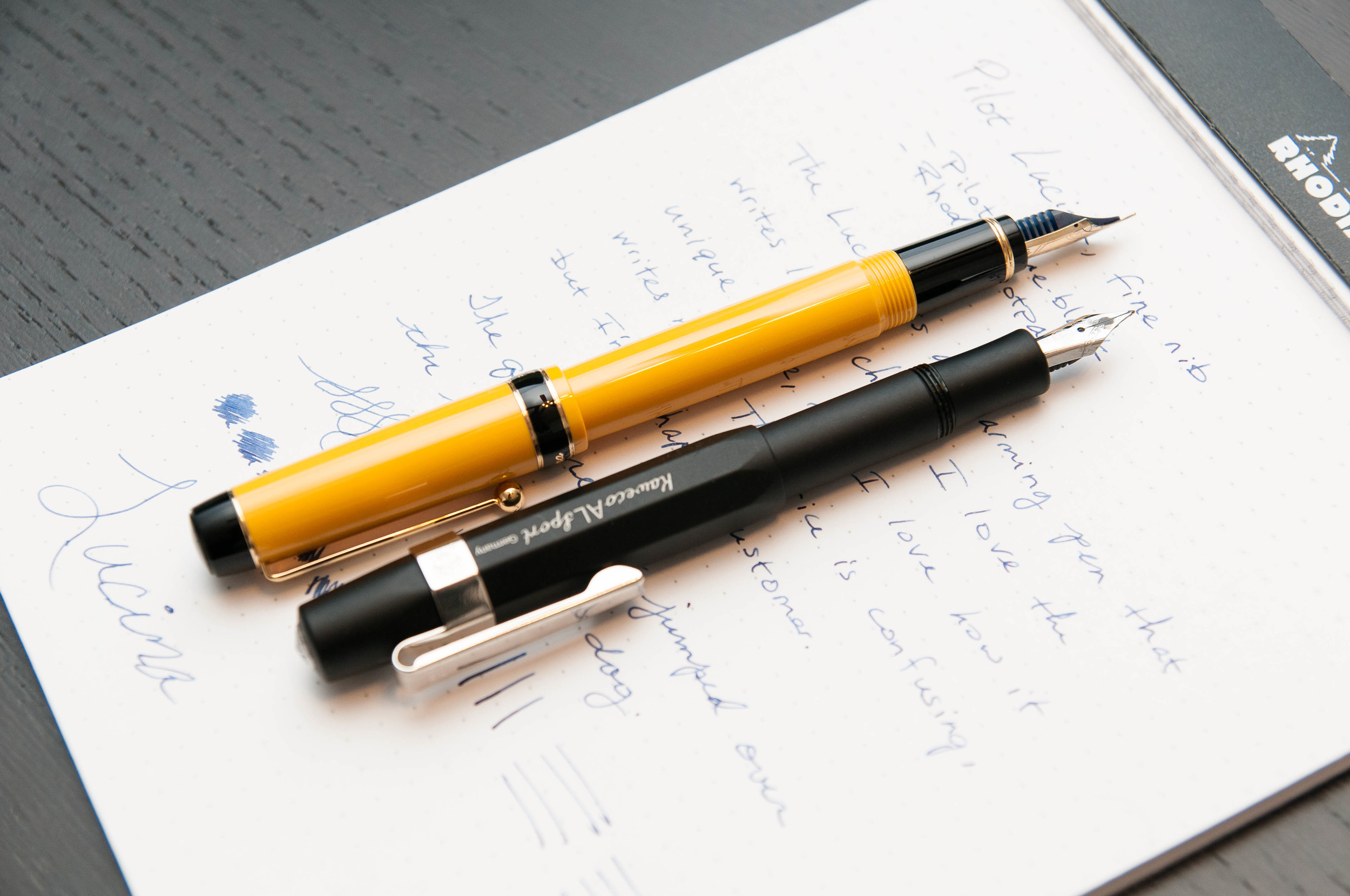
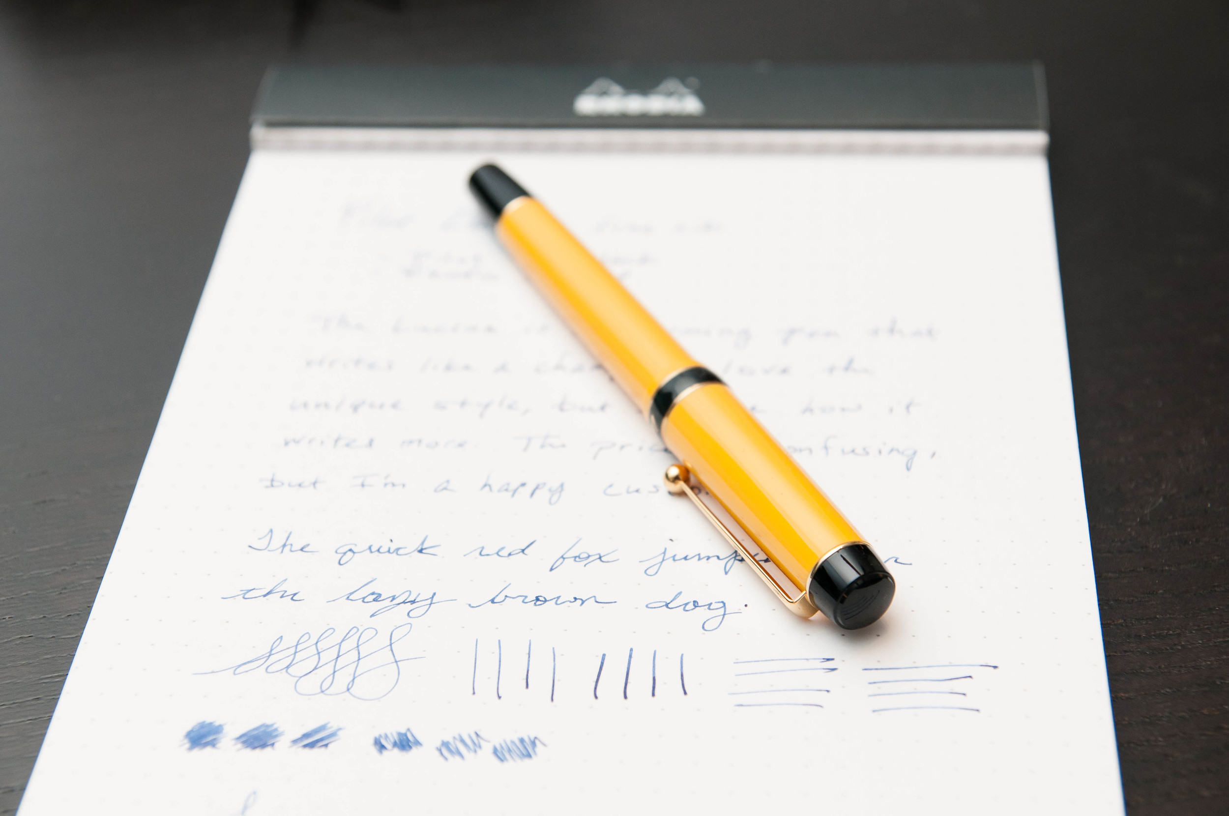
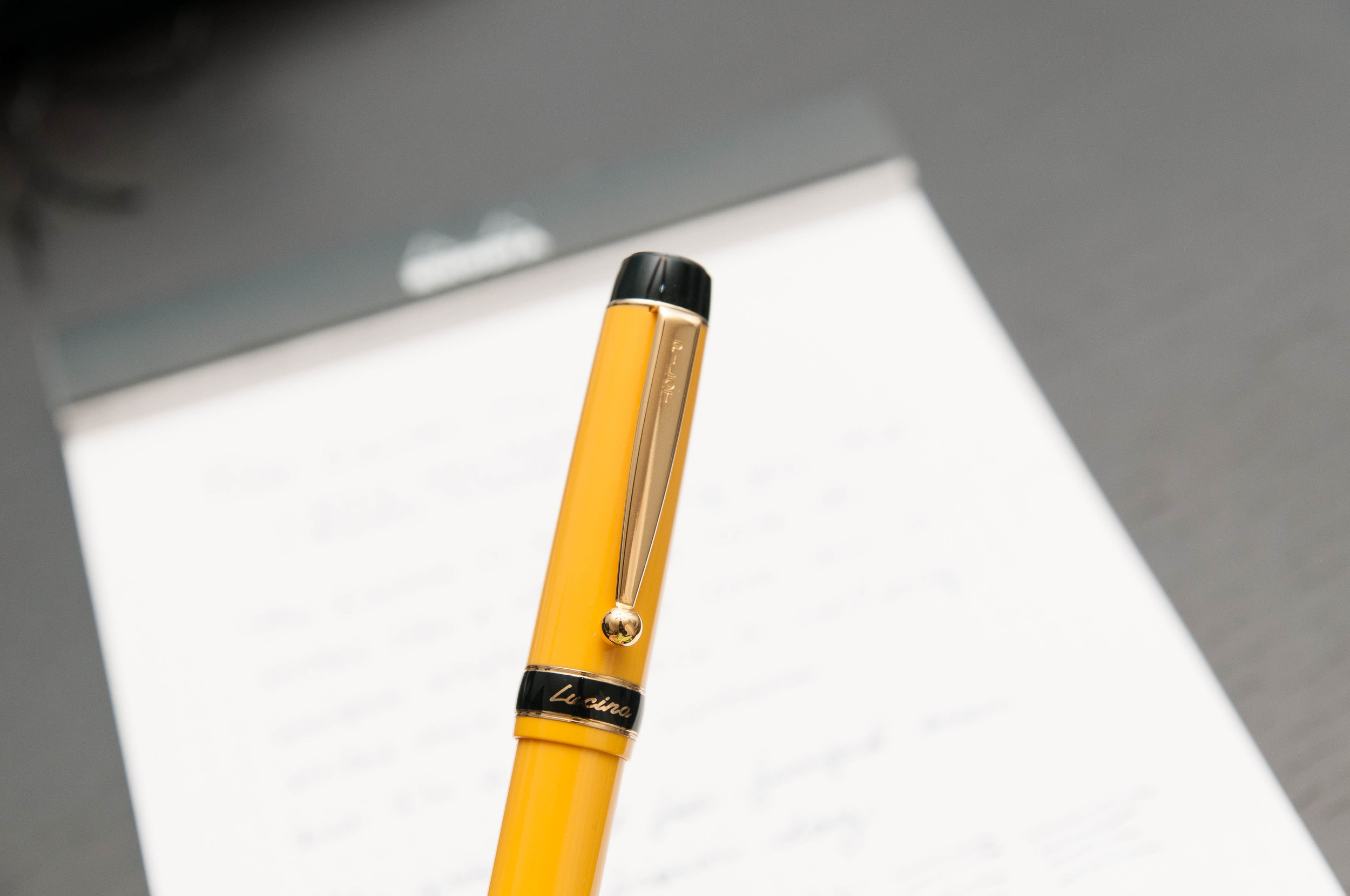
After getting the pen out of its packaging, you notice that it's a lightweight pen and really well balanced. The plastic doesn't feel cheap, and the attention to detail is superb. I'm not a huge fan of gold trim, but I think it works well on the Lucina. It has the right style to sport the gold trim well. The black accents also add more punch to the main color. In my case, I went with yellow because I really had no other choice. The red also looked interesting, but not nearly as much as the yellow. It pops.
The cap screws on and off, and posts perfectly. The nib is also gold in color and has a bit more decoration than the cheaper Pilot nibs. There's some scroll work and a Pilot logo above the standard Pilot name and nib size. The clip is what I consider to be the perfect mixture of strength and flexibility. It just works and never requires fiddling.
One thing I dislike about the looks of the pen is true of every lighter-colored pen barrel that secures the cap with threads – dirt gets into the threads and shows up instantly. My hands are pretty clean, but the dark specks still get into the threads and I can't stand it. When I uncap the pen it's the first thing I see. Yes, you can clean them, but it's not easy and it's never quite perfect again. I prefer snap on caps, but I can get over my silly OCD tendencies if the pen writes well enough. And the Lucina does.
Writing
In my experience, Pilot always delivers a well-behaved nib out of the box, and the Lucina is no exception. The steel nib is a smooth and dependable writer. I've used it on a number of different papers, and it works well on them all. Being so fine, it doesn't bleed much on cheap paper, although it can tend to snag if the paper surface is rough. On smooth paper like Rhodia and Clairefontaine, it glides like an ice skate and fresh ice.
I typically write unposted when using normal pens. The Lucina is about the size of a Metropolitan, but I really enjoy writing with this pen posted. I think it was designed to be used this way because the balance is perfect when it's posted. It feels a bit off when unposted – like writing with a Kaweco sport or TWSBI Mini unposted, but not as exaggerated.
I bought a pack of Pilot blue-black cartridges with this pen, and tried them out first. The ink flows well and the pen never skips or has issues starting – even after being idly uncapped for a few minutes. That's rare with the rest of the pens I own. They get a bit dry after a minute or two of being unused and uncapped.
The grip section feels good on this pen. I'm not very picky when it comes to how the grip feels when I'm writing as long it doesn't distract me. I don't notice the grip when I'm writing with this pen, and that's good.
The nib is extremely forgiving. There's no sweet spot on this nib, it just works however you're holding it. Fantastic.
Drawback
Here's the deal. I love this pen. It's a great writing instrument and I think the style is charming and unique. I get a great deal of enjoyment out of the pen, and I have no issues with what I paid for this pen.
However, unless you're just really attracted to the unique style and colors of this pen, I can't say it writes better or offers any other advantages over the Metropolitan. The Metropolitan is a killer pen, and I could say many of the same things about it as I said about the Lucina. The main difference is the price – a Metro runs under $20 while the Lucina is right over $80. That's four Metropolitans.
It's not a pen for beginners just because of the price, but it's still a fantastic pen. If you like the way it looks, then I say go for it. It won't disappoint. If you're still trying things out, I'd put this one on a lower priority list for now.
If you decide to grab one of these beauties, you have a choice of black, blue, red, and yellow bodies. All of them have gold trim, and only the black ones offer different nib sizes than fine.
So, there it is. The Lucina is a fantastic pen in a confusing price category. I love mine.
(You can find more from Jeff online at Draft Evolution, Twitter, and App.net.)