Posts filed under J. Herbin

J. Herbin Lierre Sauvage Ink Review

Three weeks ago, I reviewed a lovely green ink from J. Herbin called Vert Réséda. I called it a light-medium green and said I would likely try out more green inks. Well, I did, and I don't think I'm done yet.

This time around, it's the J. Herbin Lierre Sauvage that caught my eye. Ever since JetPens started carrying the adorable little 10ml bottles of J. Herbin ink, I've been looking for excuses to buy some. I guess other people felt the same way, because they sold out fast. Finally, I got mine after stock returned. First up is my second green ink, and I'm pretty sure I like it better than the first.

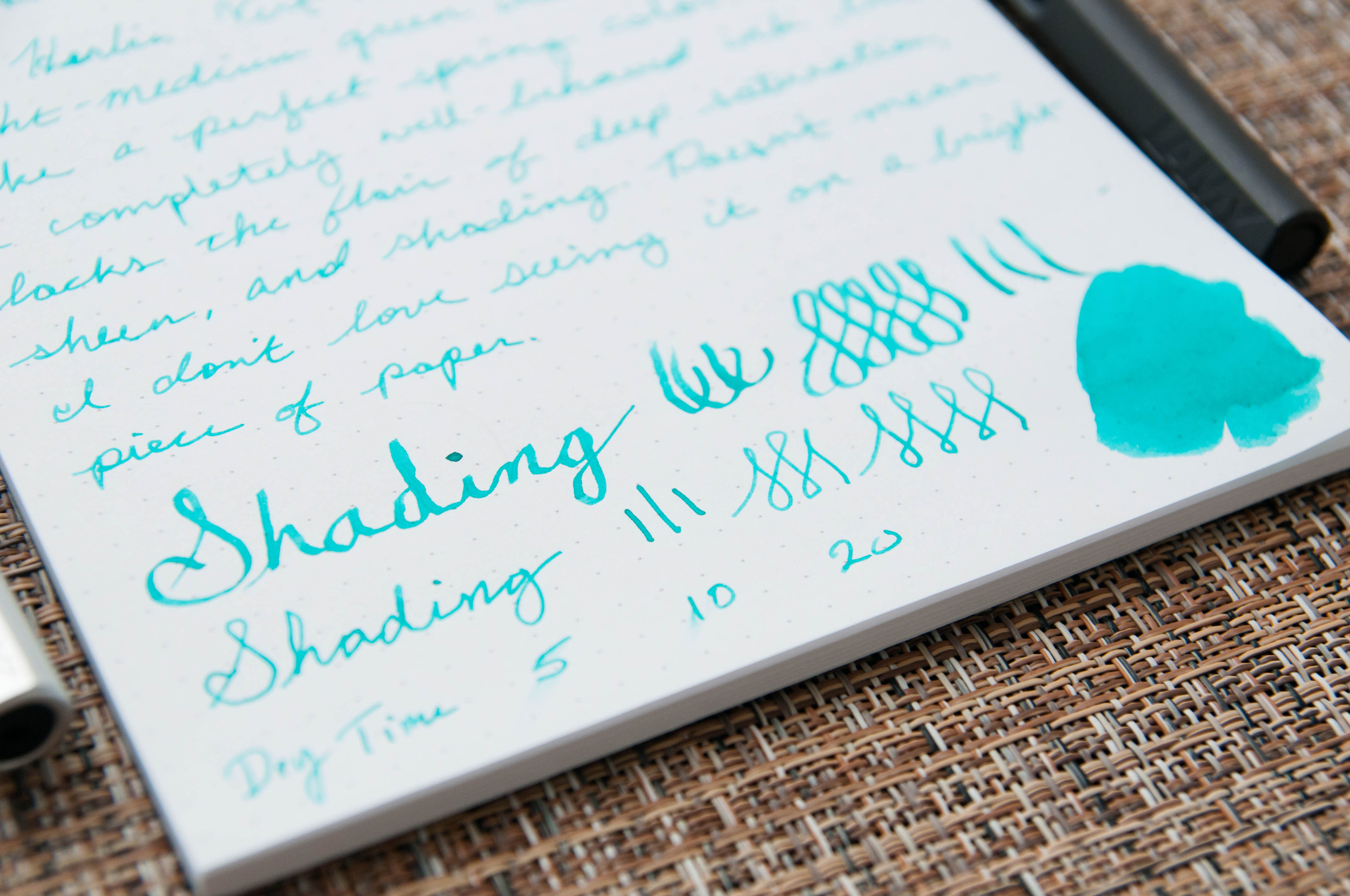
Where Vert Réséda was a light, medium green, Lierre Sauvage is a darker green that reminds me of ferns and moss. It's a forest green, and I love it. It looks fantastic on paper and has more shading qualities than the former. This ink is what I think of as a true green. The Vert ink had a bit of aqua blue coloring, which pushed it slightly toward the turquoise range. It's a beautiful ink, but not quite what I had in mind for a standard green. You can never really tell what you'll actually get when looking at ink samples online, but I'm very happy so far with the Lierre Sauvage.

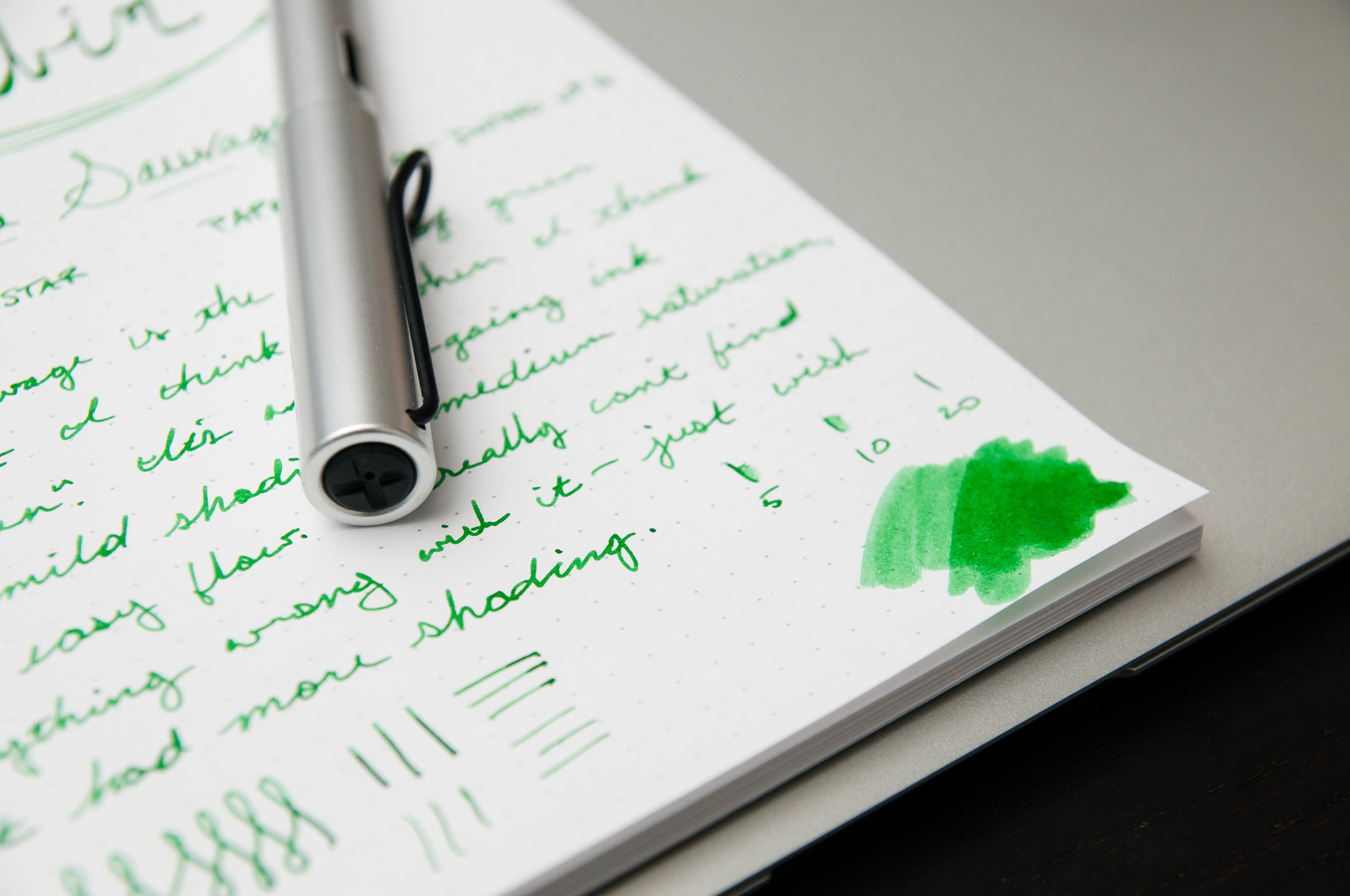
This ink is exactly what I expect from J. Herbin at this point: very well-behaved. It's worked flawlessly in both pens I've tested it in. One of the pens is a bit dry, while the other is normal. It's a lubricated ink that has no problems starting or keeping up with hasty writing, and it also does not dry or clog the nib after being uncapped for a couple of minutes.

It's a medium saturation and does have some mild shading properties. I've noticed that the shading comes out more on bright paper compared to ivory or cream paper. Dry time isn't fantastic, but it's not terrible either. It normally takes about 15 or 20 seconds to be smudge-proof.

Sadly, it doesn't shade as much as I'd like for a green. I'm still on the lookout for a beautiful green that shades easily, so let me know if you have one in mind.

Like the other J. Herbin green, this ink cleans out of pens very easily. Also, this new sample bottle size from J. Herbin is fantastic. I love the size, although it might be a problem for larger pens. The Lamy Safari and Al Star I used barely fit deep enough to draw ink up. That's something to consider when purchasing these bottles.

Overall, Lierre Sauvage is now my favorite green ink, but I'm still looking for more. It's a beautiful, well-behaved ink that lays down a gorgeous line. If you're in the market for a green ink, I think you should start with this one.

(You can find more from Jeff online at Draft Evolution, Twitter, and App.net.)

Posted on September 4, 2014 and filed under J. Herbin, Ink Reviews.

J. Herbin Verte Réséda Ink Review

As I venture into more non-standard ink colors, I'm discovering that I really have an affinity for red and green inks in particular. They've become the main focus of my obsession lately, and I don't see any signs of it losing steam. One of the first inks I tried in this vein was J. Herbin Vert Réséda.

Vert Réséda is a light-medium green ink that makes me think of spring bloom. It's a happy, beautiful color and always puts me in a better mood when I start writing with it. It seems silly, but it's actually a real "property" of the ink in my book.

I don't have any pure greens to compare this ink to, but this one is a well-behaved easy-going ink that has worked perfectly in every pen I've tried – even the ones that tend to write on the dry side.

It's a well-lubricated ink that never stutters or skips, and it does a great job of not bleeding through the page. Even the ink swap I did in the writing sample is hard to see from the other side of the page. I haven't seen another ink do that. Most of them bleed through a bit.

There are some things it lacks, however, and I call those things "flair." Saturation, sheen, and shading are light or non-existent in this ink. I don't know enough about this color range to tell you if that's normal, but for this particular ink, it's very lightly-saturated, has no sheen, and has very light shading properties. The shading is hardly there at all in a regular nib, but it comes out more in the 1.5 mm nib I used. Personally, I would love more shading in this beautiful color. I think it would give it more character. I'd love to find a similar ink with more shading properties.

Overall, I've been very pleased by this ink. When I ordered it, I didn't think I would use it very often, but I've actually used it quite a bit for general writing and notes. It's an everyday ink for me. It's not eclectic enough to take a backseat for special occasions.

I'm happy with my initial dive into the green inks, and I'm pretty sure I'll be trying more. I think I'll set my sights on some of the Diamine offerings next.

(You can find more from Jeff online at Draft Evolution, Twitter, and App.net.)

Posted on August 13, 2014 and filed under Ink Reviews, J. Herbin.

J. Herbin Encre Rouge Ink Review

J Herbin Encre Rouge 2.jpg

I've barely ventured into the realm of red inks, but the experience I've had with J. Herbin Encre Rouge makes me want to try more. I'm a little confused as to what to call this particular ink, so I'll just stick with Encre Rouge (translates to "red ink") for now. This ink is part of the Les Subtiles ("subtle") line of scented inks, available in 5 different flavors/colors. Each scent is matched to a color, so in this case: roses are red.

I don't remember the exact circumstance that landed this ink on my radar, but I bought a bottle last year to use for a Valentine's day note for my wife. What started as a fun idea for Valentine's Day has become one of the most interesting inks I own over the past year. I don't really care for the scented aspect of the ink, but I'm in love with the color.

Before we look at the writing qualities of this ink, let's talk about the special part: the scent. Remember scratch-and-sniff stickers from grade school? This is a more grown-up version of that in a way. The scent of this ink is roses, and from what I can smell, it's dead on. It's not overpowering when writing -- it smells like fresh roses are sitting on the desk next to you. That's about all you get though. Once the ink dries, the scent all but vanishes. That's my major complaint for this ink. The scent just doesn't last once the ink dries.

When writing a letter with this ink, I would expect the scent of roses to greet the reader upon opening the letter. This just isn't the case. Only the writer gets to enjoy the scent.

It's still an interesting concept. Here's how J. Herbin describe the process of infusing scents into ink:

J. Herbin scented inks are made from floral water (hydrosols) of rose, orange, lavender, apple and violets. The hydrosols used by J. Herbin come from Grasse, France, a Provencal town long associated with the perfume industry and famous for its floral scents.

Fancy!

Now, on to the writing qualities of this ink. This is where I'm really happy. I describe the color as a medium red. I can see faint shades of brown in some of the lines, but it looks more like oxblood to me. Mostly, the lines just look like the color of red rose petals. Based on Brad's description of red inks, I'm not sure if I'd call this a dark or bright ink. It seems to possess qualities of both. On one hand, I can detect some oxblood/brown shades, but it also seems to pop off the page. What do you think? Dark or bright?

J Herbin Encre Rouge 3.jpg

Opinions on color aside, this is a very well-behaved and enjoyable ink. In my use, it shows some excellent shading qualities, no feathering on nice paper, no bleed through, and it dries relatively quickly. I've tried this ink in a few pens, and I'd say it has average lubrication qualities.

Apart from my complaints about the quickly fading scent, this is a great ink. I'm afraid it's the reason that I might launch into a red ink journey in the near future. It's a few dollars more expensive than the regular J. Herbin inks, and I'm not sure it's worth the extra money. If there's a regular J. Herbin ink or an ink from another brand that has the same qualities as this ink, I'd be very eager to try it.

(You can find more from Jeff online at Draft Evolution, Twitter, and App.net.)

Put your nose close to the screen ...

Put your nose close to the screen ...

Posted on February 13, 2014 and filed under J. Herbin, Ink Reviews.