I first ran across Kevin Mellon’s artwork when I was working for JetPens. I was impressed with his style, and was interested in the tools he used to create. Watching his career take off - he is now a storyboard artist for Archer and created his own comic series called Suicide Sisters - has been really exciting to follow. My thanks to Kevin for taking the time to answer Three Questions.
1. What role do analog tools such as pens, pencils, and paper play in your day to day life?
Sadly, not as much daily as they used to. I work on the FX cartoon Archer, doing storyboards, and most of that process is digital using cintiqs. That said, I keep sketchbooks with me to work out my thoughts on scenes I’m assigned and various pens to doodle/take notes with.
I love pens/paper/etc. I have a severe JetPens addiction, as the drawers of various tools I’ve bought from them over the years continues to fill up rather than diminish. I will often buy pens just to try something, as they’re fun for me and I like finding/trying different things.
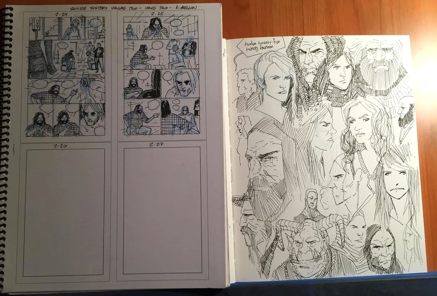
For my comics work, I often do my layouts/thumbnails in sketchbooks, so those are usually pencil, pen, and paper. I vary what I use, and a lot of the pens I buy to try out get used there.
When I do get a chance (read: make the time) to sketch for myself, that’s when I really go through what I have, just trying everything I’ve bought but haven’t gotten to yet, or just enjoying my old standbys.
2. What are your favorite products you are currently using?
For paper, I’ve been really digging Strathmore 297120 60-Pound 192-Page Sketch Book, 8.5 by 11-Inch.
It’s a sturdy paper that’s almost bristol-like. I prefer a bit of tooth to my paper, and this one certainly has a nice bite to it.
For comics pages, I’m pretty standard. I use Strathmore 300 series Vellum surface Bristol. I buy the 11x17 (unruled/no blue-line) packs of 24 in bulk from Dick Blick. Since my comics output has decreased the last few years, I’m still sitting on about a dozen packs, but they’ll get used over time.

For pens, my go-tos at the moment are:
Uni-ball Vision Elite roller ball pen. I love this one for just general use. Writing, sketching, whatever. It’s just a solid, cheap pen that never lets me down in every day use.
Platinum Carbon Desk Fountain Pen (Super Fine). I’ve used quite a few of these in the last two years, and I beat the heck out of them and they keep going. (I’m bad about chewing on the caps/stocks while working). I love the response and line that these get and the long stock is like holding a brush, which is nice since my traditional comic/illustration inking is done with brushes. These I just use for sketching, though.
Another one that’s very similar is the Sailor version of the same pen. They’re different in ways I appreciate subtly, but the Sailor is a solid one to have.
I use the Platinum Carbon ink, as I can’t be bothered to mess with filling my own ink into the converters that I have, and the carbon ink has done me well in all my various brush pens over the years.
I’ve also been messing around with Deleter G nibs using this stock (I might mention that the pink handled nib holder is slightly shorter than the blue one. I have one of each, but use the pink more, as I prefer it better).
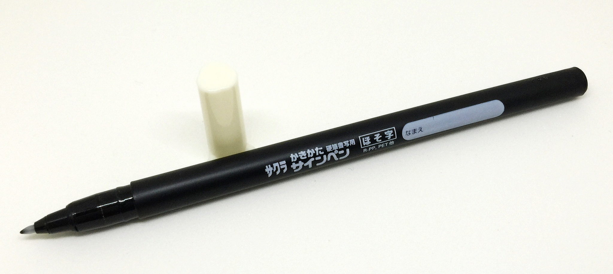
For brush pen sketching, I use the Kuretake Fudegokochi Super Fine and Regular.
And my go-to brush pen for many years has been the Kuretake no. 13. It’s a work horse and the ability to replace just the brush half makes it invaluable for sketching and travel. Also, as long as I’m not too hard on them, they last me quite a while.
For pencils:
A couple years back, you yourself got me onto the Palomino Blackwings which I didn’t expect to like, let alone fall in love with, but I did. It’s a pencil that reacts like a brush. From there I dipped even further and have switched over to the Blackwing Pearls for the most part, and those have been a mainstay for the last year or so.
Otherwise I’m using a Pentel Graph Gear 500 filled with blue lead for sketching and whatever else. The weight and feel of it, plus the metal grip is what sold me on that pencil.
Digitally, I’m forever in love with Sketchbook Pro. It’s my go-to digital sketchbook/workhorse. I swoon over every new iteration of it, and it’s been my mainstay for digital sketching/design/comics penciling for about 6 years now.
3. What creation are you the most proud of?
Hmm. This is a tough one. I’d have to say that my most recent full-length book, Suicide Sisters would have to be it. Before putting that out, I’d have said LoveSTRUCK, my second graphic novel with writer Dennis Hopeless, but since I conceived, wrote, and drew Suicide Sisters myself, I have to go with that one. Wow, that’s a lot of commas. Obviously I’m good at writing.