Paper Mate Flair Tropical Vacation Set Review

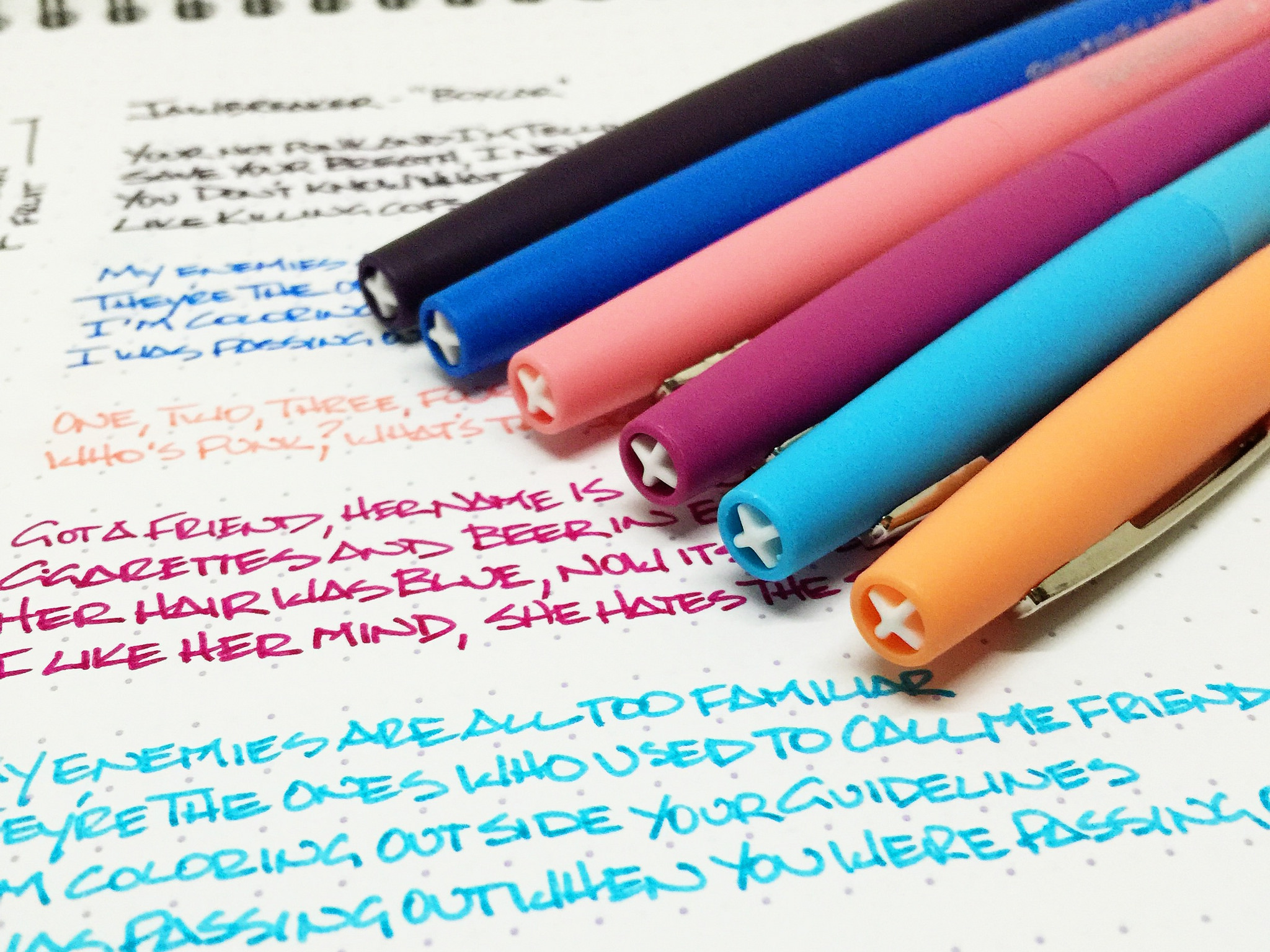
You know it's back to school time when new multi-color pen packs start hitting the shelf, and Paper Mate is just in time with its latest Flair colors. Appropriately named Tropical Vacation, this set will have you longing for the days of summer as your classes get underway for the 2015-2016 school year.

The Paper Mate Flair is a classic pen, and a long time favorite of mine and many, many others. It has a long lineage of excellent quality and performance at an excellent price. The basic black medium tip Paper Mate Flair would be considered on the first ballot of the Stationery Hall of Fame, if there were such a thing, and subsequent releases have been equally as good. The Ultra Fine is my personal favorite, but also one of the hardest to find.

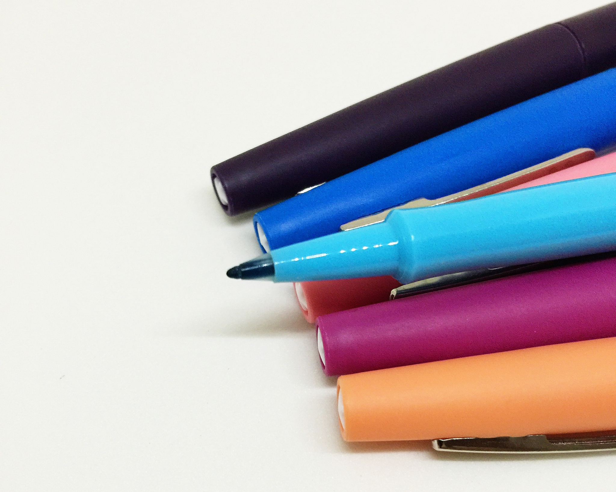
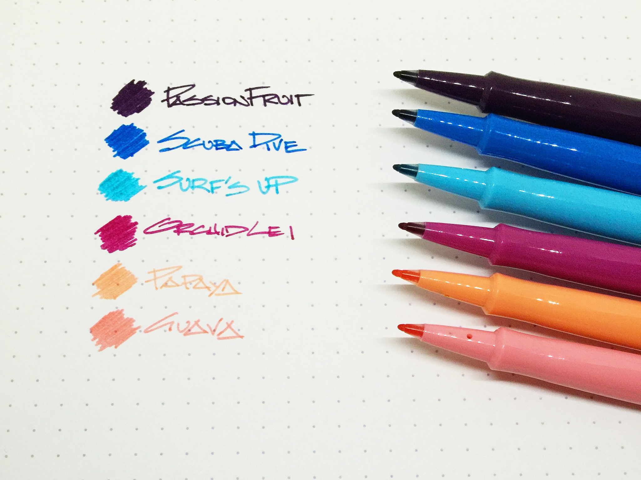
Paper Mate has introduced various color variations over the years, but they leaned towards normal shades (lime green, orange, etc.). This is one of the first non-standard releases I can remember. Tropical Vacation offers up six colors: Guava, Orchid Lei, Papaya, Passion Fruit, Scuba Dive, and Surf's Up. The purple black color of Passion Fruit is the big winner in my book, followed by the bright blue of Scuba Dive. Orchid Lei is also a standout with its dark pink/magenta shade, but the three lighter colors aren't so great, with Papaya bringing up the rear.

One interesting thing I noticed is that the line width varied slightly between pens right out of the pack. For example, the Passion Fruit was wider and softer than Papaya, whose tip was firmer and finer than the rest of the bunch. It's not a big concern because these tips will break down with use regardless, but it was noticeable. The good thing is the Flair has moved to plastic tips as opposed to the really old felt tips that would end up stringy over time.

In the grand scheme of things, Paper Mate is not always on the tips of pen addicts tongues except for one pen: The Paper Mate Flair. It's a classic that works in many situations, and it is nice to see a refresh like Tropical Vacation hit the shelves from time to time.

(JetPens provided this product at no charge to The Pen Addict for review purposes.)

In 2013, I found an unprocessed Super 8 film cartridge of footage I shot in 1992. I had no idea what it was. This is it. http://jawbreakerband.com/ https://www.facebook.com/jawbreaker https://twitter.com/jawbreakerband http://instagram.com/jawbreakermusic https://midheaven.com/artist/jawbreaker c&p 1994 schwarzenbach / bauermeister / pfahler bmi

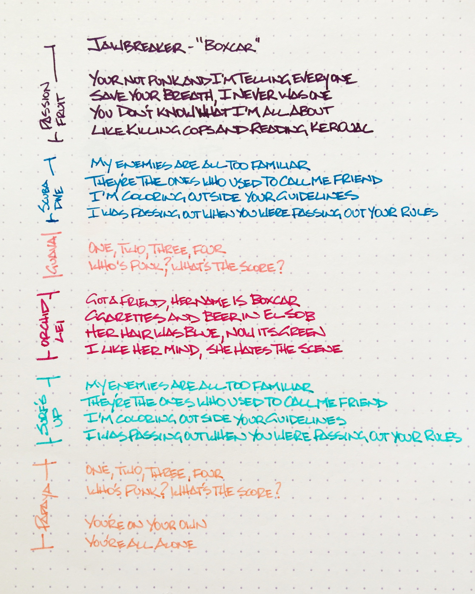
If you have made it this far, treat yourself to a listen to 'Boxcar" by the band Jawbreaker. The video footage in the video above was lost for over 20 years before being found in 2013. And if that floats your boat, check out John Darnielle totally kill it in this cover version.

Posted on August 10, 2015 and filed under Paper Mate, Pen Reviews.

Lamy Safari 2015 Neon Lime Giveaway Winner

I'm a little late on picking the winner - the brightness of the Safari blinded me yesterday! That's my excuse, and I'm sticking to it. The winner of the 2015 Neon Lime Special Edition Safari is:

Safari Winner.jpg

Congrats Chris! Email me via the Contact Page within the next week and I will get your pen on its way.

Thanks to all who entered, and thanks to Goldspot Pens for providing this pen for giveaway.

Posted on August 9, 2015 and filed under Giveaways, Lamy, Safari.

Montblanc Blue Hour Ink Review

Twilight at Caprock Canyons, Texas

Twilight at Caprock Canyons, Texas

(Susan M. Pigott is a fountain pen collector, pen and paperholic, photographer, and professor. You can find more from Susan on her blog Scribalishess.)

Montblanc "Blue Hour" or "Twilight" is "linked to the 'blue hour,' the time when the day turns to night," according to Montblanc's website. The ink comes in a 30ml square glass bottle adorned with the Montblanc emblem on the cap. It is a limited edition ink.

When I first saw a sample of this ink, I couldn't wait to purchase a bottle. It looked lovely with deep blue-green tones, sheen, and shading. I love blue inks, and I expected great things from Montblanc Blue Hour.

But when I inked my first pen with Blue Hour, I was disappointed. The ink didn't have the depth I was expecting. Where was the sheen? Where was the shading? And, worst of all, after I wrote a few pages and the ink dried, it faded to a sort of dusty bluish-green. You can see in the picture below how the ink is deep blue when it's fresh and dusty blue-green when it has dried.

I tried it in several different pens with various nib sizes and grew more disappointed. Broad nibs bring out the shading, but the ink was dry and unsaturated in my finer nibs.

The only way I was able to get sheen from the ink was in droplets. None of my writing samples, even with my super broad, flexible music nib, exhibited any sheen.

Chromatography demonstrates that the ink has blue, green, and yellow tones. I expected it to be more of a blue-black, but it leans more towards teal.

Blue Hour is not a wet, highly-saturated ink. When you do a smear test, it dries quickly. Obviously, the dry times will be longer with broader nibs, but not by much. The ink is not waterproof.

When I first used Blue Hour, I thought it resembled Iroshizuku Tsuki-Yo. The two inks look similar, but Tsuki-Yo has more green and the color definitely doesn't fade. Tsuki-Yo also flows better, especially in fine nibs.

I'm glad Blue Hour came in the smaller 30ml bottle, because this is not an ink I will use much. After falling in love with Montblanc Toffee, I genuinely thought this would be a terrific ink. But it is dry; it fades, and it simply fails to impress.

Posted on August 7, 2015 and filed under Ink Reviews, Montblanc.