The Pelikan M600 Pink Special Edition Fountain Pen: A Review

(Susan M. Pigott is a fountain pen collector, pen and paperholic, photographer, and professor. You can find more from Susan on her blog Scribalishess.)

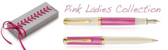
Scandalized! That's what I was when I first saw ads for the Pelikan M600 Pink "Ladies" Collection complete with boudoir box. I busted out laughing. I scoffed. I was offended by a so-called "ladies" Pelikan, even more so by the packaging. A pen in a corset box? Seriously, Pelikan?

I posted pictures on Facebook making fun of the pen. "Look! It's a Victoria's Secret pen!" "Barbie would love this pen!" "Who would buy this atrocity?"

Me, that's who.

In spite of some claims that this isn't necessarily a women's pen, it was clearly packaged and marketed to appeal primarily to women. Classic Fountain Pens simply calls it the Pelikan M600 Pink Special Edition, but notes that in "some markets" it is known as the "Pink Ladies Pelikan."

Even though I was initially incensed by such gendered marketing (I mean this is the 21st Century, people), I realized that it's nothing new. In the past there were Lady Sheaffers and Lady Soenneckens. Pilot markets pens to women, such as the Pilot Lady White Fountain Pen. Other manufacturers do the same or offer pens that might appeal more to women, such as the Montblanc Princess Grace or the Parker Sonnet Feminine collection.

So I grew a little less critical. A little. The pens above don't come in corset boxes (though one of my friends wondered why Pelikan put the pen in a tennis shoe box . . . .) Still. I think Pelikan could have thought through the implications of the packaging and marketed the pen to a broader audience.

I decided it didn't matter to me since I would never be caught dead with a Victoria's Secret pen. But then I saw photographs of the pen by actual owners. The color was less Barbie pink, more subtle, like dark cherry. The pen looked sophisticated and gorgeous rather than bubble-gum silly.

And that's when the obsession started. Me. The one who derided Pelikan for flouting a gendered pen. Me, the one who owns nothing pink in her wardrobe. Suddenly, I was thinking how nice this pen would look next to black leather.

I fell for the Pink Pelikan, and I fell hard. I had to have one. I told myself it was for research–I must write a review for Pen Addict. I even told myself I wouldn't ink the pen. I would just write a review and send it back. But I inked the Pink, and I was hooked.

This really is a gorgeous pen in person. It comes packaged in a plain white outer box (like the sleeves that are placed over racy magazines?) Inside is the boudoir box: a corset of silver laced in pink, silky ribbon.

Fortunately, you don't have to unlace the whole box. Once you untie the bow, the two sides of the box fall open to reveal the pen.

The colors have so much more depth than in the advertising shots. The darker stripes are cherry pink with a softer pink underneath.

Like the White Pelikan Tortoise, the grip and piston are white plastic with gold rings, and the cap is white.

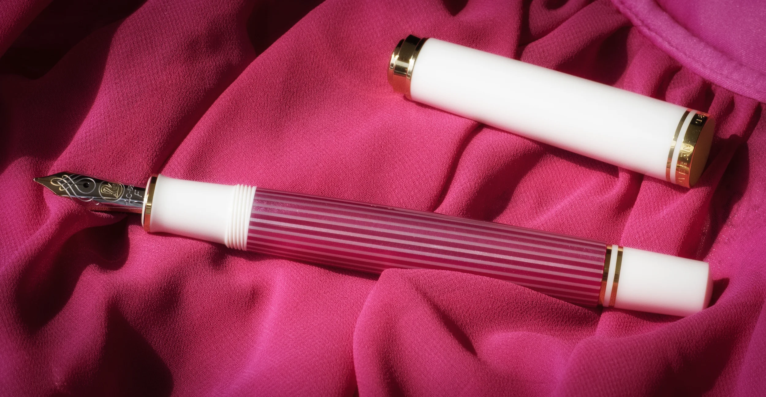
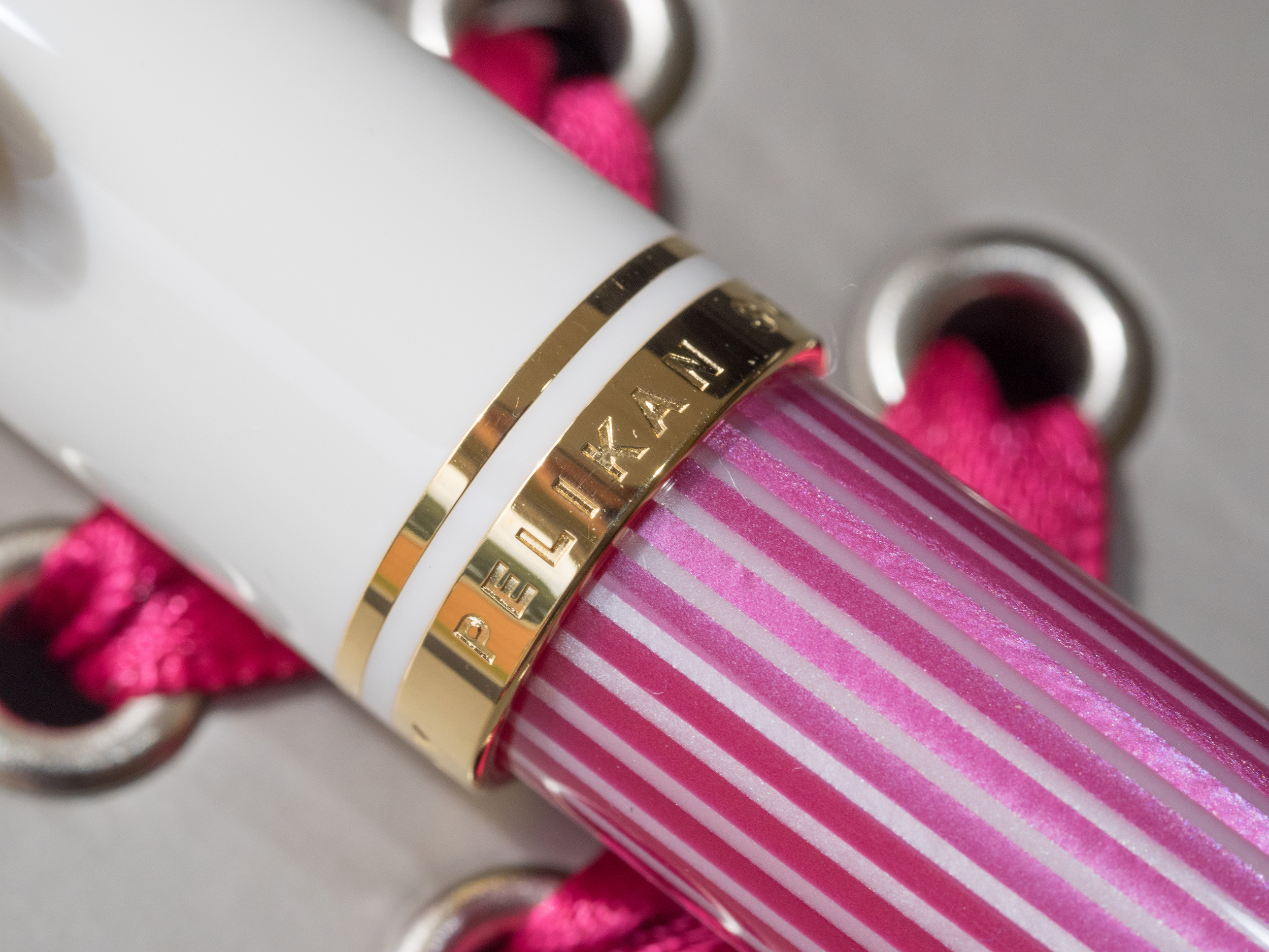
Unlike the Tortoise, the finial is etched gold rather than black and gold. The larger band at the base of the cap is engraved with the words "Pelikan," "Souverän," and "Germany."

The nib is two-tone 14K gold. It is engraved with the usual beautiful scrollwork and the Pelikan logo. I love the design of Pelikan nibs–they are spectacular.

I opted for a fine nib. In the past, I always purchased extra fine nibs on my Pelikans. Then I moved up to italics, and lately I've been getting oblique triple broads. This time I decided to keep things simple and go with a fine nib.

It writes perfectly–smooth and lush. I inked it with Iroshizuku Tsutsuji, purchased especially for this pen (my first truly pink ink). I have absolutely no complaints, no hard starts, no skipping.

The M600 is a good fit for many people. M800s can be too big and heavy. M400s can be too small.

The M600 is 5.2 inches when capped, just less than 5 inches uncapped, and 6 inches posted. It's a light pen, weighing only 18.2 grams. It retails for $500 at Classic Fountain Pens, and that seems to be the price across the board at most retailers. You may find it for less if you do some hunting.

The Pink Pelikan M600 is a terrific pen. It boasts the usual Pelikan quality, and hopefully this pen won't have the cap cracking issues the M400 White Tortoise did. I highly recommend this pen to both men and women who love this color. Pink can brighten anyone's day. Plus, who doesn't need a corset box in their closet?

Pros

  • A simply gorgeous pen with colors that are much more sophisticated in person than in photographs

  • This is a piston filler, which is my favorite type of filling system.

  • The 14K nib is smooth and writes straight out of the (corset) box.
  • The pen is light in the hand and well balanced.

Cons

  • The packaging is interesting, to say the least. But if you don't like it, you don't have to keep it. Me? I'm keeping it for posterity.
  • This is an expensive pen at $500.
  • People with larger hands or who prefer some heft to their fountain pens may find this pen too small or light
Posted on October 30, 2015 and filed under Pelikan, Pen Reviews, Fountain Pens.

Tom Norton Walnut Drawing Ink Review

(This is a guest post by Nick Folz. You can find more of Nick and his work on his blog, Smallberry Drive, Twitter, and Instagram.)

Let’s get the obvious misnomer out of the way: Walnut Ink is not made of walnuts. Instead, it aims to look like the walnut inks of antiquity, without some of those ink’s shortfalls. Before synthetic and India inks were widely available, lots of people made inks from walnut husks, people like Leonardo da Vinci and Rembrandt. Walnuts are plentiful, naturally occurring and it is actually fairly easy to make, but you don’t really want to boil walnut husks every time you want to ink something up. One of the side effects of walnut inks is that they are not completely acid free, so they slowly eat away paper as time marches on and would also lighten from the original dark or near black to the brown hues we associate with older illustrations. What is unique about Tom Norton Walnut Drawing Ink is that it aims to ape the aged look of walnut inks, with the added benefit of being acid free and easy to use and manipulate.

To show my bias early, I usually lean towards India inks. They dry fast, are waterproof and have a pleasant thickness to them. So when I inked up a brush with Walnut Ink I was surprised how light you could go with it. One dip of a brush can get you a wide variety of tones, largely dependent on how much of it you lay down at a time. The closest analogy I can think of is watercolors, which is not a bad thing. This comparison is double apt since this ink is not waterproof, so you can blend line work that has dried when you are laying in fills or shading. You can even go in with just water to spread out what you already have on the page. Working with an ink that was not waterproof threw me for a loop at first, but once I knew what to expect I really got into it and found it more forgiving that previously expected.

Brown can be a problematic color. Brown is one of those weird colors that can vary wildly yet always fall under the same header of “brown.” The problem is the way most of us make brown, by mixing the three primary colors or, in some cases, red, yellow and black. There is no brown in a rainbow, and the “B” in “ROYGBIV” sure ain’t “Brown.” Instead of a mix of two colors, you need three. That added variability adds an unwieldy aspect to this nondescript color. Despite the many pitfalls surrounding this moody hue, Walnut nails it with their pigment. It is a warm, inviting sepia tone that has a fantastic range, especially when you vary how you apply it. When using a nib, this can reach almost black depths. Brushes will give you everything from “strong coffee stain” to “old paper patina.” The overall look of this ink is vintage, imbibing everything on the page with a look of lost years. The first thing I drew with it was not a great drawing, but the look of the ink and the wash of sepia made up for any lack of skill on my part.

On another drawing, I went in with nibs first to get the rich dark browns for line work, and then went back with brushes to do the dark shading with pure ink. Once all of that dried, I washed up light areas with a mix of ink and water. I really like the end product and was very happy with the variety of tones I got with this one ink.

If you have ever enjoyed a good inkwash or watercolor, this is right up your alley and I can’t recommend it enough. If you are looking for a way to make a project you are working on look “aged” or “antique,” look no further. If you are looking for the next great fountain pen ink or a waterproof ink, look elsewhere. It is a versatile ink that is fun to use and would be a strong tool for any artist to have around. You can find more info about Walnut Ink at their website or check out a dealer near you.

(Disclaimer: This product was provided for me free of cost but I am not otherwise being compensated for this review. The opinions contained are my own.)

Posted on October 29, 2015 and filed under Ink Reviews.

Nanami Paper Seven Seas Writer Review

(Jeff Abbott is a regular contributor at The Pen Addict. You can find more from Jeff online at Draft Evolution and Twitter.)

Tomoe River paper took the world (well, a very small portion of the world) by storm a couple years ago for its phenomenal paper. Basically, the paper that Tomoe River produces is super thin, but handles fountain pen nibs and inks like nothing else. You're hard pressed to find something that will bleed through or feather on its worst day. Brad wrote a bit about it back in 2013, and I've never had a bad thing to say about it. I love Tomoe River paper.

Problem was, you could only buy Tomoe River paper in loose leaf. There weren't any notebooks or pads at first. Thankfully, this has changed. There are many products nowadays that feature this miraculous paper, and in many different formats and uses. This review focuses on a product that appeals to those who like to write on lined pages without having to switch to a new notebook for a long, long time: The Seven Seas Writer by Nanami Paper.

Most of the notebooks I review come in around 80 pages or so. Some of them even have upwards of 220. The Seven Seas Writer blows that number away with a whopping 480 pages of ivory lined Tomoe River paper. In case you didn't know, that's a ton of paper for one notebook. You'd expect a notebook of that size to be about 3 inches thick to accommodate all those pages, but that's not the case with the Seven Seas Writer. Since it's using the ultra-thin Tomoe River paper, it's the same thickness as other notebooks I have that only have 220 pages or so. Same size, almost twice the pages.

The book is an A5 size, and features a strong (but soft) cover. The cover is thin and made of a fabric of some kind. To my eyes, it's a dark brown or dark green color, and looks really inconspicuous. It's not flashy at all, but you can easily change that by purchasing a high-quality leather cover to go along with it (if you can find them in stock).

The exterior of the book is well-made. When you look at the sides of the book, the pages line up perfectly. There's no sloppy binding here. Everything about the construction of this book is done with care, and that really becomes obvious the more you use it. Tomoe River paper is incredible for how thin it is and how well it behaves with pens and inks of all types, but it's still really easy to tear. The Writer protects the pages very well so you don't have to worry about where you take it.

I've taken my Writer with me (sans-cover) many, many times, and it barely shows any wear. The cover is soft, but strong.

There are a couple of things it lacks that are mostly personal preferences: page numbers and a bookmark. The first is a nice-to-have, and the second can be solved by adding a notebook cover that also has a bookmark ribbon attached. These are really minor quibbles, though.

So, how does the book do when you're actually writing in it? Well, I love mine.

The book has absolutely no issue laying flat, even when you're still in those first pages where most notebooks really resist until broken in. Given the thin paper and high-quality binding, it just lays flat naturally, and closes with ease.

The paper is glassy smooth, the lines are perfectly spaced (8mm spacing), and it just stays out of your way. I tend to get a bit uncomfortable when writing on the fat side of the notebook when I get to the bottom of the page, but that's normal for any notebook that has this many pages (or half as many).

Nanami Paper Seven Seas Writer Ink.jpg

Dry time is incredibly fast, but you will smudge or mark up other pages if you close the book just after writing. Nanami was nice enough to include a perfectly-sized piece of blotter paper that you can use to keep that from happening, but I'm reckless and live a life a danger. The paper is thin, so there's plenty of show-through on the backs of pages, but actual bleed-through is extremely rare, regardless of the pen/ink.

I can easily say this is my favorite notebook. It's a pleasure to use, and it just keeps holding up past my expectations. I highly recommend it to anyone who enjoys lined paper and an exceptional paper. Since it's a standard size (A5), you can customize it by adding covers.

And, did I mention it's only $25? I'm still blown away by the price. Tomoe River paper is like mithril to me, so I honestly don't know how this 480-page notebook comes in at that price. I would guess that the cost is reduced because of the plain, thin cover and lack of bookmark, closure band, etc., but it still gets the job done.

Check out the Seven Seas Writer for yourself or as a gift. If they happen to be sold out, don't worry — they'll likely release a new edition fairly quickly.

Posted on October 28, 2015 and filed under Notebook Reviews, Tomoe River.