The Omas Ogiva Cocktail Vodka Yellow Limited Edition Fountain Pen: A Review

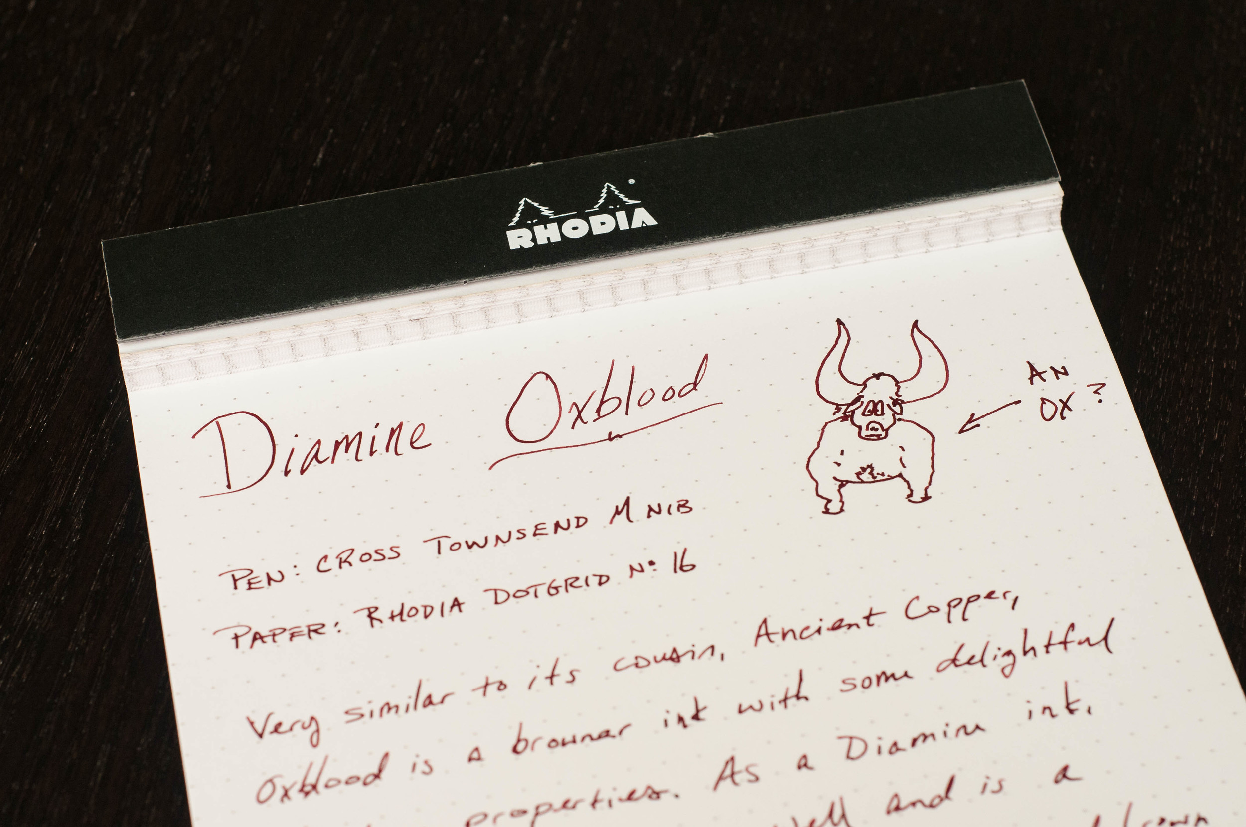
When I first saw pictures of the new Omas Ogiva Cocktail limited edition pens, I wanted one so badly. I seriously considered buying the yellow or blue version, but I simply did not have the money. Plus, I purchased one of last year's limited edition Albas in green with an EF extra flessibile nib, and I couldn't see the need for another pen just like it in a different color.

Omas Alba in Green

Omas Alba in Green

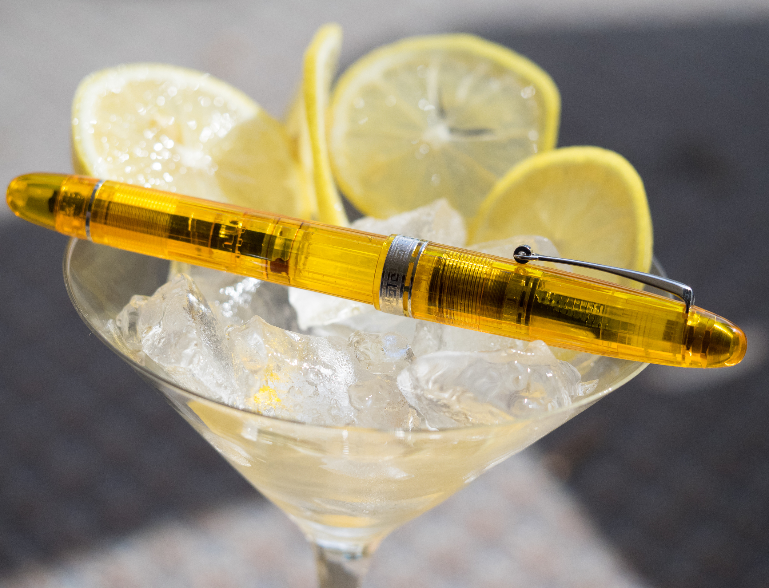
But, Kenro Industries sent the Pen Addict some pens to review, and happily, one of them was a Cocktail in Vodka Yellow with a 14K broad nib. I love my extra flessibile nib, but I was interested to see how the non-flexible broad wrote.

The Omas Ogiva Cocktail limited edition fountain pen is a cigar-shaped piston filler. All three colors (Vodka Yellow, Blue Angel, and Bloody Mary) are semi-transparent, but, obviously, the yellow is the most transparent of the three. The yellow color is rich and in sunlight the faceted surface of the cotton resin sparkles.

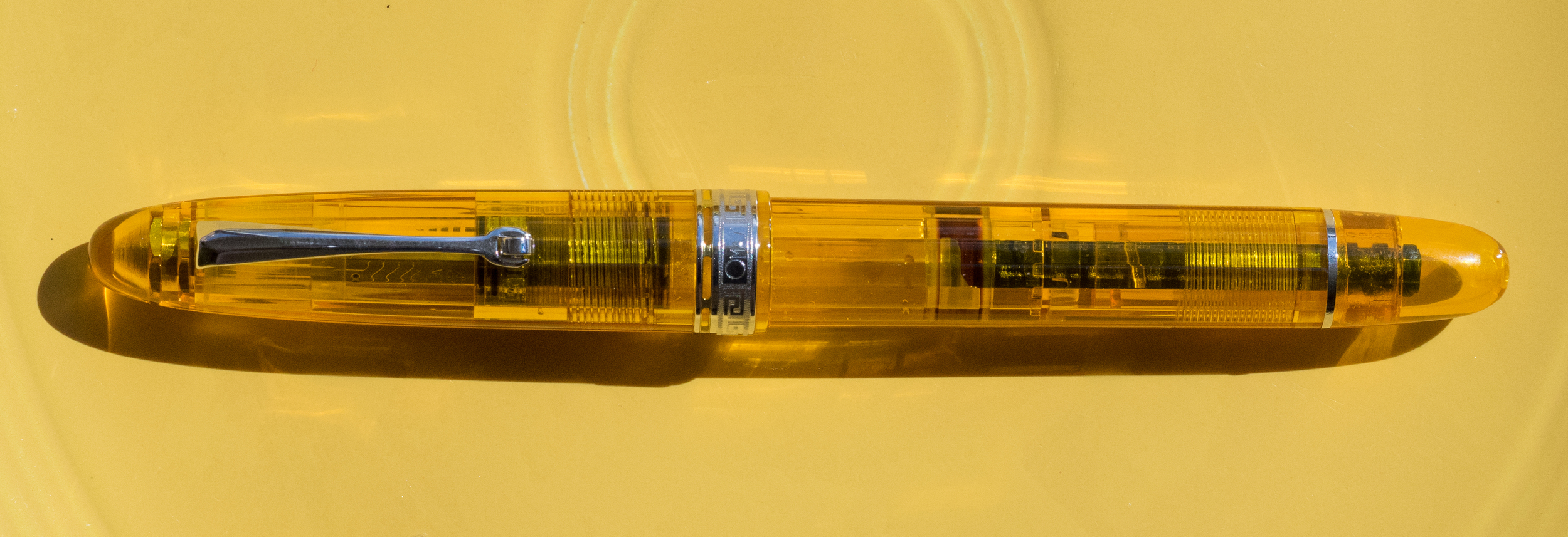
The pen has rhodium colored trim. The clip is Omas's usual style with a cylinder to assist in clipping the pen to a pocket or papers.

The band on the cap is engraved with the beautiful Greek key design as is the band at the top of the grip. The only other adornment is a thin silver ring at the piston end.

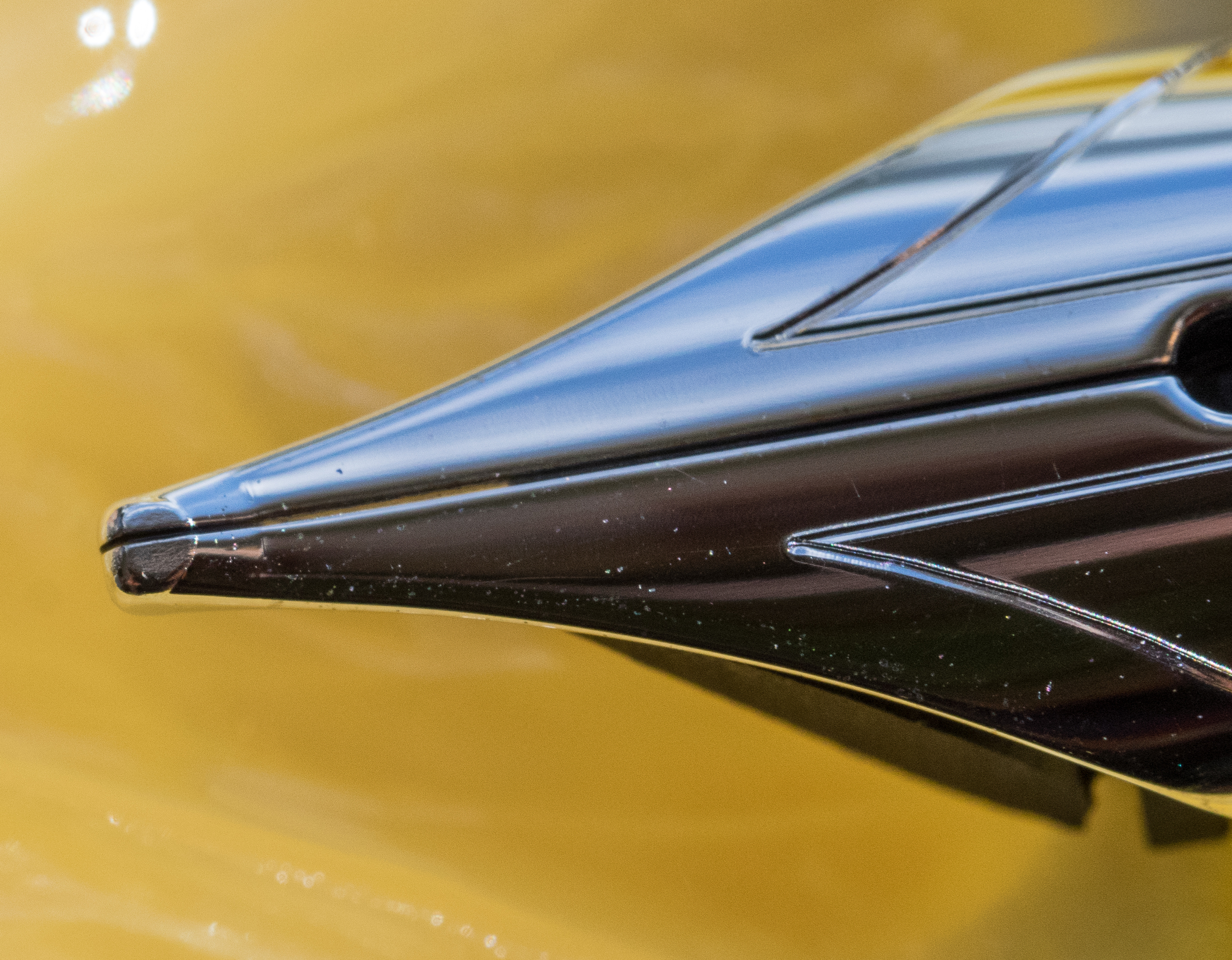
The nib is large and luscious. It has arrow engravings, the Omas name, and the gold content on top. The nib size is engraved on the side.

Omas nibs (at least the ones I've tried) tend to be very wet. That is definitely true for this nib. It never skips or has hard starts, but it lays down a thick, wet line.

Omas Broad Nib

Omas Broad Nib

Unlike the extra flessibile nibs, the broad nib has no flex. The difference is that the broad nib writes a consistently thick line whereas the extra flessibile nib offers variation from EF to B.

Omas Extra flessibile Nib

Omas Extra flessibile Nib

If I were to purchase an Omas with a broad nib, I would probably have it ground to a smooth italic and tone the wetness down just a bit. Still, I'd rather have a too-wet nib than one that stutters and is stingy with ink.

This pen is large, comparable to a MB 149 but lighter and not quite as thick. It is 5.75 inches in length, capped; 6.875 inches posted; and 5.06 inches unposted. It is light in the hand (21 grams) thanks to the cotton resin material. I find it very comfortable to write with.

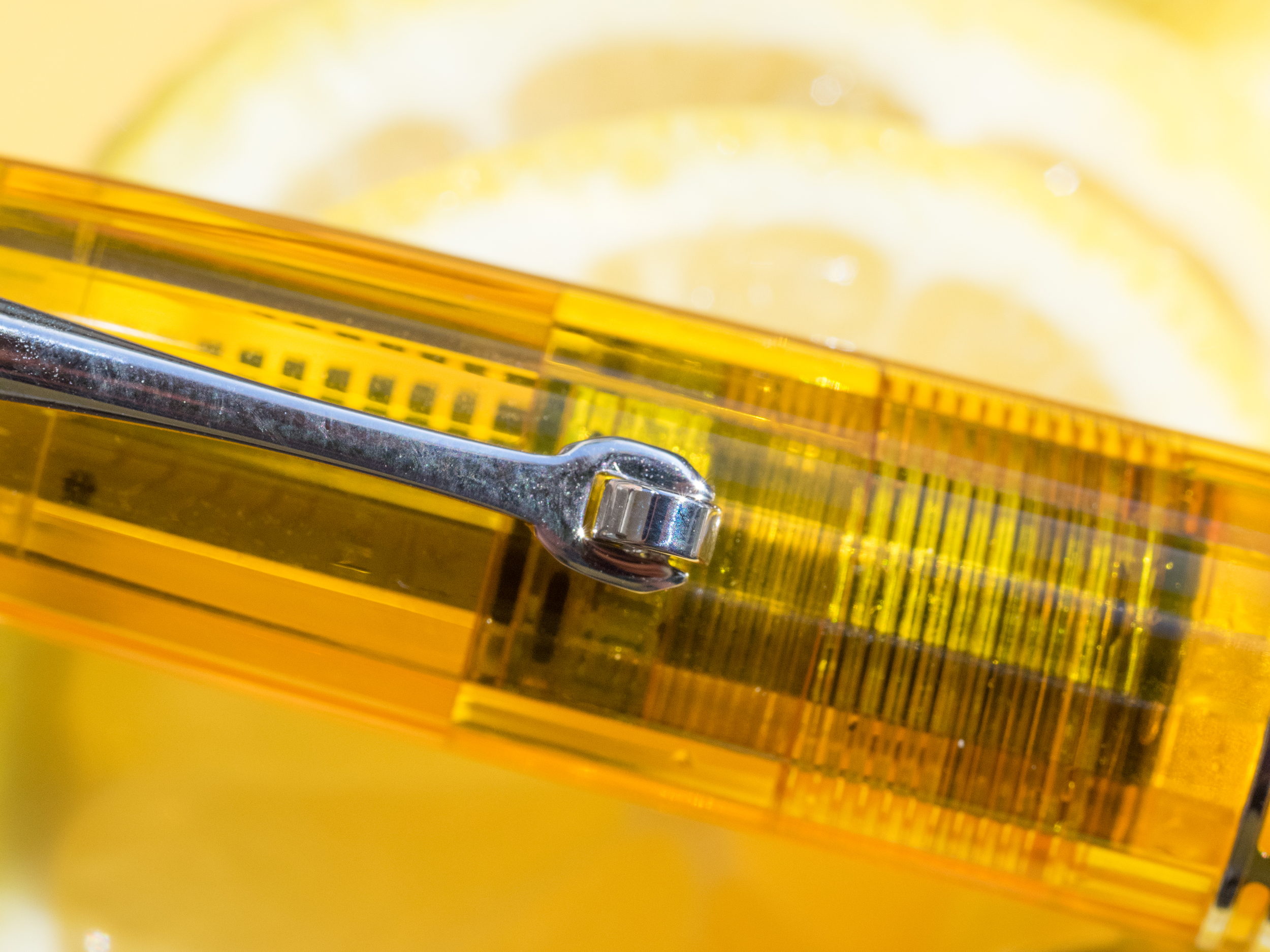
I love being able to see the inner workings of demonstrator pens. But that leads to one negative. The piston seal on this pen allowed ink to seep in between the sides of the seal and the pen body. It is quite noticeable because of the light color of the pen.

Piston Seal Leak

Piston Seal Leak

I checked my green Omas for similar leaks, but it has a tight seal. So, the defect might be limited to this particular pen. I don't think there's any way to remove the piston for cleaning, unfortunately.

No leak on the Green Alba

No leak on the Green Alba

All in all, I love the Ogiva pens Omas is producing. I am sorely tempted to buy the Blue Angel (because: BLUE), but I'm sort of hoping that next year Omas will do a light turquoise version like the vintage Omas 360.

The Omas Ogiva Cocktail pen retails for around $395.00. It comes packaged in a sturdy Omas box with a suede-like sleeve for the pen. These are limited edition pens, so once they are all sold, there will be no more.

Pros

  • The Omas Ogiva Cocktail is a beautiful demonstrator pen.
  • The pen is light in the hand and well balanced.
  • It is a piston filler and holds a good amount of ink (0.9ml).
  • The nib is smooth and trouble free. * I love the Greek key details on the pen.

Cons

  • On this particular pen, the piston seal allowed ink to leak between the seal and the body of the pen.
  • The broad nib is very wet.

(This Omas Ogiva Cocktail Vodka Yellow was loaned to Pen Addict for review by Kenro Industries)

Posted on November 5, 2015 and filed under Fountain Pens, Pen Reviews, Omas.

Diamine Oxblood Ink Review

(Jeff Abbott is a regular contributor at The Pen Addict. You can find more from Jeff online at Draft Evolution and Twitter.)

Oxblood is one of those words that took me a while to comprehend as a child. Why is the word "blood" in the name, and what does it have to do with an ox? My first memory of hearing this term was in relation to the color of a leather belt. I'm not confident I could tell you why this is still a standard color in some product lines, but it's probably fair that most people understand what the color looks like.

Diamine Oxblood is what I consider the standard oxblood color. It's not too dark, but it has plenty of dark red and brown mixing together to look like a shady blood color. I happen to be a fan of inks with this color scheme, but I understand it's also not for everyone. Either way, you'll know quickly after seeing a sample whether the color is for you. If it is, then Diamine is the one to start with.

I've written previously about a couple other red-brown inks that I really enjoyed: Diamine Ancient Copper and Organics Studio Edgar Allen Poe. These are both great inks in their own regard, but they're just a little off from the standard red-brown color I associate with a classic Oxblood. They're great inks and provide their own unique color and properties that make them great daily writers.

Diamine Oxblood is also a great daily writer. Let's get into the specifics of how this ink performs.

First off, the color is subtle, but deep and rich. It's a wonderful combination of reds and browns that I enjoy seeing on the page. Funny, I like the color of this ink, which is similar to blood, but I hate the sight of actual blood. Go figure.

Like every other Diamine ink I've used, it performs well. The ink has never dried up in my pens after a couple idle days, and it always starts straight away when I start writing. No hard starts, no skipping, or anything negative when it comes to ink flow and starting/stopping. The ink is right in the middle of the scale when it comes to lubrication and wetness. There's a pleasant amount of shading if you're using a pen with a larger nib, like a medium or larger German nib. In smaller nibs, you still get the great color, but the shading characteristics are diminished.

Dry time was average, coming in at just under 10 seconds for normal writing. You'll get smudges if you close a notebook too quickly after writing, and left-hand writers will have some issues with the long-ish dry time depending on the grip style.

When it comes to the color and how it compares to similar inks, I think it's the standard for Oxblood. Ancient Copper is also a red-brown ink, but it has more orange (copper) tones that make it more brown than red in certain light. Organics Studio Edgar Allen Poe is a much darker ink that also has some very light purple tones at times. E.A. Poe is one of my all-time favorite inks, but it's not a standard Oxblood in my opinion. Doesn't mean it's not gorgeous.

Overall, this is a fantastic ink that I think you should try if you are interested in dark reds and red-browns. As far as Oxblood goes, this is my standard in terms of color, shading, and behavior. On JetPens, you can order this ink in three different sizes/formats. It's available in a 30ml sample bottle, a full-sized 80ml bottle, and an 18-pack cartridge format.

(JetPens provided this product at no charge to The Pen Addict for review purposes.)

Posted on November 4, 2015 and filed under Diamine, Ink Reviews.

The Pen Addict Podcast: Episode 179 - Super Traditional Camo Pattern

My weekend was jam-packed full of awesomeness as Nock Co. attended the American Field pop-up shop in Atlanta. Myke and I discussed the full experience, from being strangers entering into a new world to releasing new products into the wild. We also cover a trifecta of paper goodness from Midori, Field Notes, and Hobonichi.

Show Notes & Download Links

This episode of The Pen Addict is sponsored by:

lynda.com: An easy and affordable way to help individuals and organizations learn. Free 10-day trial.

Dudek Modern Goods: Use code 'PENADDICT' for 10% off through the month of November.

Fracture: Photos printed in vivid color directly on glass. Use code 'PENADDICT' to get 15% off.

Posted on November 3, 2015 and filed under Podcast.