Posts filed under KWZ

KWZ Iron Gall Blue #4 Ink Review

(Jeff Abbott is a regular contributor at The Pen Addict. You can find more from Jeff online at Draft Evolution and Twitter.)

I recently reviewed another KWZ Iron Gall blue ink, and I was a little more than excited to try out another. This time, it's another member of the blue family — Blue #4.

Blue #4 is very similar to Blue #1, except that it dries a little slower, is slightly more lubricated, and doesn't have as much of a dramatic color-changing drying performance. Still, for all the similarities, it's the color that certainly sets this one apart from its sibling.

Let's cover the similarities first. Iron gall? Check. Dries darker than the original wet color? Oh yes. Water resistant? You bet. Easy to clean out of a pen? Definitely.

Now, let's talk a bit more in depth about the differences in Blue #4. For one, this ink is slower to dry than Blue #1. Average dry time for #4 is around 30 seconds, compared to 20 seconds for #1. 30 seconds is a bit on the long side for my tastes, so that's not something I can get over quickly.

Blue #4 can exhibit some nice shading behaviors — nothing extreme, but definitely pleasant. You'll notice it more after the ink dries since the wet ink is a pretty flat color. Like its #1 sibling, #4 also performs at an excellent level where show-through, feathering, and bleeding are concerned. Seriously, these KWZ IG inks are champs in this regard.

One thing that I definitely enjoy in this ink is the fact that it's less dry than Blue #1. It's certainly not a wet, easy-flowing ink, but it feels more normal when writing. Or, put another way, the pen/nib that I'm accustomed to still feel like the same pen/nib. With Blue #1, I hardly recognized my pen due to the significant drag on the nib from the dry ink.

Finally — possibly the most important attribute of the ink: the color. When writing, the color is a dusty purple with some distant blues shimmering through. As the ink dries, it transforms into a dark purple. It's a beautiful color once it dries, but I'd argue it's far from any blue I've seen. In certain spots, I can make out a dark, dark gray-blue, but my eyes still refuse to see anything but a purple foundation. Who knows, it may just be my unique eyes and a problem with how I see color (that's the funny thing about colors, anyway - we all see them differently to some extent), so take my opinion with a grain of salt.

That said, I like the color quite a bit. It's not what I recognize as blue, but that doesn't mean it isn't an intriguing, beautiful color.

There's a lot to like about these KWZ Iron Gall inks. What it really comes down to is your color preferences. Like the Blue #1 I tried before, Blue #4 offers some fantastic characteristics, and my favorite one by far is watching the color turn darker as the ink dries. If that sounds interesting to you, you really need to try out some KWZ IG Inks.

(Vanness Pens provided this ink sample at no charge to The Pen Addict for review purposes.)

Posted on December 16, 2015 and filed under KWZ, Ink Reviews.

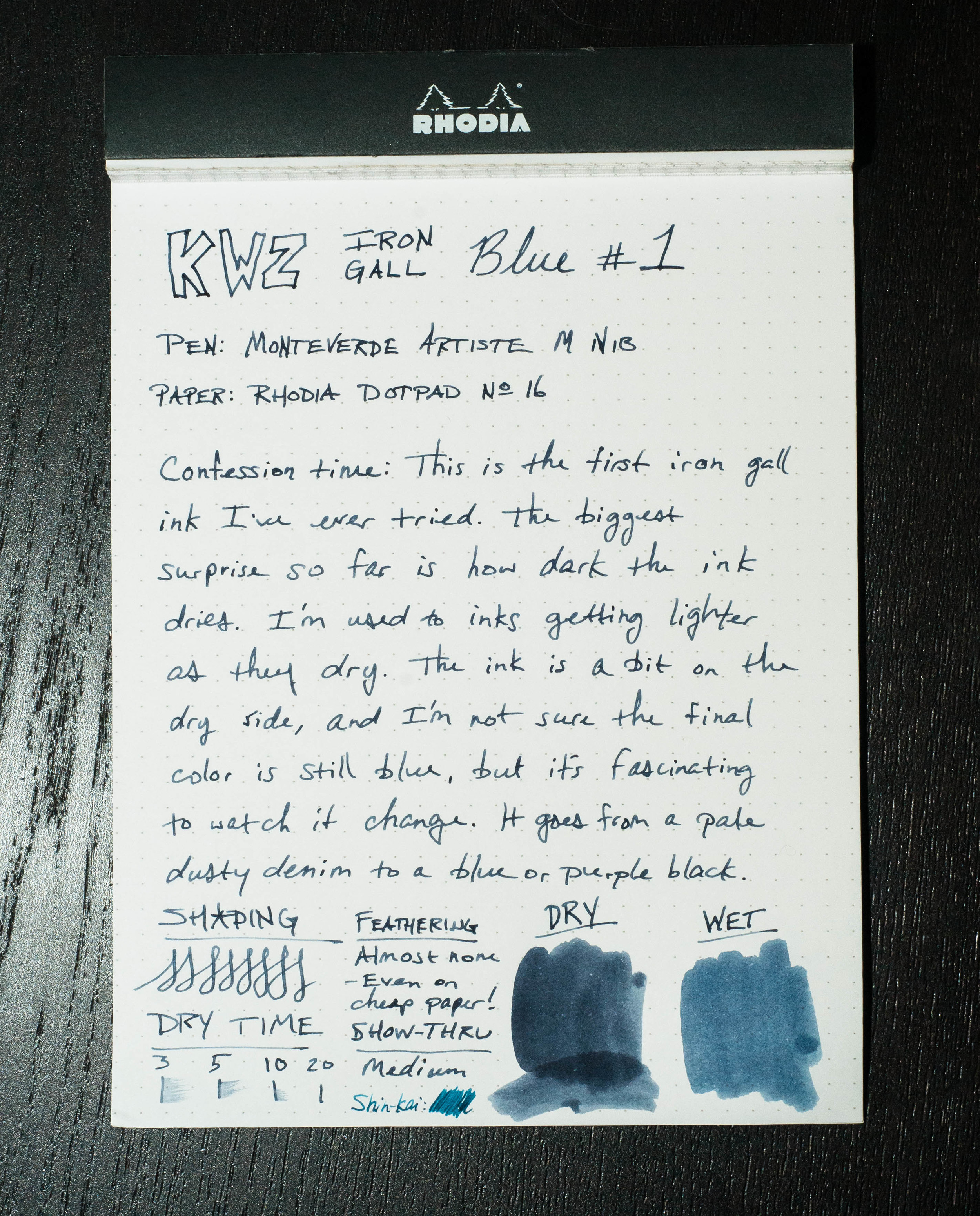
KWZ Iron Gall Blue #1

(Jeff Abbott is a regular contributor at The Pen Addict. You can find more from Jeff online at Draft Evolution and Twitter.)

Iron gall inks aren't something I've experimented with much, as there are plenty of other inks to try that aren't difficult to clean out of your pen if you leave it idle for over a week. Not a big deal, still. And then, there's the archival quality of iron gall inks, but that didn't bring me in either. It wasn't until Brad sent me some samples of some KWZ iron gall inks that I gave them a try.

For those who aren't entirely acquainted with iron gall inks and their unique attributes, Vanness Pens has a page that describes the KWZ iron gall inks, as well as a few cautions against leaving it in pens unused for long periods. Basically, iron gall inks react with the paper when the water evaporates, making a (more or less) permanent mark on the page that grows darker as it dries.

To me, that's the main distinction, and one that I find fascinating to watch, regarding iron gall inks — they dry darker. This isn't normally the case for most fountain pen inks. They either dry a little lighter and less vibrant, or stay roughly the same, minus the sheen of wet ink.

Let's be honest, sometimes I just scribble with this ink to watch it dry over 20 - 30 seconds so I can watch it magically change color.

The particular KWZ iron gall ink I've tried first is called Blue #1. When wet, it looks like a pale, dusty denim color. After it dries, it's a dark midnight blue. It's so dark, I have a hard time discerning the exact color through all the black. But, in proper light, you can tell it's a deep, dark navy with purple and green hints. It's a very pretty ink, especially if you dig dark inks (blue-black fans?).

Like I said, watching this 20-second transition fascinates me.

When writing, the flow is a bit on the dry side. The Monteverde medium nib, which usually flows like glass with most inks, feels like it's dragging a tad. But, even though it feels a little slow, it's still smooth.

There's not a lot of shading in this ink, since it's so incredibly dark. You can see in the swab sample that there are some variations in color, but I never got that result from a nib. Show-through also isn't much a problem with this ink. It's on par in that respect in that you normally can't see it from the back of the page.

Dry time is also normal, coming in around 20 seconds or so in a medium nib. Not fast, but not slow either.

Since this is an iron gall ink, I also brought some water into the equation. If you've ever applied water to any colored inks, you'll probably find in most cases that the ink runs like a brand new red shirt in a load of white laundry. In the case of KWZ Blue #1, the results are impressive. I used cheap 20# copy paper for this test, and the aftermath is very usable. The text is legible, but it also barely bled and feathered. If you need an archival-quality ink in a dark midnight blue, look no further. This is permanent as long as the paper exists.

Cleaning the ink out of pens wasn't difficult. None of my pens laid around very long with the ink in them, so that's something to consider. I imagine it make take considerable more effort if the ink had been idle for a long period. Vanness pens make a special note of saying that stainless steel (which are used in a lot of nibs) is more susceptible to damage than gold nibs. It's nothing to panic about, but just be mindful!

In all, I have to admit I'm pretty impressed with iron gall inks, and KWZ, in general. The only complaint I have is in the name. I wouldn't say it's "misleading," but it's also not informative. Blue #1 doesn't indicate what kind of blue, and the screenshots online can be confusing. It would be great if they had signature names to tell them apart, because the blues all look fairly similar to me.

Apart from that one complaint, KWZ Iron Gall Blue #1 really impressed me. I hope the fascination with watching the ink change color as it dries never wears off. It's definitely worth your consideration.

(Vanness Pens provided this ink sample at no charge to The Pen Addict for review purposes.)

Posted on November 25, 2015 and filed under Ink Reviews, KWZ.

KWZ Gummiberry Iron Gall Ink Review

I’m a fan of Iron gall inks, especially the more modern varieties like this KWZ Gummiberry from Vanness Pens. Iron gall inks can be intimidating if you are unfamiliar with them, but the way companies manufacture ink these days helps keep your pens safer as long as good fountain pen hygeine is used.

KWZ is a brand I have heard of in passing over the last few years. Made in Poland by Konrad Żurawski, the inks are made in small batches. This allows for experimentation with a wide range of colors that I personally haven’t seen before, especially in the iron gall realm.

Lisa Vanness asked me which color of the lineup I wanted to sample, and Gummiberry jumped off the page at me. I have enough blue and blue black inks to last a lifetime, and I’m a fan of Rohrer & Klingner Scabiosa, so I figured I’d see how another purple iron gall ink would compare.

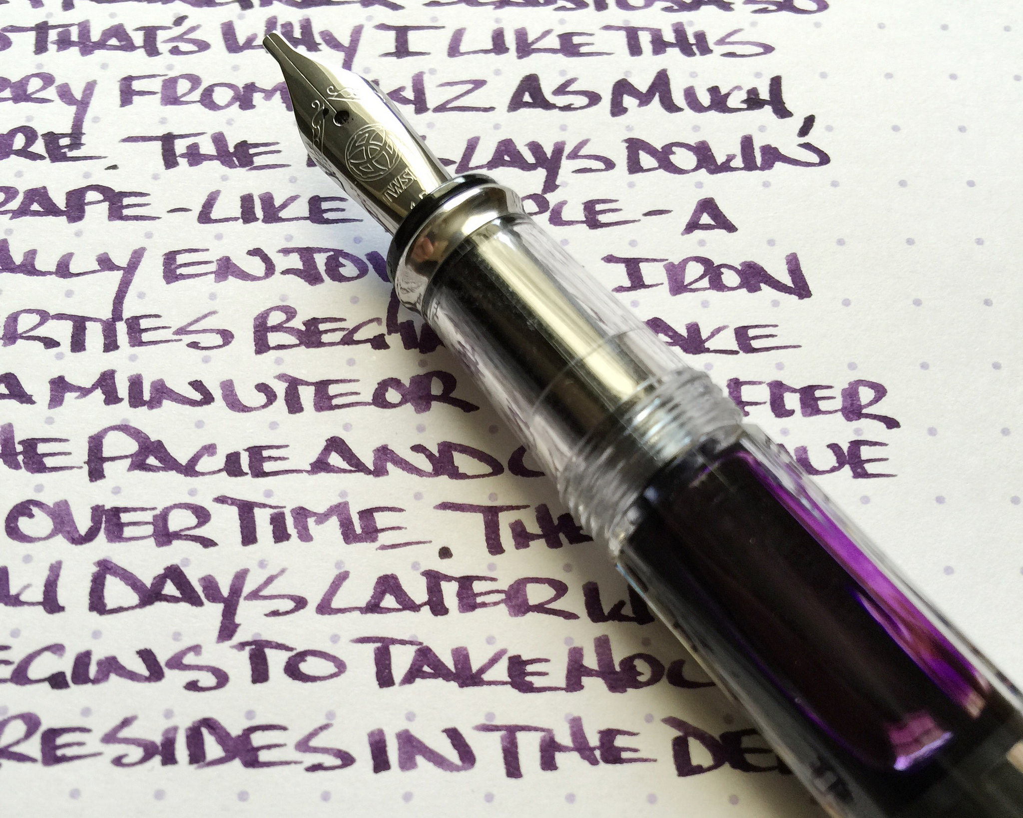
Gummiberry is a grape-colored purple. It hits the page similar in color to the juice found in a grape jelly jar and dries into a color as deep as the deepest recesses of the jelly itself. From a distance, the aged color is nearly black, but a closer look shows that the deep purple color is retained. It has a wonderful look on the page.

Iron gall inks are generally quick drying, and this one is no exception. Even on slick Rhodia paper there was little smudging after 10 seconds, which puts it ahead of most standard inks. The ink is also waterproof, forming a bond with the paper after drying that is not able to be washed out. This is why iron gall inks were the historical standard for important documents and signatures.

As much of a fan of iron gall inks as I am, I am concious that without proper pen maintenance and cleaning I could be opening up myself to problems in my pens down the line. As I mentioned earlier, most iron gall inks these days are tamer than their predacessors and I have no problem keeping them inked in my modern pens for weeks, if not months, at a time. KWZ has an excellent page set up for fountain pens and iron gall ink maintenance that you should read prior to getting into these great inks.

I’m anxious to try more of what KWZ is offering, if nothing else for the colors offered (turquoise iron gall anyone?) My thanks to Vanness Pens for sending me this ink at no charge for review purposes. I’m hooked, and will definitely be purchasing more at the DC Pen Show next month.

Posted on July 13, 2015 and filed under Ink Reviews, Iron Gall, KWZ.