KWZ Iron Gall Gold Ink Review

(Jeff Abbott is a regular contributor at The Pen Addict. You can find more from Jeff online at Draft Evolution and Twitter.)

On my third KWZ iron gall ink, the KWZ IG Gold color has managed to shock me again. These KWZ inks really are special, and you owe it to yourself to try some out at some point. The hardest part of this will be choosing.

Previously, I reviewed KWZ IG Blue #1 and KWZ IG Blue #4 and was mesmerized by the way the ink changed color as it dried. The Gold is no exception. This behavior is a characteristic of iron gall inks, and you can read a bit more about the KWZ variety over at Vaness Pens.

The Gold ink is very similar to the other KWZ inks I've tried when it comes to the behavior and ink characteristics. It never has trouble starting or skipping, it doesn't feather, show-through is minimal, there's a nice medium level of shading that looks fantastic on the page, and it's a tad on the dry side when writing. After using several of these inks, this all feels normal now. Dry time isn't among the fastest — you're looking at around 20-25 seconds in most cases. Sure, this will be quicker the smaller the nib and thinner the paper, but it's still on the slow side.

Once it dries, though, it's nearly permanent. The drip and dunk tests were congruent with the other KWZ inks. The water damages the paper and blurs the ink, but it's 100% readable afterwards.

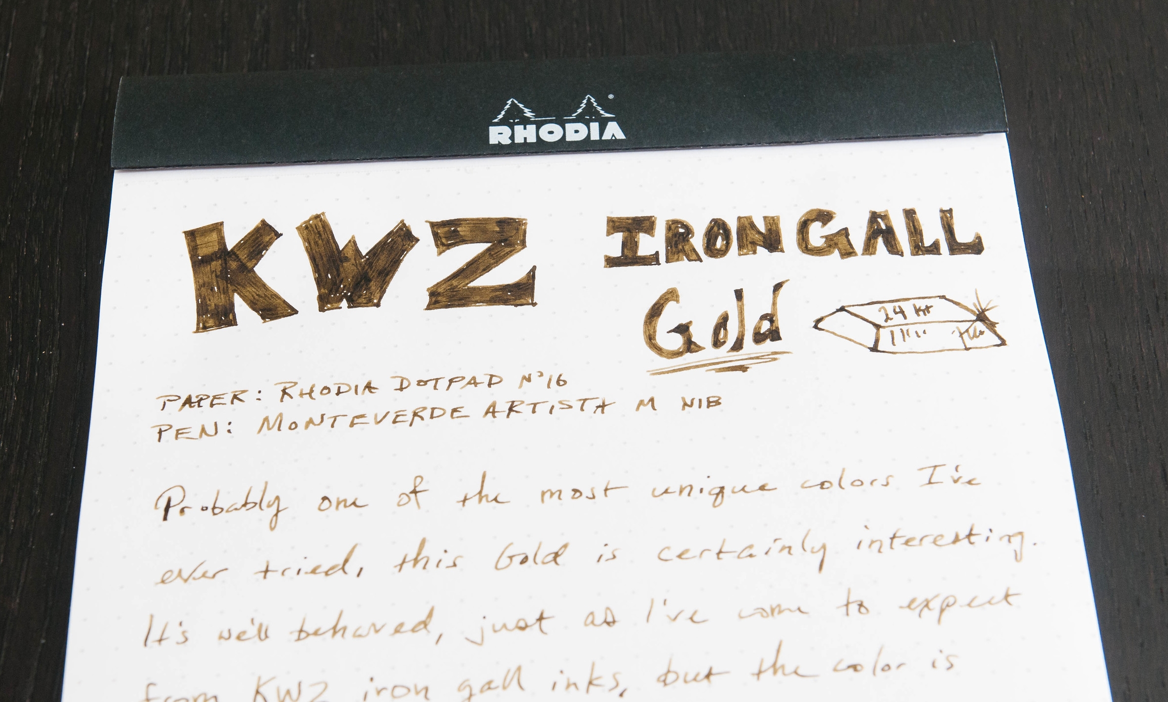
The color is what sets this ink apart. Gold isn't really a color you think of when looking at inks. Gold is a yellow metal that shines and sparkles. That's difficult to emulate in an ink without introducing some kind of sparkling particulates in the ink. J. Herbin and Diamine both have experience in this, but KWZ went another route. Instead of trying to produce a Goldschläger ink, the shading provides the depth of color that you need when trying to emulate gold. It doesn't look exactly like gold (nothing will, which is why gold is highly valued), but it definitely reminds you of gold.

When writing, the ink has a light-straw yellow color. As it dries, it turns partially to a light brown with yellow tones, while thinner ink strokes retain a more light-straw color. It's this straw and light brown color combo along with the beautiful shading characteristics of this ink that evoke the thought of gold in this ink. I'm not sure if I'd describe this ink as "gold colored" if I didn't know the name of the ink, but I definitely see the connection. If it's not called gold, then it's some sort of mix between dirty yellow, light brown, and some slight green tones to enhance the yellows. Overall, it's a strange, unique color that I can't stop inspecting. It's beautiful!

When looking at the ink in the bottle and samples online, I didn't think this ink would impress me much. This is definitely a color that will appeal to some people, while completely flopping with others. If you like light to medium brown inks, this is definitely worth trying. If you like inks that shade, it's also something you need to try. In any case, you need to try some KWZ iron gall inks! These inks are so much fun, and the colors are so unique compared to non-iron gall inks.

As with the other KWZ inks, you can pick up a 60 ml bottle of Gold, or a 4 ml sample vial to see if the color is something you appreciate.

(Vanness Pens provided this product at no charge to The Pen Addict for review purposes.)

Posted on January 6, 2016 and filed under Ink Reviews, KWZ.

Introducing Pen Addict Memberships

I'm not sure I have ever been more excited to hit publish on a blog post in my life.

When I started writing The Pen Addict over eight years ago I had no idea what I was doing. Some will argue I still don’t, but what I have learned over this time is that I love writing this site. I love the readers and the community. I love helping people get started down the slippery slope of buying good stationery.

I love that fact that doing something I love can be my job. And to do this, I am asking for your help.

The big ask is always the hard part, and adding a membership option to the site (more on this in a second) is not something I take lightly. Every day, we are presented with a choice on how to spend our hard earned dollars. Asking readers to part with a few of those dollars a month is a big deal. My goal is to provide members with great added benefits and to make the choice to support The Pen Addict an easy decision.

Before I get into the membership details, let me answer the biggest question in your head right now. What happens to the current site? What if I can’t or don’t want to pay for a membership? Absolutely nothing is changing with the way The Pen Addict is currently written and presented. All content published here has, and will remain free and available to anyone in any way they would like to consume it. There is no paywall, no change to RSS, no private section, no member logins, no nothing. If anything, there will be even MORE of the content you have come to love and expect here. I’ll have more time to publish more content and that benefits everybody.

What members will receive is additional content that wouldn’t normally appear on the site as it is currently constructed. This will be in the form of a weekly newsletter that will contain more of my personal views on the stationery world, some editorial content that I would like to publish, on-topic links and commentary from around the internet, member only giveaways, Q & A, and much, much more. It will also not contain any advertising or affiliate links. I plan on eventually integrating audio, video, and interviews into the membership content as well. The newsletter will hit your inbox every Saturday morning to get your weekend started off right.

And as they say on TV: That’s not all! I’m adding a store to The Pen Addict where you will be able to purchase various items throughout the year. Starting with T-Shirts in January, the store is open to everyone, but members will receive additional discounts on all items available (discounts will vary depending on the item). I have some neat things planned as we get further down the line.

Pen Addict Memberships run $5 per month, or $4 per month if you choose to pay for 12 months in advance. All memberships are run through Memberful, which uses Stripe for secure payment.

Click here to become a member of The Pen Addict.

My decision to do this did not come lightly. I quit my day job - a job I have held for the majority of the past 15 years - because I believe in this site, I believe in the readers, and I want to continue spreading the stationery word. It would be an honor if you would consider supporting me and The Pen Addict as I take this on full time. Along with Nock Co., I am all in on analog and am comitting myself to this world and to you.

Posted on January 5, 2016 and filed under Members.

Deleter Neopiko Line 3 Drawing Pen Review

Deleter is known as one of the premier Japanese manga supply brands, releasing various sets of pens, markers, and paper for those interested in manga artwork, and comic art in general. I’ve used their products in the past, and Brian Draghi reviewed the Neopiko Line 2 for The Pen Addict when it was imported by JetPens in 2012.

The Line 2 is a good pen, but not a great one when compared to its peers in the drawing pen market. I found the tip to be a little soft and the price a bit high compared to pens like the Sakura Pigma Micron but it was something different, was kind of cool, and worth having one laying around for a switch up from time to time.

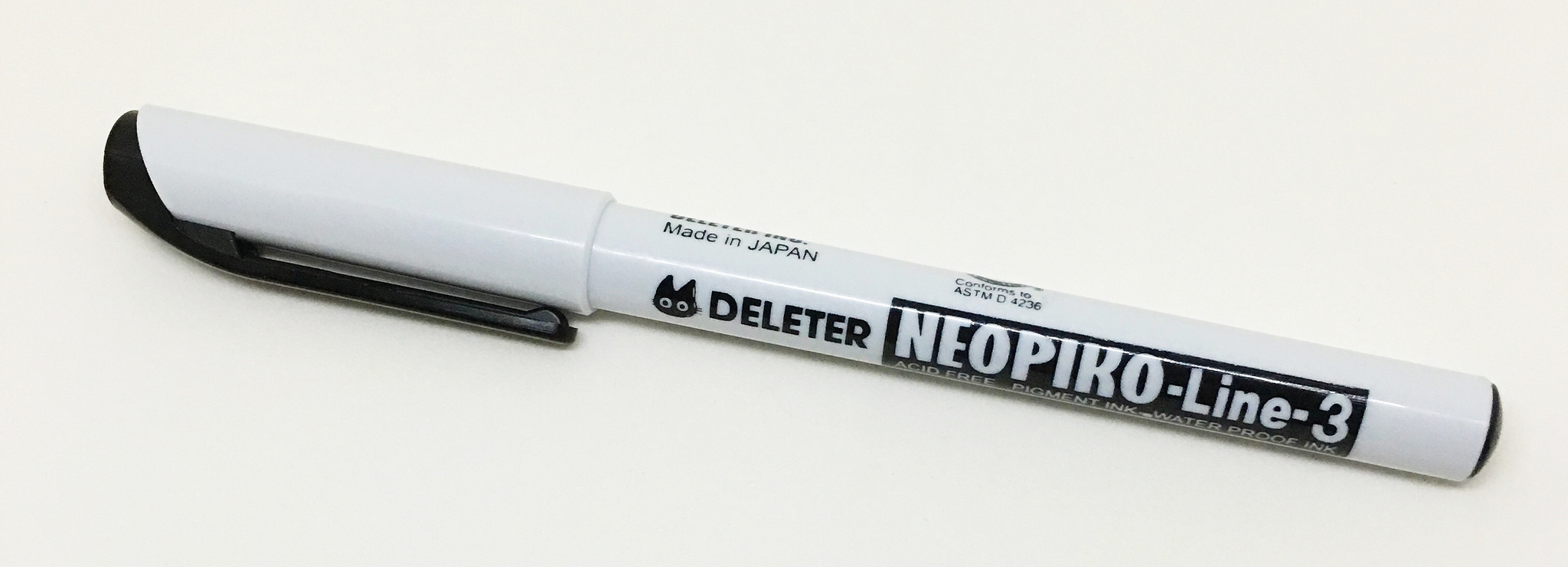
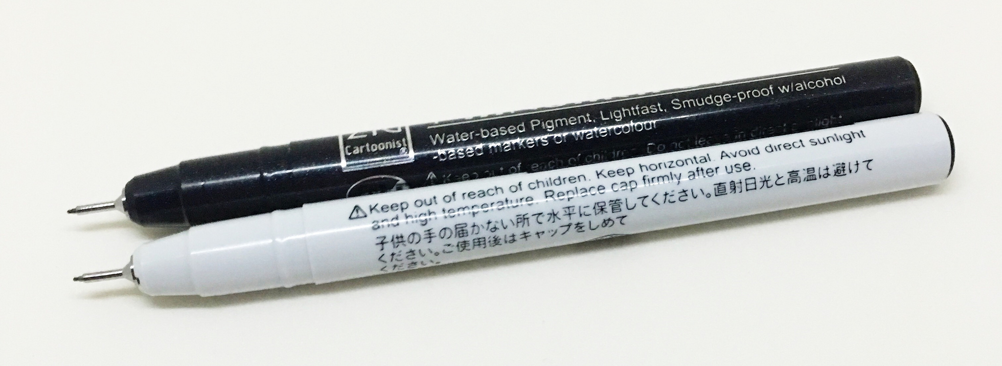
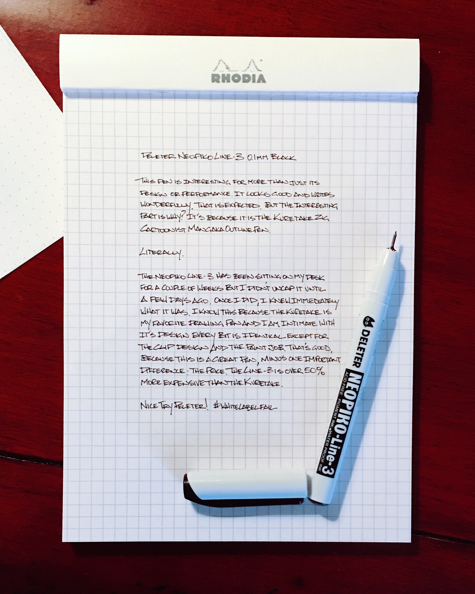
Because of that, I was happy to grab the Deleter Neopiko Line 3 when it landed at JetPens and try it out. The barrel looked nice and the price was even less than the previous model, but I discovered something strange when I uncapped it the first time. This pen is a Deleter in paint job only. The pen itself is the Kuretake Zig Cartoonist Mangaka Outline Pen, also known as my number 1 plastic tip pen.

White label production is not a new thing. Many companies across many industries use this type of manufacturing for various reasons, primarily to increase the bottom line. There is no issue with this, and it is actually a benefit to the consumer in many cases, allowing them to buy a similar quality product for less than the original marketed and advertised product. Unfortunately for Deleter, that’s not what happened here.

(Note: I'm making an assumption that Kuretake is the one making the pen for Deleter. Could it be the other way around? Yes, but I think that is very unlikely.)

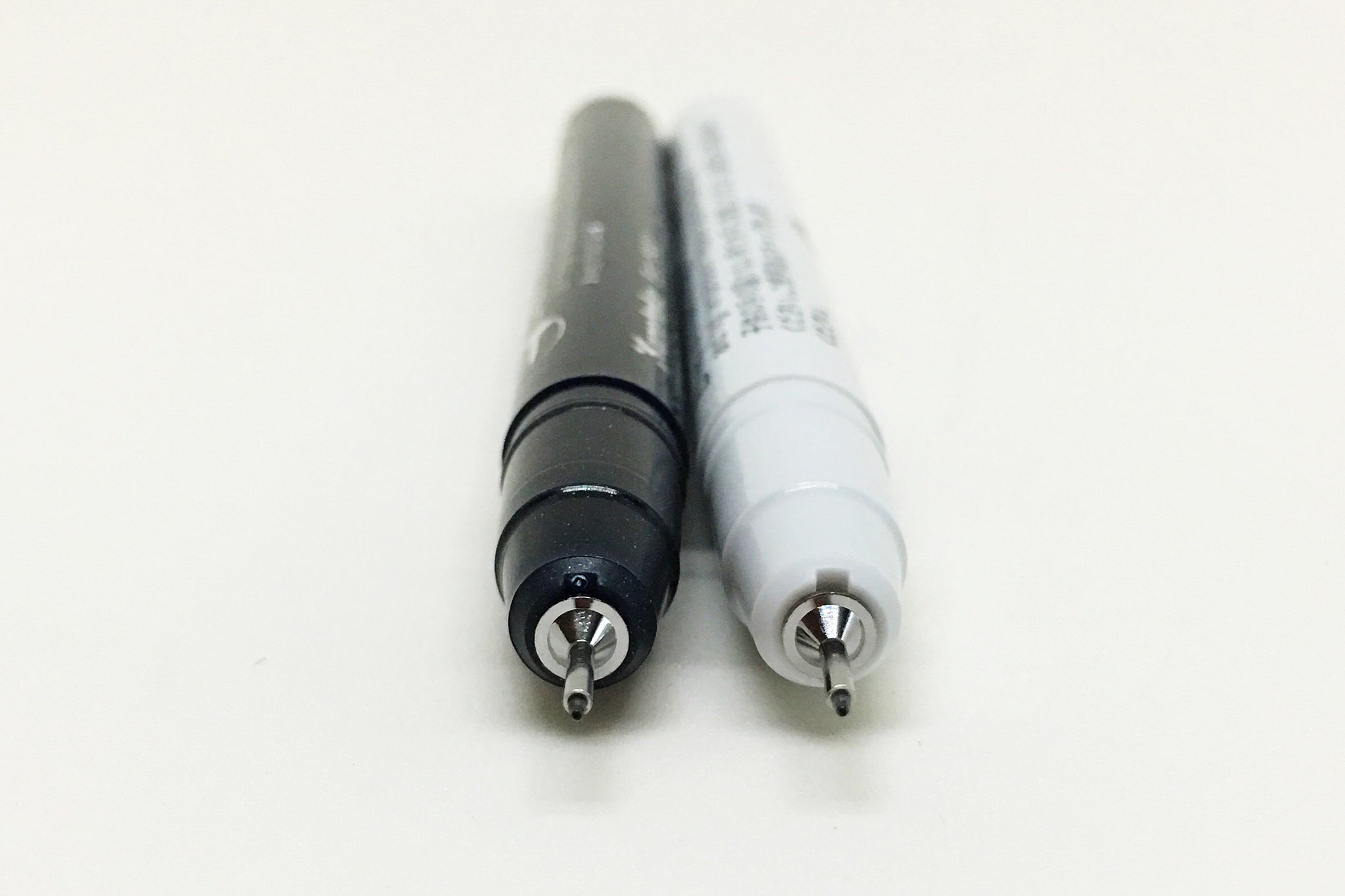
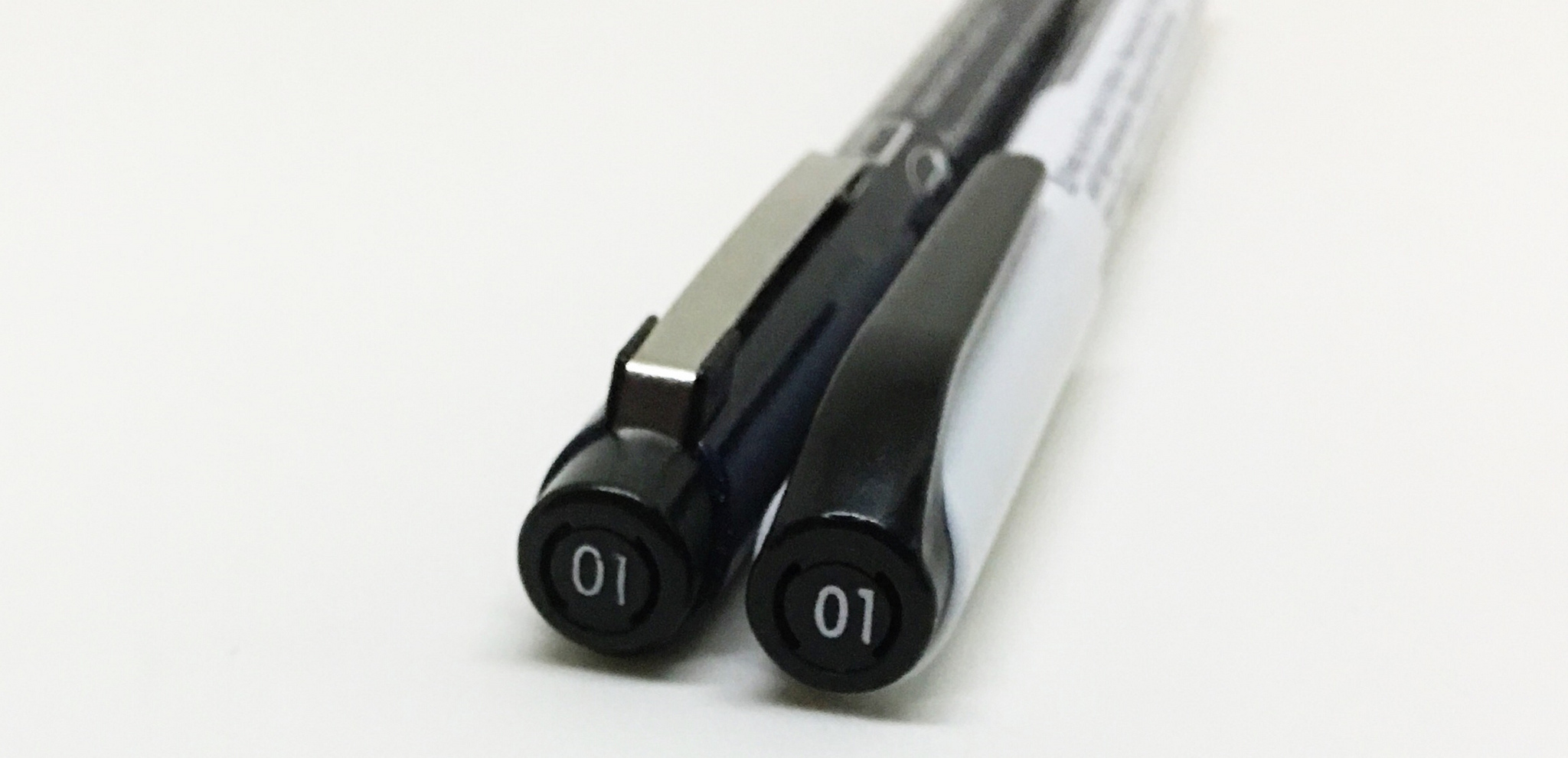
I didn’t catch it from the exterior design at first, but the second I opened the pen and before I even wrote with it I said wait a minute, this looks familiar. I grabbed the Kuretake Zig from my desk, uncapped it, and set it next to the Line 3 and I was right. It is the exact same pen. Literally.

That’s good I thought, because the Kuretake is a great pen. My next thought was to compare the price. The Deleter should be cheaper, or at least the same price, right? Nope. It’s 50% more from JetPens than the Kuretake, and comes in fewer options. Bummer.

If you are a Deleter fan and swear by their products this shouldn’t sway you from paying more for the same pen. I pay more for Copics because I like them and their style even though they are overpriced compared to the competition. But just know what you are getting with Deleter. If you want an awesome drawing pen, save over a dollar per unit, and have more choice, then buy the Kuretake Zig Cartoonist and don’t look back.

(JetPens provided this product at no charge to The Pen Addict for review purposes.)
Posted on January 4, 2016 and filed under Deleter, Drawing Pen, Kuretake, Pen Reviews.