(Susan M. Pigott is a fountain pen collector, pen and paperholic, photographer, and professor. You can find more from Susan on her blog Scribalishess.)
The Conid Minimalistica is a fountain pen made in Antwerp, Belgium by Conid Pen. Conid is known for their bulkfiller system (described below) and their unique, custom-designed pens.

I borrowed Brad's Minimalistica back in August. I was so impressed with it that I decided to order my own. When a demonstrator version of the Minimalistica was announced, I jumped on it.
The Conid Minimalistica comes packaged in a hinged black metal box.

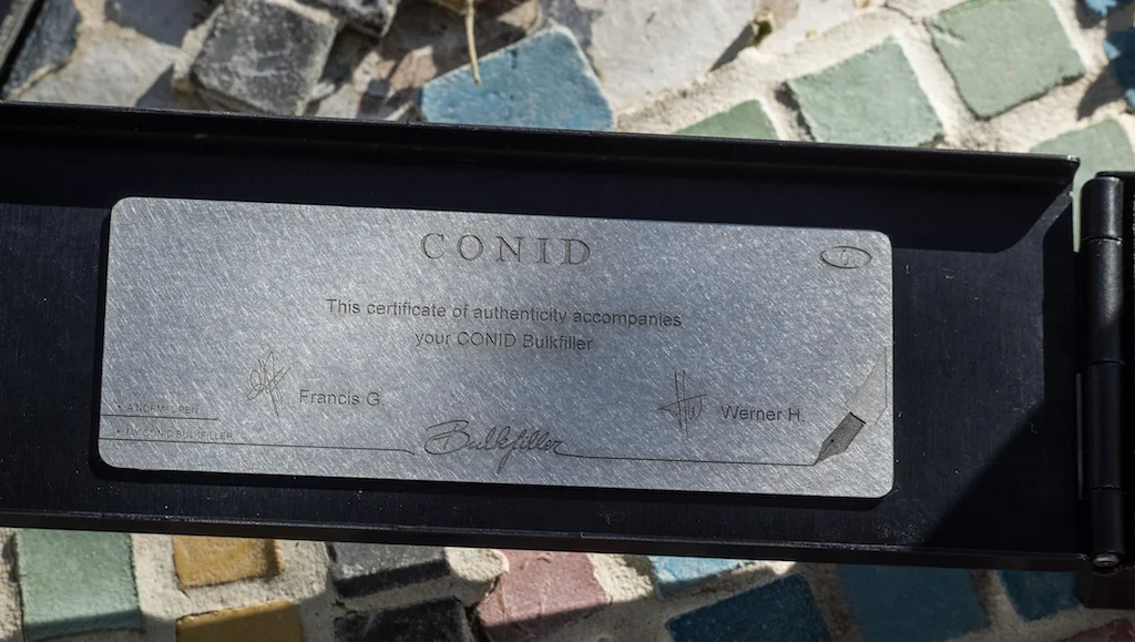
Inside is a card indicating who worked on the nib and an impressive titanium plate with the certificate of authenticity inside the cover.
The foam insert holds the pen, tools and extra nibs (if you ordered them). A small cleaning cloth is also provided.

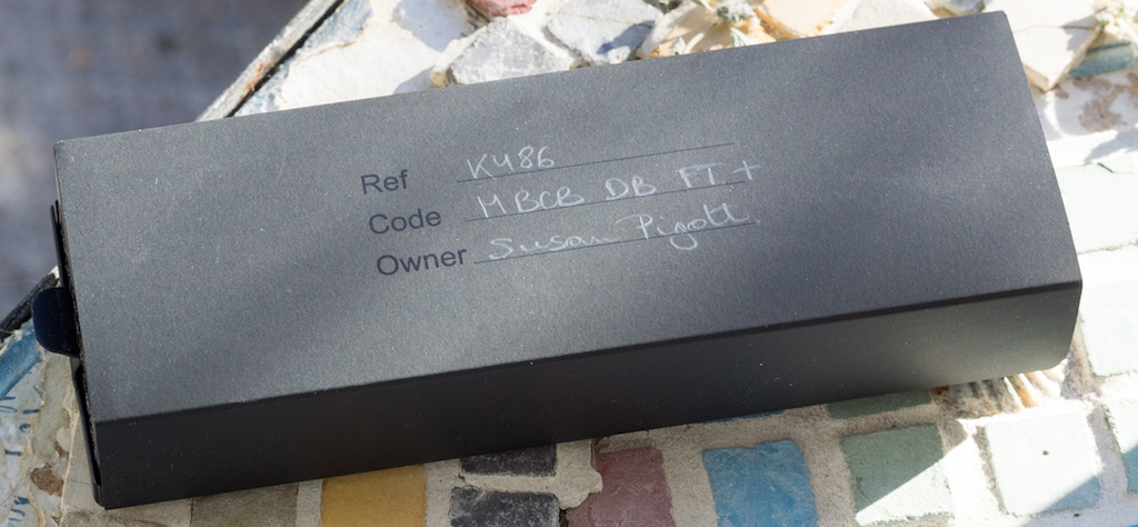
The metal box is enclosed in a cardboard sleeve with your name and pen information hand-penciled on top. This gives the pen a "made-just-for-me" feel. The code tells you exactly what pen you purchased: M BCB DB FT+ = Minimalistica Black Conid Bulkfiller Demonstrator Barrel Flat Top Plus Clip. I feel like I just solved an equation.
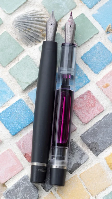
Brad's pen is the solid black "Pi" model. I was very disappointed that my clip didn't have the Pi symbol on it, but I learned that Brad's is one of the first production run that came out March 14, 2015 (3.1415=Pi). So no Pi symbol for me.

Our pens are essentially the same, except for the fact that mine is a demonstrator. Although mine appears to be a few millimeters longer, I think that is just due to how deeply the caps fit onto the barrel.

Brad's Minimalistica (L) and Mine (R)
When you compare the caps side by side and the pens (uncapped) side by side, they are the same length.
Brad's Minimalistica (L) and Mine (R)
The cap is made of Delrin resin with a solid titanium clip and the yin-yang Conid logo on the finial.

My clip ring has a small flaw on it, but, really, you can only see it if you use a magnifying glass or a macro lens.

The piston knob has a small hole for the hex key should you want to remove it from the pen. Above that is a titanium ring engraved with "Antwerp Belgium Conid." Otherwise the pen is unadorned.

The Minimalistica is 137 mm/5.4 inches in length capped, 126 mm/5 inches uncapped, and 160 mm/6.3 inches posted. It weighs 26 grams (without ink) and holds 2.5 ml of ink. For me this is the perfect size. However, a whole range of pens is available, including the Regular, the Giraffe, the Slimline, and the Kingsize.

One of the main claims to fame for Conid is their unique bulkfiller system. With the bulkfiller, the ink completely fills the barrel, unlike other systems which always leave space. The instructions included with the pen explain the process, but watching the video helps you understand the system more fully. The demonstrator Minimalistica allows you to see the filling system in action, and, I must say, it's very cool.

The one caveat I have about this otherwise perfect filling system is that you have to unscrew the piston a few millimeters for long writing sessions (just like the Pilot Custom 823). It's not a big deal, but sometimes I forget and the ink stops flowing.
The titanium nib is smooth and bouncy. I love the design on the nib and the titanium complements the pen perfectly.

And just look at that gorgeous fine nib ground to a perfect stub:
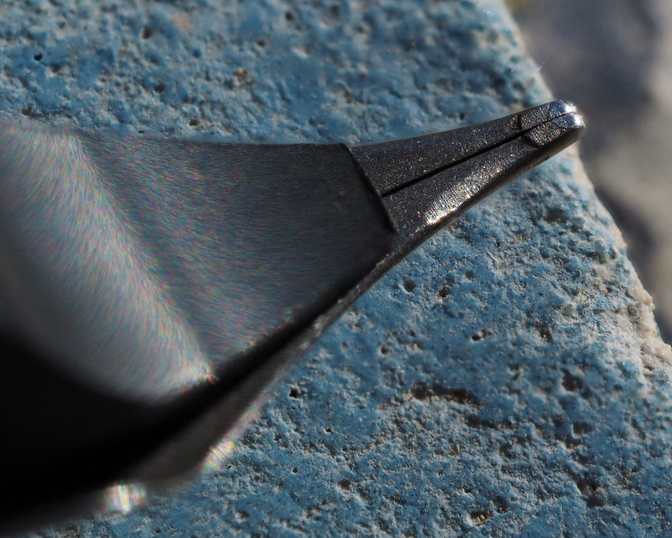
Writing with the Minimalistica is a wonderful experience. The fine stub nib offers some line variation and the ink flows nicely. On occasion I've had some skips, and if I push the nib too hard (it is not a flex nib) sometimes the ink stops completely. A pull and push of the piston gets everything working again.

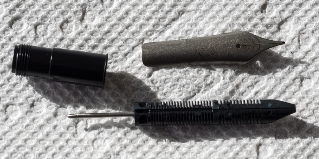
I decided to disassemble my pen completely in order to clean out the first batch of ink. You can only do this if you order the special tools.

Conid offers instructions on their site and you can watch Stephen R. E. Brown's video which shows you step-by-step how to disassemble the pen (though Brown's pen is a different model). Disassembly is not at all difficult, and I was able to get all traces of ink out of the nooks and crannies of my pen.
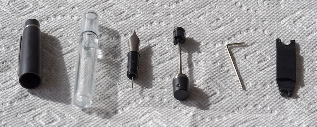
I removed the nib unit and cleaned that as well. The only difficulty I had was reinserting the nib unit. I discovered that I had to insert the feed first and then push the nib in on top of it.
Conid pens are made to order, and, once you place your order, you will receive an email confirmation (this can take several days, so be patient). The company emails you again when they start work on your pen and one more time when the pen ships. It took about a month from the day I ordered my pen to the day I received it.

I love my Conid Minimalistica. It is a well-designed pen, and, depending on the model, you have dozens of configurations from which to choose. That said, it is also a very expensive pen because it is custom made. Considering the superior materials and design, I think it is well worth the cost.
Pros
- This is a beautiful, custom-designed demonstrator pen made with top-notch materials.
- Conid uses a unique filling system with a huge ink reservoir.
- You can completely disassemble the pen for cleaning (though you have to pay extra for the tools).
- The titanium nib is spectacular and the stub grind is perfect.
Cons
- The pen is very expensive, but you are paying for a custom design.
- At this price I think the tools for disassembling the pen should be included at no extra cost.
- You have to remember to unscrew the piston knob a few millimeters for long writing sessions.