Sailor Specialty Nibs Review

(Susan M. Pigott is a fountain pen collector, pen and paperholic, photographer, and professor. You can find more from Susan on her blog Scribalishess.)

Ever since I discovered the Sailor Specialty Nibs page at Classic Fountain Pens, I spent hours looking at each nib and its characteristics, fascinated by the different shapes and styles. The prices always threw me for a loop, though, so I just looked and coveted.

I finally found a pretty good price on a Sailor Pro Gear with a Cross Point nib on Engeika. It took several weeks to arrive, but the wait was worth it.

I loved the lush broad lines it made–so glorious with sheening and shading inks. But I couldn't write with the nib upside down. You're supposed to be able to write fine lines with it, but mine just cuts into the paper.

I discovered why, after taking macro shots of the nib: the tines are misaligned. This doesn't affect the broad strokes, but it definitely makes the nib unusable for fine lines. I'm going to have to send the nib in for work.

In the meantime, a person on Fountain Pen Geeks offered a Sailor 1911 with a Cross Concord nib for a steal. I knew the Concord, with its beak-like nib, could write fine on one side and do the luscious lines on the other, so I bought the pen.

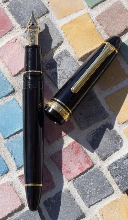
So, now I have two Sailor Specialty Nibs.

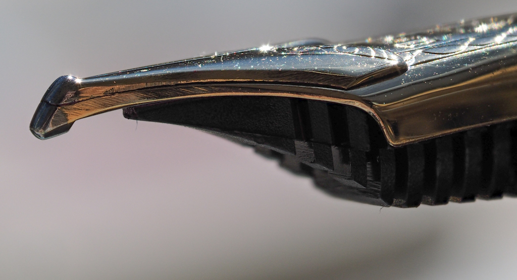
The two nibs are similar in what they can do: write fine strokes with the nib in one position and broad strokes in the other. The Cross Point nib in the normal position writes broad strokes.

Cross Point Nib

Cross Point Nib

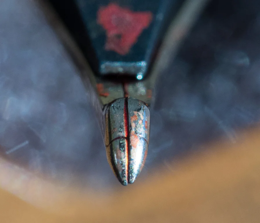
The Cross Concord is the opposite. Personally, I prefer the Cross Concord because I can pick it up and immediately use it like a normal fountain pen. If I want the broad strokes I turn it upside down. With the Cross Point, you have to hold the pen with the nib upside down if you want to write fine strokes.

Cross Concord Nib

Cross Concord Nib

Because my Cross Point's tines are misaligned, I can't compare the two pens' fine strokes. But I can compare the broad ones. They are similar in width (if not exactly the same). You can vary the width of the line of both nibs depending on the angle you hold the pen. If you wish, you can even mimic brush strokes with the nibs.

The Sailor Specialty Nibs are clearly designed for Japanese calligraphy, not western writing. But, I've found they work great for writing Hebrew. I'm no calligrapher, but I love the nice thick lines I can make for Hebrew lettering.

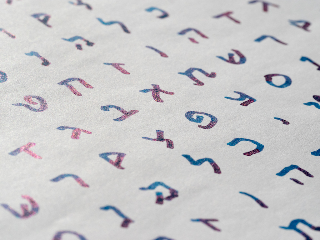
Yes, there are Hebrew/Arabic nib grinds for this purpose, but they aren't all that versatile if you write primarily in cursive. With the Sailor nibs, I can write Hebrew letters with the broad side and turn the nib over and write cursive English.

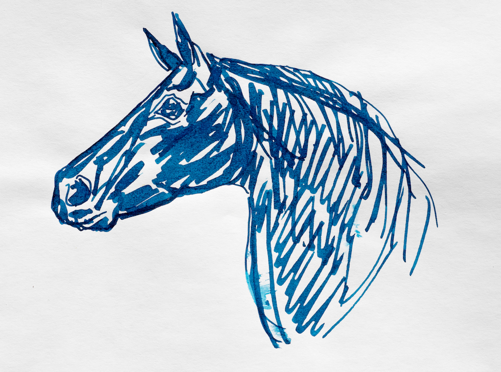
These nibs are also great for drawing. I'm no artist, but I could see how people who like to sketch with ink would love these pens. You can paint with the broad side and sketch details with the fine.

The nibs themselves are works of art. The double-layer nibs, the scroll work, the beautiful 21K gold, all combine to make for an exquisite nib. You can get the specialty nibs with an extra bar on top that increases the ink flow, but I think it ruins the aesthetic of the nib. So far, I've had no need for increased ink flow.

The one negative about these nibs is that they are limited to Sailor pens. It's not that I have anything against Sailors, it's just that their converters are tiny. They just don't hold much ink (0.5ml). Even the Sailor Realo (a piston fill pen) doesn't hold much more (0.9ml). When you're doing broad, juicy strokes, you can blow through a small converter of ink very quickly.

Another limitation of Sailor pens is the lack of choices in pen color. Finding a Sailor with a specialty nib in any color other than black is difficult, and you have to be willing to pay a premium. If you want one of the fancier Sailors with a specialty nib expect to pay close to $1,000.

I purchased my boring black Pro Gear from Engeika for $390. The Sailor 1911 with a Cross Concord would normally be $535, but I got it for around $300 as well.

Pros

  • These specialty nibs really are special. No other manufacturer makes anything like them.
  • They are extremely versatile. You can write fine and broad and in between and use them for sketching.
  • These nibs are great for certain types of calligraphy and even for Hebrew (which I know is very important to most people).
  • Sailor specialty nibs make great ink testers because they show off the ink in both fine and super broad strokes.

Cons

  • The nibs are only available on Sailor pens which have small ink capacity.
  • Sailor pens with specialty nibs are quite expensive.
  • You don't have much choice in colors unless you're willing to pay almost $1,000.
  • Sailor recently suspended orders on these nibs so quantities are currently limited.
Posted on February 12, 2016 and filed under Pen Reviews, Sailor, Nibs.

What Makes The Stationery Community Great

That time when the Nock Co. party turned into a show and tell.

That time when the Nock Co. party turned into a show and tell.

(Daniel Lemay is an analog tool enthusiast and enjoys pondering over many things. You can find him on Twitter at @dslemay and his blog at Circumspect Reverie)

Less than 18 months ago I was on the outside looking in. I wasn't into pens or stationery, but decided to try out a fountain pen to see if it would help remediate growing RSI issues. I listened to the most recent Pen Addict fountain pen primer episode. Since then I have fallen deep into the pen, and other stationery, rabbit holes. Beyond that I have discovered what an amazing community there is here. As many have mentioned previously, the stationery community has been the best community that I have been a part of.

At the heart of a good community is a focus on the health of the people, the relationships therein, and an empathetic basis. The stationery community has this in spades. The welcoming and inclusive attitude of the community, even to an introverted fledgling such as myself, is one of its shining characteristics. Regardless of your current knowledge of stationery, people in this community have always been ready to help you find out what work best for you and troubleshoot problems. People are open and willing to share their knowledge and experience, and are overall excited to share and spread the love of good writing instruments.

Something that has always struck me as significant about the community is the care people have for each other and how giving they are. This is not a group of people whose connection to each other ends at the discussion of one's latest acquisition. They truly care about the people in it and come alongside both in the positive and more difficult moments. On one such occasion last year the community secretly orchestrated the funding, purchase, and delivery of a Nakaya for Mary Collis after she received news of her MS diagnosis. The accompanying note sums up the heart of this compassionate and caring community: "...This pen doesn't fix anything, but hopefully every time you use it it will put a smile on your face as you tackle all that lies ahead." Such care and support are something to be cherished.

I too experienced the sheer generosity of the people here. After saving up for months fairly early in my pen addiction I finally was able to purchase a Franklin Christoph Model 40. Less than two months into owning it, I somehow lost it (my most expensive pen at the time and the only one I ever lost). After sharing the sad news in the Pen Addict Slack Group I got an unexpected message from Thomas Hall offering to give me his Model 40 because he wasn't using it much. That was something that totally caught me off guard--that I, a nobody in my perspective, would be the recipient of such generosity from someone I didn't even know. The generosity of this community shows itself regularly through freely offering ink samples, picking up and shipping of Field Notes only found locally, etc.

Additionally, the stationery community is a great place where we can challenge each other and disagreements don't devolve into the normal internet vitriol. Conversations include TWSBI's build quality, the temporary transition of Noodler's ink to plastic bottles, Kickstarter snafus, the renewal of the Esterbrook brand, and more. Most recently, Ian Hedley began a great discussion about Pilot's product availability and significant price difference between the USA and the UK. It has continued with an official response from Pilot and Ian sharing some additional thoughts on Pilot's response here. Even amidst disagreement, conversations remain productive and respectful, which is the best we can ask for. A community where everyone agrees lacks diversity and the opportunity for growth.

The stationery community is not just a place where people share their nerdy obsession. Rather, that serves as the societal impetus bringing us all together. The community is much more than that. It is a place that is welcoming and works to cast off the notion of societal cliques. It is a place which avoids myopic behavior, where people care about each other deeply and are giving in spirit. It is a place where disagreement and civil discourse can take place. Ultimately, the stationery community is a place to be welcomed into, to belong, and to call home.

Posted on February 11, 2016 and filed under Pen Shows, Guest Post.

Pilot Iroshizuku Syo-ro Ink Review

(Jeff Abbott is a regular contributor at The Pen Addict. You can find more from Jeff online at Draft Evolution and Twitter.)

Pilot Iroshizuku inks are well-known for being great fountain pen inks, and I'm sure we've all tried our fair share of different colors from the brand. For many of us, some of our favorite inks come from this line, and for good reason.

I've long been a fan of their Kon-peki ink, which is a bright blue that pops off any page. But, it can be a bit too much pop for some moods. Another favorite color of mine for fountain pen inks is turquoise mixed with other colors to tone down the gemstone feel. Sailor Yama-dori is a wonderful ink, and I've recently come to love Franklin Christoph's Midnight Emerald. Both of these inks are dark, subdued, and expose beautiful levels of depth when writing. So, it was only inevitable that I try the Iroshizuku color that somewhat matches the same spectrum. In short, it's an exceptional ink with a beautiful color.

Pilot Iroshizuku Syo-ro is labeled as "Pine Tree Dew" on JetPens' site, which boils down to "Gray Turquoise." In this case, I think the word arrangement is perfect — it's definitely a turquoise ink with a bit of gray mixed in, not the other way around. There's plenty of color in the ink, but it's subdued enough to make it elegant and intriguing. I like inks that make you look twice or second-guess your first assumption.

If you've ever tried an Iroshizuku ink, you know what to expect. If you never have tried them, you're in for a treat. Like all other in this brand, the Syo-ro ink is smooth, quick-drying, and resists feathering and bleeding on pretty much all papers (with the exception being cheap copy paper). There's a fair amount of shading to create the beautiful level of depth in the colors, and it works well with a pen that has some flex.

I've tried some other green inks in the past that I hoped would match the characteristics in this ink. Sadly, most of them looked dull on the page after the ink dried. With Syo-ro, the color is still bright and present after the ink has dried. The color looks like it has life, which exactly what I want from an ink that I use daily.

Show-through, bleeding, and feathering are minimal with this ink. It's remarkably well-behaved in many circumstances, and it's gentle on your pens as well. Cleaning is an easy exercise.

Dry time on this ink keeps surprising me. In most cases on my Rhodia pad, I could only create a tiny smudge on the 10-second mark. This is very quick for a fountain pen ink, and something to keep in mind if that attribute is important to you. Keep in mind, though, that this will vary based on the nib and feed unit for every pen you use.

I really have nothing bad to say about this ink. Sure, the Iroshizuku inks aren't the cheapest, but that's for good reason. When you buy an ink from this line, you know that it will perform well. The only thing you have to decide is what color, or how many.

Syo-ro is available from JetPens in two sizes: a 50ml bottle and a 15ml sample bottle. With the 15ml bottle being half the price of the 50ml bottle, it's hard to justify choosing it. It might make more sense if it was a 25ml bottle to match the price difference, or if the price was more in line with a bottle that is only 30% of the larger one. At any rate, if you like turquoise and fountain pens, this is one you don't want to miss.

(JetPens provided this product at no charge to The Pen Addict for review purposes.)

Posted on February 10, 2016 and filed under Ink Reviews, Iroshizuku, Pilot.