The Montblanc Heritage Rouge et Noir Coral Fountain Pen: A Review

(Susan M. Pigott is a fountain pen collector, pen and paperholic, photographer, and professor. You can find more from Susan on her blog Scribalishess.)

I've long been entranced by the Montblanc Agatha Christie Writer's Edition–that serpent clip and nib are so fabulous. When Montblanc announced the Heritage Rouge et Noir edition, I fell in love immediately. I mean, what's not to love? A Montblanc pen in coral (coral is the new black) and a serpent clip with green spinels for eyes and a serpent nib–all for a price significantly less than an Agatha? I knew I had to have one.

I ordered my pen from Appelboom and requested a special factory-made oblique medium nib.

"This," I told my beleaguered husband, "will be my Mother's Day, Anniversary, Birthday, and Christmas gift!"
"Okay," he said, "but you can't open it until Christmas."
"Sure!" I said. "I can totally wait until Christmas."

But, sacrifices have to be made for the Pen Addict. What's the point of waiting until December to review this pen when all of them might be sold by then? No. Pen Addict readers need to know whether or not they should buy this pen themselves. I am such a fountain pen martyr that I opened it for your sake, good readers. But, I promise that I will clean it thoroughly, put it back in its box, and save it for Christmas once I'm done with this review. Really!

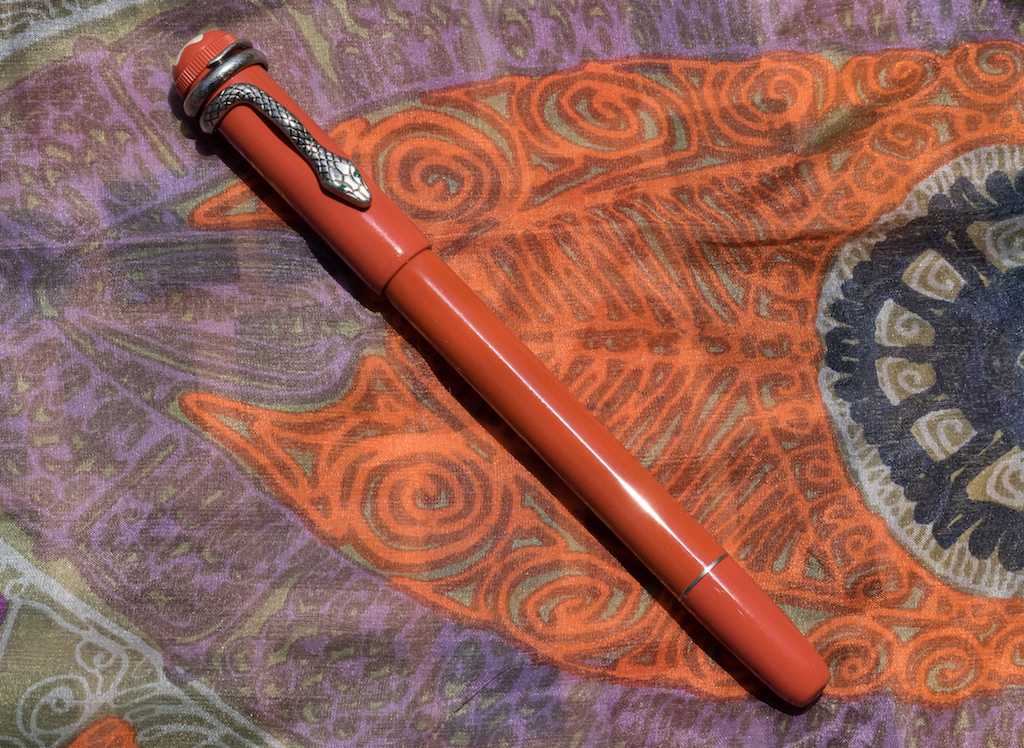
The Montblanc Heritage Rouge et Noir is part of a retro series Montblanc embarked on with the Heritage 1912 (see my review here). The Heritage Rouge et Noir series–one in black, one in coral, and one in black ebonite–hearken back to the 1906 safety-pens, though the modern ones are piston fillers. Taking a cue from the past, the pens have large snowcaps/stars on their finials and a retro-looking serpent clip.

I chose the coral version because, frankly, I'm tired of black pens. Plus, the serpent on the coral version has green spinels for eyes whereas the black version has no jewels. The far more expensive ebonite version has rubies for the serpent's eyes.

The packaging for the Heritage Rouge et Noir is pretty understated for Montblanc. The pen is housed in a black and cream clamshell cardboard box (albeit a nice cardboard box) with a cream velvet interior. A leaflet accompanies the pen.

Aside from the added flare of the serpent clip and nib, this pen is a simple design. The barrel is made of lacquered metal with an antique-looking metal grip. The cap threads are on the nib end of the grip, so your fingers don't contact them. The piston knob is set off with a metal ring that matches the grip. The knob turns on metal threads, and I'm pretty sure there's a ball or agitator inside the piston housing to keep the ink flowing. I can hear it when I shake the pen.

The cap is made of resin with a large cream-colored snowcap/star with a ridged ring around the finial. These details evoke the look of the 1906 safety pens.

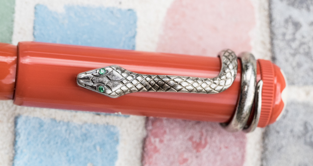
An old-style Montblanc logo is etched into the side and matches the cream color of the star.

Of course, the highlight of the cap is the serpent clip. The tail wraps around the cap twice and the upper body of the serpent forms the clip. Montblanc says that the clip is made of a special alloy that has been "aged by a unique galvanic and stripping process." The green crystal serpent eyes glint in the sun and make me smile.

The nib is 14K gold, rhodium-plated with a golden engraved serpent (the black model has a single-tone nib, whereas the ebonite model also has a two-tone nib). The triangular breather hole nicely melds with the serpent's head. It is a striking design (pun intended).

The nib is small but in proportion with the rest of the pen. Unlike the Heritage 1912 nib which has a vintage, springy feel to it, this nib has no "give," unfortunately.

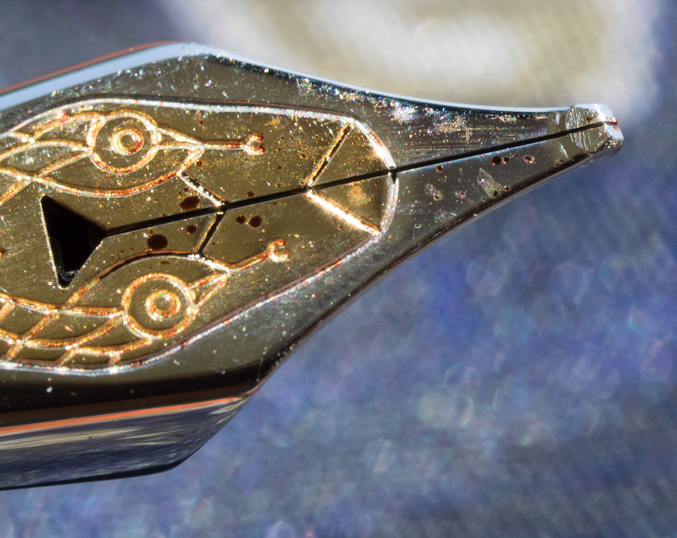
The oblique medium grind offers some line variation and accommodates my tendency to rotate the pen while writing. It took me a little practice to find the sweet spot, but, once I did, the nib wrote smoothly. For some reason the feed doesn't deliver as much ink as I'd like, so periodically I have to shake the pen to get the ink flowing more. It's not that the pen ever completely stops writing or skips, it's just that the ink flow slows down.

I should note that getting my Rouge et Noir with the OM nib took some time. I ordered the pen on April 9, but Appelboom didn't receive it until late June. The specialty nibs are simply not well stocked by Montblanc.

So. How does my Mother's Day, Anniversary, Birthday, and Christmas pen measure up? In terms of quality and beauty, this pen is outstanding and gorgeous. But, dang it, it's just too skinny. It measures 135mm in length, capped; 125mm uncapped; 160mm posted but is less than 10mm in diameter at the grip. Although the proportions are elegant and lean, it feels like a (rather heavy) Bic in the hand (horrors!).

The metal barrel gives the pen some heft, but my hand cramps up when I'm writing for any length of time. I love everything else about this pen, but I don't much enjoy writing with it, and that truly is a shame. Perhaps, with some time, adjusting my grip, and experimenting with different inks, I'll discover I can write with this pen without discomfort. Still, beauty and elegance won't heal hand cramps, so I may have to let this one go. Honestly, I think I really just want an Agatha, but this one almost scratched that itch.

The MB Heritage Rouge et Noir is available at many retailers and Montblanc boutiques. The list price for the black or coral resin versions is around $700.00. If you want the ebonite version, the list price is around $2,000.

Pros

  • The Montblanc Heritage Rouge et Noir is a well-crafted, retro-looking fountain pen.
  • Despite its svelt girth, the pen feels solid in the hand because the barrel is made of metal.
  • The serpent clip and nib are absolutely stunning. The coral color is a welcome departure from black.
  • It is a piston filler, though the ink capacity is rather small (less than 1ml).
  • The nib performs smoothly but does not have the spring of the MB Heritage 1912 nib.

Cons

  • Unfortunately, the pen is very thin in diameter. While this might not bother some people, others will find the pen uncomfortable to write with.
  • The pen is expensive (but that's true for all Montblancs).
  • The Rouge et Noir is quickly becoming more difficult to find. And, if you want a special nib, be aware that it takes a long time to obtain one.
  • I found the ink flow to be a bit stingy but need to experiment more with different inks.

I purchased this pen with my own money and was not compensated by Montblanc for this review.


Enjoy reading The Pen Addict? Then consider becoming a member to receive additional weekly content, giveaways, and discounts in The Pen Addict shop. Plus, you support me and the site directly, which I am very grateful for.

Membership starts at just $5/month, with a discounted annual option available. To find out more about membership click here and join us!

Posted on July 15, 2016 and filed under Montblanc, Fountain Pens, Pen Reviews.

When promises are not delivered: The Parker 5th

(This is a guest post by Sébastien Morissette. You can find more from Sébastien on Twitter @SebMorissette.)

Recently, I have received a gift from my manager. She knows all about my pen addiction, of course, as I do most of my pen usage at work. She gave me a Parker IM Premium 5th Twin Chiseled. 5th in the name means it is the one with a fine liner - felt tip refill that hides under a fountain pen nib shaped hood. She thought she was buying a fountain pen but only realized it wasn’t once back home. She offered me to go back to the store and exchange it for a fountain pen but I refused, by courtesy, and acted like I was happy to get felt-tip pen. And I was in a way: it is not every day that your Manager goes out shopping to buy you a gift as a mark of appreciation. More even so that it is not my work anniversary or my birthday.

At first, I have to be honest, I was a bit disappointed with her buying mistake. What was I going to do with a fake fountain pen? Putting a fake nib on a felt-tip pen is like putting a racing rear spoiler on a Toyota corolla. It doesn’t belong there, it is meaningless, it is useless and it looks silly.

That being said, a closer look to the pen quickly brought me to realize that the pen itself is of good quality. It is made of what seems to be good quality aluminum, and both the shape of the pen and the finish is absolutely beautiful. I got the two toned one with a chromed colored cap while the body is somewhere between gun metal and rose gold. The whole pen is etched with a nice chiseled pattern. The chrome-colored clip is the classic Parker Arrow clip. The grip section is brushed aluminum. There are 3 different finishes in total on the pen between the grip, the pen body and the cap. Without being totally stunning it is a very nice looking pen and does attract attention from my coworkers, more than some of my most expensive fountain pens. The hood is engraved with the Parker’s arrow pattern and the Parker name.

I am not a felt-tip pen person. I do use Sharpie pens from time to time, and do enjoy them, but if I’m reaching out for something else than a fountain pen or a pencil will naturally pick a good rollerball over a felt tip 9 times out of 10. Being a pen nerd, I still was intrigued by this pen and wanted to learn more about the reasoning behind the design choices. I went on Parker’s web site and here is what I found:

“Parker 5THTM Technology: a flexible tip which interacts with the metal hood, and is finely engraved with the emblematic Parker arrow, to provide an exceptionally smooth and fluid writing experience, with an intense and sharp rendering. Adjusts intuitively to the user's style of writing, in just a few words. A highly innovative technology that ensures a clean and simple refill process.”

This refill is rather on the dry side. I did have to adjust my writing angle from low 45 degrees to a good 75 degrees in order to keep a nice wet flow of ink. I wrote for a good 1-hour session on two occasions and had to put the cap back on between pauses to prevent the tip from drying. The pen feels good in the hand and is well balanced. The cap posts well, while keeping a good weight balance. I prefer not to post the cap in general, and this pen body is long enough to be comfortable to use without posting.

The refill that came with my pen is a Medium Tip in a gorgeous green colour. Again my curiosity pushed me online to find out which colour is available for this refill. Again a nice surprise was awaiting me. Parker offers a great selection of bright colour for the 5th type refill: Black, Blue, Burgundy, Purple, Peacock Blue, Olive Green.

But the question remains: Does it do what Parker say it does? From the second that I started writing with this pen I could feel a remarkable difference from a sharpie pen. This Parker refill is Soft. I mean Soft with a capital “S”. Super Soft. Even on cheap copy paper. But the whole idea of a flexy tip that interacts with a hood does not work. The tip bending property does not absorb any sort of the pressure variation created by your hand movement because it hits the hood instantaneously. The concept, while being good, doesn’t work. The hood is too rigid. Parker’s marketing material also states that the tip “Adjusts intuitively to the user's style of writing, in just a few words”; I have not experienced that.

Overall it is not a bad pen. The quality of the materials and the softness of the tip makes it a pen that will find a spot in my non-fountain pen rotation. I will buy refills of each colors and will use them. That being said I believe that anybody who would buy this pen based on Parker’s promises on what the 5th technology writing experience will be disappointed.

As for the aesthetically disturbing nib-like hood, well, it tends to go away when using the pen because that “nib” is not touching the paper, which tricks my brain to believe that it is simply part of the barrel. Because of that I can tolerate it, like I tolerate a trunk lip on a Toyota Corolla, but never a racing spoiler.

Posted on July 14, 2016 and filed under Parker, Pen Reviews.

Pilot Capless Decimo Fountain Pen Review

(Jeff Abbott is a regular contributor at The Pen Addict. You can find more from Jeff online at Draft Evolution and Twitter.)

The Pilot Vanishing Point has long been a point of discussion on the podcast, and typically polarizes users because of the unique shape and clip positioning. If you're a fan of the Vanishing Point, then you might be interested in the Capless Decimo from Pilot, as it's essentially the same pen with a smaller barrel diameter.

If, however, you don't care for the style or grip of the Vanishing Point, the Capless Decimo won't do anything for you since it uses the exact same grip. The clip is a little smaller, but not enough to make any difference in how it feels, and the larger issue remains the placement of the clip more than the size.

For me, I'm a huge fan of the Vanishing Point, and I was excited to try out the cousin based on the different barrel diameter and color options. My verdict? I prefer the Decimo over the standard Vanishing Point exclusively because of how it feels in my hand. That smaller diameter barrel hits the sweet spot for me. Luckily, the Vanishing Point and Decimo pens use the exact same nib units!

Appearance and feel

At first glance, the Decimo looks like a Vanishing Point, and vice-versa. It's difficult to tell them apart on their own, but there are a couple of factors that make it a bit obvious. For one, "decimo" is printed on the clip of the Decimo models, while the Vanishing Points only feature the "Pilot Japan" print on the barrel above the mid-section. The Decimo also includes this print in the same location. So, in a pinch — just look at the print on the clip to identify a Decimo.

Along with the printing on the clip, the clip has a slightly narrower shape than the Vanishing Point. It's more slim and matches the smaller diameter barrel perfectly. The tip of the pen looks a bit smaller than the Vanishing Point, but it's hard to tell from the naked eye. Apart from these differences, I can't find any others when looking at them side by side.

Weight-wise, the Decimo is a tad lighter. The Vanishing Point has long been a favorite pen of mine, and that doesn't change. But, I prefer to Decimo over the Vanishing Point because of how the Decimo feels in my hand when writing. It's a more enjoyable experience. That's not to say my Vanishing Point is annoying or negative — it's just not as enjoyable as the Decimo.

For me, the clip placement is perfect for how I grip pens, and it didn't take any adjustment since I was already accustomed to the Vanishing Point.

If you're unfamiliar with the Vanishing Point and Capless lines, the retractable mechanism is really well-designed. When the pen is retracted, there's a small door that closes on the inside of the tip to keep the nib from drying out. As you extend the nib, the door opens. In my experience, the pen never dried out after sitting for more than 5 days, and didn't have any hard start or skipping issues.

There are some unique colors in the Decimo line, but nothing out of the ordinary if you stay in the same price point. The Light Blue color that I received is nice, but it's not my favorite out of the full lineup. Although, the Iroshizuku ama-iro pairs very nicely with this body color — almost like they were made for each other.

Writing performance

I'm practically in love with the nib on this pen. It came outfitted with an 18k gold Medium nib unit that writes like a dream. I have one other 18k Medium gold nib from Pilot, and I've exclaimed my affection for that nib as well. Pilot continues to impress me with their out-of-the-box nib tuning and performance, and this Decimo is just another tick on the "winning" side for me.

The nib glides over all types of paper like satin over glass. The medium nib is wet enough to show off ink properties and provide a good amount of line variation, but still small enough for everyday use. There's a subtle amount of feedback in the nib when writing, but it's just enough to let you know that you're writing on paper instead of butter.

Of course, being a gold nib, it exhibits a small amount of flex if you apply pressure. It's not something I do often, but the added flourish is worth it in some occasions (even with my shabby handwriting).

I expected good things when I received the pen, but my expectations were exceeded immediately after I inked up the pen.

Conclusion

In summary, I love this pen, and I love the nib unit even more. I'm continually impressed by the Pilot brand, and this pen has been no exception. I really wish there was a readily-available version of this pen in a clipless model so that more people could enjoy the Vanishing Point and Capless lines. I'm lucky in that my grip happens to match up with the intended grip on the pen, but it's a shame that it makes it difficult or intolerable for other writers.

The Pilot Capless Decimocomes in Burgundy, Champagne, Light Blue, and Purple from Goldspot and retails for $140. And again, the nib units are compatible with both the Capless Decimo and the Vanishing Point.

(Goldspot provided this product at no charge to The Pen Addict for review purposes.)


Enjoy reading The Pen Addict? Then consider becoming a member to receive additional weekly content, giveaways, and discounts in The Pen Addict shop. Plus, you support me and the site directly, which I am very grateful for.

Membership starts at just $5/month, with a discounted annual option available. To find out more about membership click here and join us!

Posted on July 13, 2016 and filed under Pilot, Vanishing Point, Pen Reviews.