Posts filed under Ink Review

Diamine Salamander Ink Review

Diamine Salamander

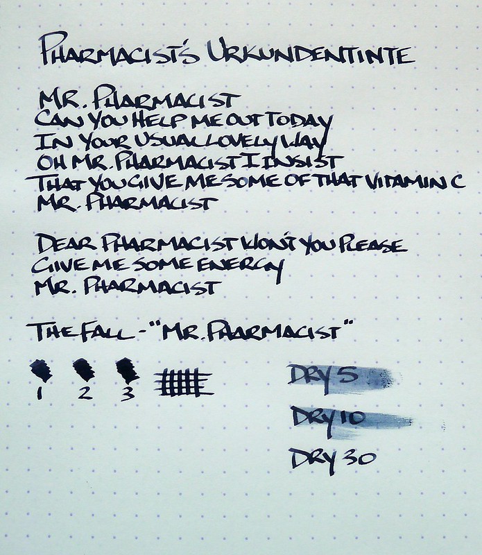
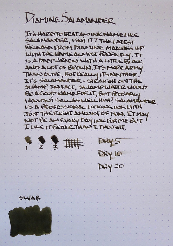
Diamine Salamander is one of the latest inks to be introduced by the venerable British manufacturer. While you wouldn't be incorrect that the name harkens to the amphibian found in various regions around the globe, there is actually a little more behind the name. The Good Captain, a member of the Fountain Pen Network, was actually involved in the naming:

Working in collaboration with Phil Davies at Diamine I was asked to come up with a name for a sample of the ink he'd sent me to have a look at, labelled 'No 93'. I was intrigued and Salamander was born. It reminded me of the colours of Royal Flying corps bi-planes during WWI so I had a look for some more information.

It is cool to be able to read behind the scenes notes like these. Check out the link for more details.

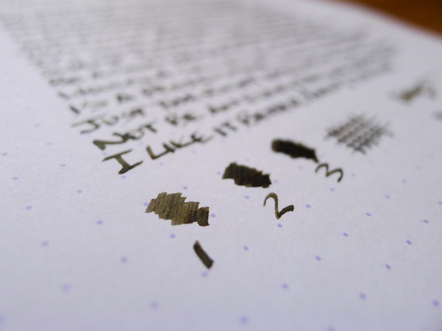
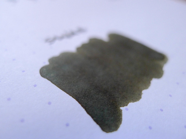
Salamander surprised me once I inked up my TWSBI Mini 1.5 mm stub to test with. I was expecting kind of a dark olive black ink, and while those colors come through, the depth of the color was intriguing. There is a lot of brown, a wide range of green, and a nice sheen that shows on the Rhodia paper I tested on. I tried to get a close-up of the sheen and only partially succeeded. It is not always immediately apparent, but after drying it does show up in certain light. Very cool.

The real gauge for me is if the ink will crack my every day rotation. Right now, Diamine Salamander is a no, but it is a close second tier color, around the Noodlers 54th Mass level. It will see intermediate action for sure. Well worth checking out if you are a fan of greens and browns.

Diamine Salamander

Diamine Salamander

(JetPens is an advertiser on The Pen Addict and I received this product at no charge.)

Posted on November 7, 2013 and filed under Diamine, Ink Review.

My Fountain Pen (Ink) Education: Pharmacist's Urkundentinte

Pharmacist's Urkundentinte

My fountain pen education, with the assistance of my friend Thomas, hasn't just revolved around pens, but the inks that go in them as well. Iron gall ink has always fascinated me - and confused me - and with his help I have been able to try out some of the most popular and unique iron gall inks around.

Pharmacist's Urkundentinte (aka "Document Ink") is not an ink you can order from any store but rather from a member of the Fountain Pen Network named Pharmacist. He makes his own iron gall inks based around traditional recipes, and according to Thomas, they contain twice the amount of iron gall content than other iron gall inks.

What does a statement like that mean? It means you need to practice good fountain pen hygiene. There is no need to be afraid of inks like this, as I was initially. Most off the shelf iron gall inks these days are reasonably tame, and even stronger inks like this Urkundentinte take only a little additional care. With a steel nib pen, cleaning every week or two would be more than sufficient, while non-corrosive nibs like gold you could go even longer. Some people keep their iron gall inks segregated in specific pens, but as Thomas told me "Don't be overly freaked out -- it's not going to melt your pens."

As I learned quickly, a single written review is not going to do an ink like Pharmacist's Urkundentinte justice. The inks goes on the page in a deep blue black shade and dries to black in a short amount of time. As the hours and days go by, the ink oxidizes into a deeper black and becomes permanent on the page. That permanence is why these inks were so popular historically. You couldn't sign important documents using anything else. I'll work on a video or a follow-up post to see if I can capture the ink transformation better.

Could an ink like Urkundentinte be an every day writer? I think so, especially for those looking for permanence in their ink. It dries quickly, despite the smear in my 10 second sample - I pulled the trigger a little quickly. I'd say it is dry in the 12-15 second range on this Rhodia DotPad, which is better than many inks. On standard copy paper the dry time would be much less.

For me, I don't think this will make my every day rotation due to the darkness. I prefer a bit more blue to come through, starting light then turning a darker shade but still noticeably blue. I'm testing out other iron gall inks like Rohrer & Klingner Salix that fit the bill better for me.

Still, Pharmacist's Urkundentinte is a spectacular ink if nothing else for the history behind it and the commitment by its creator to be as authentic as possible. There is much more to learn about iron gall ink and these links and reviews below helped me get started. I'd love to hear your experiences with iron gall inks so please let me know your thoughts in the comments below.

FPN Pharmacist: Some Exciting News About My Iron Gall Ink Experiments

Pharmacist's Urkundentinte Iron Gall

Writing Down the Ink #13: More Blues and Beyond

Ink Review: Pharmacist’s Urkundentinte

Pharmacist’s Urkundentinte Video Review

The source of the lyrics above...it had to be done:

Posted on July 8, 2013 and filed under Ink Review, Iron Gall.

J. Herbin Gris Nuage Ink Review

J. Herbin Gris Nuage

Ink reviews are intimidating to me. I read all of these amazing ink reviews from my pen friends, on FPN, and elsewhere, and my mind is blown. The depth and breadth of knowledge these reviewers have on fountain pen inks is impressive.

One of these days, I hope to get there myself. Like with anything else, getting started is the first step, but repetition is the key. I still think I am at the novice level in my fountain pen knowledge, but I worked on that area a lot in 2012 and believe I made strides. I plan on expanding that knowledge in 2013, not just in the realm of pens but in inks as well. (I have a favor to ask of you - see the bottom of this post)

J. Herbin Gris Nuage

A bottle of J. Herbin Gris Nuage found its way into my stocking on Christmas. I had been eyeing this particular shade for some time and was eager to get it loaded up. I syringe filled one of my Pilot Namiki ink cartridges, popped it in to my Pilot Prera M nib fountain pen, and got to writing.

The ink went on light and thin - it was fun to see the ink flow through the lines after writing them - but dried darker to the shade you see in the image. If you look closely you will notice a repeatable issue I was having: The tops of my rounded letters were lighter. I chalk this up to the Prera nib and/or my writing stroke, although I don't recall this being a problem in the past with this pen. Maybe I need to pick a better ink reviewing pen?

Regardless, I am happy with this ink. I don't think I will go as far as putting it in the every day rotation but it will see regular use.

2013 is going to be the year of the fountain pen ink, and I am kindly requesting your help.

It is time to start a new list. And this list, it will be an awesome list. For this list will be a shopping list for all of the fountain pen inks that you, my dear readers, have tried and love. Will you help me fill out this list?

Leave a comment, Tweet me, or click the Contact button and let me know what ink I should try. I'll add them to this awesomest of lists and warm up the credit card. There is just one rule: You can only give me one name. I will compile this list and share it with all of you in a week or so.

Thank you!

Posted on January 1, 2013 and filed under J. Herbin, Ink Review.