Studio Neat Panobook Notebook Review

When my friends Tom Gerhardt and Dan Provost from Studio Neat told me they were interested in making a notebook I was hyped. Knowing these guys like I do, I knew no detail would be spared, and I was right. The Panobook is an awesome notebook.

Yes, I consider Tom and Dan friends, and yes, I gave feedback throughout the design process. I even have some early prototypes laying around here that changed a good bit before the final product was settled on. This is so you know where I’m coming from with my review. But as you know, and as Tom and Dan learned, I don’t hold back my opinions. I deal in honesty and facts based on my experience with the product in question. And with the Panobook, there wasn’t much questioning to go around.

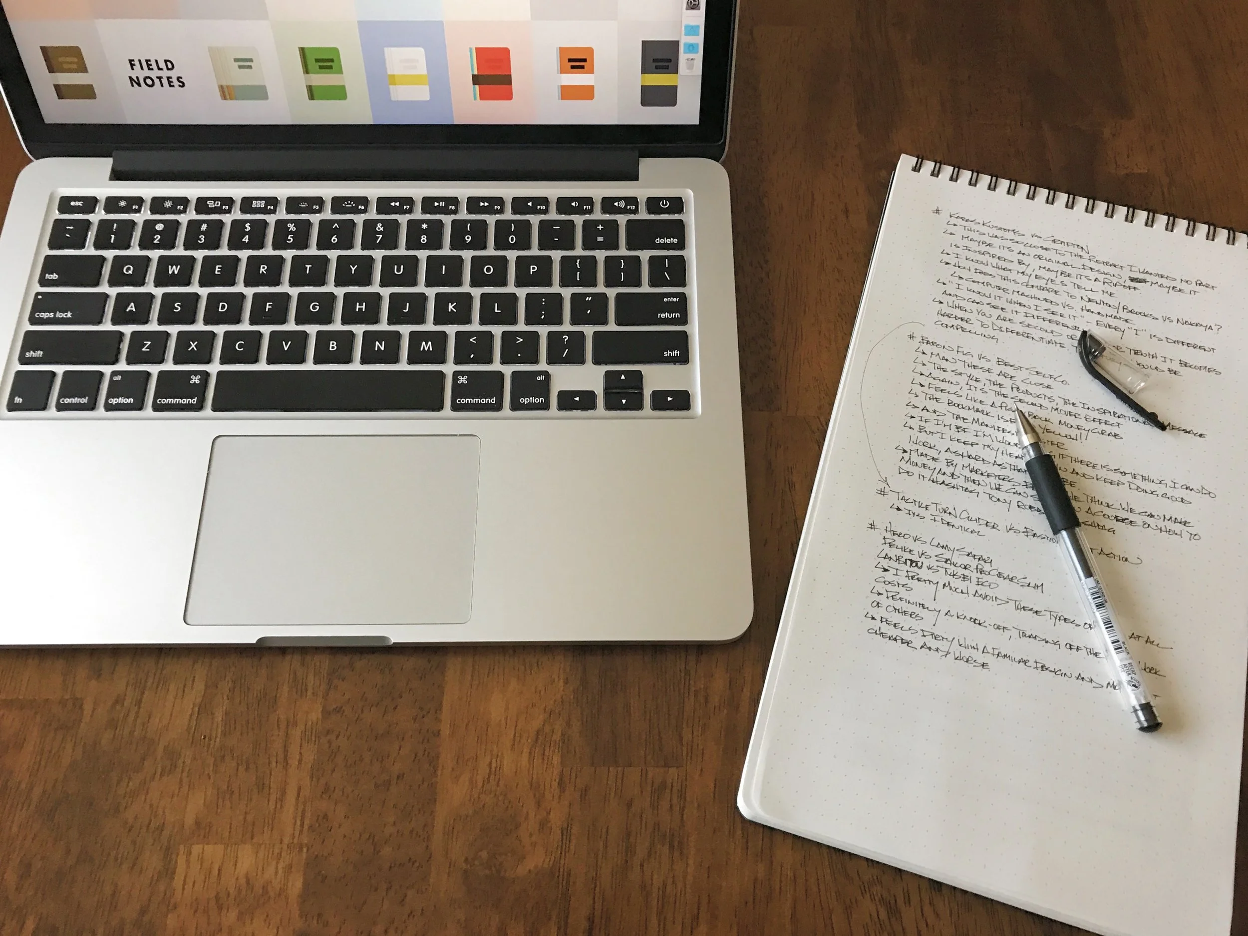
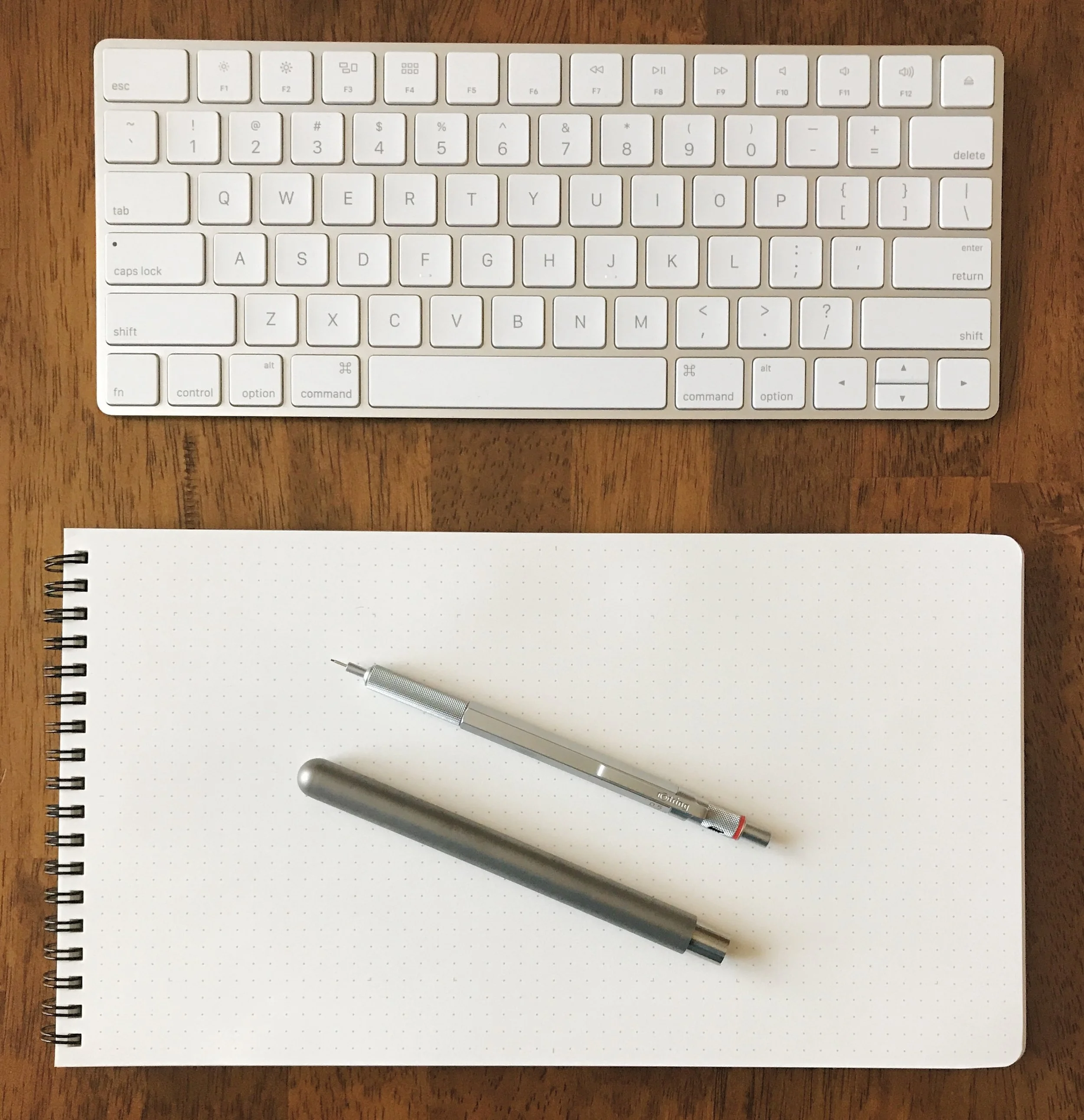
I’ll start you off with this: This is my most used notebook over the last month. By far. What I am enjoying so much about the Panobook is that the firm covers allows me to write comfortably with the notebook in my lap. I’ll grab a drawing pen - recently the Deleter Neopiko - or anything with a Schmidt P8126 refill - recently something Top Secret - and go to town. I can sit in a comfy chair in my living room and just write away. Like I told Myke on last weeks podcast, I wrote two pages of notes in my Panobook for one of the topics we covered. It made for fun and easy show prep.

The Panobook is designed to be a desk notebook, and I use mine there too. I generally keep it to the right side of my laptop or keyboard and in the vertical position. I surprised myself by using it in that orientation, as I love landscape mode in notebooks. But that is what works for me. It’s like a tall A5 pad.

It handles all inks very well, including fountain pen ink. I don’t like using fountain pens with the Panobook though, as the paper is dry and uncoated. There is no feathering, bleed, or ghosting, but the colors are flat with no shading or sheen, like the line from a drawing marker. They work fine, but I enjoy other pens and pencils more.

Back side of the ink samples page

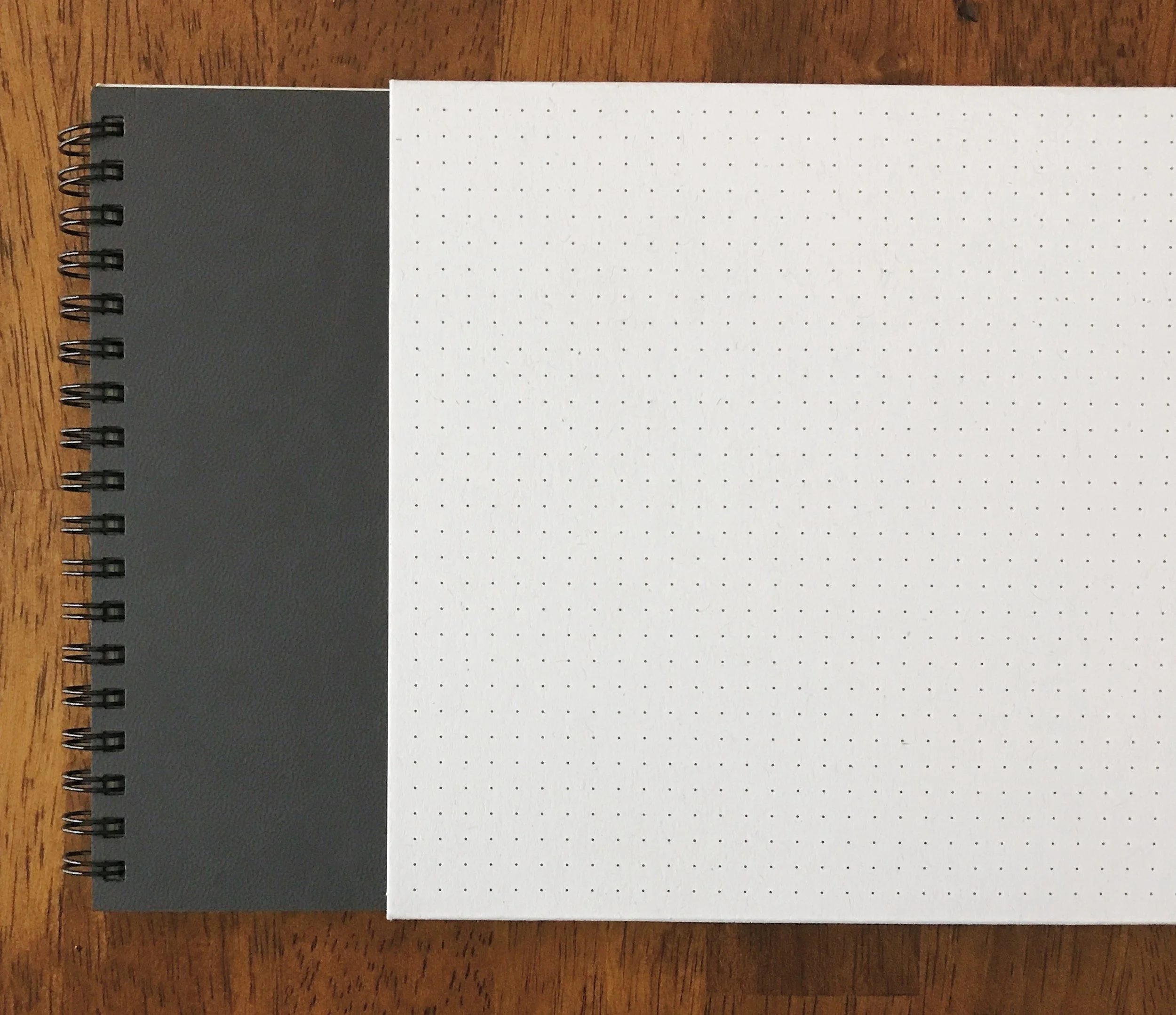
From a design perspective, Studio Neat thought of it all. The covers are firm but have a soft feel. The dot grid is a light grey with subtle guide markers for UI design or storyboards. The wire binding is strong and smooth, allowing you to turn the page easily and lay flat. There is even a slip cover for storage between uses or when done and filed away.

At $20, it is priced right in line with every other quality notebook in this category. I bought all three of mine through their very successful Kickstarter project, and they are taking pre-orders for them on the Studio Neat site for the next batch.

As a Studio Neat fan and customer for years, I’m glad to see them dip their toes into the stationery market. I have a feeling this won’t be the last product we see from them in this area.


Enjoy reading The Pen Addict? Then consider becoming a member to receive additional weekly content, giveaways, and discounts in The Pen Addict shop. Plus, you support me and the site directly, for which I am very grateful.

Membership starts at just $5/month, with a discounted annual option available. To find out more about membership click here and join us!

Posted on November 20, 2017 and filed under Studio Neat, Panobook, Notebook Reviews.

The Pen Addict Podcast: Episode 283 - A Significant Business in Clever Pen Cases

I’m really happy we did this episode, and even happier with how it turned out. The feedback has been fantastic so far. And don’t miss the Tiffany Sharpie follow-up!

Show Notes & Download Links

This episode of The Pen Addict is sponsored by:

Harry’s: Claim your free trial set!

Squarespace: Make your next move. Enter offer code INK at checkout to get 10% off your first purchase.

Posted on November 17, 2017 and filed under Podcast.

Franklin-Christoph 03 Iterum in Coco and Créme with an EF SIG Nib: A Review

(Susan M. Pigott is a fountain pen collector, pen and paperholic, photographer, and professor. You can find more from Susan on her blog Scribalishess.)

The Franklin-Christoph Iterum is a medium-sized fountain pen in acrylic with a screw-on cap. The pen comes packaged in a Franklin-Christoph cardboard box and a zippered leather pen envelope.

The Iterum’s body and cap are cylindrical with a flat finial and barrel bottom. The grip tapers down from the barrel and the cap threads are near the nib—out of the way but also providing a lip to prevent your fingers from slipping.

The Coco and Créme acrylic is a deep brown with shimmery swirls of cream. It’s a subtle pen, and I love the colors which remind me of hot chocolate or a well-brewed cappuccino.

The cream-colored finial is embedded into the cap and is engraved with the Franklin-Christoph logo. One reason I chose the Iterum model is because I liked the complementary colored finial.

The clip is rhodium-plated with four F-C diamonds engraved. It is a fairly stiff clip, so it will keep the pen secure on a shirt pocket or a thin tablet.

The only other adornment is “Franklin-Christoph 03” lightly engraved near the base of the cap.

The pen is a size I think most writers will find comfortable. Unposted, it is 5.01 inches in length, 6.91 inches posted, and 5.5 inches capped. The pen is quite light (25.79 grams), so posting shouldn’t present a weight problem. But because the cap doesn’t post deeply, the pen feels unwieldy posted.

Like many Franklin-Christoph models, the Iterum can be filled via cartridge, converter, or eyedropper. If you choose to eyedropper this pen, it will hold a lot of ink. I eyedroppered one of my other Franklin-Christoph pens, but I found it messy and inconvenient (plus it can stain lighter acrylics). So, I use the provided converter. Yes, I have to refill the pen more often, but I like that there’s less mess.

The nib I chose for this F-C pen is an EF steel SIG nib. SIG stands for “stub italic gradient.” Essentially it’s an extra-fine italic with the corners smoothed so that it is in between a cursive italic and a stub nib.

The EF SIG nib obviously doesn’t show as much line variation as a broader nib would, but I like that it offers a little more character than a regular EF nib would. Unfortunately, this particular nib is a little scratchy compared to my other F-C nibs, but I think that’s because it’s an EF. I’m accustomed to F-C medium italics.

The Iterum is no longer available in the Coco-Créme color. I got one of the last ones before the color was retired. You still have several color options, though: black and maroon, emerald and white, smoke and maroon, or ghost and smoke. Prices for this pen depend on what nib you choose. If you purchase the Iterum with a basic steel nib, you’ll pay $175. For one like mine with a SIG nib, you’ll pay $185. 14k nib options start at $265 for regular nibs and $285 for Masuyama nibs. See the Franklin-Christoph Iterum page for all the options.

I now own three Franklin-Christoph pens: the Marietta (model 20), the Stabilis (model 66), and the Iterum (model 03), and I love them all. I like the Iterum’s size, shape, and styling.

Pros

  • The Iterum is a pen style that I think most people will like. It’s a medium-sized pen with a comfortable grip.
  • The Iterum comes in a variety of acrylic colors with complementary finials.
  • I think one of the great benefits of buying Franklin-Christoph pens is the wide variety of nib options. I really like the SIG nib grind because formal italics can be too sharp and stubs can be too rounded. The SIG is nicely in between. Plus, those of us who can’t get to pen shows to have Mike Masuyama grind nibs for us, can still experience his workmanship via Franklin-Christoph. Note that you can’t purchase Masuyama nibs separately; you have to order a Masuyama nib along with a pen. All the other nibs are available for purchase separately.
  • Another advantage of Franklin-Christoph pens is the three different filling options.

Cons

  • Honestly, the only possible negative I can think of with Franklin-Christoph pens is how light they are. I personally prefer pens with some heft to them, but I find the Iterum incredibly comfortable to write with. I’d much prefer a pen to be light rather than so heavy it’s uncomfortable.

Enjoy reading The Pen Addict? Then consider becoming a member to receive additional weekly content, giveaways, and discounts in The Pen Addict shop. Plus, you support me and the site directly, for which I am very grateful.

Membership starts at just $5/month, with a discounted annual option available. To find out more about membership click here and join us!

Posted on November 17, 2017 and filed under Franklin-Christoph, Fountain Pens, Pen Reviews.