Posts filed under Ink Review

DeAtramentis Benjamin Franklin Ink Review

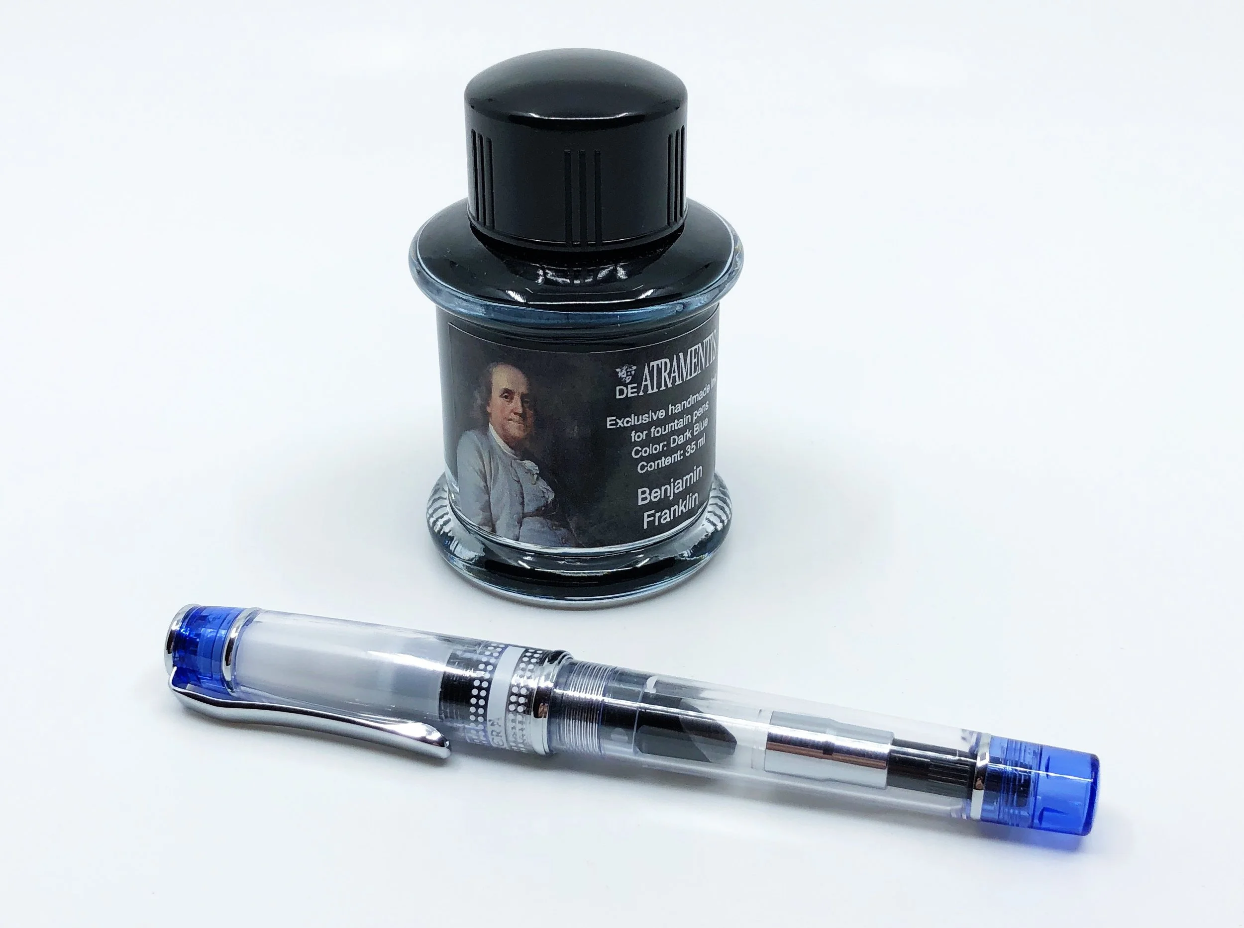
In my formative fountain pen years, you know, like three years ago, I fell in love with DeAtramentis Benjamin Franklin ink. It’s a basic dark blue, but at a time when I had somewhere around seven inks instead of seventy, it set itself apart.

I remember writing with it and feeling like a real fountain pen user for the first time. Basic black and blue inks were boring, and I had yet to discover the oranges, pinks, and purples that I would eventually fall in love with. Benjamin Franklin had character and stood out on the page. My handwriting looked wonderful.

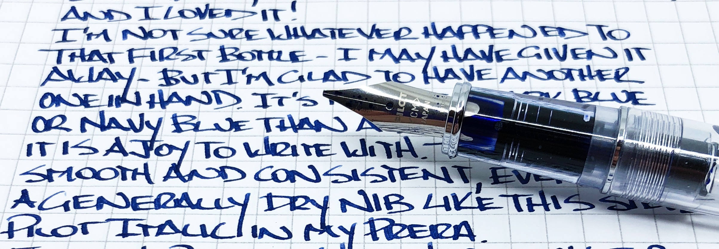
The ink is wet and flows wonderfully, even from a dry nib like the Pilot Prera italic nib I used for this review. It feels wet and lubricated, and flows well. The color is dark for sure, along the lines of a darker blue black ink. As you may or may not know, blue black inks make up some of my all-time favorites and daily workhorses. This one doesn’t have the black or grey you may see in other blue black inks, but the blue is deep and rich. And it even has a hint of red sheen.

As I was re-familiarizing myself with Benjamin Franklin, my first thought went to one of my current favorite inks: Montblanc JFK. Another dark blue, JFK is a shade or two lighter, shows off a touch of grey, and overall, has more character. They are close though. My next thought went to Diamine Cult Pens Deep Dark Blue, but as the name would lead you to believe, it is a deeper, darker blue than Benjamin Franklin.

I learned something new during this review as well. According to Vanness Pens, DeAtramentis Benjamin Franklin is the same ink as DeAtramentis Standard Dark Blue. Seems kind of dishonest from DeAtrementis to repackage one of their standard inks as if it were something special. Fortunately, both inks are the same price - $13 for a 35ml bottle - but it’s a strange move. I can only assume the rest of the historical lineup has the same duplication.

Regardless, this is an excellent ink at a fair price. I’ll be using this one a lot, and will try not to misplace this bottle like I did my original bottle.

(Vanness Pens provided this product at no charge to The Pen Addict for review purposes.)


Enjoy reading The Pen Addict? Then consider becoming a member to receive additional weekly content, giveaways, and discounts in The Pen Addict shop. Plus, you support me and the site directly, for which I am very grateful.

Membership starts at just $5/month, with a discounted annual option available. To find out more about membership click here and join us!

Posted on December 4, 2017 and filed under DeAtramentis, Ink Review.

J. Herbin Amethyste de l'Oural Ink Review

(Sarah Read is an author, editor, yarn artist, and pen/paper/ink addict. You can find more about her at her website and on Twitter.)

The Herbin Company (formerly known as J. Herbin) has launched their new line of inks this fall--the 1798 collection, with the stunning Amethyste de l’Oural. I've been known to say that I don't care much for shimmer inks, and then inks like this one make me eat those words for breakfast. I like everything about this ink.

The new 1798 collection is based on another milestone for the Herbin company--the year they moved to their shop in Paris. They sold pen nibs and wax and ink--necessities in those days, and little luxuries today. The new collection makes a few improvements over the 1670 anniversary collection. The mouth of the bottle is wider to accommodate pens more easily, the wax cap seal is thicker and stronger, the labeling and packaging has improved. My favorite thing about this ink might be the beautiful bottle. I love the embossed ship logo on the bottom. The bottle is also heavy and sturdy, so it's not likely to tip over.

The ink is a rich, royal purple with a fine, subtle silver shimmer. The particles need to be gently distributed into the ink before filling your pen. The purple "amethyste" color is to honor the gemstone that was shipped around the world in the 16th and 17th centuries. It's a sophisticated shade, and the silver sparkle adds a bit of smoky shine to it. It's not a glaring mirror-shine, but a more elegant glint. It isn't even noticeable in some lights or on some paper, but when the right light hits it at an angle, it gives a little wink of fairy dust.

The ink is well saturated and has some water resistance to it. Lines were still visible after spending a few minutes in water. I can also say it lingers on the fingertips through many (many) washes. It's a wet, well-lubricated ink. I was delightfully surprised by that. One of the things I dislike about a lot of shimmer inks is how they can feel a bit dry or clumpy. This is one of the wettest inks I've ever used. I put it in the driest nib I own--one of the black-coated Lamy fine nibs--and it lubricated the writing so well that it made me enjoy a nib I usually avoid. Between the wetness and the shimmer, there's very little shading--but it doesn't need it. It's also rather slow to dry on Rhodia paper. There was very mild feathering (there might be more with a wider/wetter nib) and no bleed-through.

Perhaps because the particles seem finer (at least by sight) than in some other shimmer inks, I had no trouble cleaning it out of my pen. It's actually one of the better-behaving inks I've ever used. Still be careful when using it in vintage pens or pens that are notoriously difficult to clean--but I have no concerns about using this ink regularly in an everyday writer. In fact, I've been using it every day for some time, now, and enjoying every minute.

(Exaclair USA provided this product at no charge to The Pen Addict for review purposes.)


Enjoy reading The Pen Addict? Then consider becoming a member to receive additional weekly content, giveaways, and discounts in The Pen Addict shop. Plus, you support me and the site directly, for which I am very grateful.

Membership starts at just $5/month, with a discounted annual option available. To find out more about membership click here and join us!

Posted on November 16, 2017 and filed under J. Herbin, Ink Review.

Diamine Salamander Ink Review

Diamine Salamander

Diamine Salamander is one of the latest inks to be introduced by the venerable British manufacturer. While you wouldn't be incorrect that the name harkens to the amphibian found in various regions around the globe, there is actually a little more behind the name. The Good Captain, a member of the Fountain Pen Network, was actually involved in the naming:

Working in collaboration with Phil Davies at Diamine I was asked to come up with a name for a sample of the ink he'd sent me to have a look at, labelled 'No 93'. I was intrigued and Salamander was born. It reminded me of the colours of Royal Flying corps bi-planes during WWI so I had a look for some more information.

It is cool to be able to read behind the scenes notes like these. Check out the link for more details.

Salamander surprised me once I inked up my TWSBI Mini 1.5 mm stub to test with. I was expecting kind of a dark olive black ink, and while those colors come through, the depth of the color was intriguing. There is a lot of brown, a wide range of green, and a nice sheen that shows on the Rhodia paper I tested on. I tried to get a close-up of the sheen and only partially succeeded. It is not always immediately apparent, but after drying it does show up in certain light. Very cool.

The real gauge for me is if the ink will crack my every day rotation. Right now, Diamine Salamander is a no, but it is a close second tier color, around the Noodlers 54th Mass level. It will see intermediate action for sure. Well worth checking out if you are a fan of greens and browns.

Diamine Salamander

Diamine Salamander

(JetPens is an advertiser on The Pen Addict and I received this product at no charge.)

Posted on November 7, 2013 and filed under Diamine, Ink Review.