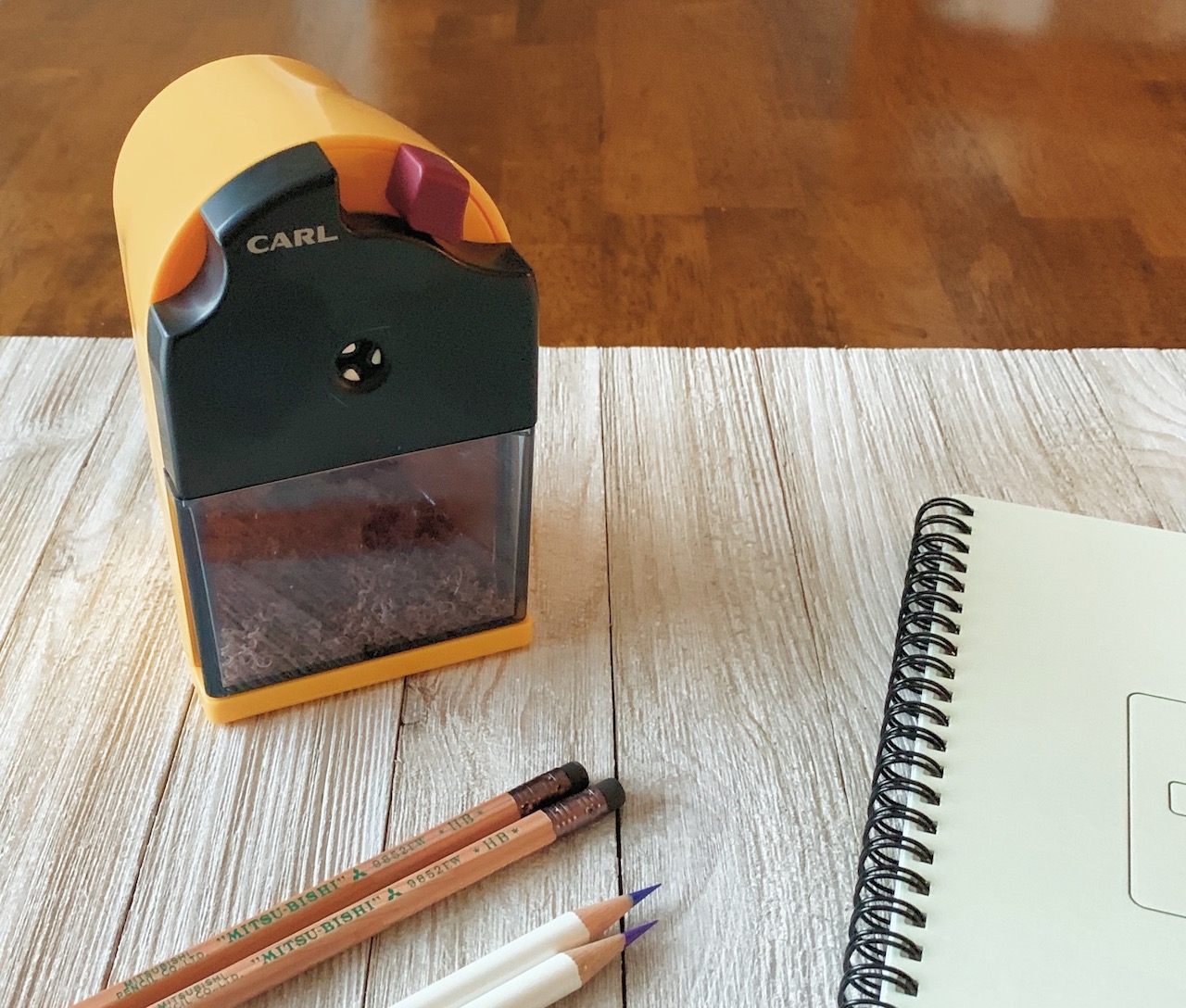
One of the most fun parts about being obsessed with stationery isn’t just discovering new writing instruments, but also the accessories that go with the writing instruments. I’ve developed a fondness for wooden pencils over the years, and as much fun as I have trying new ones and discovering my favorites, I also enjoy exploring pencil-adjacent accessories, like pencil sharpeners.
The Carl Ein Pencil Sharpener is the latest to hit my desk, and has a feature I wasn’t aware I needed: Two stages of tip sharpness. Why is this important to me? I’m so glad you asked!
Not all pencil cores are created equally. Traditional writing pencils, like your standard HB, have a graphite core. They sharpen to a pointy, durable tip and write well from the moment they hit the page. Colored pencils use a clay-based core, making them softer and more prone to breakage when sharpened to a point as fine as I like with my writing pencils. Have you ever sharpened a colored pencil in a regular sharpener and snapped the tip of the pencil off the moment it touched the page? That’s why.
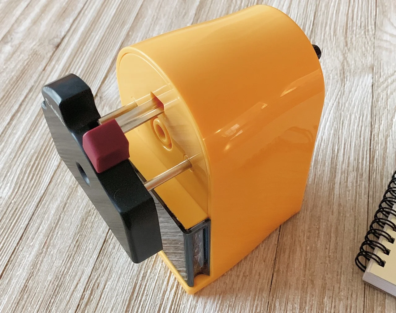
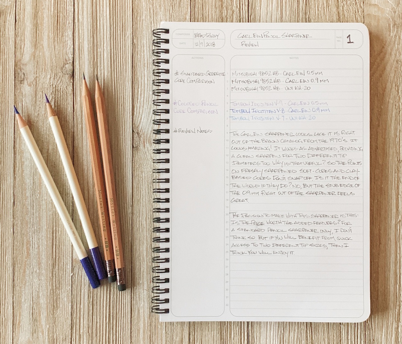
The Carl Ein helps with this issue by having two settings in one sharpener: An 0.5 mm standard pointed tip for traditional writing pencils, and an 0.9 mm broad, stub tip for pencils that are softer or use different core materials, like colored pencils. This setting is simple to swap between with a simple twist of the knob on the handle side of the sharpener.
While the selling point of the sharpener works as intended, Carl and I had a rough start. When my package arrived and I pulled out the box I noticed a lot of rattling. Opening it up, there were small, loose parts everywhere. The front, slide-out panel had become completely disassembled in shipping. Putting it back together was a 20-30 minute exercise in frustration. It’s one of those things that requires three hands to assemble, and unfortunately, I was only born with two.
This had me worried about the overall build and sturdiness of the sharpener from the jump, but it has proven to be a workhorse and no further issues with functionality have been detected.
One design feature I noticed and appreciated with regular use was the sloped top cover of the sharpener. Desk sharpeners usually require two hands to operate, one on the crank and one on the top of the sharpener to hold it steady. I didn’t even realize this feature until I was switching back and forth between my favorite Uni KH-20 sharpener and felt that the Carl was easier to hold on to. It’s also slightly wider and has a wider base, so that contributes to its sturdiness.
0.5 mm on the top of each pair, 0.9 mm on the bottom
I’m happy overall with the Carl Ein, but their is one final gotcha to be aware of: The price. This is a $40 desktop pencil sharpener. I’ve used great desktop sharpeners in the low-$20 range, like the Classroom Friendly. My personal favorite is the aforementioned KH-20, which runs $30.
Does the Carl Ein offer enough in its added features to justify the extra cost? For me personally, no. I will recommend the KH-20 every time over the Carl. But, for hardcore colorists and soft-pencil core users I can see the benefit of having dual point sizes built into a single sharpener. And for that, I think the Carl Ein is a good choice.
(JetPens provided this product at no charge to The Pen Addict for review purposes.)
Enjoy reading The Pen Addict? Then consider becoming a member to receive additional weekly content, giveaways, and discounts in The Pen Addict shop. Plus, you support me and the site directly, for which I am very grateful.
Membership starts at just $5/month, with a discounted annual option available. To find out more about membership click here and join us!


