Taccia Daidai Orange Ink Review

(Jeff Abbott is a regular contributor at The Pen Addict. You can find more from Jeff online at Draft Evolution and Twitter.)

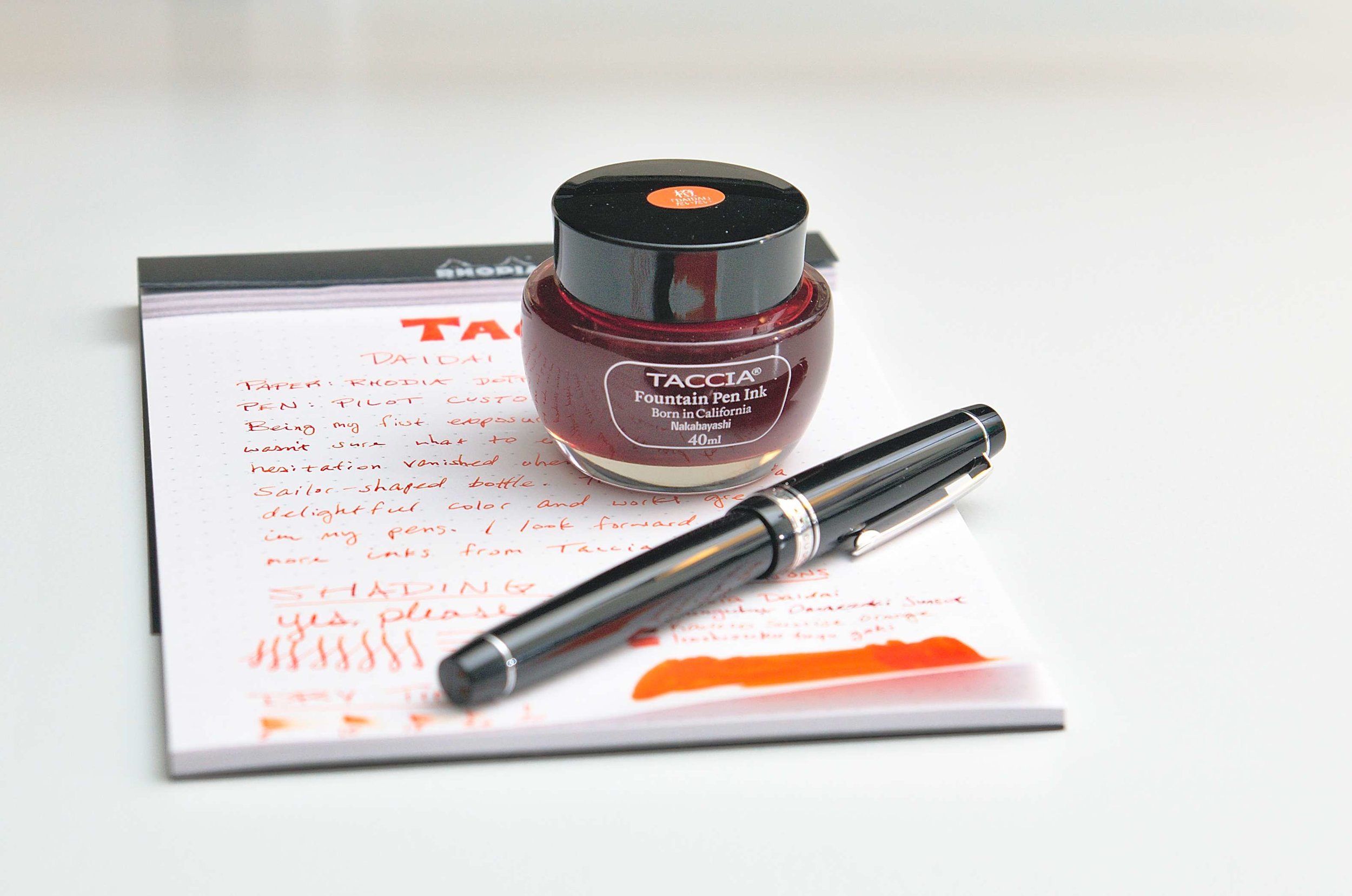
Taccia may have entered the ink game a bit late, but they already have a good sense of what they're doing. Taccia inks are made in Japan and feature a bottle design that is very reminiscent of Sailor bottles. The ink names are all Japanese and center around the primary colors that generate joy and spark imagination. The color I'm reviewing today is Daidai orange, and it is lovely.

Daidai orange is a fairly standard bright orange. There aren't many hints of red, yellow, or brown in this variant, and it just screams on the page. I can't help but smile when writing with this ink, and I find myself scribbling and filling in more areas with ink just to see more of the color.

Another thing I love about this ink is the level of shading it exhibits. While the main color is a tangerine orange color, it can also lighten up a bit in the shallow strokes. It's definitely still orange, but noticeably lighter. Either way, the level of variance is what makes this ink just a touch more special than a typical bright orange ink. The shading really adds the spark and makes it a great choice for any orange lover.

One thing that I haven't enjoyed so much about this ink is the dry times. It is a slow dryer. Even when writing fairly lightly and using as little ink as possible, it takes upwards of twenty seconds for the ink to fully dry. While this isn't unheard of and certainly well within accepted metrics, it's also a bit of a bummer. In a perfect world, inks would always dry in a couple of seconds, but that's not the physical world we live in.

Writing with this ink has been fantastic in a number of pens. It flows smoothly and makes dry nibs feel a tad wetter and smoother when writing. The lubrication quality is good but not overdone, and I haven't had any issues with this ink clogging up or drying out my nibs. According to Taccia, the ink is pH neutral, which means it should play nice with any pen you put it in. Inks and pen materials can sometimes react poorly, but that's rarely the case with a neutral ink like this one. And, almost as important as not ruining your pen, this ink also washes out of your nib, feed, and converters with ease.

I've used this ink with several different nibs, ranging from EF to a soft gold medium, and I haven't seen any issues with feathering or bleeding. The ink stays within the nib tracks very well. Being an orange, it also doesn't show through on the back side of the page very well. It's such a well-behaved ink!

Taccia Daidai orange is available in a 40ml bottle for just $12. Based on my experience with the ink, this is a steal. It's a well-behaved ink with plenty of character and depth, and 40ml is a good size for a bottle of good ink. But, if you don't want to commit to the whole bottle, you can also pick up a 4ml sample. I plan to try out several other Taccia inks, and I'm hopeful that they all share the same level of quality and craftsmanship as Daidai. If that's the case, this is a fantastic value with plenty of great color options to keep everyone happy.

(Vanness Pens provided this product at no charge to The Pen Addict for review purposes.)


Enjoy reading The Pen Addict? Then consider becoming a member to receive additional weekly content, giveaways, and discounts in The Pen Addict shop. Plus, you support me and the site directly, for which I am very grateful.

Membership starts at just $5/month, with a discounted annual option available. To find out more about membership click here and join us!

Posted on September 4, 2019 and filed under Taccia, Ink Reviews.

Mark’s A5 Weekly Agenda 2020 Giveaway

I’m jumping the gun a little bit on this Mark’s A5 Weekly Agenda 2020 giveaway, but with good reason: It starts this month! This is a 16-month planner begins in September 2019 and runs through the end of 2020, and it’s all I could do to not crack it open and use it myself. If you are interested in learning more, keep an eye on JetPens Mark's Planners Page to see when it drops. It should be very soon!

Posted on September 3, 2019 and filed under Mark's, Giveaways.

Tombow Mono KM-KKS 4B Pencil Review

I have an odd habit of not reviewing some of my favorite products in a timely fashion. Maybe that’s because I’m busy using them and forgetting to set them aside to take pictures of? Who knows. What I do know is that I am enjoying the Tombow Mono KM-KKS 4B pencil more than I ever thought I would. So much so that it falls into the “favorite” category.

I don’t recall exactly where I first came across this pencil, but I’d wager it was from Johnny at Pencil Revolution. I was struck by how pretty is was. Tombow already makes some of the best looking products, but this one even more so for me. And then I saw it: 4B. And at the time I began to hunt one down, only 4B. That’s a non-starter for someone like me who lives on the H side of the graphite hardness scale.

Despite that fact, I picked one up during our visit to C.W. Pencil Enterprise last fall, almost begrudgingly so. I had a stack of other products, so I figured what was the harm in another $2.50 to see what the hype was about. Worse case is I have a pencil that looks great in photographs.

Then I never used used it. It sat in my pencil box for months before I decided to give it a try. Needless to say, I was mad at myself for waiting so long to sharpen it up, because it is fantastic.

The product description for the KM-KKS is unlike any other pencil that I am familiar with. Words like “penmanship,” “calligraphy,” and “brush” are not normal descriptors, so I should have known this was a different animal. I noticed the moment that I started writing that it was.

How products feel is terribly difficult to describe in typed words, and honestly, I’m not sure I can do the 4B core of this pencil justice. For starters, the core is wide, which is common in softer graphite - assumedly for structural reasons. They are more fragile by nature.

While I comprehend that, what threw me off the most is how smooth the graphite is. Glassy doesn’t quite describe it, but there is no grit or texture to speak of. The best comparison I can think of is something like how a Pilot gold fountain pen nib feels different than a Platinum or Sailor nib. All of them are great, but Pilot’s nibs have a stickiness on the page - for lack of a better term - that sets it apart. This Tombow pencil feels different from its competitors in a similar way.

Oddly, it seems to have more of a graphite sheen to it on the page. It looks different in changing light angles more than other pencils I own.

I know this all sounds weird, but I promise I am of sound body and mind when writing this review!

My writing looks great on the page, which is not something I ever expected to say about a 4B pencil. The tip obviously will wear down faster than my normal 2H, but not in a “sharpen it every two lines” kind of way. I did the short written review below without sharpening so you could see the difference from start to finish. The way the core wears I could have kept going further and been happy with the output.

In the realm of wooden pencils, this one falls in the expensive category at $2.50 a pop. I’ve gotten more value than that just looking at the darn thing, much less writing with it. It’s fun to use, looks cool, and is different than most every other pencil I own. I’m going to keep using this one down to the stub, and then buy a few more. I may even risk buying the only other model readily available in the US: the 6B version.


Enjoy reading The Pen Addict? Then consider becoming a member to receive additional weekly content, giveaways, and discounts in The Pen Addict shop. Plus, you support me and the site directly, for which I am very grateful.

Membership starts at just $5/month, with a discounted annual option available. To find out more about membership click here and join us!

Posted on September 2, 2019 and filed under Tombow, Pencil Reviews.