The Pen Addict Podcast: Episode 378 - I Have a Whole System Around That

I test out the Theme System Journal and share my findings for Myke live on the show. He was not prepared for this.

Show Notes & Download Links

This episode of The Pen Addict is sponsored by:

Pen Chalet: Click the ‘podcast’ link at the top of the website and enter the password ‘penaddict’ for this week’s special offer, and to get your code for 10% off.

Backblaze: Unlimited cloud backup for Macs and PCs for just $6/month.

Care/of: Personalized vitamins, protein and more, delivered to your door. Use ‘penaddict’ for 25% off.

Posted on September 27, 2019 and filed under Podcast.

Pebble Stationery Co. Glacier Edition Pocket Notebook: A Review

(Susan M. Pigott is a fountain pen collector, pen and paperholic, photographer, and professor. You can find more from Susan on her blog Scribalishess.)

Pebble Stationery Company was founded by Lois Ho and Joohn Soh. Both founders originally did corporate work in Australia, but they decided to leave the world of meetings to create products that are useful, minimalistic, simple, and beautiful.

The Glacier is Pebble’s first limited edition notebook, inspired by the glaciers of Antarctica. Thus, the linen cover is an icy blue with the company’s logo in silver.

The pages are edged in silver foil as a special touch.

Each pocket notebook is sewn stitch bound with silver thread.

The notebooks are 3.5 inches by 5.5 inches with rounded corners.80 pages of 52 gsm Tomoe River Paper are printed with 4mm dot grid in light gray ink.

The inside cover includes a space for the owner’s name, contact information, the inclusive dates for the notebook, contents, and location.

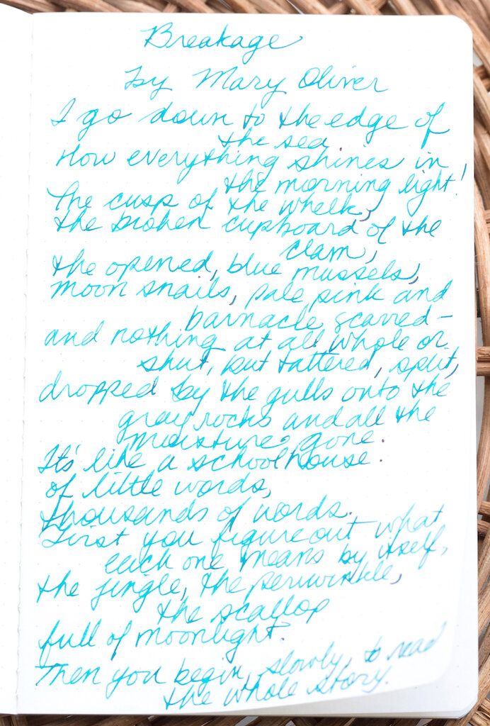
As you would expect, Tomoe River Paper works extremely well with fountain pen ink. I tested the paper with a variety of pens and inks, and none of the bled through (although there’s definitely show through).

I also did several ink swabs. The paper handles all of the inks well, showing off the shading with no bleed through. I didn’t notice much (if any) sheen, however.

I also tested the paper with various gel pens, rollerballs, and ballpoints. The paper tolerated all of these quite well. Even the Sharpie ink (fine point) did not bleed through.

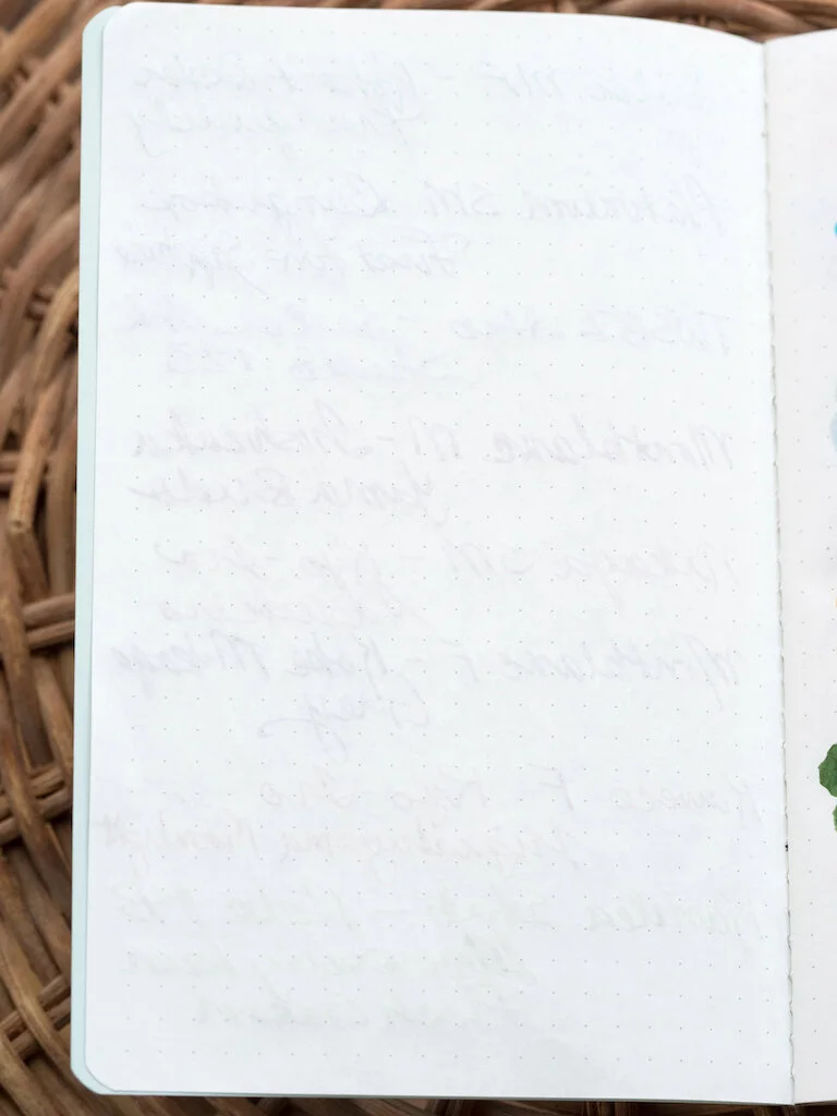
The paper is thin enough that when you write with sharp nibs or press down hard enough with rollerballs, the page underneath bears the imprints. But, those imprints will be obscured by any writing you do later.

The notebook is the perfect size for capturing to do lists, swabs, and short quotations.

My only criticism is that the dot grid is quite light and hard to see. I had difficulty keeping my lines straight because of this.

The Pebble Stationery Glacier Pocket Notebook is an example of outstanding craftsmanship. I love the attention to detail--the silver gilded page edges, silver thread, and silver embossed branding.

You can purchase the special edition Glacier Pocket Notebook directly from Pebble Stationery Company. For $12.00 you receive a pack of two beautiful notebooks. Get them while they’re still available!

(Pebble Stationery Company provided this product at no charge to The Pen Addict for review purposes.)


Enjoy reading The Pen Addict? Then consider becoming a member to receive additional weekly content, giveaways, and discounts in The Pen Addict shop. Plus, you support me and the site directly, for which I am very grateful.

Membership starts at just $5/month, with a discounted annual option available. To find out more about membership click here and join us!

Posted on September 27, 2019 and filed under Pebble Stationery Co., Notebook Reviews.

Colorverse Apollo 11 50th Anniversary First Moon Landing Limited Edition Ink Set Review

(Sarah Read is an author, editor, yarn artist, and pen/paper/ink addict. You can find more about her at her website and on Twitter. And check out her first novel, The Bone Weaver’s Orchard, now available where books are sold!)

There have been so many fun moon landing anniversary editions in the stationery world this year, and the Colorverse Apollo 11 Ink Set is certainly no exception. It's a fun theme, a great celebration, and this is probably the most drool-worthy ink set I've encountered.

The first thing you can't help but notice about this set is the amazing packaging. The spacey looking grey box unfolds to fun facts and illustrations about NASA's mission and the spacecraft. Then there's a layer of wee cute ink bottles nestled in formed foam. The cardstock has more fun facts. Beneath that is another layer of ink bottles and yet more educational nuggets. The set comes with napkins and info cards and stickers. It's clear a lot of thought went into what would be inside this box besides the fun inks themselves.

I love the color choices for this set. It's the essentials--every color you really need is here, yet they're all still wonderfully within the theme. And somehow they've used common colors and still made them unique. Of all my sample cards, I could not find any that looked like a clear duplicate of any of these five colors.

Best of all, I love the tones. The blue-black, called Apollo 11, has a lovely smoky blue shade that pools to a deep navy. The grey, called One Small Step, is a perfect moon dust color. It seems cool in its lighter tones, and warm where it's darker. The teal, called Eagle, is fresh and bright but still readable. The green, Tranquility Base, is a lovely, earthy, matcha green. And the red, Columbia, is sometimes pink, sometimes orange, and sometimes deep red with a gold-green sheen.

The chromatography tests for these inks blew me away. The teal and red were fairly straightforward, through it did bring out the pinks in the red. The green left a lovely smoky line behind as the brighter neon green crept away. The blue-black had some lovely hidden pinks and purples that I hadn't been expecting. But that grey? Holy cats! Bright orange, pink, and teal. There's clearly some sort of alchemy afoot at the Colorverse laboratory. As I watched the colors climb the paper, I felt like I was watching some sort of spell unravel. And it also explains that dual warm/cold look to the ink itself.

I'll do a part two of this review where I talk about all of their behaviors in actual pens. But for now, I can easily say that this is the most fun I've had with inks in a long time. The only downside to this set? The price. The $100 cost is a bit high, even for all this magical fun. While I think the packaging is unbeatable as far as coolness goes, I wonder how much it has driven up the cost of this set. There are only 125ml of ink here. And while there's a good color variety, and the bottles are adorable, I'm not sure I'd have splurged on this. I think the audience for this package requires a very specific overlap in the Venn diagram of ink buyers: People who are drawn to practical colors, who are space fanatics, and collectors of limited editions. I'm sure there are plenty of pen addicts who fit into those categories, and I do hope that this limited run will all find good homes. I can't help but love it, myself. More fun with these inks to come next week!

(JetPens provided this product at no charge to The Pen Addict for review purposes.)


Enjoy reading The Pen Addict? Then consider becoming a member to receive additional weekly content, giveaways, and discounts in The Pen Addict shop. Plus, you support me and the site directly, for which I am very grateful.

Membership starts at just $5/month, with a discounted annual option available. To find out more about membership click here and join us!

Posted on September 26, 2019 and filed under Colorverse, Ink Reviews.