Posts filed under Robert Oster

Vanness Pens x Robert Oster Hemp Fountain Pen Ink Review

Vanness Pens x Robert Oster Hemp Fountain Pen Ink Review

It takes a lot to get me to like a green ink.

Akkerman #28 Hofkwartier Groen is far and away my favorite, and is a top five personal ink, regardless of color. The green is bright, no doubt thanks to a hefty dose of yellow in the mix, and shades wonderfully. It’s flat-out fun to use.

Well down the line after that shade comes the classic Rohrer & Klinger Alt-Goldgrun, primarily because it is weird as heck, and shades like a beast. It’s one of those inks that once you see it in person you know you have to have it. Faber-Castell Viper Green is a more traditional shade of green, but has an electric/searing nature in its tone. This would fall into an everyday writing green, but with a bit of an edge.

Vanness Pens x Robert Oster Hemp Fountain Pen Ink

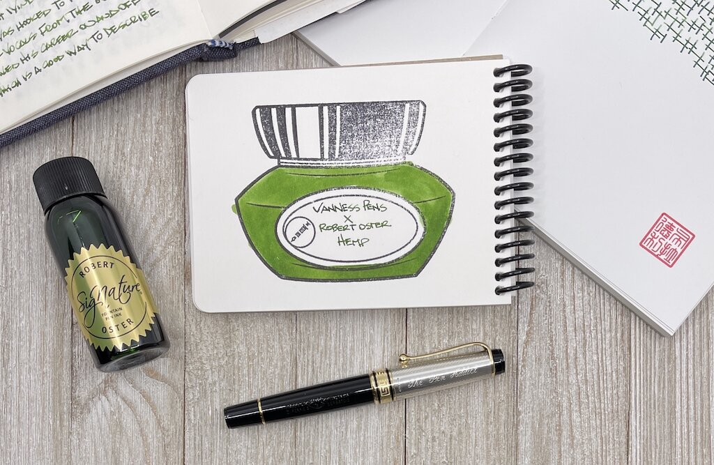
That’s mostly it for my green use, at least until I took a chance on Hemp, one of the three Vanness Pens collaborations with Robert Oster. This one is going into the rotation, most likely as my second green behind Akkerman #28.

Green inks are a short list for me, although I can’t explain why. Unlike blue, orange, or purple, green has to be a little weird for me to use. Traditional greens in the Kelly or Forest shades need not apply. Yellow undertones are good, which brings out the brightness, and having odd questions come to mind, like “What color of frog is this?” only serve to make it more fun.

Vanness Pens x Robert Oster Hemp Fountain Pen Ink Dry Time

I wasn’t sure what color Hemp would actually be. Was this to represent fresh growth, or in a processed for production phase? It’s definitely the former, with a good combination of established green in the middle, and the youth of yellow around the edges.

Vanness Pens x Robert Oster Hemp Fountain Pen Ink Writing

In my bank paper Musubi Notebook I saw more shading than I expected, using an Aurora Optima with a Medium gold nib. On Rhodia, the color was more flat, but bright (and had a loooong dry time.) On Tomoe River paper, the range of darkness showed up. The swab on the Col-o-ring Oversize is the best representation of the color that I see when writing with a nib.

The only remaining question I have at this point is how the ink will look on the page in one of my finer nibs. will the brightness and character still show up? I hope so, because I’ve answered the other important question - do I like this ink - already. And now I’m ready to use it more.

(I bought this ink from Vanness Pens at a discount.)


Enjoy reading The Pen Addict? Then consider becoming a member to receive additional weekly content, giveaways, and discounts in The Pen Addict shop. Plus, you support me and the site directly, for which I am very grateful.

Membership starts at just $5/month, with a discounted annual option available. To find out more about membership click here and join us!

Vanness Pens x Robert Oster Hemp Fountain Pen Ink Lines
Posted on March 1, 2021 and filed under Robert Oster, Ink Reviews.

Robert Oster Carbon Fire Ink Review

Robert Oster Carbon Fire Ink Review

(Jeff Abbott is a regular contributor at The Pen Addict. You can find more from Jeff online at Draft Evolution and Twitter.)

Over the past few months, I've definitely had a thing for trying new blue black inks. While I'm not tired of blue blacks, I decided it was time for something a little different. But don't get too excited — this next ink is just a shade or two brighter than the typical blue black. Despite being a close cousin of blue black, Robert Oster Carbon Fire is a spectacular dark blue that has just enough brightness to really lift my spirits.

While going through my ink and swatch collection to find comparable inks to Carbon Fire, I realized that I really don't have much at all in the blue spectrum that falls between bright, happy blue and blue black. Carbon Fire is the perfect dark blue that has an obviously blue hue while also being dark enough to seem "professional." To me, this is the color that most defacto "blue" that comes in gel, ballpoint, or rollerball refills. But, Carbon Fire has some extra qualities that set it apart from regular old navy blue.

Robert Oster Carbon Fire Ink Shading

For one, I'm a big fan of the amount of shading in this ink. It's not an intense level of shade between different blues, but it's enough that you can see it with small nibs. Of course, the larger the nib, the more pronounced and beautiful the shading becomes. I love an ink that has a good amount of shading, and Carbon Fire really does the trick for me.

Another hidden quality that I've only been able to coax out when using this ink with a medium cursive italic (or anything larger) is a very subtle sheen. It's so subtle and hard to detect that I can't decide if it's more of a red or pink sheen. Despite being subtle, it's somehow quite deliberate when you're looking at the ink color as a whole. It's difficult to describe. The subtle sheen adds a level of intrigue to the ink because you can't quite put your finger on what makes the ink something a bit more than a standard blue ink. It's not shimmery, it's not glossy...what is it?! These were my internal questions while I was testing this ink. Only by holding the paper at the right angle against the light does the sheen show itself for what it is. It hides beneath the navy surface and adds a pleasant je ne sais quoi to an otherwise ordinary ink color.

Robert Oster Carbon Fire Ink Comparison

If you like ink colors that exhibit mysterious qualities, this ink is right up your alley.

Aside from the color, shading, and sheen, this ink is standard fare for Robert Oster. It's not dry, but not too wet. It's smooth when writing and behaves well in the pens I've tried. It dries in a fairly standard 15-20 seconds depending on how large and wet the nib is. I couldn't detect any feathering or bleeding, which is also something I've come to admire with any Robert Oster ink.

I picked up Carbon Fire as a sample because I was intrigued by the name and thought the online swatch example was unique for a dark blue ink. I'm glad I followed the intrigue, because I might have found a new favorite ink.

You can pick up your own bottle of Robert Oster Carbon Fire from your favorite ink retailers for around $17 (Vanness, Pen Chalet, Goldspotand JetPens to name a few).


Enjoy reading The Pen Addict? Then consider becoming a member to receive additional weekly content, giveaways, and discounts in The Pen Addict shop. Plus, you support me and the site directly, for which I am very grateful.

Membership starts at just $5/month, with a discounted annual option available. To find out more about membership click here and join us!

Robert Oster Carbon Fire Ink Swab
Posted on January 27, 2021 and filed under Robert Oster, Ink Reviews.

Robert Oster Australis Oak Fountain Pen Ink Review

Robert Oster Australis Oak Fountain Pen Ink Review

Robert Oster Australis Oak is exactly the type of ink that I never buy for myself, while simultaneously being the exact type of ink I should be buying for myself. Not every ink has to be Blue Black, Orange, or Purple - right? RIGHT???

I’ve wanted a good every day brown ink for a while now, and Australis Oak is certainly a contender. I’ve always thought the more chocolate brown shades would be my thing, but with the few I’ve tested none have stuck. They seem to lean flat, and boring. Leaning red is not much my style either, but what about a shade that goes a bit deeper in the gold/yellow range? Maybe so.

Robert Oster Australis Oak

That’s what I was hoping to get with this ink, and I believe I succeeded. This is a rich, brown gold that leans a little gold. Or maybe well-worn tan leather. Or maybe fresh out of the oven pralines. Wherever it lands, I’m happy with it.

Part of the challenge with brown inks is that, for my personal usage, they do need to favor the pen I am going to ink it up in. That means no Pink Love here, and no Primary Manipulation. It has to math more closely than if I was throwing a bright blue ink around, for example. With my Stylo-Art Kinpaku, I found the perfect match.

Robert Oster Australis Oak Notes

This is the perfect fall pen, with the perfect fall ink. Any brown, red, gold, or yellow would be ideal for this pen, and it doesn’t hurt that I’m inking it up while the leaves are turning.

From a performance perspective, Australis Oak is identical to every other standard Robert Oster ink I use. It flows beautifully from the Pilot stub nib in this pen, with moderate shading. There is no sheen to speak of, and the dry times and color saturation are right smack in the mid-range. In short, it’s a perfect all-day, every-day writing ink.

Robert Oster Australis Oak Lines

Will I commit to using it that way? That’s the question that still remains. I love it, and it is a great compliment to the rotation of inks I find myself using regularly. I guess we will find out together!

(Vanness Pens provided this product at no charge to The Pen Addict for review purposes.)


Enjoy reading The Pen Addict? Then consider becoming a member to receive additional weekly content, giveaways, and discounts in The Pen Addict shop. Plus, you support me and the site directly, for which I am very grateful.

Membership starts at just $5/month, with a discounted annual option available. To find out more about membership click here and join us!

Robert Oster Australis Oak Line Art
Posted on October 26, 2020 and filed under Robert Oster, Ink Reviews.