Posts filed under Sailor

Sailor 1911L 4am Fountain Pen Review

(Sarah Read is an author, editor, yarn artist, and pen/paper/ink addict. You can find more about her at her website and on Twitter. And check out her latest book, Out of Water, now available where books are sold!)

Pen shows are a great place to try out the pens you have resisted buying for years, because it's so much easier to resist things online. And by "great" of course I mean dangerous, because it's so much harder to resist things in person. Especially when Brad says, "Hey, you were looking for one of these, right?"

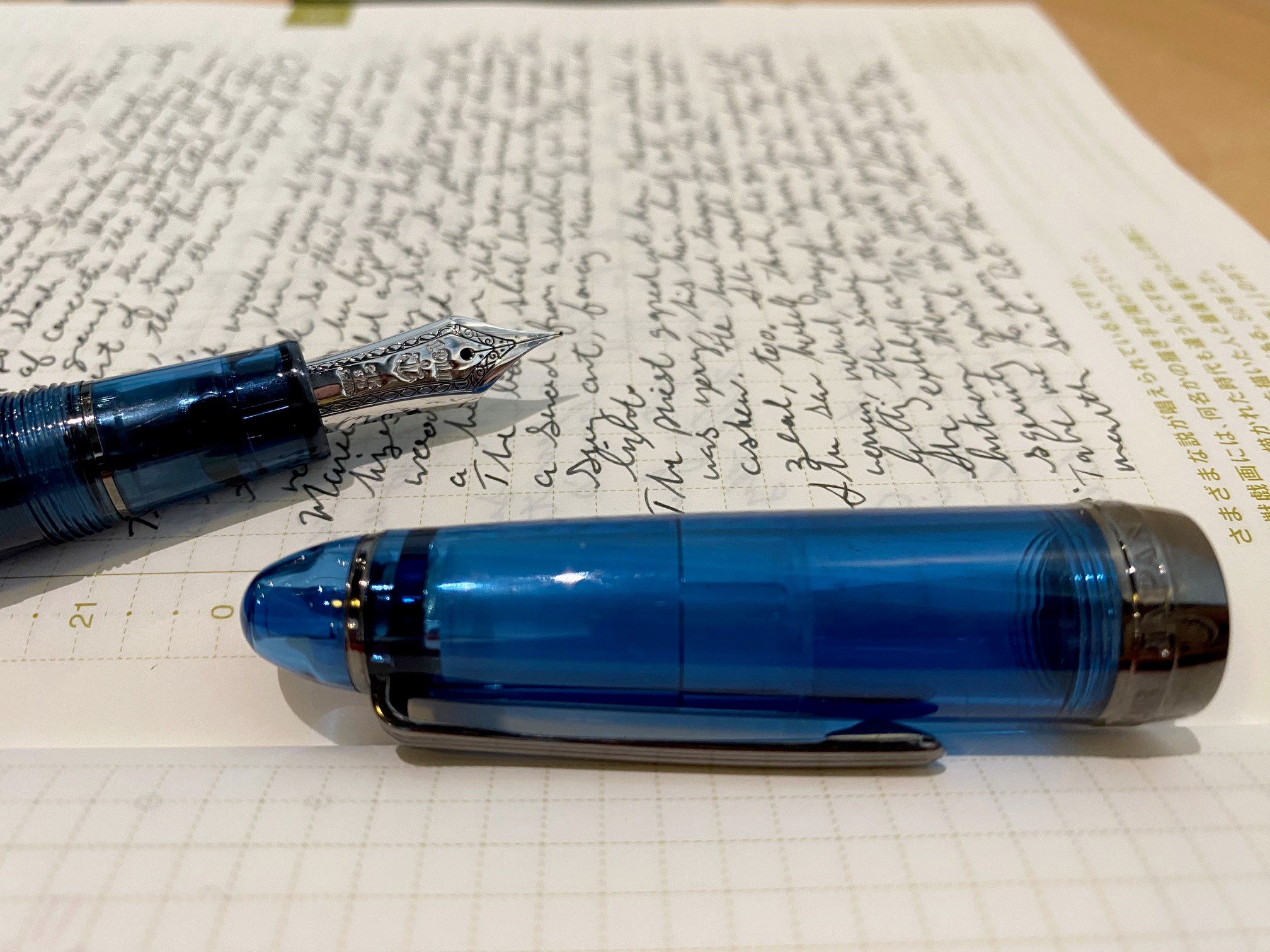
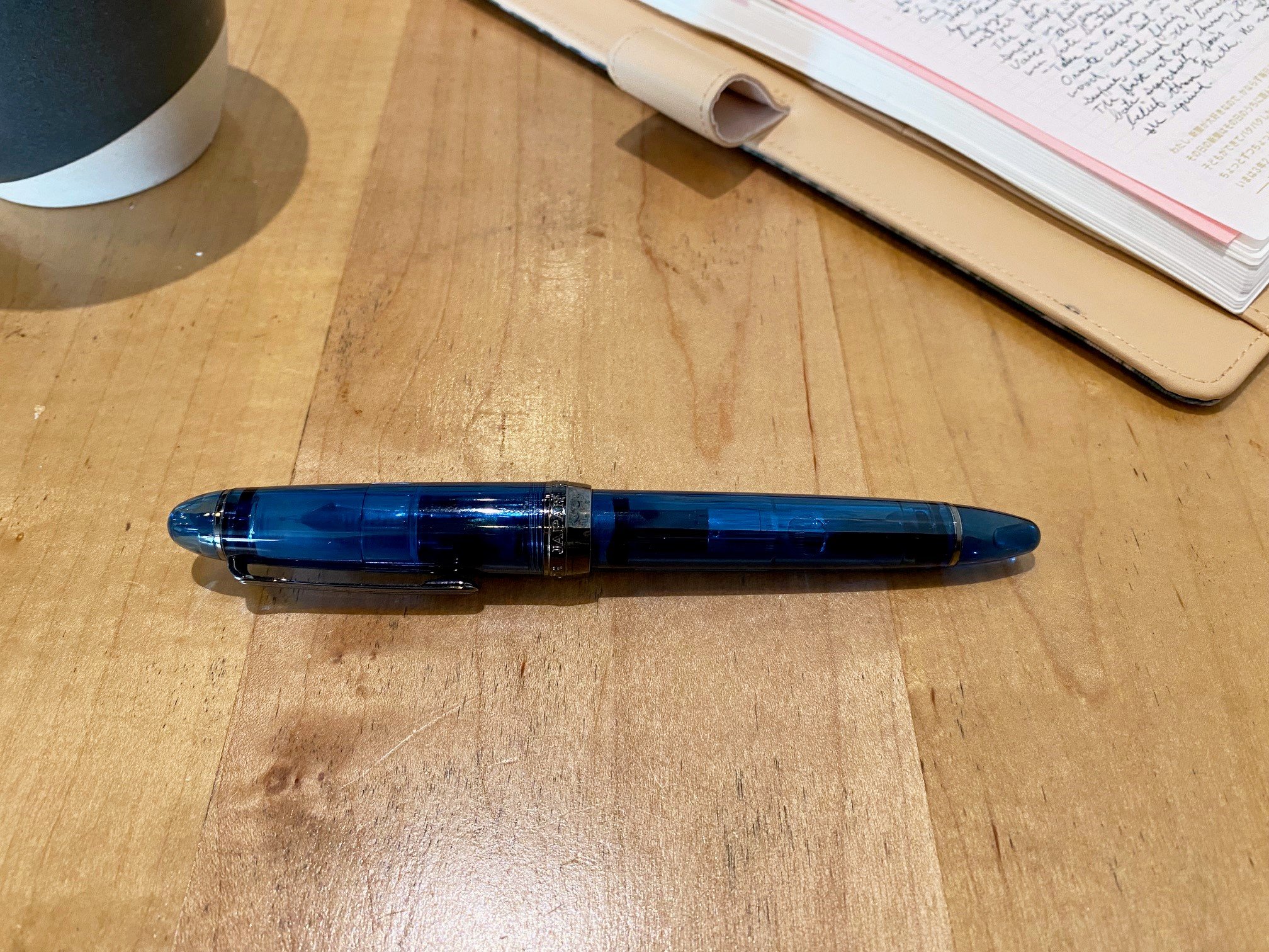
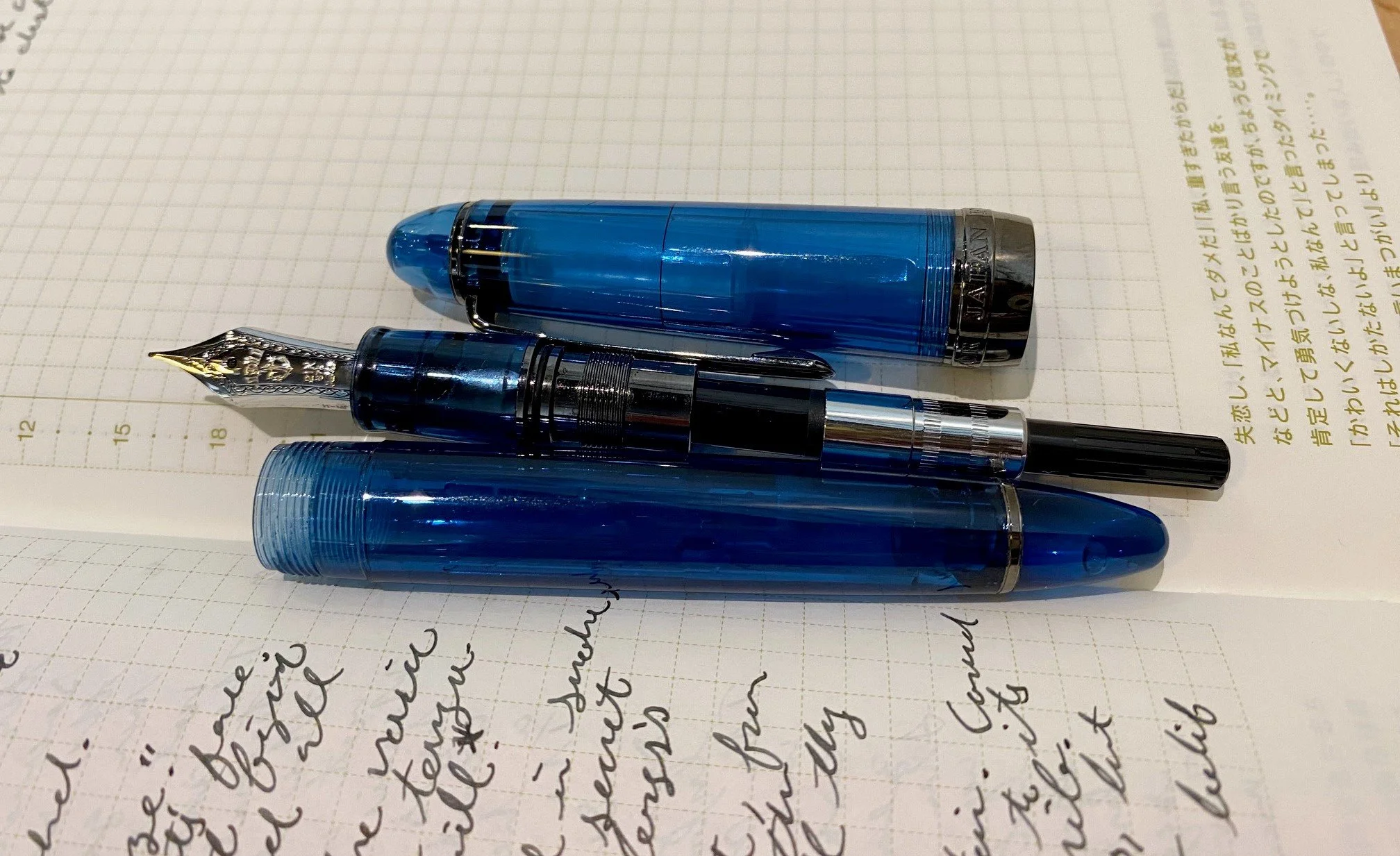
In any case, I left the Chicago Pen Show with a Sailor 1911L 4am, and I'm very glad I did. As a habitual night owl who frequently greets the hour of 4am with pen in hand, that cool, blue glow of pre-dawn is like an old friend. The resin material of this pen matches that tone perfectly, and the gunmetal grey accents look elegant and moody. It's a gorgeous pen, and I coveted it when it was first released. I hesitated, though, because it was a limited edition and pricier than a standard Sailor, and I already have a number of lovely Sailors, and I didn't NEED it, and and and, etc. There was always an excuse. And then Sailor raised their prices, and even though this pen remained at the pre-rise price, I was feeling grumbly about the brand in general. So I kept resisting. Until Brad texted me at the Chicago Pen Show.

Brandon, of Rocky Top Pen Co., had a 4am at his table. It was used, but it also had a MF cursive italic nib grind by John Mottishaw, and he was selling it for $275--$37 under the retail price for a 1911L. While the pen is still available at many retailers in the smaller version for $220, that nib was calling to me. It's practically my favorite grind, and I don't own any other Mottishaw nibs. And that pen was right in front of me, then it was in my hand, then I put it down and walked away, and then I walked right back. Let's just call that the Pen Show Tango.

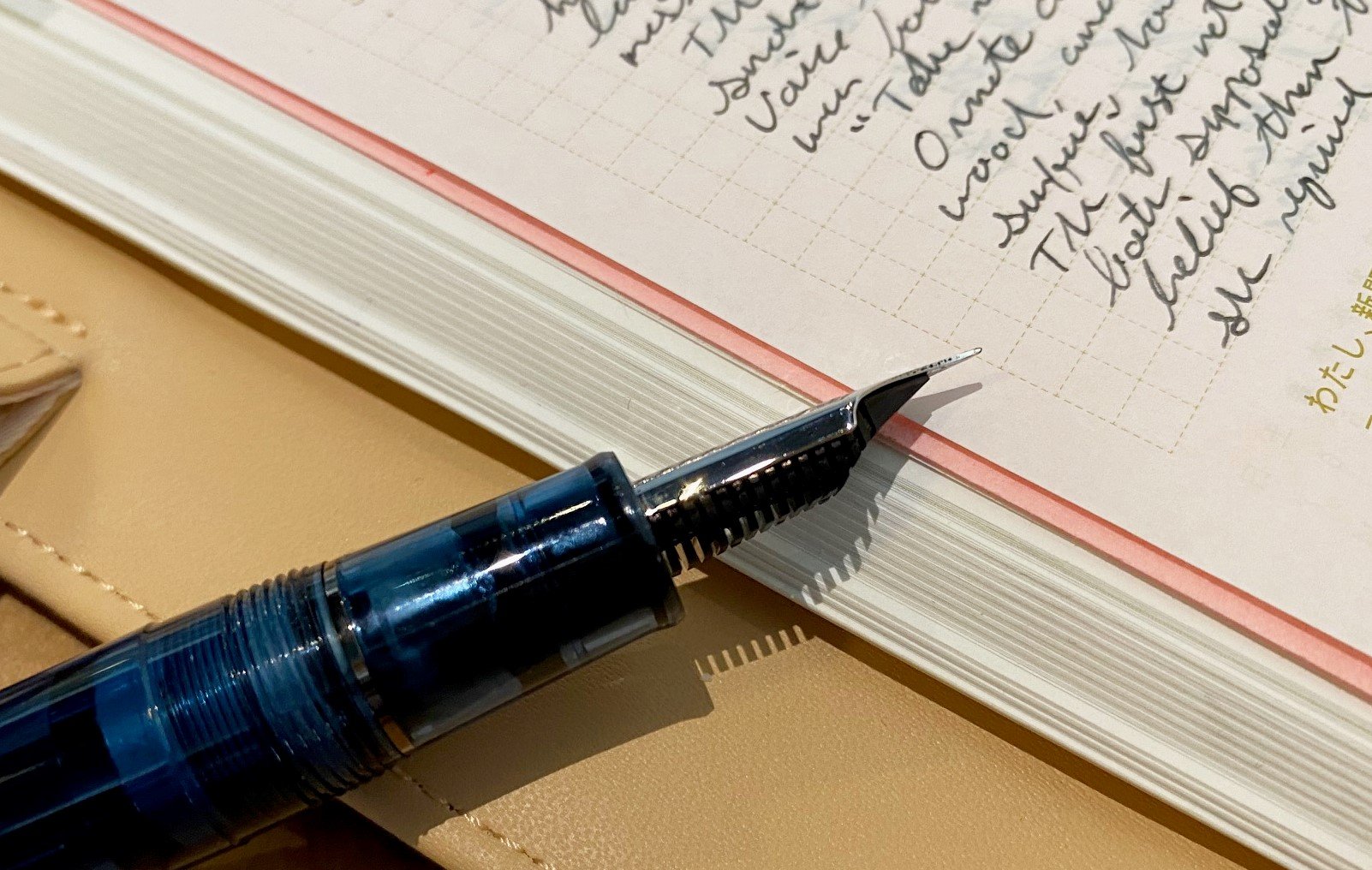
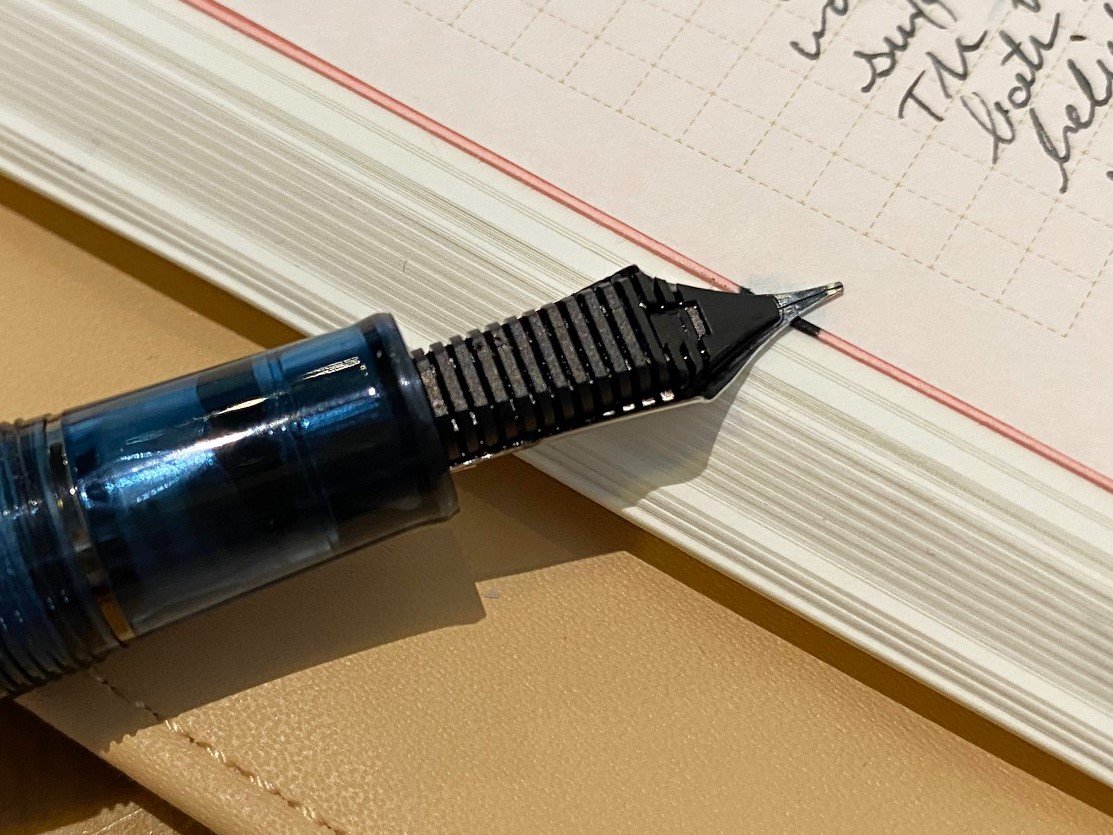
The pen has a 21k gold nib, and the CI grind on this MF nib is crisp and perfect. It shows just the right amount of character in the lines it creates, while still being both very fine and maintaining good flow. This nib is easily in my top three nibs that I own, maybe even the top one--though I'd need a Platinum showdown to confirm that. In any case, it's almost too good to write with, not because I'm afraid to use it, but because it's difficult to think about what I'm writing when I can't stop swooning over HOW I'm writing. That hasn't stopped me from using it every day since I bought it, though.

Perhaps this is more a review of the nib than the pen, as Sailor hardly needs my voice added to its chorus of praises, or maybe it's a review of the pen show experience, where you can find rare treasures and irresistible deals. But I wouldn't hesitate to recommend all three: The Sailor 4am, which you can still find in most online stores; Mottishaw nib grinds, which have utterly enchanted me; and attending pen shows, where resistance is futile.

This pen has seen two 4am writing sessions already. It will see several more in the coming weeks, as I'm in my heaviest deadline season. I'm very glad to have this aptly themed writing companion along for the ride.


Enjoy reading The Pen Addict? Then consider becoming a member to receive additional weekly content, giveaways, and discounts in The Pen Addict shop. Plus, you support me and the site directly, for which I am very grateful.

Membership starts at just $5/month, with a discounted annual option available. To find out more about membership click here and join us!

Posted on May 25, 2023 and filed under Sailor, Fountain Pens, Pen Reviews.

Sailor Yurameku 2nd Edition Date Gokoro Ink Review

Multi-shading inks are all of the rage these days, and Sailor is at the forefront with their Yurameku fountain pen ink lineup.

When they launched the 1st edition of these inks inks, I was excited, but my expectations were tempered due to the lightness of the colors. I reviewed one of the relatively darker shades in Itezora, and was pleasantly surprised. The color was dark enough for regular writing, and the color - wow - that’s what I signed up for. Is it blue? Green? Purple? How about yes to all of the above?

That is the idea of Yurameku in a nutshell. From Sailor’s website:

“The color changes depending on the length of time and the paper. A mysterious ink that shows glimpses of different colors in shades and streaks.”

Mysterious is the right word. And it’s nice to see Sailor point out, even subtly, that paper matters.

With the 2nd Edition Yurameku inks, Sailor brought in the darker shades, which are more up my alley for day to day use. I get why the light colors went first - they are much more visually appealing in pictures - but the dark colors are where it’s at for day to day writing.

Sailor includes converter stickers in some of their ink lineups.

I bought three bottles of the 2nd Edition at the Atlanta Pen Show, Date Gokoro, Suki Gokoro, and Zare Gokoro, and I’m reviewing the first in the list today. Looking at the packaging of Date Gokoro, I expected a purplish black ink, and I think that’s what we have here. Maybe.

Before even inking it up in a pen, I took my Kakimori dip nib out and laid some ink down on original 52 gsm Tomoe River, new Sanzen Tomoe River, Yamamoto Bank Paper, and Kokuyo Business Paper. I like to know how inks work on these papers. The first three are specialty papers that handle fountain pen inks well, albeit in different ways, and the last one is more of a stock, basic paper.

In general, the color is close on all paper types, but on closer inspection, different colors take prominence depending on the page.

The character of Date Gokoro shines on these fountain pen friendly papers. It’s a deep dark purple with hints of blue and black, a note of pink underneath, and a moderate red sheen after it dries. On the Kokuyo Business Paper, the color is much more flat. That makes sense since it is more absorbent. It’s good for fountain pens, but it dries fast. With these multi-shading inks, you want the ink to dry slower to get the full character of the ink to come out.

I inked up Date Gokoro in a new Mythic Pen Co. Aeschylus model, also bought at the Atlanta Pen Show, with a Medium steel Jowo nib. It flowed very well from this setup, with a deep, dark purple fresh from the nib, and lighter shades as it dried. This is the entire idea of the Yurameku ink lineup. Yes, many inks exhibit this exact behavior, but the multi-color appearance after it dries is what sets it apart. There is a lot going on with these lines on the page.

The color is all over the place depending on how much ink goes down on the page.

Dry time on Yamamoto Bank Paper was on the slow side, which, again, is the expectation here. I wouldn’t buy one of these inks if you worry about smearing the lines right after putting them down.

If you are interested in buying these inks, they are in the premium category. They are “only” $20 per bottle, but the bottle is 20 ml in size. I think we can all do that math, which, for ink, is expensive. I’m ok with it - maybe I’ll actually finish a bottle of ink for a change.

(I purchased this product at a discount from Dromgoole’s at the 2023 Atlanta Pen Show.)


Enjoy reading The Pen Addict? Then consider becoming a member to receive additional weekly content, giveaways, and discounts in The Pen Addict shop. Plus, you support me and the site directly, for which I am very grateful.

Membership starts at just $5/month, with a discounted annual option available. To find out more about membership click here and join us!

Random Kakimori streaks on Sanzen Tomoe River.

Posted on April 17, 2023 and filed under Sailor, Ink Reviews.

Dippity doo dah, dippity yay - A Dip Nib Comparison

(Kimberly (she/her) took the express train down the fountain pen/stationery rabbit hole and doesn't want to be rescued. She can be found on Instagram @allthehobbies because there really are many, many hobbies!.)

….my oh my, what a wonderful day! Sorry, not sorry, for the ear worm but I decided to play with some dip nibs cuz it’s swatch time in December, AKA Inkvent! Even if you aren’t joining in Diamine’s Green Edition Inkvent for 2022, chances are good that you still want to swatch your inks at some point, right? So I thought it would be fun to do a little dip pen showdown - are you ready? Let’s go!

Methodology

Ok, this isn’t rocket science but I wanted to make sure the different dip nibs were on the same playing field, so here are the ground rules.

  1. Ink - I used Waterman Serenity Blue as a baseline for the swatches/writing samples. This is most nib grinders’ preferred ink of choice as it has consistent flow, does not stain and is good for vintage pens. I also picked a shimmer ink to see if it behaved differently. I capped and shook the vial between each test.
  2. Paper - I used a combination of a 68 gsm Tomoe River notebook, a 80 gsm Rhodia graph pad, and the standard sized Col-O-Ring cards made from 160gsm paper.
  3. Cleaning - Since I have used some of these for a long time and others I just got last week, some have been cleaned many times and some have not. I will make a note of which ones were cleaned prior to usage and which ones needed extra cleaning, if any. I will just use tap water to rinse between uses.
  4. Writing - Aside from the name of the dip nib, I tried to write the same text on the different papers so you can see how much writing I could get out of one dip. The exceptions are the Sailor Hocoro Fine Dip Nib and Kakimori Pen Nib where I wrote the first line without first cleaning the nib and then I did a quick water rinse/dry before rewriting the line again.
  5. Swatches - I made a broad line swatch for some but not all of the nibs. The finer dip nibs/ones without feeds aren’t really designed for depositing large amounts of ink.
Dip Pens

Short Drillog holder with 0.5 nib, Long Drillog holder with 1.2 nib, Glass Dip Pen, Brass Kakimori nib in a Tachikawa T36 holder, Stainless Steel Kakimori nib in an Aluminum Kakimori holder, Kakimori Pen Nib in a Speedball Marbled holder, Sailor Hocoro Fine and Fude Dip Pens.

Not all of these holders have caps, though you can get a Tachikawa holder with a cap which is handy for travel. Also, the length of the Kakimori is, of course, dependent on whatever holder you buy.

Dip Nibs/Pens

  1. Drillog Dip Pens/Nibs - The nibs and holders were sent to Brad for review by Drillog. They currently cost 16,280 Yen (currently ~$120) for the nibs - the holders are sold separately starting at 14,080 Yen (~$103).
  2. Glass Dip Pen - I purchased mine on eBay years ago (so the brand/name/price might be different) but you can still find them on eBay, like this one
  3. Kakimori Brass Dip Nib - I bought this from Yoseka - it is currently $54.50.
  4. Kakimori Stainless Steel Dip Nib - I bought mine new from someone on Instagram, but you can get the Kakimori Steel dip nib from Yoseka for $54.50 and the holder for $72.00. These Kakimori nibs are more widely available now than a few months ago.
  5. Kakimori Pen Nib - The Pen Nib for $28 as well as the Tachikawa Nib Holder were sent to Brad from St Louis Art Supply.
  6. Sailor Hocoro Fine Dip Nib (without feed) - I bought the Sailor Hocoro Fine in Grey from Stilo e Stile for 12.30 EU (~$13), but it also comes in white. The feeds were out of stock but are now back in stock here for an additional 2.05EU (~$2.15).
  7. Sailor Hocoro Fude Dip Nib (with feed) - I bought the Sailor Hocoro Fude in White from Stilo e Stile for 13.11EU (~14), but it also comes in grey. The feed was already part of the pen.
Drillog

The Drillog 0.5 (left) and 1.2 (right) nibs - I am referring to the 0.5 as “Fine”.

Drillog

Drillog Fine writing sample - It writes similar to a Japanese Medium Fine or a Western Fine.

Drillog

Drillog 1.2 writing sample - This didn’t write as much like a stub as I expected. Not surprising that the bigger tip means you don’t get as many words per dip.

Considering how expensive the Drillog nibs are, as well as their nibs being proprietary to their holders (though a couple of makers have figured out how to make their own Drillog holders), I was surprised at how poorly they performed. I had tried them a few times when I got them from Brad a few months ago and I couldn’t get them to write, so I set them aside for future testing. I was actually shocked that both of them wrote immediately with Waterman Serenity Blue but the Fine 0.5 did not want to write with the Robert Oster shimmer (the first line at the very top of the shimmer test page) until I dipped it again and the 1.2 was quite the gusher as well. The Fine also felt very scratchy. Writing on the Col-O-Ring was quite unpleasant as nib would catch on the subtle texture of the card. The Drillog Fine was probably my least favorite of them all and the 1.2 was kind of fun but a bit too wet/broad for me to use for swatching/writing samples. Lastly, because I hold my pens close to the nib and have a steep writing angle, I did not love how long the nibs were, as well as how far back I had to hold the pen due to the taper on the barrel. This is obviously a personal bias, but is something to keep in mind.

Glass Dip Pen

Glass dip pen writing sample - You can see when I rotated the nib to get more ink to the tip.

I have had mixed success with glass dip nibs over the years with some writing well, like this one, and others giving me inconsistent lines or having sweet spots that would only write if I rotated it just so. The other thing about glass dip nibs is that they are, well, made of glass, which makes them more fragile than all the other nibs that I tested which are metal. But they have traditionally been fairly inexpensive (though you can also get fancy glass dip pens from Japan for several hundred dollars) and I particularly like that this one has a cap, which can be screwed to post - I keep mine in my pen accessories case which I pack in my suitcase.

Kakimori Brass Nib

Kakimori Brass writing sample - Compare the line width to its Stainless Steel sibling below.

Kakimori Steel Nib
Kakimori Steel Nib

I was able to get significantly more writing with the Steel Kakimori because it didn’t make thicker/wetter lines like the Brass one.

My first experience with the Kakimori dip nib was with the brass one, since the steel one was sold out. I had a heck of a time getting it to write at all, and despite washing it several times with soap and water and a gentle toothbrush, it would either not write, or would blob ink. I even asked several folks to see if this was normal, but most of the others had the steel one. I was almost ready to call it quits but decided to just keep trying and then out of the blue it started working. I had been using that for swatching/writing samples for several months. When a steel one came up for sale on Instagram, I pounced on it and this one wrote right out of the box with no fuss. The Brass one seems to have much more flow and gives me a much broader line than the Steel one. I have been using the Kakimori Steel dip nib ever since I got it a couple months ago. I like that they can be used at a shallower angle to provide nice wide lines, which I use in one of my ink swatch journals.

Kakimori Steel Dip Nib

Wider lines of ink are easily made with either of the Kakimori dip nibs.

Like the Brass and Steel dip nibs, the Kakimori Pen Nib can also be fitted into any nib holder that has a ferrule. The Pen Nib has a nice fine line but because it does not have a feed or reservoir or channels to hold ink, it isn’t meant for a lot of writing between dips. Still, if I didn’t have a need for making wide lines in my ink journal, I could see using this for the writing sample part of ink swatching.

Kakimori Nib

I mistakenly wrote “Fountain Nib” instead of “Pen Nib” because it looks like a fountain pen nib.

The Sailor Hocoro Dip Pen in Fine had an even fewer number of words it could write before running out. I first tried writing without cleaning the nib and then again after a water rinse and wipe. The lack of feed or channels makes it difficult to hold much ink. The Fude, on the other hand, wrote quite nicely and for a decent amount of lines. This is because there is an included feed which holds a bit more ink. I suspect the Fine will be much better when I am able to order the feed.

Sailor Hocoro

Not a lot of words with the Sailor Hocoro Fine nib - but this could be good for swatching where you are writing a few words.

Sailor Hocoro

No feed means nothing to hold onto the ink means fewer words.

Sailor Hocoro Fude

Sailor Hocoro Fude writing sample.

Sailor Hocoro Fude
Sailor Hocoro Fude Feed

You can get more words on the page even with the added line width due to the presence of a feed.

A few things I really like about the Hocoro Dip Pens: (1) they come in different sizes - Fine, Fude, 1.0 and 2.0 stubs, (2) there is no cap to lose because the nibs can be stored in the pen barrel so they don’t get damaged and (3) there is a flat bevel on the barrel so that it doesn’t roll around - I literally had to corral all the other dip pens on the table because they kept threatening to jump ship. And they are reasonably priced too.

Sailor Hocoro

Left shows the nib inserted into the barrel for storage. The grip section and nib unit are beveled so there is only one way to install or put away the nib. Right shows the other end of the barrel, which is also beveled.

Lastly, I thought I’d try something that wasn’t a tried and true ink like Waterman Serenity Blue so I picked a shimmer ink from my shimmer samples bag. I knew that Robert Oster Glistening Orange Rumble had a fair amount of shimmer, so I wanted to see if the shimmer (1) would cause any flow issues and (2) if you could see the shimmer on the page or if would it get stuck in the channels or immediately get dumped onto the first few characters.

Dip Nib Shimmer Ink

You can see the difference in line widths and as a result the difference in color/saturation.

Dip Nib Shimmer Ink

Angled so you can see some of the shimmer - All but the glass dip pen deposited the shimmer without any issues. The glass dip pen had very little shimmer and a couple of skips.

All of the nibs cleaned out pretty easily - I blasted a syringeful of water after using Waterman and also rinsed in the sink after using the RO shimmer ink. The glass dip nib took a little more effort than the others but it wasn’t too bad.

So what’s the TLDR version of all this?

  1. Drillog is way too expensive for what it is, and it didn’t behave well enough even if it was a fraction of the price.
  2. My favorite is probably the Kakimori Stainless Steel nib because it has a Medium line and can also deposit a wider line for swatches. I had a lot of trouble with the Brass and even now it’s too wet/thick for my preference. This could be fun if I did art.
  3. The Sailor Hocoro Fude Nib is my second favorite as it has a little bit of line variation and can write a decent number of words due to the feed. Can’t wait to try the Hocoro Fine with a feed.
  4. The others are fine (Get it? “Fine”? I’ll see myself out, lol) - they behave alright. It comes down to personal preference and budget.
  5. Dip pens with caps are extra cool.

Anyway, now that I’ve done this research, I’m going to use Kakimori Stainless Steel dip nib and the Sailor Hocoro Fude nib for my Diamine Inkvent swatching and see which one will be crowned the winner! Happy dipping to all, and to all a good write!

Diamine Inkvent

Happy Inkvent!


Enjoy reading The Pen Addict? Then consider becoming a member to receive additional weekly content, giveaways, and discounts in The Pen Addict shop. Plus, you support me and the site directly, for which I am very grateful.

Membership starts at just $5/month, with a discounted annual option available. To find out more about membership click here and join us!

Posted on December 2, 2022 and filed under Dip Nib, Kakimori, Sailor, Tachikawa, Waterman, Pen Reviews.