I was fortunate to receive this Carolina Pen Co. Charleston Slim Fountain Pen for review, and I’m passing that good fortune on. If you like narrower diameter and lighter weight pens like I do, then this one is for you. Read the rules below and enter away!
Carolina Pen Co. Charleston Slim Fountain Pen Review
If you have been using pens for any length of time, I’m sure you have discovered what your favorites are. Favorite brands, favorite materials, favorite shapes, favorite sizes, favorite weights, and so on.
I use all kinds of pens, and in a wide range of options. From big and heavy, to small and light. But I do play favorites with my most … favorite … pens. In general, I prefer pens on the smaller end of the spectrum. Barrels that are narrow, materials that are light. Those needs match my handwriting style - tiny, block printing - the best.
The latest pen to match my needs perfectly is the Charleston Slim model from Carolina Pen Company.
The original Charleston model is one of the pens that launched Jonathon Brooks’ pen making career. It is a classic fountain pen shape, with its widest point in the middle of the barrel, and slight tapers towards each end. I’d imagine it is one of his most popular sellers, too, as it is a great platform to show off his material making prowess.
In general, the Charleston is too wide for me to own more than the one I have. It’s great, and I have it fitted with a wider nib - Broad, ground into a Kodachi by Matthew Chen - befitting its wider diameter. But this isn’t a pen barrel I want to use finer nibs and grinds with.
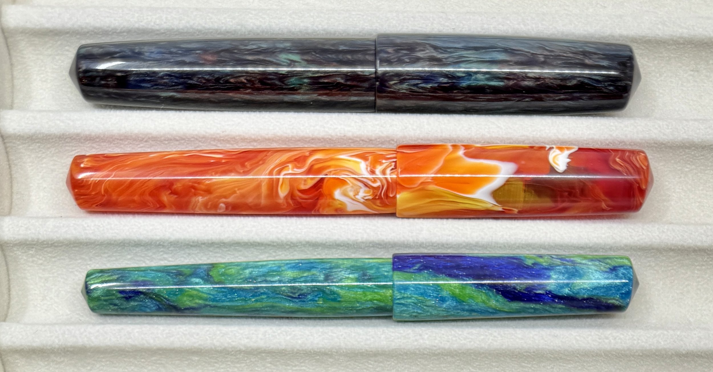
Top top bottom: Standard Charleston, one-off slightly narrower Charleston, Charleston Slim.
Jonathon knows this about me, and last year he took it upon himself to narrow down a Charleston model when I ordered a pen using his Warm Tone Primary Manipulation material. In quick measurements of the widest point in the barrel, the change knocked off a little more than 1 mm of the diameter (15.9 mm on the standard, 14.8 mm on my one-off,) which is noticeable in the hand.
Fast forward to this Summer, at the Washington D.C. Pen show, when I spent plenty of time with Jonathan, and his child Kristen, checking out all of their pens and materials. That’s when Jonathan handed me this new “official” pen model, the Charleston Slim. It was even narrower than the last pen he made for me, and I was immediately smitten with it. He even let me pick out a couple to review, keep, or giveaway. Maybe all of the above!
Edison Beaumont, top.
First things first: the measurement. Taking my calipers to the same spot of the barrel, it checks in at 13.2 mm. For comparison, the Edison Beaumont - another personal favorite - lands at 12.1 mm mid-barrel. And the Beaumont is a pen that I rave about, despite being too small for many users. Not for me, though!
The Charleston Slim is exactly what I want size and weight-wise from a fountain pen. The length fits my hand perfectly unposted (you can technically post it, but it is loooong,) and the pinched section hits my grip just right.
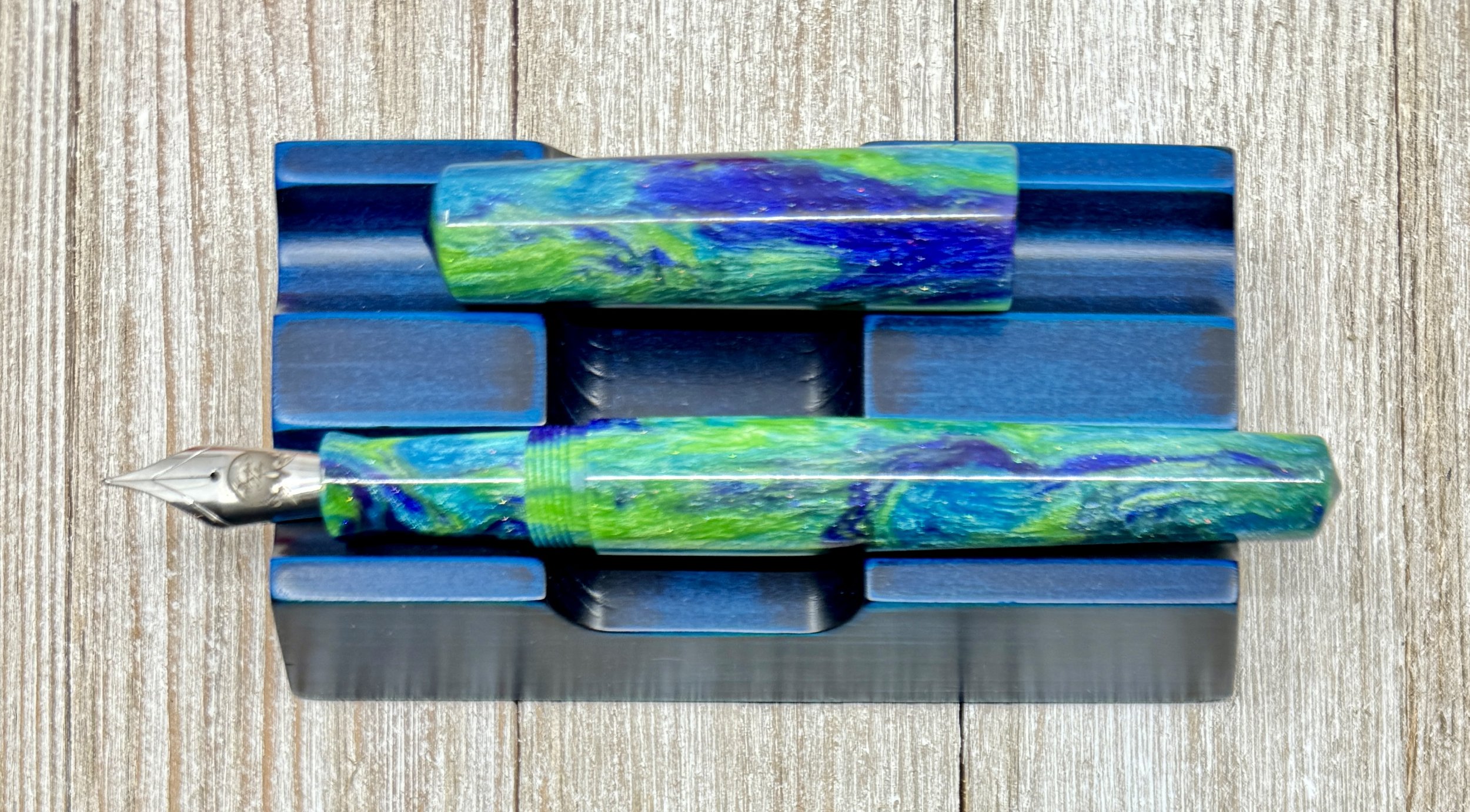
The material of this model is called “The Committee,” and is one of Kristen’s materials from Fountain Telling. It is a wonderful blue green swirl with sparkly undertones, and it POPS. It’s hard not to grab a material like this first off the table when you see it. It also has the Fountain Telling logo etched onto the Fine Jowo #6 nib.
The Charleston Slim is a new favorite pen shape of mine, and one I look forward to exploring in other materials. Jonathon has several models listed for sale on his website for $200, and will certainly have more available at a pen show near you in the future.
My thanks to Jonathon and Kristen for providing me this pen for review. And stay tuned for tomorrow’s post!
(Carolina Pen Co. provided this product at no charge to The Pen Addict for review purposes.)
Enjoy reading The Pen Addict? Then consider becoming a member to receive additional weekly content, giveaways, and discounts in The Pen Addict shop. Plus, you support me and the site directly, for which I am very grateful.
Membership starts at just $5/month, with a discounted annual option available. To find out more about membership click here and join us!
Misfill, Fruit World Edition
Each week in Refill, the Pen Addict Members newsletter, I publish Ink Links as part of the additional content you receive for being a member. And each week, after 10 to 15 links, plus my added commentary on each, I'm left with many great items I want to share. Enter Misfill. Here are this weeks links:
— When the US Government Commissioned 7,497 Watercolor Paintings of Every Known Fruit in the World (1886) (Open Culture)
— Pilot Pokemon (Figboot on Pens)
— Pen Pit Stop : Pelikan M600 Tortoiseshell Red (inkxplorations)
— Inktober 13 & 14 and rockets continue (Writing at Large)
— Spicing up old M and B nibs (mnmlscholar)
— Kinokuniya, metro Atlanta's new Japanese bookstore, is a delightful place to shop for unique gifts (Atlanta Magazine)
— Ink Review: Colorverse Golden Gate Bridge (The Well-Appointed Desk)
— The London Autumn Pen Show, 2023: my haul. (Fountain pen blog)
— Pininfarina PF One Fountain Pen Review (SBREBrown)
— Sources of Helpful Information to Prevent My Mistakes (Chronicles of a Fountain Pen)
— What’s What 10/8-10/14 (Line Variation)
— Pantographia: A Specimen Book of All the Alphabets Known on Earth (1799) (The Public Domain Review)
— 2023 Updated list of Stationery Stores to Visit in Taiwan (The Penguin Post)
— Diamine Ancient Copper on Clairefontaine Triomphe (Inkcredible Colours)
— Let's use AI to recreate a weird pen (Extra Fine Writing)
— A Fuller Picture of Piet Mondrian (Hyperallergic)
— 2023 Q3 Carries (Everyday Commentary)
Want to catch the rest, plus extra articles, reviews, commentary, discounts, and more? Try out a Pen Addict Membership for only $5 per month!


