Posts filed under Troublemaker Inks

Troublemaker x Flax Pen to Paper Exclusive Ink Review

(Kimberly (she/her) took the express train down the fountain pen/stationery rabbit hole and doesn't want to be rescued. She can be found on Instagram @allthehobbies because there really are many, many hobbies!.)

At this year’s SF Pen Show, I was excited to get the set of 3 exclusive inks made by Troublemaker Inks for Flax Pen to Paper, a stationery shop in Los Angeles, CA. The 3 inks are Momo Mochi, Sage Green, and Into the Depths.

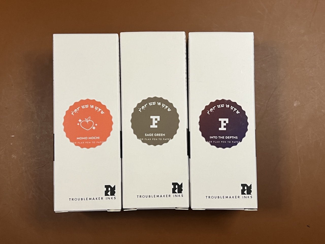
I like that the labels on the front give you an idea of what the ink color is.

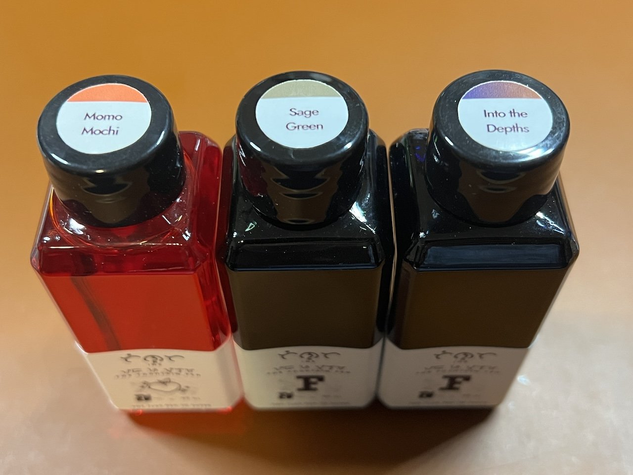
Ditto the labels on the tops of the bottles. I don’t know why the Momo Mochi bottle is transparent while the other two are opaque (and it’s not because the inks are dark.)

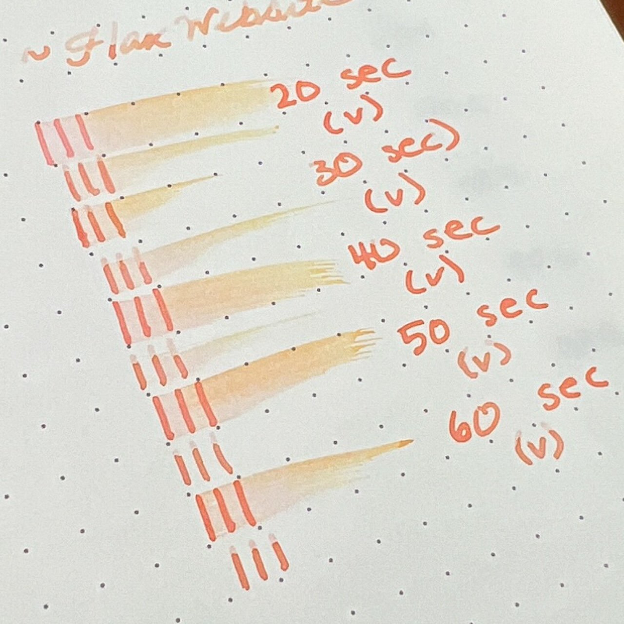
As in the past, all swatches were done on Col-O-Ring cards using a Kakimori steel dip nib and the non-brush end of a paintbrush, while writing samples were done with a TWSBI Go with a Medium nib and a Lamy Vista with a steel Medium nib. The TWSBI Go is a wetter writer and the Lamy is a drier writer, so these two give me a good idea of how an ink will look from different pens. The notebook used for writing samples is from Endless Recorder with 68 gsm Tomoe River paper. Dry times may be a bit slower on 52gsm TR or faster on papers like Rhodia, copy paper, Cosmo Air Light or with drier or finer nibs.

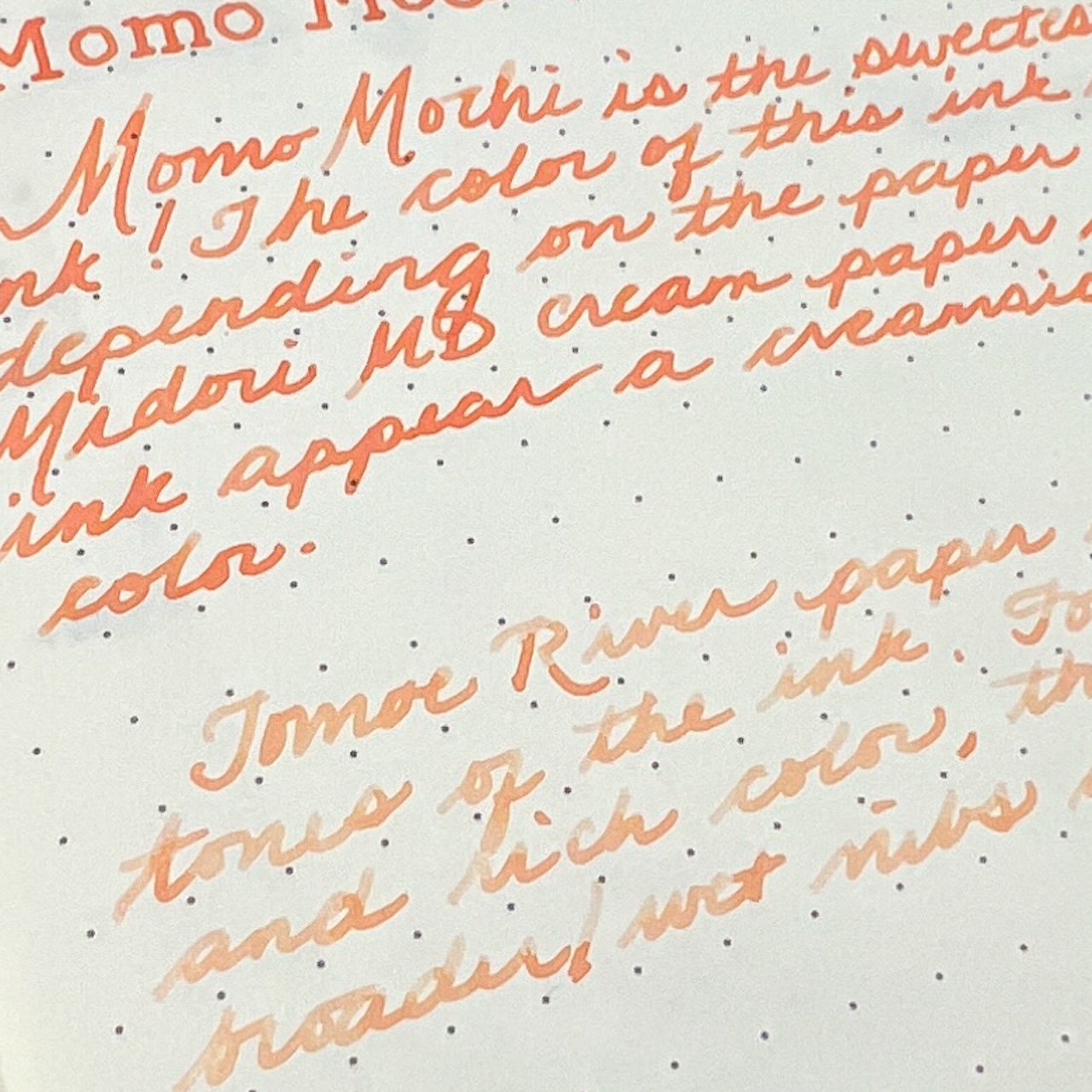
Momo Mochi is a bright peachy coral-y color that is in between orange, pink and other inks that have peach in the name. You can see its shades of orange, yellow and pink in a drier pen like the Vista, but it was almost too light for my personal preference. The wetter nib made it more readable but you don’t get as much shading. There are varying levels of shading depending on nib wetness and no sheen.

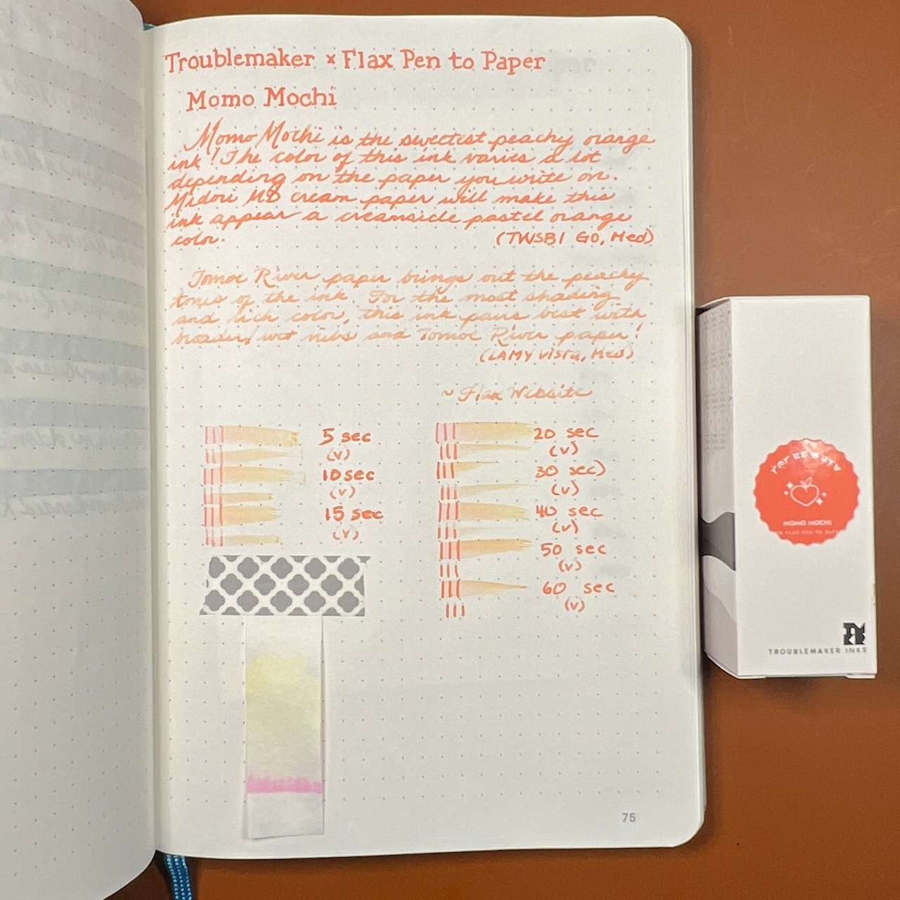
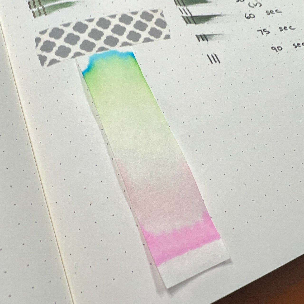
Chromatography of Momo Mochi shows light yellow and pink.

You can really see the orange and yellow shades in the smear.

What a difference a pen makes! Hard to believe these are the same ink!

Inks similar to Momo Mochi: Sailor 2023 Pen Show Ink (it is more vibrant irl), Sailor Manyo Sakura, Sailor Ink Studio 173, Laban Apollo Orange (which is the most similar in tone but lacks the chromashading), and Colorverse Space Needle. Neither the Robert Oster 2020 Dutch Peach or Diamine Peach Punch inks were a good match as they were too red.

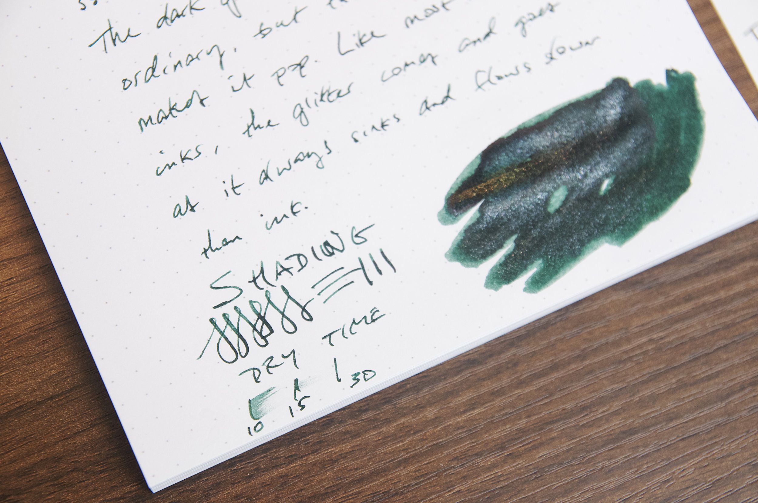
Sage Green is a nice olive green with hints of brown. It is a medium to medium-wet ink (depending on nib) and dry times ranged from 50-90 seconds depending on nib wetness. As with Momo Mochi, the level of shading will depend on the wetness of the nib; there is no sheen.

I wouldn’t have guessed that there would be so much bright pink from this ink!

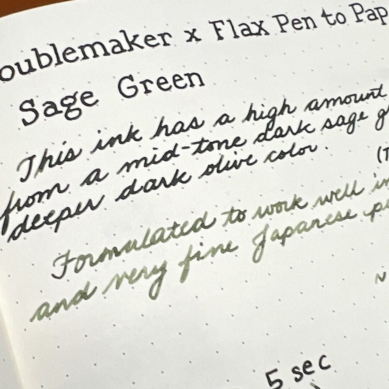
The Lamy Vista really shows off the brown undertones here while the wet TWSBI produces a nicely saturated darker tone.

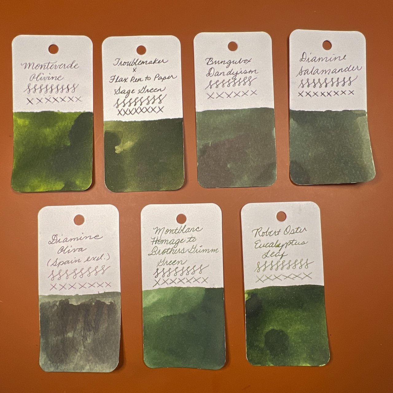
Inks similar to Sage Green are Monteverde Olivine (a bit too green), BUngubox Dandyism (not enough yellow), Diamine Salamander (ditto), Diamine Oliva (too dark), and both Montblanc Homage to Brothers Grimm and Robert Oster Eucalyptus Leaf didn’t have enough brown undertones.

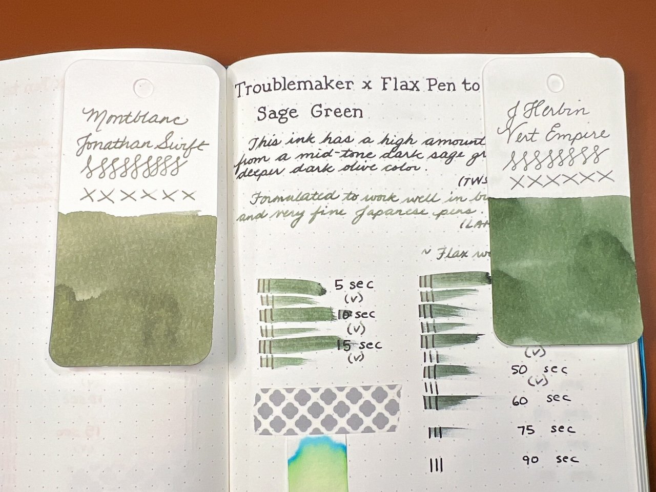
Since the color is so different from the drier nib, I decided to find similar inks to match. Montblanc Jonathan Swift is a better match irl than the photo suggests and J Herbin’s Vert Empire was a really good match too.

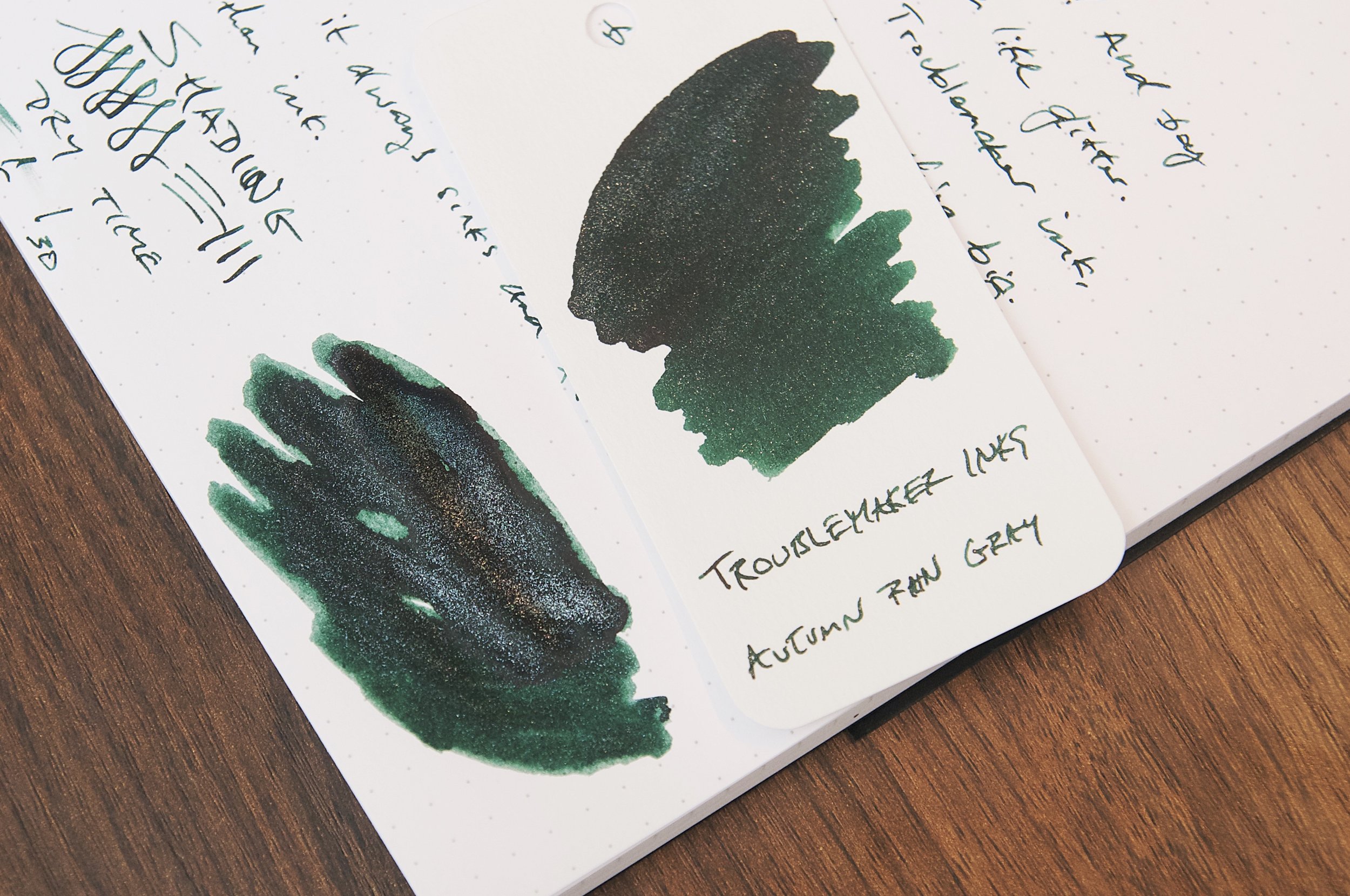
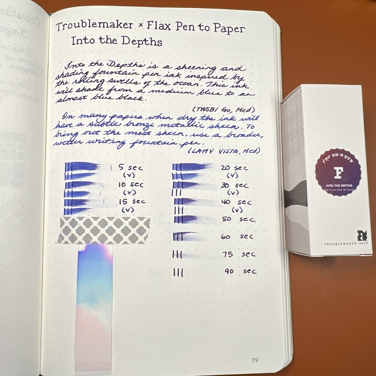
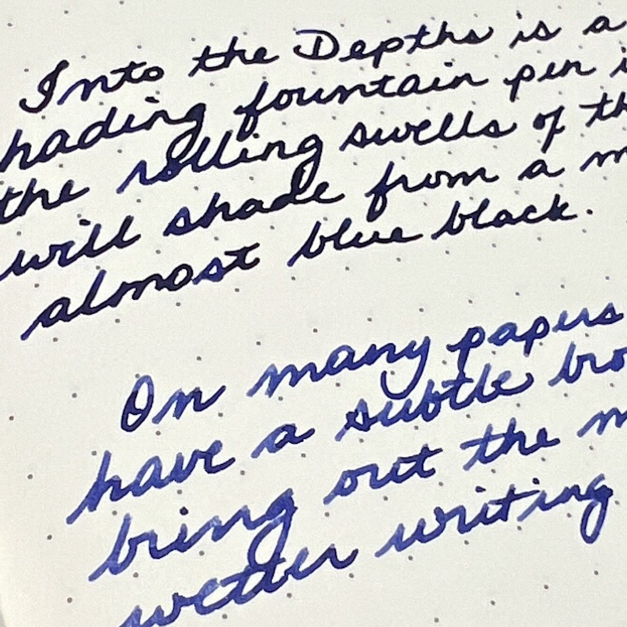
Into the Depths is a dark blue that borders on blurple, depending on nib wetness and paper. It is a medium to medium-wet ink (depending on nib) and dry times ranged from 40-80 seconds. The ink is either a very saturated and dark blue or a medium blue with some shading. The sheen was difficult to pick up in the writing samples but you can see it on the swatches.

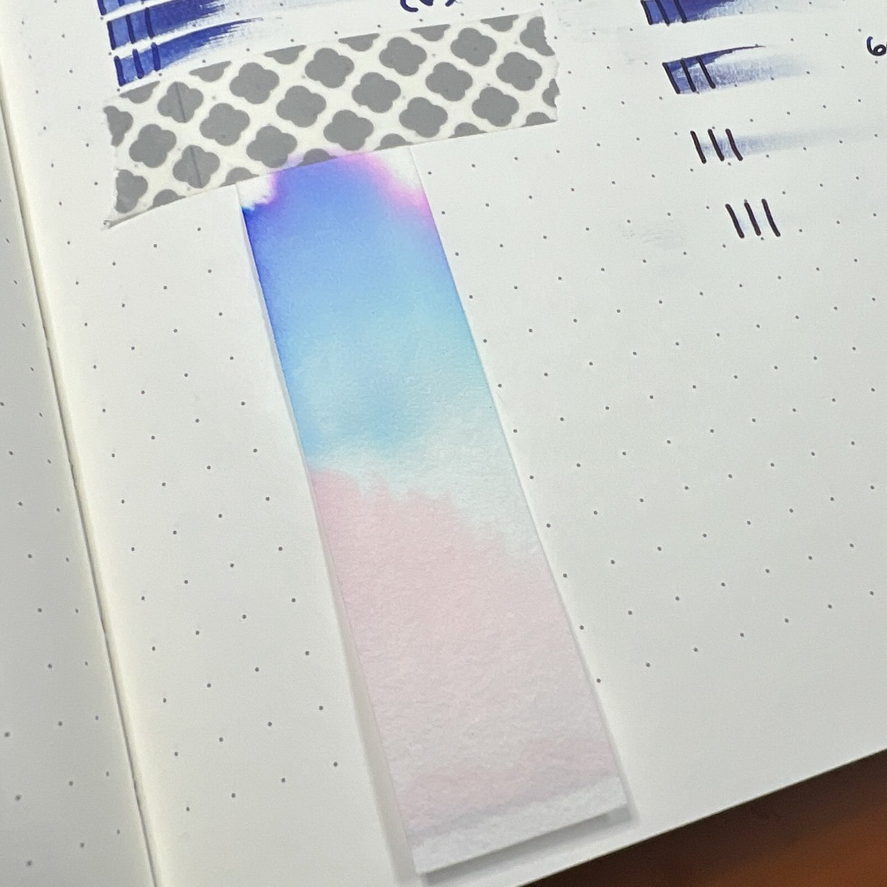
Pinks, blues, some purple and then pink again??

The difference between the two writing samples is pretty drastic. I liked the tones and writing experiences with both pens.

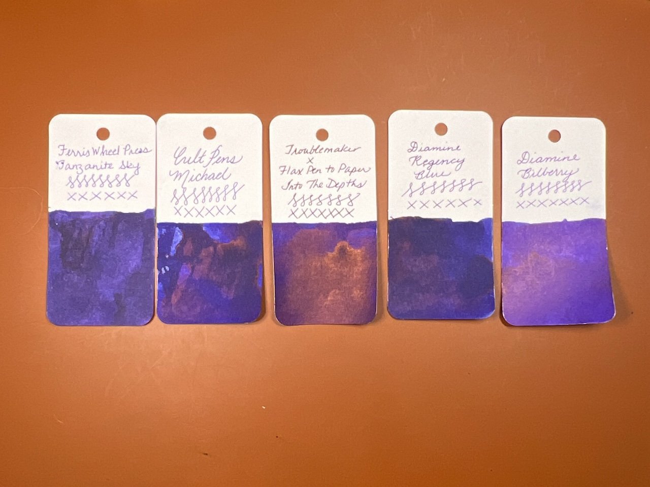
Inks similar to Into the Depths are Ferris Wheel Press Tanzanite Sky, Cult Pens Michael, Diamine Regency Blue, and Diamine Bilberry (a bit too purple.)

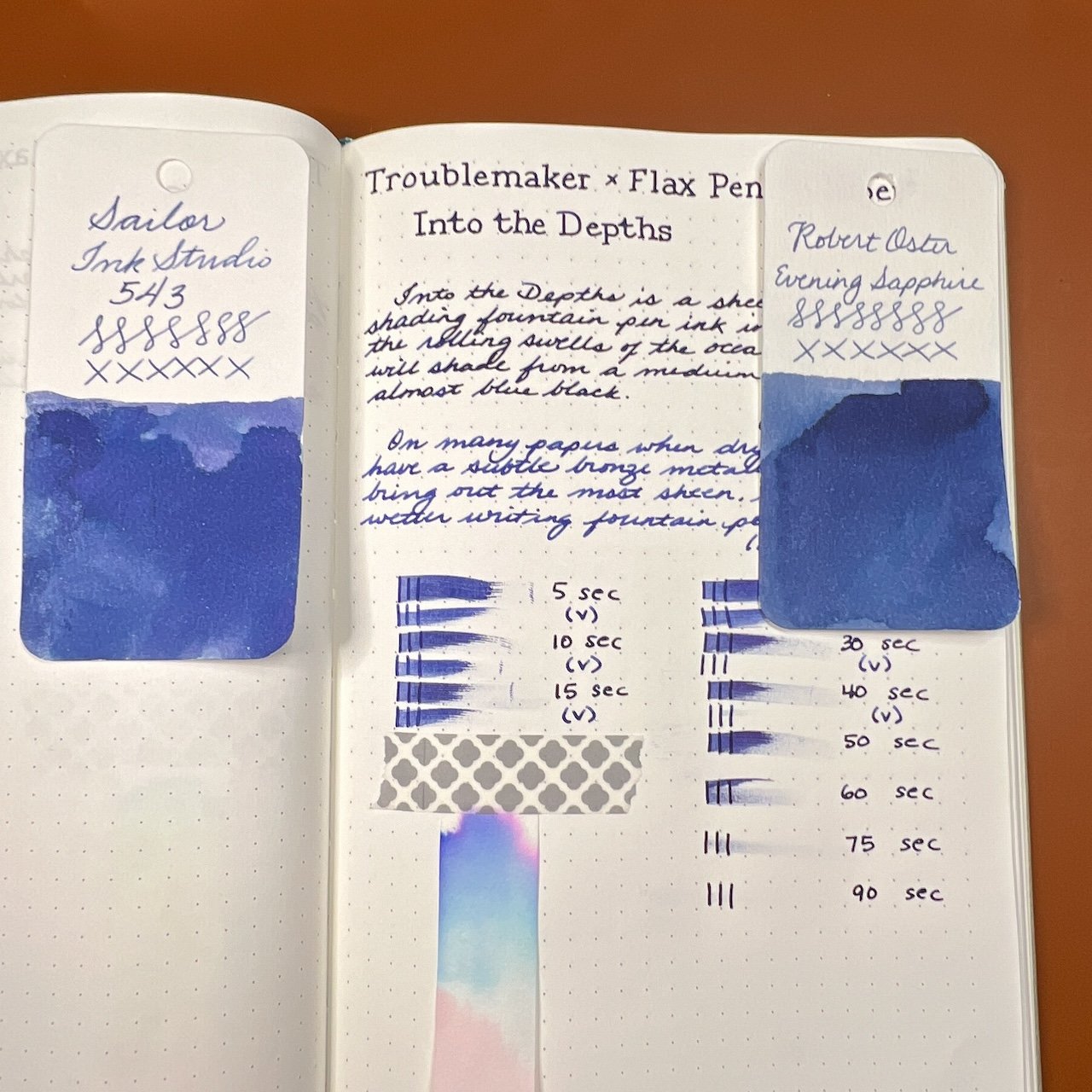
Here are two matches if you’re using Into the Depths with a drier nib: Sailor Ink Studio 543 and Robert Oster Evening Sapphire.

All in all, the inks behaved well, though Momo Mochi felt too dry for me in the Lamy Vista, but I liked it in the TWSBI. This was a great reminder that the pen & ink (and paper) combination really makes a difference, not just in the color & saturation of the ink but also in the writing experience. You may prefer the color or writing experience that a wetter or drier pen/nib will produce, and that preference might be different depending on the ink/pen combination too. I liked the wetter pen/nib for Momo Mochi but the drier one for Sage Green and I liked them both for Into the Depths. So, before you judge an ink too harshly for being too dry or too wet, etc, consider trying it in a different pen/nib and give it another chance!

These Troublemaker inks sell for $15.00 for a 60 ml bottle and are available exclusively at Flax Pen to Paper’s website or in-store at 1078 Gayley Avenue, Los Angeles.

(Flax Pen to Paper provided this product at no charge to The Pen Addict for review purposes.)

Posted on October 27, 2023 and filed under Troublemaker Inks, Ink Reviews.

Troublemaker Tablea Fountain Pen Ink Review

(Jeff Abbott is a regular contributor at The Pen Addict. You can find more from Jeff online at Draft Evolution and Twitter.)

It was just a few months ago that I had the pleasure of using my first ink from Troublemaker Inks out of the Philippines. Autumn Rain Gray is a shimmering ink with dark character, but the latest ink I'm trying is part of their standard line of inks. Tablea is a deep brown ink with plenty of shading and zero shimmer.

Brown inks are never at the top of my list of things to try or rotate into my active pens. That said, I can definitely appreciate a nice brown ink if it has some character. In my mind, that character can be achieved with shading. With Tablea, there's plenty of shading to be had, and you don't even need a really large nib to coax it out.

With a lot of dark inks, seeing the shading effects can be difficult with smaller nibs. Given the dark color of the ink, you have to spread it drastically to allow the shading to pop through. Tablea is just light enough to allow the lovely shading to come through with even a German fine nib. It comes out even easier with the 1.1mm stub I used for the photos of this review. Given the great shading effect of this ink, it's definitely a brown that I'll keep around and recommend.

Apart from the shading, this ink is pretty standard. The flow is good, but it feels a tad dry on the nib when writing. This isn't a flow issue at all — more of a lubrication item due to the unique formula of this particular ink. At any rate, it's not severe enough to be unpleasant. It only took a few seconds of writing to adjust to the feel.

The ink does really well on paper. The lines are crisp and defined, and there aren't any bleeding or feathering issues that I've noticed on the different papers I've tried. Show through on the back of the page is on par with what I'd expect with a dark ink, but not overly noticeable. The back of the page is still usable.

The one area where this ink is a little disappointing is the dry time. In my unscientific testing, the ink took between 35 to 45 seconds to dry to a point where it didn't smudge when I ran a finger of it. Look out lefties — this probably won't work well for you unless you really like all your writing to be smudged and on your hand. Regardless of your writing style, you still have to be careful about handling the paper or notebook after writing to avoid smudging or transferring the ink before it's fully dried.

Tablea is a rich, beautiful medium brown ink that fits in well with this season of changing leaves and cooler weather. You can pick up a bottle for $16.50 or a 4ml sample for $4 from Vanness. I'm not often in the mood for a dark brown ink, but this is definitely on the top of my list for when that mood strikes. Give it a try if it looks interesting to you!

(Vanness Pens provided this product at a discount to The Pen Addict for review purposes.)

Enjoy reading The Pen Addict? Then consider becoming a member to receive additional weekly content, giveaways, and discounts in The Pen Addict shop. Plus, you support me and the site directly, for which I am very grateful.

Membership starts at just $5/month, with a discounted annual option available. To find out more about membership click here and join us!

Posted on October 18, 2023 and filed under Troublemaker Inks, Ink Reviews.

Troublemaker Inks Autumn Rain Gray Review

(Jeff Abbott is a regular contributor at The Pen Addict. You can find more from Jeff online at Draft Evolution and Twitter.)

It's been quite a while since I've tried a new shimmer ink. For whatever reason, they just don't interest me as much as inks that shade beautifully or feature vibrant colors. In some cases, a little shimmer effect really makes an ink look like more than the sum of its parts. With Autumn Rain Gray from Troublemaker Inks, this is definitely the goal.

For the uninitiated, a shimmer ink is a fountain pen ink that features a reflective glitter material suspended in the ink. The glitter material is usually silver or gold colored, but can be other colors as well. When writing with a shimmer ink, little glitter particulates end up on the page while you write, and start to sparkle as the ink dries. It's a magical effect that took the fountain pen ink world by storm a few years ago.

In the case of Autumn Rain, the base ink color is a dark green or green-black and the shimmer effect is achieved with a silver glitter material. There isn't much in the way of shading with this ink, but there is a ton of shimmer. After inking the pen, there was so much glitter on the grip section that I was worried that I hadn't shaken the bottle enough to evenly disperse all the glitter. Nope; in this case, there is more than enough shimmer to go around in the ink while also wasting some when filling a pen.

Based on the name of the ink, I was expecting a medium gray ink with some moderate shading to imitate a dreary autumn sky full of thick clouds and streaky rain. Instead, this is much, much darker to the point that I don't think the name fits at all. When looking at the swatches, it makes me think of a star-filled night — absolutely nothing to do with autumn or rain. When writing with this ink, it looks like a really dark gray or gray-black on the page. When swatching this ink, you can tell that the main color under all the darkness is actually a beautiful forest green. The green is so much more prominent than any gray that I once again find the name of this ink to be such a bad choice. The forest green color under the dark clouds is so pretty with silver glitter on top of it. I absolutely love the color I see on my swatches. I just wish I saw more of that when writing with this ink! If it were up to me, I might name this ink something like Dewey Forest or Deep Lagoon.

Name choices aside, I really enjoy this ink. The dark color and minor shading paired with the bright sparkle is a great combination. It's a smooth flowing ink and has no issues starting or bleeding. I tend not to worry or treat inks any differently whether they're shimmering or not, but I haven't noticed any downsides to using this ink with all the glitter material floating around in the pen. Aside from behaving well when writing, it also dries pretty quickly. In my tests, normal writing normally dries between 20 and 30 seconds to the point that it is smudge resistant. Not bad, but certainly not a fast drying ink.

Troublemaker is a new brand to me (based out of the Philippines), and I'm definitely interested in trying more of their inks. I think this ink is fun, pretty, and interesting, though the name is a complete miss. If you can get past the name (and also be aware that it's a misnomer for the actual ink color), I'd definitely recommend trying it. A large 60ml bottle is just $24, though Vanness also have a small 4ml sample vial if you're not ready to commit to such a large amount of shimmer ink.

(Vanness Pens provided this product at no charge to The Pen Addict for review purposes.)


Enjoy reading The Pen Addict? Then consider becoming a member to receive additional weekly content, giveaways, and discounts in The Pen Addict shop. Plus, you support me and the site directly, for which I am very grateful.

Membership starts at just $5/month, with a discounted annual option available. To find out more about membership click here and join us!

Posted on July 26, 2023 and filed under Troublemaker Inks, Ink Reviews.