Posts filed under TWSBI

TWSBI GO 1.1mm Stub Nib Fountain Pen Review

(Jeff Abbott is a regular contributor at The Pen Addict. You can find more from Jeff online at Draft Evolution and Twitter.)

The TWSBI GO isn't that new any more, but I've only just recently picked on up to play with. It always spoke to me as a great candidate for being an ink testing pen due to the simple filling system. After using this one for a while, there's definitely a lot more to like about this fun pen, and it will be more than just a testing pen.

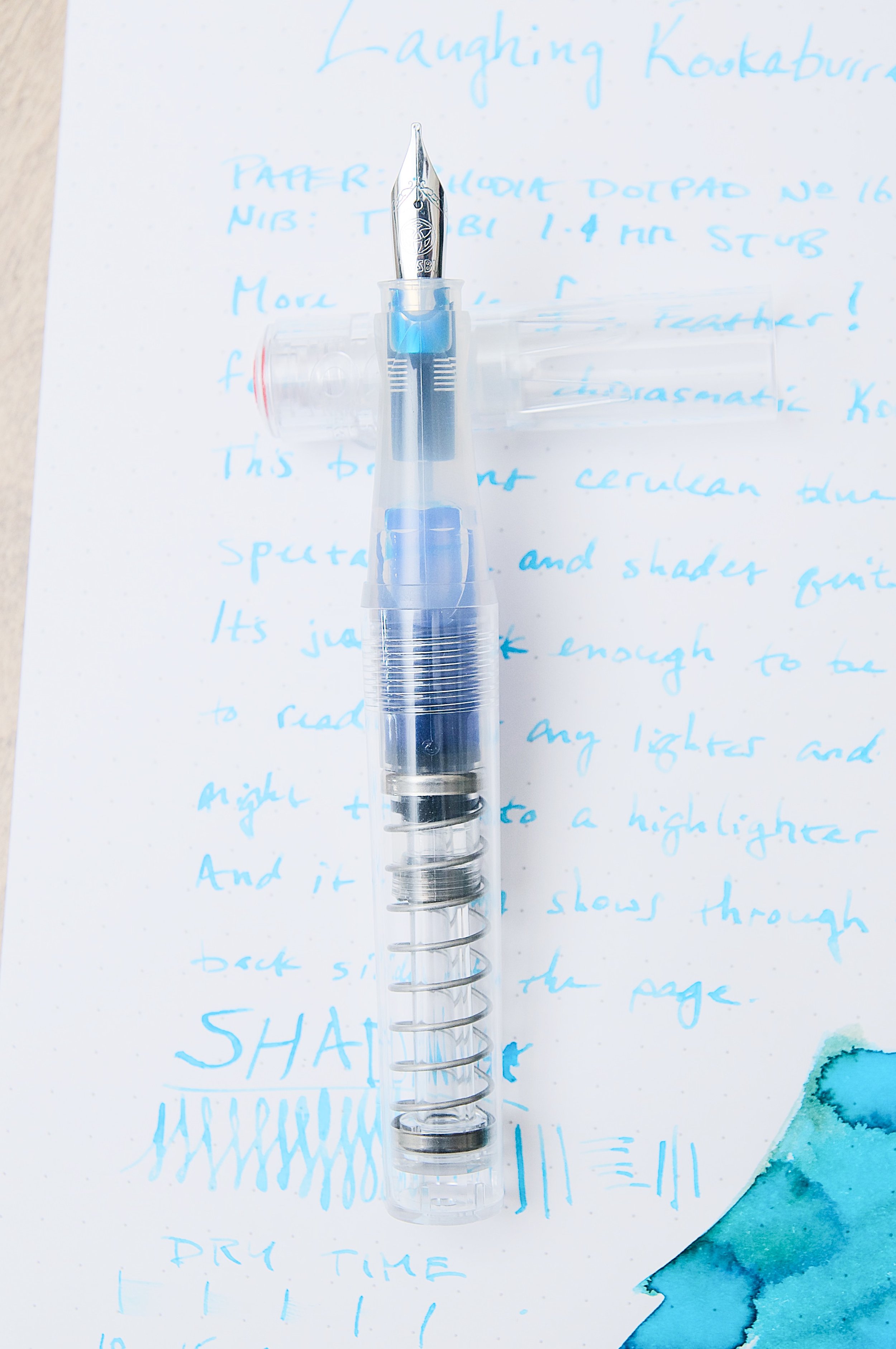
I went with the fully transparent model with a 1.1mm stub nib as my intro to the GO. This is also my first time trying a TWSBI 1.1mm stub nib. Lots of firsts going into this pen experience!

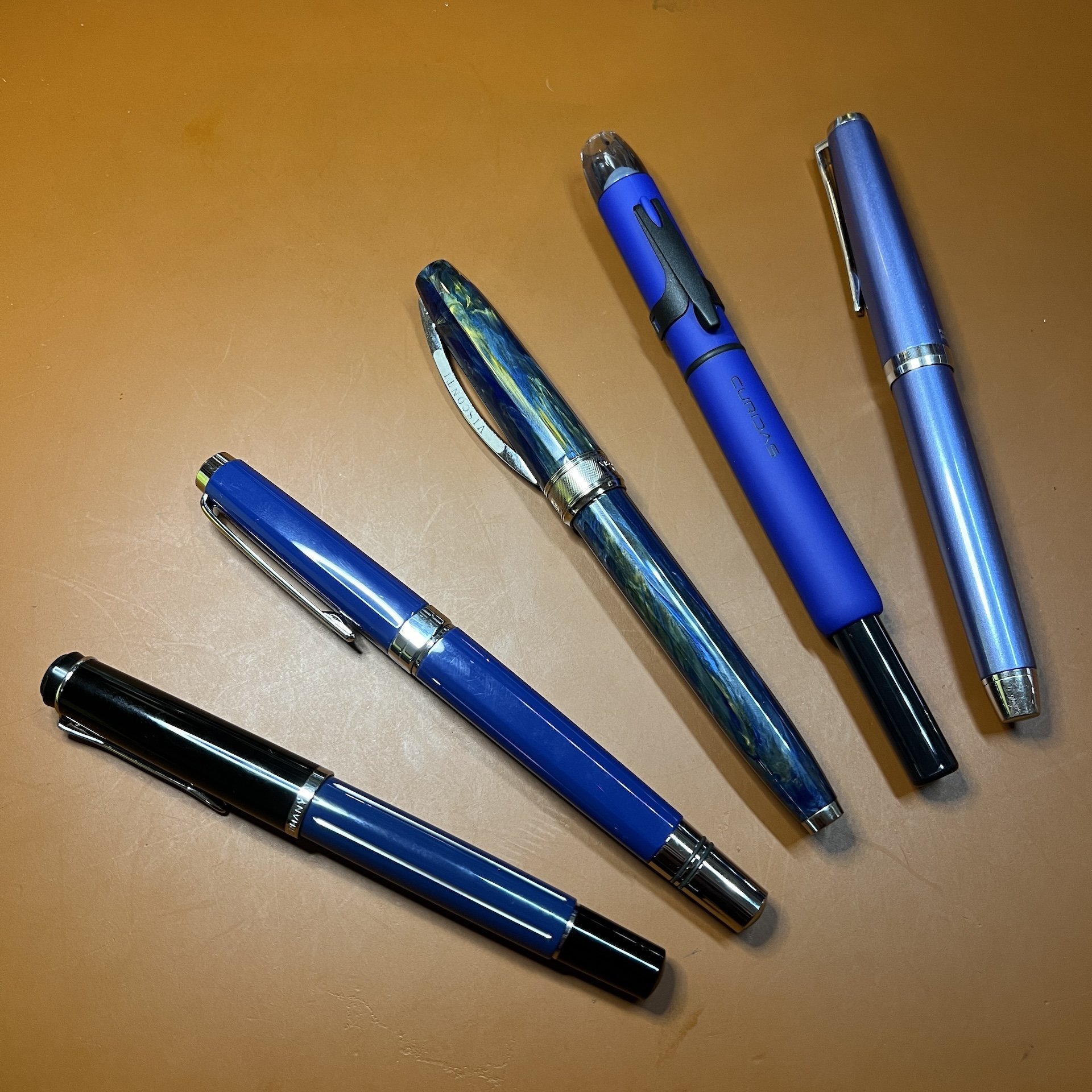
There are plenty of TWSBIs in my collection already, so I knew what to expect in terms of the nib and build of the pen. With this being their lowest-cost entry point, I'm actually more impressed than I thought I'd be. For less than $20 USD, you get a lot of pen. I'm embarrassed that I waited so long to check out the GO and see what the fuss was about!

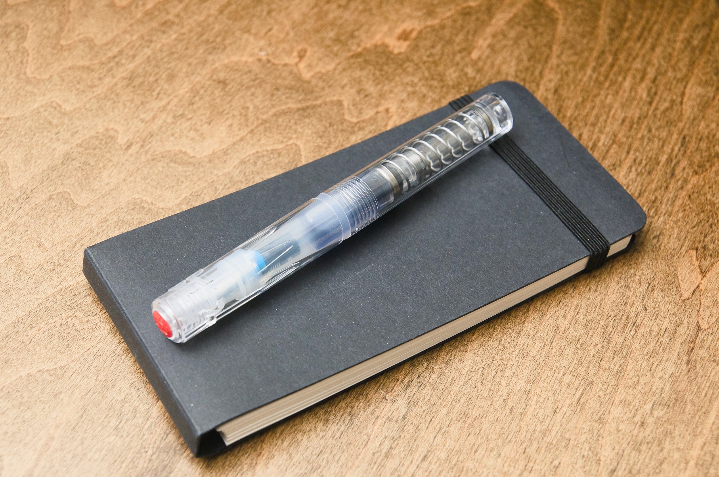
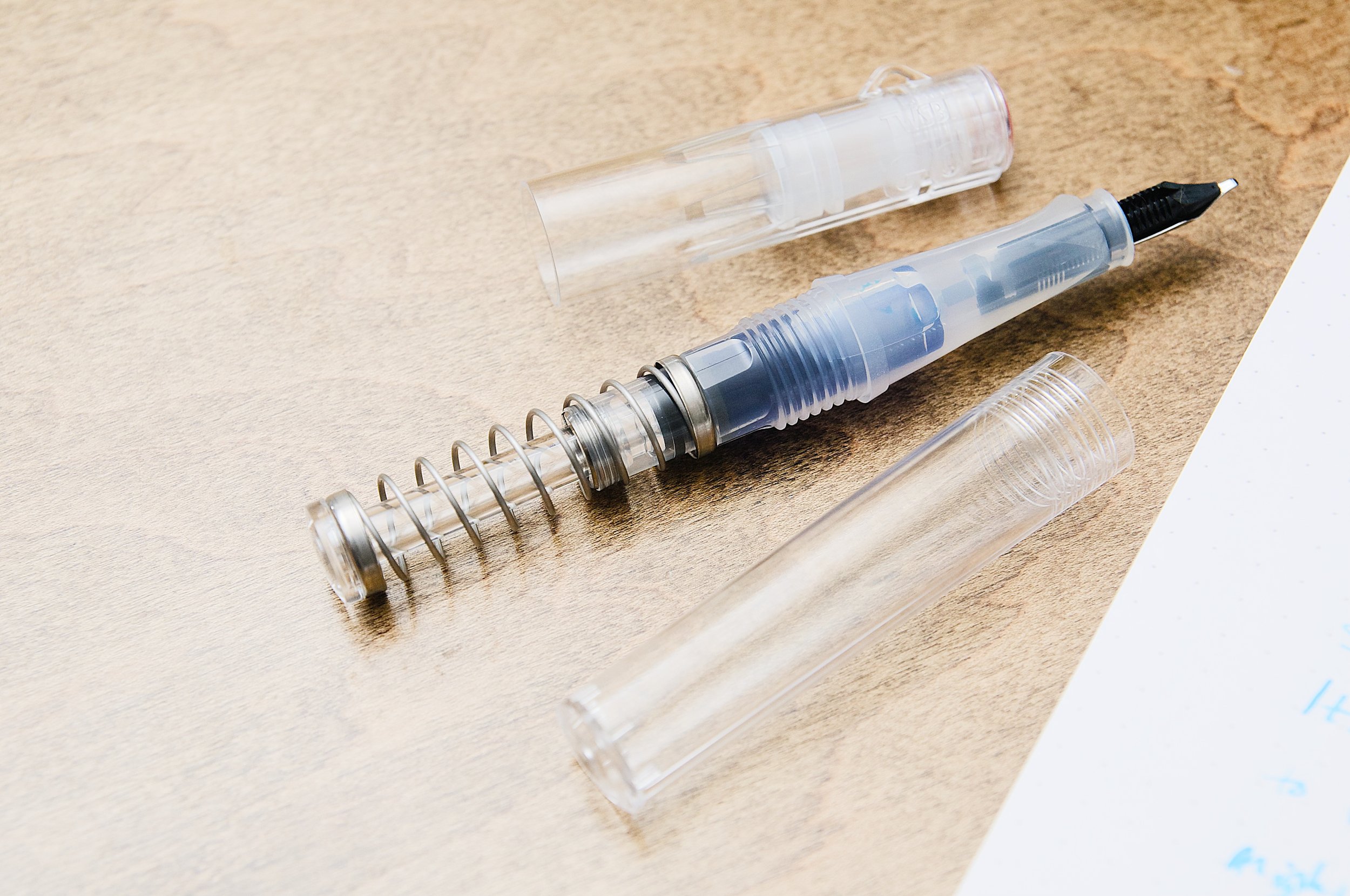
For the uninitiated, the GO is a plastic-barrel pen that features a spring-powered piston filling system. The large spring under the transparent body also adds a fun visual for the pen as well as being functional. It uses the standard TWSBI nib, but without the convenient threaded nib/feed module that you'll find on the more expensive models. You can still swap out the nib without much trouble, but it's not as quick and easy as with other TWSBIs.

This is the only TWSBI I've used that has a friction-fit cap instead of a screw-on cap. I still make the mistake of trying to unscrew it! The cap works really well. Capping and uncapping the pen is really stable and makes a satisfying click. You can post the cap on the back of the pen, but this makes the pen too long for my preference. The uncapped pen is the perfect length for me when writing.

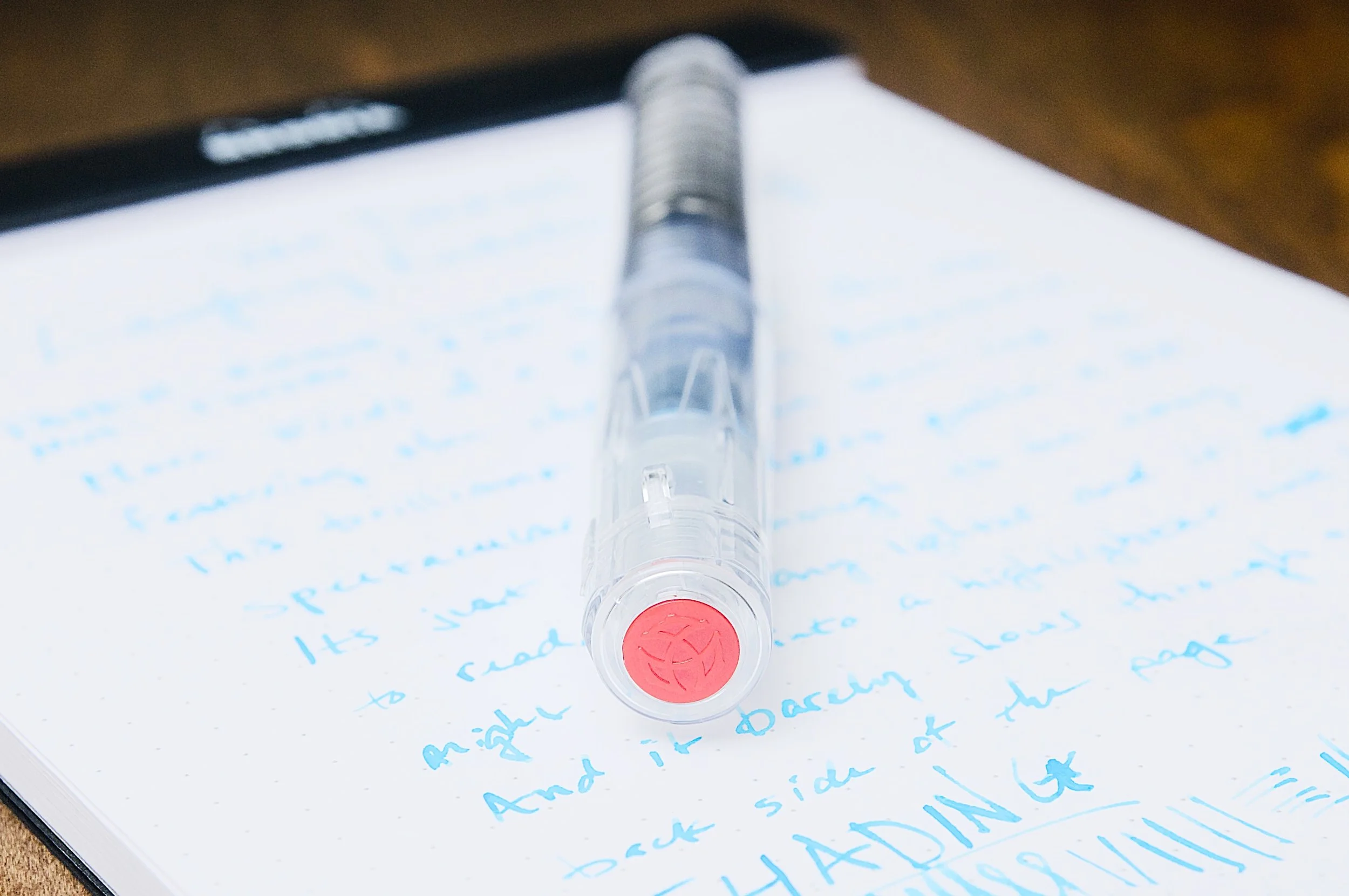
The grip section is a really nice shape. It has a nice taper down to the nib, and then there are three flattened edges that add a nice aesthetic to the grip but also a good spot for your fingers to hold steady.

To cut down on costs, there's no clip on this pen. It does have a small nub on the cap to keep the pen from rolling on your desk, but you can't clip this pen to anything. For the price, I'm not complaining. I'd rather have the cool spring filling system over a clip for this price.

Like every other TWSBI nib I've used, this is a great nib that worked great out of the box. It's my first time using the 1.1mm stub nib, and I've been really happy with it. The flow is smooth and the nib lays down a nice layer of ink with ease. I've tried several inks with it already, but I'm currently still loving the Laughing Kookaburra Wing with this pen/nib combo now.

The TWSBI GO is a fun pen, and I wish I'd tried one out sooner. The design is so much fun, and the large spring in the body catches everyone's attention. People can't help but pick up this pen, and that's exactly what I like to see with a pen that's marketed toward newcomers to the hobby. It's crazy what you get with this pen for less than $20 USD. Cool transparent body? Got it. Included converter that doesn't need cartridges? Even better — this pen has a built in piston filling system that can hold lots of ink. Good nib? Yup. I don't think there are any other options under $20 for getting a good 1.1mm stub nib. All considered, this pen is a phenomenal value that is perfect for newcomers who are interested in non-cartridge fountain pens and stub nibs. But, it's so much fun that it's great for those of us that already have too many pens!

The playful and unique design makes this a great pen for your collection that can also be a workhorse. It also makes for a great gift for those fountain-pen-curious folks in your life!

(Vanness Pens provided this product at a discount to The Pen Addict for review purposes.)


Enjoy reading The Pen Addict? Then consider becoming a member to receive additional weekly content, giveaways, and discounts in The Pen Addict shop. Plus, you support me and the site directly, for which I am very grateful.

Membership starts at just $5/month, with a discounted annual option available. To find out more about membership click here and join us!

Posted on December 13, 2023 and filed under TWSBI, Fountain Pens, Pen Reviews.

Reflections on Some Currently Inked Pens

(Kimberly (she/her) took the express train down the fountain pen/stationery rabbit hole and doesn't want to be rescued. She can be found on Instagram @allthehobbies because there really are many, many hobbies!.)

Despite being in this rabbit hole for 6.5 years, I continue to learn not just about pens, inks and all that, but about my preferences and habits. There isn’t a right or wrong way to be in this hobby and what works for someone may or may not work for you. For some reason during the past few weeks, a few of my currently inked pens were good reminders of lessons I’ve learned along the way.

On the surface, there isn’t much that is similar among these pens, other than they all happen to be blue! (Bottom to top: Pelikan M215 Blue Stripe, TWSBI Classic Blue, Visconti Van Gogh, Platinum Curidas, Pilot Falcon/Elabo.)

Pelikan M215 Blue Stripe

Hard to tell from this picture but there are silver colored stripes on the barrel of this pen.

  • Patience (and research), Grasshopper - I have wanted this pen for 3-4 years (maybe longer) and have seen it on eBay for very high/ambitious prices. And I am definitely not one for patience. But I also don’t want to overspend. Doing research ahead of time, including reaching out to folks who have better pulses on the Pelikan secondary market, made it easier for me to pounce on a listing that was finally in the right price range.
  • Inks & pen combinations matter - As I mentioned in recent ink reviews, inks behave differently in different pens (and also on different papers too). This M215 is currently inked up with Pelikan Edelstein Tanzanite, which is a lovely blue-black ink. Is it a shocker that this is a good matchup? No, not really, but I haven’t used this ink since I first tried it, gulp, way back in 2017, in a Lamy Safari. I absolutely hated the combination because it felt like writing with sand and I wondered if I should dump the ink out of the pen and get rid of the sample. What I didn’t know then, was that Lamy pens can be on the drier side and that Pelikan inks are also on the drier side (to compensate for their wetter nibs), so that combination was doomed from the start. What’s sad is that I was hesitant to try the ink again, even though I learned more about pens and inks since 2017. I’m glad I decided to try the ink in this pen, because it flows just perfectly from this pen, and it’s a great match colorwise, too. I’ve also since learned that it’s ok to empty out a pen if the ink just isn’t doing it for you. Life’s too short to write with a bad combination.

TWSBI Classic, Blue

  • Oldie but goodie - One of my first TWSBIs is the Classic, in Turquoise. I love the non-demonstrator look but I don’t really think about them as much because I usually want a demonstrator when I want to ink up a TWSBI. I needed to ink up a blue pen so I decided on the blue Classic. It had a Fine nib and even though Mediums are my usual jam, I just shrugged and inked it up anyway. Then I wrote with it and was shocked at how much I liked the Classic AND the fine nib. It is so easy to ink up the latest acquisitions and forget about the older pens (and inks). I try to balance that urge by having a mix of old and new pens in the “to-be-inked-next” tray. I do this with inks too. It’s like discovering a lost treasure.

Visconti Van Gogh, Starry Night

  • It’s ok if looks are important - As a Van Gogh fan, and more specifically of Starry Night, I love this pen. Not because it is an amazing writer (I mean, it writes fine) but because looking at it makes me happy. It makes me think about my favorite piece of art and that makes me happy. People place different levels of importance on the nib vs the appearance and that’s one of the many wonderful things about this rabbit hole. My personal pen preference emphasizes looks over writing (probably 65:35 as long as the nib doesn’t write poorly). In the end, as long as you’re happy, whether it’s with the looks, the nib (or both), it’s a win in my book.
  • Oldie but goodie, this time with ink - I inked this up with an ink that I once loved but sorta put by the wayside (shame on me) - Iroshizuku Tsuki-yo. When everyone was raving about Shin-kai (cough cough, Bossman), I instead fell in love with Tsuki-yo. With all the deluge of inks that currently exist and continue to be released, it’s easy to get caught up in the latest “must-have ink”. I had forgotten how much I liked that ink and I’m glad I decided to use it again.

Platinum Curidas, Matte Blue

  • It is not a popularity contest - Not gonna lie, the Platinum Curidas is probably one of the more polarizing pens when it comes to looks, nock length, design, etc. And yet, I still love it. I have the original demonstrator finishes but I love this Matte Blue with black trim. The Medium steel nib gives me the perfect line width. Do I love it more than the Vanishing Points or Decimos? Probably not, but I still love it, even if it’s not for everyone, and that’s what matters.
  • Don’t judge an ink before using it - I bought a sample of Taccia Ukiyo-e Hiroshige-Ruri and after swatching it, I thought “yet another dark blue ink” and was glad that I hadn’t bought a bottle. After pairing it up with the Curidas though, I’m loving the richness of this blue ink, along with its subtle sheen that can even been seen on Rhodia, and am now adding it to my “bottles to buy” list. It’s another reminder that I shouldn’t judge an ink too quickly!

Pilot Falcon/Elabo, Metal Blue

  • They can’t all be winners - The Pilot Falcon (or Elabo in other markets) is a pen that has a fun, bouncy nib that can give some line variation, which I generally love, but there’s something about this one that isn’t doing it for me. I really like the plastic version of this pen with a Soft Fine nib, but I don’t think it’s the minimally- added weight. The Akkerman Delfts Blauw ink is flowing just fine so it’s not that. Maybe it’s the Soft Medium nib which feels blobby and almost squeaky. I really want to love it, but I don’t, so I think it’s better to part ways, than to have it stay in the collection untouched and unloved.
  • It’s hard saying goodbye - Despite everything I just wrote about the pen not being a good fit, it’s still really hard for me to decide to sell a pen. I just have to remember that someone else will enjoy it more than I do and that I can use the proceeds to get something else, like that bottle of Taccia Hiroshige-ruri :-)

None of these things are earth-shattering or new in any way, but I don’t usually have these revelations when I’m writing with my pens. So when they do pop up, it’s worth taking a moment to pay attention to what they’re trying to teach me.

Posted on November 17, 2023 and filed under Fountain Pens, Pilot, Pelikan, TWSBI, Visconti, Platinum.