

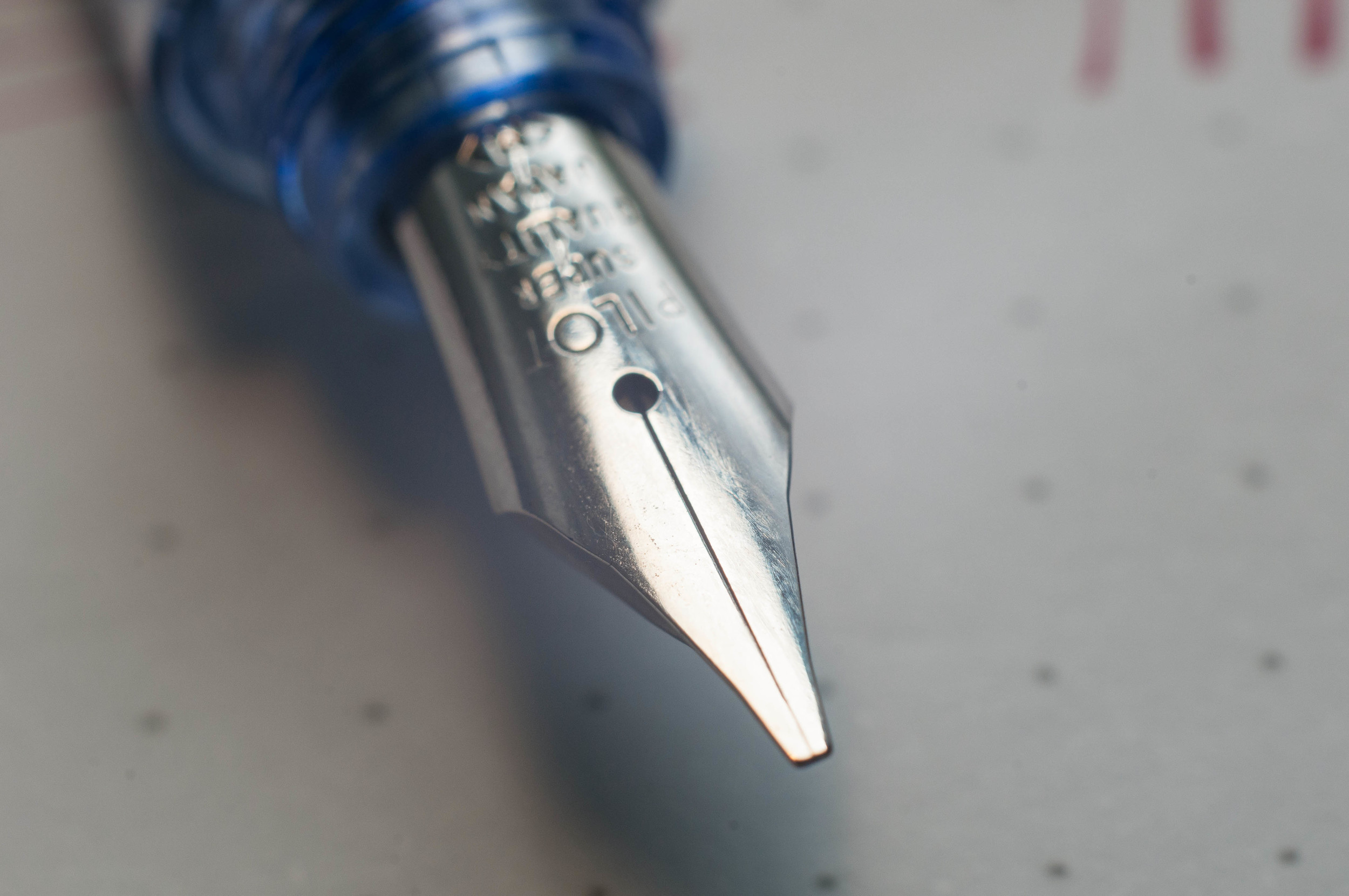
I've taken my first dip into the world of squared nibs, and I'm afraid I'll have to jump all the way in before long.
The Pilot Plumix with a medium italic nib is my first experience with an italic nib. From what I understand, the italic nib is different than a stub nib, but similar. I did a little research and found this article on Richard Binder's site that explains the difference. Italic nibs are squared off while stub nibs are rounded off a bit. This information will become relevant a little later in this review.

Looks
The Plumix is made almost entirely of plastic, save the nib. Even though it's made of a cheap material, it doesn't feel cheap. The plastic is sturdy and has a gem-like appearance that makes it pleasing to look at in certain light.
The grip section has a triangular grip that resembles what you find on a Lamy Safari. In my use, I prefer the grip of the Safari over the Plumix. If it were up to me, I'd stick with a plain grip section. I'm sure Pilot representatives are listening and will change their entire design to please me. Right?
There's an interesting bulb further down the body of the pen, just past the grip section. The bulb faces down (opposite the top of the nib) and provides some support when writing by snugging up to the space where your thumb meets your hand. I thought the design was a little odd when I first saw the pen, but I have to admit I really like this feature. An added bonus of this bulb is that it keeps the pen from rolling. This is important since the pen has no clip.
The fact that there is no clip on this pen isn't a huge deal for me, but it does mean I don't want to take it out with me. Pilot did integrate some small tabs on the lid of the pen to keep it from rolling.
One of the strangest things about this pen is the cap. It's tiny. It's only long enough to cover the nib and screw onto the section. I've never seen a cap that's so small. Surprisingly, it posts to the end of the pen, but it's not sturdy enough for my taste. A slight bump will send it tottering across the desk.
Overall, the build of this pen is better than I expected for the price. It's actually quite pleasant to hold and use. The quirky design is endearing to me.
Writing experience
In my mind, this nib would create a large, dramatic line variation that would rival calligraphy nibs. In reality, a Japanese medium is not that wide to begin with. The nib lays down a line that's a bit thicker than a regular medium nib when drawing with the flat side of the nib square to the paper (the thick end). If you turn the nib sideways, it lays down a really fine line.
The nib is smooth and has no starting or skipping issues. It ran a bit on the dry side for me. I'm not sure if this is a common issue, but it did annoy me several times. On the other hand, it also forced me to slow down to get the adequate ink flow that I wanted. This was good practice and actually improved my handwriting.
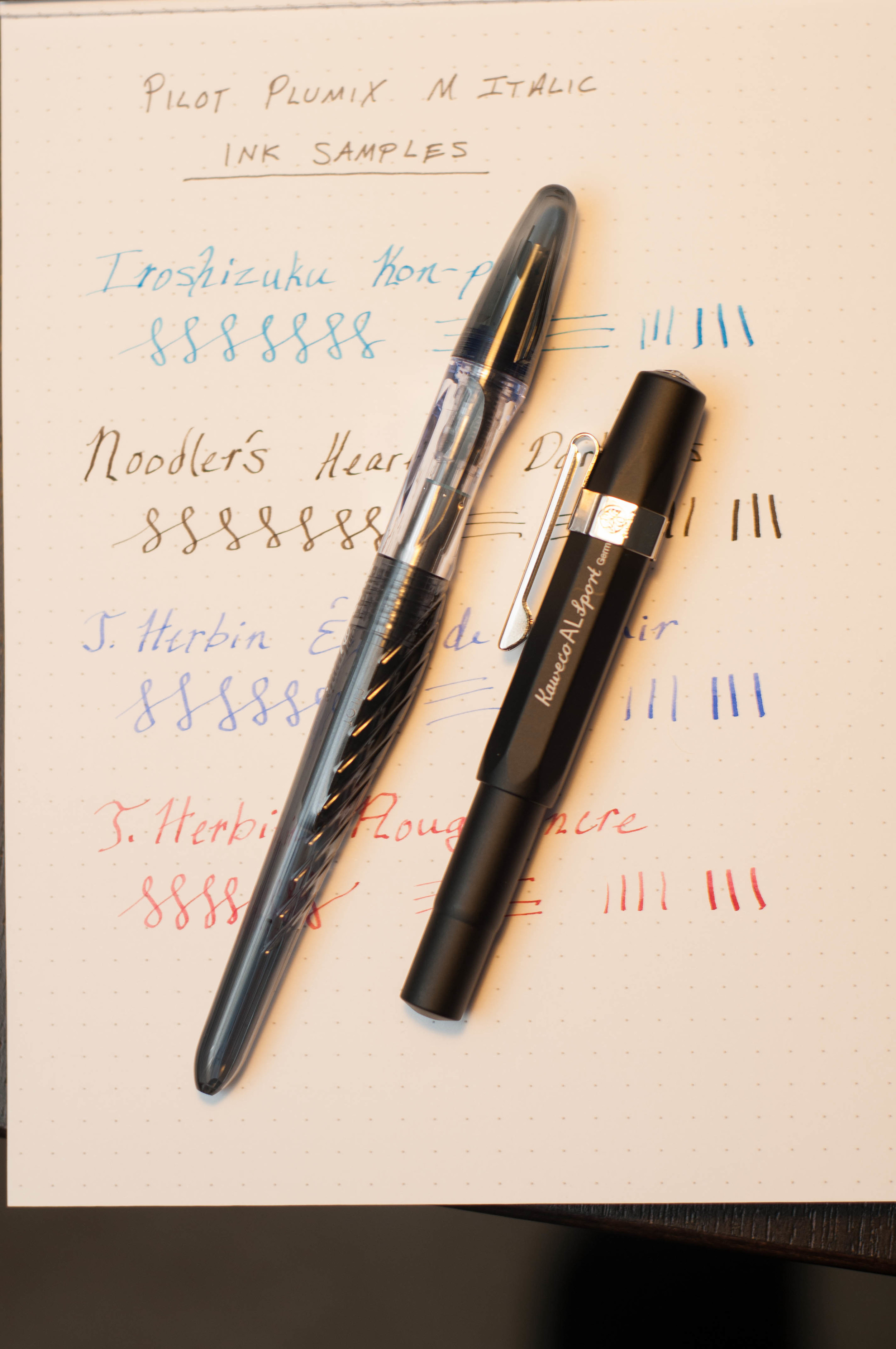
The pen ships with a standard blue Pilot cartridge. I skipped that entirely and went with one of the bulb converters from one of my Metropolitans. I tried several inks in the pen, and found that they were all a bit dry. My only guess is that the feed might need an adjustment or that the wide nib is spreading the ink further. I'd love to know if anyone else has mentioned or noticed anything similar.
The italic nib caused some trouble for me. The squared off edges don't play nice with thin or cheap paper. This nib is definitely much happier with a nice, smooth paper. It's because of this nib that I'm convinced one of my next fountain pens will be a stub. I imagine a stub is better suited to everyday writing. I'll keep the Plumix around to help me improve my handwriting.
Conclusion
Overall, this is an excellent deal for a quirky little pen that will open your eyes to a different world of nibs. And if you're already a member of this other nib world, it's still fun to try the nib and the shape of the pen.
The Plumix is available in purple, light blue, and black. When I purchased the pen, I was under the impression that purple was the only color. Bummer. That light blue looks awesome. But, it's fairly easy to swap the nib to a Metropolitan or a Prera body, so that opens up a lot of style options.
If you're in the mood for an affordable, quirky italic pen, try out the Plumix.
(You can find more from Jeff online at Draft Evolution, Twitter, and App.net.)


