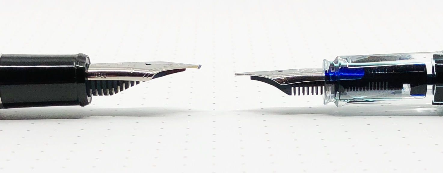
One of the most frequent questions I get asked at a pen show is “Do you have an architect nib grind I can test out?” I try to bring the one that I have, a Platinum 3776 broad nib modified into an architect nib by Dan Smith. I don’t always remember it, so I figured I would do a quick comparison between an architect nib and stub nib so you can see what this grind has to offer.
Let’s start with this: Pictures will never do an architect nib justice. It has a completely different feel when writing, more than even the sharpest cursive italic nib offers. It requires a consistent writing angle to reach its full effect, and no amount of practice is ever enough. It’s a commitment, as the ~$60 price tag for just the grind tells you.
Once you get it, it can be a complete blast to use. The line variance is enormous, and the exact opposite of what you get from a stub or cursive italic nib.
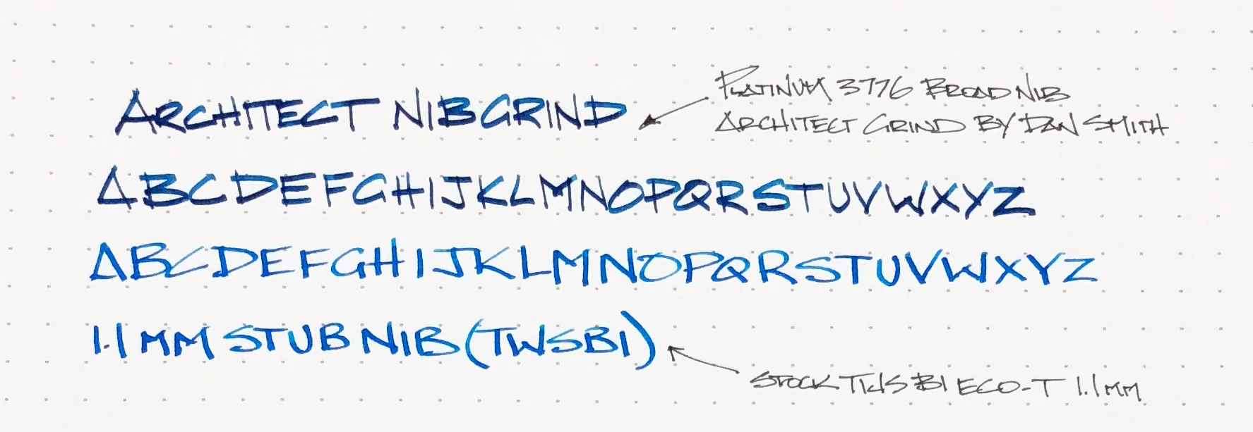
For this comparison, I put my TWSBI ECO-T with a stock 1.1 mm stub nib to the test. I figure it is a fairly normal stock stub nib to compare to that many people may have used. And as stated above, the architect grind was done on a broad Platinum 3776 nib for full effect. The more nib tipping for an architect grind for a nibmeister to work with, the better. Also, the more line variation you will have.
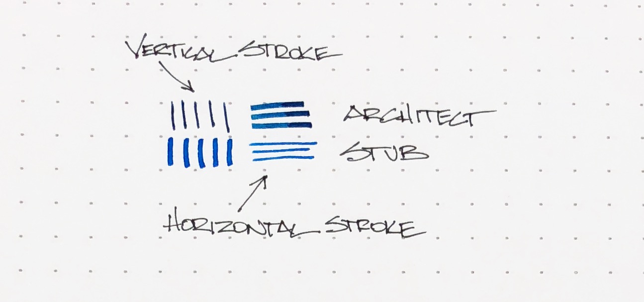
You can see in the picture above, the architect nib gives you thin vertical strokes and wide horizontal strokes. The stub nib is essentially the opposite, but with wider thin lines. When writing the alphabet, you can see how the line thicknesses caused by the shape of the nibs compare. Letters like E, F, and T with very defined, angular strokes show this variance. H may be my favorite.
I write with a blocky architecture style to begin with, so at a quick glance you may not notice a ton of difference. Rest assured, the feel of the nib is very different. I have to pay more attention with the architect nib, and force myself to slow down. The architect nib isn’t the best with curved shapes, and I would hesitate using it for cursive handwriting due to the angle of the nib. I’m sure it can be done, I’m just not sure how enjoyable it would be.
The architect nib is designed for sharp, straight lines, and that’s what it does best. The more letters I put down on the page, the more I notice the different effect this nib provides. As much as I love it and have fun with it when I use it, it is not an all day, every day writer for me. But, I’m glad I have it, and I’m glad to let you try it out whenever you see me at a pen show. I’ll make sure I have this pen with me, inked up and ready to write!
Enjoy reading The Pen Addict? Then consider becoming a member to receive additional weekly content, giveaways, and discounts in The Pen Addict shop. Plus, you support me and the site directly, for which I am very grateful.
Membership starts at just $5/month, with a discounted annual option available. To find out more about membership click here and join us!


