(Sarah Read is an author, editor, yarn artist, and pen/paper/ink addict. You can find more about her at her website and on Bluesky. And her latest book, The Atropine Tree, is now available!)
I might have said, recently, that I don't need any more ink--that all the colors on earth are well represented in my collection, and that I could write forever with the supply that I have. But when I said that, I hadn't met this ink yet, so. Past Sarah was wrong.
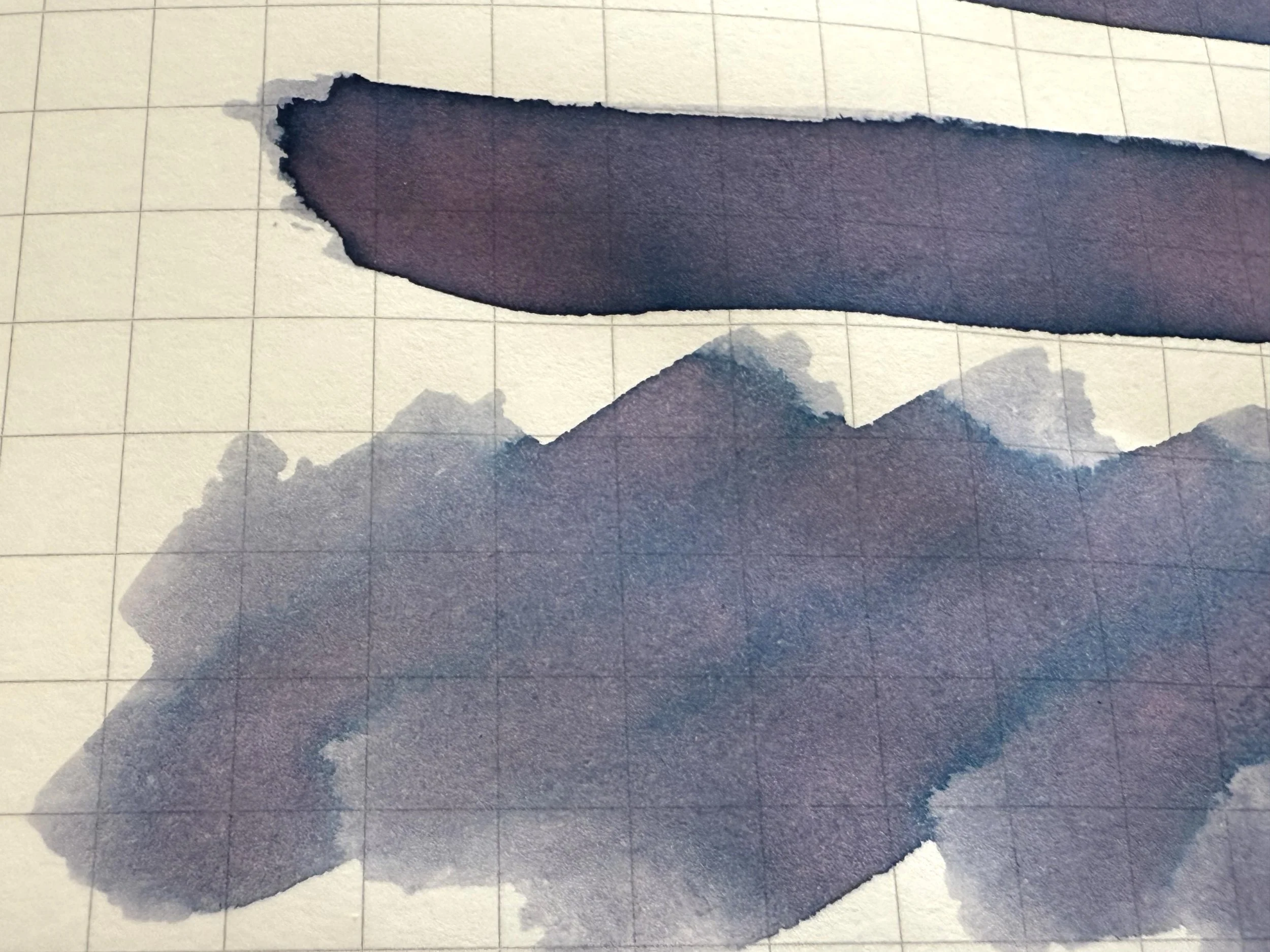
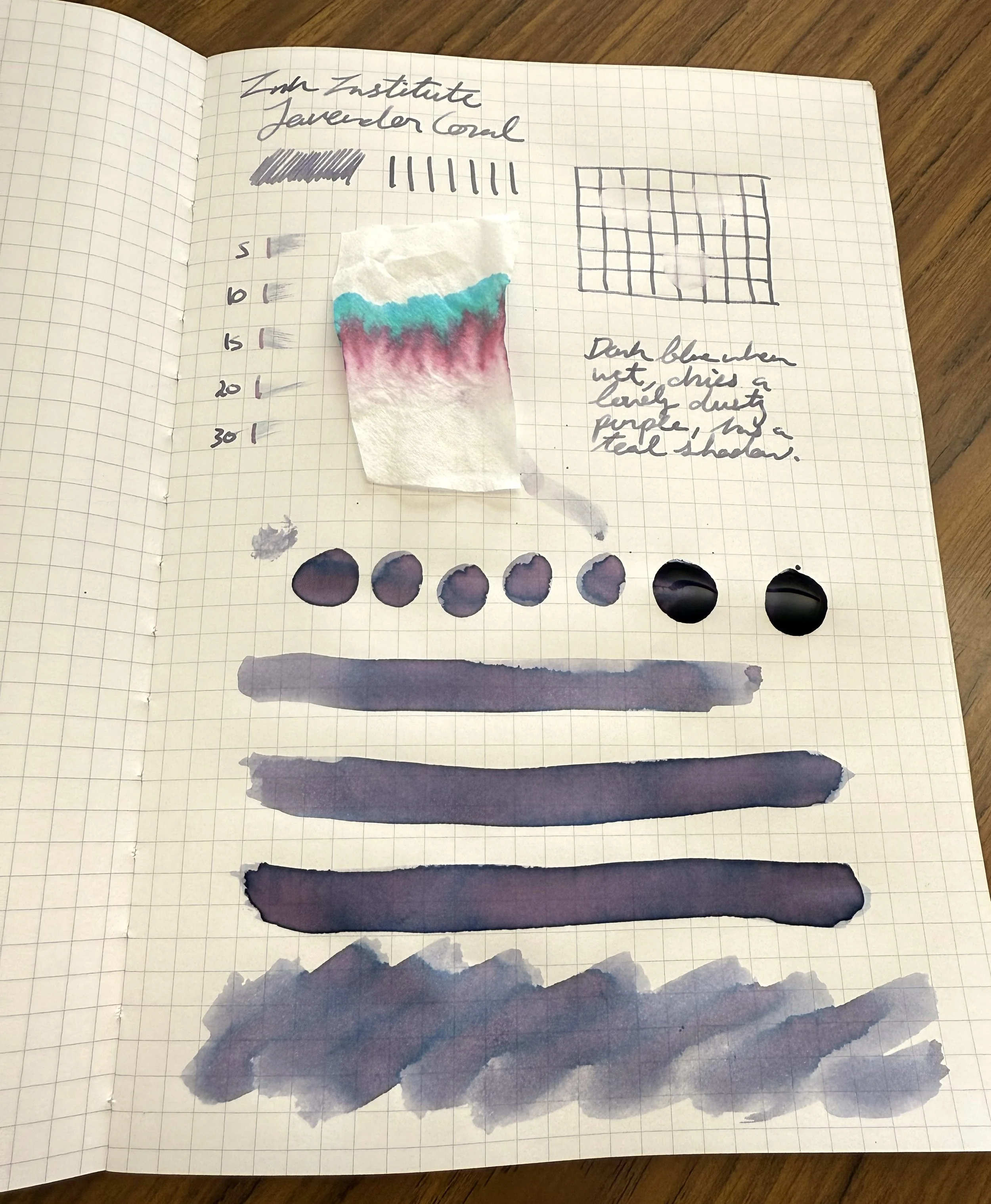
The Ink Institute Taiwan’s Secret Realm ink in the color Lavender Coral is in that favorite color family: a dusty purple with pink and blue undertones and heavy shading that shows all the complexity of the color. There are lots of inks in this flavor family, but they're notorious for being quite pale and sometimes even unreadable in low light. Still lovely, but more pretty than practical. Lavender Coral, though, is saturated enough that it hits those soft color tones while still being bold enough to be practical. And I am enjoying it so much.
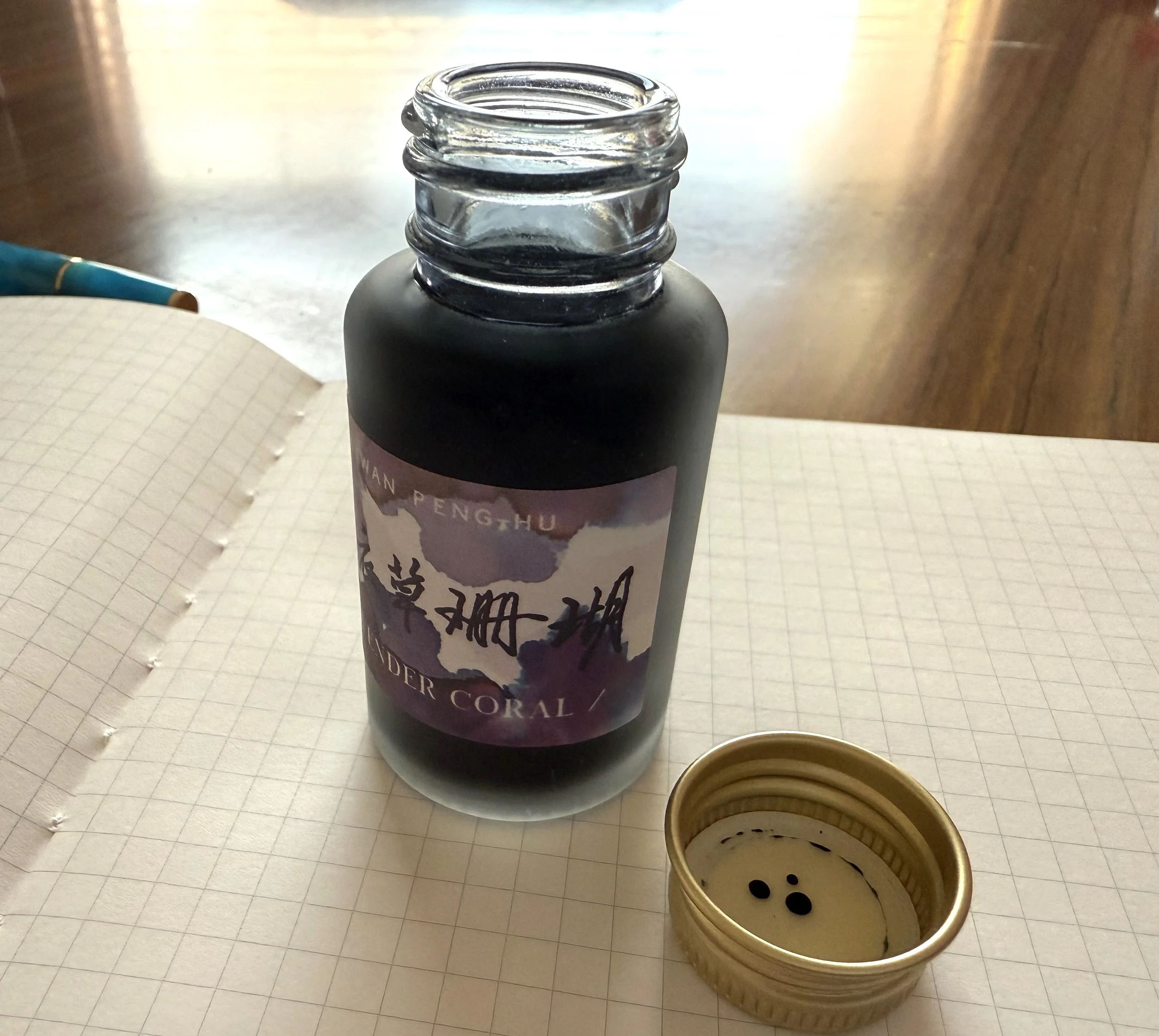
This is my first Ink Institute ink, so I can't compare it to their other offerings. (Yet. I now have my eye on a few. Help.) I've enjoyed the experience getting to know this ink. It comes in a fancy box with a slipcase and some lovely art. The 30ml bottle is frosted glass. It looks great and is practical for keeping direct light away from the ink inside. It has a metal screw cap. The bottle opening is a bit narrow, but not unreasonably so. The bottle felt stable while I was filling the pen.
I was happy as soon as I started writing. The ink has great flow. It is described online as a dry flow with fast drying, but I did not find that to be the case on my Kokuyo paper. It hadn't dried after 30 seconds, when I stopped timing it. But I like wet inks, so that's not a negative in my book. The slow dry time helps with the incredible shading, I think. The ink starts out looking like a smoky blue-grey, and the lavender-pink tones develop as the ink dries. In the shaded areas where the ink pools, the deeper purple shows, and a great complexity of color shows around the edges. Have you ever just sat and watched in transfixed delight as ink dries? Don't lie, I know you have. This was a 10/10 watching ink dry experience.
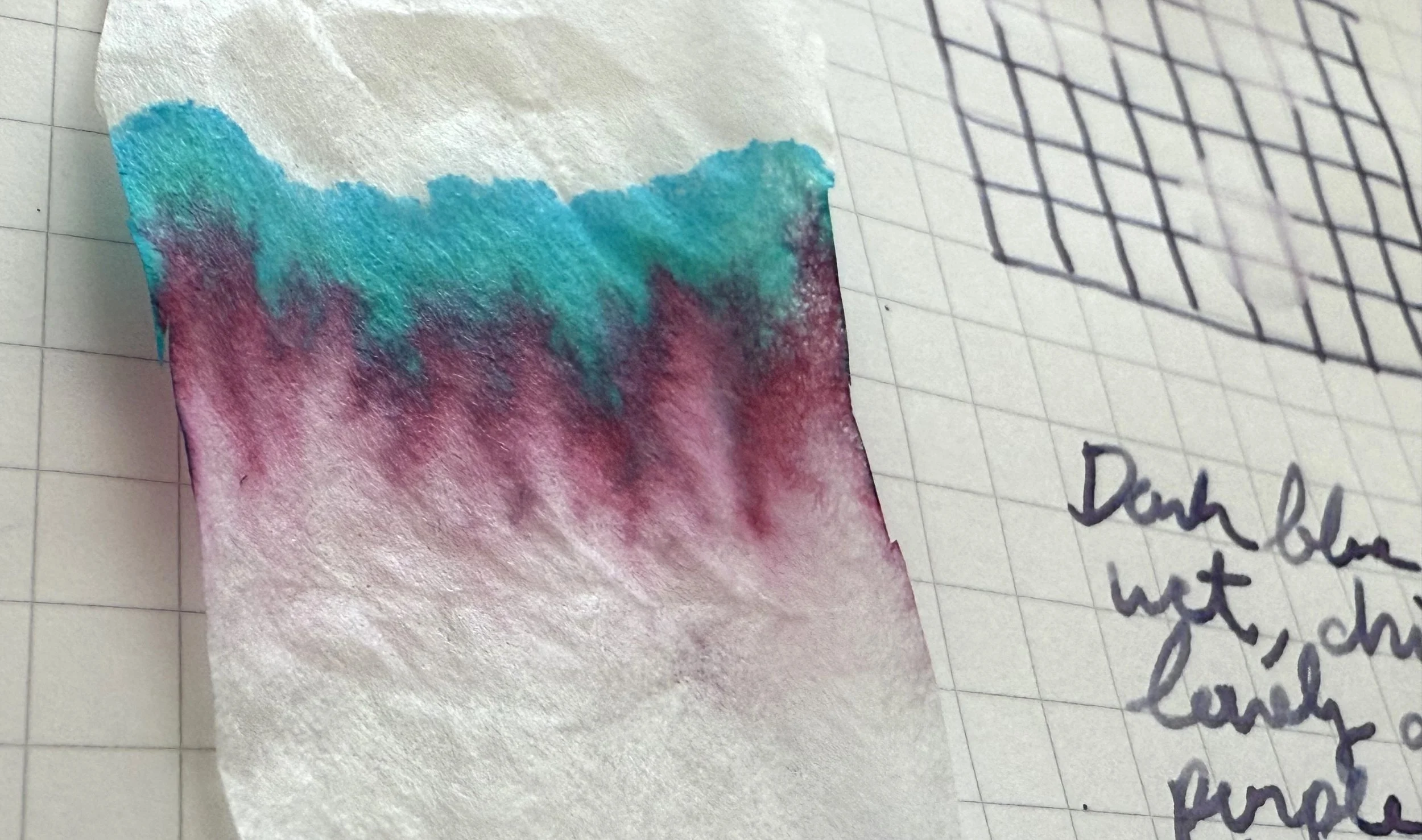
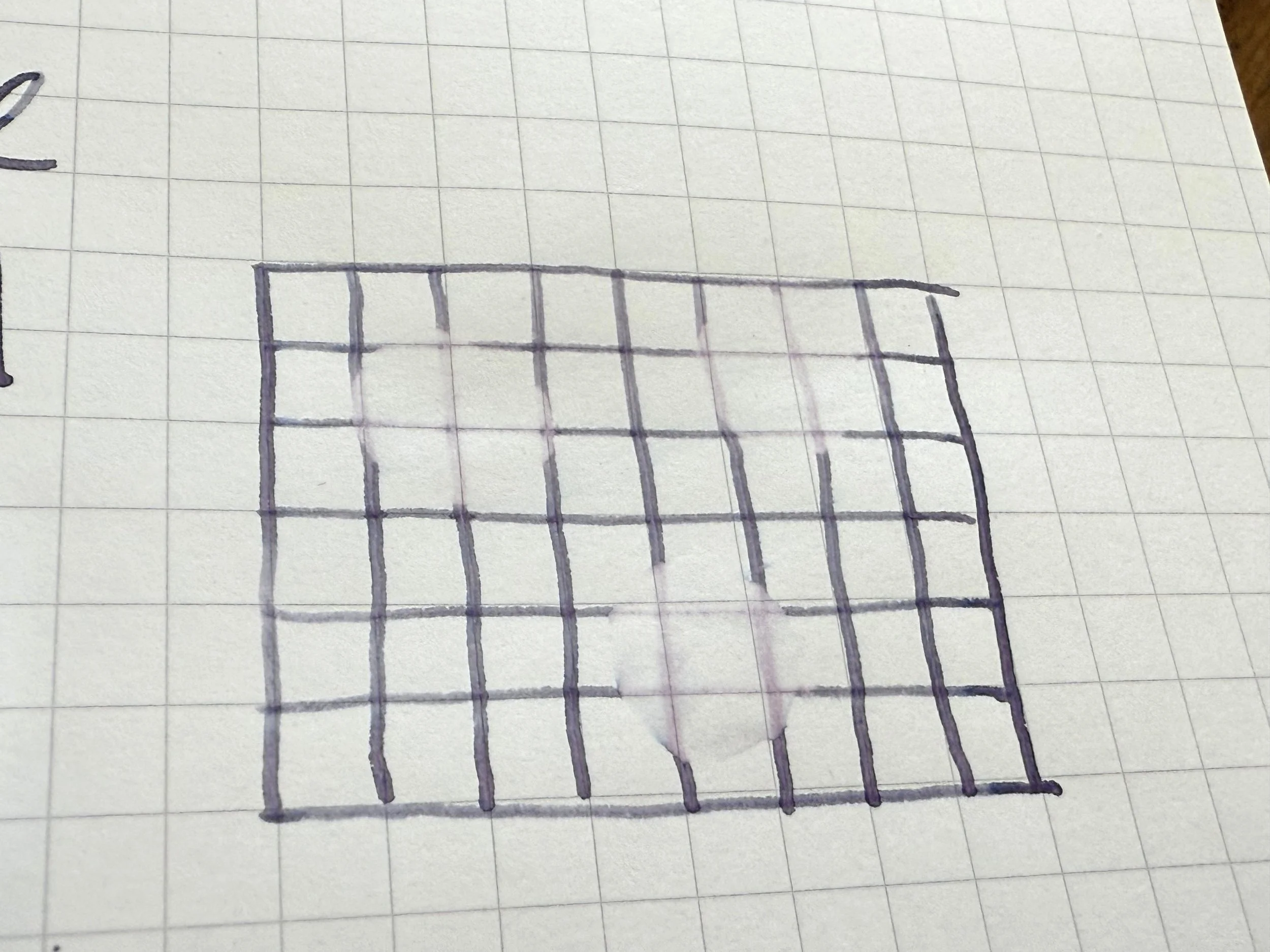
The chromatography shows just how many colors are hiding in this ink, and how the bright colors have blended into something softer. There's also no feathering or bleeding, even with heavy use.
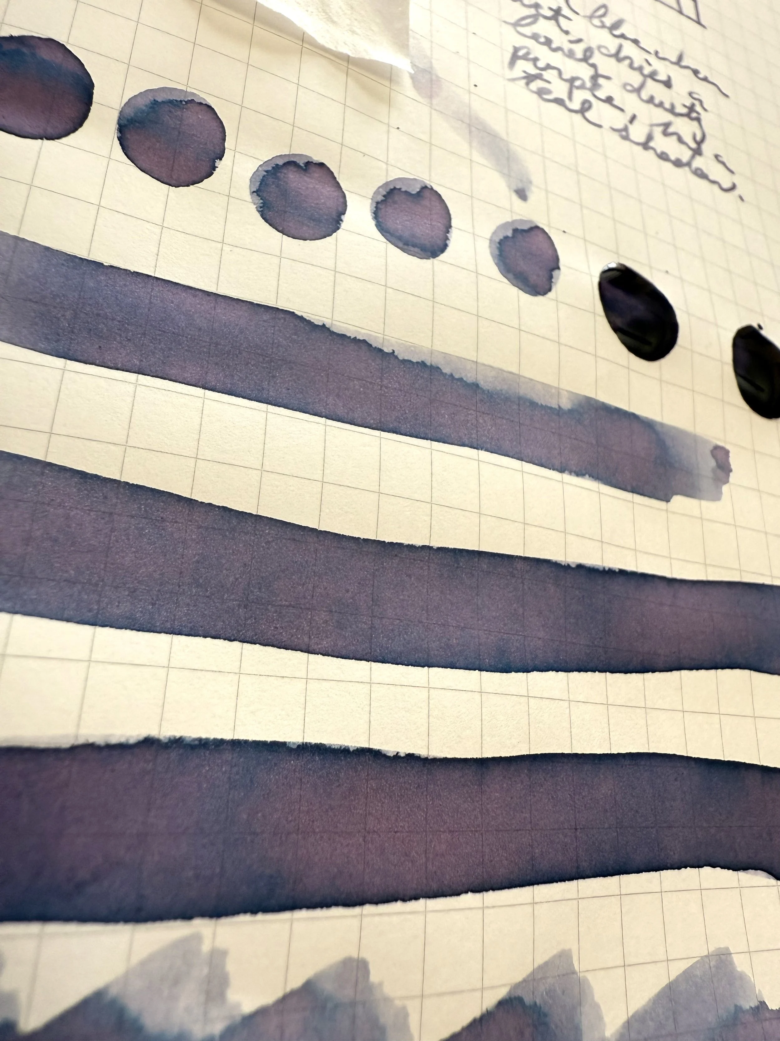
This ink isn't waterproof or water resistant, though some hint of purple stayed after a water spill test. The dramatic shading shows well in writing, and it builds with multiple layers, which makes it great for artwork. I'm very excited to continue writing with it. It's a contender for a new top favorite for me, as it has a similar effect as a previous favorite that isn't as easy to read.
The 30ml bottle sells for $21, which is a little pricey. A 50ml bottle of Sailor ink is $18 to $24, for comparison. A 30ml bottle of Diamine is only $8. So this ink is toward the upper end of the spectrum, price-wise. Would I buy it at that price? Yes, even though I said I'm not buying any more ink. Maybe that's saying something, but maybe it isn't. What I can say is that it's a pleasure to write with it, even if I spend as much time staring at the ink and watching it dry as I spend writing.
Enjoy reading The Pen Addict? Then consider becoming a member to receive additional weekly content, giveaways, and discounts in The Pen Addict shop. Plus, you support me and the site directly, for which I am very grateful.
Membership starts at just $5/month, with a discounted annual option available. To find out more about membership click here and join us!