Posts filed under DeAtramentis

DeAtramentis Thomas Gainsborough Black-brown Ink Review

(Jeff Abbott is a regular contributor at The Pen Addict. You can find more from Jeff online at Draft Evolution and Twitter.)

With all the vibrant, gorgeous ink colors available on the market today, it's a wonder anyone tries the browns and blacks to uncover the subtle treasures they offer, but I'm always glad when I take a trip to the dark side of ink. DeAtramentis Thomas Gainsborough is my latest experiment, and I've been pleasantly surprised.

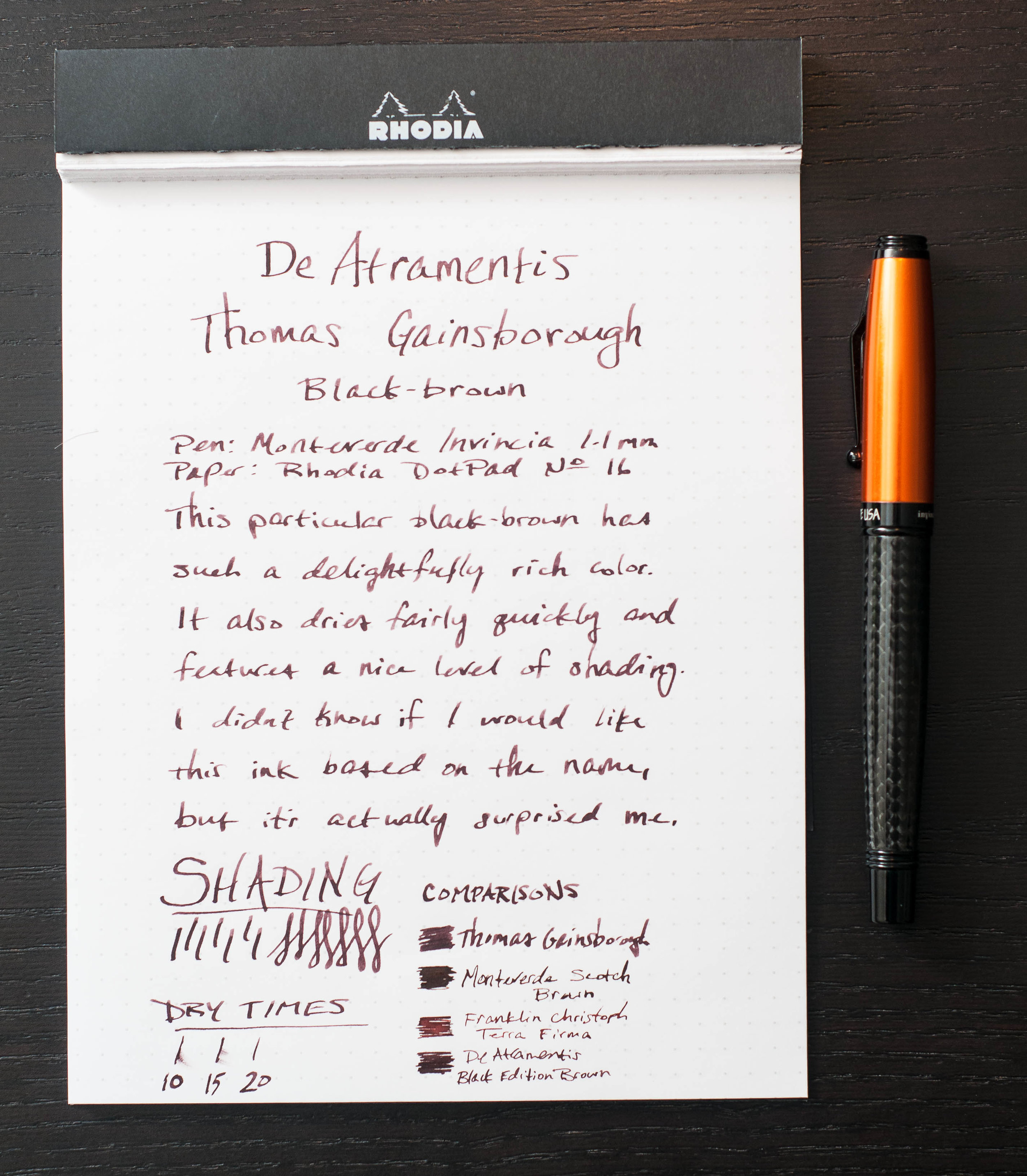
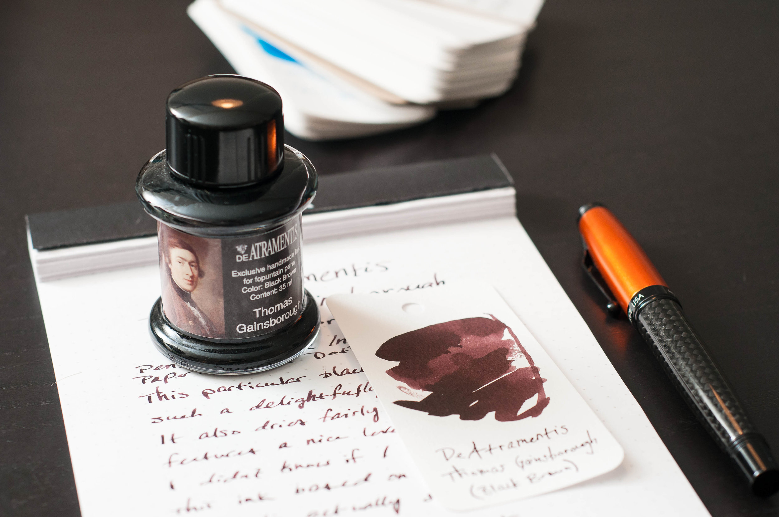
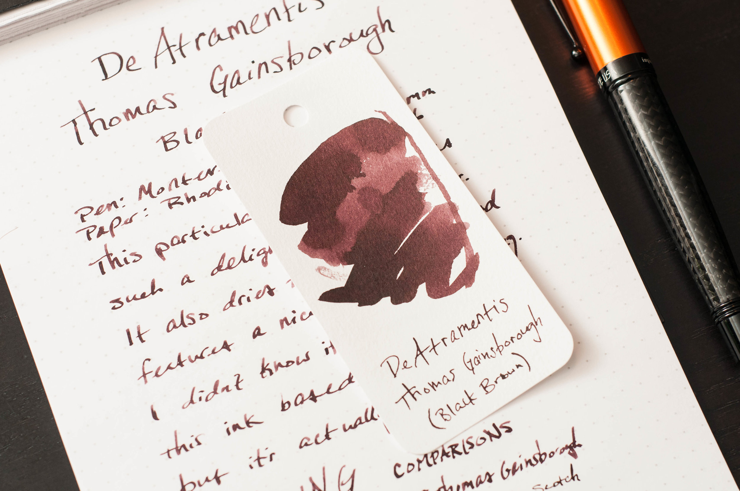
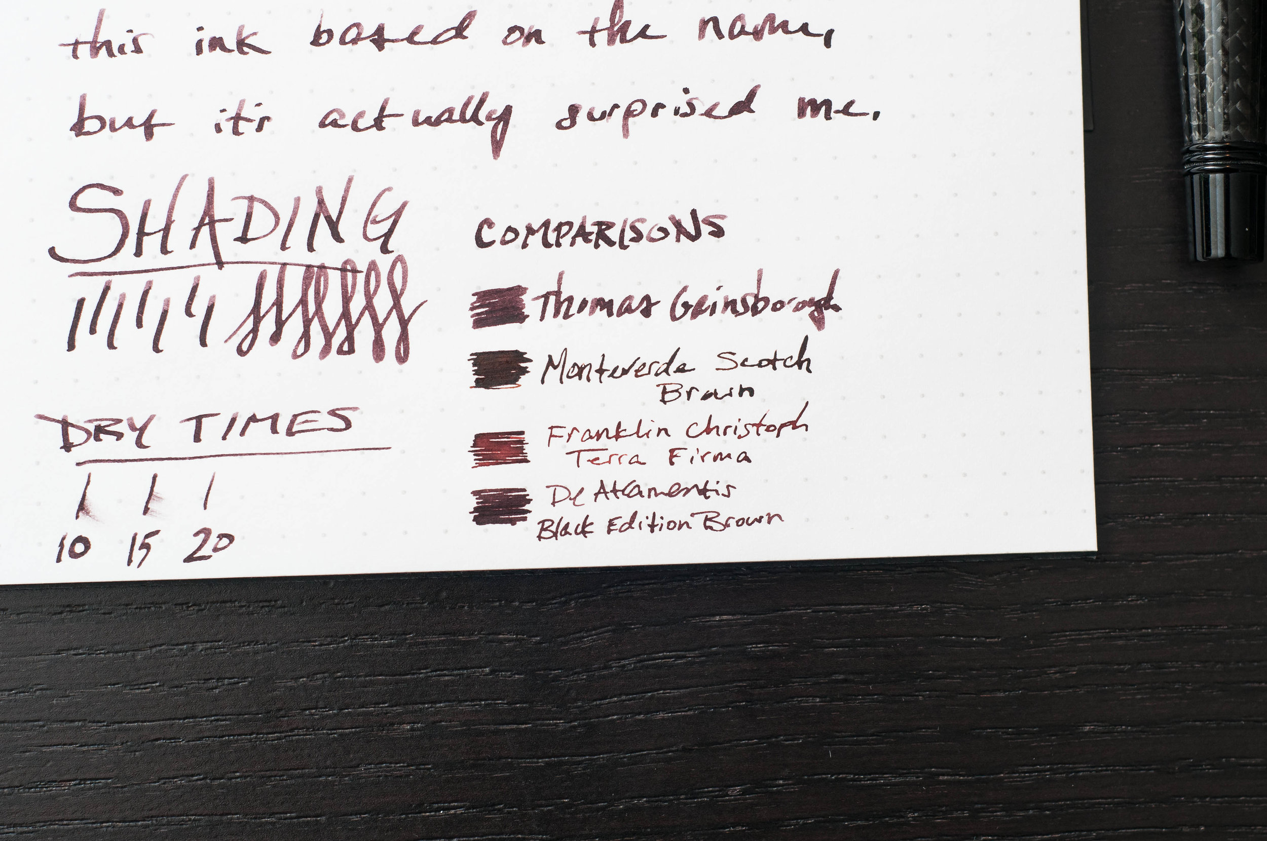
DeAtramentis Thomas Gainsborough, part of the famous people collection of inks, is a rich black-brown ink that reminds me of caramelized sugar or bourbon when writing. My expectations were a little harsh on this ink just because of the name. When I think of a black-brown, I think of the inks I've tried that so dark that you can barely see the chocolate colors coming through. In the case of this black-brown, the brown is still the star and main attraction. The color reminds me very much of Monteverde Scotch Brown, but just a tad darker.

Along with the sultry color, the ink exhibits some lovely shading. The amount of variance isn't dramatic, but it's just enough to add some visual interest on the page that alters between a dark and medium brown. I was surprised (again) to see this much variation in such a dark color, but these types of unexpected features are always welcome.

It's not often I find an ink that dries in less than 15 seconds, but this ink easily fits in that category. Using the 1.1mm stub nib on my test pen, the ink was typically dry in 15 to 20 seconds. But, when using a smaller medium nib, it was dry between 10 and 15 seconds. Not bad!

The Monteverde I use to test inks can also lean toward the dry side, but this ink does a good job of lubricating the nib and keeping the flow of ink steady and dependable. Using the pen after a long period of rest was also no problem — after a few test strokes, the ink starts flowing easily.

This ink is also incredibly easy to clean out of pens. It washes out quickly and doesn't leave behind any pigment. Overall, it's extremely well-behaved.

DeAtramentis Thomas Gainsborough is available in a 35ml bottle for around $14. It's a beautiful but subtle color, and I can highly recommend it if you're a fan of brown inks.

(Vanness Pens provided this product at no charge to The Pen Addict for review purposes.)


Enjoy reading The Pen Addict? Then consider becoming a member to receive additional weekly content, giveaways, and discounts in The Pen Addict shop. Plus, you support me and the site directly, for which I am very grateful.

Membership starts at just $5/month, with a discounted annual option available. To find out more about membership click here and join us!

Posted on February 21, 2018 and filed under DeAtramentis, Ink Reviews.

DeAtramentis Louis XIV of France, Antique Pink: A Review

(Susan M. Pigott is a fountain pen collector, pen and paperholic, photographer, and professor. You can find more from Susan on her blog Scribalishess.)

King Louis XIV of France was nothing if not a man of extravagance. He commissioned numerous portraits of himself, and had the Hall of Mirrors built at Versailles to commemorate his military victories.

Photo by Susan Pigott

So, it seems fitting that DeAtramentis chose to name this flamboyant pink color after Louis XIV.

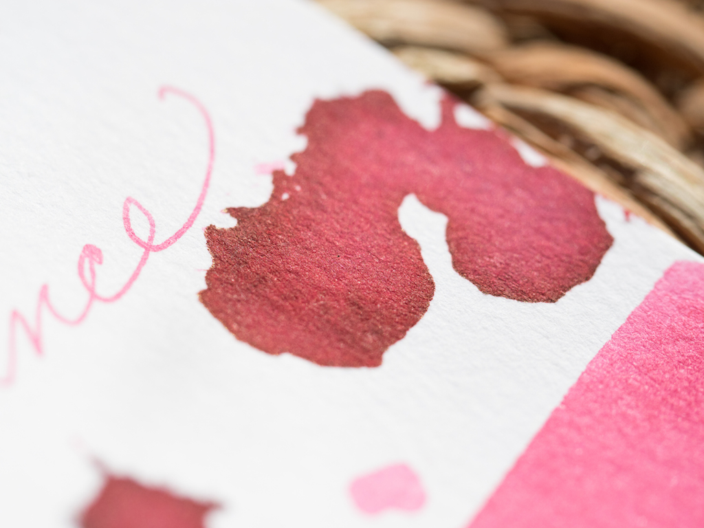
Louis XIV of France (also called “antique pink”), is a lovely shade of pink. It’s not a subtle pink (just as Louis XIV was not a subtle king); rather, it is bright and cheery, much like pink roses.

I tested the ink using my Platinum Century 3776 with a fine nib. Platinum nibs are much finer than Western ones, so essentially the lines are like an extra fine. With such a fine line, you wouldn’t expect to find shading, and I didn’t. But the ink flowed well and had reasonable dry times. You can really see the rich color in the swab. The ink is not waterproof.

Chromatography demonstrates that this ink has little more than pink and dark pink in its composition.

I compared DeAtramentis Louis XIV pink with a few other pink inks I had on hand (I am clearly not a pink person, because I struggled to find four!). Each shade is rather unique, especially J. Herbin’s Rouille d’Ancre, which reminds me of well-worn ballet shoes.

Using my ruling pen, I wrote some nice big letters (with fabulous curlicues befitting King Louis). You can definitely see some shading using this large nib, though the ink doesn’t have any sheen.

King Louis of France ink is a good choice for anyone who wants a shade that is unabashedly pink. This would make a terrific Valentine’s Day ink. You can get a 35ml bottle from Vanness Pens for $14.00.


Enjoy reading The Pen Addict? Then consider becoming a member to receive additional weekly content, giveaways, and discounts in The Pen Addict shop. Plus, you support me and the site directly, for which I am very grateful.

Membership starts at just $5/month, with a discounted annual option available. To find out more about membership click here and join us!
Posted on February 9, 2018 and filed under DeAtramentis, Ink Reviews.

DeAtramentis Benjamin Franklin Ink Review

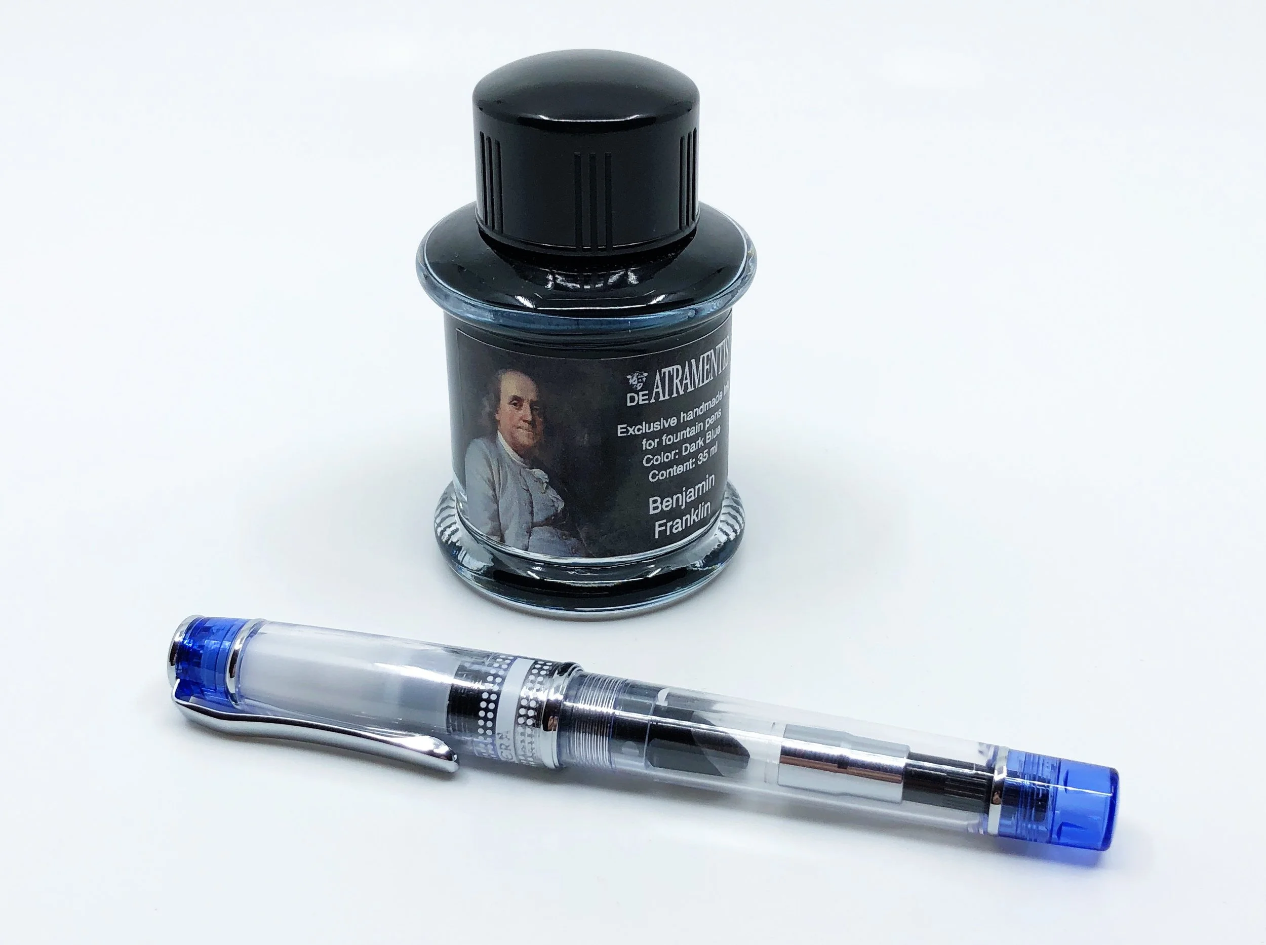
In my formative fountain pen years, you know, like three years ago, I fell in love with DeAtramentis Benjamin Franklin ink. It’s a basic dark blue, but at a time when I had somewhere around seven inks instead of seventy, it set itself apart.

I remember writing with it and feeling like a real fountain pen user for the first time. Basic black and blue inks were boring, and I had yet to discover the oranges, pinks, and purples that I would eventually fall in love with. Benjamin Franklin had character and stood out on the page. My handwriting looked wonderful.

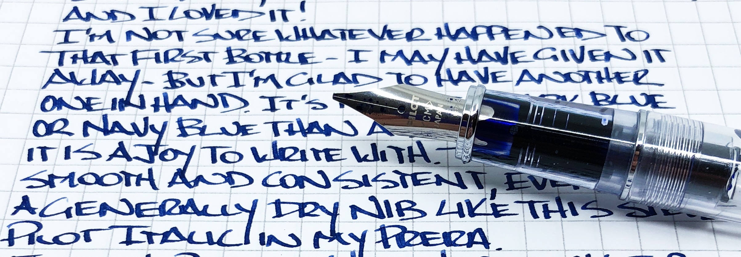
The ink is wet and flows wonderfully, even from a dry nib like the Pilot Prera italic nib I used for this review. It feels wet and lubricated, and flows well. The color is dark for sure, along the lines of a darker blue black ink. As you may or may not know, blue black inks make up some of my all-time favorites and daily workhorses. This one doesn’t have the black or grey you may see in other blue black inks, but the blue is deep and rich. And it even has a hint of red sheen.

As I was re-familiarizing myself with Benjamin Franklin, my first thought went to one of my current favorite inks: Montblanc JFK. Another dark blue, JFK is a shade or two lighter, shows off a touch of grey, and overall, has more character. They are close though. My next thought went to Diamine Cult Pens Deep Dark Blue, but as the name would lead you to believe, it is a deeper, darker blue than Benjamin Franklin.

I learned something new during this review as well. According to Vanness Pens, DeAtramentis Benjamin Franklin is the same ink as DeAtramentis Standard Dark Blue. Seems kind of dishonest from DeAtrementis to repackage one of their standard inks as if it were something special. Fortunately, both inks are the same price - $13 for a 35ml bottle - but it’s a strange move. I can only assume the rest of the historical lineup has the same duplication.

Regardless, this is an excellent ink at a fair price. I’ll be using this one a lot, and will try not to misplace this bottle like I did my original bottle.

(Vanness Pens provided this product at no charge to The Pen Addict for review purposes.)


Enjoy reading The Pen Addict? Then consider becoming a member to receive additional weekly content, giveaways, and discounts in The Pen Addict shop. Plus, you support me and the site directly, for which I am very grateful.

Membership starts at just $5/month, with a discounted annual option available. To find out more about membership click here and join us!
Posted on December 4, 2017 and filed under DeAtramentis, Ink Review.