Posts filed under Ink Review

Pennonia Strigoi Ink Review

(Sarah Read is an author, editor, yarn artist, and pen/paper/ink addict. You can find more about her at her website and on Twitter. And check out her latest book, Out of Water, now available where books are sold!)

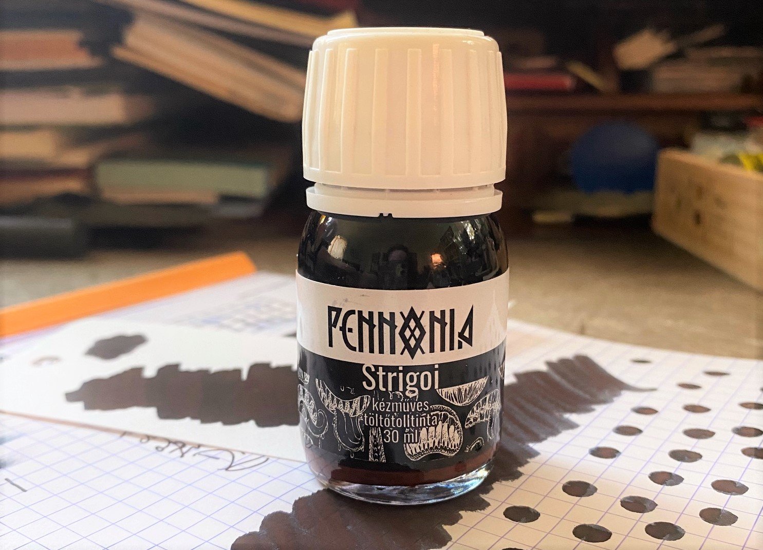
This 2022 limited edition ink from Pennonia, Strigoi, is inspired by a Romanian legend about a spirit that rises from the grave, transforms into animals, turns invisible, drinks blood, and is believed to be the inspiration for the character Dracula. The ink is described as black with red micro pigments, but that's a simple description for what is a very complex ink.

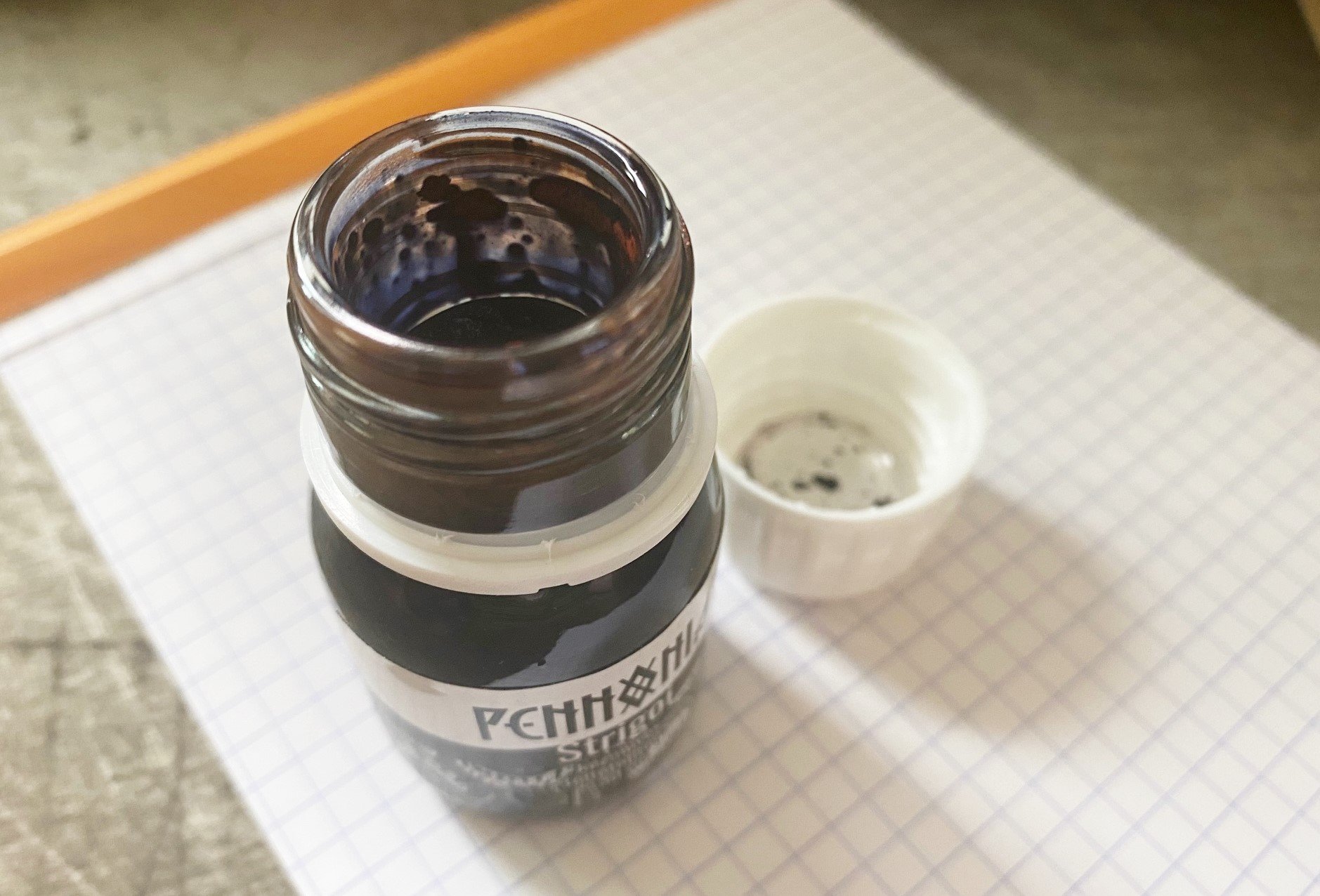
The standout word there is micro pigments. Huh? In this ink, the micro pigments are a very fine sediment in the liquid that adds a matte texture to it--like the opposite of a shimmer. The red pigment is a very earthy tone, like the grave clay of the Strigoi. It does settle to the bottom of the bottle quickly, and it takes a bit of shaking and mixing to get it redistributed--which means it's also going to do that in your pen. The website does caution against putting this ink into a fancy or fussy pen. And if you're not fond of pen cleaning (like me), you'll want to proceed with caution. Because I know myself, I only filled the converter partway, so I know I'll run out more quickly and, in theory, clean the pen sooner. I let some of the pigment settle in the neck of the bottle so I could mess with it, and it has the texture of clay--thick and kind of sticky. It feels a bit wrong to put it in a pen, and I admit I might hesitate to do so, except... It looks So. Freaking. Awesome.

Y'all, this one is super hard to photograph, so I'm going to do my best to describe it. Calling this ink "black" is like calling the ocean blue. Sure, some of the ocean is blue, but it's also green, and aqua, and even brown, etc. This ink has a lot of sneaky color going on. To me, it looks like a navy charcoal color, like a shadowy version of a blue black. The chromatography really shows off the complexity, with the red-brown clay at the bottom, then the ink splitting into lilac and a bright teal. The Pennonia alchemists were flexing. The deep red matte of the pigment looks as though it's resting on top of that navy charcoal, giving a 3D effect, almost like it's casting a shadow. It doesn't show up as much in written lines, but the matte effect is still there. I don't think this ink would work with a fine or extra fine nib.

While the pigment gives the ink a dry feel, it actually takes an eternity to dry. Somewhere between 30 and 40 seconds it finally chilled out. And while the inkiness washes away easily in water, the pigment stays behind, so a small spill won't eradicate your writing. I wouldn't call it waterproof, but there is an element of permanence. As for color comparisons, I've got nothing. I'm not aware of any similar inks.

This 30ml bottle is only $16 at Vanness Pens, which is a great deal for a vial of undead blood-drinking spirit. And for ink, if that's what you're buying.

(Vanness Pens provided this product at a discount to The Pen Addict for review purposes.)


Enjoy reading The Pen Addict? Then consider becoming a member to receive additional weekly content, giveaways, and discounts in The Pen Addict shop. Plus, you support me and the site directly, for which I am very grateful.

Membership starts at just $5/month, with a discounted annual option available. To find out more about membership click here and join us!

Posted on August 10, 2023 and filed under Pennonia, Ink Review.

Van Dieman's Devil's Kitchen Fountain Pen Ink Review

Is “blue” the broadest fountain pen ink category? It has to be, right? Royal Blue, Navy Blue, Blue Black, Turquoise, Sky, insert Ocean or Lake descriptor here. The list goes on and on.

Why are they so popular? Because they are not black, and are mostly appropriate in an office setting. They give your writing character, and co-workers won’t give you the side-eye that green, purple, or orange might bring.

Fountain pen users have no shortage of blue inks at their fingertips, and a wide range of favorites. And you know what else? There is always room for one more. That’s where Van Dieman’s Devil’s Kitchen comes in.

You may have seen Jeff recently review this ink right here in these pages. I’m always open to reviewing the same writing instrument as other reviewers - we all have unique use cases and experiences for pens and pencils. But inks? They are a more static product, and usually one review is enough.

So, why was I compelled to review Devil’s Kitchen a second time? Because the color of ink in my bottle looks completely different than Jeff’s, and different than most retail samples you see online.

The color of ink in Jeff’s review perfectly matches the most common sample shown online, such as the swab from Vanness Pens, where I purchased my bottle from, and where Jeff’s sample vial was from. It’s a beautiful deep teal green, and a color I would highly recommend if you are looking for that shade.

That’s not what I see from my bottle, though. What I see is represented on Van Dieman’s product page, a rich, complex deep ocean blue. Their image even has more character than I’ve personally seen so far, but that hasn’t kept me from enjoying this ink immensely.

That I use it and enjoy it so much is what got me looking at the color variations online. I think the shade I have is perfect, and one of the best blues I have used in some time. The teal green is good, too, but this blue pops. I’ve used it as part of my #NaNoCoMo project (inked in the recently reviewed Edison x Goldspot Pens Newark Orion Nebula,) and I plan on keeping it on the front of the ink shelf for frequent use in other pens.

But it is blue. And it is different than Jeff’s sample, and other samples online. Right?

It looks like I have some emails to send to sort out the true color. Either that, or have my eyes checked.

(I purchased this ink from Vanness Pens at a discount for review purposes.)


Enjoy reading The Pen Addict? Then consider becoming a member to receive additional weekly content, giveaways, and discounts in The Pen Addict shop. Plus, you support me and the site directly, for which I am very grateful.

Membership starts at just $5/month, with a discounted annual option available. To find out more about membership click here and join us!

Posted on November 22, 2021 and filed under Van Dieman's, Ink Review.

Diamine Blue Black Ink Review

Diamine Blue Black Ink Review

(Jeff Abbott is a regular contributor at The Pen Addict. You can find more from Jeff online at Draft Evolution and Twitter.)

It's been quite a while since I've had the inclination to reach for a blue black ink for one of my fountain pens, but I've had a resurgence of interest lately and have decided to go with it. The first ink on my list of blue blacks is from Diamine. This is the standard variant, not the special 1864 150th-anniversary or registrar's versions.

Diamine Blue Black is something that I consider to be a very solid blue black ink by definition. The color is dark but still obviously blue, there's a nice level of shading, and there aren't any purple undertones present. With any blue black, the color is important and often a point of intense opinions. I'm not a fan of blue blacks that are so black that you can barely see any blue, but I'm also not a fan of washed-out, light blue black variations that look more like a watered down black. Diamine's interpretation of blue black makes my heart happy. It's a dark navy with plenty of inky mystery, but it also lets the lighter side show through on lighter strokes. It strikes the crucial balance of darkness and blue that meets my individual expectations.

Diamine Blue Black Ink

Like all the other Diamine inks I've tried, this one is very well-behaved. I haven't noticed any feathering or bleeding, regardless of the paper I use. It's a dark ink, so there's a fair amount of show-through on the back side of the page I write on, but it's not too bad and it's easy to ignore if I'm using a nib that's under the bold size.

One thing that I did not expect about this ink is how wet it is. Especially in the 1.1mm stub nib I used for this review, the ink just flows out of the nib with ease. It doesn't seem to affect the line crispness, but it certainly increases the dry time. In my tests (in the very humid southeast US), it takes anywhere between 20 to 30 seconds for this ink to fully dry on Rhodia paper. It's a little quicker on uncoated paper, but not by much. If you want a quick-drying ink, look elsewhere!

Diamine Blue Black Ink Test

Several other blue black inks I've tried in the past have a significant sheen that you can see in certain lights. I haven't noticed any sheen in Diamine's version. If you want an ink with a lot of fancy sheen, you should also look elsewhere.

Even though this ink is wet and doesn't have any sheen, I can't help but love the subtle amount of shading it presents. This looks particularly great in a large nib because you see a variance of dark, dark blue and medium blue as you write. What I really appreciate is that I can't see any hint of green, purple, or gray in the lighter shades of this ink. That's something I've noticed in other blue black inks that I don't like. Again, this is what makes Diamine's blue black a true standard for my book of inks.

Diamine Blue Black Ink Swab

And as you might expect with Diamine, it's also a great value. The 30ml bottle I picked up is less than $8, and the whopping 80ml bottle is less than $17. If cartridges are your thing, then an 18 pack of cartridges is only $8.25. If you only want to try this ink out first, I think the smaller 30ml bottle is a good choice.

Aside from the really long dry time, this ink is a stellar performer. It nails the definition of a solid blue black ink for me, and I'm looking forward to using it more in the future as I rotate more dark inks into my pen usage.

(JetPens provided this product at no charge to The Pen Addict for review purposes.)


Enjoy reading The Pen Addict? Then consider becoming a member to receive additional weekly content, giveaways, and discounts in The Pen Addict shop. Plus, you support me and the site directly, for which I am very grateful.

Membership starts at just $5/month, with a discounted annual option available. To find out more about membership click here and join us!

Diamine Blue Black Ink Color
Posted on August 12, 2020 and filed under Diamine, Ink Review.