(Kimberly (she/her) took the express train down the fountain pen/stationery rabbit hole and doesn't want to be rescued. She can be found on Instagram @allthehobbies because there really are many, many hobbies!.)
While at the Philadelphia Pen Show back in January, I picked up some Nikitana paper that Piper Trading Co. had just released. For those who aren’t aware, Piper Trading Co. (“PTC”) is a wholly-owned subsidiary of Franklin-Christoph. In full disclosure, while I have worked at the F-C tables at many shows, and for Piper Trading Co. at last year’s St. Louis Pen Show, I don’t actually work for either company, so I will approach this review as honestly and objectively as I do all my other reviews.
PTC’s Nikitana paper is a cream, 57 gsm paper which comes in two formats - loose leaf or “notebooks”, which I would consider more of an insert than a traditional notebook. I’ll start with the loose leaf papers.
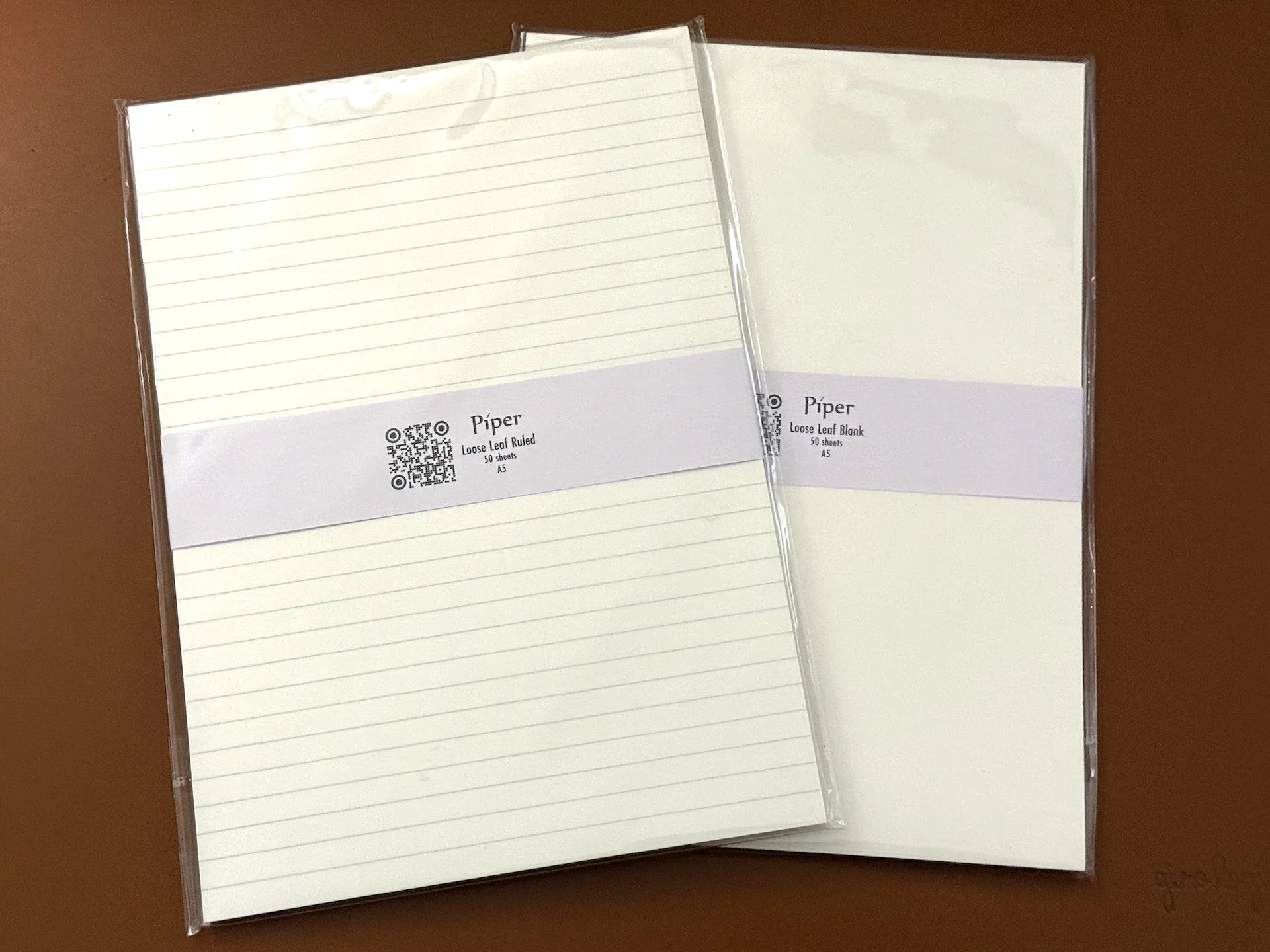
The Nikitana Loose Leaf paper comes in Ruled or Blank, in A4 and A5 sizes.
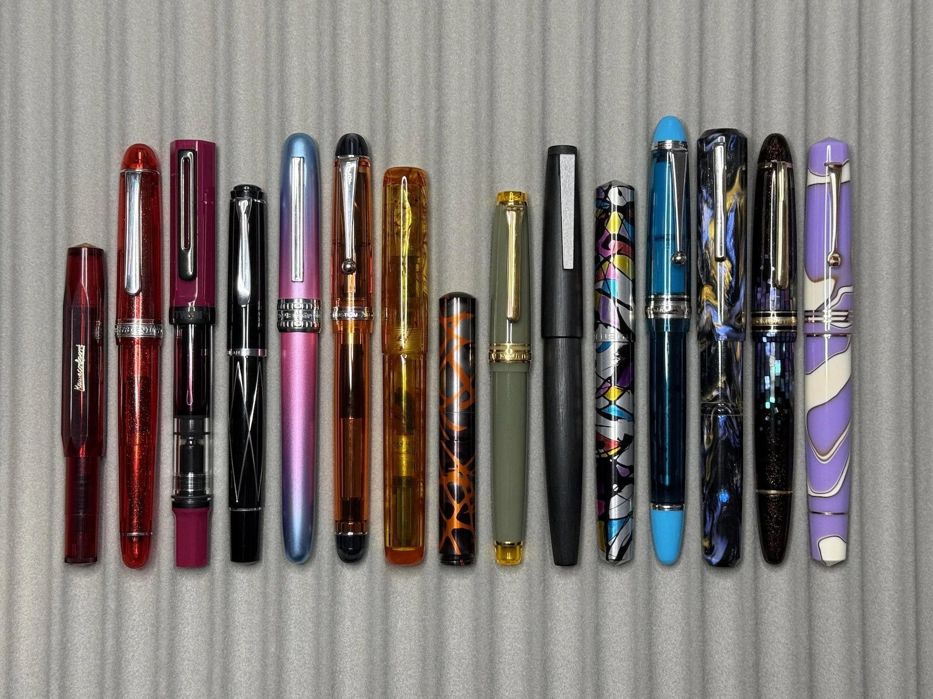
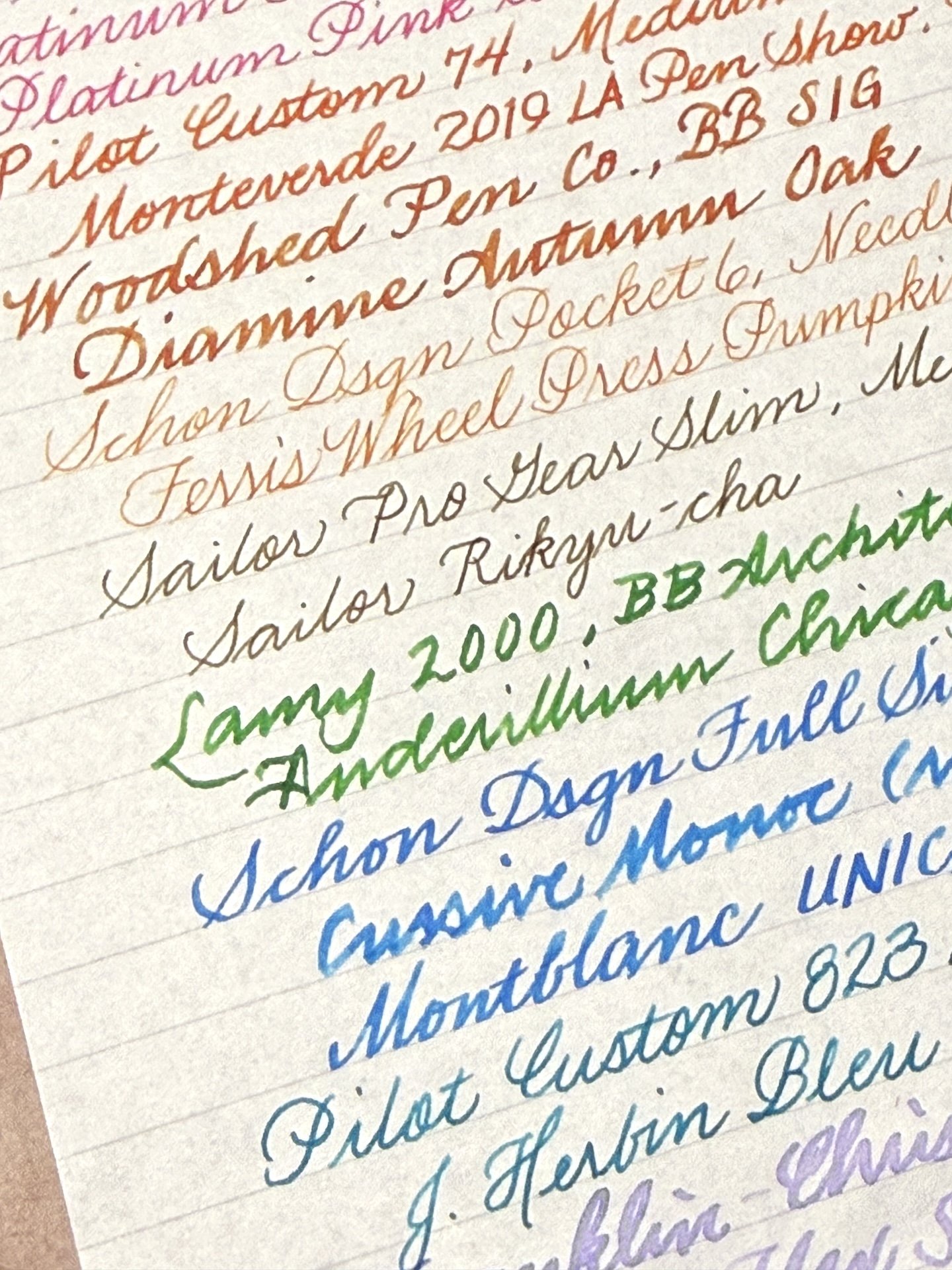
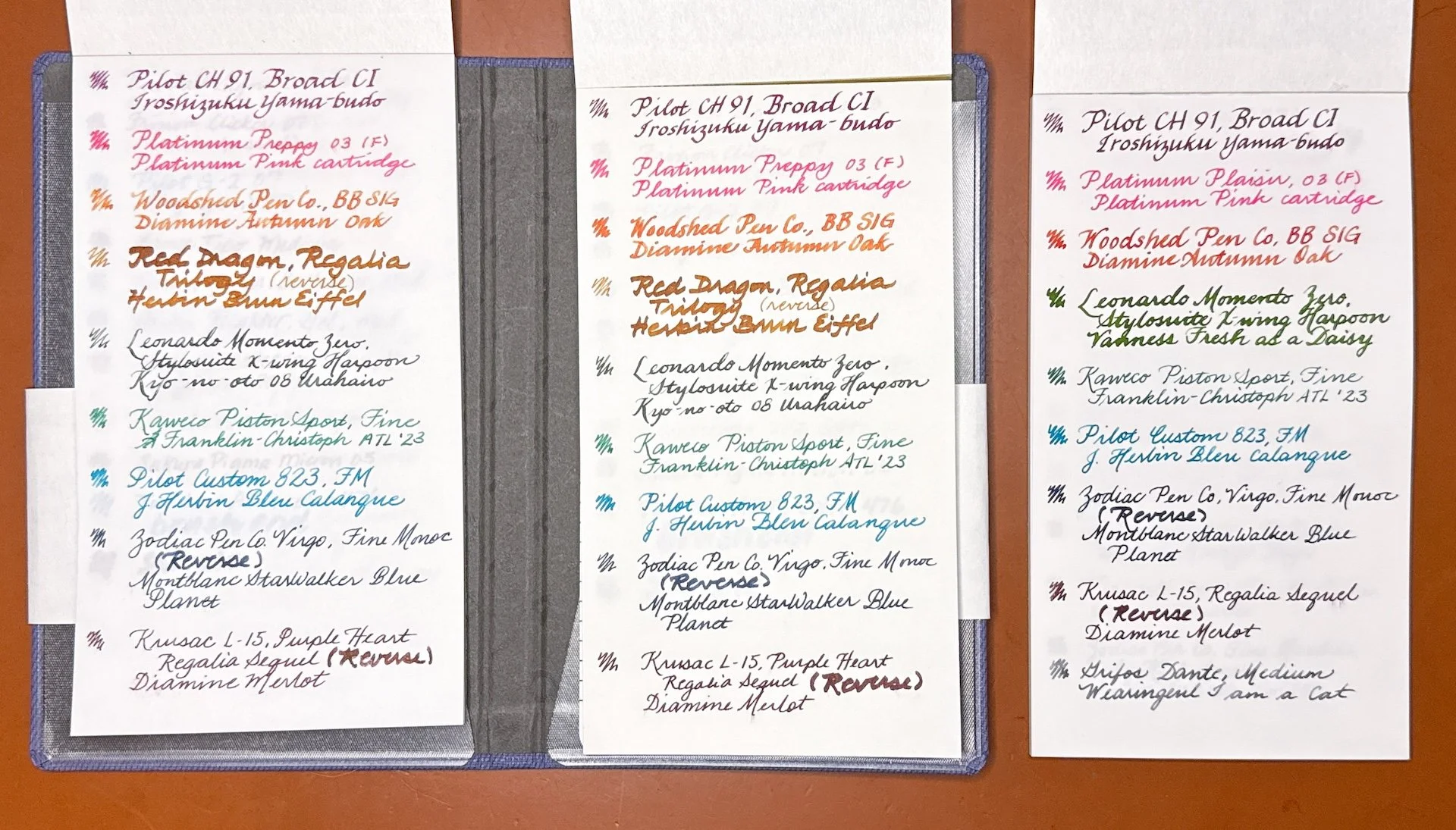
I picked a variety of fountain pens for testing, chosen based on (1) what was already inked, (2) variety of nib sizes, and (3) nib characteristics like flex, grind, or wet/dry, etc. Some of these were used in my Yamamoto Canopus Paper review.
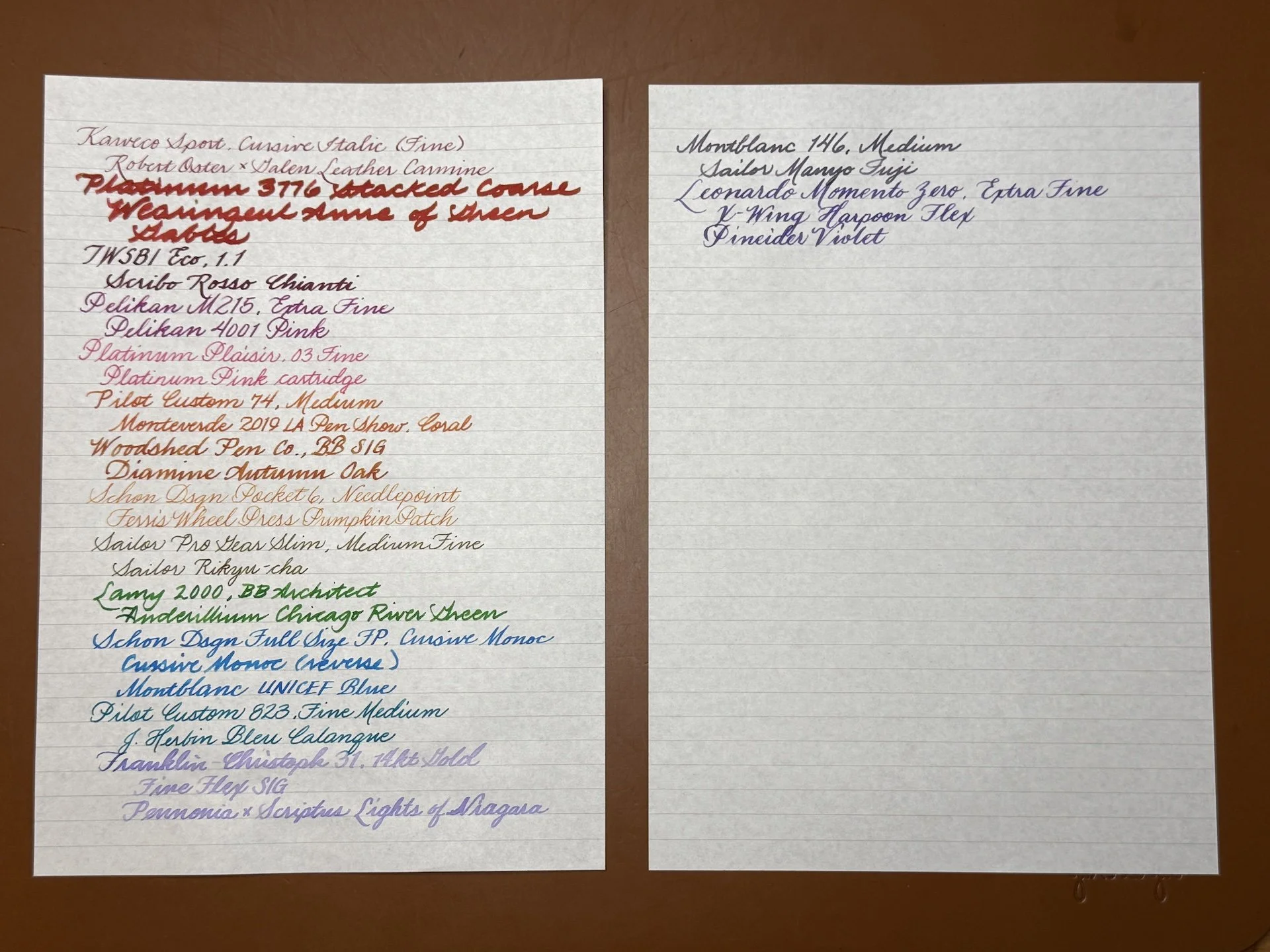
Left to right: Kaweco Sport (FCI), Platinum 3776 (stacked Coarse), TWSBI Eco (1.1), Pelikan M215 (Extra Fine), Platinum Plaisir (Fine), Pilot Custom 74 (Medium), Woodshed (BB SIG), Schon Pocket 6 (Needlepoint), Sailor Pro Gear Slim (Medium Fine), Lamy 2000 (BB Architect), Schon Full Size (Cursive Monoc), Pilot Custom 823 (Fine Medium), Franklin-Christoph 31 (Fine Flex SIG), Montblanc (Medium, Leonardo Momento Zero (Stylosuite EF X-Wing Harpoon flex).
I would describe the Nikitana paper as a fairly smooth and thin paper – similar to Tomoe River in weight, with maybe a wee bit more tooth than TR. The ruled spacing is 6mm and is one of my preferred ruling widths. I like that the lines are visible but not super dark or distracting.
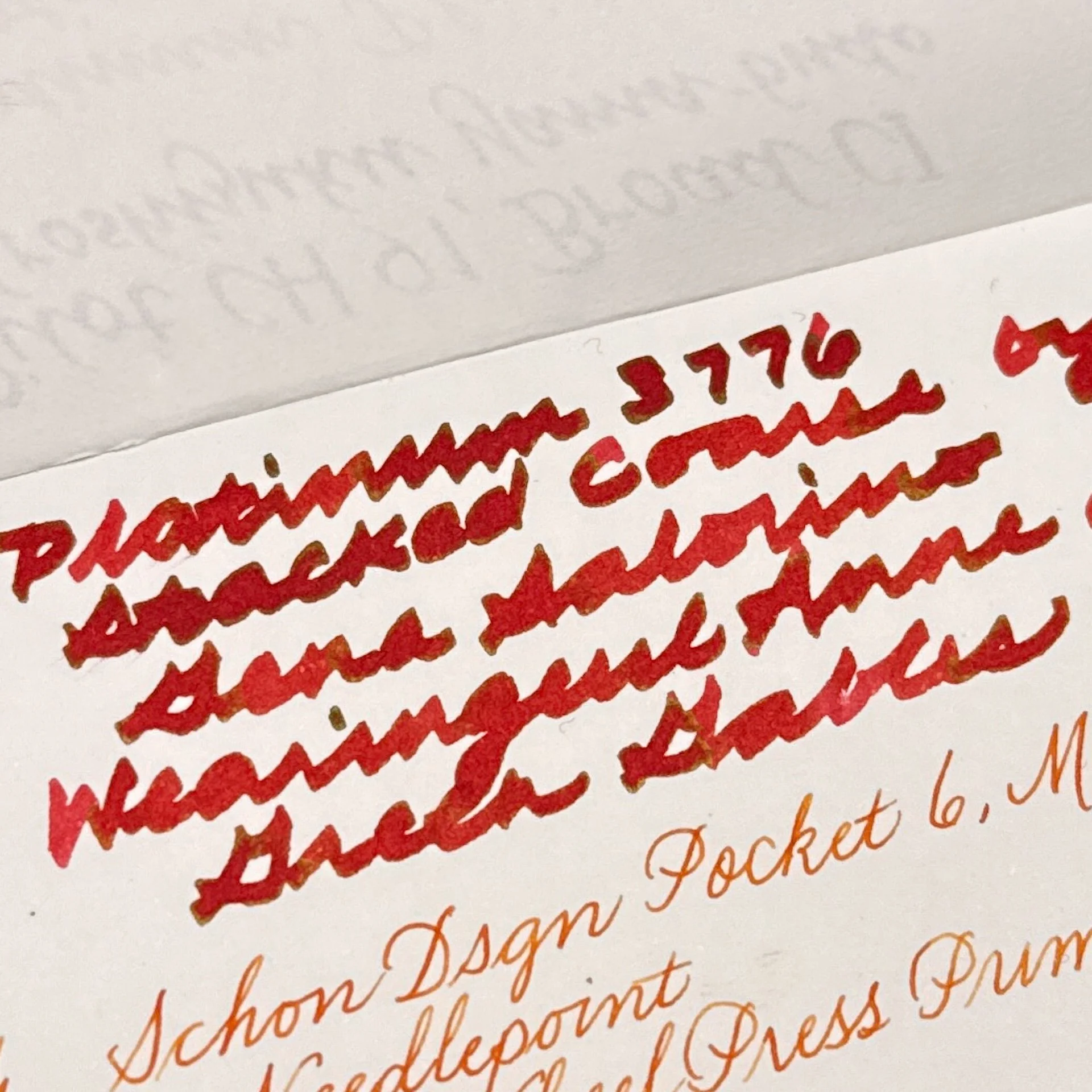
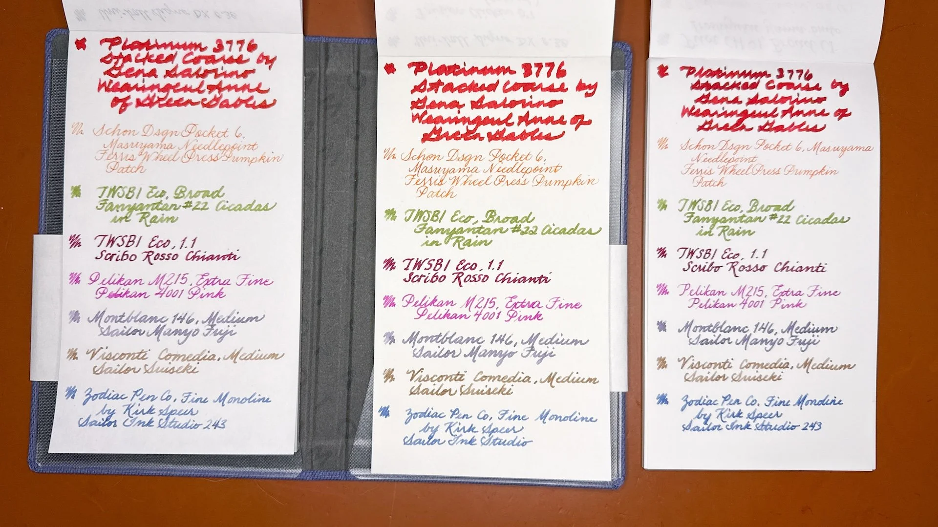
Look at the pooling from the super juicy Platinum 3776 with the stacked Coarse nib! The paper handled it without any problems.
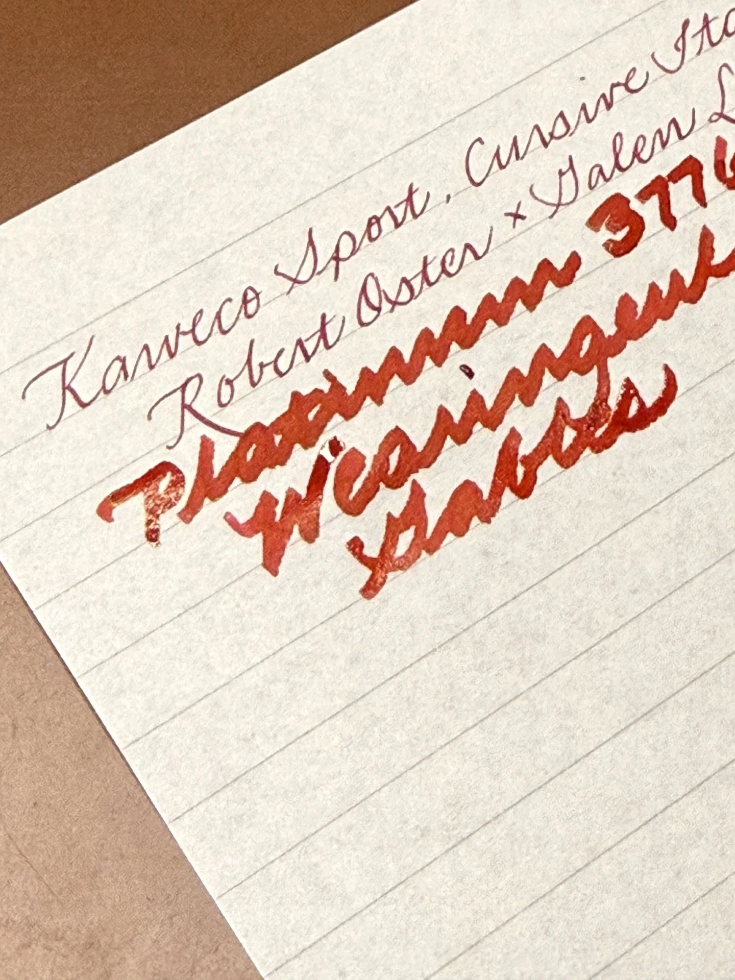
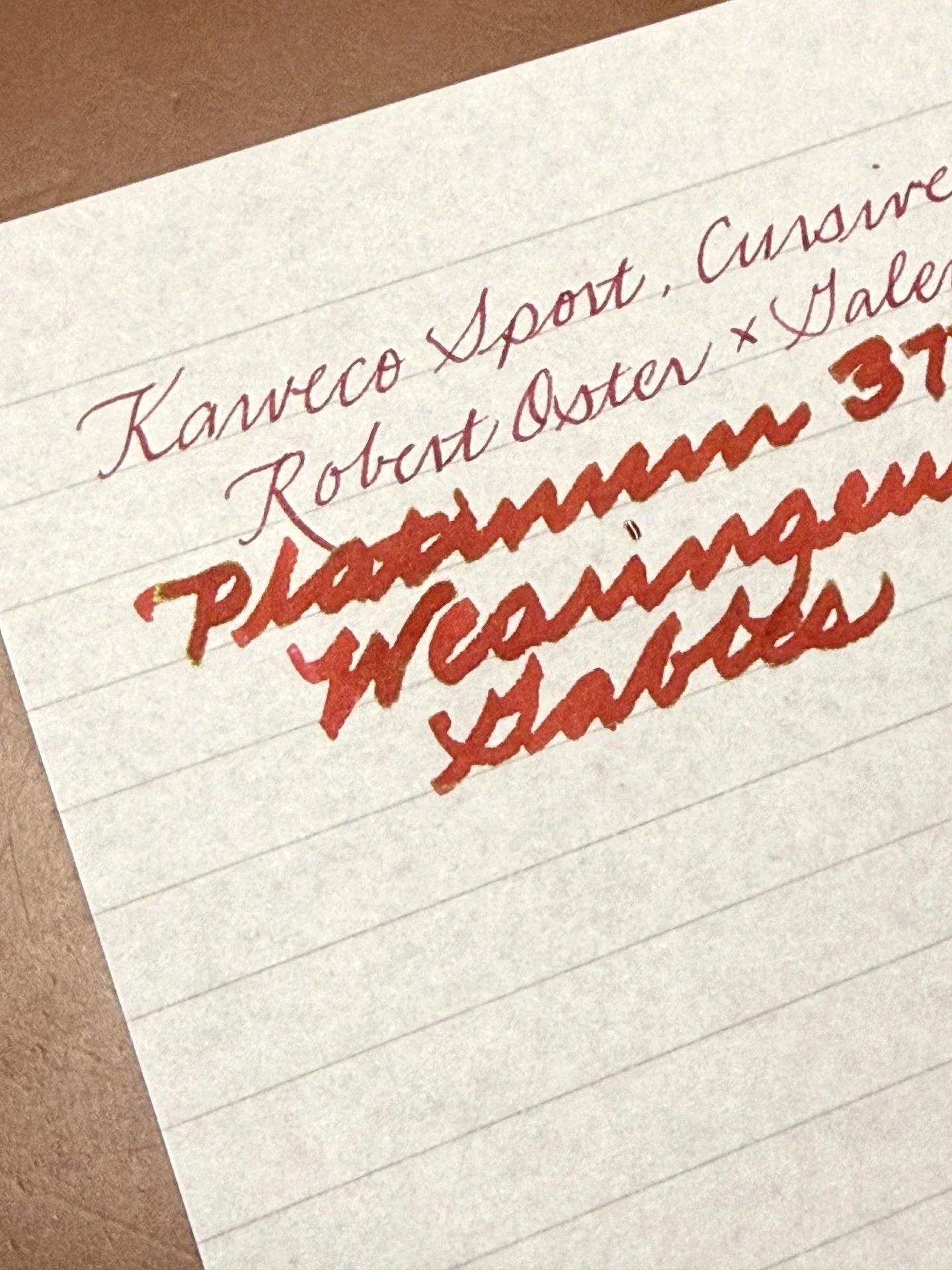
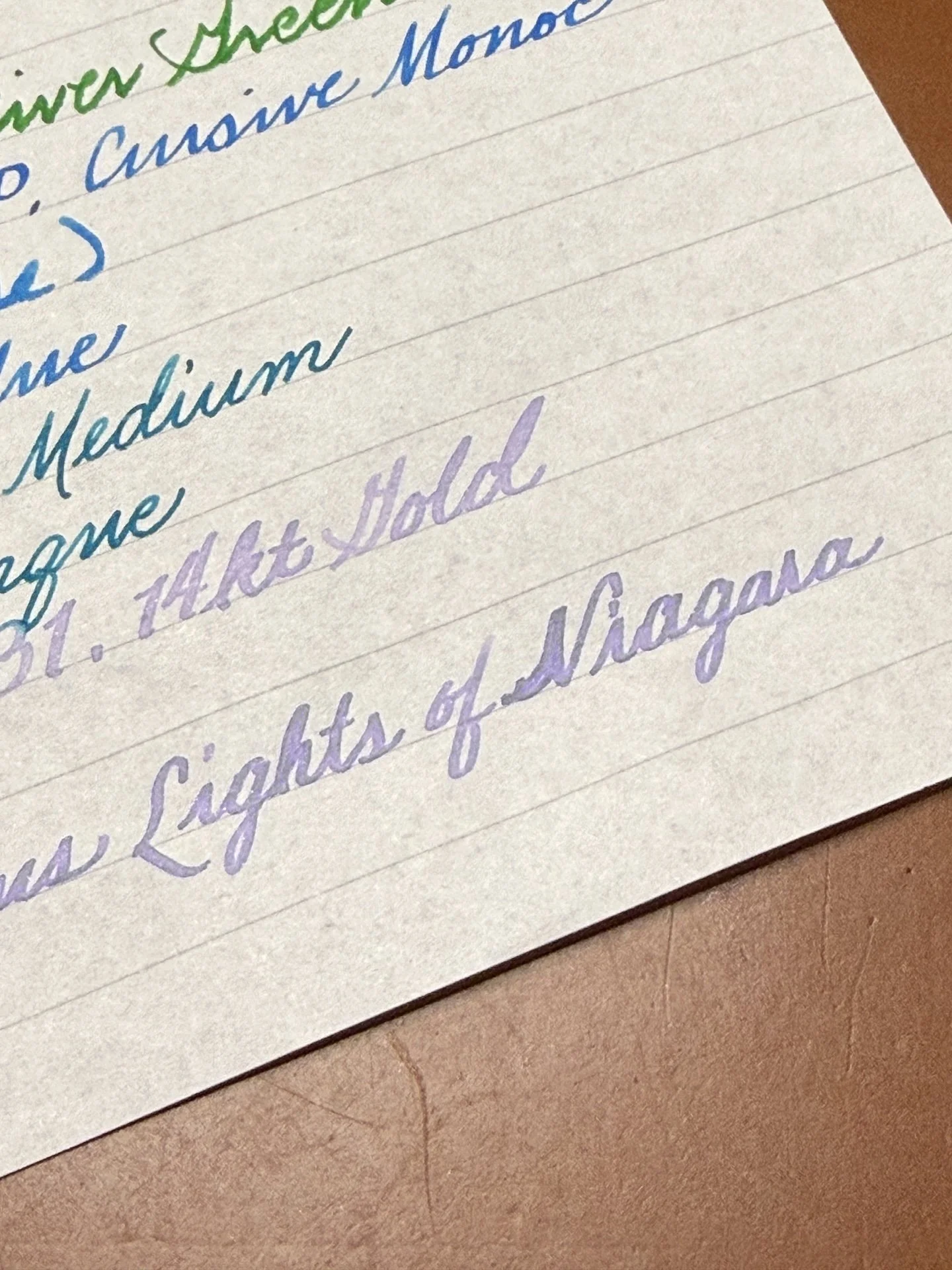
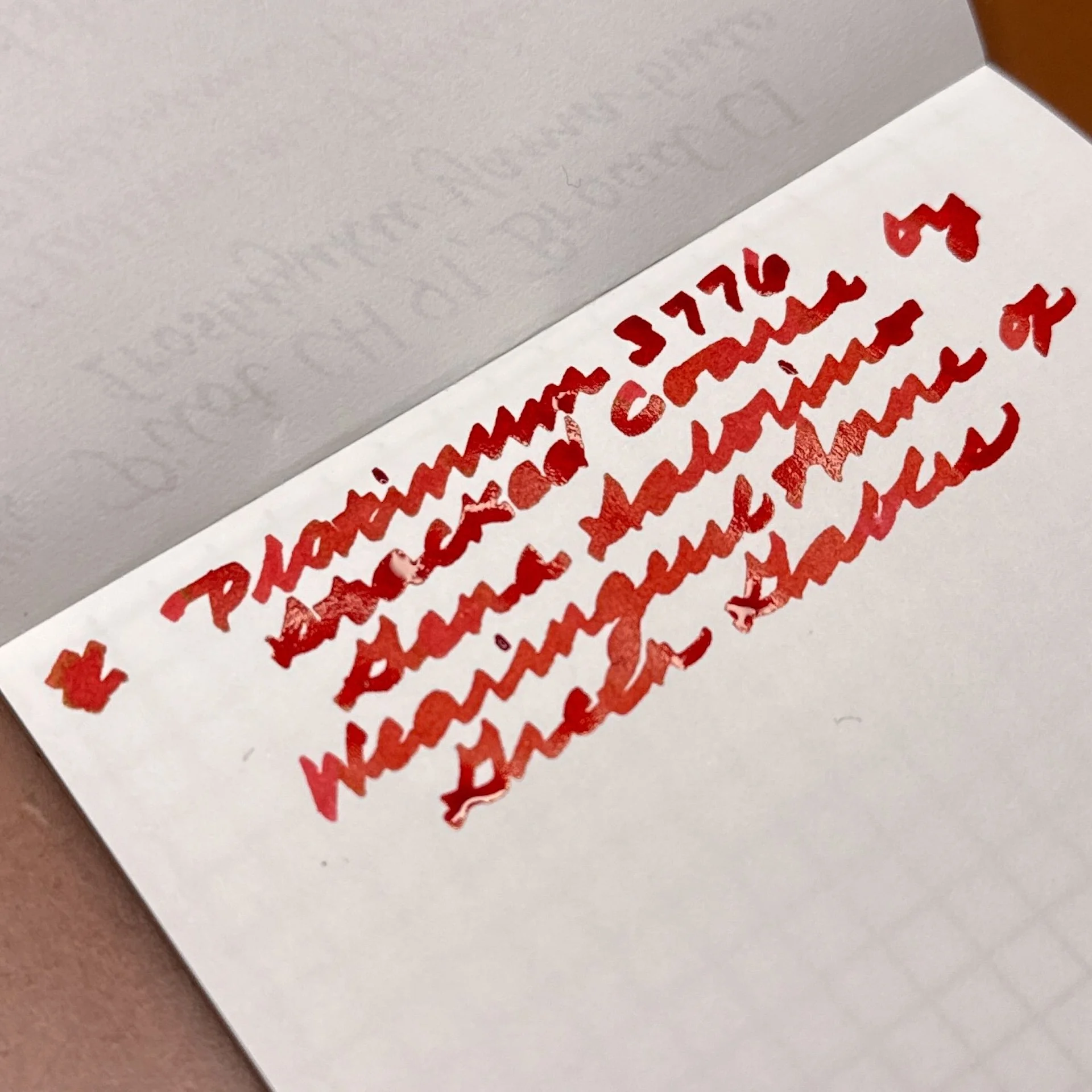
You can see the subtle gold sheen of Wearingeul Anne of Green Gables.
Not gonna lie, I kinda liked using a BB SIG followed by a Masuyama Needlepoint. The paper handled all the nibs and inks without any issue.
Hard to see here, but it handled the shimmer from Pennonia x Scriptus Lights of Niagara (boy did I mess up that N, cuz it kinda looks like Viagra, lol).
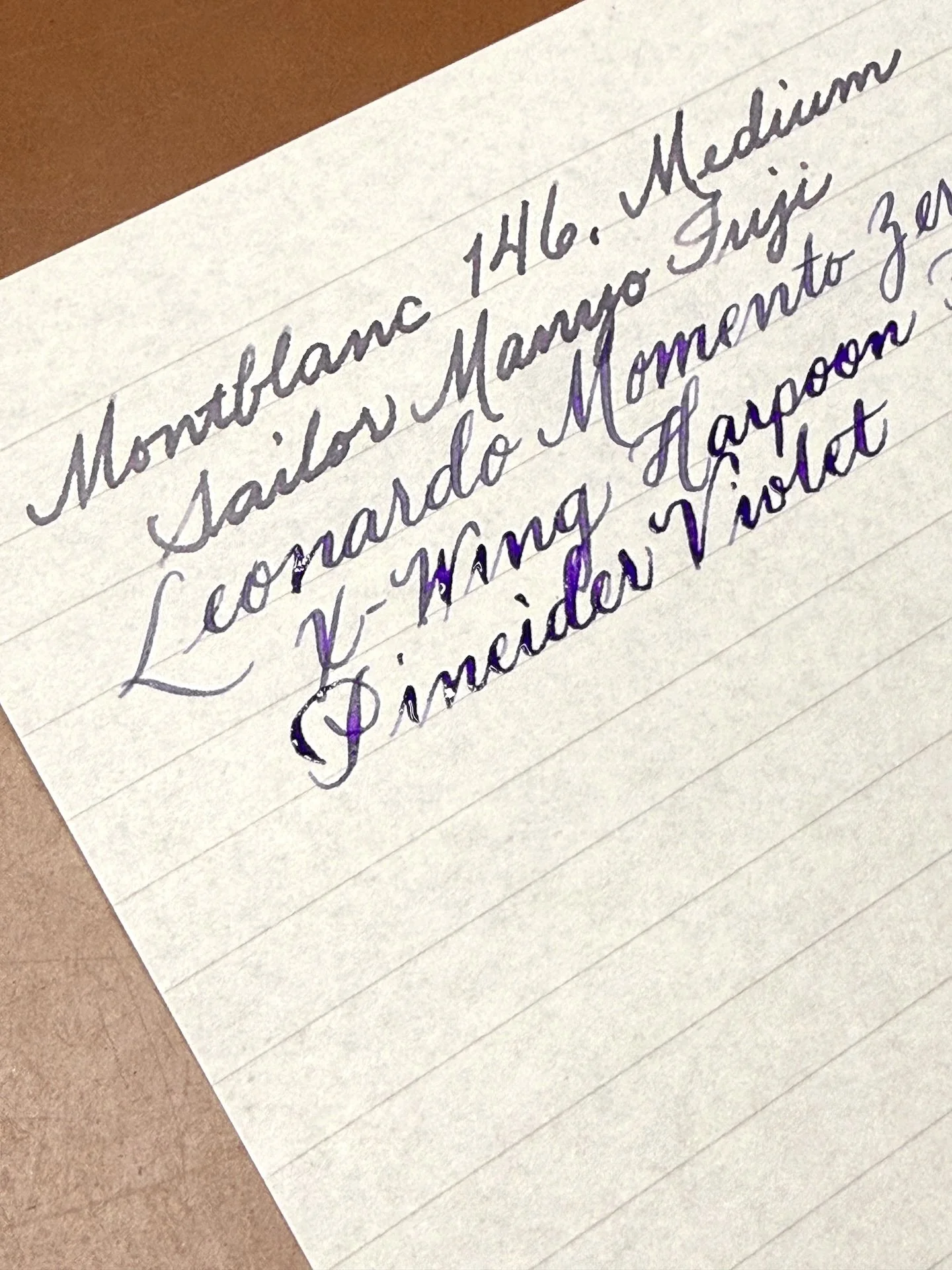
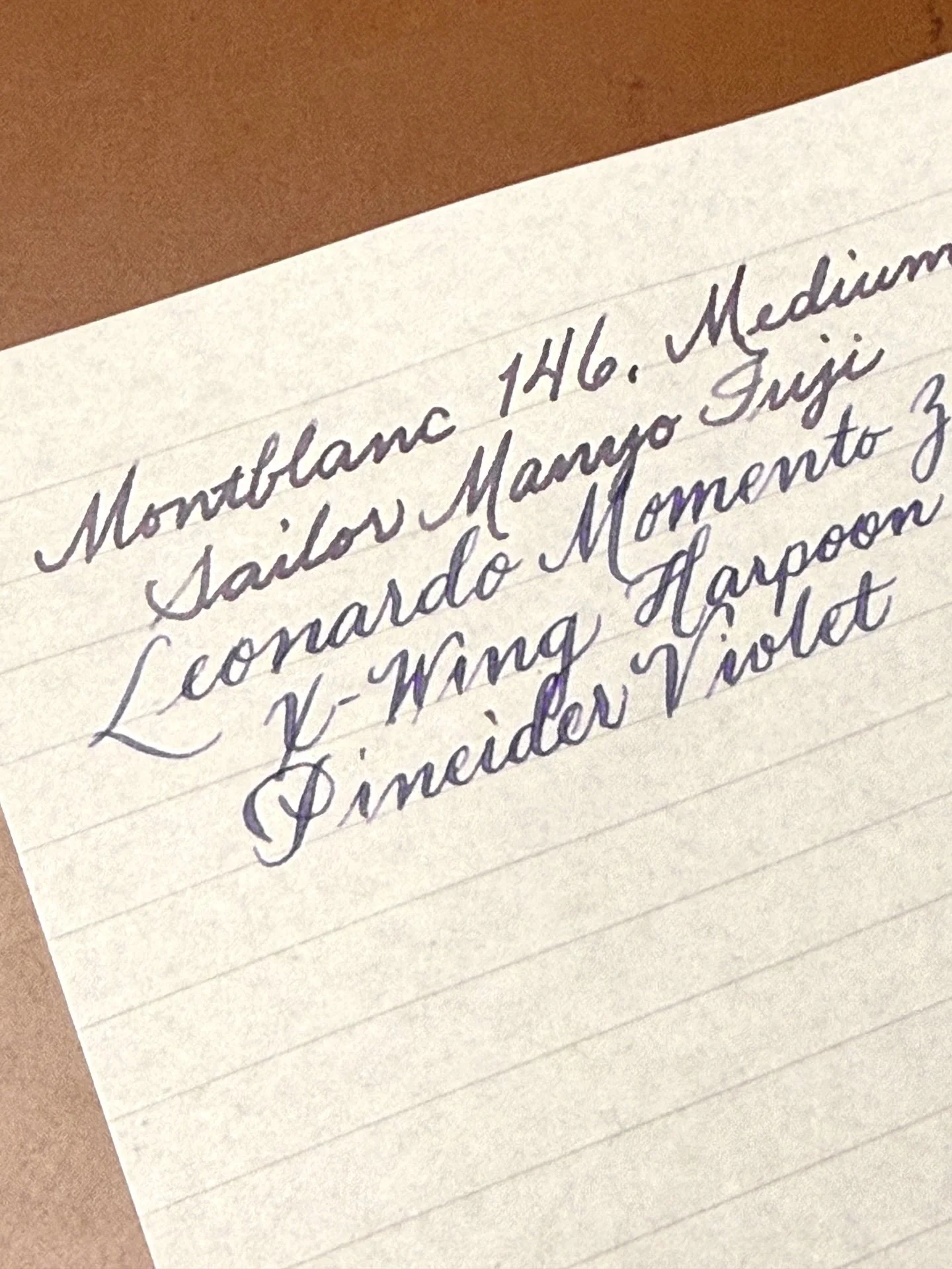
Laying down the wet lines from Stylosuite’s Extra Fine X-Wing Harpoon flex nib and Pineider Violet.
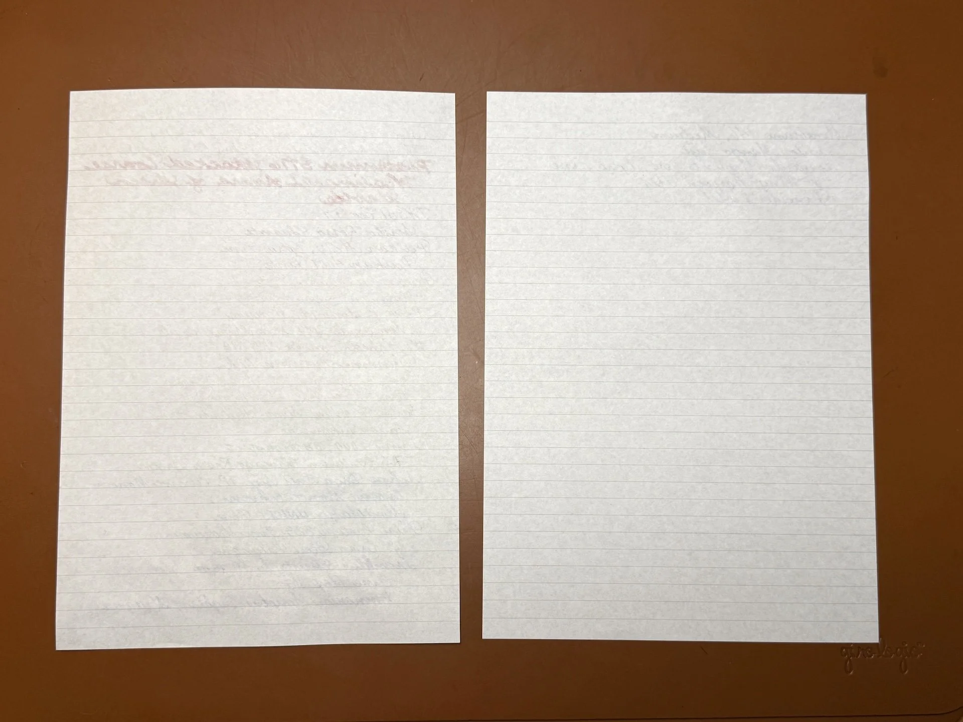
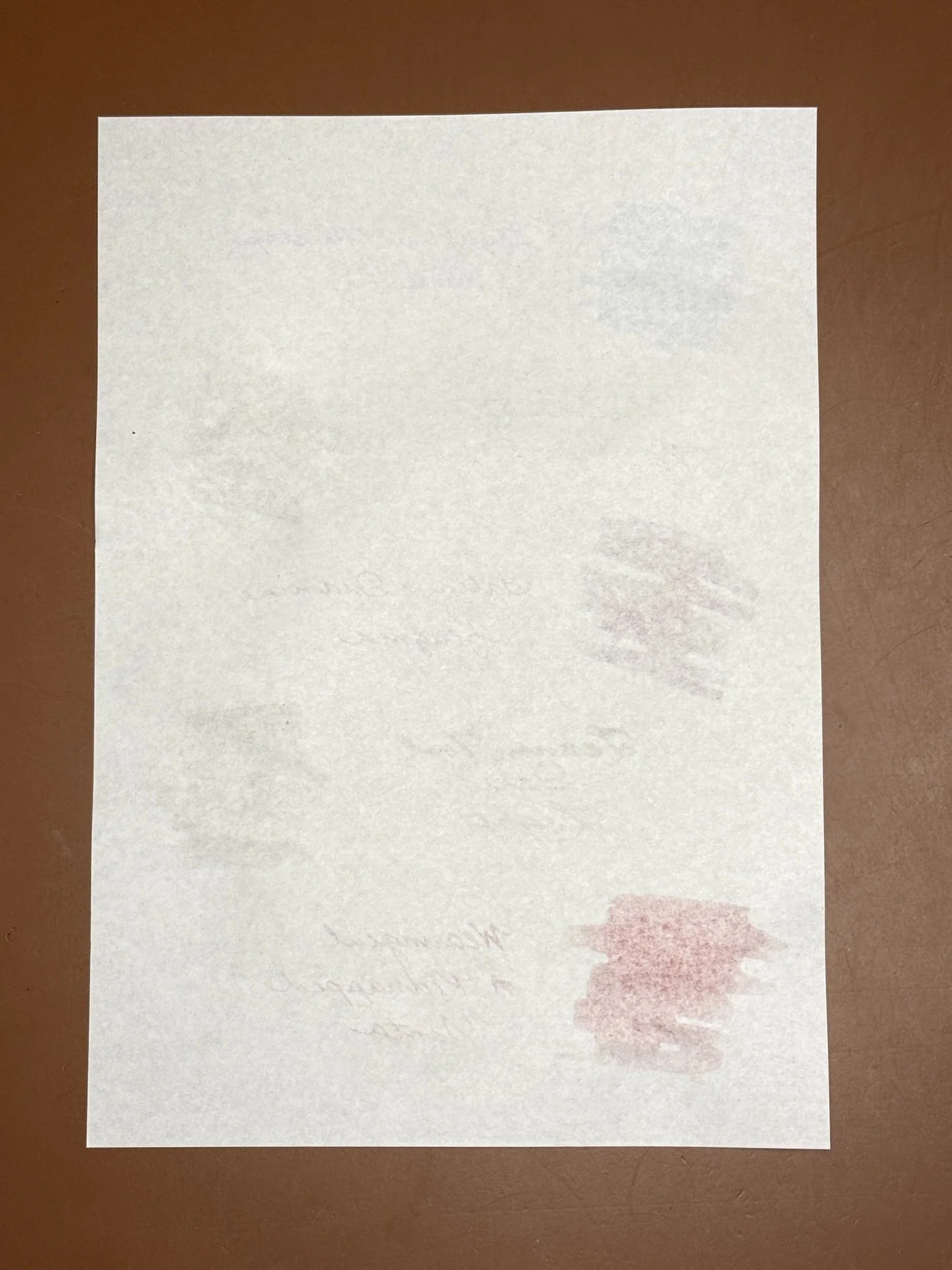
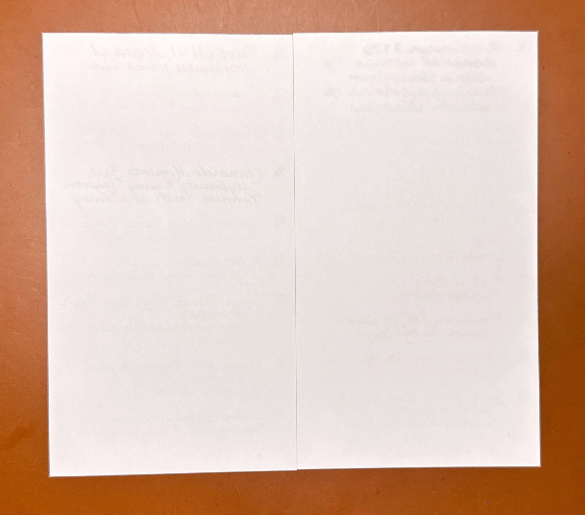
The paper had no problems letting all that ink dry, without soaking through to the other side.
Gotta love me an inky rainbow!
You can just make out some ghosting from the very wet 3776 stacked nib, but otherwise no problems here.
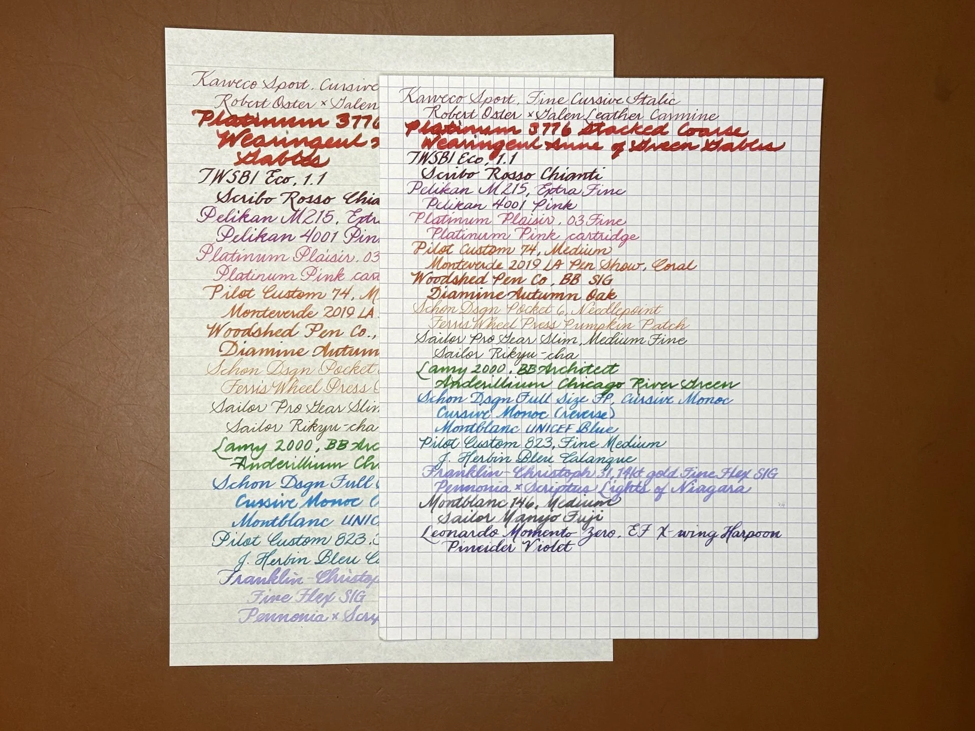
As mentioned above, the Nikitana paper is cream-colored, which can be easier on the eyes than white. Here it is, on the left, compared to 80gsm Rhodia, where you can see the color difference.
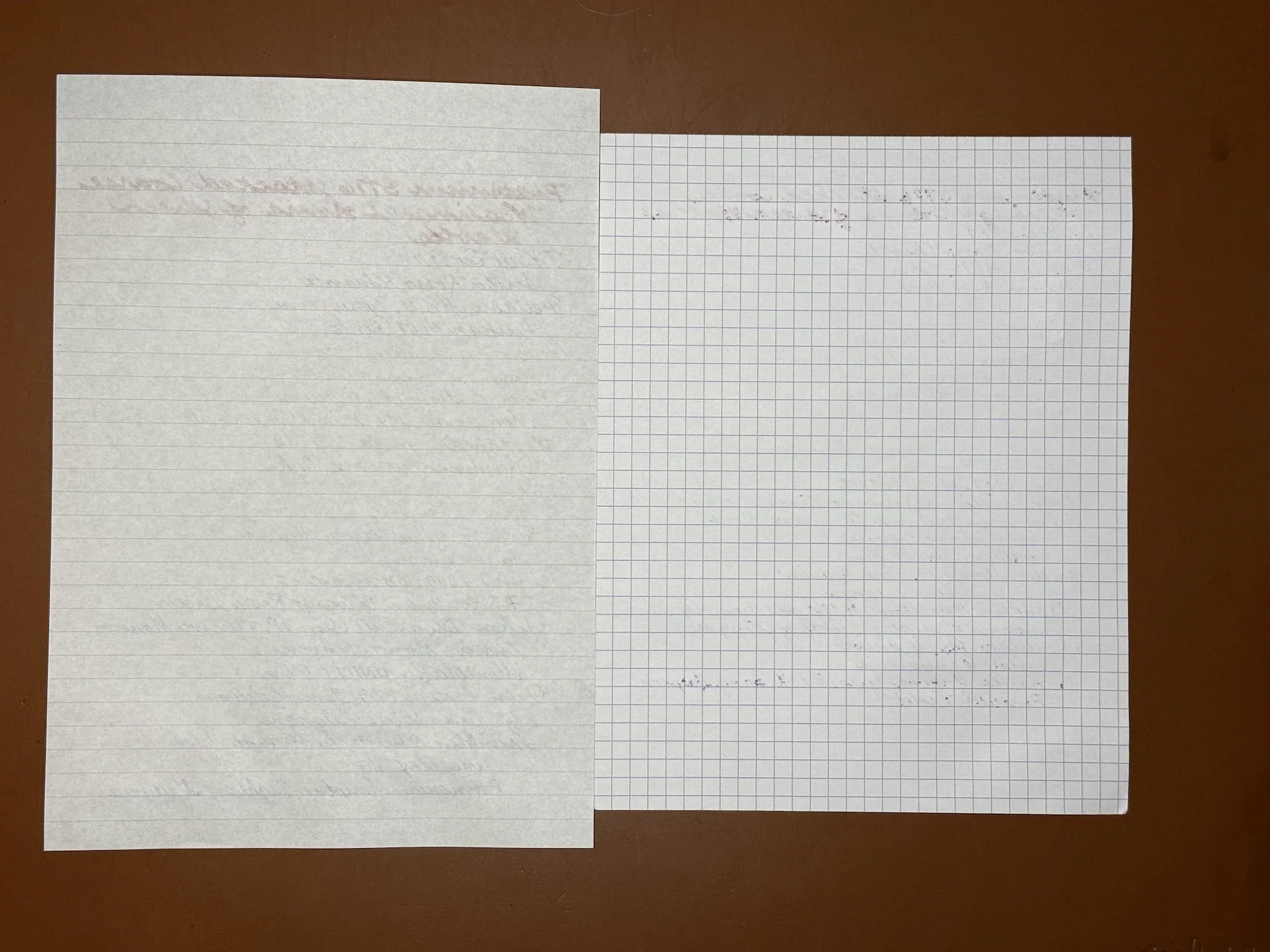
Despite the slightly higher gsm, the 80gsm Rhodia actually had bleedthrough for the 3776 as well as the flex nibs on the Franklin-Christoph 31 and the Leonardo.
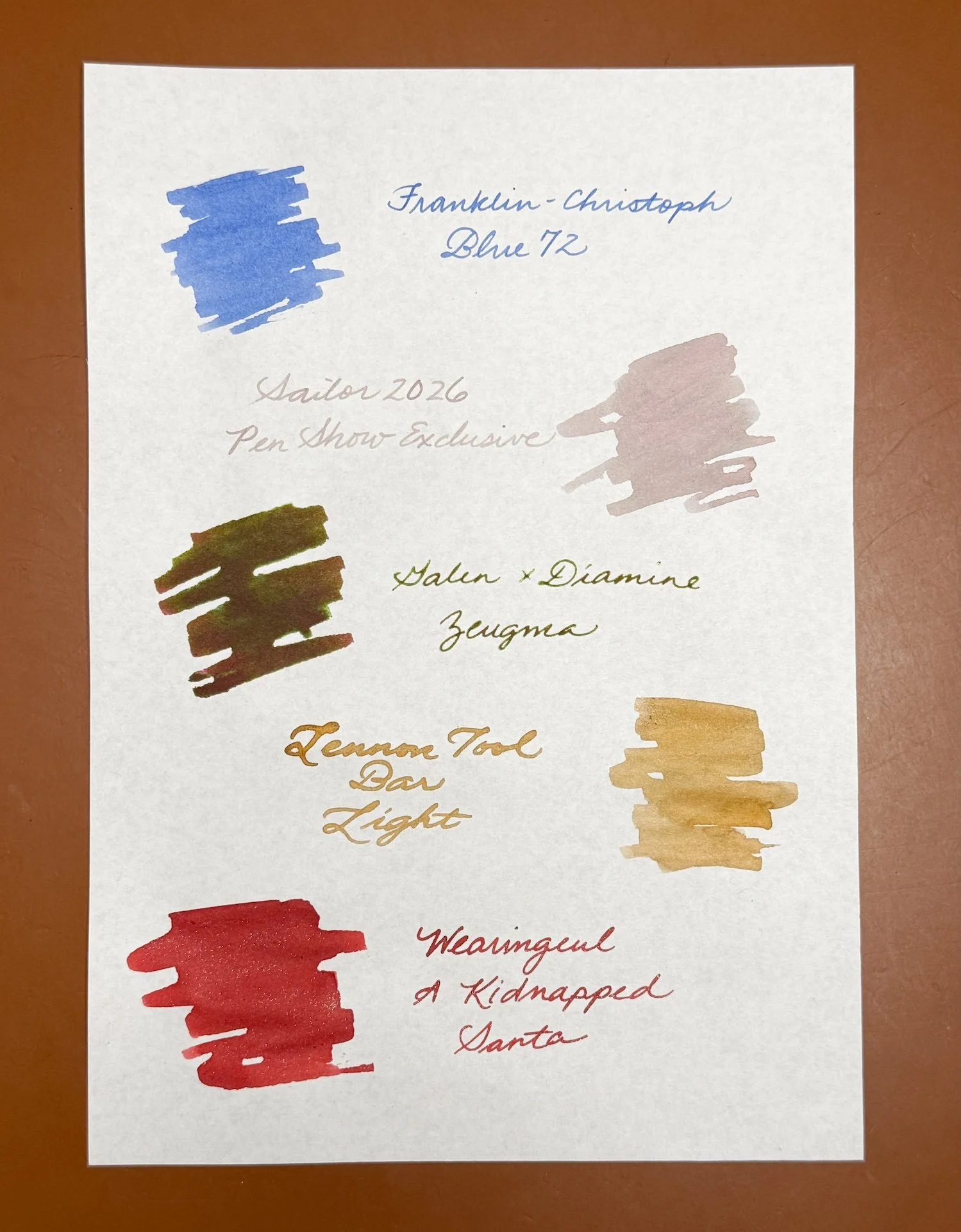
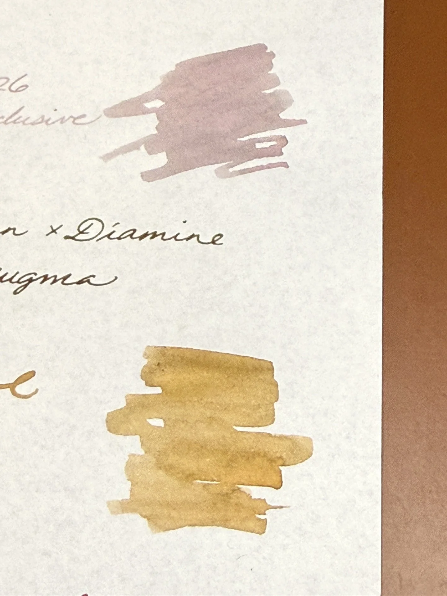
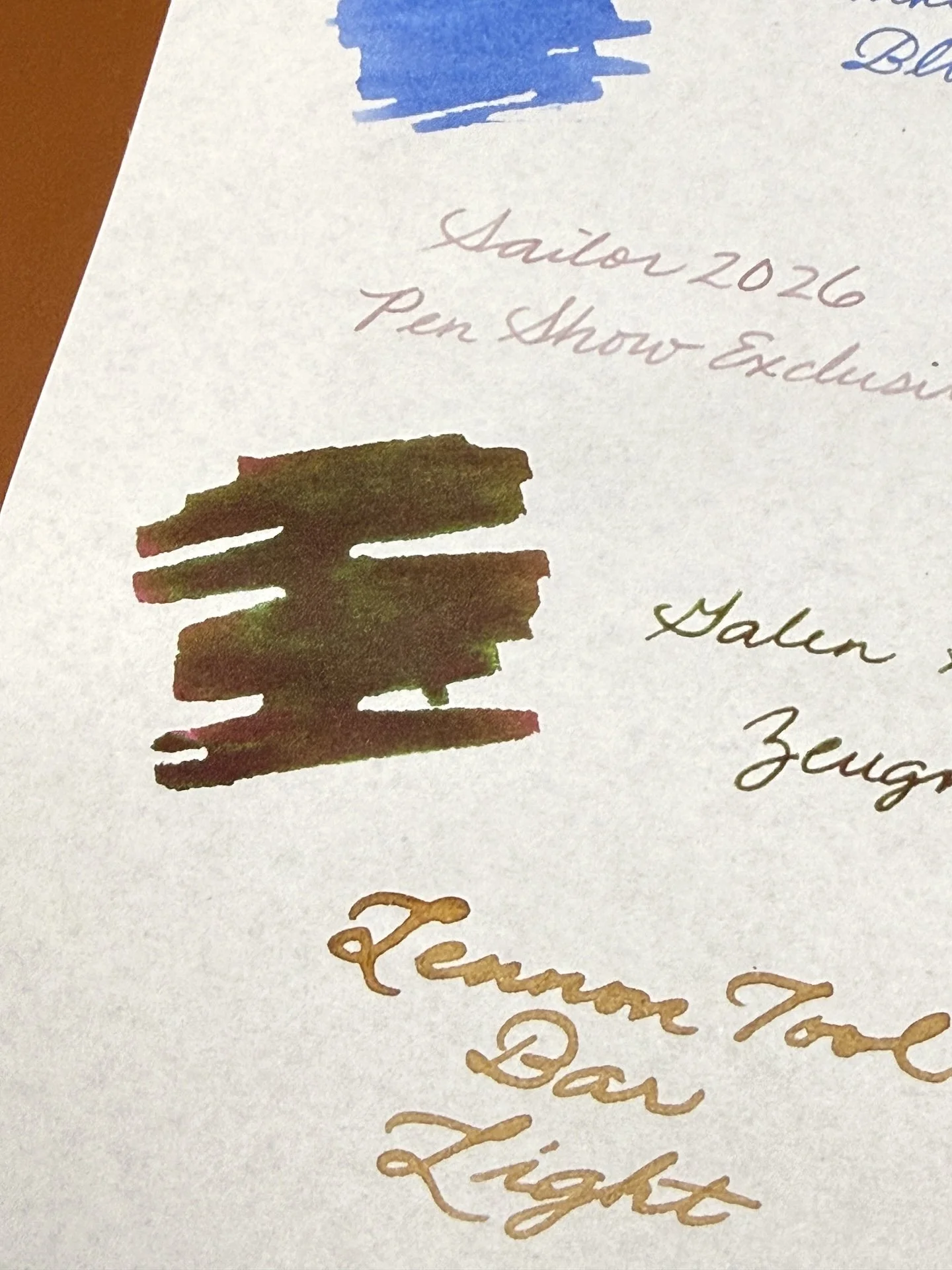
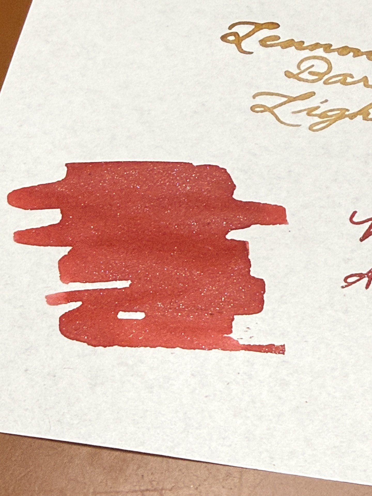
I swatched a few inks that were sitting in my to-be-swatched pile just to see how the paper would handle them. Franklin-Christoph Blue 72 (yes, this bottle was already on my desk), Sailor 2026 Pen Show Exclusive, Diamine x Galen Zeugma, Lennon Tool Bar Light, Wearingeul A Kidnapped Santa.
Chromashaders are hard to see in the picture but trust me, that Sailor ink is both pink and grey, while the Lennon Tool Bar is golden brown with hints of peach.
Look at the green sheen of the Diamine x Galen Zeugma that I picked up at the recent CA Pen Show.
Love the shimmer from Wearingeul A Kidnapped Santa - not gonna lie, I love the name even more!
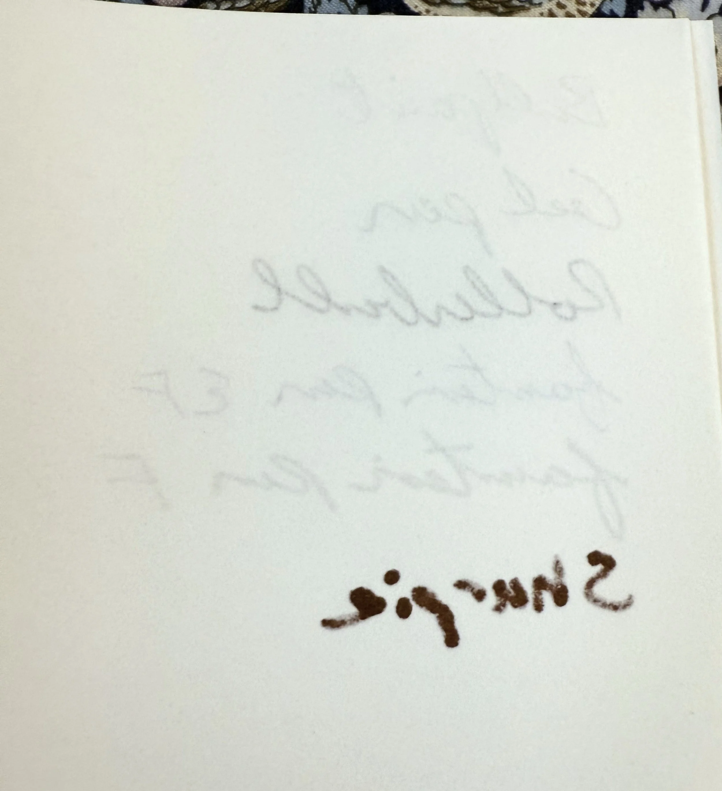
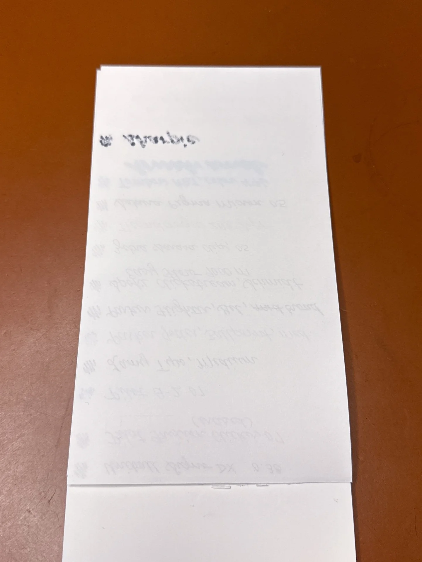
With such a heavy application of ink, it’s not surprising that you’d see some ghosting on the back, but no actual bleedthrough which is really good.
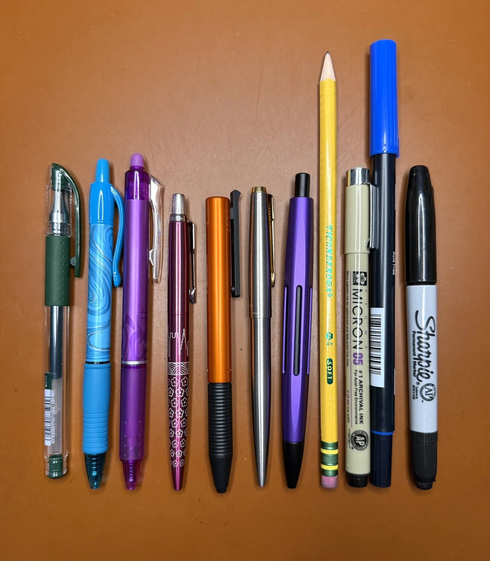
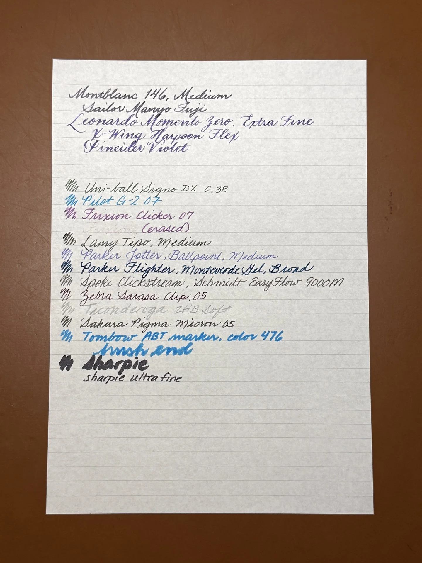
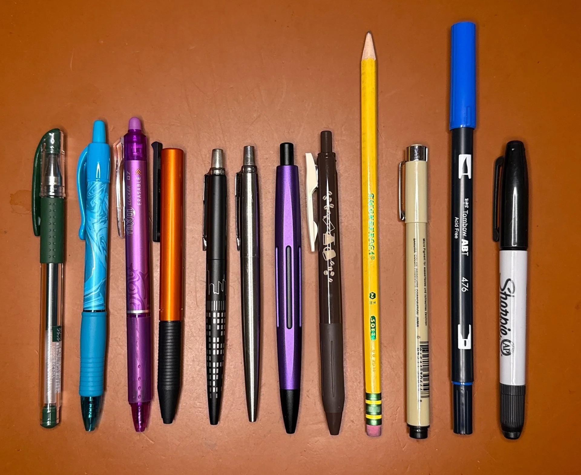
I’ve decided to make this set of standard pens, markers, and pencils as my default, and put them in its own cup so I don’t have to dig around every time I do a paper review. Don’t ask me why it’s taken me this long to figure this out, haha.
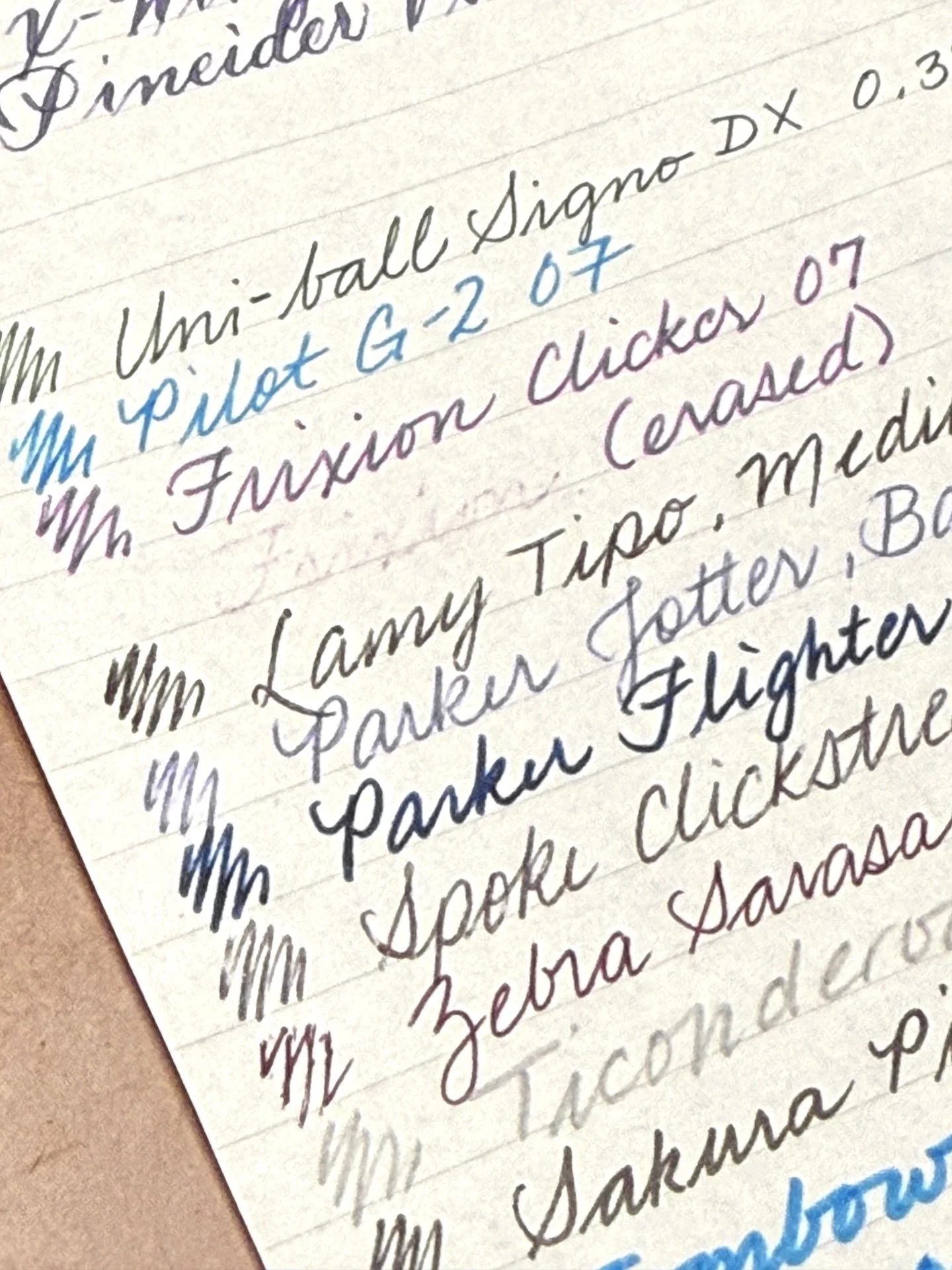
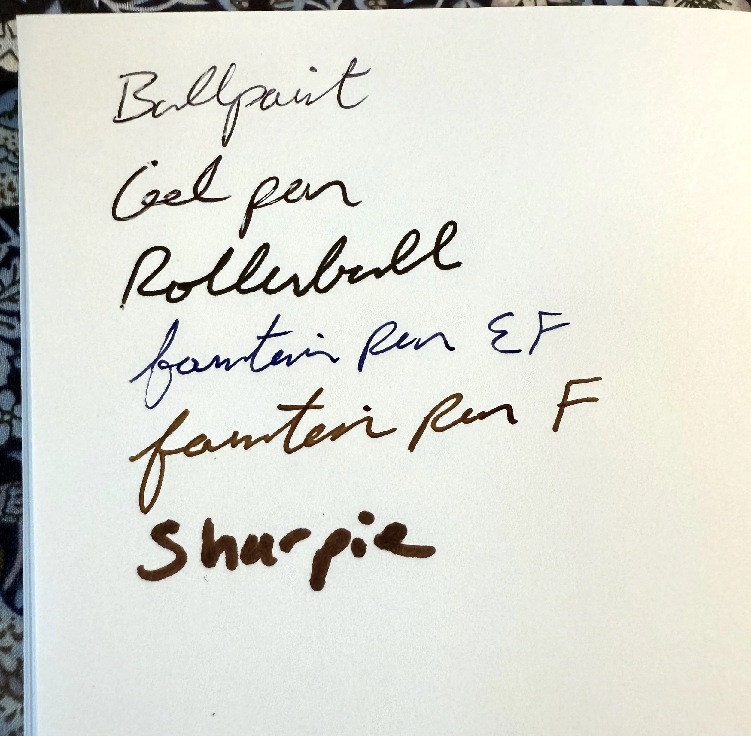
Standard pens (l to r): Uni-ball Signo DX, 0.38, Pilot G-2 07, Frixion Clicker 07, Lamy Tipo Medium, Parker Jotter, Ballpoint, Parker Flighter, Gel, Spoke Clickstream, Schmidt EasyFlow 9000 M, Zebra Sarasa Clip 05, Ticonderoga 2HB Soft, Sakura Pigma Micron 05, Tombow ABT, color 476, Sharpie. And yes, this is the same photo (and set of pens) that I’ve used for the last several paper reviews.
It took some effort to erase the writing of the Frixion, partly due to the fact that I didn’t want to rip the paper, but it does require a fair amount of friction (sorry, not sorry) in order to erase the ink. It really feels like trying to erase on something like Tomoe River. Even after all that effort, you can still see the remnants, moreso than on other papers.
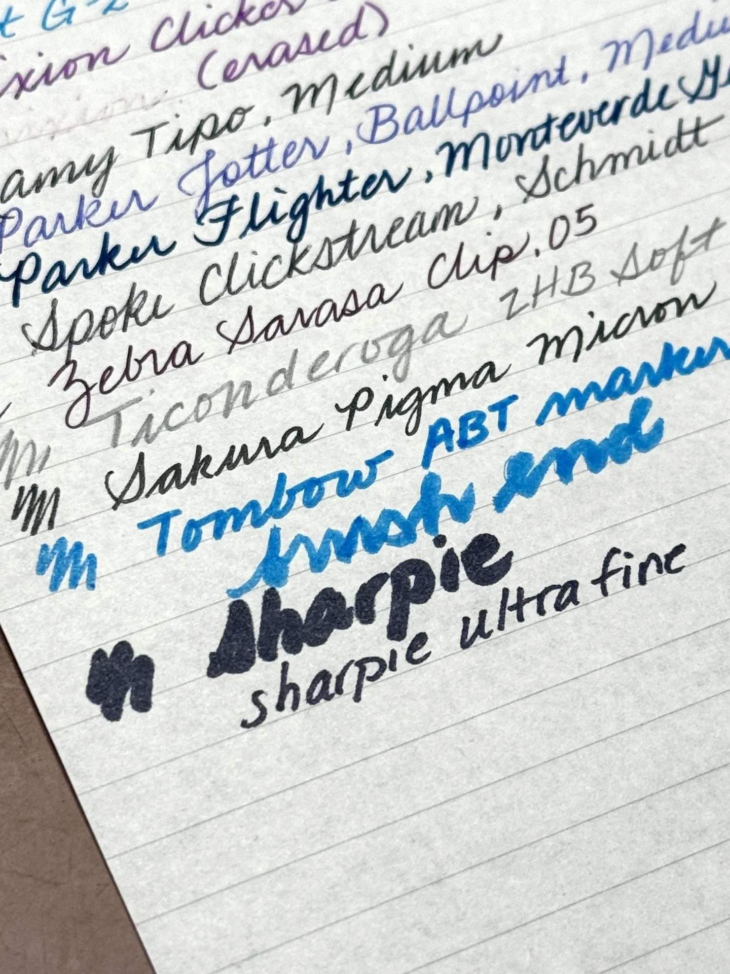
A few thoughts - wow that Monteverde gel refill color looks amazing and was super smooth - I’m going to need to try more colors. I continue to dislike pencils, sorry. Also, I cannot write with brushes. Lastly, why do I keep testing with Sharpies? Do I really expect it to ever do well?
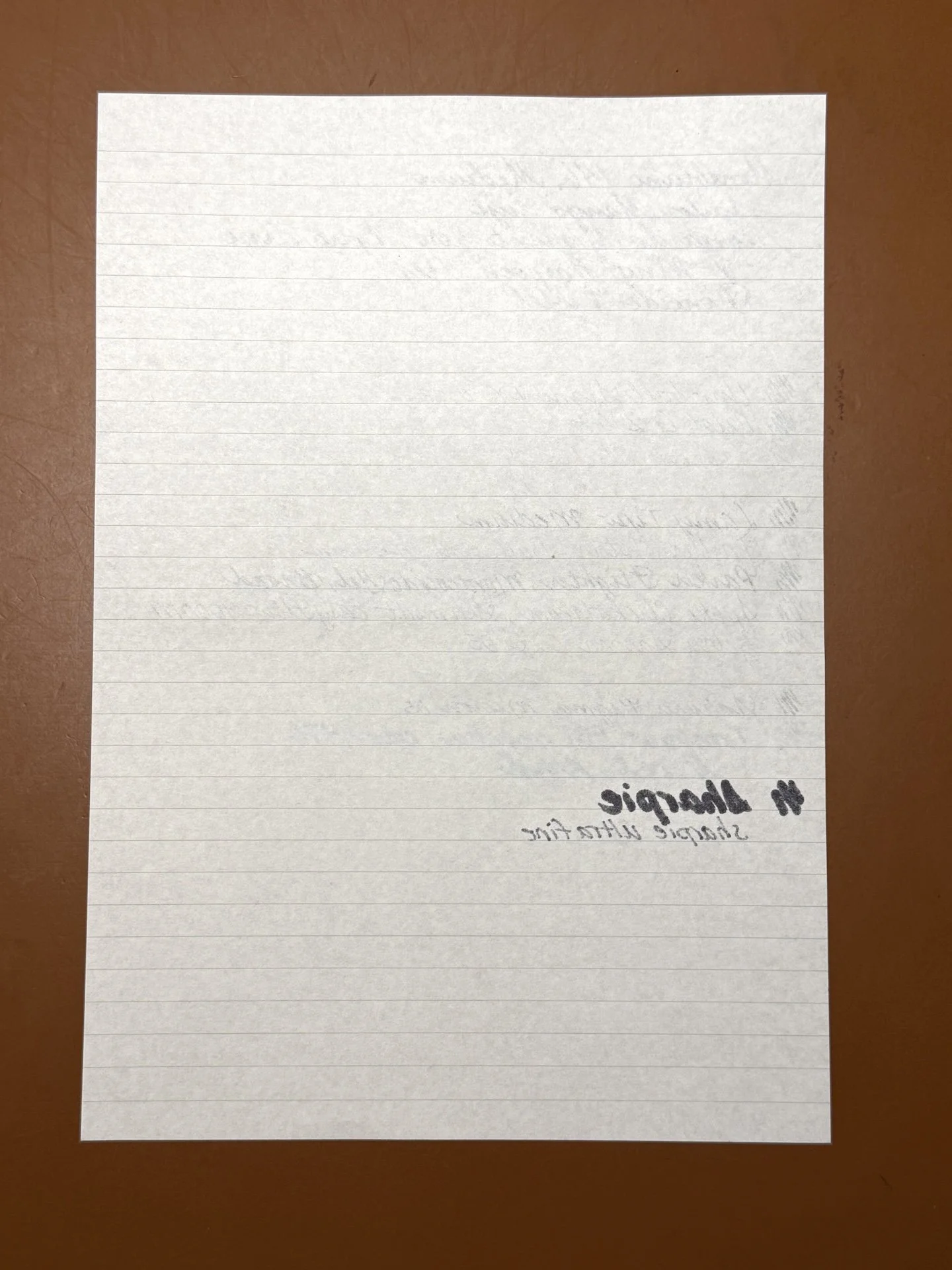
Not one to waste paper, I wrote with the above pens/pencil/markers and it handled most of them just fine. Wanna guess the troublemakers?
Yep, the Sharpie marker and ultra fine tip pens were the ones that bled through, but I don’t think that is a surprise.
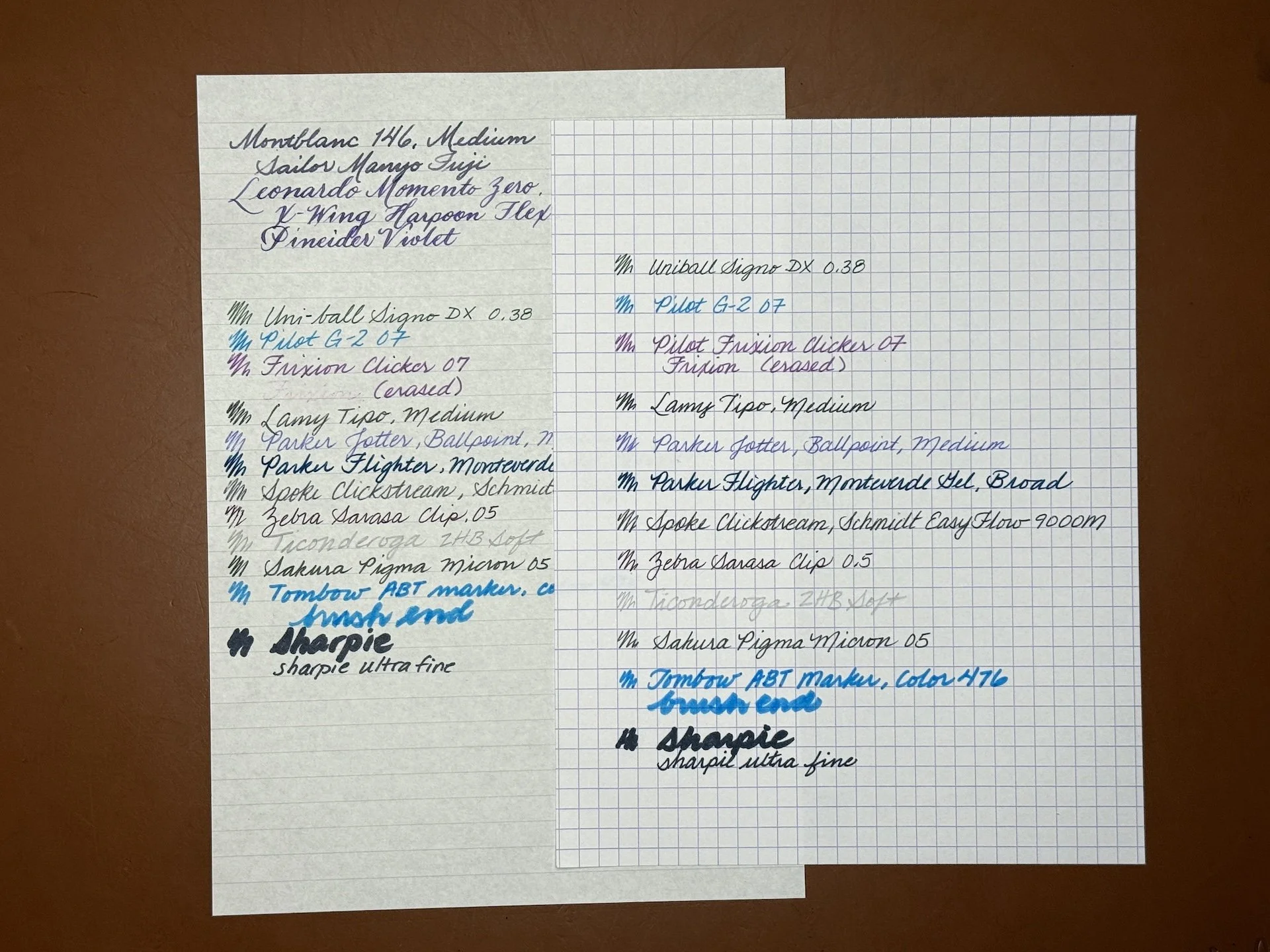
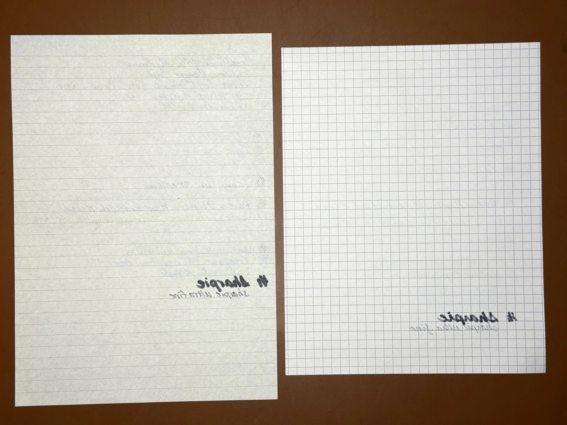
Nikitana (left) and 80 gsm Rhodia.
Both papers didn’t like the Sharpies, but the Rhodia did a slightly better job of handling it - probably because it’s 80gsm vs Nikitana’s 57.
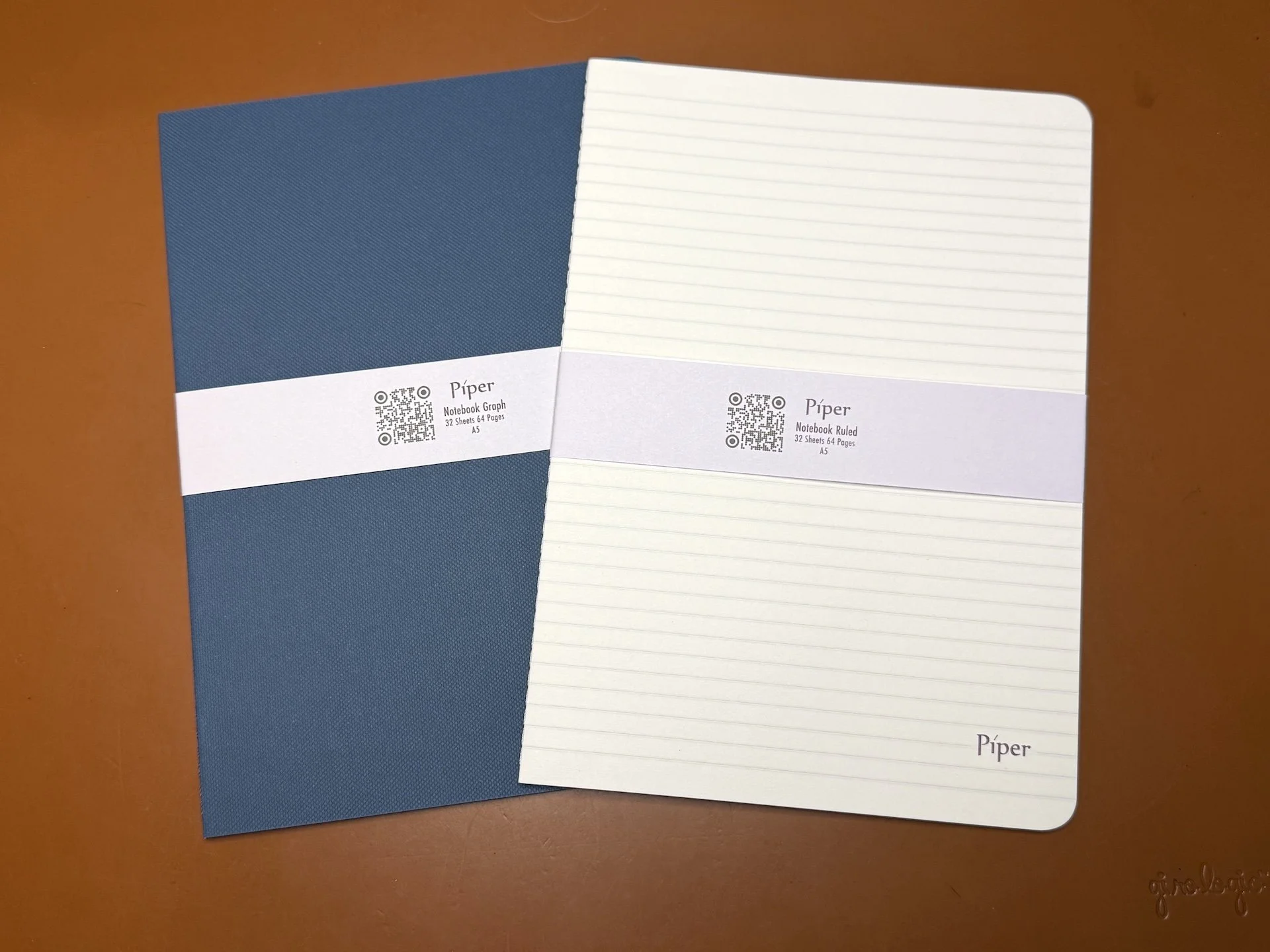
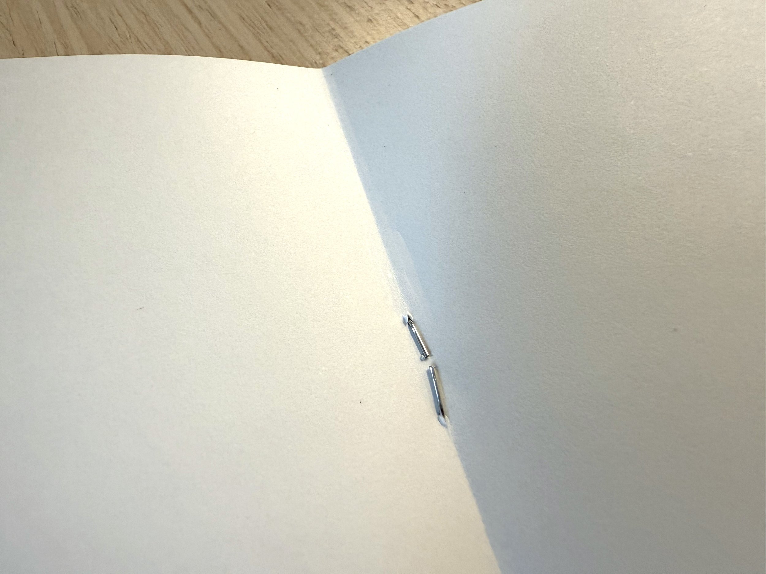
The Nikitana Notebooks are more like inserts than what I would consider a notebook, primarily because of their covers, or lack thereof in the case of the “naked” option (that’s what’s on their website, but I’m going to refer to it as “coverless”). They are made with the same 57 gsm paper that I tested above, so I didn’t do another pen/ink test. The notebooks are thread-bound/stitched, which is a nice touch over staple-bound.
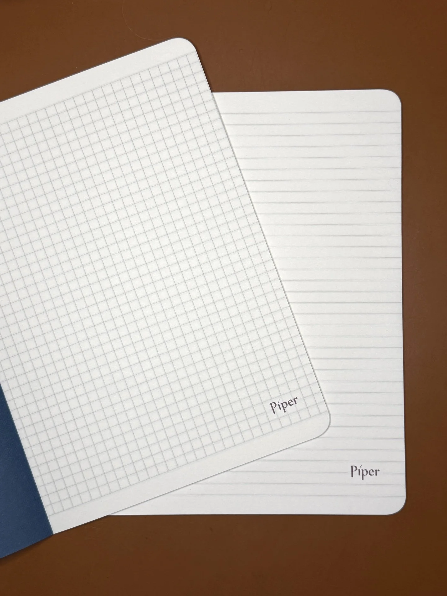
The Nikitana Notebooks come in Graph or Ruled, with a blue cover or coverless (the cover is the same paper as the rest of the notebook), in Pocket and A5 sizes.
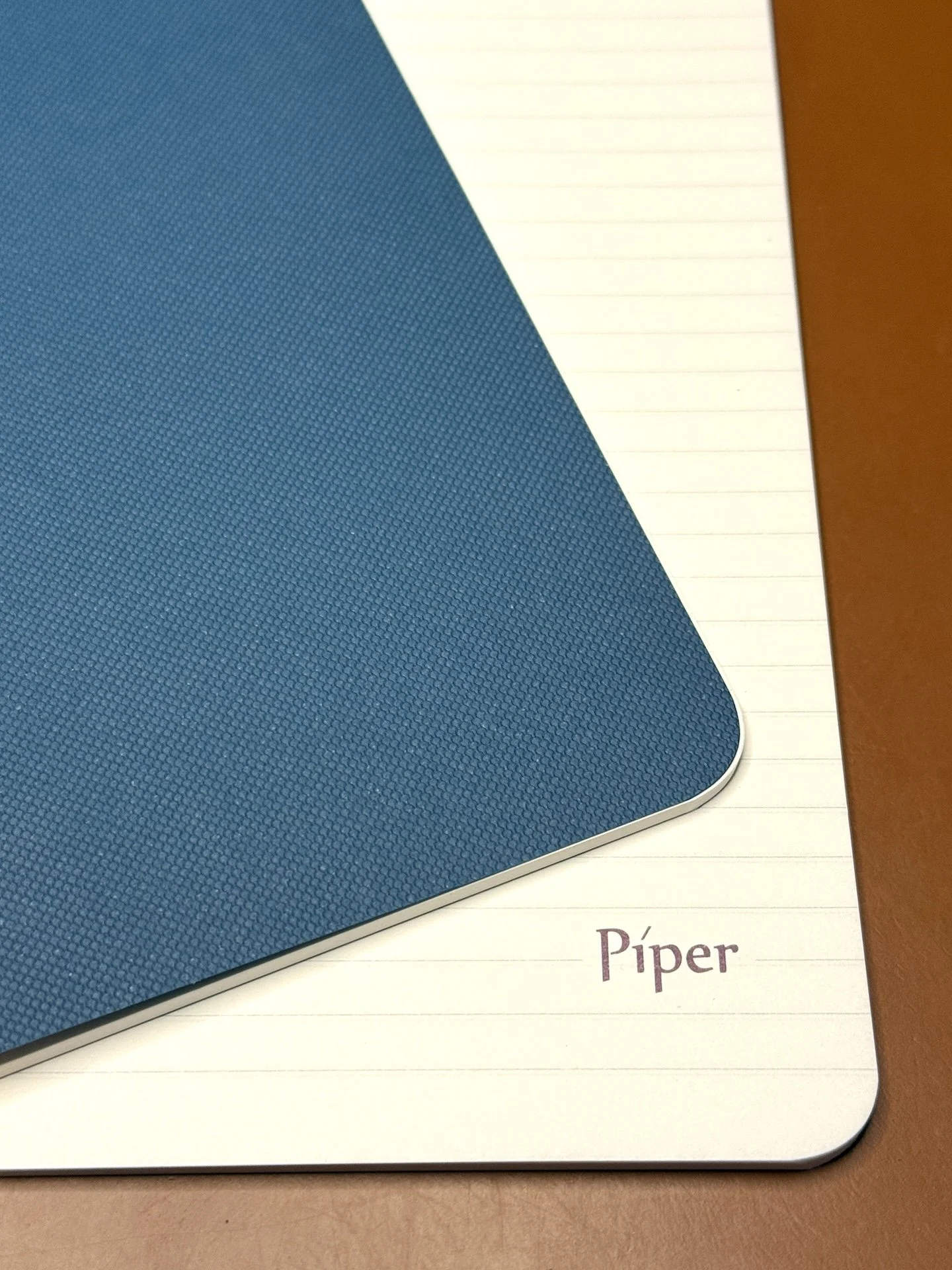
The teal/blue cover on the left is textured on the outside but smooth on the inside, while the coverless’ “cover” is the first sheet of Nikitana paper with “Piper” on the bottom corner.
The first page of the covered notebook (left) and the cover page of the coverless notebook (right) both have “Piper” on the bottom right corner. All other pages don’t have this branding.
Thoughts about the notebooks:
- I like the covered notebook, though I wish the covers were maybe slightly thicker. I think they’d be pretty easy to fold or bend if they weren’t in a notebook cover.
- I don’t like the coverless notebook because it feels really flimsy and would easily get damaged, especially when you’re trying to slide it into a notebook cover.
- I don’t mind the Piper branding on the first page of the covered notebook, but I don’t like it on the coverless.
- I would like the covered notebook to be available in a Traveler’s Notebook size.
- I like that the notebooks are thread-bound and lay fairly flat.
- Maybe a blank option for the notebooks for those who like to draw or use it as a swatch book.
- I would personally like these with more pages and with stiffer but pliable covers like the ones Rhodia and Leuchtturm have.
Both types of Nikitana Paper are available on the Piper Trading Co website. The Loose Leaf comes in packs of 50 sheets, in A4 and A5, for $12.50 and $7.50, respectively. The Notebooks have 32 sheets/64 pages, come in packs of 3, and prices range from $9.25 to $16.50 depending on size and cover option.
Overall, I enjoyed writing on the paper and look forward to using the loose leaf for letter writing, and the notebooks for language learning notes.
(Disclaimer: Thank you to Piper Trading Co for providing the paper and notebooks for review at no charge. All other products shown are my own. And as always, my thoughts and opinions are also my own.)

